Gray Text Color in UI: Why #808080 Is Too Light, and What to Use
Middle gray feels like the safe pick for secondary text, but on white it is too light to read. Use #767676 on white, go darker on gray cards, skip gray on color, and use #848484 on dark.
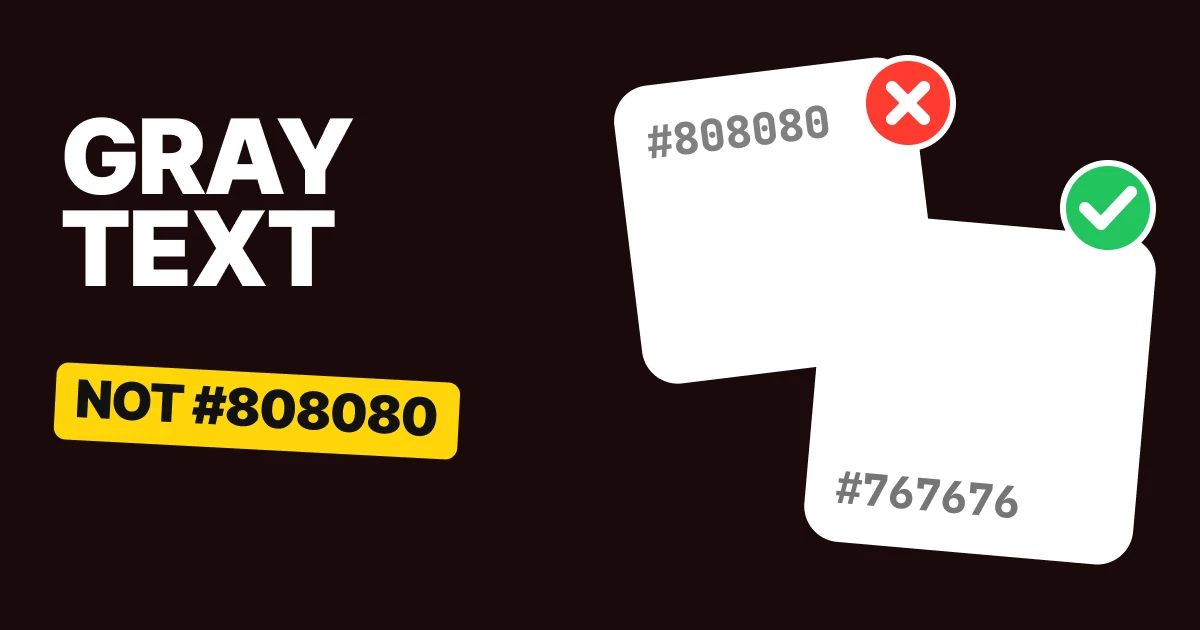
The lightest gray you can use for text on a white background is #767676. Middle gray, #808080, feels like the safe choice for secondary text, and it is just under the line where reading gets comfortable. Here are the four fixes, one for each kind of background, and the lightest gray for eight common grounds.
Why #808080 is the wrong gray
Nobody chooses #808080 after testing it. It is the midpoint of the scale, 128 out of 255 on every channel, so it is where a hand lands when asked for "a gray that is not black".
Two other routes end at the same code. Black text at 50% opacity renders exactly #808080 on white, so a muted label built with opacity instead of a hex is the same mistake in disguise.
The problem is that secondary text is still text. People read the preview line, the date, the footnote and the helper text, and #808080 on white sits just under the contrast WCAG asks of body text.
Fix 1: on white, #767676 or darker
#808080 on white
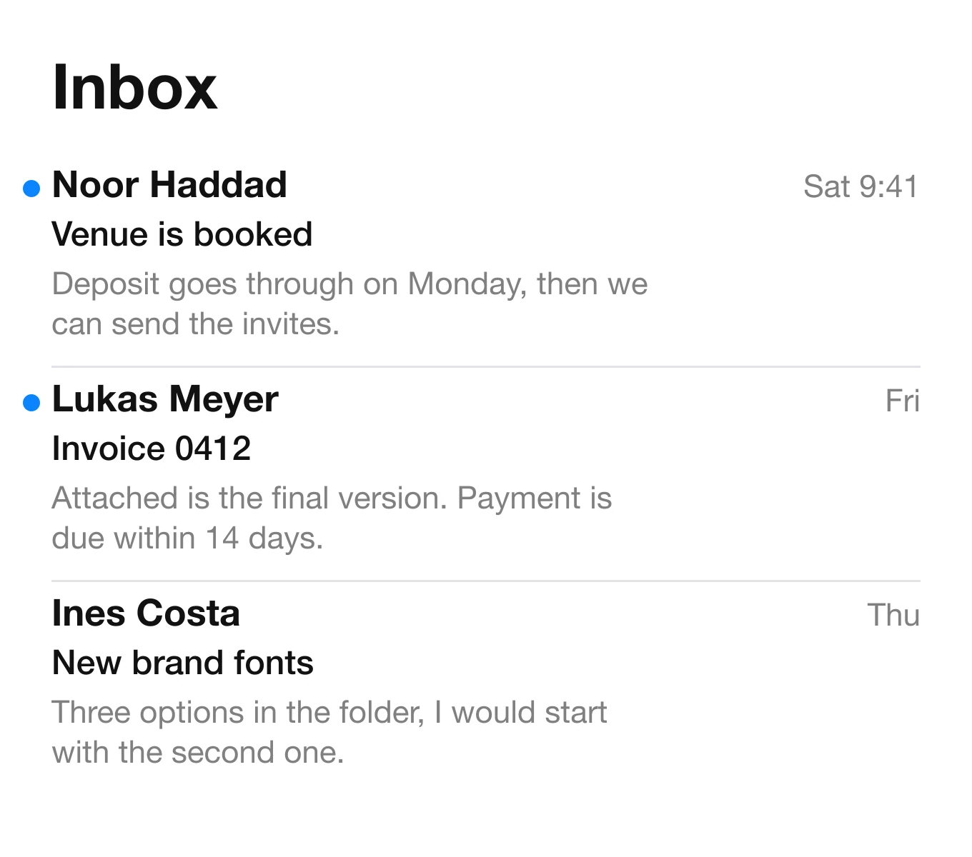
#767676 on white
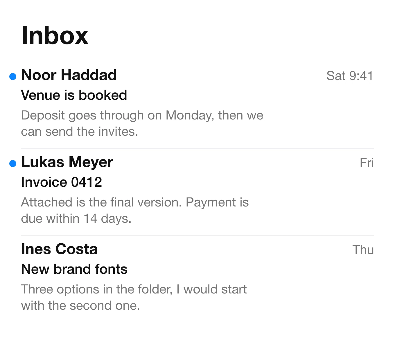
#767676 is the lightest pure gray that passes on white. One step lighter, #777777, already falls under the line.
Use it as the ceiling. Anything darker, such as #6B6B6B or #595959, is fine, and a darker gray is the right choice for text people need to read at a small size, like a 13 pt caption.
The same fix applies to every kind of quiet text: timestamps, helper text under a field, table headers, breadcrumbs and the unselected labels in a tab bar.
Fix 2: on a gray card, go darker
#808080 on #F2F2F7
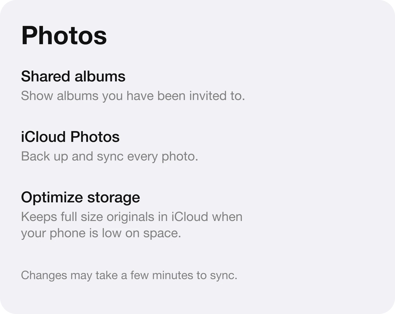
#6F6F6F on #F2F2F7
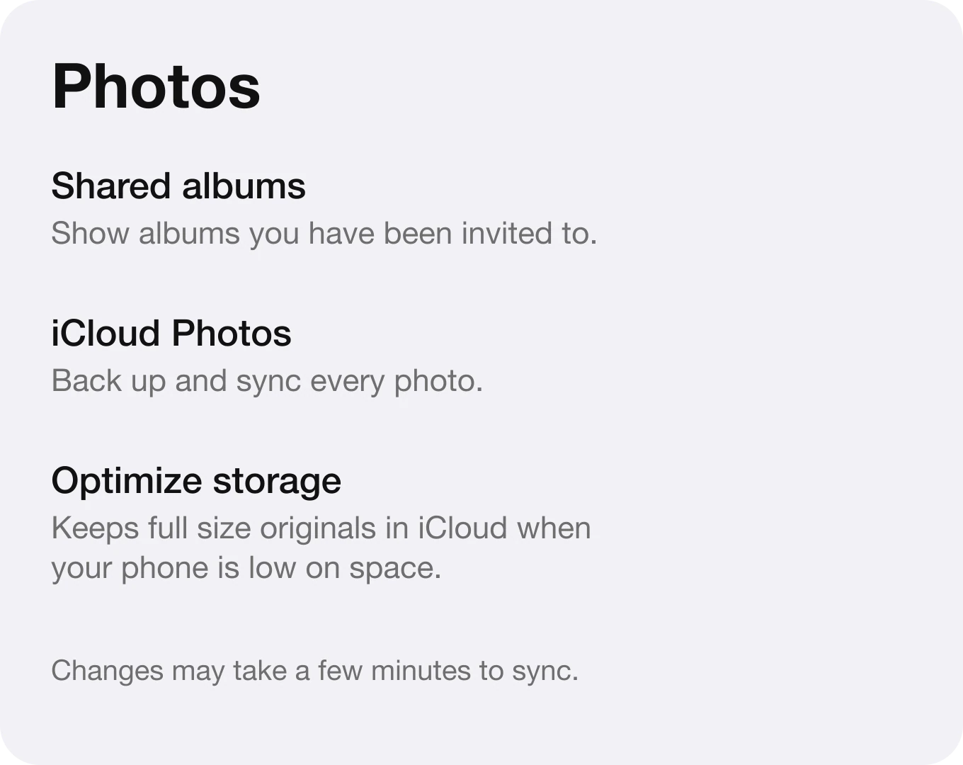
A gray background is less bright than white, so the text on it has less room before it merges. #767676 gets too close. #6F6F6F is the lightest pure gray that still reads on #F2F2F7.
The rule does not depend on one background. The lighter your ground, the lighter the text can be, and every step darker in the background asks for a darker text gray. The table further down has the value for each ground.
Fix 3: on a colored card, skip the gray
#808080 on #E6DDFF

#4E2FB3 on #E6DDFF

Gray does not belong on a colored background, because gray is the absence of color and the ground is full of it. The text ends up looking muddy and, on this card, it is also too light to read.
Refactoring UI makes the same point in "Don't use grey text on colored backgrounds": pick a darker shade of the background's hue instead. Take the hue of the card, drop the lightness until the text reads, and keep the saturation. The result stays secondary because it is lighter than the headline, and it stays readable because it is dark.
Fix 4: in dark mode, use a lighter gray
#767676 on #1C1C1E

#848484 on #1C1C1E

On a dark surface the lightness has to go up. #767676 on #1C1C1E is too dim, and #848484 is the darkest gray that passes. Do not reuse your light theme value and hope it holds. Pick the dark theme gray against the dark ground, the way we do with dark mode surfaces.
The lightest gray for 8 common backgrounds
Pick your gray from the background it sits on. Each field shows the real text color on its ground, and it is the lightest pure gray that passes WCAG for body text.
White #FFFFFF
Grey 50 #FAFAFA
Grey 100 #F5F5F5
Grouped #F2F2F7
Black #000000
Surface #121212
iOS dark #1C1C1E
iOS fill #2C2C2E
| Background | Lightest gray that reads | Use it for |
|---|---|---|
| #FFFFFF | #767676 | White page, white card |
| #FAFAFA | #737373 | Material Grey 50 |
| #F5F5F5 | #707070 | Material Grey 100 |
| #F2F2F7 | #6F6F6F | iOS grouped background |
| #000000 | #757575 | OLED black |
| #121212 | #7D7D7D | Material dark surface |
| #1C1C1E | #848484 | iOS dark surface |
| #2C2C2E | #939393 | iOS dark fill |
One step lighter on a light ground, or one step darker on a dark ground, fails in every row. Treat these as the limit, not the target.
Check your opacity grays too. Black at 50% over white renders #808080, so rgba(0,0,0,0.5) fails exactly as the hex does. If you want a muted text that adapts to its ground, use opacity at 55% or higher (black at 55% over white renders #737373), and test it on the real surface.
Hand this to your developer
:root {
  --text-primary: #111111;
  --text-secondary: #767676;     /* white */
  --text-secondary-on-tint: #6F6F6F; /* #F2F2F7 cards */
}

@media (prefers-color-scheme: dark) {
  :root {
    --text-primary: #F5F5F7;
    --text-secondary: #848484;   /* #1C1C1E */
  }
}

.card--violet { --text-secondary: #4E2FB3; } /* dark shade of the card color */
Name the secondary text as a role, not as a gray. When the surface changes, the token changes, and no component has to remember which gray goes where.
The numbers behind "easy to read"
| Text on ground | Contrast |
|---|---|
| #808080 on #FFFFFF | 3.95 to 1, fails |
| #767676 on #FFFFFF | 4.54 to 1, passes |
| #777777 on #FFFFFF | 4.48 to 1, fails |
| #808080 on #F2F2F7 | 3.54 to 1, fails |
| #6F6F6F on #F2F2F7 | 4.50 to 1, passes |
| #808080 on #E6DDFF | 3.04 to 1, fails |
| #4E2FB3 on #E6DDFF | 6.78 to 1, passes |
| #767676 on #1C1C1E | 3.75 to 1, fails |
| #848484 on #1C1C1E | 4.55 to 1, passes |
WCAG 2.x success criterion 1.4.3 sets one bar for body text and a lower one for large text (24 px, or 18.66 px bold). Secondary text is usually small, so the body bar is the one that matters. Large headings in gray have more room.
FAQ
What gray should text be in UI design?
#767676 or darker on a white background. It is the lightest pure gray that meets the WCAG minimum for body text.
Is #808080 accessible on white?
No. It falls under the WCAG minimum for normal text on white. It passes only for large text.
What is the lightest gray that passes on white?
#767676. It is the lightest pure gray that passes, and #777777 already falls just under.
What gray text color works in dark mode?
A lighter gray than you use on white. #848484 reads on #1C1C1E, and #767676 is too dim there.
Can I use gray text on a colored background?
Avoid it. Use a dark shade of the background's own color instead, such as #4E2FB3 on #E6DDFF.
Is black at 50% opacity a safe gray?
On white it renders #808080, which fails. Check the final color on the real surface instead of trusting the opacity.
Sources
- WCAG 2, 1.4.3 Contrast (Minimum): 4.5 to 1 for body text, 3 to 1 for large text (AA).
- Ratios computed with the WCAG relative luminance formula. #000000 at 50% opacity over #FFFFFF renders #808080.
- #F2F2F7, #1C1C1E and #2C2C2E are the iOS grouped background, dark surface and dark fill. #121212 is the Material dark surface, and #FAFAFA and #F5F5F5 are Material Grey 50 and 100.
- Adam Wathan and Steve Schoger, Refactoring UI: "Don't use grey text on colored backgrounds".
- The inbox, settings and plan screens are invented for this page.
- First published as a carousel on UX Brainy.
Get new papers by email
New Brainy papers in your inbox. Confirm once, unsubscribe anytime.