Invoice Screen Design: A Mobile Invoice App, Before and After
An invoice screen with the amount owed at 10 px, a six column table and four caps buttons, and the same screen fixed: amount due first, a status pill, flat rows, one solid button. Every change side by side, with the free Figma file.
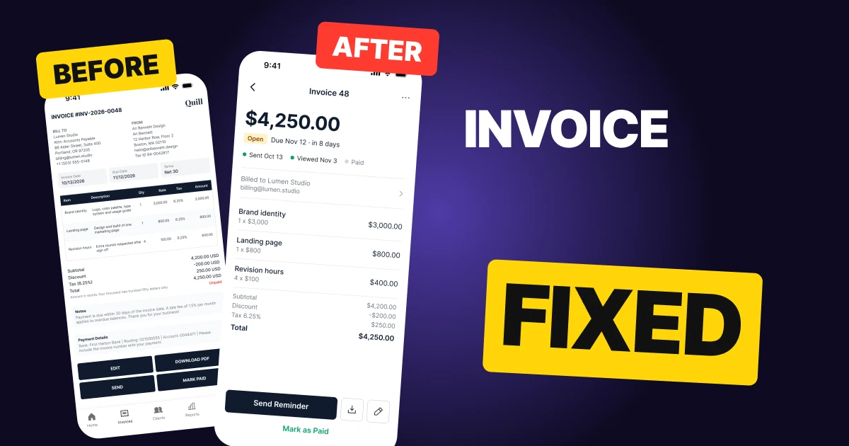
An invoice screen on a phone has one job: tell the person how much is owed and by when. The first draft below has every detail a client could ask for, but it reads like a printed page. The amount owed sits at 10 px with the same weight as the subtotal, the table runs six columns at 8 px, and four caps buttons shout at once.
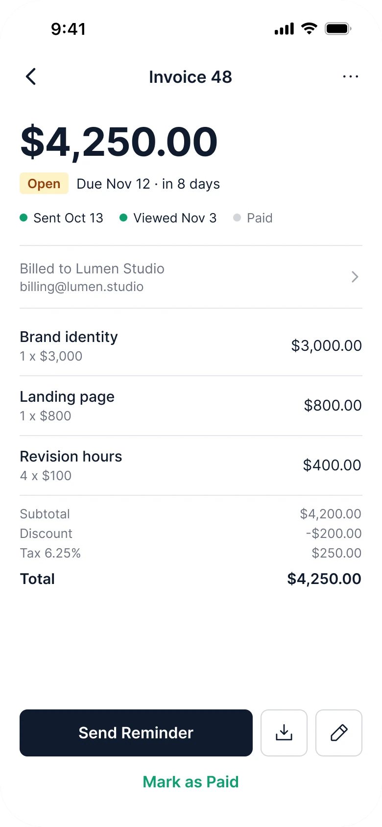
The fix keeps every function and changes the order: the amount due first and biggest, its status and due date right under it, then the work as flat rows, then one solid button.
The whole screen, before and after
Junior draft
Fixed
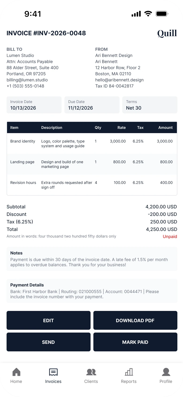
On the left, the person is handed a document. The amount owed is the last line of a totals block, in the same 10 px as Subtotal, with the word Unpaid in red off to the side. Two address blocks, three date boxes, a table, two grey note boxes and four buttons all compete before the tab bar.
On the right, the screen answers the questions a freelancer or a client asks in order: how much, is it paid, when is it due, who is it for, what is it for, and what do I do now.
What changed, measured
| Junior draft | Fixed | |
|---|---|---|
| Amount owed | 10 px, the same as Subtotal, last in the totals | 40 px bold, first on the screen |
| Status | "Unpaid" at 9 px, in red | An Open pill, the due date and "in 8 days", then three steps |
| Table | Six columns at 8 px | Flat rows: a name, a quantity, a price |
| Addresses | Two blocks of seven lines | One row, Billed to Lumen Studio |
| Buttons | Four equal caps buttons | One 48 px Send Reminder, two 48 px outlines |
| Tab bar | Five tabs, mixed filled and outline icons | None, it is a task screen |
| Margins | 14 left and 12 right | 20 on both sides |
| Text sizes | 8 to 13 px | 13 to 17 pt |
Fix 1: lead with the amount due
Before
After
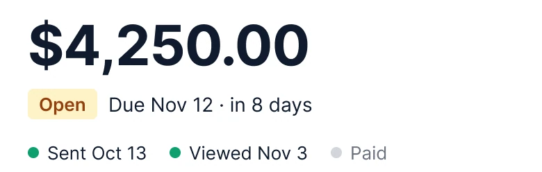
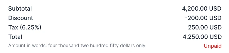
A totals block with Subtotal 4,200.00 USD, Discount -200.00 USD, Tax (6.25%) 250.00 USD and Total 4,250.00 USD in the same small type, and under it Amount in words: four thousand two hundred fifty dollars only with Unpaid in red, against $4,250.00 in very large bold type, an amber Open pill with Due Nov 12 in 8 days, and three steps: Sent Oct 13 and Viewed Nov 3 with green dots, Paid with a grey dot.
In the draft, the number the person came for is the fourth line of a list. It has the same size and weight as Subtotal, and "Unpaid" is a 9 px red word at the far edge. To learn whether the invoice is late, the reader has to find the date in a grey box far above and do the sum in their head.
The fix puts the amount at 40 px, bold, at the top. Under it sits a pill that says Open, the due date, and the time left, "in 8 days". The three steps show where the invoice is: sent on Oct 13, viewed on Nov 3, not yet paid. The due date is not a calculation anymore, and a person who wants the date the invoice was created finds it as the Sent step.
Rule to reuse: the one number the screen exists for gets the biggest type, and its status sits next to it, not in a corner.
Fix 2: fold two addresses into one row
Before
After

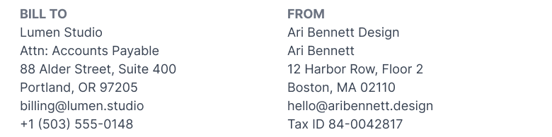
Two columns of seven lines each, BILL TO with Lumen Studio, Attn: Accounts Payable, a street, a city, an email and a phone number, and FROM with Ari Bennett Design, a name, a street, a city, an email and a tax ID, against one row with Billed to Lumen Studio over billing@lumen.studio and a chevron.
Fourteen lines of address are the first thing on the draft. The sender knows their own address, and the client knows theirs. What the person needs to confirm is who the invoice is for.
The fix keeps one row: the client's name and the email the invoice goes to, with a chevron that opens the full block. The sender address, the phone number and the tax ID are not deleted. They open from the menu in the header, and they print in full on the PDF, which is the document an accountant reads.
Rule to reuse: show what the person needs to confirm, and move what they already know one tap away.
Fix 3: flat rows instead of a six column table
Before
After
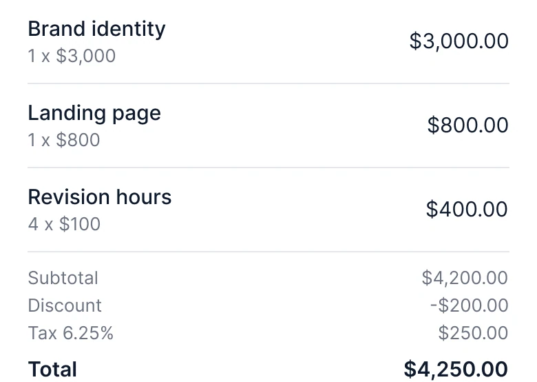
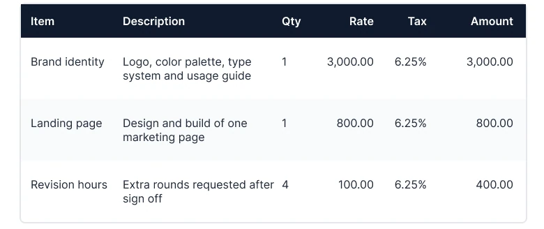
A table with a dark header row and six columns, Item, Description, Qty, Rate, Tax and Amount at 8 px, with rows for Brand identity at 3,000.00, Landing page at 800.00 and Revision hours at 400.00, each repeating 6.25% in a Tax column, against three flat rows with a name over a grey 1 x $3,000, 1 x $800 and 4 x $100 and the price on the right, then a quiet Subtotal $4,200.00, Discount -$200.00 and Tax 6.25% $250.00 block and a bold Total $4,250.00.
A table with six columns is a desktop layout shrunk to fit a phone. The columns force 8 px text, the descriptions wrap to two lines, and the tax rate repeats 6.25% on every row, three times, for a number that is the same everywhere.
The fix gives each line item one row: the name, a grey "quantity x rate" under it, and the price on the right. Descriptions and the per row tax column are gone from the screen, since the tax is one line below. The sums still add up in a column you can read down: $3,000, $800 and $400 make $4,200, less the $200 discount is $4,000, and 6.25% tax on that is $250, so the total is $4,250.00. Subtotal, Discount and Tax are in grey and the Total is in bold, so the eye lands on the last line.
Rule to reuse: on a phone, one row per item with the price on the right beats any table with more than three columns.
Fix 4: one solid button
Before
After
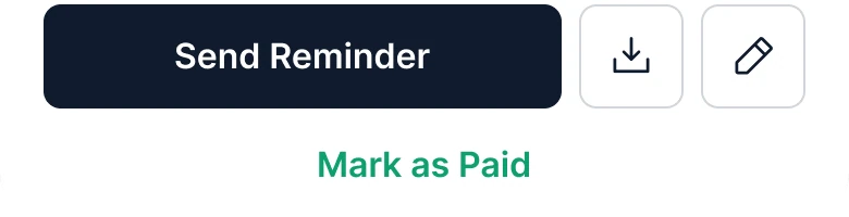
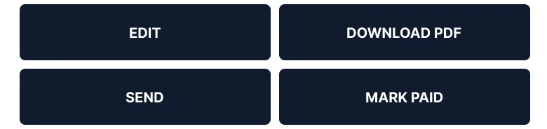
Four dark buttons of the same size in two rows, EDIT and DOWNLOAD PDF over SEND and MARK PAID, against a dark Send Reminder button with two outlined square buttons beside it, a download icon and an edit icon, and Mark as Paid as green text under them.
Four identical caps buttons say that every action is equally important. Send and Mark Paid are opposites, and they sit side by side at the same weight, where one slip changes the status of the invoice.
The fix picks the action that matters now: Send Reminder, solid and 48 px tall. Download and edit are quiet 48 px outlines with an icon, because people use them less. Mark as Paid is a text button under the row, in the one green the screen uses, so it cannot be hit by accident next to Send. Every action from the draft is still reachable.
Rule to reuse: one solid button per screen. Everything else is an outline or text.
The smaller fixes
- Every function stays. Download and Edit are the two outlined squares. Send is Send Reminder. Mark Paid is the text button. The invoice date is the Sent step. Notes, payment details, terms and the sender block open from the header menu and the client row.
- One green. The done steps and Mark as Paid share one green, #0E9F6E. Nothing else is colored except the amber Open pill.
- No tab bar. Home, Clients and Reports are one step back. This is a task screen, so the back arrow replaces the five tabs, and the buttons get the bottom edge.
- No wordmark. The draft's Quill logo took the top right for nothing the person needs. The fixed screen has a title and a back arrow.
- Flat, on white. Hairlines separate the rows. There is no card, no gradient, no shadow, and no grey boxes behind the dates and notes.
- A 20 px margin on both sides. The draft used 14 on the left and 12 on the right.
Audit your own invoice screen
| Question | Why it matters |
|---|---|
| Is the amount due the biggest thing? | It is the reason the person opened the screen |
| Can you see the status and due date next to it? | Late or not is the second question |
| Does each line item fit on one row? | More than three columns turns into 8 px text |
| Are you showing something the person already knows? | Their own address can open from a menu |
| Is there one clear main action? | Four equal buttons make a slip costly |
| Is anything that changes status next to a harmless button? | Send and Mark Paid should not look alike |
| Can the person still reach every old function? | Fewer things on screen is not fewer features |
Get the Figma file
The free file has the junior draft, the fixed screen and every part as a component.
Free Figma file
Invoice screen redesign, before and after
Both screens and every part as a Figma component. Free, view only, duplicate it to your drafts.
FAQ
How should a mobile invoice screen be designed?
Lead with the amount due in the largest type, add a status pill, the due date and the steps, then the client as one row, the line items as flat rows and a bold total. Finish with one solid action button.
What should the top of an invoice show?
The amount due, whether it is open or paid, and the due date. Stripe's hosted invoice page opens the same way, with the amount due and a due date above the line items.
How many columns should an invoice have on mobile?
Two: the item with its quantity under it, and the price. A six column table needs 8 px text on a phone. Keep the tax and the description for the PDF.
Should an invoice screen have a tab bar?
Not on a task screen. A person looking at one invoice needs a back arrow and the action, not five ways to leave.
Where do the bank details and notes go on a mobile invoice?
Behind a row or the header menu, and in full on the PDF. They matter when the client pays, not when the sender checks the amount.
Sources
- Both screens are our own, designed and measured in Figma. The app, Quill, Lumen Studio, Ari Bennett Design, First Harbor Bank and every figure are made up. The sums add up: 3,000 + 800 + 400 = 4,200, less 200 discount is 4,000, 6.25% tax on 4,000 is 250, and the total is 4,250.00. Net 30 from Oct 13 is Nov 12.
- Measured: before, margins 14 left and 12 right, text 8 to 13 px, a six column table at 8 px, totals all 10 px Medium, "Unpaid" at 9 px, four equal caps buttons, five tabs with mixed filled and outline icons. After, white ground, margin 20, the amount at 40 bold, an Open pill with radius 4, text 13 to 17 pt, flat rows with 1 px hairlines, Send Reminder 48 tall with radius 8, download and edit as 48 px outlines, no card, no gradient, no shadow, no tab bar.
- Pattern studied: Stripe invoicing for the amount due and due date on top of the invoice. Icons: Phosphor (MIT).
- First published as a carousel on App Brainy.
Get new papers by email
New Brainy papers in your inbox. Confirm once, unsubscribe anytime.