UI State Colors: Error, Focus and Selected Palettes
Eight UI palettes with exact hex codes, tested on state colors. Why an error red that matches the button reads like a button, why amber needs a banner, and why a soft accent vanishes as a focus ring.
A UI palette is not finished when it has a brand color. It needs state colors: the error, the success, the warning, the focus ring and the picked option. Here are eight palettes tested on exactly those, with every hex code and the fix where one fails.
The state colors every UI needs
Error says something went wrong. Success says it went right. Warning says look before you continue. Focus and selected say where you are.
None of them is body text, but each one has to be seen, and each can fail in a different way.
Error and success colors that read like buttons
A button is the one color on screen that says tap me. If your error red or success green is almost the same color, people read the message as something to press. The fix is distance on the color wheel, not a brighter shade.
For error colors in general, and the exact reds to use in light and dark mode, see our paper on error message color. This one is about how the state color sits next to the rest of the palette.
Paprika
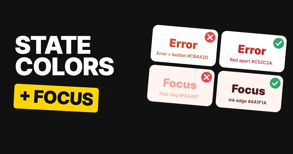
Paprika Kisses #CB4A2D as the button, white label: passes
Persian Red #D03733 as error text on white: passes
Paprika Kisses and Persian Red sit only 7 degrees apart on the color wheel. Both pass on their own, and that is the trap: on screen the error reads like another button.
Warm Blue
Warm Blue #4446CB as the button, white label: passes
Red Carpet #C52C2A as error text on white: passes
Warm Blue keeps red for errors alone. Red Carpet is 112 degrees from the button blue, so an error never looks tappable, and the error text still passes on white.
Bold Irish
Bold Irish #298646 as the button, white label: passes
Lush Paradise #2E8436 as success text on white: passes
Success has the same problem. Bold Irish and Lush Paradise are 5 degrees apart, so the delivered message looks like a button too. Both pass, and neither tells the reader which one is a message.
Warning colors need a banner
Warnings are usually amber, and amber is the lightest color in any palette. On white it fails as text. As a fill it is one of the best signals you have, as long as the words on it are dark.
Purple Emperor
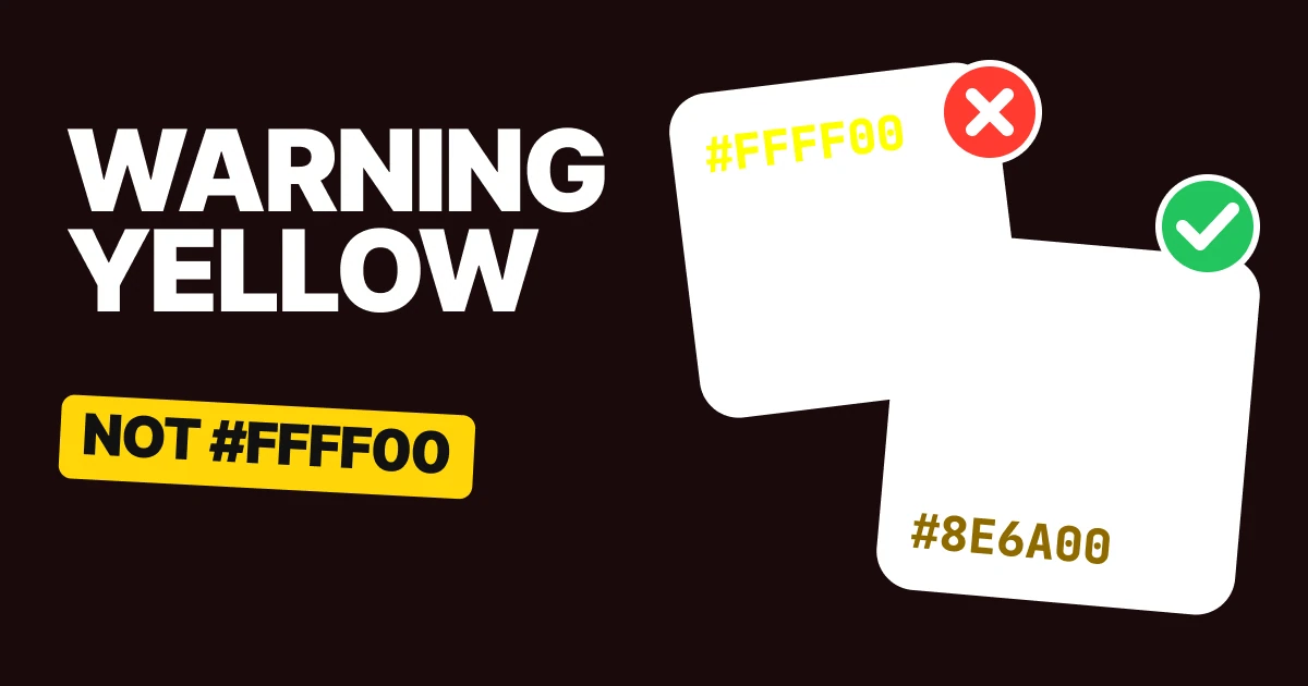
Sultan Gold #F9AD26 as warning text on white: fails
Midnight Monarch #221630 on Sultan Gold #F9AD26: passes
Purple Emperor #773AC1 as the button, white label: passes
Amber is a clear warning color, but as text on white it fails. Put it in a filled banner with dark text on top and the same gold works.
Focus rings and selected states
A focus ring, a picked radio, a selected tab and a chosen date are not text. They still have to be seen against what is around them, and the bar for that is lower than for text but real. Soft pastels are where it goes wrong: they look gentle in a palette and disappear on a pale surface.
The tiles below show each accent as the ring on its own surface, then the ink drawn as an edge, which is the fix.
Emperor Jade
Emperor Jade #0E7C7B ring on Lighthouse #F3F7F6: passes
Oceanic Noir #0F2A2E edge on Lighthouse: passes
Emperor Jade holds up as the ring on Lighthouse. A teal this deep is visible without any help.
No Way Rosé
No Way Rosé #F2A497 ring on Seashell #FFF4F1: fails
Bitter Chocolate #4A1F1A edge on Seashell: passes
No Way Rosé is friendly and nearly invisible on Seashell, so the picked option is hard to find. Keep it as the dot and draw the edge in Bitter Chocolate.
Baklava
Baklava #F0B23C ring on Eigengrau #16181D: passes
Whipped Cream #F2EEE4 edge on Eigengrau: passes
Baklava on Eigengrau is the easy case. A bright accent on a dark surface stands out on its own.
Perrywinkle
Perrywinkle #A193E8 ring on Cloud Break #F2EFFB: fails
Stormy Night #251C4F edge on Cloud Break: passes
Perrywinkle on Cloud Break fades the same way. Keep it as the selected fill and give the segment an edge in Stormy Night.
So the soft colors are not banned. Keep them as the fill, and put an edge in the ink around the thing you want people to find.
All eight palettes in one table
| Palette | Colors | The state it tests |
|---|---|---|
| Paprika | Burnt Coffee #2B1A17, Paprika Kisses #CB4A2D, Persian Red #D03733 | Error red sits close to the button |
| Warm Blue | Midnight Velvet #1B1D3A, Warm Blue #4446CB, Red Carpet #C52C2A | Error red stands apart, passes on white |
| Bold Irish | Midnight Pines #13261C, Bold Irish #298646, Lush Paradise #2E8436 | Success green sits close to the button |
| Purple Emperor | Midnight Monarch #221630, Purple Emperor #773AC1, Sultan Gold #F9AD26 | Amber fails as text, works as a banner |
| Emperor Jade | Lighthouse #F3F7F6, Emperor Jade #0E7C7B, Oceanic Noir #0F2A2E | Focus ring passes on the surface |
| No Way Rosé | Seashell #FFF4F1, No Way Rosé #F2A497, Bitter Chocolate #4A1F1A | Focus ring vanishes, ink edge fixes it |
| Baklava | Eigengrau #16181D, Baklava #F0B23C, Whipped Cream #F2EEE4 | Picked day passes on the dark surface |
| Perrywinkle | Cloud Break #F2EFFB, Perrywinkle #A193E8, Stormy Night #251C4F | Selected tab vanishes, ink edge fixes it |
The numbers, for the person defending the choice
Every pairing was measured with the WCAG 2 contrast formula. This is the only table in the paper with ratios.
| Palette | Test | Ratio | Result |
|---|---|---|---|
| Paprika | White label on button / state on white / hue gap to button | 4.61:1 / 4.91:1 / 7 degrees | Passes, passes, too close |
| Warm Blue | White label on button / state on white / hue gap to button | 7.04:1 / 5.57:1 / 112 degrees | Passes, passes, far apart |
| Bold Irish | White label on button / state on white / hue gap to button | 4.57:1 / 4.70:1 / 5 degrees | Passes, passes, too close |
| Purple Emperor | Gold as text on white / ink on gold / white label on button | 1.90:1 / 9.00:1 / 6.65:1 | Fails, passes, passes |
| Emperor Jade | Accent on surface / ink on surface | 4.64:1 / 13.98:1 | Passes, passes |
| No Way Rosé | Accent on surface / ink on surface | 1.85:1 / 12.96:1 | Fails, passes |
| Baklava | Accent on surface / ink on surface | 9.42:1 / 15.33:1 | Passes, passes |
| Perrywinkle | Accent on surface / ink on surface | 2.36:1 / 13.64:1 | Fails, passes |
How to build your own state colors
- Pick the brand accent first. Check its label, like white on Warm Blue #4446CB, then leave it alone.
- Move the error color away on the wheel. Aim for a clear gap from the accent, and check the error text on your surface.
- Do the same for success. A green next to a green button reads as a button.
- Put the warning in a banner. Fill with amber like Sultan Gold #F9AD26, set the text in your darkest ink.
- Test the ring on the surface it sits on. If the accent is soft, keep it as the fill and draw the edge in the ink. Our papers on accessible color contrast and UI color mistakes go deeper on the thresholds.
Get the files for each set
Each set is a free color set on Forge, with tap-to-copy codes, swatch files for Figma and Adobe (ASE), CSS variables and design tokens.
Free color set
Red means one thing: Paprika, Warm Blue, Bold Irish, Purple Emperor
Every hex, plus ASE swatches, CSS variables and design tokens.
Free color set
Focus rings and selected states: Emperor Jade, No Way Rosé, Baklava, Perrywinkle
Every hex, plus ASE swatches, CSS variables and design tokens.
FAQ
What are UI state colors?
The colors that tell people what is happening: error, success, warning, focus and selected. They sit next to the brand accent and have to look different from it. Warm Blue #4446CB with Red Carpet #C52C2A is a clear example.
Should the error color match the button color?
No. If they are close on the color wheel, an error reads like something to tap. Paprika Kisses #CB4A2D and Persian Red #D03733 are 7 degrees apart and blur together.
What color should a warning be?
Amber, in a filled banner with dark text. Sultan Gold #F9AD26 fails as text on white, and works with Midnight Monarch #221630 on top.
What color should a focus ring be?
One that stands out from the surface around it. Emperor Jade #0E7C7B passes on Lighthouse #F3F7F6. A soft pink like No Way Rosé #F2A497 does not pass on Seashell #FFF4F1, so draw the edge in Bitter Chocolate #4A1F1A.
Can I use a pastel for a selected state?
As the fill, yes. As the only signal, no. Perrywinkle #A193E8 fades on Cloud Break #F2EFFB, so add an edge in Stormy Night #251C4F.
Does a focus ring need to meet a contrast rule?
Yes. Focus indicators and selected states count as interface components, so WCAG asks for a clear step from the surface behind them.
Sources
- Color names and hex codes from the UX Brainy color sets on Forge, vol 13 and 14. Contrast was computed with the WCAG 2 formula against the surface each color sits on.
- Text and shape thresholds follow W3C WCAG 2.2: Contrast (Minimum) and Non-text Contrast, which asks for 3:1 on focus indicators and selected states.
- The hue gap between each accent and its state color is computed in code, in OKLCH, so those degree figures are derived from the palette hexes.
- First published as two carousels on UX Brainy: If your error red looks like your button and A focus ring isn't text, and it still has to be seen.
Get new papers by email
New Brainy papers in your inbox. Confirm once, unsubscribe anytime.