Warning Color in UI: Why #FFFF00 Fails, and the Yellows to Use
Pure yellow is almost invisible on white and glares on dark screens. Use #8E6A00 for warning text, dark text on a #F1C21B fill, a softer yellow on dark, and always add an icon.
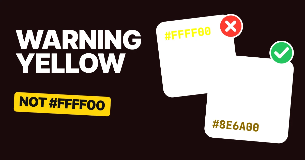
The best warning color is not pure yellow. #FFFF00 is the first yellow every picker offers, and on a white page it is almost invisible. IBM's Carbon design system has yellows that fix it, and this page walks through the four fixes with the exact values.
Why pure yellow breaks
Yellow is the color of caution, so designers reach for the purest one. #FFFF00 is the top of the hue wheel at full brightness, and it is also the brightest color a screen can make, apart from white.
That is the whole problem. White text on #FFFF00 and #FFFF00 text on white are two almost-white colors next to each other. Both pairs fall far under the WCAG minimum for body text.
On a dark screen the failure flips. #FFFF00 on #161616 passes the contrast number easily, but it glares. Large areas of it look like a highlighter held up to the face. A warning should get attention, not hurt.
A warning color needs a different recipe for each place it appears: as text, as a fill, on dark, and as a signal. Those are the four fixes.
Fix 1: for text, go dark
#FFFF00 on white
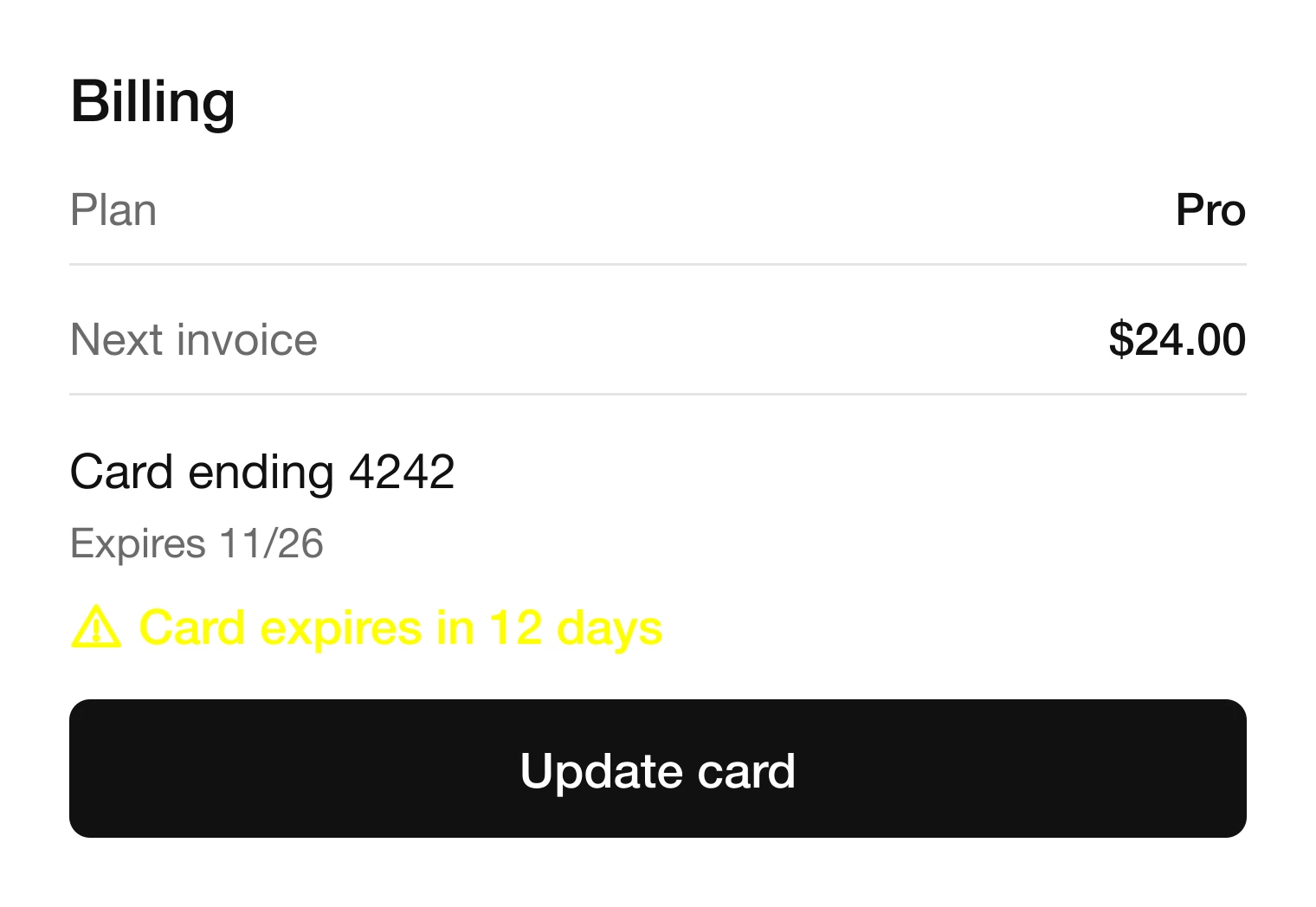
#8E6A00 on white
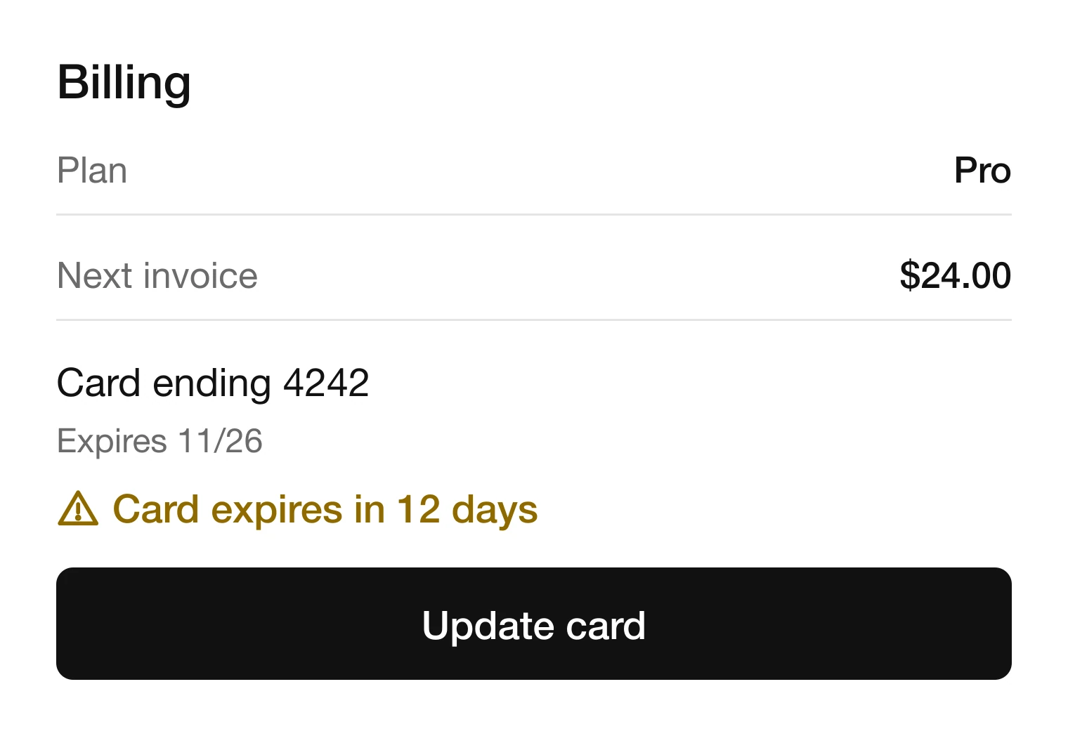
Yellow text on white cannot work, because yellow is a light color by nature. Darken it until it reads, and it turns into a golden brown. #8E6A00 is the "yellow 60" step in the Carbon ramp, and it passes on white.
It still looks yellow in context, especially next to an alert icon, so people still read it as a warning. It just stops being a color you squint at.
The same fix applies anywhere the warning is text on a light ground: an inline message under a field, a status label in a table, the expiry tag on a card, the line in a settings screen.
Fix 2: for a fill, put dark text on it
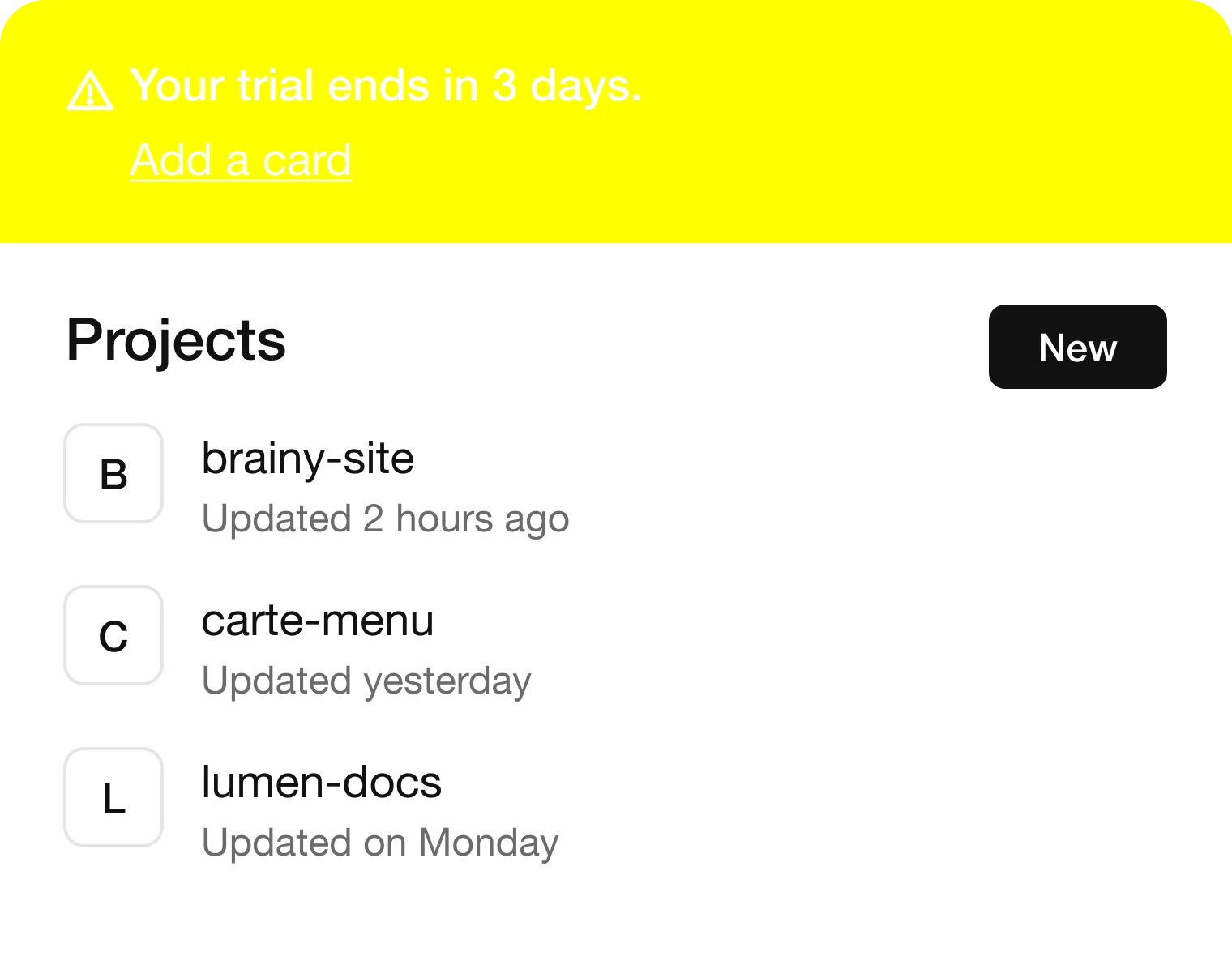
#FFFFFF on #FFFF00
#161616 on #F1C21B
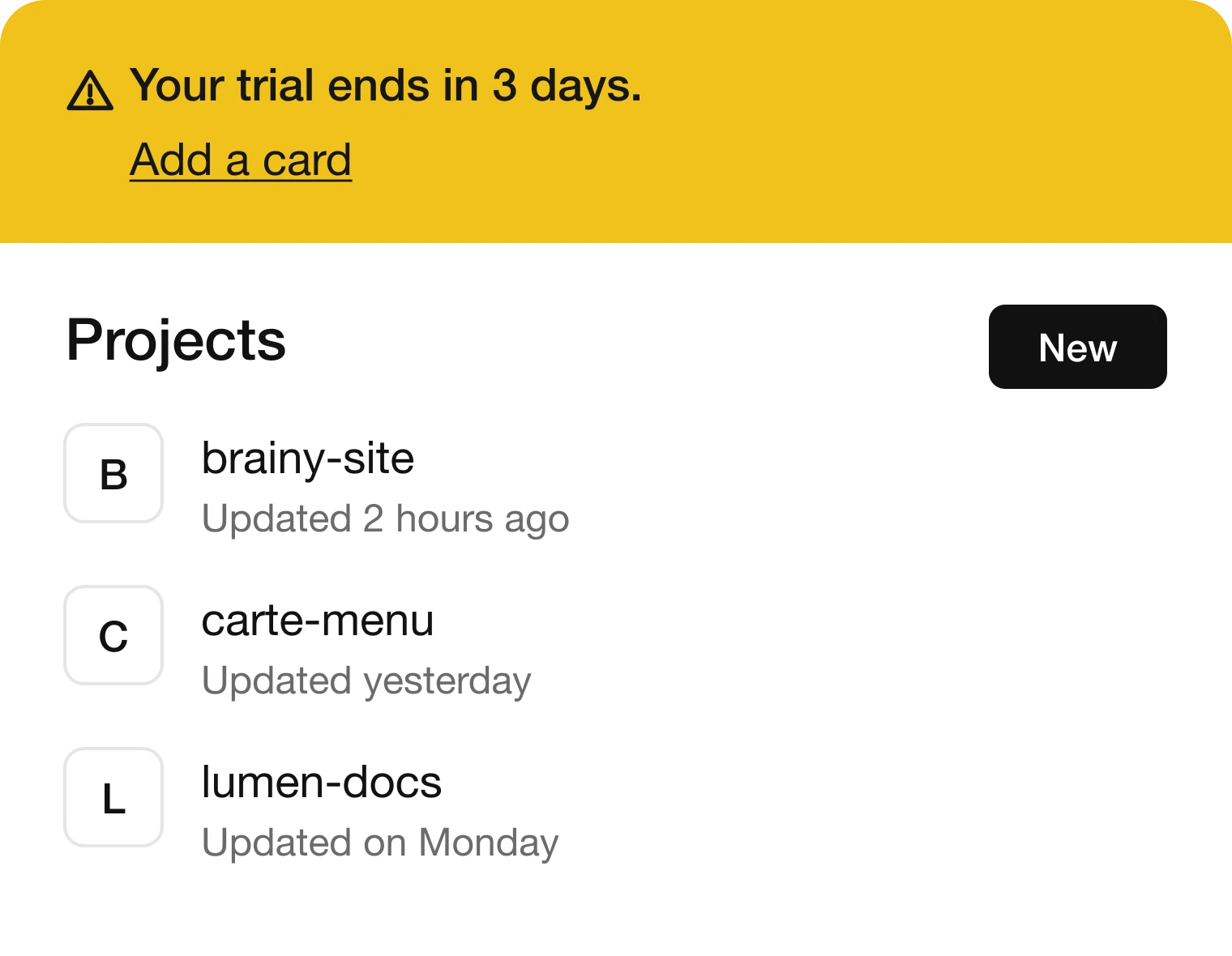
A yellow banner is the most common warning in a product, and white text is the most common way to ruin it. Yellow is a light color, so the text on it has to be dark.
Carbon's "yellow 30" is #F1C21B. It is still unmistakably yellow, but less neon, and #161616 on it reads with room to spare. Use the same pairing for the badge, the toast, the chip and the highlighted row.
Shopify's Polaris lands on the same rule. Its warning fill is #FFB800, and it sets #251A00 on top of it, so two unrelated design systems agree: dark text on yellow.
For a lighter, calmer version of the banner, use "yellow 20", #FDDC69, with #483700 on it, which also passes comfortably. It suits an inline notice that should not shout.
Fix 3: on dark, soften it
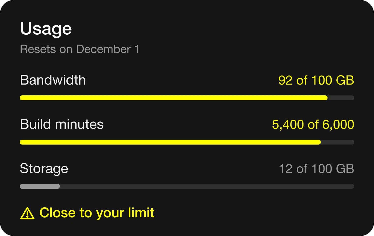
#FFFF00 on #161616
#F1C21B on #161616
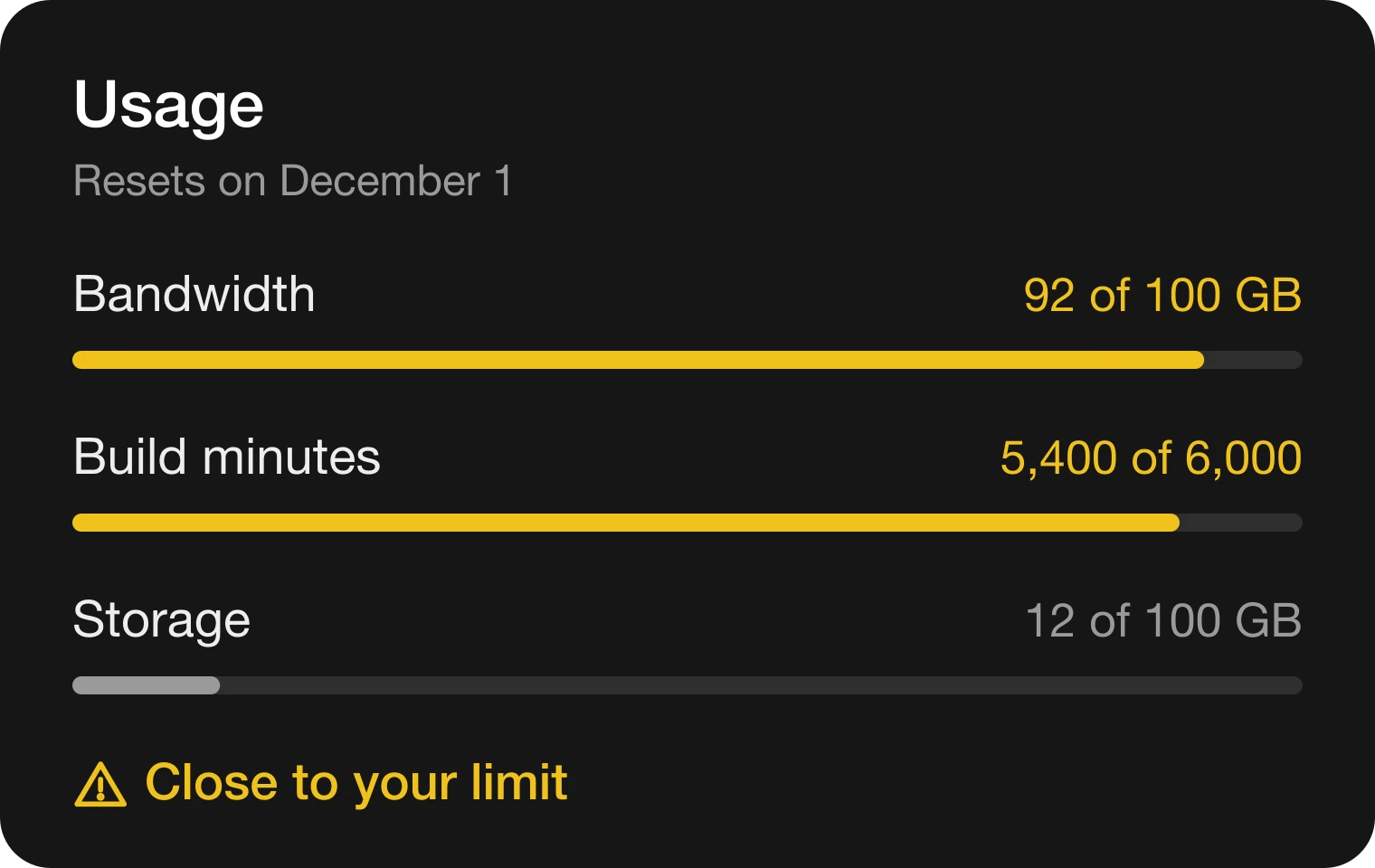
Dark mode is where #FFFF00 fails in the opposite way. The contrast number looks great and the screen still feels wrong, because a bright neon field on a dark ground blooms.
Use the same #F1C21B you use for fills. It is easy on the eyes on #161616, and it means you keep one warning yellow across the whole product instead of two.
If your dark theme uses a tinted fill rather than a solid one, flip the container pair: #483700 as the container and #FDDC69 as the text on it.
The rule matches what we say about dark mode surfaces: a color that is right on white is rarely the right color on dark, so choose the dark value on purpose.
Fix 4: never use color alone
A colored dot, in grayscale
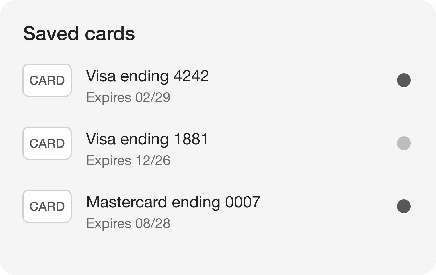
An icon and words, in grayscale
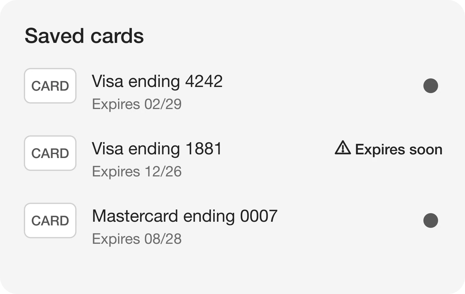
A yellow dot only works for people who can tell yellow from green at a glance. In grayscale, #F1C21B turns into a pale #BDBDBD and the success green #198038 turns into a mid #595959, so the warning dot is the quiet one in the list.
WCAG 2.2 success criterion 1.4.1, Use of Color, says color must not be the only way to show information. The fix is cheap. Add an alert icon, and say it in words: "Expires soon", "Close to your limit", "Needs attention".
That also helps people with color blindness, people on a bright screen outdoors, and anyone looking at a printed or screenshotted version of your product.
All 8 warning colors, light and dark
Every value below comes from the Carbon yellow ramp and one near-black gray. Each field shows the real text color on its ground.
Light: warning
Light: on warning
Light: container
Light: on container
Dark: warning
Dark: on warning
Dark: container
Dark: on container
| Role | Light theme | Dark theme | Use it for |
|---|---|---|---|
| Warning | #F1C21B | #F1C21B | Banner, badge and meter fills |
| On warning | #161616 | #161616 | Text and icons on the fill |
| Container | #FDDC69 | #483700 | Calm inline notices |
| On container | #483700 | #FDDC69 | Text on the container |
| Warning text | #8E6A00 | #F1C21B | Warning text with no fill |
The warning text row is the one most sheets forget. On white it is #8E6A00, and on dark it is the same #F1C21B as the fill.
Hand this to your developer
:root {
  --warning: #F1C21B;
  --on-warning: #161616;
  --warning-container: #FDDC69;
  --on-warning-container: #483700;
  --warning-text: #8E6A00;
}

@media (prefers-color-scheme: dark) {
  :root {
    --warning-container: #483700;
    --on-warning-container: #FDDC69;
    --warning-text: #F1C21B;
  }
}
Name them as roles, not as yellows. When the theme changes, the token changes, and no component has to remember which yellow goes where.
The numbers behind "easy to read"
| Text on ground | Contrast |
|---|---|
| #FFFF00 on #FFFFFF | 1.07 to 1, fails |
| #FFFFFF on #FFFF00 | 1.07 to 1, fails |
| #8E6A00 on #FFFFFF | 4.99 to 1, passes |
| #161616 on #F1C21B | 10.75 to 1, passes |
| #483700 on #FDDC69 | 8.57 to 1, passes |
| #FFFF00 on #161616 | 16.85 to 1, passes, but it glares |
| #F1C21B on #161616 | 10.75 to 1, passes |
WCAG 2.x success criterion 1.4.3 sets a higher bar for body text than for large text, and the table has every pair. The #FFFF00 on #161616 row is the one where a checker says yes and the choice is still wrong, because contrast does not measure glare.
FAQ
What color should a warning message be in UI design?
A yellow or amber, but not pure #FFFF00. Use #F1C21B as the fill with #161616 text on it, and #8E6A00 when the warning is text on white.
What is the best yellow for a warning banner?
#F1C21B with #161616 text. It is IBM Carbon's yellow 30, and it passes with room to spare.
Can I use yellow text on a white background?
Not pure yellow, which fails on white. Darken it to #8E6A00, which passes.
Should text on a yellow background be white or black?
Dark. White on #FFFF00 fails, while #161616 on #F1C21B passes easily.
What warning color works in dark mode?
#F1C21B on #161616. It reads clearly and avoids the glare of neon #FFFF00.
Why do warnings need an icon?
Color alone fails for people who cannot tell the colors apart, and in grayscale a yellow dot disappears. WCAG 1.4.1 asks for a second cue, such as an icon and words.
Sources
- IBM, Carbon Design System color: yellow 20 #FDDC69, yellow 30 #F1C21B, yellow 60 #8E6A00, yellow 80 #483700, gray 100 #161616.
- WCAG 2, 1.4.3 Contrast (Minimum): 4.5 to 1 for body text.
- WCAG 2.2, 1.4.1 Use of Color: color must not be the only visual means of conveying information.
- Shopify, @shopify/polaris-tokens 9.4.2: the warning fill #FFB800 carries #251A00.
- Ratios computed with the WCAG relative luminance formula. In grayscale by luminance, #F1C21B lands on #BDBDBD and #198038 on #595959.
- The billing card, trial banner, projects, usage numbers and saved cards are invented for this page.
- First published as a carousel on UX Brainy.
Get new papers by email
New Brainy papers in your inbox. Confirm once, unsubscribe anytime.