Package Tracking Screen Design: A Delivery Tracking App, Before and After
A tracking screen with a 120 px map, the arrival status in one 9 px line and seven rows of history, and the same screen fixed: a big map, one sheet with the arrival time, a progress bar and the courier. Every change side by side, with the free Figma file.
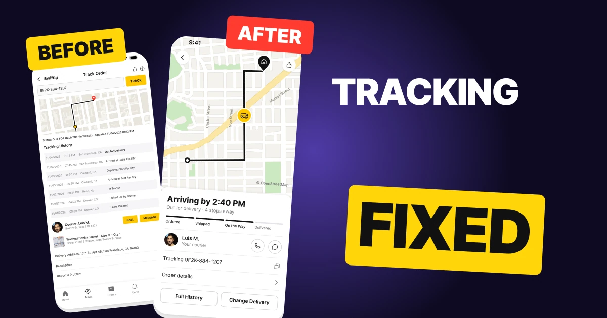
A package tracking screen has one question to answer: when does it arrive? The first draft below has all the data a person could want, but it opens on a form they already filled in, squeezes the map into a 120 px strip and hides the delivery status in a single 9 px line. The time of arrival is not on the screen at all.
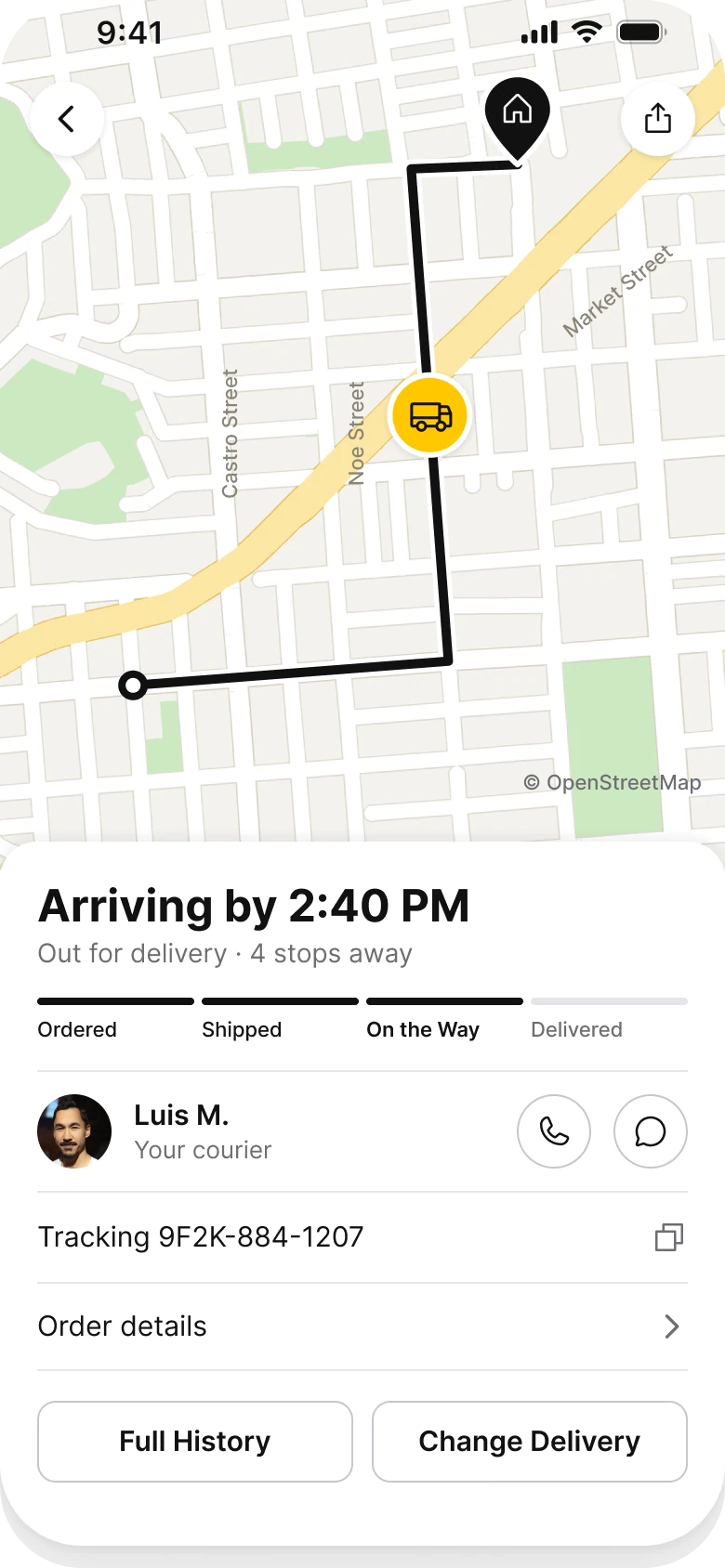
The fix keeps every function and changes what comes first: a big map with the route, then one sheet with the arrival time in one line, a four step progress bar, the courier and two quiet buttons.
The whole screen, before and after
Junior draft
Fixed
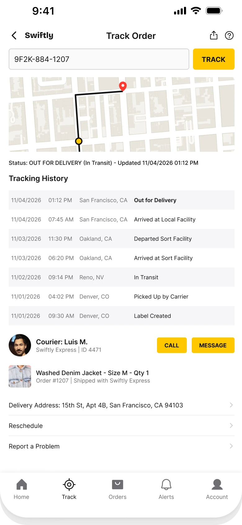
On the left, the person opens the screen and is asked for a tracking number they have already entered. The map is a strip below the form, the status is a single line of small type, and the history runs seven rows before the courier appears.
On the right, the screen starts where the person's question is. The map shows where the package is and where it is going, the sheet says when, and the rest is one tap away.
What changed, measured
| Junior draft | Fixed | |
|---|---|---|
| Map | 364 x 120 px strip, tight zoom | 390 x 480 px, 55% of the screen, zoomed out to twice the width |
| Arrival | Not shown | "Arriving by 2:40 PM" at 24 bold |
| Status | One 9 px line in caps | A 14 pt line and a four step progress bar |
| History | Seven rows at 9 px | Behind a Full History button |
| Courier | 9 px text, two caps buttons | A 40 px photo, a name, two 40 px round buttons |
| Buttons | Three yellow filled caps buttons | Two quiet outlines, two round outlines |
| Tab bar | Five tabs, mixed filled and outline icons | None, it is a task screen |
| Text sizes | 9 to 14 px | 11 to 24 pt |
Fix 1: give the map the top half
Before
After
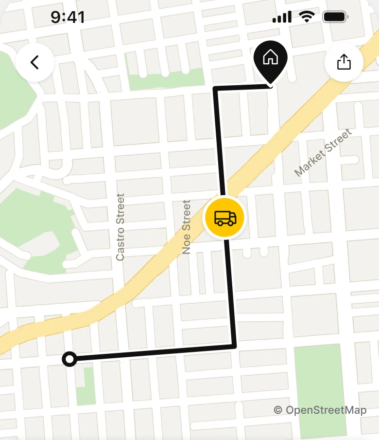
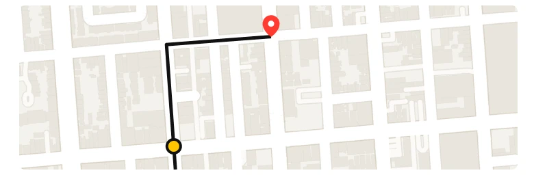
A 364 x 120 px map strip with a short black route, a yellow dot and a red pin, under a tracking number field, against a full width map with no radius that runs from the status bar to the sheet, a 5 px black route with a white edge, a yellow van, a black home pin, two white round buttons for back and share, and street names Castro, Noe and Market.
In the draft, the map is a strip. At a tight zoom it shows one block, so the route is two straight lines and the person cannot tell whether the van is close or across the city. It also sits under a form for a number that is already on the screen.
The fix lets the map run behind the status bar and takes 55% of the screen. It is zoomed out to twice the width of the old one, about 0.8 mi across, so the route has room: it starts far from the home pin and crosses the top half.
A 5 px black line with a white edge stays readable over streets, parks and the yellow main road. The van is the only yellow thing on the screen, so the eye finds it first. Back and share become plain white circles that sit on the map and do not need a header.
Rule to reuse: the map is the answer to "where is it", so give it the room to answer. Zoom out until the start, the van and the destination all fit with space between them.
Fix 2: say when, in one line
Before

After
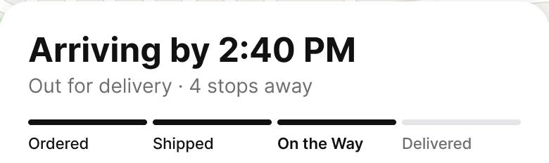
One 9 px line, Status: OUT FOR DELIVERY (In Transit) - Updated 11/04/2026 01:12 PM, against Arriving by 2:40 PM in 24 bold, Out for delivery, 4 stops away in grey, and a four step progress bar with Ordered, Shipped and On the Way filled and Delivered grey.
The draft's status line says what the carrier's system says, in the carrier's words, with the time of the last scan. The person has to work out two things from it: what "In Transit" means and when the box will be at the door. The word the screen leaves out is the one they came for.
The fix opens the sheet with the answer: Arriving by 2:40 PM, at 24 bold. Under it, one grey line says what is happening in plain words, Out for delivery, 4 stops away. The progress bar has four segments, three filled.
The bar shows where the package is in the whole trip, and the labels are short enough to read at a glance. "Out for Delivery" became On the Way, the step the person would name themselves.
Rule to reuse: lead with the outcome the person is waiting for, and show the carrier's status as a step, not a sentence.
Fix 3: show the courier as a person
Before

After

A 36 px photo, Courier: Luis M. and Swiftly Express | ID 4471 in small grey type, and two yellow caps buttons, CALL and MESSAGE, against a 40 px photo, Luis M. at 15 semibold, Your courier in grey, and two 40 px round outline buttons with a phone icon and a chat icon.
The draft has the courier's name at 13 px with a company and an ID number under it at 9 px. The CALL and MESSAGE buttons are filled yellow, the loudest thing on the screen, for actions most people use once or never.
The fix makes the courier a face and a name, with the label "Your courier" under it. The two actions are round hairline circles with a phone and a chat icon, 40 px each, which is large enough to tap and quiet enough not to compete with the arrival time. The carrier name and ID number leave the screen.
Rule to reuse: a person is easier to trust than a number. Show a face and a name, and give the actions an icon instead of a loud button.
Fix 4: fold the history into a button
Before
After
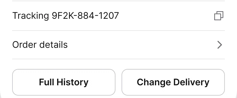
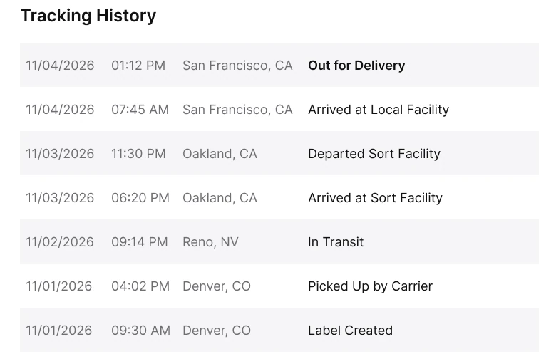
A Tracking History title and seven striped rows of date, time, city and event at 9 px, from Out for Delivery on 11/04/2026 down to Label Created on 11/01/2026, against a Tracking row with a copy icon, an Order details row with a chevron, and two outlined 44 px buttons, Full History and Change Delivery.
Seven rows of date, time, city and event take a third of the draft. The two newest rows say what the status line already said. The older five describe days the person was not waiting for. Everything is at 9 px, in four columns, so the eye has to track across to connect a time with an event.
The fix turns it into two text rows and two quiet buttons.
The tracking number is the first row with a copy icon, because that is what a person needs when they call support. Full History opens the whole list, and Change Delivery opens the address and the reschedule options. Order details holds the jacket and the order number. Nothing was deleted: the seven rows, the address, Reschedule and Report a Problem are all one tap away.
Rule to reuse: show the latest state and keep the log behind a button. A person checking a package wants the last event, not the archive.
The smaller fixes
- Every function stays. The tracking number is a row with a copy icon, and the back button returns to the orders list where a new number goes in. Share stays on the map. Call and Message stay on the courier row. Help and Report a Problem open from Full History.
- No form on top. The tracking field and its TRACK button asked for a number the app already had. They are gone from this screen.
- No tab bar. This is a task screen, so a back arrow replaces five tabs, and the sheet gets the bottom edge. The draft's tabs mixed filled and outline icons.
- No product photo. The draft showed a jacket photo with a size and a quantity. The fix keeps the name in Order details and leaves the photo out, because the person is not deciding what they bought.
- One yellow. In the draft, TRACK, CALL and MESSAGE were all yellow. In the fix, yellow belongs to the van.
- Margins. The draft used 14 left and 12 right. The sheet uses 20 on both sides.
- A sheet pinned to the edges. It has a 20 radius on the top corners and one soft shadow, so it reads as attached to the screen and not floating over the map.
Audit your own tracking screen
| Question | Why it matters |
|---|---|
| Does the screen say when it arrives, in words? | It is the question the person opened it with |
| Is the map at least half the screen? | A strip cannot show distance |
| Can you see the start, the vehicle and the destination at once? | A tight zoom hides how close it is |
| Is the carrier's status turned into a step? | "In Transit" is a system word |
| Are the courier actions quieter than the arrival time? | They are used once, the time is read often |
| Is the full history behind a button? | The latest event is what most people need |
| Can the person still reach every old function? | Fewer things on screen is not fewer features |
Get the Figma file
The free file has the junior draft, the fixed screen and every part as a component.
Free Figma file
Package tracking screen redesign, before and after
Both screens and every part as a Figma component. Free, view only, duplicate it to your drafts.
FAQ
How should a package tracking screen be designed?
Put a large map on top with the route, the vehicle and the destination. Pin one sheet to the bottom with the arrival time, a short status, a progress bar, the courier and two quiet buttons. Keep the history and order details one tap away.
What should a delivery tracking screen show first?
The time the package will arrive, and where it is now. The tracking number and the carrier's scan history matter less than those two answers.
How big should the map be on a tracking screen?
Large enough to show the start, the vehicle and the destination with space between them. In this redesign it is 390 x 480 px, 55% of an 844 px screen, zoomed out to about 0.8 mi across.
How many steps should a delivery progress bar have?
Four is enough for most parcels: Ordered, Shipped, On the Way and Delivered. Each label should be a word the customer would use, not a carrier status code.
Should a tracking screen have a tab bar?
Not on a task screen. A person following one delivery needs a back arrow and the courier, not five ways to leave.
Sources
- Both screens are our own, designed and measured in Figma. The app, Swiftly, the courier, the order and the times are made up.
- Measured: before, margins 14 left and 12 right, text 9 to 14 px, a 364 x 120 map, a 9 px status line, seven 9 px history rows, caps TRACK, CALL and MESSAGE buttons, a product photo row, five tabs with mixed filled and outline icons. After, a white ground, no tab bar, a 390 x 480 map with no radius, a 5 px ink route with white casing, a sheet with a 20 radius on the top corners and one soft shadow, Arriving by 2:40 PM at 24 bold, a 14 pt grey line, four 4 px segments, a 40 px avatar, two 40 px hairline circles and two hairline buttons 44 tall at radius 10.
- Map: OpenStreetMap contributors, San Francisco. Courier photo: Peter Platou on Pexels. Icons: Phosphor (MIT).
- First published as a carousel on App Brainy.
Get new papers by email
New Brainy papers in your inbox. Confirm once, unsubscribe anytime.