Social Feed Design: Stop Shrinking the Photo (Before and After)
A social app home feed that wraps every story in the same ring, sets the photo in a bordered card and gives six actions the same weight, and the same feed fixed: a plain header, rings that mean something, a full-width photo and one row of actions. Every change side by side, with the free Figma file.
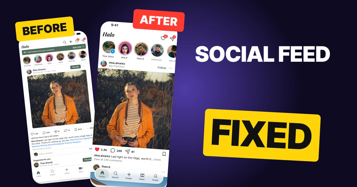
A social feed has one job: put the photo in front of the person scrolling. The first draft below has every function a feed needs, and it still fails that job. A sync banner sits above the stories, a bordered card shrinks the photo, and six actions at the same small size share one row under it.
The fix keeps every function and changes the weight. The header is a wordmark and two icons, the story rings tell new from seen, the photo runs the full width of the screen with nothing on it, and the actions drop to one plain row with save alone on the right.
The whole feed, before and after
Junior draft
Fixed
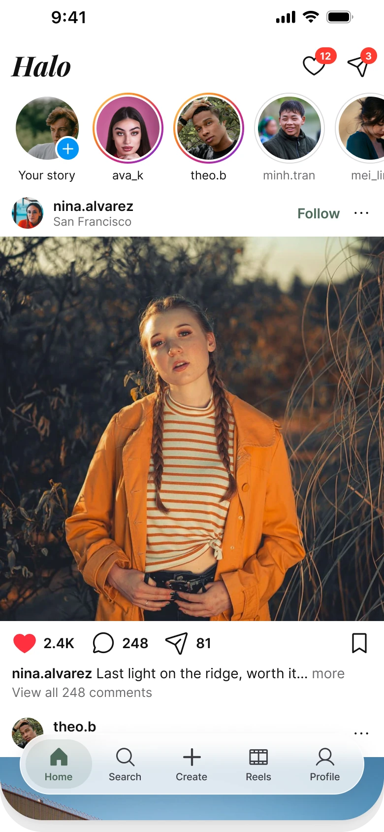
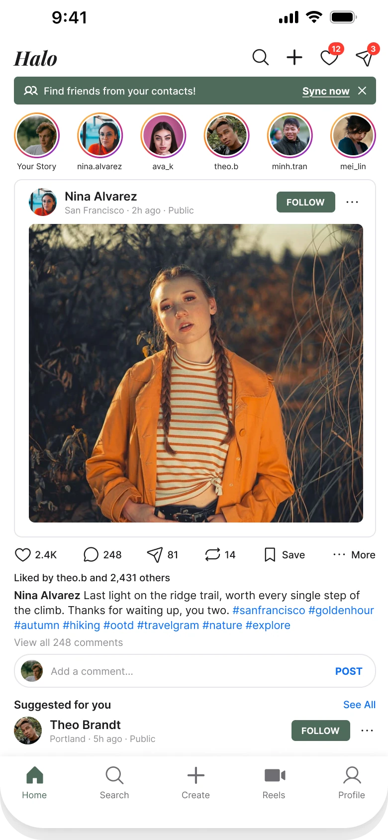
On the left, the screen gives the eye no order. A banner, six identical rings, a boxed card, a photo with a margin on every side, six actions, a hashtag block and a reply field all sit at the same small weight, and the photo, the reason anyone opened the app, is a 336 by 300 rectangle inside a frame.
On the right, the screen reads in the order a person scrolls: who is new, who posted, what did they post, what can I do about it, and then the next post already peeking in under the tab bar.
Count what the eye processes
The draft has a wordmark, four header icons, a banner with two links, six rings, a card, a follow chip, a photo, six actions, a liked-by line, a caption with hashtags, a comments link, a reply field, a suggestion row and five tabs. The fixed feed has a wordmark, two icons, five rings, a name row, a photo, three actions and a save, a caption line and five tabs.
What changed, measured
| Junior draft | Fixed | |
|---|---|---|
| Side margins | 14 left, 12 right | 12 on both sides |
| Text | 8 to 12 px | 12 to 14 px, plus a 28 px wordmark |
| Header icons | Search, plus, heart, paper plane, 20 px | Heart and paper plane with badges, 26 px |
| Story rings | Six rainbow rings, 46 px around 40 px avatars | 72 px rings around 64 px avatars, 2 px gradient for new, 1 px #DBDBDB for seen |
| Photo | 336 x 300, radius 6, inside a bordered card | 390 x 390, no radius, nothing on it |
| Post header | 28 px avatar, name, place, time, Public, FOLLOW chip | 32 px avatar, 14 px name, 12 px place, plain Follow text |
| Actions | Six at 18 px with 10 px labels | Three at 26 px with 14 px counts, save alone on the right |
| Tab bar | Five tabs, mixed filled and outline icons | Five tabs, one icon style, a floating 62 px bar |
Fix 1: say Halo, nothing else
Before

After

The draft puts a 27 px Halo, then search, plus, heart and paper plane icons in a row, with a green sync banner right under them reading Find friends from your contacts with Sync now and a close button. Against a large Halo wordmark in ink with only a heart and a paper plane, each with its badge, and no banner.
Search and create already live in the tab bar. In the draft they are there twice, so the header spends width on buttons a person can already reach with a thumb. The fix removes the duplicates and gives the freed space to the wordmark, which is the only brand moment on the screen.
The banner was the other cost. A sync nag above the stories pushes everything down 28 px and asks for something before the person has seen a single photo. It moved to the Search tab, where people look for friends, so the function is still reachable.
Rule to reuse: if a tab already does it, take it out of the header.
Fix 2: make the rings mean something
Before

After
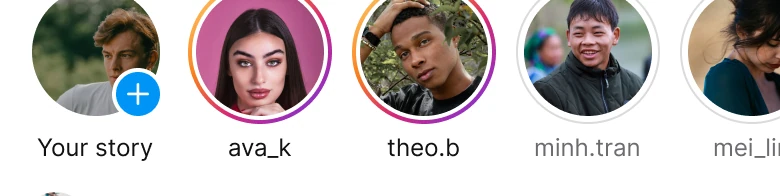
The draft shows six stories, each in the same orange to purple ring, all with names at 10 px, in a row that ends exactly at the margin. Against 72 px rings where new stories have a gradient ring and seen ones a thin grey one, with a plus badge on your own story and a row that runs off the right edge.
A ring is a signal, not a decoration. When all six rings look the same, the ring says nothing, and a person has to tap each avatar to learn what is new. When new stories carry a color ring and seen ones a hairline grey, the row answers the question at a glance.
The row also runs off the edge. A cropped avatar tells the thumb there is more to the right, which a row that ends neatly inside the margins does not. The avatars grow from 40 to 64 px, so faces are recognisable and names can be set at 12 px instead of 10.
Rule to reuse: use color only for what is new, and let a row bleed off the screen when it scrolls.
Fix 3: the photo gets the width
Before
After
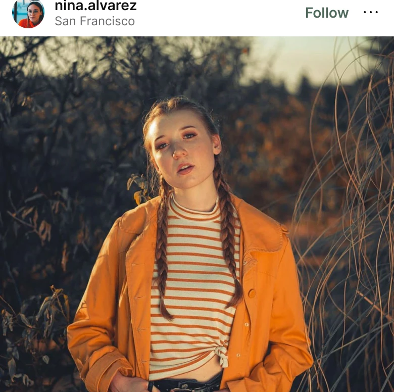
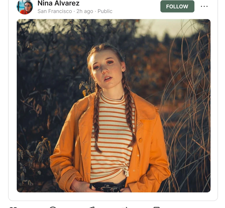
The draft wraps each feed item in a bordered card, with the 28 px avatar, name, a line reading San Francisco, 2h ago, Public, a FOLLOW chip and three dots above a 336 by 300 photo with rounded corners. Against a 32 px avatar with nina.alvarez over San Francisco, a plain green Follow and three dots, above a 390 by 390 photo that touches both edges.
This is the fix the whole screen turns on. In the draft the photo is the second thing inside a card, with 15 px of padding around it, a border outside that, and 14 px of margin outside the border. It is 336 pixels wide on a 390 pixel screen. The fix gives it all 390.
The name row gets lighter in the same move. The FOLLOW chip becomes a word in the brand color, "Public" and the time go behind the three dots, and the place stays because it is part of the story of the photo. The photo is square rather than 4:5 on purpose: at 4:5 it would be 488 tall, the caption would end under the tab bar and the next post could not start on the same screen.
Rule to reuse: remove every frame around the one thing the screen is for.
Fix 4: six actions become one row
Before
After
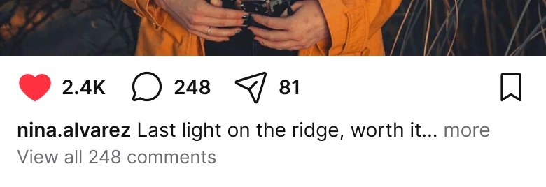
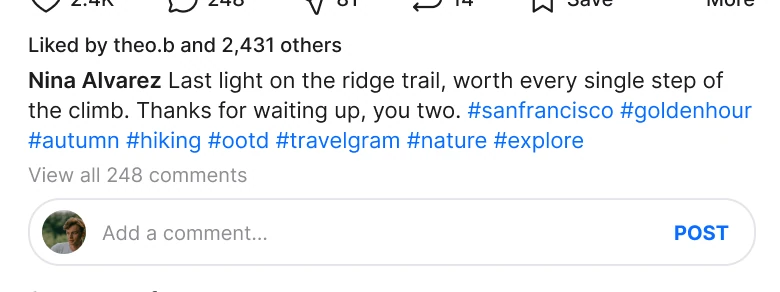
The draft has heart 2.4K, comments 248, share 81, repost 14, Save and More in one row at 18 px with 10 px labels, then a Liked by line, a caption with six hashtags, a comments link and an Add a comment... field. Against a red heart, comments and a share at 26 px with 14 px counts, a bookmark alone on the right, a one line caption ending in more and a comments link.
Six actions at one size is a menu, not a row of choices. Two of them, repost and More, are used far less than a heart, and the Save label spells out what the bookmark icon already says. In the fix, three actions stay in the row and the rest move one tap away: reposts open from the paper plane, more lives behind the three dots, and Save keeps its place alone on the right, where a thumb finds it without hitting like by mistake.
The text under the row shrinks to what a person reads while scrolling: a one line caption with a more link and the count of comments. The six hashtags go behind more, Liked by sits behind the heart count, and the reply field opens from the count of comments.
Rule to reuse: keep the three actions people use all the time in the row and let the rest open from them.
The smaller fixes
- Every function stays. Search and create are tabs, more is the three dots, 14 reposts sit behind the paper plane, Liked by is behind the heart count, hashtags are behind more, and finding friends moved to the Search tab.
- Margins match. The draft has 14 px on the left and 12 on the right. The fix uses 12 on both sides and lets the photo ignore them.
- One icon style. The draft's tab bar mixes filled and outline icons. The fix uses one set, Phosphor, in one weight.
- The next post shows. The caption ends above the tab bar and the next post's header and photo continue under it, so the floating bar reads as a real scroll and not a footer.
- A readable wordmark. Halo is set in Playfair Display Bold Italic at 28 px. Two script faces were tried first and went thin at that size.
- Type that reads. The draft runs from 8 to 12 px. The fix sits between 12 and 14 px with the wordmark above.
Audit your own feed
| Question | Why it matters |
|---|---|
| Does the photo touch both edges of the screen? | The photo is why people open a feed |
| Does a ring mean something? | Six identical rings carry no information |
| Is anything in the header also a tab? | A duplicate costs width and a decision |
| Are there more than three actions in the row? | Equal actions are a menu |
| Is there a banner above the first story? | A request before the first photo costs attention |
| Can you see the start of the next post? | It tells the thumb the feed keeps going |
Get the Figma file
The free file has the junior draft, the fixed screen and every part as a component.
Free Figma file
Social feed redesign, before and after
Both screens and every part as a Figma component. Free, view only, duplicate it to your drafts.
FAQ
How wide should the photo be in a social feed?
The full width of the screen. A 390 px phone gets a 390 by 390 photo with no radius, no border and nothing drawn on it. Square keeps the caption and the start of the next post on the same screen, which a 4:5 photo does not.
What should a story ring show?
Whether the story is new. A 2 px color ring for unseen stories and a 1 px light grey ring, such as #DBDBDB, for seen ones. When every ring looks the same it tells the viewer nothing.
How many actions should sit under a post?
Three in the row: like, comments and share, with save alone on the far right. Repost, more and the caption options can open from those, which keeps every function reachable without six equal icons.
What belongs in a social feed header?
The wordmark and the two things tabs do not cover, notifications and messages. Search and create belong in the tab bar, so they should not appear twice.
Where does a sync or find friends banner go?
Not above the first story. Move it to the Search tab, where people already look for friends, so the feed opens with a photo and not a request.
Sources
- Both screens are our own, designed and measured in Figma. The app, Halo, the people and the numbers are made up.
- Pattern studied: the home feed of Instagram, which is where the plain header, the ring states and the full-width photo come from.
- Icons are from Phosphor (MIT). The wordmark is Playfair Display Bold Italic. Photos are on Pexels: Alexandro David, Jin Wr, Carlos Gutierrez, Dario Moscato, Giovanna Kamimura, Dan Zoso, Ron Jacob Leonador and Son Hoa Nguyen.
- First published as a carousel on App Brainy.
Get new papers by email
New Brainy papers in your inbox. Confirm once, unsubscribe anytime.