Optical Centering in Logo Design: Why Centered by the Math Looks Off
A shape centered by the math looks too far left. How YouTube, YouTube Music, Google and Volvo nudge shapes and letters by eye, with the real measurements and a rule you can use on your own logo.
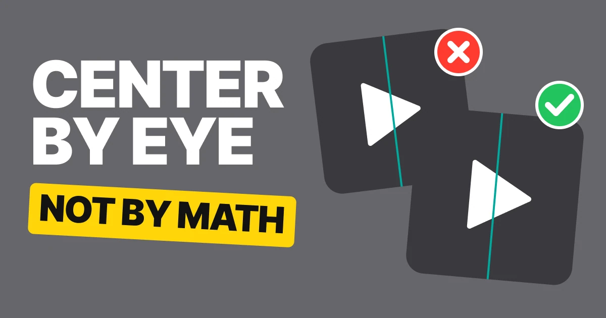
Your logo is perfectly centered and still looks wrong. That is not a bug in your design tool. Your eyes do not measure the space around a shape, they weigh it, and a shape with a wide end and a narrow end weighs more on one side.
What optical centering means
Mathematical centering puts the middle of a shape's bounding box on the middle of its container. Optical centering puts the middle of its visual weight there instead. For a square or a circle the two are the same point. For a triangle, a letter with a tail or a shape with a heavy side, they are not.
A triangle pointing right is the clearest case. Its wide end is a full-height edge on the left, and its point is a single dot on the right. Most of the ink is on the left, so a triangle centered by its box looks like it is falling off to the left.
The play button, drawn on the real file
The same demo twice. A box and a triangle in YouTube's proportions, the dashed line marks the middle of the box.
Centered by the math
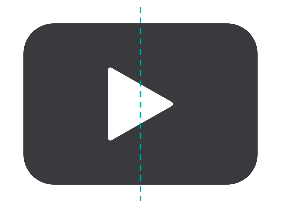
Moved 10% right
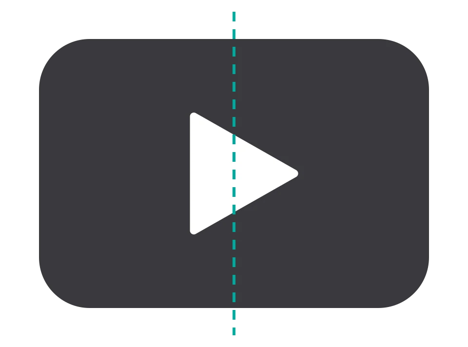
This is not our demo's opinion. Here is what the real thing does.
YouTube: 469 on the left, 409 on the right
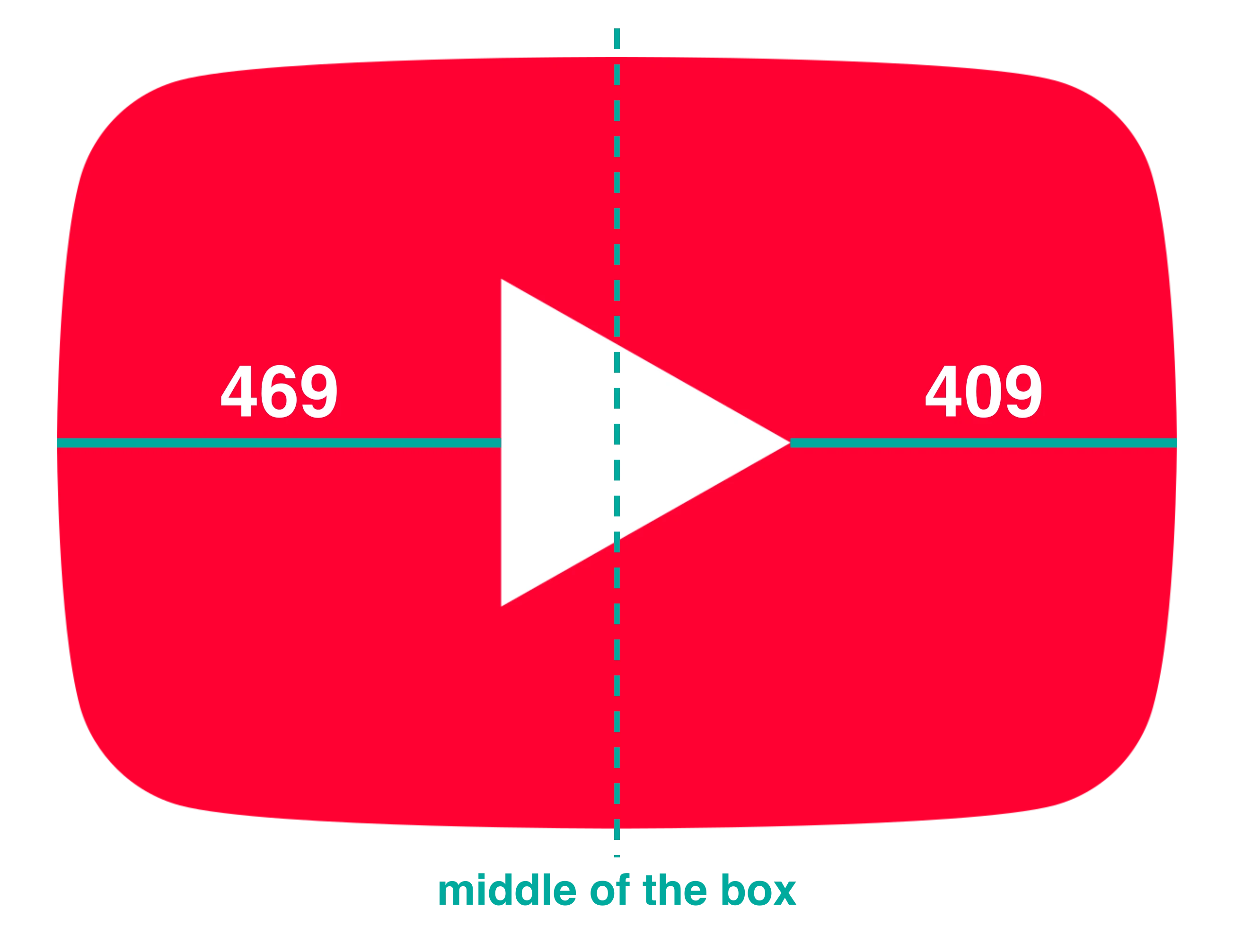
In the 2024 icon file the red box is 1183.9 units wide, so its middle is at 592. The play triangle runs from 469.5 to 775.25, which puts its own middle at 622.4. That is 30.4 units right of the middle of the box, 9.9% of the triangle's width.
The area center of the triangle, where it would balance on a pin, is still at 571.5, left of the box's middle even after the move. That is the whole point: the wide end is the heavy end, and moving the box-center by 10% only brings the visual weight close to the middle.
YouTube Music does the same: 10%
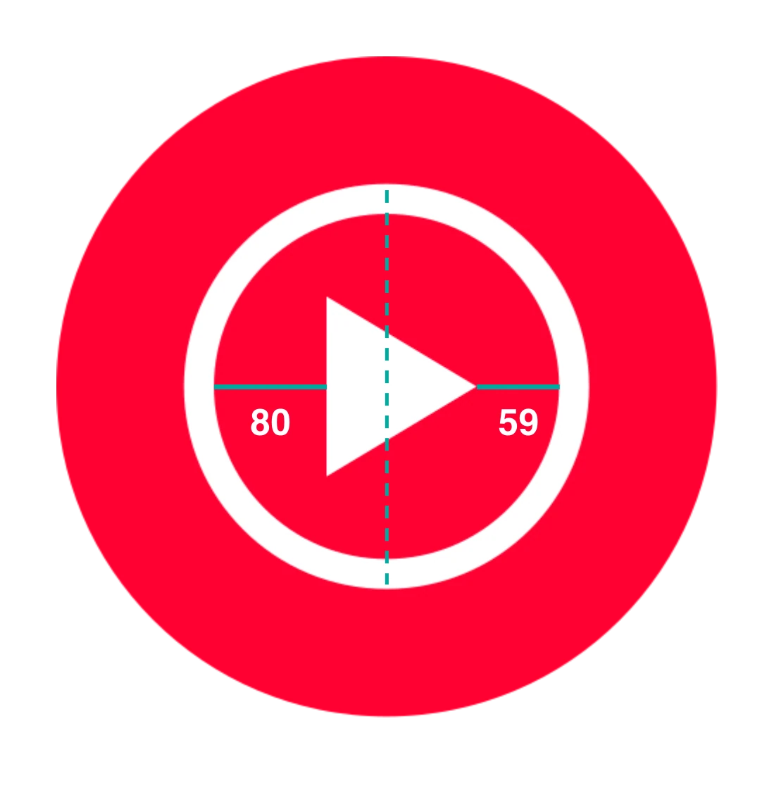
Different icon, different shape around it, same answer. In the file the red inner disc runs from 112 to 357.25, so its middle is 234.6. The triangle's middle is 245.25, which is 10.6 units to the right. That is 10.0% of the triangle's 106.5 width, with 80 units of space on its left and 59 on its right.
Two icons from the same company agree on 10%. A rule of thumb that two separate drawings arrive at is worth trusting.
Letters work the same way: Google
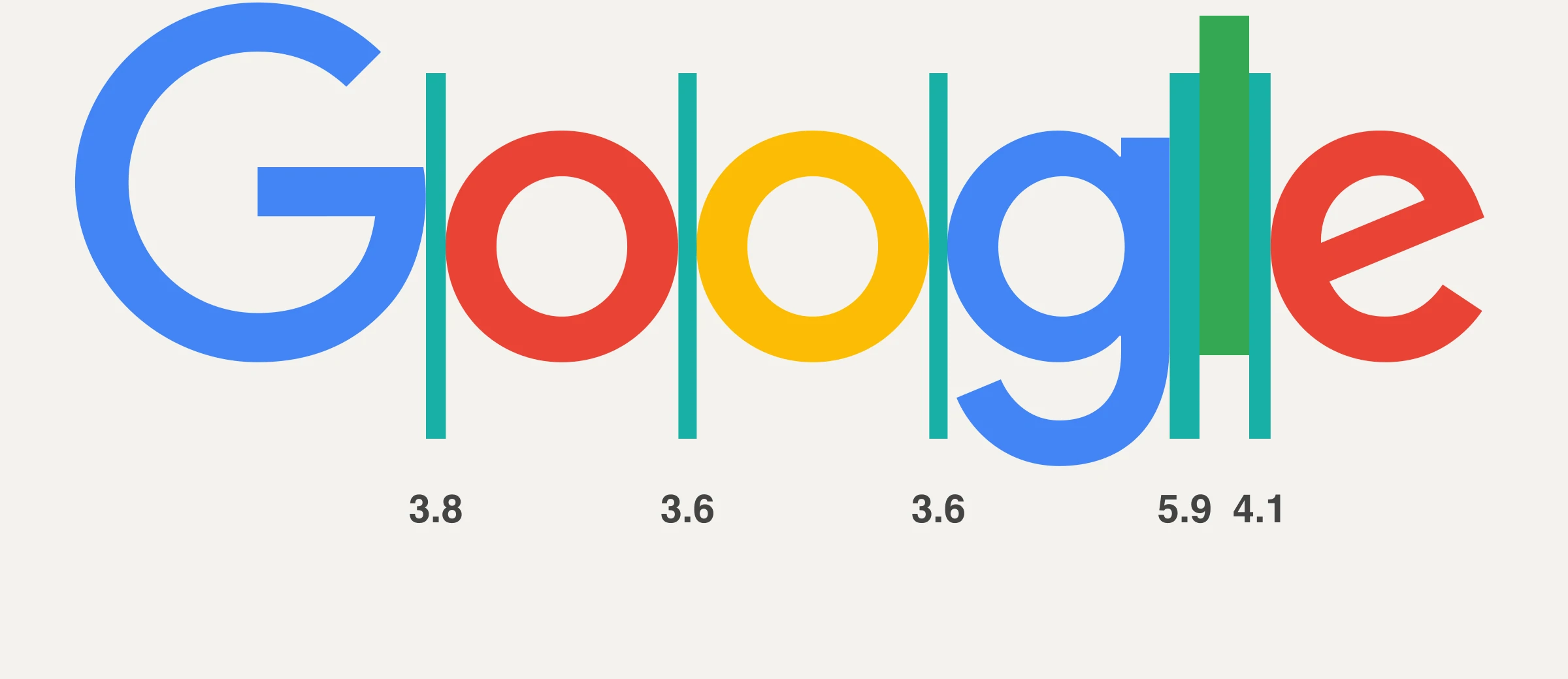
Space between letters is the same problem in a line. In the 2015 wordmark, measured between the boxes of the letters, the gaps are 3.8 from G to o, 3.6 from o to o, 3.6 from o to g, 5.9 from g to l and 4.1 from l to e.
Round next to round is the tightest, 3.6 to 3.8, because a round letter curves away and leaves air above and below its edges. Every gap that touches the straight l is wider, 4.1 to 5.9, because a straight edge has no air to lend. Equal boxes would look uneven. Unequal gaps look even.
And a slanted letter: Volvo
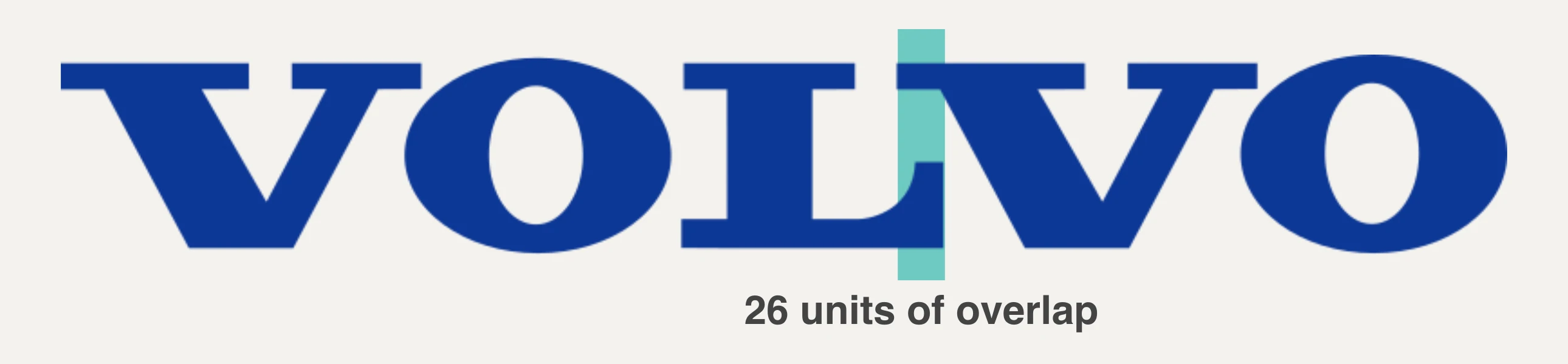
Volvo's wordmark goes one step further. The L runs from 343.2 to 488.27 and the V after it runs from 462.4 to 661.87. Their boxes overlap by 25.9 units, about 3% of the 800-unit wordmark, and the logo still reads as even spacing. The L has empty space above its arm, and the slanted V can slide into it.
"Optical" is our reading of these measurements. None of these brands has said it this way.
A rule you can use
| Shape | What the math gives | What your eye needs |
|---|---|---|
| Play triangle, or any right-pointing shape | Box in the middle | Move it right, about 10% of its width |
| Round letter next to round letter | Equal gaps | The tightest gap in the word |
| Round letter next to a straight one | Equal gaps | A wider gap |
| Slanted letter next to an L, T or F | Boxes touching | Tuck it into the open space |
Then squint at it. Blur your eyes or shrink the logo to the size of a favicon. If a shape looks like it is sliding to one side, or a gap looks like a hole, it is off, whatever the numbers say.
How to do it in your own logo
- Center it by the math first. Align the box to the middle of the container. This is your starting line, not your answer.
- Find the heavy end. Wide end, tail, thick stroke. Move the shape toward the light end in small steps, about 2% of its width at a time.
- Stop at about 10% for a triangle. Past that it looks pushed. If you need more, the shape's proportions are the problem.
- Check at small size. Optical corrections that look fine at 600 px can disappear at 32 px, and the other way round.
- Do the same for letters. Set the tightest gap between two round letters first, then open the gaps around straight ones until the word reads as one even line.
FAQ
Why does my logo look off center when it is perfectly centered?
Your eyes judge visual weight, not the bounding box. A shape with a heavy side, like a triangle, looks like it leans toward its wide end, so it needs a small nudge toward the light end.
How far should a play button sit right of center?
About 10% of its own width. YouTube's 2024 icon is at 9.9% and YouTube Music's is at 10.0%, measured from the logo files.
What is optical alignment?
Placing shapes and letters so they look aligned to the eye, even when the numbers say they are slightly off. It is the opposite of trusting the grid blindly.
What is the difference between kerning and optical kerning?
Kerning is the adjustment of space between two letters. Optical kerning means judging that space by how it looks, not by a fixed table of pairs. Google's gaps from 3.6 to 5.9 are an example of the result.
Do I need to do this if my logo is a circle or a square?
No. Symmetrical shapes carry the same weight on both sides, so the math and the eye agree. It matters for triangles, arrows, letters and anything lopsided.
Sources
- Measurements read from the logo files on Wikimedia Commons by rendering each file and finding shapes by color: YouTube full-color icon (2024), YouTube Music icon 2024, Google 2015 logo and Volvo logo. Units are each file's own.
- The demo with the two boxes is our own drawing in YouTube's proportions (a 400 by 276 box, a 103 by 117 triangle), not a logo.
- The Logo Brainy post this paper grew from: Centered isn't centered.
Get new papers by email
New Brainy papers in your inbox. Confirm once, unsubscribe anytime.