Dropdown vs Radio Buttons: When to Use Each in a Form
Six options or more go in a dropdown, five or fewer go in radio buttons. Both patterns rebuilt on a checkout form, the cases where each one fails, and a decision table for ten common fields.
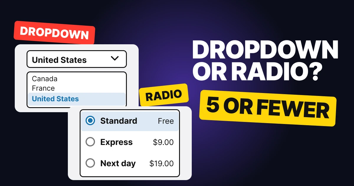
Dropdowns and radio buttons both let people pick one option from a list, so teams swap them without a second thought. They are not interchangeable. One hides the choices until you ask for them, the other shows every choice all the time. Below: the number that decides it, both patterns rebuilt on a checkout form, and a decision table.
The one question: do people need to see every option?
Radio buttons are for a short set of choices that people should weigh against each other. A dropdown is for a long set that most people never read, because they already know the answer or keep the default.
Count the options. At five or fewer, the whole list fits on the screen and comparing is the job, so show it. At six or more, the list is a wall of choices that pushes the rest of the form off the screen, so fold it away.
The dropdown: a long list, out of the way
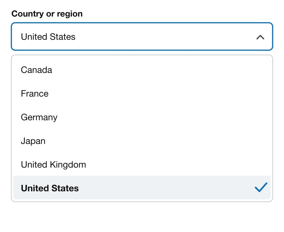
A dropdown, also called a select or a pop-up button, shows one value and opens a list on tap. It is right when:
- There are six options or more. Countries, states, time zones, currencies.
- Most people keep the default. The store ships to the US, most buyers are in the US, so the field already holds the right answer.
- Space is tight. One closed field takes one row, whatever the length of the list.
Nielsen Norman Group says to use a dropdown "if there's limited screen space, an optimal default value, and to downplay alternatives and making changes." Apple's guidance for the pop-up button says the same thing in other words: use it when space is limited and you do not need to display all options all the time, and make the default an item most people are likely to want.
Where it fails: short lists. NN/g notes that a dropdown requires a click to see the options and supports only a single selection.
Radio buttons: a short list, all in view
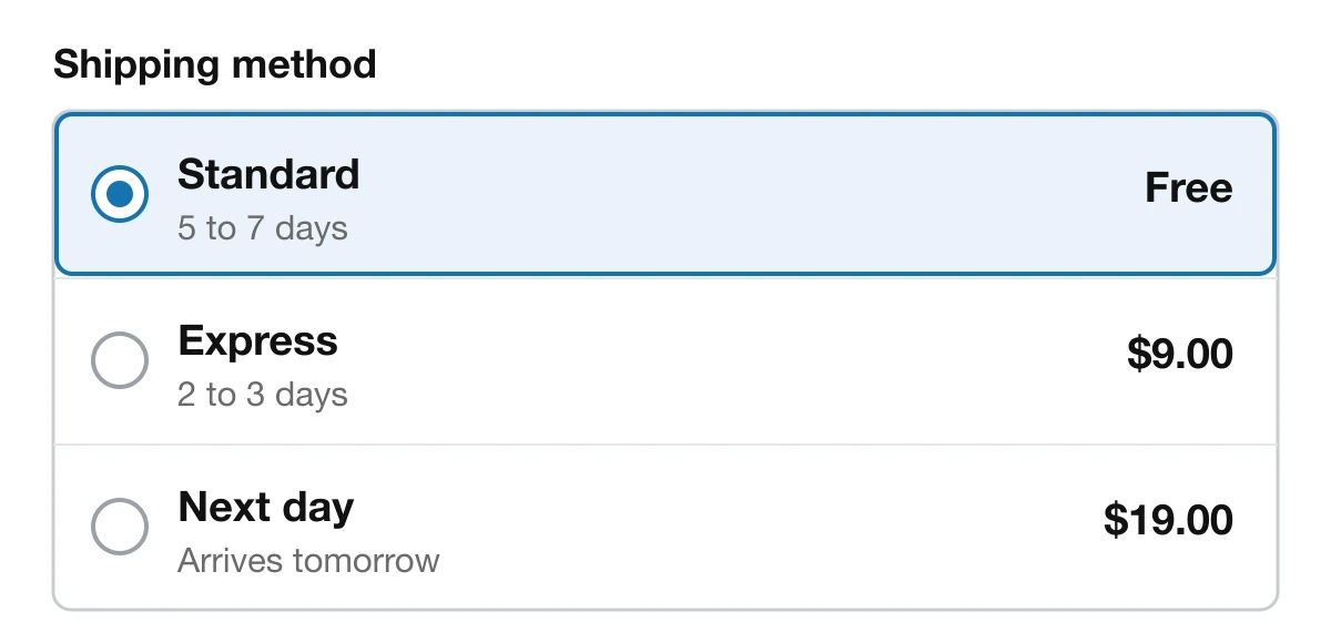
Radio buttons show every option as its own row with a circle. Choosing one clears the others. They are right when:
- There are five options or fewer. Apple describes radio buttons as typically displayed in groups of two to five.
- The options differ in ways people compare. Speed against price is a decision, and it is easier when both rows are side by side.
- People must pick exactly one. Nielsen Norman Group describes radio buttons as the control for options that are "mutually exclusive and the user must select exactly one choice."
Notice what the rows above carry that a dropdown could not: a name, a line of detail and a price, all readable before anyone taps. Pick one, and the row takes a ring and a pale tint, so the choice is obvious.
Where it fails: long lists. Eight countries as radio buttons is already a screen of its own.
Never hide three options behind a dropdown
Wrong: three options in a dropdown

Right: three options as radio buttons
On the left, a person sees "Standard" and nothing else. They have to tap to learn that Express and Next day exist, and tap again to learn what they cost. Some will not, and the faster options never get seen.
On the right, the same three options take up three rows and every price is on the screen. NN/g marks the overview of all items, selected or not, as a point against the dropdown for exactly this reason: seeing everything aids task completion.
Never turn a long list into radio buttons
Wrong: eight countries as radio buttons
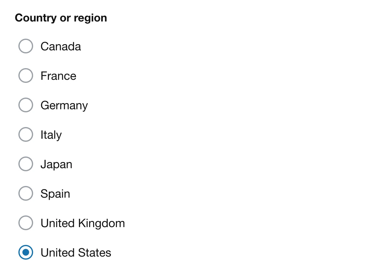
Right: a dropdown with the default set

The left list already fills most of a phone screen with eight countries, and a real country list runs far longer. The right field takes one row and arrives with the answer already in it. Apple's advice for this case is direct: if you need to present more than about five options, consider a pop-up button instead.
Dropdown or radio: a decision table
| Field | Pick | Why |
|---|---|---|
| Country or region | Dropdown | A long list, and most people keep the default |
| Shipping method | Radio | Three options people compare on price and speed |
| Payment method | Radio | A few options, each one a different path |
| Billing cycle: monthly or yearly | Radio | Two options, and the price difference is the decision |
| T-shirt size: S to XL | Radio | Five options, and stock matters at a glance |
| State or province | Dropdown | Dozens of options |
| Year of birth | Dropdown | Dozens of options, none worth displaying |
| Yes or no | Radio | Two options, never a dropdown |
| Time zone | Dropdown | A long list with a good default |
| Sort order: newest, price, rating | Radio | Three options, and people compare them before choosing |
If a person could select several at once, neither pattern is right. Use checkboxes.
Who does it well
Shopify's checkout lists shipping methods as joined rows with the radio on the left, the name and detail in the middle and the price on the right, and the selected row takes a brand ring and a pale tint. That is the proportion worth copying. Apple's HIG gives the dropdown its own name, the pop-up button, and reserves it for lists too long to show.
FAQ
What is the difference between a dropdown and radio buttons?
A dropdown shows one value and hides the rest until it is tapped. Radio buttons show every option at once. Both let people choose exactly one.
When should I use radio buttons instead of a dropdown?
When there are five options or fewer and people need to compare them, like delivery speed or a billing cycle. Seeing every option at once helps them choose.
When should I use a dropdown instead of radio buttons?
When there are six options or more, when space is tight, or when most people keep a sensible default, like a country list.
How many options should a radio button group have?
Apple's guidelines describe radio buttons as typically displayed in groups of two to five. Past about five, use a dropdown or pop-up button.
Should I use a dropdown for a yes or no question?
No. Two options belong in radio buttons, or a single checkbox or switch. A dropdown adds a tap and hides the answer.
Sources
- Anna Kaley, Listboxes vs. Dropdown Lists, Nielsen Norman Group.
- Jakob Nielsen, Checkboxes vs. Radio Buttons, Nielsen Norman Group.
- Toggles: Radio buttons and Pop-up buttons, Apple Human Interface Guidelines.
- First published as a carousel on UX Brainy.
Get new papers by email
New Brainy papers in your inbox. Confirm once, unsubscribe anytime.