Property Details Screen Design: Show the House First (Before and After)
A real estate listing screen that keeps the house in a small inset photo and buries the price in a table of 12 facts, and the same screen fixed: a full-bleed photo, a loud price, two plain rows and one sticky bar. Every change side by side, with the free Figma file.
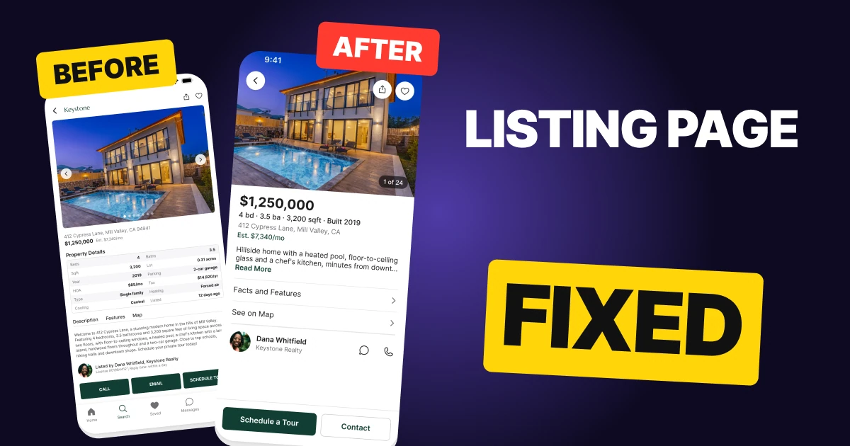
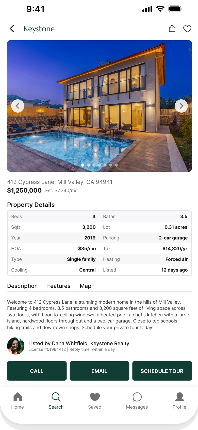
A property details screen has one job: let a buyer decide whether this house is worth a tour. The first draft below has every fact a buyer asks for, and it still fails that job. The house sits in an inset photo with arrows on it, the price is set at 12 px, and the facts arrive as a table of twelve rows at 9 px.
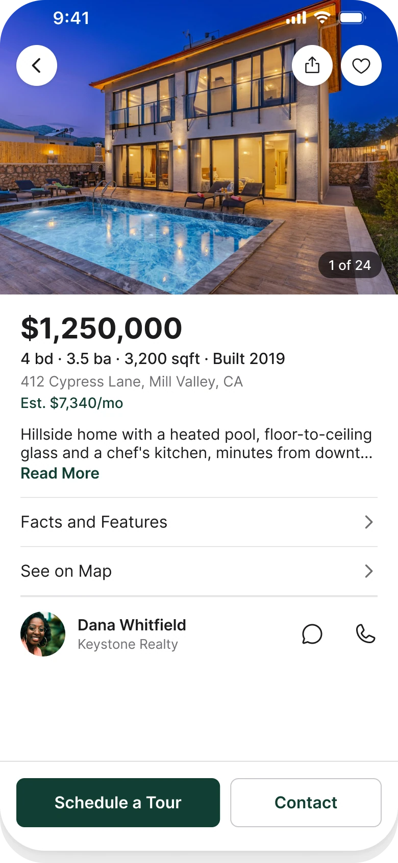
The fix keeps every function and changes the order and the weight. One photo runs edge to edge behind the status bar, the price becomes the biggest thing under it, the table folds into two plain rows, and the three equal buttons become one sticky bar with a single main action.
The whole screen, before and after
Junior draft
Fixed
On the left, the screen shows a buyer the paperwork before it shows the house. A small photo, a small price, a table, a tab strip, a paragraph and three caps buttons all sit at the same weight, and the thing the buyer came for, the house, takes up a quarter of the screen.
On the right, the screen reads in the order a buyer thinks: what does it look like, what does it cost, how big is it, where is it, what do I do next.
Count what the eye has to process. The draft has a photo with two arrows and seven dots, a price, an address, twelve table rows, three tabs, a paragraph, an agent line, three buttons and five tabs. The fixed screen has a photo, a price, a facts line, an address, an estimate, two rows, an agent and one bar.
What changed, measured
| Junior draft | Fixed | |
|---|---|---|
| Photo | Inset 364 x 258, arrows and 7 dots | 390 x 300, edge to edge, no radius, swipe and a "1 of 24" pill |
| Price | 12 px, beside the address | 28 pt bold, first text under the photo |
| Facts | Table of 12 facts at 9 px | One 15 pt line with the four that buyers compare |
| Description | Five lines at 9 px under a tab strip | Two lines and Read More |
| Detail | Features and Map as text tabs | Two 16 pt rows with a chevron |
| Actions | CALL, EMAIL and SCHEDULE TOUR, equal, caps | Schedule a Tour (solid) and Contact (outline), 48 tall |
| Margins | 14 left, 12 right | 20 on both sides |
| Tabs | Five, mixed filled and outline icons | None, back returns to them |
Fix 1: one photo, edge to edge
Before
After
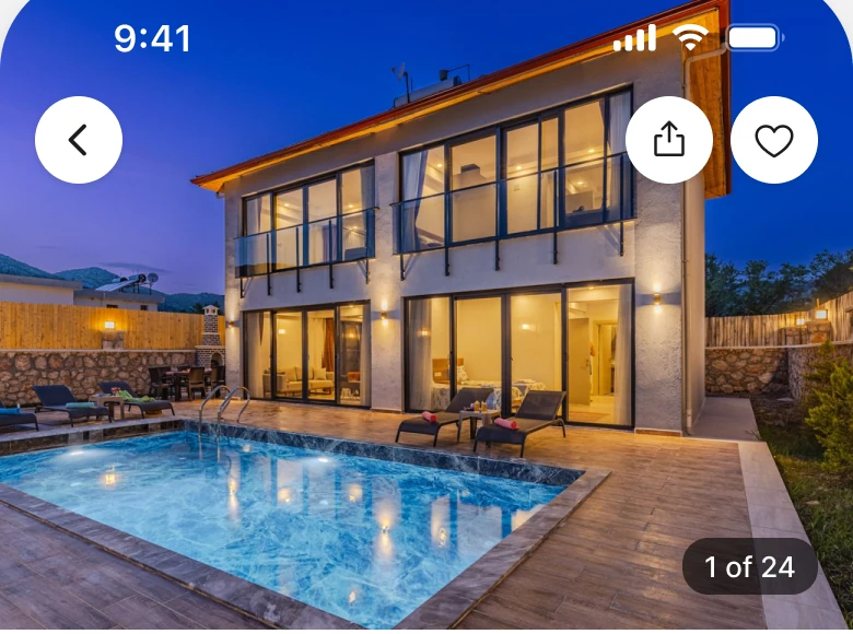
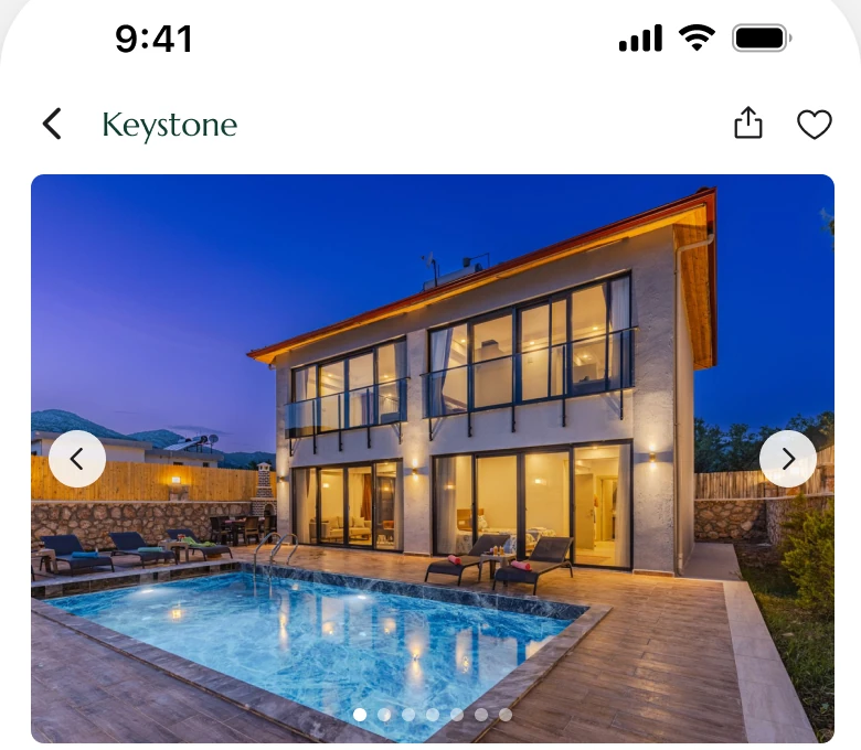
The top of the draft: a Keystone wordmark, share and heart icons, then a photo inset with margins on every side, with left and right arrows over it and seven dots at the bottom edge. Against one photo that fills the full width and runs up behind the status bar, with three solid white circles for back, share and save and a dark "1 of 24" pill in the corner.
The house is the product. In the draft it is a 364 px box with a frame of white around it, and the arrows and dots take more of the photo than they need to. In the fix the photo is 390 by 300, about 36 percent of the screen, with no radius and no scrim.
The arrows and dots are gone because a gallery swipes. "1 of 24" says how many photos there are in four characters and a corner. The wordmark is gone too, since a buyer who opened a listing already knows which app they are in. The three circles are solid white so they stay readable on any photo.
Rule to reuse: when the image is what is for sale, let it have the screen.
Fix 2: the price is the loudest text under the photo
Before

After
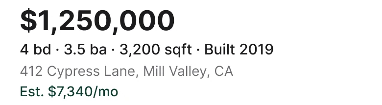
The draft puts the address in grey above a small $1,250,000 with Est. $7,340/mo beside it, all within two lines of 12 to 15 px text. Against a 28 pt bold $1,250,000, a 15 pt line reading 4 bd, 3.5 ba, 3,200 sqft, Built 2019, a grey 14 pt address and a green estimate of $7,340 a month.
A buyer scanning listings asks the same four questions every time: how much, how many bedrooms, how big, where. In the draft the answer to the first is the same size as the answer to the last, and the bedrooms and square feet are rows of a table further down.
The fix sets them in the order buyers ask them. Price first at 28 pt bold. The four numbers buyers compare go on one 15 pt line, so they can be read in a glance. The address drops to a quiet grey and the monthly estimate gets the only color on the screen, a forest green, #123F34.
Rule to reuse: put the number people compare first and biggest, then the next three on one line.
Fix 3: twelve facts become two rows
Before
After

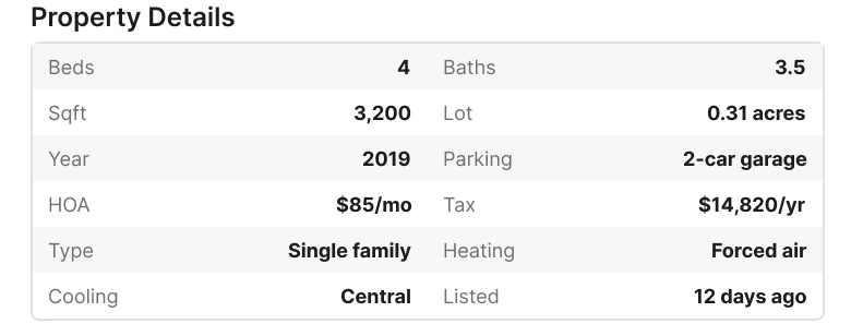
A bordered Property Details table with twelve rows in two columns, Beds, Baths, Sqft, Lot, Year, Parking, HOA, Tax, Type, Heating, Cooling and Listed, striped in grey at 9 px. Against two plain 16 pt rows, Facts and Features and See on Map, each with a chevron and a hairline above.
Twelve facts at equal weight is a spreadsheet. Beds, baths, square feet and year were worth a line of their own, so they moved up under the price. The other eight, parking, HOA, tax, type, heating, cooling, lot and listed date, are still there, one tap away behind Facts and Features. They matter once a buyer is interested, and they matter less than the photo and the price when the buyer is deciding.
The Map text tab became the See on Map row. It is a place, not a section of the page, so it behaves like one: a row that opens it.
Rule to reuse: if a table has twelve rows, pull out the four people compare and put the rest one tap away.
Fix 4: the description gets two lines
Before
After

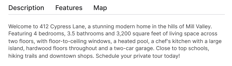
The draft shows Description, Features and Map as three text tabs over a hairline, with a five line paragraph in 9 px type under them. Against a description cut to two lines in 15 px type ending in a green Read More.
A tab strip over a paragraph makes the buyer choose a view before they know what is in it. The paragraph, in turn, repeats what the facts line and the photo already said: four bedrooms, a pool, floor to ceiling glass.
The fix keeps the one sentence that is not elsewhere, a hillside home with a heated pool and a chef's kitchen, and hands the rest to Read More. Features moved behind the Facts and Features row, so nothing was removed, only moved to where a buyer who wants it will look.
Rule to reuse: two lines and a Read More beats a paragraph nobody finishes.
Fix 5: three equal buttons become one bar
Before
After

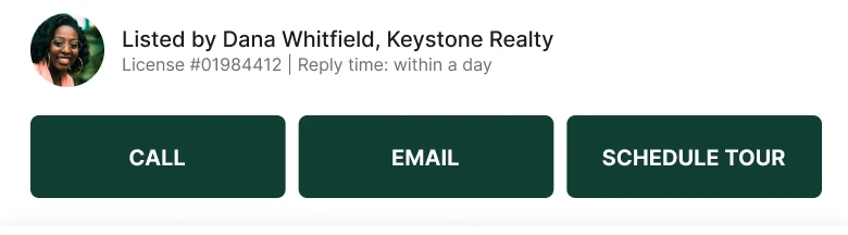
The draft's agent row, Listed by Dana Whitfield, Keystone Realty, with a license number and a reply time, then three solid dark green caps buttons of the same size, CALL, EMAIL and SCHEDULE TOUR. Against a flat bar with a hairline on top holding a solid Schedule a Tour button and a quiet outline Contact button, both 48 tall with an 8 px radius.
Three equal buttons are three equal choices, and only one of them is the step a buyer takes next. A tour is the step that turns a browser into a lead, so it gets the solid fill. Contact is there for anyone who wants to ask first, and it is an outline so it does not compete.
The bar is pinned to the bottom, so it is reachable while the buyer scrolls through the description and the rows. The agent line moved up into its own row with a 44 px avatar, the brokerage under the name, and plain chat and phone icons: CALL is the phone, EMAIL is Contact. The license number and reply time open from that row.
Rule to reuse: one filled button per screen, and keep it where the thumb is.
The smaller fixes
- Every function stays. The gallery swipes, Description is two lines and Read More, Features and the other eight facts sit behind Facts and Features, Map is See on Map, CALL is the phone icon on the agent row, EMAIL is Contact, and share and save stayed on the photo.
- No tab bar. This is a task screen, so the five tabs are gone. Back returns to them, and Saved is the heart on the photo.
- One margin. The draft has 14 px on the left and 12 on the right. The fixed screen uses 20 on both sides.
- One accent. The forest green is used for the estimate, Read More, the Schedule a Tour button and the Contact label. The draft used it on the wordmark, three buttons and a tab.
- No boxes, no stripes. The bordered, striped table is two rows with hairlines, and nothing carries a shadow.
- Type that reads. The draft runs from 8 to 15 px with most of the facts at 9. The fix uses 28, 16, 15 and 14.
Audit your own property screen
| Question | Why it matters |
|---|---|
| Does the photo get at least a third of the screen? | The house is the product |
| Is the price the biggest text under the photo? | It is the number every buyer checks first |
| Are the facts buyers compare on one line? | Four numbers read in a glance, twelve do not |
| Is the rest of the table one tap away? | Detail is for the buyer who is already interested |
| Is there one filled button? | Equal buttons are equal choices |
| Is the main action pinned where the thumb is? | A tour request should never need a scroll |
Get the Figma file
The free file has the junior draft, the fixed screen and every part as a component.
Free Figma file
Property details redesign, before and after
Both screens and every part as a Figma component. Free, view only, duplicate it to your drafts.
FAQ
What should a property details screen show first?
The photo, then the price. Run one photo edge to edge at the top, then the price in large bold type, then one line with beds, baths, square feet and year, then the address.
How many photos or details should the first view of a listing show?
One photo, with a counter such as "1 of 24" and a swipe for the rest. Show the four facts buyers compare on one line and put the longer table behind a Facts and Features row.
Should a listing page have a sticky call to action?
Yes. Pin one flat bar to the bottom with Schedule a Tour as the solid button and Contact as an outline, so the next step is in reach however far the buyer has scrolled.
How long should a listing description be on mobile?
Two lines and a Read More. Beds, baths and size are already on the facts line, so the description keeps the one thing that is not elsewhere, such as a heated pool or a chef's kitchen.
Do you need a tab bar on a property details screen?
No. A details page is a task screen, so the back button returns to the tabs. Saving a listing is the heart on the photo.
Sources
- Both screens are our own, designed and measured in Figma. The app, Keystone, the agent Dana Whitfield, the address, the price and the estimate are made up.
- Pattern studied: the photo first, price and key facts layout of Zillow's listing page, and the sticky bottom bar on Airbnb's listing page.
- Icons are from Phosphor (MIT). The wordmark is Marcellus Regular. Photos are on Pexels: photos by Ahmet Çötür and Luthfi Ramaditya.
- First published as a carousel on App Brainy.
Get new papers by email
New Brainy papers in your inbox. Confirm once, unsubscribe anytime.