Hiking Trail App Design: A Trail Page Redesign, Before and After
A hiking trail page that squeezes six facts into one 9 px line and draws the climb as a thin grey line, and the same screen fixed: three plain numbers, a filled elevation shape with the summit named, one mud warning row and one orange Start Hike. Free Figma file.
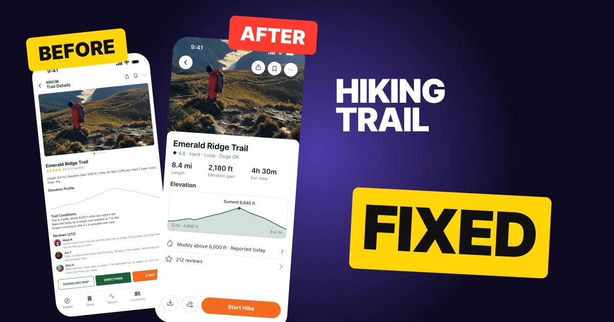
A trail page has one job: tell a hiker whether this is the right trail today, then get them moving. The first draft below has every fact a hiker needs, and it still reads like a permit application. Length, gain, time, difficulty, type and dogs sit in one 9 px line, the climb is a thin grey line with no numbers, and the conditions are three lines of 9 px text.
The fix keeps every function and changes the weight. Three numbers get their own column, the climb becomes a filled shape with the summit named, the conditions shrink to one row that warns about the mud, and one orange button does the next thing.
The whole screen, before and after
Junior draft
Fixed
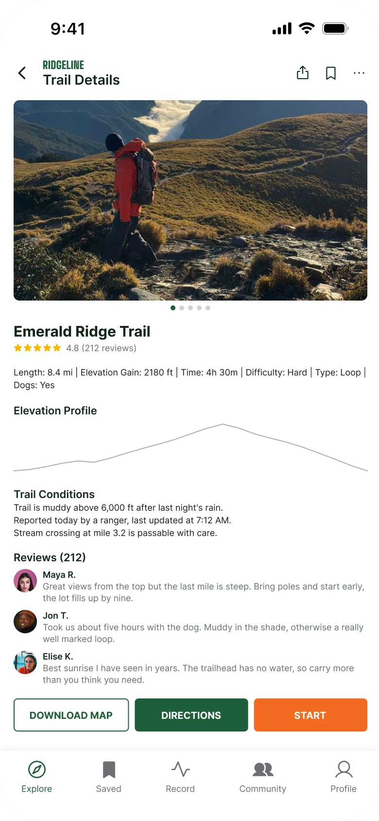
On the left, nothing is bigger than anything else. A header, a framed photo, a spec line, a chart, a conditions block, three reviews and three buttons all use the same few small sizes, and the facts a hiker came for are the smallest text on the page.
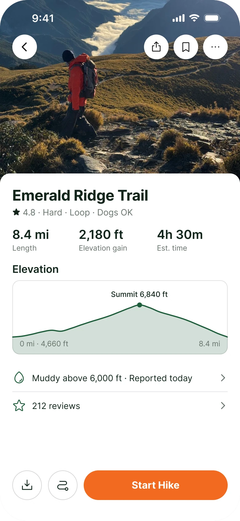
On the right, the page reads in the order a hiker asks: where is this, how hard is it, how big is the climb, can I go today, start.
Count what the eye has to process before the first number. The draft has a wordmark, a title, back, share, bookmark and more icons, a photo with five dots, a name, five stars and a rating: about a dozen things. The fixed screen has a photo and a name.
What changed, measured
| Junior draft | Fixed | |
|---|---|---|
| Specs | Six facts in one 9 px line | Length, gain and time at 20 px semibold over 12 pt labels |
| Elevation | A 1 px grey line, no labels | A 350 x 120 shape, 20% forest fill (#1F5E3B), a 2 px line, Summit 6,840 ft |
| Conditions | Three lines at 9 px | One 44 px row with a chevron |
| Photo | 364 x 206, radius 6, five dots | 390 x 300 full bleed, 36% of the screen |
| Buttons | Three caps buttons, 34 px tall | One 48 px Start Hike, two 48 px circles |
| Margins | 14 left, 12 right | 20 on both sides, 16 between blocks |
| Tabs | Five, mixed filled and outline icons | None on this screen, back returns to them |
Fix 1: three plain numbers
Before

After
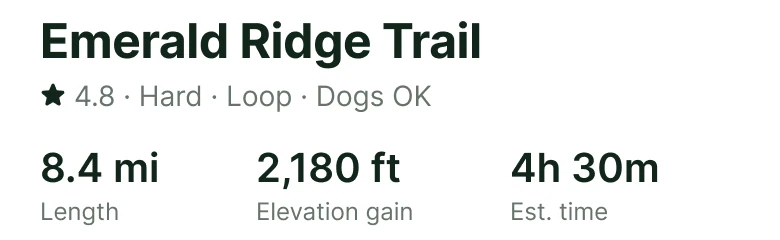
The draft: Emerald Ridge Trail at 15, five yellow stars and 4.8 (212 reviews), then one 9 px line wrapping onto a second line with six facts divided by pipes. Against the fixed sheet: the trail name at 24 bold, a 14 pt line reading 4.8, Hard, Loop, Dogs OK, then 8.4 mi, 2,180 ft and 4h 30m at 20 semibold over small labels.
The draft hides the three numbers a hiker compares between trails inside a sentence of pipes. To find the elevation gain you read the line left to right until you hit it, and the line wraps, so the last fact lands on its own row.
The fix splits the facts by job. Three numbers a hiker uses to size up the day, length, gain and time, get their own column with a label under each. Four facts that describe the trail, rating, difficulty, loop and dogs, become one quiet line under the name. There are no dividers, because the space between columns already separates them.
Rule to reuse: if a fact is a number people compare, give it a column. If it is a tag, put it in a line.
Fix 2: draw the climb as a shape
Before
After
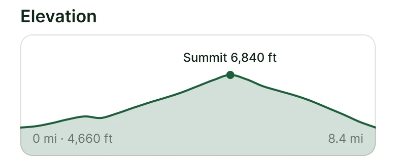
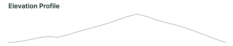
The draft: the words Elevation Profile at 13 px above a 1 px grey line rising and falling across the screen with no numbers. Against the fix: the word Elevation at 20, then a rounded shape filled in light forest green with a darker line on top, a dot and the label Summit 6,840 ft over the peak, and 0 mi at 4,660 ft and 8.4 mi at the bottom corners.
A thin line shows that the trail goes up and down. It does not say how far up, or where. A hiker looking at the draft cannot tell a gentle rise from a hard one, and the chart has no start height, no end distance and no peak.
The fix fills the area under the line, so the climb has mass, and puts three labels on it: the summit with a dot, the starting height at the left and the distance at the right. The numbers agree: 4,660 ft at the trailhead plus a 2,180 ft gain is the 6,840 ft summit, and it matches the number in the stats row.
Rule to reuse: a chart that cannot be read without a tap needs three labels, the start, the peak and the end.
Fix 3: one row that warns about the mud
Before
After
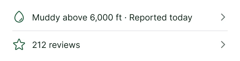
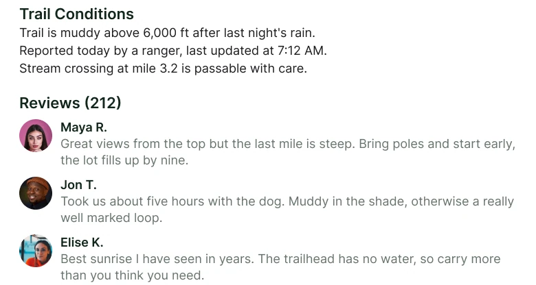
The draft: a Trail Conditions heading and three 9 px lines (muddy above 6,000 ft after last night's rain, reported today by a ranger at 7:12 AM, stream crossing at mile 3.2 passable with care), then a Reviews heading with three reviews, each with an avatar and two lines of 9 px text. Against the fix: two plain 44 px rows, a drop icon with Muddy above 6,000 ft, Reported today and a chevron, then a star with 212 reviews and a chevron.
The conditions are the most time-sensitive thing on the page, and in the draft they are three lines of the smallest text, in the same grey as everything else. The review block takes more room than the chart and the stats put together, and nothing in it helps a hiker decide before they set out.
The fix writes the warning, the one a hiker has to act on, as the row itself: Muddy above 6,000 ft, Reported today. The ranger's note and the stream crossing are one tap away behind the chevron. Reviews become a second row with a count. Both rows are 44 px tall, so they are easy to hit with a thumb, and a hairline separates them.
Rule to reuse: show the warning, link the detail.
Fix 4: one button, two quiet circles
Before

After

The draft: three caps buttons side by side at 10 px on 34 px heights, Download Map outlined, Directions in dark green and Start in orange, over a five tab bar. Against the fix: two 48 px outlined circles with a download icon and a route icon, then a 48 px orange pill reading Start Hike.
The draft gives three actions the same width and nearly the same weight, so the hiker has to read all three to find the one that matters. Download Map and Directions are useful, and they are both things you do before the hike, once. Start is the action of the whole screen.
The fix makes that obvious. One orange pill, twice the width of anything else, says Start Hike in plain words. The two supporting actions shrink to icon circles with a hairline, so they are still reachable and they do not compete.
Rule to reuse: one primary button per screen, and everything else is quieter than it.
The smaller fixes
- Every function stays. Back, share, bookmark and more sit on the photo in four white 40 px circles. Difficulty, rating, loop and dogs are the line under the name. The ranger's note and the stream crossing open from the conditions row, and reviews open from the 212 reviews row.
- The photo is the header. The framed photo and its five dots become one full bleed photo behind the status bar, with no scrim and no radius. The dots became the gallery behind that photo, and the three small photo tiles are gone.
- One margin. The draft uses 14 on the left and 12 on the right. The fix uses 20 on both sides and 16 between blocks.
- One accent. Orange (#F26B21) is used for Start Hike and nothing else. The draft used a dark green button and an orange one next to each other.
- No tab bar on a detail screen. The five tabs, with mixed filled and outline icons, step aside here, and back returns to them.
- No cards, no shadows. Blocks are separated by space and one hairline, and the sheet is a single white surface with 16 px top corners.
Audit your own trail screen
| Question | Why it matters |
|---|---|
| Are length, gain and time readable without squinting? | They are the numbers hikers compare between trails |
| Does the elevation chart show the start, the peak and the end? | A line without numbers is a decoration |
| Is the weather or mud warning one tap or zero taps away? | Conditions change the decision |
| Do three buttons share one weight? | The hiker has to read them all to find Start |
| Does the photo open the page? | A trail is a place, and the page should show it first |
| Is there one margin and one accent color? | Consistency makes a dense page quiet |
Get the Figma file
The free file has the junior draft, the fixed screen and every part as a component.
Free Figma file
Hiking trail redesign, before and after
Both screens and every part as a Figma component. Free, view only, duplicate it to your drafts.
FAQ
How should a hiking trail app detail screen be designed?
Open with a full bleed photo, then a sheet with the trail name, one line of tags, three big numbers for length, gain and time, a labelled elevation shape, a conditions row and one Start button.
How do you design an elevation profile in an app?
Fill the area under the line so the climb has mass, name the summit with its height, and label the start height and the total distance. Keep the numbers consistent with the stats above it.
How should trail conditions be shown?
Show the warning that changes a decision, such as mud above a height, as one row with the date it was reported. Put the full note and smaller hazards behind a chevron.
Should a trail page have three equal buttons?
No. Give Start Hike one filled button and make Download map and Directions quieter icon buttons beside it, so the primary action is clear.
Sources
- Both screens are our own, designed and measured in Figma. The app, Ridgeline, Emerald Ridge Trail, the reviewers and the trail numbers are made up. The chart's numbers agree: 4,660 ft at the trailhead plus a 2,180 ft gain is the 6,840 ft summit.
- Photos from Pexels: the hiker on the ridge by Oliver Hung; the reviewer avatars by Carlos Gutierrez, Iphanyi Ezemenari and Dario Moscato.
- Icons are from Phosphor (MIT). The wordmark is Big Shoulders Display Black.
- First published as a carousel on App Brainy.
Get new papers by email
New Brainy papers in your inbox. Confirm once, unsubscribe anytime.