Checkout Screen Design: An Ecommerce App, Before and After
A checkout that asks for the email twice and the address twice, and the same screen fixed: ask once, the order summary on top, Apple Pay and the saved card, one button that says Pay $80.07. Every change side by side, with the free Figma file.
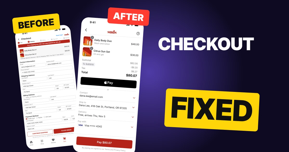
A checkout screen has one job: let a person who already decided to buy finish without thinking. The first draft below can take the order, but it asks for the email twice and the address twice, hides the money in one small grey line, keeps five steps and a tab bar on screen, and gives Continue Shopping the same weight as Place Order.
The fix keeps every function and changes what the person has to do: the order first, the saved details as rows, a fast way to pay, and one button that says the amount.
The whole screen, before and after
Junior draft
Fixed
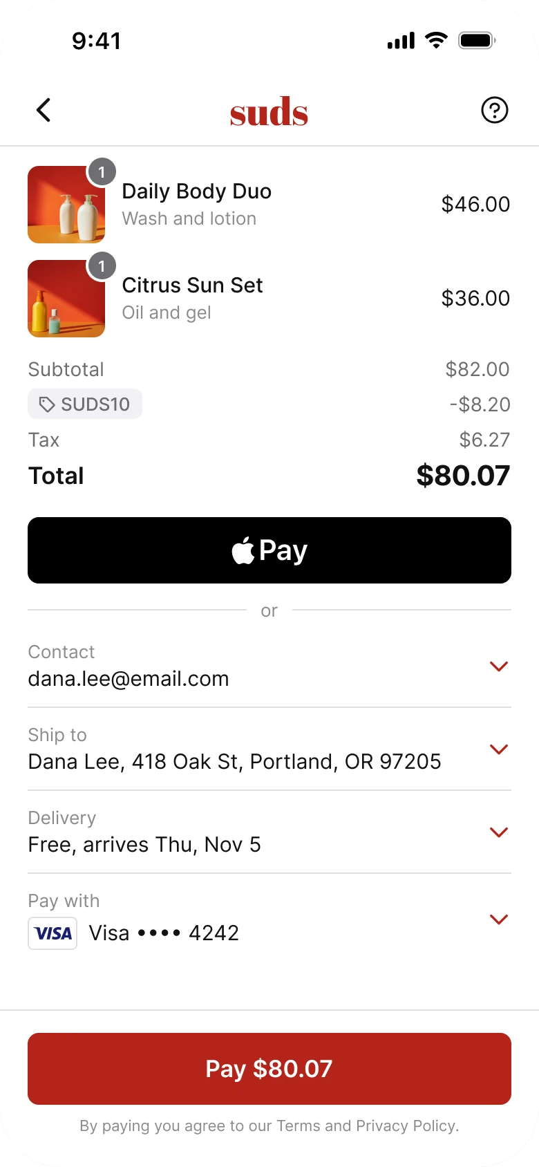
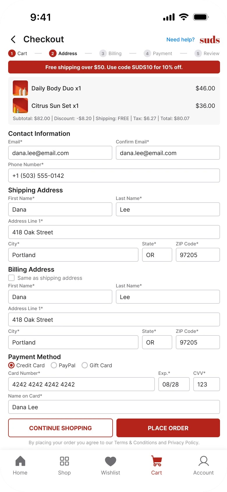
On the left, the person is handed a form. Nineteen input fields sit in one scroll, in 7 to 15 px type, and the order they are paying for is a grey box with a single line of numbers. Nothing says what matters.
On the right, the screen reads top to bottom as the questions a buyer asks: what am I buying, what does it cost, how do I pay, where does it go, and where do I tap. The only color left is the red on the button and the small chevrons.
What changed, measured
| Junior draft | Fixed | |
|---|---|---|
| Input fields | 19, with Email and Confirm Email, and the same name and address under Shipping and Billing | None until a row is tapped, details shown as rows |
| Order summary | A grey box, 26 px thumbnails, one line of totals | 56 px thumbnails, a line per item, Subtotal, code, Tax and Total in a column |
| Money | Subtotal, Discount, Shipping, Tax and Total in one small grey line | Total in bold, the largest text on the screen |
| Steps | Five labels at 8 px | None, the screen is the step |
| Payment | A card form with a card number, expiry, CVV and name | Apple Pay, then the saved Visa ending 4242 |
| Buttons | Two equal 32 px caps buttons | One 52 px button, Pay $80.07 |
| Tab bar | Five tabs | None |
| Margins | 14 left and 12 right | 20 on both sides |
| Text sizes | 7 to 15 px | 13 to 15 for rows, larger for the total |
Fix 1: ask once
Before
After
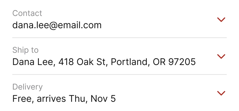
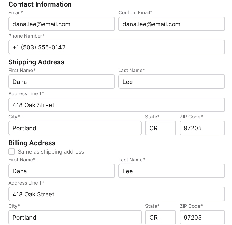
A form with Contact Information holding Email and Confirm Email side by side and a Phone Number, a Shipping Address with first and last name, address line, city, state and ZIP, and a Billing Address with a Same as shipping address checkbox left empty and the same name, address, city, state and ZIP typed again, against three rows with a grey label over the value and a red chevron: Contact dana.lee@email.com, Ship to Dana Lee, 418 Oak St, Portland, OR 97205, and Delivery Free, arrives Thu, Nov 5.
The draft asks for the email, and then asks for it again to confirm. It asks for a name and address under Shipping, and then asks for the same name and address under Billing, with a checkbox to skip it that starts unchecked. A buyer who typed a street name once has to type it a second time, on a phone keyboard, to pay.
The fix treats what the app already knows as a fact and not as a question. Each saved detail is a row: a grey label over the value, and a chevron that opens it for editing. Billing is the same as shipping unless the person says otherwise, so the second address never appears. A first-time buyer fills the address once, and the screen then looks like this one.
Rule to reuse: never ask for something the screen already has, and never ask for the same thing twice.
Fix 2: put the order on top, line by line
Before
After
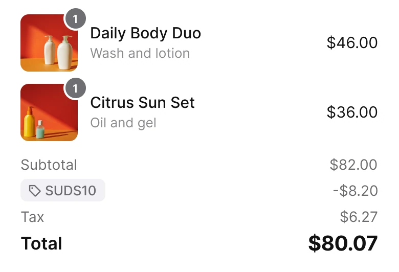
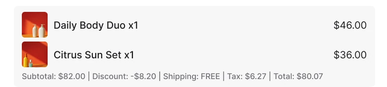
A grey box with two tiny thumbnails, Daily Body Duo x1 at $46.00 and Citrus Sun Set x1 at $36.00, and one line of 7 px text reading Subtotal: $82.00 | Discount: -$8.20 | Shipping: FREE | Tax: $6.27 | Total: $80.07, against two items with 56 px photos and quantity badges, then a right-aligned column: Subtotal $82.00, a SUDS10 tag at -$8.20, Tax $6.27, and Total $80.07 in bold.
In the draft, the total is the last item in a pipe-separated line, the same size as the word "Subtotal". The most important number on the screen has no more weight than the least important one.
The fix writes the sum the way a receipt does.
The numbers add up in the column you can read down: $46 and $36 make $82, the code SUDS10 takes 10%, which is $8.20, $73.80 plus 8.5% tax of $6.27 comes to $80.07. The code shows as a small tag, so the person sees why the price dropped. Free shipping moved to the Delivery row, where it belongs. The thumbnails grew from 26 to 56 px, because a buyer checks that the right product is in the cart by looking at it, and the quantity sits on a small badge on the photo.
Rule to reuse: show the sum as a column, make the total the biggest thing in it, and name every discount.
Fix 3: pay with a tap
Before
After

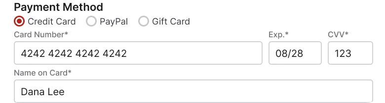
A Payment Method block with three radio options, Credit Card selected, PayPal and Gift Card, then Card Number 4242 4242 4242 4242, Exp. 08/28, CVV 123 and Name on Card, against a black Apple Pay button with the real Apple mark above a hairline with the word or.
A card form asks for sixteen digits, a date, a security code and a name. On a phone, that is the part of checkout where people leave. Typing a card number is the longest single task on the left screen.
The fix puts a one-tap option first: a black Apple Pay button, 48 px high, with the real Apple mark and a hairline "or" under it. Below, the "Pay with" row shows the saved Visa ending 4242 with the real Visa mark, and a tap on its chevron opens the rest: PayPal, Gift Card and a new card are all still there, one tap away.
This is a known pattern. Stripe Checkout's prebuilt form puts the order summary with quantity badges on thumbnails on top and Apple Pay in black over a hairline "or", and Shopify's Shop Pay guidelines use the grey label over a value with a chevron for saved details.
Rule to reuse: put the fastest way to pay first and move the slow one behind a row.
Fix 4: one button that says what you pay
Before

After
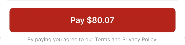
Two side by side caps buttons of the same height, CONTINUE SHOPPING outlined in red and PLACE ORDER filled red, with a 7 px terms line under them, against one full width red button reading Pay $80.07 with By paying you agree to our Terms and Privacy Policy under it.
Two buttons of equal size ask the buyer to choose between leaving and paying, at the last step. "Place order" does not say what it costs, and the 32 px caps labels are small for a thumb.
The fix has one button, full width and 52 px high. It says "Pay $80.07", so the amount is the last thing the person reads before they commit. Continue Shopping did not disappear: it is the back arrow in the header, where people look for it. The terms sit under the button in one grey line.
Rule to reuse: name the action and the amount on the button, and give "go back" a back arrow, not a button.
The smaller fixes
- Every function stays. Continue Shopping is the back chevron. Need Help is the help icon. The phone number sits behind Contact. PayPal, Gift Card and a new card sit behind the Pay with chevron. The promo is the SUDS10 line. Free shipping is on the Delivery row. The terms sit under the button.
- No step counter. Five labels at 8 px told the buyer how far they were from the end. A checkout that fits one screen does not need a progress bar.
- No tab bar. Home, Shop, Wishlist, Cart and Account are not what a person needs while paying, and removing them gives the Pay button the bottom edge. The back arrow is the way out.
- No red banner. The draft's free shipping banner at the top competed with the order. The same news is now one word on the Delivery row.
- A white ground and 20 px margins. The draft used 14 on the left and 12 on the right. The fixed screen uses 20 on both sides.
- No boxes inside boxes. The rows are separated by hairlines, and nothing on the screen has a shadow.
Audit your own checkout
| Question | Why it matters |
|---|---|
| Is anything asked twice? | Confirm Email and a second address are work the buyer does for you |
| Is billing the same as shipping by default? | Most orders ship to the card's owner |
| Is the total the biggest number? | It is the one the person checks |
| Is there a one-tap way to pay above the card form? | Typing 16 digits is where people leave |
| Does the button say the amount? | The last thing read before paying should be the price |
| Is anything on screen that is not about paying? | Steps, tabs and banners can all go |
| Can the person still reach every old function? | Fewer things on screen is not fewer features |
Get the Figma file
The free file has the junior draft, the fixed screen and every part as a component.
Free Figma file
Checkout screen redesign, before and after
Both screens and every part as a Figma component. Free, view only, duplicate it to your drafts.
FAQ
How should a mobile checkout screen be designed?
In the order the buyer decides: what they are buying, what it costs, how they pay, where it goes, then one button. Show the order summary first, saved details as rows, Apple Pay above the card option, and a Pay button with the amount.
How many fields should a checkout form have?
As few as the order needs. Ask for each detail once, skip the email confirmation, and make billing the same as shipping by default. Saved details can show as rows that open for editing.
Should the checkout button say Pay or Place order?
A button that states the action and the amount, such as "Pay $80.07", tells the buyer what happens and what it costs. "Place order" leaves the price to be found elsewhere.
Should a checkout page have a progress bar and a tab bar?
Not on a single screen checkout. A step counter has nothing to count, and a tab bar offers ways to leave when the person is trying to finish.
What should an order summary show?
Each item with a photo and quantity, then the subtotal, any discount code by name, the tax, and the total in the largest type. Every line should add up to the total.
Sources
- Both screens are our own, designed and measured in Figma. The store, products, prices and buyer are made up. The numbers add up on both screens: $46 and $36 make $82, code SUDS10 takes 10%, $8.20, $73.80 plus 8.5% tax of $6.27 is $80.07, and shipping is free over $50. Tue Nov 3, 2026 and Thu Nov 5 are real dates.
- Measured: before, margins 14 left and 12 right, text 7 to 15 px, nineteen input fields, 26 px product thumbnails, five step labels at 8 px, two equal 32 px caps buttons, five tabs. After, white ground, margin 20, row text 15 with 13 px labels, 56 px thumbnails with radius 8, one 48 px Apple Pay button, one 52 px Pay button, no tab bar, no shadow inside the screen. White text on the button red #B3241A has a contrast ratio of 6.6 to 1.
- Patterns studied: Stripe Checkout for the order summary, Apple Pay above a hairline "or", and a button that states the amount, and Shop Pay design guidelines for the saved rows. The Apple Pay button follows Apple's guidelines: the real mark, black, radius 8. The Visa mark is the real one.
- Photos: Pexels, Edward Jenner, unbranded bottles from one shoot.
- First published as a carousel on App Brainy.
Get new papers by email
New Brainy papers in your inbox. Confirm once, unsubscribe anytime.