Padding vs Margin: What's the Difference in UI Design?
Padding is the space inside a box. Margin is the space between two boxes. Both rebuilt on an order card, plus the tap area, the Figma auto layout trap and a quick table for handoff.
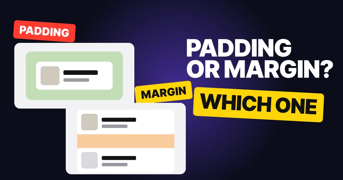
Padding and margin both add space around things, so people use the words loosely. They do different jobs. One lives inside a box and one lives between boxes, and mixing them up is how a design arrives at handoff with spacing nobody can build. Below: both rebuilt on an order card, what changes for tap areas, how Figma handles it, and a table to settle arguments.
Padding: the space inside the box
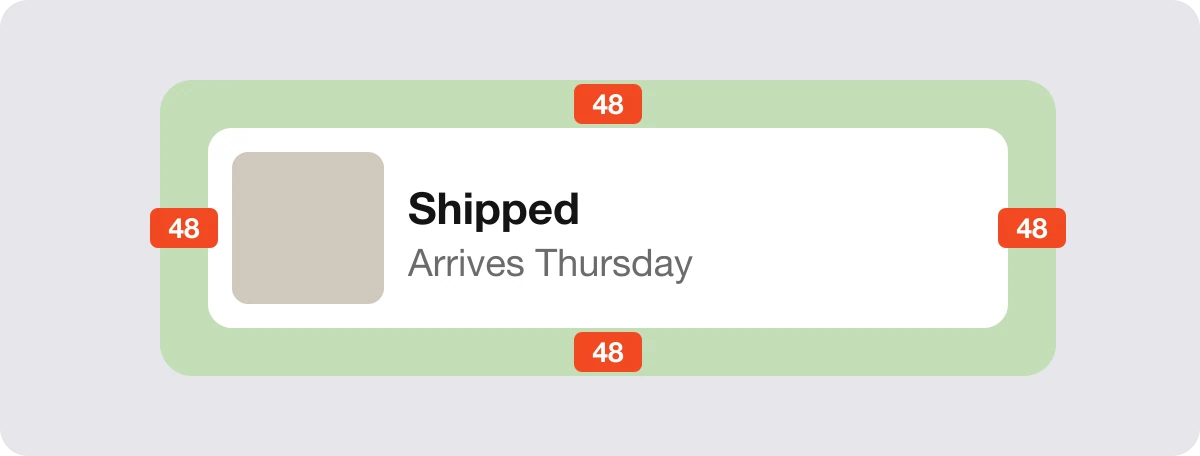
The green band is the padding: 48 on every side between the edge of the box and the card it holds. It is green because that is how Chrome's developer tools draw it, and orange is how they draw margin.
Padding belongs to the box, so the box's background fills it. If the box is a button, the padded area is part of the button. That makes padding the right tool when:
- The space belongs inside the box. The content needs room to breathe before the edge.
- The background should fill it. A filled button, a card, a chip.
- A bigger tap area helps. The padded area is what responds to a tap.
Margin: the space between boxes
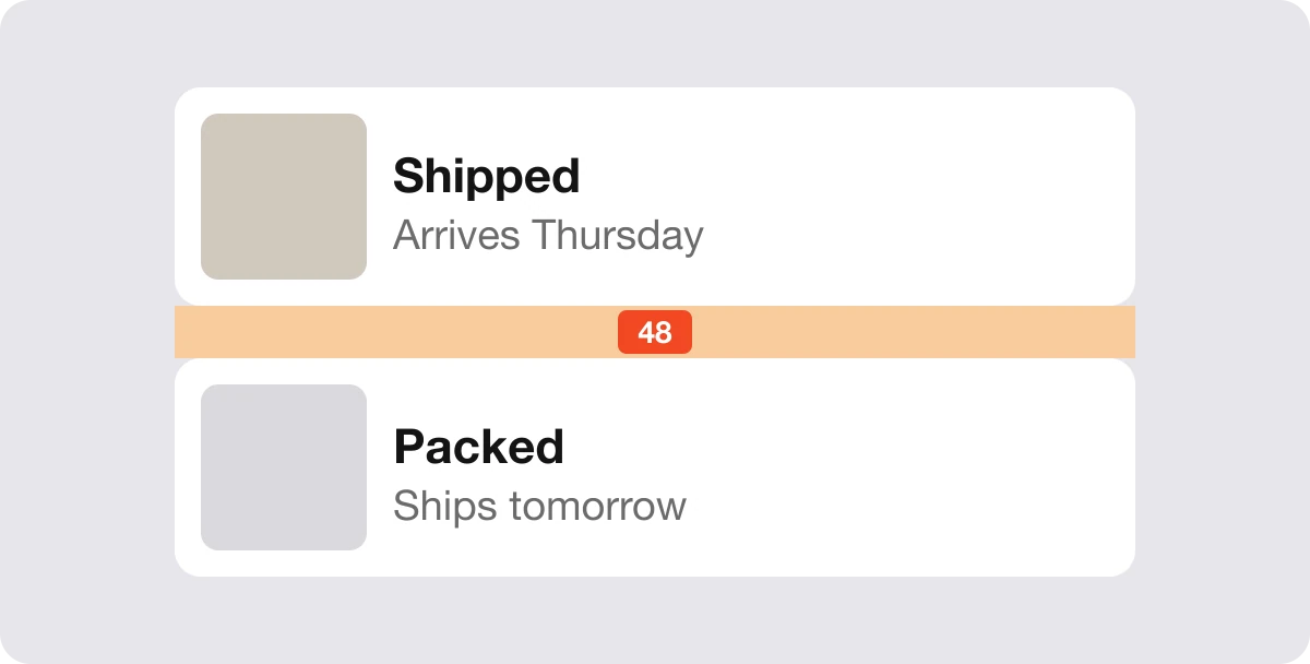
The orange band is the margin: 48 of space between the Shipped card and the Packed card. Neither card's background reaches into it. The margin does one job, which is to push a neighbor away.
Margin is the right tool when the space describes a relationship. How far is this card from the next one, how far is this heading from the paragraph above it. Change the margin and the boxes stay the same size. Change the padding and the box itself gets bigger.
Why padding changes the tap area
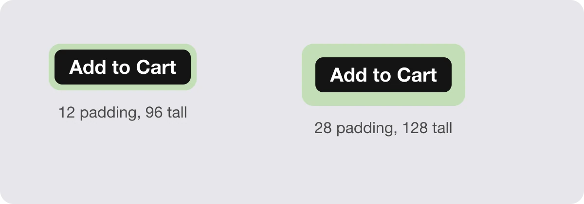
Both buttons carry the same label. The one with more padding is taller and wider, and the whole green area responds when someone taps it. Margin would not do this: space outside the button is not part of the button, so tapping it does nothing.
That is why a cramped button is a padding problem, not a spacing problem. Pad the button, then use margin or gap to keep it away from its neighbors.
The Figma trap: there is no margin
Figma auto layout has two spacing controls. Padding sits inside the frame. The gap sits between the items in it. There is no margin property.
So in Figma, map it like this: space inside a box is the frame's padding, space between boxes is the gap of the frame that holds them. When a developer reads the design, padding becomes CSS padding and the gap becomes margin or the gap property. Saying which one you mean in the handoff saves a round of questions.
The other trap: text boxes carry extra space
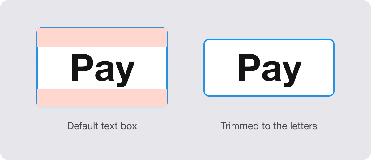
A text box holds extra space above and below the letters, so padding looks bigger than its number. You set 16 and the label looks like it has more, because the line height adds space you cannot see. In Figma, turn on vertical trim ("Cap height to baseline") and the box measures from the letters. CSS has text-box-trim for the same job.
Padding or margin: a quick table
| Situation | Use | Why |
|---|---|---|
| Space between a button's label and its edge | Padding | It is inside the box and the background fills it |
| Making a tap target bigger | Padding | Padded area responds to the tap |
| Space between two cards in a list | Margin or gap | It is between boxes |
| Space between a heading and the paragraph above | Margin or gap | It describes a relationship |
| Space inside a Figma frame | Padding | Auto layout padding |
| Space between items in a Figma frame | Gap | Auto layout has no margin |
FAQ
What is the difference between padding and margin?
Padding is the space inside a box, between its edge and its content, and the background fills it. Margin is the space outside the box, between it and its neighbors, and the background stops at the edge.
Does Figma have margin?
No. Auto layout has padding on the frame and a gap between items. Use gap for the space between boxes, and padding for the space inside one.
Does padding make a button bigger?
Yes. Padding is part of the box, so a button with more padding is larger and its whole area responds to a tap. Margin does not change the button's size.
Why does my padding look bigger than the number I set?
A text box holds extra space above and below the letters. Turn on vertical trim in Figma, or use text-box-trim in CSS, so the space is measured from the letters.
Is gap the same as margin?
Close, in practice. Both create space between boxes. Gap is set once on the container, margin is set on each item.
Sources
- The box model, MDN Web Docs: padding sits inside the border and the background extends under it, margin is the space outside the border that separates a box from its neighbors.
- Guide to auto layout, Figma Help Center: padding and the gap between items.
- text-box-trim, MDN Web Docs.
- First published as a carousel on UX Brainy.
Get new papers by email
New Brainy papers in your inbox. Confirm once, unsubscribe anytime.