Why Your Cards Look Junior: 6 Card UI Design Fixes
Six fixes that turn a junior card into a senior one: border or shadow, one main action, one image ratio, even padding, grouped details and fewer extras. Each shown side by side on a listing card, with the values.
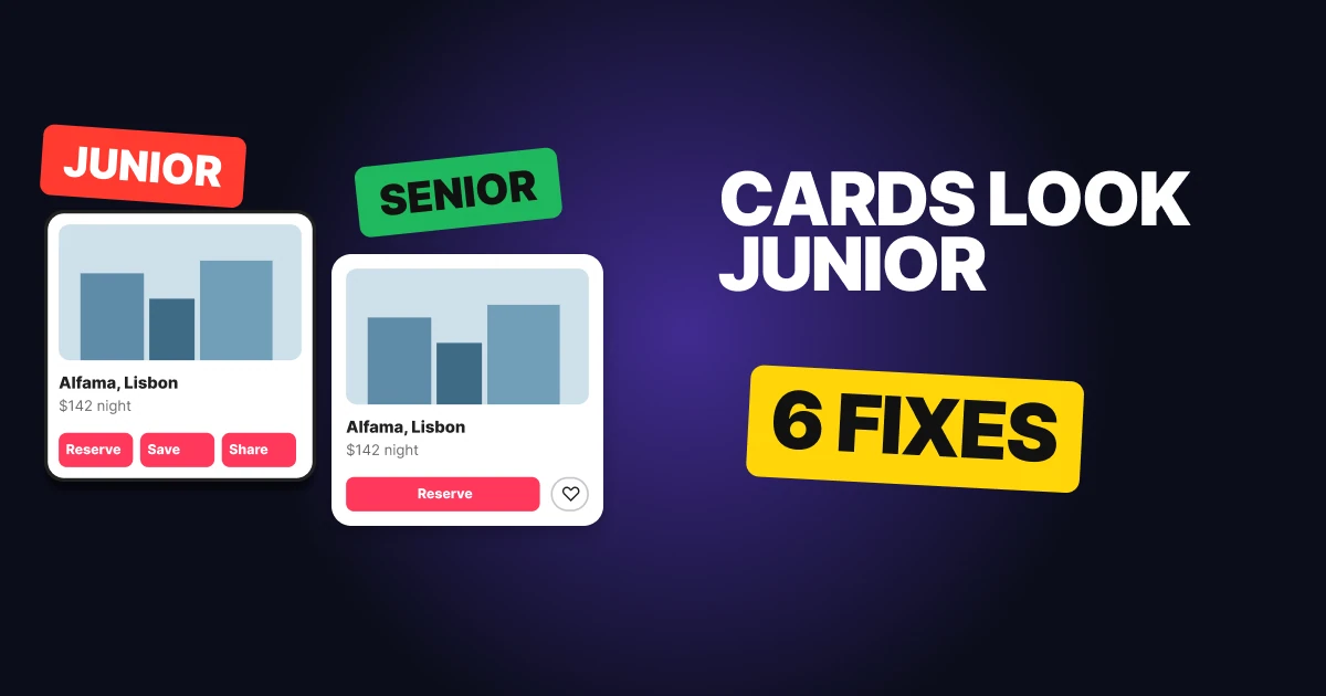
A card is a small bundle of information with one job: get someone to tap. Most cards that look junior fail for the same reason. They show everything at the same volume, so the eye has nowhere to land. Below are six fixes, each built side by side on a stay listing card, with the values you can copy.
1. Border or shadow, not both
Junior
Senior
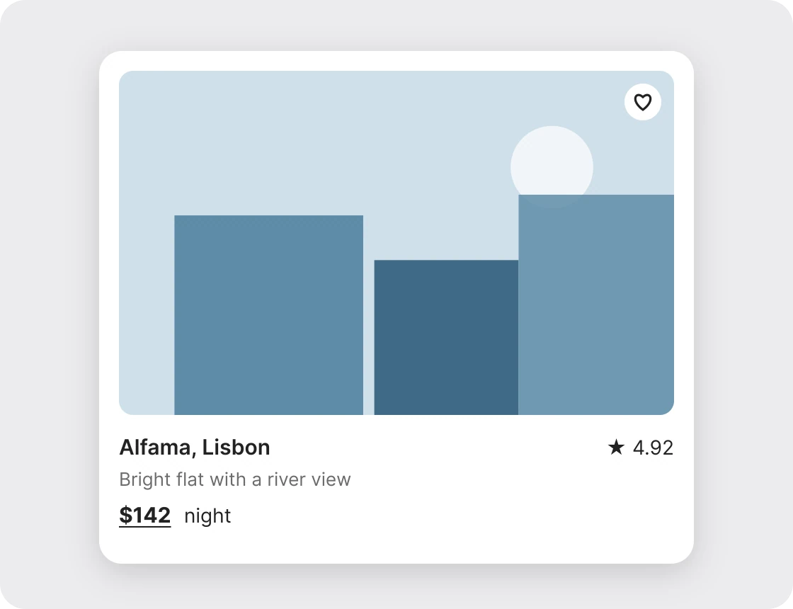
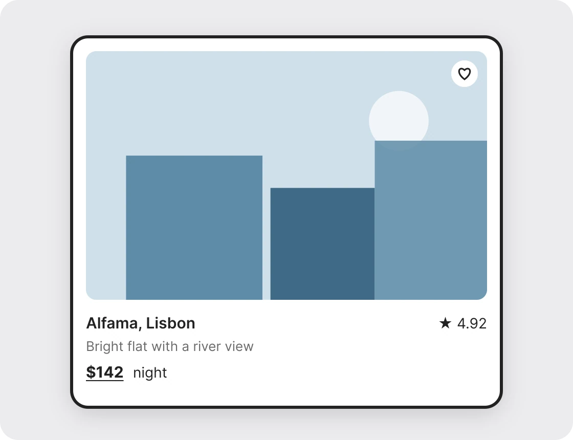
A heavy outline fights with the shadow under it, and together they make the card look boxed in. One soft shadow lifts the card off the page and lets the photo do the talking. If you prefer flat design, use a thin light border and no shadow. Pick one.
A soft shadow here means low opacity and a wide blur, about 16 percent black, blurred 24 and dropped 6 pixels. Anything darker starts to look like a sticker.
2. One main action
Junior
Senior
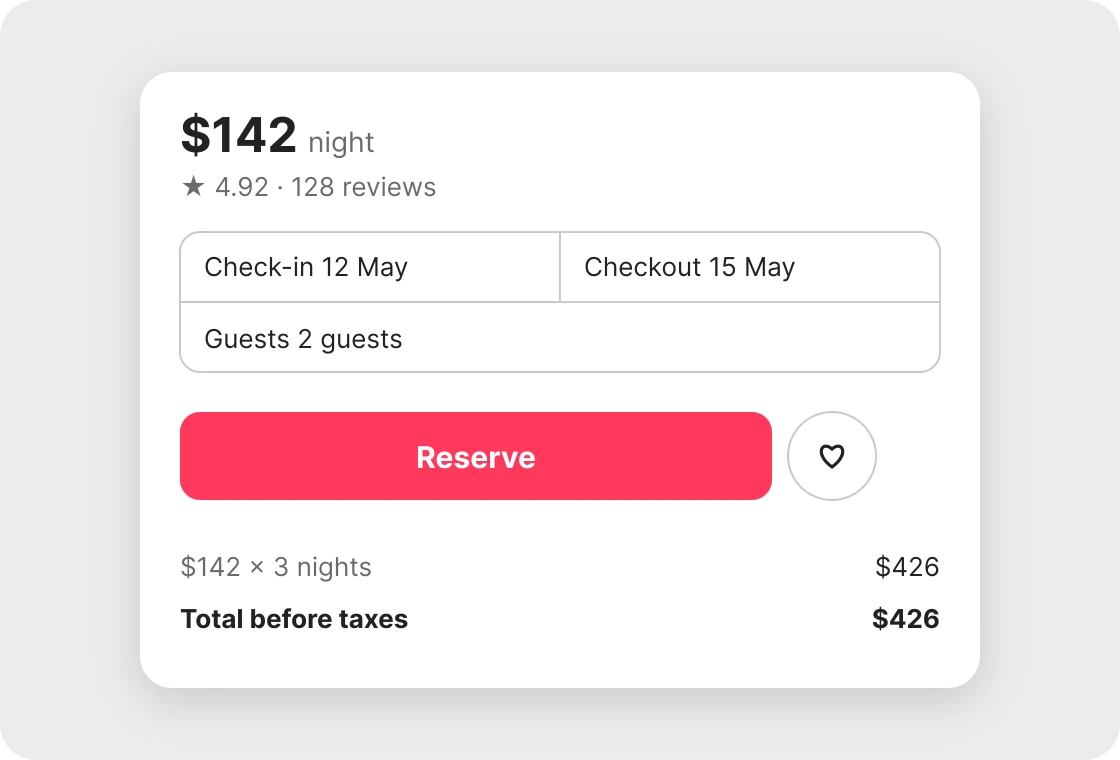
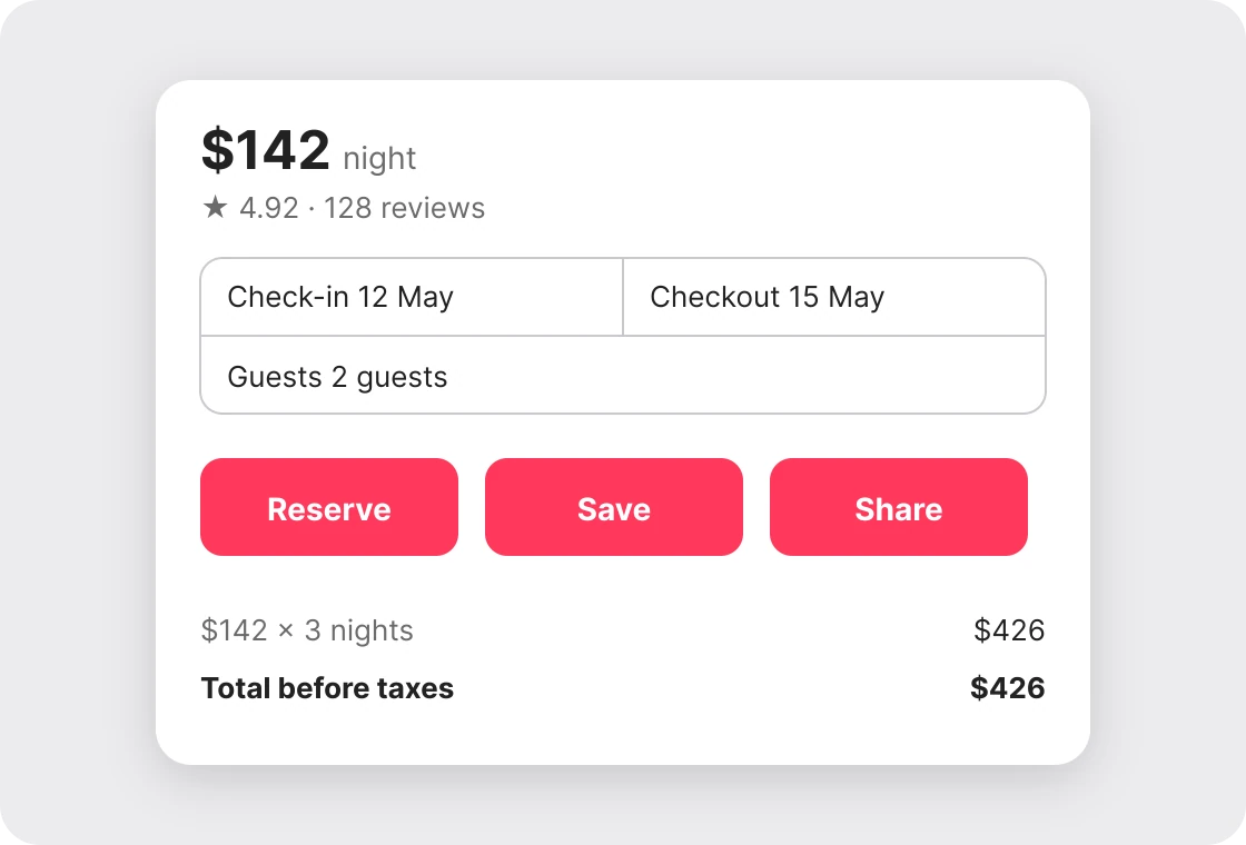
Three equal buttons ask the reader to decide before they can act. One filled button says what the card is for, and the small heart handles the quiet extra. Only the main action gets the loud color.
The test is simple. Cover the card and ask what the one thing is you want a tap for. That gets the filled button. Everything else is a ghost button or an icon.
3. One image ratio
Junior
Senior
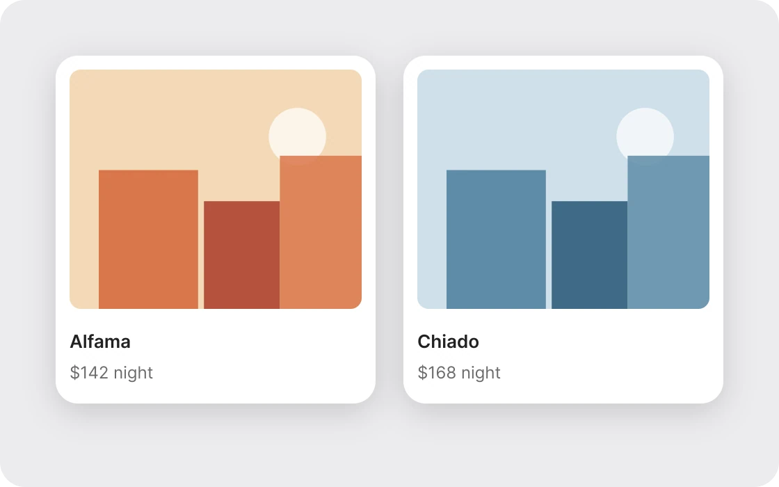
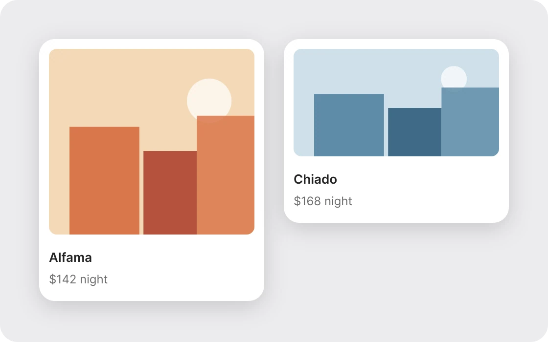
When photos change shape from card to card, the grid looks like a mistake. Pick one ratio and crop every image to it. Here it is 4:3, which suits a stay photo. This is a chosen value, not a standard, so use whichever ratio fits your content and keep it everywhere.
In Figma, set the image frame to a fixed ratio and fill it. In CSS, use aspect-ratio: 4 / 3 with object-fit: cover.
4. Pad evenly
Junior
Senior
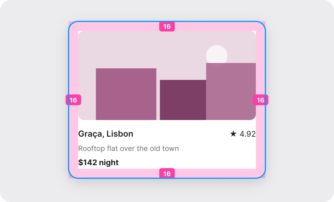
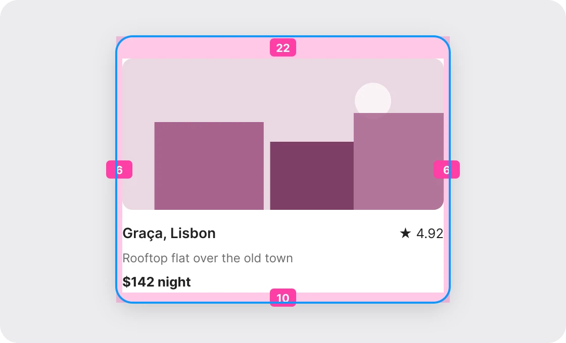
Uneven padding is the quietest way a card looks junior. A designer nudges things by eye and ends up with 6 on one side and 22 on another. Choose one number, here 16, and use it on all four sides. The pink bands and numbers show the padding the way Figma draws auto layout.
In Figma auto layout, set padding to 16 on the card frame. In CSS that is padding: 16px. If you need space between the pieces inside, use gap, not extra padding. The padding vs margin paper covers the difference.
5. Group the details
Junior
Senior
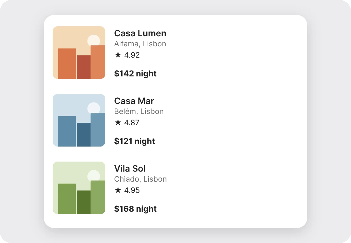
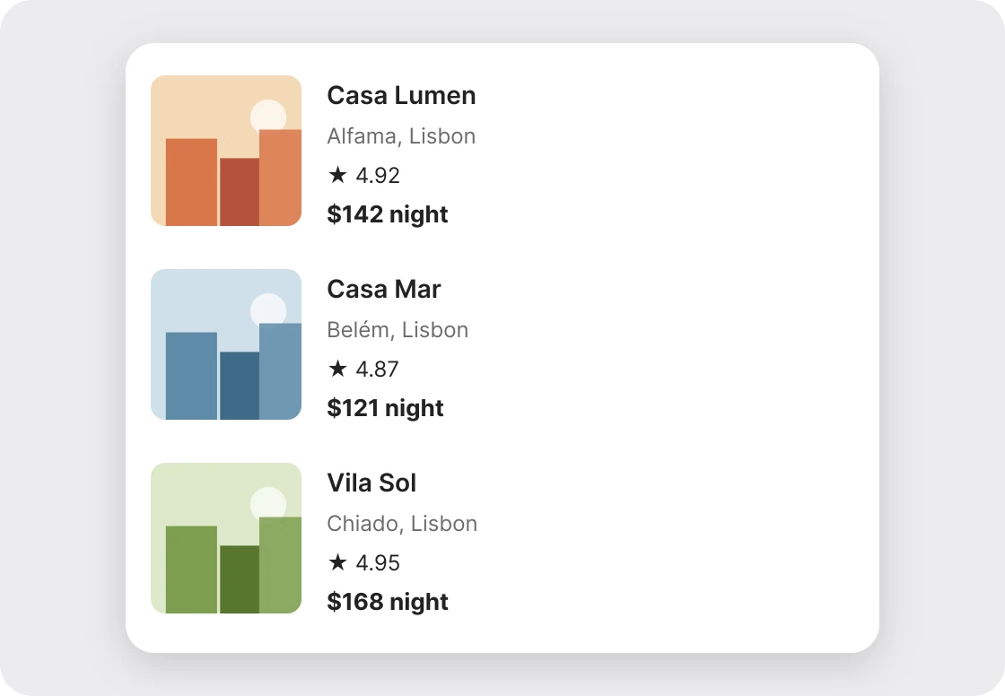
Equal spacing between every line makes four separate facts. Proximity tells the eye what belongs together. Name and place are one thought, so they sit close, and the price gets more room. No extra line or color needed.
6. Cut the extras
Junior
Senior
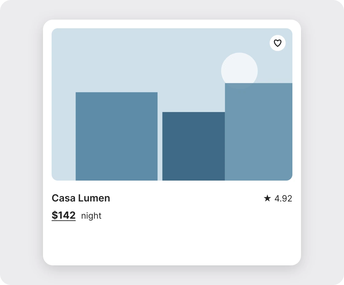
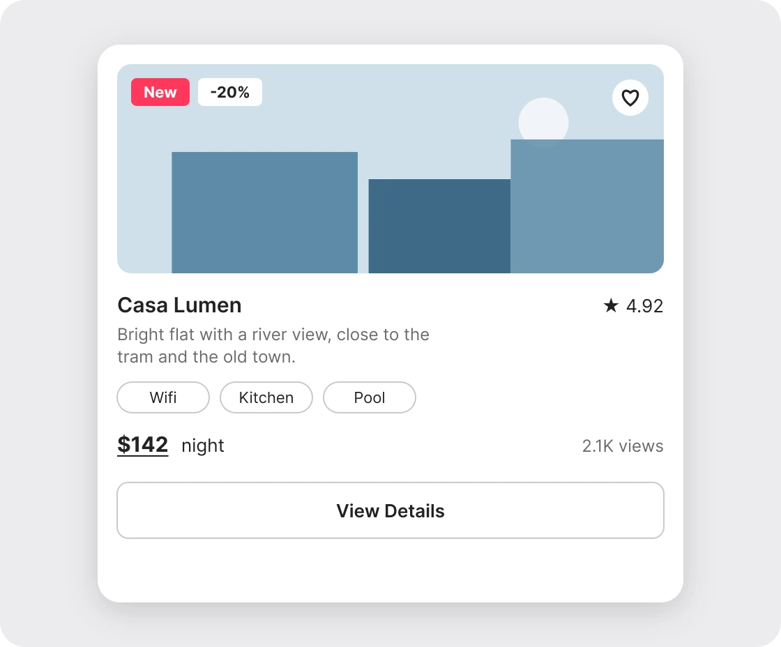
Every extra on a card competes with the price and the photo. Badges, chips, a view count and a second button belong on the detail page, where there is room. Name, price and rating is enough to decide whether to tap. The card is a doorway, so the whole card is the button and View Details is not needed.
The six fixes in one table
| # | Junior | Senior | Value |
|---|---|---|---|
| 1 | Outline and shadow | One soft shadow | 16% black, blur 24, 6 down |
| 2 | Three equal buttons | One filled button, one icon | One loud color per card |
| 3 | Mixed photo shapes | One ratio everywhere | 4:3 in this example |
| 4 | 6 left, 22 top | Same padding on all sides | 16 |
| 5 | Equal gaps between lines | Related details close, price apart | Tight for name and place |
| 6 | Badges, chips, views, extra button | Name, price, rating | Three facts |
FAQ
Should a card have a border or a shadow?
Pick one. A thin light border suits flat interfaces, and one soft shadow suits layered ones. Both together make the card look heavy.
How much padding should a card have?
Use one number on all four sides. 16 is a common choice for mobile cards, but the rule that matters is that it is the same on every side.
What aspect ratio should card images use?
Any ratio works as long as it is the same on every card. 4:3 is a good default for photos of places and products.
How many buttons should a card have?
One main action, shown as the filled button. Secondary actions, such as save or share, go in small icons or out of the card.
What should a listing card show?
A photo, the name, the price and a rating. Move everything else to the detail page.
How do I make cards look less amateur?
Remove things first. Drop the second outline or button, then even out the padding, then fix the image ratio. Most junior cards are fixed by cutting.
Sources
- Cards, Material Design 3: a card holds content and actions about a single subject, and should keep its actions limited.
- Explore auto layout properties, Figma Help Center: padding and gap.
- aspect-ratio, MDN Web Docs.
- The listing card follows the shape of Airbnb's stay cards (photo with a heart, star rating, price before "night"). Names, prices, ratings and review counts are invented examples. The 4:3 ratio and the 16 padding value are chosen values, not standards.
- First published as a carousel on UX Brainy.
Get new papers by email
New Brainy papers in your inbox. Confirm once, unsubscribe anytime.