Job Search App Design: Show the Salary in the List (Before and After)
A job search home that hides the pay behind "Salary: see posting" on every row, and the same screen fixed: one search field, a row of filters that swipes, a top match and a real salary on every job. Every change side by side, with the free Figma file.
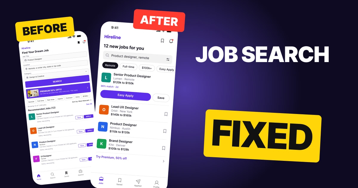
A job search home has one job: let a candidate decide which postings are worth opening. The first draft below has everything a candidate needs, and it still fails that job. Every row says "Salary: see posting" at 8 px, so the one number people compare is behind a tap, on every job.
The fix keeps every function and changes the order and the weight. One search field replaces a three field form, the filters become a row that swipes, the best match gets a block with its pay and one tap to apply, and every other job is a flat row with a title, a place and a real number.
The whole screen, before and after
Junior draft
Fixed
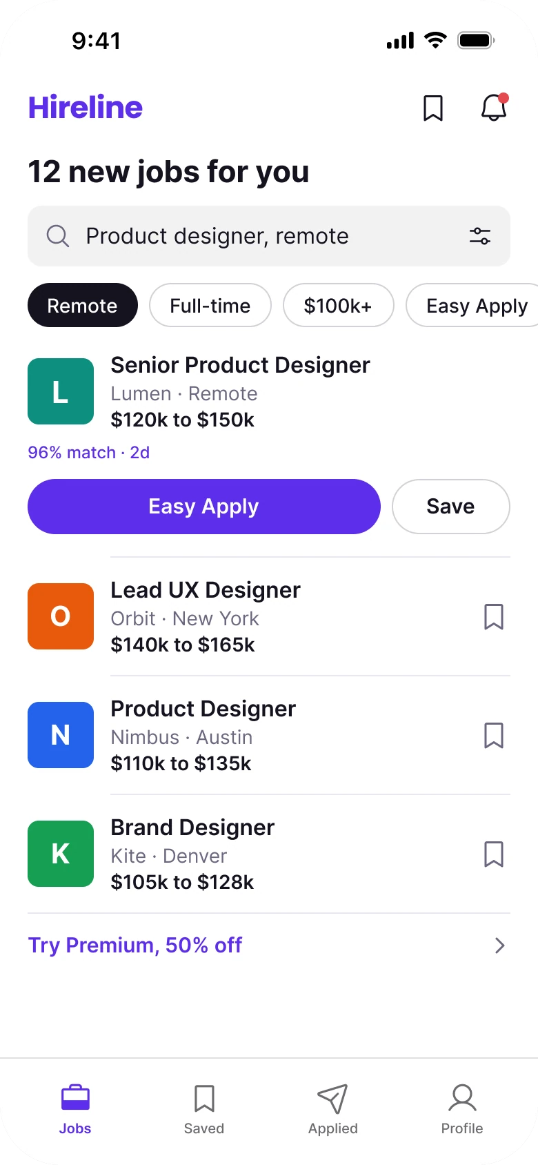
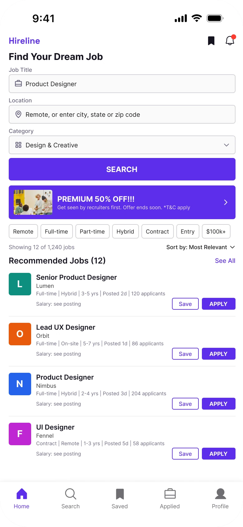
On the left, everything has the same weight. A form, a sale banner, seven chips, a sort line and four rows with four buttons each all ask for attention at once, and the answer to the candidate's real question, what does it pay, is the faintest text on the screen.
On the right, the screen reads in the order a candidate thinks: how many jobs, what am I searching for, which filters are on, what is the best match, what else is there.
Count what the eye has to process above the first job. The draft has three labels, three fields, a button, a banner, seven chips and a sort line: sixteen things before the first title. The fixed screen has a heading, one field and one row of chips: three. The first job starts near the middle of the draft and at the top third of the fix.
What changed, measured
| Junior draft | Fixed | |
|---|---|---|
| Salary | "Salary: see posting" at 8 px on all four rows | A real range on all four jobs, same weight as the title |
| Search | Three fields (Job Title, Location, Category) and a caps SEARCH button | One 44 px field with the filter icon inside |
| Filters | Seven chips, none selected, all visible at once | A row of 32 px chips that swipes off the edge, Remote selected |
| Jobs | 36 px logo tile, 8 px spec line, Save and APPLY on every row | 48 px logo, 16 px title, 14 px text, one bookmark |
| Offer | "PREMIUM 50% OFF!!!" banner with a photo under the form | One text row under the list |
| Margins | 14 left, 12 right | 20 on both sides |
| Tabs | Five, mixed filled and outline icons | Four, one style, flat bar with a hairline |
Fix 1: fold the form into one field
Before
After

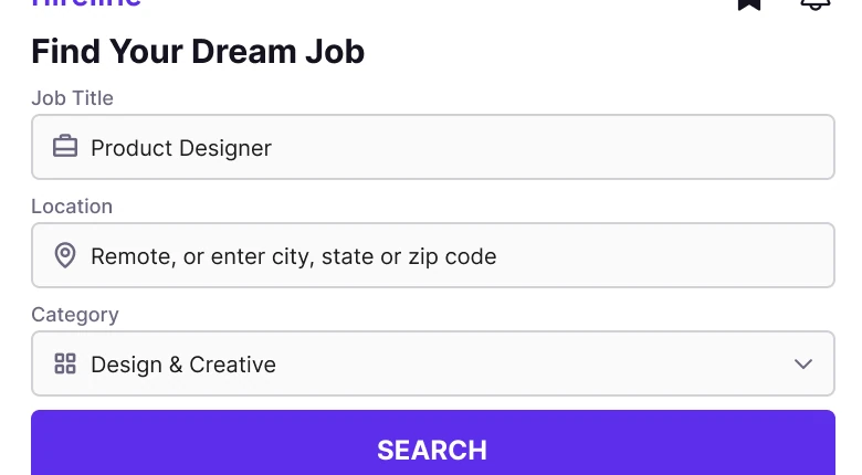
The top of the draft: the heading Find Your Dream Job, then Job Title, Location and Category, each with a label, a bordered field and an icon, and a full width purple SEARCH button in caps. Against one grey field reading Product designer, remote with a search icon on the left and a filter icon on the right.
The draft asks three questions before it shows a single job. Most of the time a candidate already knows the first one, and the other two are filters, not requirements.
The fix is one field, 44 px tall, radius 10, on a #F2F2F2 fill. The role and the place go in the same line. Category, Part-time, Entry level and Sort moved behind the filter icon, so they are still reachable but not on the screen all the time. The SEARCH button is gone because the list under the field already is the result.
Rule to reuse: if a form has no required field, it is a search field with filters.
Fix 2: seven chips become a row that swipes
Before

After

Seven small outlined chips, Remote, Full-time, Part-time, Hybrid, Contract, Entry and $100k+, all the same, none selected. Against four larger pills, Remote filled in black, then Full-time, $100k+ and Easy Apply, the last one cut off by the screen edge.
Seven chips in a row of tiny text tell the candidate nothing about the current state. Nothing is selected, so you cannot tell whether the list below is filtered.
The fix makes the chips 32 px tall and lets the row run off the edge. A cut off chip is the cue that it swipes. Remote is filled in ink, so the active filter is the only dark thing in the row, and Hybrid and Contract are still there, one swipe away.
Rule to reuse: a filter row should show state first and options second.
Fix 3: give the best match its own block
Before

After
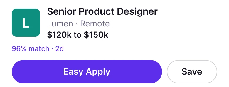
The first row of the draft: a 36 px L tile, Senior Product Designer, Lumen, a spec line reading Full-time, Hybrid, 3 to 5 yrs, Posted 2d, 120 applicants, then Salary: see posting with a Save and an APPLY button. Against a 48 px tile, the same title at 16, Lumen and Remote, 120k to 150k dollars in bold, a violet 96% match line and a full width Easy Apply pill beside Save.
In the draft the first job looks like every other job, and the only number it shows is how many other people applied. The fix treats the best match as the one decision the screen wants: a logo, a title, a place, the pay, why it matches, and one tap to apply. This follows the way LinkedIn Jobs and Indeed lead with a top result.
The hours, years of experience and applicant count did not vanish. They move to the job's own page, which is where a candidate who is already interested will look for them.
Rule to reuse: one row gets the call to action, the rest get a bookmark.
Fix 4: a real number on every row
Before

After

A draft row for Lead UX Designer at Orbit: a 36 px O tile, a title and company, a grey spec line, Salary: see posting at 8 px, a Save button and an APPLY button. Against the fixed row: a 48 px tile, Lead UX Designer, Orbit and New York, 140k to 165k dollars in bold, and one outline bookmark.
This is the change in the cover line. In the draft a candidate has to open a posting to learn the pay, then go back, then open the next one. The cost of finding out is a tap and a screen load per job, and a candidate who is comparing four jobs pays it four times.
The fix puts the range where the eye lands after the title and sets it in the same bold weight. Each row is three lines: title, company and place, pay. A row with three lines is a row a candidate can compare at a glance.
Showing pay is also becoming the rule in more places. California's SB 1162 requires employers with 15 or more employees to include the pay scale in job postings, and the EU's Pay Transparency Directive (2023/970) gives applicants the right to pay information before the interview. A design that hides the salary is working against where the law is going.
Rule to reuse: put the number people compare in the list, not behind the tap.
The smaller fixes
- Every function stays. Search and the filter icon sit in one field. Category, Part-time, Entry and Sort are behind the filter icon, and Hybrid and Contract swipe in the chips. Save is the bookmark on every job, and APPLY is Easy Apply on the top match and inside each job.
- The sale banner is one line. "PREMIUM 50% OFF!!!" with a photo sat between the search button and the results. It is now "Try Premium, 50% off" as a text row under the list, so the offer is still there and no longer competes with the search.
- One margin. The draft has 14 px on the left and 12 on the right. The fixed screen uses 20 on both sides.
- One accent. A single violet (#5D2EEA) is used for the wordmark, Easy Apply, the match line and the active tab. The draft used it on the wordmark, a button, a banner and links.
- No cards, no shadows, no photo. Rows are separated by a hairline, and the logos are plain letter tiles with radius 8.
- A calmer tab bar. Five tabs with mixed filled and outline icons become four tabs in one style. Home and Search became the Jobs tab, and the Saved tab opens the same list as the bookmark in the header.
Audit your own job search screen
| Question | Why it matters |
|---|---|
| Can a candidate see the pay without opening a posting? | The number people compare should be in the list |
| Is there one search field, or a form? | A form with no required field is a search with filters |
| Does the filter row show which filter is on? | State first, options second |
| Does one job get the primary action? | Four equal APPLY buttons are four equal choices |
| Is the sale banner above the results? | An offer between the search and the list slows the search |
| Is there one margin and one accent color? | Consistency makes a dense list readable |
Get the Figma file
The free file has the junior draft, the fixed screen and every part as a component.
Free Figma file
Job search redesign, before and after
Both screens and every part as a Figma component. Free, view only, duplicate it to your drafts.
FAQ
How should a job search app home screen be designed?
Lead with one search field with a filter icon inside, a swipeable row of filters with the active one selected, then a top match with its pay and one apply button, then flat rows. Each row should show the title, the company and place, and the salary.
Should a job listing show the salary?
Yes. The salary is the number candidates compare, so it belongs in the list at the same weight as the title. California's SB 1162 and the EU Pay Transparency Directive both point toward pay being shown up front.
How many filters should a job search app show?
Show a handful as chips that swipe and put the rest behind a filter icon. The active filters should look different from the inactive ones, so the candidate can tell the list is filtered.
Should every job card have an Apply button?
Not on the list. Give the best match an Easy Apply button and give every other row a bookmark. Apply is the action inside a job, where the candidate has the details.
Sources
- Both screens are our own, designed and measured in Figma. The app, Hireline, the companies (Lumen, Orbit, Nimbus, Kite, Fennel), the salaries, the 96% match and the applicant counts are made up. Companies are letter tiles, no real logo is used.
- Pay in postings: California SB 1162 (pay scale in job postings for employers with 15 or more employees) and Directive (EU) 2023/970 on pay transparency.
- Pattern studied: the top result and rows in LinkedIn Jobs and Indeed.
- Icons are from Phosphor (MIT). The wordmark is Poppins Bold. The draft's banner photo is by Moe Magners on Pexels.
- First published as a carousel on App Brainy.
Get new papers by email
New Brainy papers in your inbox. Confirm once, unsubscribe anytime.