Live Scores App Design: A Sports Home Screen Redesign, Before and After
A sports app that shows every match at the same size, and the same live scores screen fixed: three date tabs, one live card with a 40 px score, matches grouped by league and a clear header. Every change side by side, with the free Figma file.
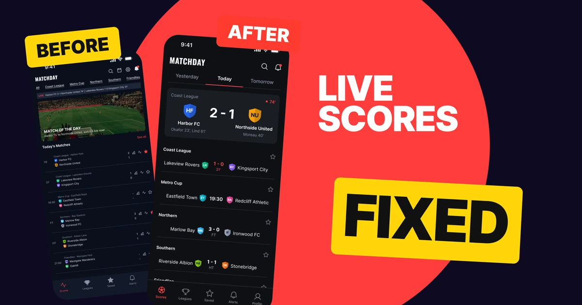
A live scores app has one job on its home screen: show the number. The first draft below has every match, every stat and every league, and the score is the smallest thing on the screen. Team names and scores both sit at 9 px, four icons crowd the header, and six league tabs show nothing selected.
The fix keeps every function and changes what gets size. The live match becomes one card with a 40 px score, the date becomes three tabs, and the other matches are grouped under their league.
The whole screen, before and after
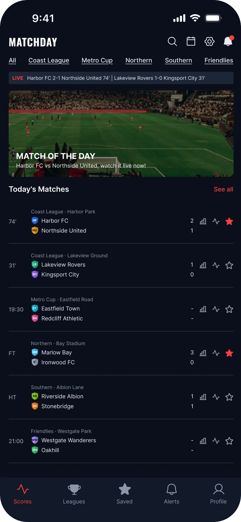
Junior draft
Fixed
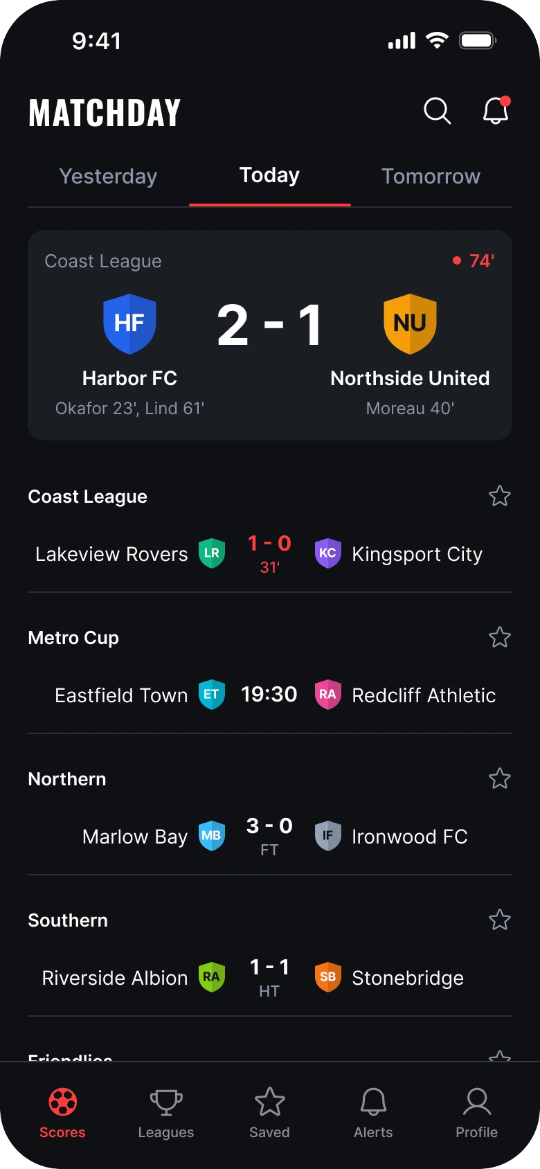
On the left, everything is the same size. The ticker, the banner, the tabs and six rows ask for attention together, and a fan who opened the app for one number has to read to find it. Matchday, a made-up app with made-up clubs, is the test case. Harbor FC against Northside United is 2-1 at 74 minutes on both screens.
On the right there is an order: the app, the day, the match in play, then the rest of the day by league. The red is used twice, on the live minute and on live scores, so it means "this is happening now".
What changed, measured
| Junior draft | Fixed | |
|---|---|---|
| Score | 9 px, same weight as the team name | 40 pt bold in the live card, 15 pt in rows |
| Margins | 14 left, 12 right | 20 on both sides |
| Header | Wordmark, search, calendar, gear and bell | Wordmark, search, bell |
| Navigation | Six 10 px text tabs, nothing selected | Three date tabs in a 44 px row, 2 px red underline |
| Live match | An 8 px ticker and a 140 px stadium banner | One 350 x 152 card at radius 12 |
| Crests | Small, beside the name | 48 px in the card, 24 px in rows |
| Rows | Six at 71 px, with stats icons and a ground line | 56 px, name, crest, score, crest, name |
| Grouping | A league label repeated on every row | One 13 pt header per league, with a star |
| Tabs | Five, mixed filled and outline icons | Five, flat, in a full-width 78 px bar |
Fix 1: clear the header
Before

After

A small Matchday wordmark with four icons to its right, a search glass, a calendar, a gear and a bell with a red dot, against a larger wordmark with only a search glass and a bell.
The draft header holds five things in one row: the wordmark and four 18 px icons. Search, calendar, settings and alerts all look alike, and none of them is the reason someone opened the app.
The fix keeps two actions, search and the bell, at 24 px with no circles around them. The calendar became the date tabs, the gear moved to the Profile tab, and alerts stay in both the bell and the tab bar. Nothing was deleted. Each thing moved to where it is easier to find.
Rule to reuse: a header is for the name and the two things people do on every visit. If a function has a tab or a better home, take it out of the header.
Fix 2: three date tabs instead of six leagues
Before

After

A row of six small underlined links, All, Coast League, Metro Cup, Northern, Southern and Friendlies, with none of them marked, against a row of three tabs, Yesterday, Today and Tomorrow, with Today in bold and a red underline.
Six underlined links at 10 px read as links, not tabs, and nothing is selected, so a reader cannot tell what they are looking at. Leagues are also the wrong first question. In a scores app most people want to know what is on today, and only then in which league.
The fix asks about time first. Yesterday, Today and Tomorrow sit in a 44 px row, the current day is bold, and a 2 px red underline marks it. Three tabs fit a thumb and say where you are.
The leagues did not disappear. They became the group headers in the list, so the same five names are still there, in the place they belong.
Rule to reuse: a tab row is a statement of where the person is. If nothing in it is marked, it is a list of links.
Fix 3: one card for the live match
Before
After
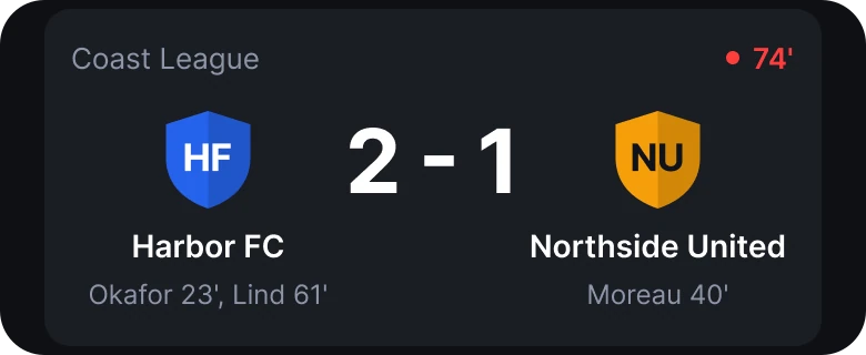
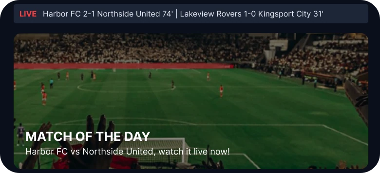
A thin LIVE ticker with two scores in small text above a photo banner of a football pitch reading Match of the Day, against one flat dark card with the league name, a red 74 minute marker, two 48 px shield crests, the score 2 - 1 at 40 pt, both team names and the scorers underneath.
The draft shows the live match three times: in the ticker, in the banner and again in the first row. The ticker is 8 px, the banner is a photo of a pitch with no pitch information in it, and the score is the one piece of text that is missing from the banner. A stadium photo is decoration here, and it pushes the list down by 140 px.
The fix replaces all three with one flat card on a slightly lighter ground. The league name and the red live minute sit at the top. The crests are 48 px, the score is 40 pt bold between them, the team names are 14 pt, and the scorers are 12 pt in gray underneath, Okafor 23', Lind 61' and Moreau 40'. A fan can read the score, the minute and who scored in one glance, with no photo.
Rule to reuse: show an important number once, large, with its context beside it. Showing it three times at 9 px is not emphasis.
Fix 4: group the list by league
Before
After
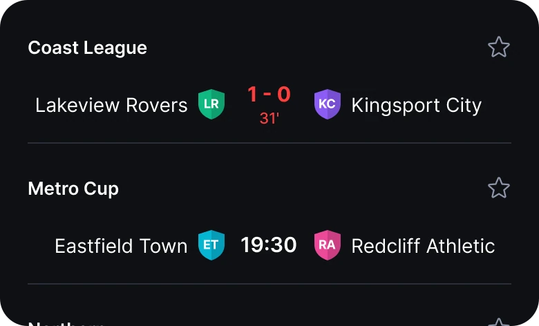
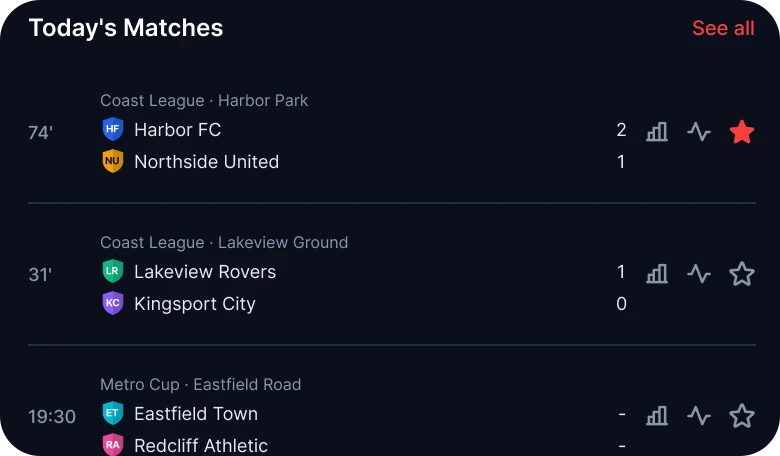
A Today's Matches list where each row carries a small league and ground line above two stacked team names, two stacked 9 px scores and three icons at the right, against rows grouped under bold league headers with a star, each row one line: the home team, a crest, the score or time in the middle, a crest and the away team.
A draft row carries a league and ground line, two stacked team names, two stacked scores, a stats icon, an activity icon and a star. That is eight pieces per match at 71 px, and the league name is repeated even when two rows share it.
The fix moves the league to a header, once, at 13 pt semibold with a star to follow the whole league. A row is then one line at 56 px: the home team right-aligned, a 24 px crest, the score or kick-off time centered at 15 pt, a second crest and the away team. Lakeview Rovers 1-0 Kingsport City sits in the middle with its 31' under it in red, and Eastfield Town against Redcliff Athletic shows 19:30 in the same place.
Because the score sits in the middle of every row, the eye can run down the center and read all the results without moving sideways. The stats and ground line moved to the match page, one tap on any row.
Rule to reuse: put the answer in a fixed column. If every row shows its score in the same place, a list reads like a table.
The smaller fixes
- Every function stays reachable. Search and the bell stay in the header, the calendar is the date tabs, the gear is in Profile, the stats icons are on the match page, and the six matches are all still there, with Harbor FC as the live card and the rest under the tab bar.
- Even margins. The draft has 14 px on the left and 12 on the right. The fix uses 20 on both sides.
- A flat ground. The screen is one dark ground, #0F1115, with the card on #1A1D24. There is no gradient, glow, blur or shadow.
- Red means live. Brand red, #FF3D3D, sits only on the live minute and live scores, so it works as a signal.
- A real type scale. Text runs from 12 to 40 pt, against the draft's 8 to 17 px.
- A calmer tab bar. Five flat icons in a full-width bar, with the list running under it so the screen never ends in a wall.
Audit your own scores screen
| Question | Why it matters |
|---|---|
| Is the score the biggest text on the screen? | It is the reason someone opened the app |
| Is the live match shown once? | Three copies at small sizes lower each other |
| Does the tab row show where you are? | A row with nothing selected is a list of links |
| Is the league named once per group? | Repeating it on every row adds noise |
| Is every score in the same column? | A fixed column lets the eye scan results |
| Is red reserved for what is live? | If everything is red, nothing is urgent |
| Does the header hold only what people use every visit? | Four equal icons hide the two that matter |
Get the Figma file
The free file has the junior draft, the fixed screen and every part as a component.
Free Figma file
Live scores home screen redesign, before and after
Both screens and every part as a Figma component. Free, view only, duplicate it to your drafts.
FAQ
How should a live scores app home screen be designed?
Open with three date tabs, then one card for the match in play with the score at the largest size on the screen. Below it, group the other matches under league names, one line per match with the score in the center.
What size should the score be in a sports app?
In this redesign the live score is 40 pt bold in the card and 15 pt in the list rows, against 9 px in the draft. The score should be larger than the team names in every place it appears.
Should a live scores app show leagues or dates first?
Dates first. Most people want to know what is on today, so Yesterday, Today and Tomorrow come first, and leagues become group headers in the list.
How do you show a live match in a scores app?
Show it once, in one card, with the league, the live minute, both crests, the score and the scorers. Mark the live minute in the brand color so it stands out from finished matches.
How many icons should a sports app header have?
Two is enough here: search and alerts. Calendar and settings have better homes in the date tabs and the profile tab.
Sources
- Both screens are our own, designed and measured in Figma. The app, Matchday, and every club, player and ground are made up.
- Pattern studied: how FotMob lays out a scores day, with date tabs, league groups and one score column.
- Photo of the pitch in the draft from Pexels by Eslam Mohammed Abdelmaksoud. Icons are from Phosphor (MIT). The wordmark is set in Oswald Bold.
- First published as a carousel on App Brainy.
Get new papers by email
New Brainy papers in your inbox. Confirm once, unsubscribe anytime.