Send Money Screen Design: A Transfer Screen Redesign, Before and After
A transfer screen that asks for everything at once, and the same screen fixed: an 88 px amount, a bare keypad, faces instead of a search box, one fee line and one Send button. Every change side by side, with the free Figma file.
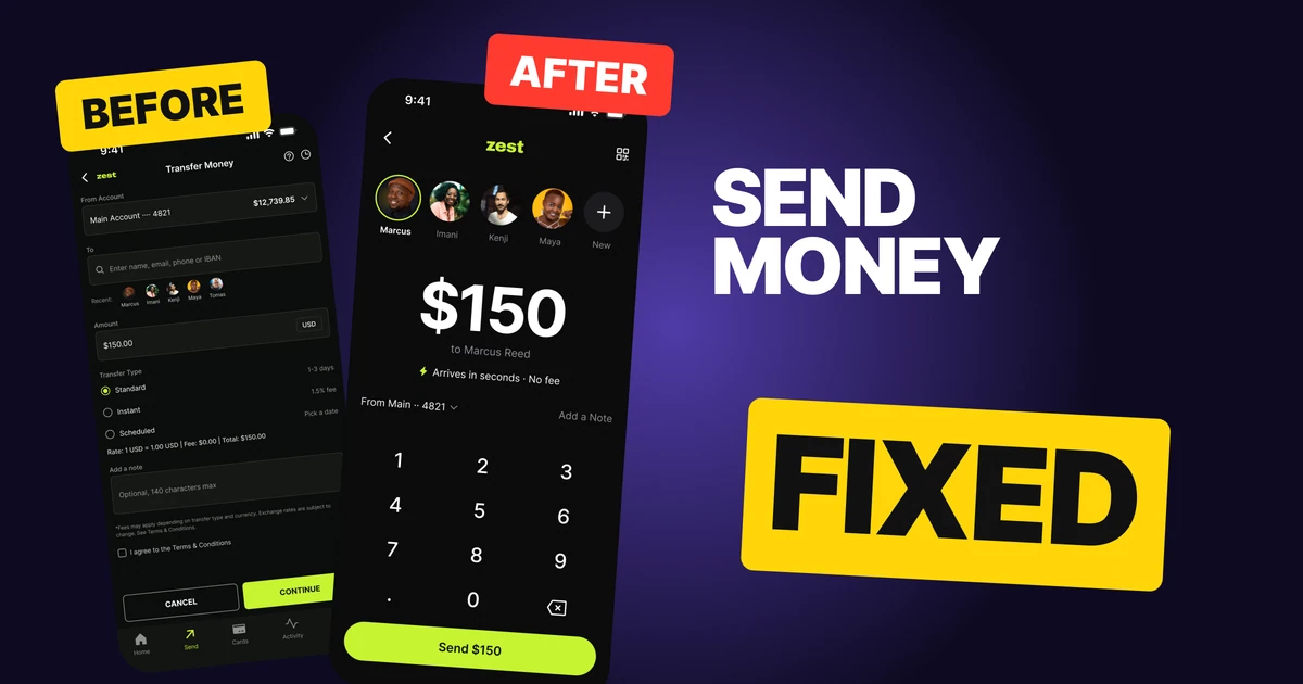
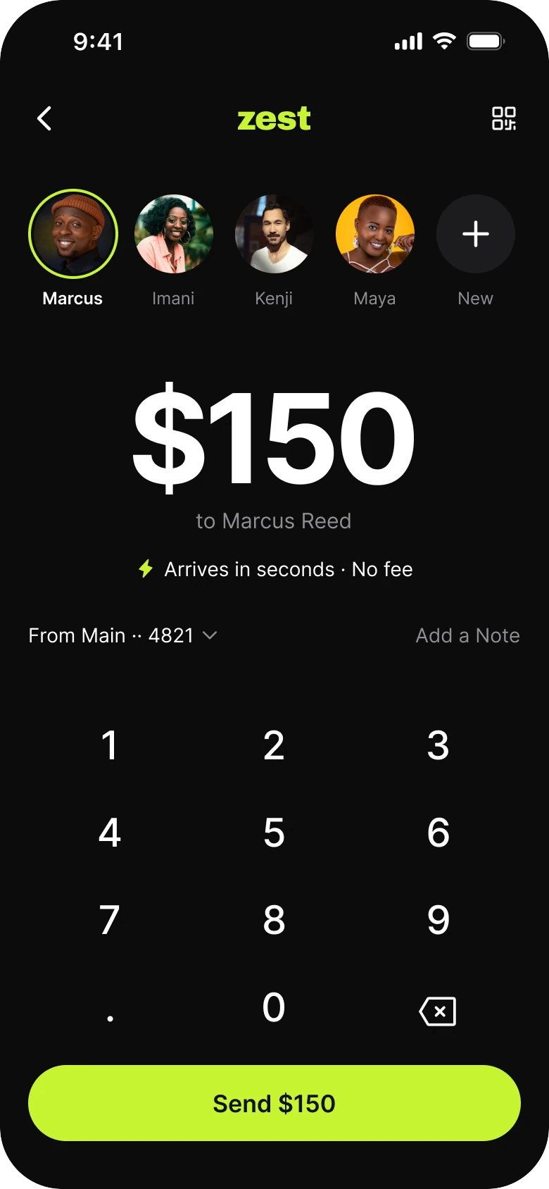
A send money screen has one job: let a person move an amount to someone and feel sure it went to the right place. The first draft below makes that a form. It asks for an account, a recipient, an amount, a transfer type, a note and a checkbox before it lets anyone press a button.
The fix keeps every function and changes what comes first. The amount becomes the hero, the people become faces, the fee becomes a sentence and the button repeats the number.
The whole screen, before and after
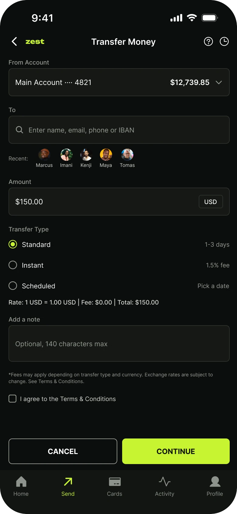
Junior draft
Fixed
On the left, everything is the same size and almost nothing is the point. The amount, the thing the person came to set, sits in a 12 px field. The fee is in a rate line and in 8 px small print. CANCEL is as big as CONTINUE, so the screen treats giving up as an equal choice.
On the right there is an order: who, how much, what it costs and when it lands, then the one button. Zest is a made-up app, and the numbers are the same on both sides: $150, a main account ending 4821, a balance of $12,739.85.
What changed, measured
| Junior draft | Fixed | |
|---|---|---|
| Amount | 12 px text in a 46 px field | 88 pt at -4% tracking, centered |
| Entering it | The system keyboard over the form | A bare keypad, 28 pt digits on 62 px rows |
| Recipient | A search field and five 20 px recents | Five 56 pt faces, a 2 px lime ring on the chosen one |
| Fee | A rate line and 8 px small print | One 14 px line: Arrives in seconds, no fee |
| Other speeds | Three radio buttons always open | One tap behind the arrival line |
| Margins | 14 left, 12 right | 20 on both sides |
| Header | Back, wordmark, title, help, history | Back, wordmark, scan |
| Buttons | CANCEL and CONTINUE, both 42 px tall | One 54 pt full-width lime Send pill |
| Tabs | Five, mixed filled and outline icons | None |
Fix 1: make the amount the hero
Before

After

A small dark field labeled Amount holding $150.00 in small white text with a USD chip at the right, against the number $150 in huge white type centered on the screen with the words to Marcus Reed in gray under it.
A person opening a transfer screen already knows two things: who and how much. The draft gives the amount the smallest type on the screen, 12 px inside a field with a USD chip, so the most important number is the hardest to read.
The fix sets it at 88 pt, centered, with slightly tight tracking so five characters read as one shape. Under it, "to Marcus Reed" in gray says whose money this is. The number is now the thing you look at, and also the thing you check before you press send.
The keypad is bare: digits at 28 pt on 62 px rows, with no key backgrounds. There is no field to tap into, because the number is the field. The pattern follows what Cash App does with its amount and keypad.
Rule to reuse: on a payment screen, set the number the person is responsible for at the largest size on the page.
Fix 2: faces instead of a search box
Before
After

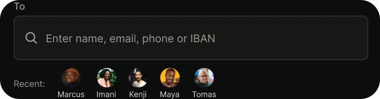
A To label above a search field reading Enter name, email, phone or IBAN, with a row of five tiny avatars and names under it, against a row of five large round photos with names, a thin lime ring around Marcus, and a plus button labeled New.
The draft asks the person to type a name, an email, a phone number or an IBAN. For someone who sends money to the same few people, that is the slowest possible start. Their recents are already there, at 20 px, below the field, where they read as a footnote.
The fix removes the search field from the first view and makes the recents the screen. Five 56 pt faces fit across the width, so picking Marcus is one tap. A thin 2 px lime ring marks the person who gets the money, and his name goes to full white while the others stay gray.
Faces do a second job: a photo of someone you know is a quicker check than a typed name. The full search is still there, behind the New button at the end of the row.
Rule to reuse: if most visits go to the same few destinations, show those destinations first and put search behind them.
Fix 3: say the fee and the arrival out loud
Before
After

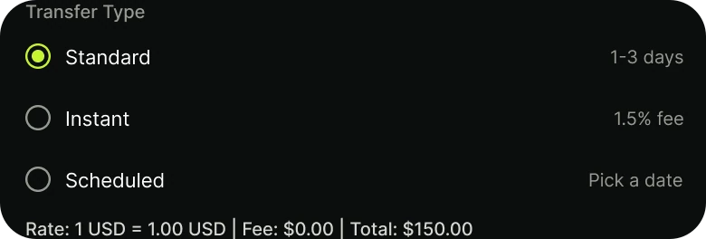
A Transfer Type list with three radio buttons, Standard at 1 to 3 days, Instant with a 1.5% fee and Scheduled with Pick a date, then a rate line reading Rate 1 USD equals 1.00 USD, Fee $0.00, Total $150.00, against a single line with a lightning bolt reading Arrives in seconds, No fee, and a From Main 4821 row with Add a Note at the right.
A money screen fails when the person has to work out what it costs. The draft shows three transfer types, each with its own time or fee, then a rate line, then an asterisk, then the real warning in 8 px small print. A reader has to combine four pieces of text to answer a two-word question: how long, and how much.
The fix answers it in one 14 px line with a lightning bolt: "Arrives in seconds, no fee". It follows the way Wise puts the cost and the arrival up front. The other speeds, Standard, Instant and Scheduled, sit one tap behind that line, so nobody loses a choice.
The no-fee line is true here because Zest to Zest is instant and free in this made-up app. In the draft the same transfer lists a 1.5% fee for Instant to other banks, so the screen has to be built around the fact it is showing.
The From row shrinks to a plain line, "From Main 4821", with a chevron. The note becomes the Add a Note text on the same row.
Rule to reuse: if the answer to "what does this cost and when does it land" takes more than one line, the screen is hiding it.
Fix 4: one button that repeats the number
Before

After

Two buttons of the same size side by side, an outlined CANCEL and a lime CONTINUE, against one wide lime pill reading Send $150.
CANCEL and CONTINUE are both 42 px tall and take up the same width. That makes leaving as loud as going on, and CONTINUE says nothing about what happens next. On a money screen, a button that does not say what it does is a reason to hesitate.
The fix is one 54 pt full-width lime pill that reads "Send $150". The button names the action and repeats the amount, so the last thing a person reads before pressing is the number they typed.
CANCEL does not vanish. It is the back chevron at the top left, where every other screen puts it.
Rule to reuse: name the verb and the value on the final button, and give the exit a quieter place.
The smaller fixes
- Every function stays reachable. Standard, Instant and Scheduled sit one tap behind the arrival line, the USD choice moves with the account behind the From row, the note is the Add a Note text, and the full To search opens from New.
- The legal pieces move to the right moment. The agree checkbox, Help and History move to the review step that follows Send, where they apply.
- Even margins. The draft has 14 px on the left and 12 on the right. The fix uses 20 on both sides.
- A flat ground. The fix sits on a flat #0B0B0C with no glow and no shadow, so the lime button and the white number are the only bright things.
- Plain header icons. 24 px icons with no circles around them replace a help and a history button.
- No tab bar. Sending is a task, so the five mixed filled and outline tabs go away while someone is in it.
Audit your own transfer screen
| Question | Why it matters |
|---|---|
| Is the amount the largest thing on the screen? | It is the number the person is responsible for |
| Can the usual recipient be picked in one tap? | People who send often tend to send to the same few contacts |
| Is the fee said in one line, in readable type? | A fee in 8 px print reads as a trick |
| Does the arrival time sit next to the fee? | Cost and speed are one question |
| Does the final button say the verb and the number? | A person should read what they are agreeing to |
| Is leaving smaller than going on? | An equal Cancel invites second thoughts |
| Is every old option still one tap away? | A redesign should hide choices, not delete them |
Get the Figma file
The free file has the junior draft, the fixed screen and every part as a component.
Free Figma file
Send money screen redesign, before and after
Both screens and every part as a Figma component. Free, view only, duplicate it to your drafts.
FAQ
How should a send money screen be designed?
Put the amount at the top in the largest type on the screen with a keypad under it. Show recent recipients as faces, one line for the fee and arrival time, and one full-width button that says Send with the amount.
How big should the amount be on a payment screen?
Here it is 88 pt on a 390 px wide screen, centered, with tight tracking. The point is that it is the largest thing on the page, so it can be checked at a glance.
Should a transfer screen have a Cancel button?
Not as a twin of the main button. Keep it as the back chevron in the header, and give the bottom of the screen to one clear Send action.
Where should fees go on a money transfer screen?
Next to the arrival time, in one line of normal reading size. If other speeds have other fees, put them one tap behind that line.
Should recipients be a search field or a list?
For people who send money to the same few contacts, a row of faces is faster than a search field. Keep the full search behind a New button for the rest.
Sources
- Both screens are our own, designed and measured in Figma. The app, Zest, the people and the account numbers are made up.
- Patterns studied: the amount and keypad of Cash App and the up-front fee and arrival time of Wise.
- Avatar photos from Pexels by Iphanyi Ezemenari, Luthfi Ramaditya, Peter Platou, Tamra Creatives Agency and Son Hoa Nguyen. Icons are from Phosphor (MIT). The wordmark is set in Archivo Black.
- First published as a carousel on App Brainy.
Get new papers by email
New Brainy papers in your inbox. Confirm once, unsubscribe anytime.