Beauty Store App Design: A Skincare Shop Home Screen Redesign, Before and After
A beauty app that sells products in a grid of identical tiles, and the same home screen fixed: a plain header, one full-bleed photo, a numbered skin routine and two-up product tiles. Every change side by side, with the free Figma file.
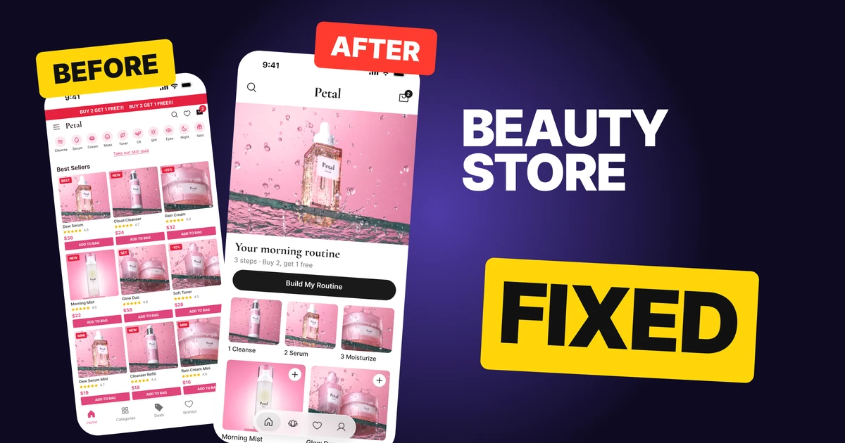
A beauty store app has one job on its home screen: turn a browser into someone with a routine. The first draft below does the opposite. A red marquee shouts a deal, ten tiny category circles share one row, the skin quiz is a ten pixel link, and nine identical product tiles each carry a tag, stars, a price and a caps button.
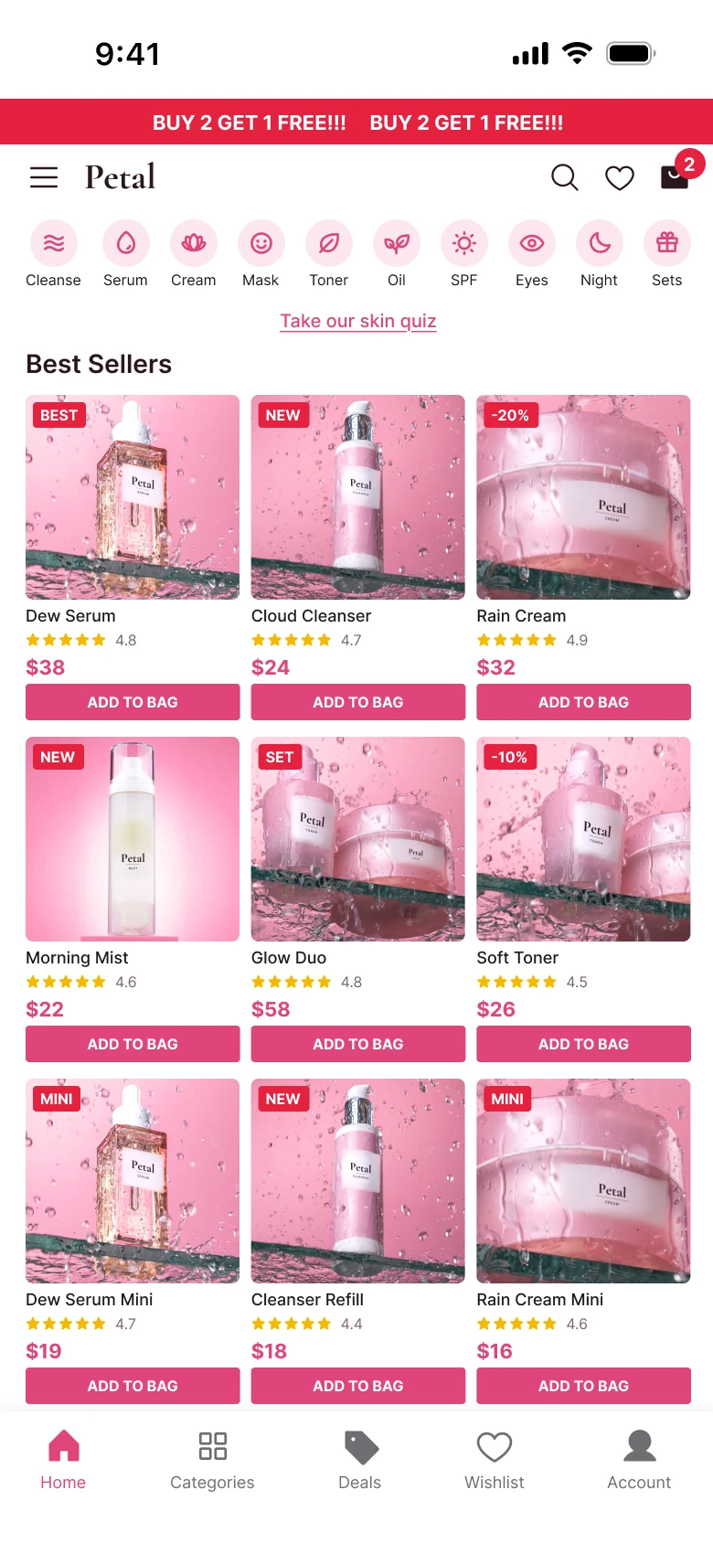
The fix keeps every function and changes the order. One full-bleed photo opens the screen, the offer sits under it as a routine, the quiz becomes three numbered steps, and the products drop their cards.
The whole screen, before and after
Junior draft
Fixed
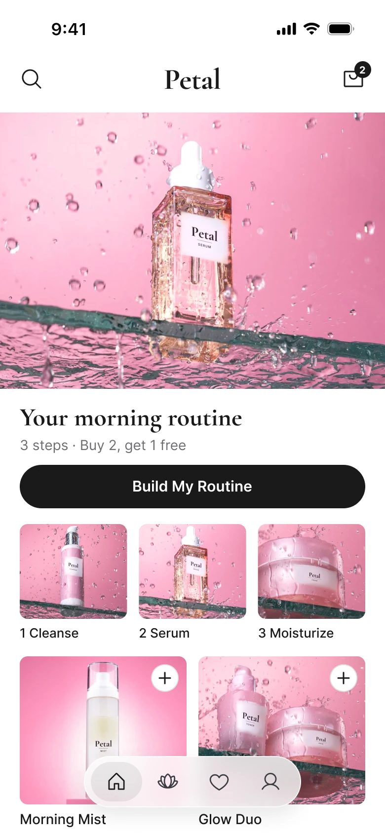
On the left, everything is the same size. Ten icons, nine tiles, a banner and a link all ask for attention at once, and the shopper has to decide where to look before deciding what to buy. Petal, a made-up skincare shop, is the test case, with prices from $16 to $58.
On the right there is an order: the brand, one picture, what to do with it, the first steps, then the products. The pink comes from the photos, so the interface itself can stay white and ink.
What changed, measured
| Junior draft | Fixed | |
|---|---|---|
| Offer | A full-width red marquee at 11 px | A 390 x 280 photo (33% of the 844 px screen), then a 26 pt serif line and a 14 pt gray line |
| Margins | 14 left, 12 right | 20 on both sides, 10 between blocks |
| Header | Menu, wordmark, search, heart and bag | Search, centered wordmark, bag |
| Categories | Ten 26 px circles, 14 px icons, 8 px labels | Behind search |
| Skin quiz | A 10 px underlined link | A 44 px ink button, then three 108 x 84 step tiles |
| Products | Nine 117 x 112 photos, 9 px names | Two across, 150 px photos at radius 8, 14 pt names |
| Under each photo | Tag, stars, price and a caps button at 8 px | Name, price, rating and a 28 px plus |
| Tabs | Five, mixed filled and outline icons | Four, icon only, in a 52 px floating bar |
| Pink | Marquee, tags, prices, buttons, icons | The photos only |
Fix 1: a plain header
Before

After

A left-aligned header with a menu icon, the small Petal wordmark, then search, a heart and a bag with a red badge, against a taller header with a search icon at the left, a large centered Petal wordmark and a bag with a small dark badge.
The draft header holds five things in one 364 px row: a menu, a wordmark, search, a heart and a bag. The wordmark is the smallest of them, so the brand is the quietest thing at the top of a brand's own app.
The fix keeps two actions, search and the bag, and centers the wordmark at 30 pt in Cormorant Garamond Bold. The heart is now the Saved tab, and the menu's places are the four tabs, so nothing was deleted. It moved to where a thumb already goes.
Rule to reuse: a header is for the name and the two actions people use on every visit. Anything else already has a tab.
Fix 2: the offer sells the routine
Before

After
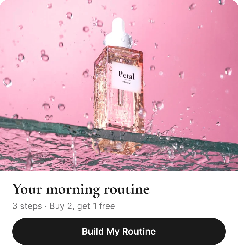
A thin full-width red bar with white capitals reading BUY 2 GET 1 FREE three exclamation marks, twice, against a full-bleed photo of a serum bottle in water drops, the words Your morning routine in a large serif, 3 steps, Buy 2, get 1 free in gray under it, and a dark Build My Routine button.
A marquee is a banner, and people have learned to skip banners. This one repeats the same four words twice at 11 px and shows no product. It tells the shopper there is a discount and nothing about what the discount buys.
The fix gives the offer a picture. The photo is one serum bottle, 390 x 280, with no radius so it runs edge to edge.
Under it, two lines do the marquee's job: a 26 pt serif line that names the routine, and a 14 pt gray line, "3 steps · Buy 2, get 1 free". The deal is still there, but now it explains why you would buy three things. The Deals tab became that line.
Rule to reuse: say what the offer is for, not only what it costs. A discount on a routine is easier to say yes to than a discount on a product.
Fix 3: turn the buried quiz into steps
Before

After
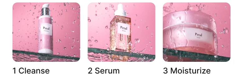
Ten small pink category circles in a row with a tiny underlined pink link reading Take our skin quiz under them, against a dark pill button reading Build My Routine and three photo thumbnails numbered 1 Cleanse, 2 Serum and 3 Moisturize.
The skin quiz is the most useful thing in this app, because it is the one place that asks the shopper about their skin. In the draft it is a 10 px underlined link under ten category circles, so a person has to scan a dense row of icons just to miss it.
The fix gives it a 44 px button, which is a comfortable tap target, and puts three numbered thumbnails under it.
The numbers do the explaining: first cleanse, then serum, then moisturize. Each thumbnail is 108 x 84 at radius 8, with a 13 pt label, and the three steps are the quiz's first answers, so a tap on one is the start of the quiz. The ten categories did not vanish. They sit behind the search icon, where someone who knows what they want will look.
Rule to reuse: if a feature is the reason people stay, give it a button and a visible first step. Do not put it at the size of a footnote.
Fix 4: drop the cards
Before
After
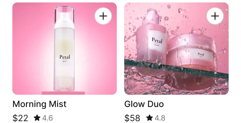
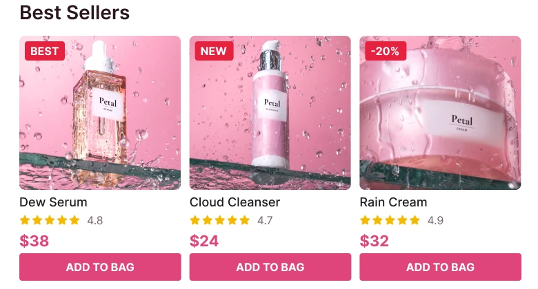
A row of three small product tiles, each with a pink photo, a red tag, a 9 px name, five gold stars with a rating, a bold pink price and a wide pink ADD TO BAG button, against two larger tiles with a photo, a white plus button at the corner, a name, a price and a rating under it.
A draft tile holds seven things: photo, tag, name, stars, rating, price and a button. At 117 px wide each gets a few pixels. The name is 9 px, the button text is 8 px, and the pink button under every product turns a product list into a wall of identical calls to action.
The fix keeps four: photo, name, price and rating. The photo grows to 150 px at radius 8, the name and price go to 14 pt, the rating to 12 pt. The tag moves into the product page, where "New" and "Best Seller" can be explained. Add to bag becomes a 28 px white plus with a hairline at the photo's corner, so the function is one tap away without a pink bar under every tile.
Two photos across, not three, also means every name fits on one line. The tab bar floats over the next row of products, so the scroll never hits a wall and a shopper can see there is more.
Rule to reuse: a tile on a list page answers "do I like it and what does it cost". Everything else belongs one tap deeper.
The smaller fixes
- Every function stays reachable. Search is the plain header icon, the bag keeps its badge, the heart and the Wishlist tab become the Saved tab, the Deals tab is the line under Your morning routine, the skin quiz is what Build My Routine opens, and the other products continue below on scroll.
- Even margins. The draft has 14 px on the left and 12 on the right. The fix uses 20 on both sides and 10 between blocks.
- White ground, one ink. The interface is white and dark ink, so the pink in the photos is the only color on the screen.
- A real type scale. Text runs from 12 to 30 pt, against the draft's 8 to 20 px.
- A calmer tab bar. Four icons in a 52 px floating capsule replace five labeled tabs with mixed filled and outline icons.
Audit your own beauty app
| Question | Why it matters |
|---|---|
| Does the first thing you see show a product? | A beauty app is a picture book before it is a price list |
| Is the offer said once, in plain text? | A banner gets skipped, a headline gets read |
| Can someone start your quiz or routine in one tap? | The feature people stay for should not be a footnote |
| Is pink used by the interface or by the photos? | If the buttons are pink too, nothing stands out |
| Does each tile show only photo, name, price and rating? | The rest belongs on the product page |
| Is the add button smaller than the photo? | A bar under every tile turns browsing into a wall of buttons |
| Is every tap target at least 44 px? | A 10 px link is easy to miss with a thumb |
Get the Figma file
The free file has the junior draft, the fixed screen and every part as a component.
Free Figma file
Beauty store home screen redesign, before and after
Both screens and every part as a Figma component. Free, view only, duplicate it to your drafts.
FAQ
How should a beauty store app home screen be designed?
Lead with a full-bleed photo of one product, put the offer in a line of text under it, and follow with a button for the skin quiz. Then show products in two columns with a large photo, a name, a price and a rating.
What size should product photos be in a beauty app?
Here the tiles are 150 px photos on a 390 px screen, two per row, with a small radius. Two across leaves room for a 14 pt name on one line.
Should a beauty app have a sale banner?
Avoid a banner that carries no product. A photo with a short offer line under it does the same job, and the discount reads as part of a routine instead of a warning.
Where should a skin quiz go in a shopping app?
On the home screen, as a button at a comfortable tap size with the first steps visible under it. Burying it in a small link hides the most useful feature in the app.
How many tabs should a store app have?
Four icons are enough: home, shop, saved and account. The bag stays in the header, where its count is visible.
Sources
- Both screens are our own, designed and measured in Figma. The app, Petal, its products, its prices and its ratings are made up.
- Pattern studied: the beauty store apps of Glossier and Sephora, with a plain header, a large product photo and two-across tiles.
- Photos from Pexels by Moni Rathnak, one shoot. The real brand labels on the bottles are retouched out and replaced with a blank label and the Petal wordmark. Icons are from Phosphor (MIT). The wordmark is set in Cormorant Garamond Bold.
- First published as a carousel on App Brainy.
Get new papers by email
New Brainy papers in your inbox. Confirm once, unsubscribe anytime.