Pastel Color Palettes: 12 Soft Brand Palettes With Hex Codes
Twelve pastel and muted color palettes for brands and logos, each with exact hex codes. Every soft palette needs one darker color to carry the mark, and here is which one.
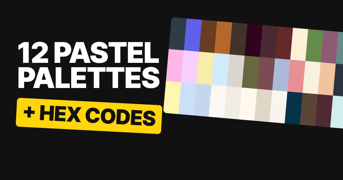
A pastel color palette is easy to love and easy to get wrong. Soft colors make a gentle brand, but a logo needs something to push against. Here are twelve pastel and muted palettes with every hex code, and the one darker color in each that does the holding.
What makes a pastel palette hold
A pastel is a color lifted toward white, and a muted color is one turned down toward gray. Both are calm, and both lose contrast fast. Put Blush Pop #FFB6EB on Vanilla Custard #FFF7AE and the edge is gone.
So the palettes below are not sets of equals. Each has colors doing different jobs: a dark one that sets the type and the mark, and soft ones that fill the space. The fourth tile under each palette shows the pairing a mark would actually use, built only from that palette with no white or black added.
There are three ways to get there. Add a backbone to the pastels, let the dark lead a quiet palette, or keep the middle tones for headlines. For the loud version of the same idea, see our paper on bold color palettes.
Pastels with a backbone
Pastels make soft brands, and weak logos unless one color does the heavy lifting. In each of these four there is a pastel pair and a darker color that can carry the mark.
Blush Pop
Charcoal Blue
Blush Pop
Vanilla Custard
Blush Pop on Charcoal Blue
Charcoal Blue holds Blush Pop and Vanilla Custard with room to spare. It carries a wordmark at any size, so this is the strongest backbone of the four.
Blue Hepatica
Blue Hepatica
Pink Diamond
Fly a Kite
Pink Diamond on Blue Hepatica
A softer backbone. Blue Hepatica is fine for a big mark on Pink Diamond or Fly a Kite, but not for the small print under it. Set the tagline in something darker.
Van Dyke
Van Dyke Brown
Bleached Sunflower
Misty Mountains
Bleached Sunflower on Van Dyke Brown
Van Dyke Brown holds Bleached Sunflower with room to spare. Misty Mountains adds a cool pale beside the warm pair.
Polished Copper
Polished Copper
Cloudless
Morning Snow
Morning Snow on Polished Copper
Polished Copper follows the same rule as Blue Hepatica: use it for the logo, not for fine print. Cloudless and Morning Snow are the two pale grounds.
Quiet palettes led by the dark
A quiet palette works by lightness, not by hue. If the dark sits far from the light, three near-neutrals still read as a brand. This is also the clearest case of a muted color palette: little saturation, and the structure comes from the gap between dark and light.
Demitasse
Demitasse
White Sand
Coconut Milk
Coconut Milk on Demitasse
Demitasse, White Sand and Coconut Milk are three neutrals, and they still read as a brand because the dark sits far from the light.
Olive Leaf
Midnight Violet
Olive Leaf
Floral White
Floral White on Midnight Violet
Midnight Violet on Floral White goes further still, the widest gap in this set. Olive Leaf sits between them as the one color with a clear hue.
Wild Ginger
Winetasting
Wild Ginger
Turtledove
Turtledove on Winetasting
Winetasting and Wild Ginger sit very close. That is too close for text and right for a pattern or a stripe behind a logo. Turtledove is the color that carries the words.
Arcane Red
Arcane Red
Lilac Sachet
Dipped in Cream
Dipped in Cream on Arcane Red
A deep red with a cool lilac and a cream. The red and the cream do the reading, and Lilac Sachet is the one cool note.
The trick to remember: tone on tone is a texture, not a text color. Use two close colors side by side for a pattern, and bring in the far one for words.
Mid-tones are for headlines
Your middle color is a headline color. Garden Matcha, Grape Nectar and Oil Blue are mid-tones, so against anything else in their palette they work for a big logo or a headline and are too weak for small print. Let the dark do the reading and keep the mid-tone for the big shapes.
Light Coral
Papaya Whip
Light Coral
Deep Space Blue
Light Coral on Deep Space Blue
The exception. Light Coral on Deep Space Blue is strong enough to carry the small print too, so this palette lets the loud color do both jobs.
Garden Matcha
Garden Matcha
Milk Foam
Mocha
Milk Foam on Mocha
Mocha holds Milk Foam and reads easily. Garden Matcha goes on the large shapes, such as a stripe, a panel or a headline.
Grape Nectar
Grape Nectar
Almond Cream
Port Royale
Port Royale on Almond Cream
Port Royale holds Almond Cream. Grape Nectar is the big-shape color, and the words stay in the dark pair.
Oil Blue
Oil Blue
Blueberry
Mint Julep
Blueberry on Mint Julep
Blueberry holds Mint Julep. Oil Blue is the mid-tone, used for the large areas and left out of the small print.
All twelve palettes in one table
| Palette | Colors | Best pairing for a mark |
|---|---|---|
| Blush Pop | Charcoal Blue #2F3D46, Blush Pop #FFB6EB, Vanilla Custard #FFF7AE | Blush Pop on Charcoal Blue |
| Blue Hepatica | Blue Hepatica #6060EE, Pink Diamond #F8CFFF, Fly a Kite #CCDEF8 | Pink Diamond on Blue Hepatica, big marks only |
| Van Dyke | Van Dyke Brown #693E21, Bleached Sunflower #F7EBA9, Misty Mountains #C6D6EF | Bleached Sunflower on Van Dyke Brown |
| Polished Copper | Polished Copper #B7672C, Cloudless #D0EBFC, Morning Snow #FBF7F1 | Morning Snow on Polished Copper, big marks only |
| Demitasse | Demitasse #40342B, White Sand #DBD5D1, Coconut Milk #F0EDE5 | Coconut Milk on Demitasse |
| Olive Leaf | Midnight Violet #31031F, Olive Leaf #66693E, Floral White #FFF8ED | Floral White on Midnight Violet |
| Wild Ginger | Winetasting #492A34, Wild Ginger #7C4C53, Turtledove #DED7C8 | Turtledove on Winetasting |
| Arcane Red | Arcane Red #642828, Lilac Sachet #ACB9D9, Dipped in Cream #FAF6EB | Dipped in Cream on Arcane Red |
| Light Coral | Papaya Whip #FCF0D6, Light Coral #E88F93, Deep Space Blue #05334A | Light Coral on Deep Space Blue |
| Garden Matcha | Garden Matcha #668B4A, Milk Foam #F8F1DC, Mocha #5A4636 | Milk Foam on Mocha |
| Grape Nectar | Grape Nectar #8D5C74, Almond Cream #F4C29F, Port Royale #502B33 | Almond Cream on Port Royale |
| Oil Blue | Oil Blue #658C88, Blueberry #2C333E, Mint Julep #D1EFED | Mint Julep on Blueberry |
How to use a pastel palette for your brand
- Name the backbone first. Before you fall for the soft colors, pick the darker color that will carry the logo and the words, like Port Royale #502B33 under Almond Cream #F4C29F.
- Give the mid-tone big jobs only. Headlines, stripes, panels and large marks. Never the footnote.
- Use the palest color as the page. Most of what people see of a brand is background, and a soft cream or a pale tint is calmer than pure white.
- Test the logo in one color. If it only works in the pastel, it will fail on a stamp, a receipt or a dark photo. Our brand color palette paper covers the full system, and color harmony explained covers why these combinations sit well together.
Get the files for each family
Each family is a free color set on Forge, with tap-to-copy codes, swatch files for Figma and Adobe (ASE), CSS variables and design tokens.
Free color set
Pastels with a backbone: Blush Pop, Blue Hepatica, Van Dyke, Polished Copper
Every hex, plus ASE swatches, CSS variables and design tokens.
Free color set
Quiet palettes, dark-led: Demitasse, Olive Leaf, Wild Ginger, Arcane Red
Every hex, plus ASE swatches, CSS variables and design tokens.
Free color set
Mid-tones are for headlines: Light Coral, Garden Matcha, Grape Nectar, Oil Blue
Every hex, plus ASE swatches, CSS variables and design tokens.
FAQ
What is a pastel color palette?
A pastel color palette is a set of soft, light colors such as Blush Pop #FFB6EB, Pink Diamond #F8CFFF and Fly a Kite #CCDEF8. For a brand, it works best when one darker color is added to carry the logo and the text.
What is a muted color palette?
A muted color palette uses colors with little saturation, such as the neutrals Demitasse #40342B, White Sand #DBD5D1 and Coconut Milk #F0EDE5. It gets its structure from the distance between the dark and the light, not from bright hues.
What colors go with pastels?
A deep color from a related hue. Charcoal Blue #2F3D46 holds Blush Pop #FFB6EB, and Van Dyke Brown #693E21 holds Bleached Sunflower #F7EBA9. The pastels become the background and the dark does the work.
Can I use a pastel color in a logo?
Yes, if it sits on a darker color or the mark is set in a darker one. A pastel logo on a pale ground loses its edge. Softer backbones such as Blue Hepatica #6060EE suit a large mark, but not the small text beside it.
Which colors in a palette should I use for headlines?
The middle ones. In Garden Matcha, Grape Nectar and Oil Blue, the mid-tone is a headline color and the dark carries the small print. Light Coral #E88F93 on Deep Space Blue #05334A is the exception, because it is strong enough for both.
Are these color palettes free to use?
Yes. The hex codes are free to use in any project, and each family is a free download on Forge with swatch files and CSS.
Sources
- Color names and hex codes from the palette cards on our team's color board, checked against the published Forge color sets.
- Readability of each pairing checked with the WCAG 2 contrast formula. Pastels with a backbone: Charcoal Blue and Van Dyke Brown carry text on their pastels, while Blue Hepatica and Polished Copper are softer backbones that suit large marks. Mid-tones in Garden Matcha, Grape Nectar and Oil Blue meet the WCAG minimum for large type only; Light Coral clears it for small text on Deep Space Blue.
- First published as three carousels on Logo Brainy: Pastels with a backbone, Quiet palettes, dark-led and Mid-tones are for headlines.
Want a palette built for your own brand, tested on your logo, your packaging and your screens? Our team designs brand identities that hold up everywhere.
Get StartedGet new papers by email
New Brainy papers in your inbox. Confirm once, unsubscribe anytime.