

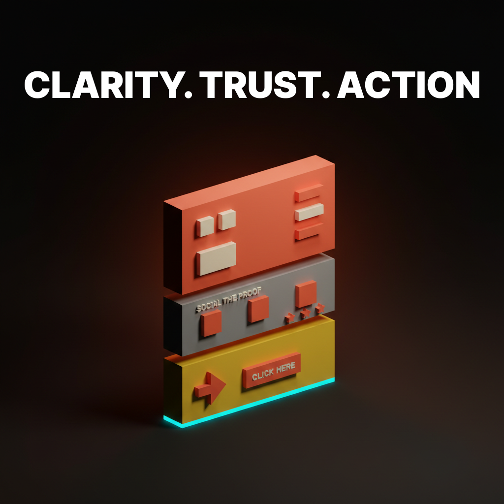
Landing Page Design: 2026 में High-Converting Pages के 12 Principles
बारह principles जो converting landing pages को सिर्फ exist करने वाले pages से अलग करते हैं। Above-the-fold clarity, social proof, CTA hierarchy, form friction, और 2026 के वो patterns जो चुराने लायक हैं।
ज़्यादातर landing pages visitor को पहले दो seconds में ही खो देते हैं। इसलिए नहीं कि design बेकार है। बल्कि इसलिए कि page उस सवाल का जवाब नहीं देता जो visitor पूछने आया था, इतनी जल्दी नहीं, उस जगह नहीं जहाँ वो देख रहा है।
2026 में convert करने वाले pages उन pages से ज़्यादा सुंदर नहीं हैं जो नहीं करते। वो ज़्यादा clear हैं। वो faster load होते हैं, claim के साथ शुरू करते हैं, कुछ माँगने से पहले proof दिखाते हैं, और हर वो input हटा देते हैं जो visitor को strictly देने की ज़रूरत नहीं। यह paper उसके पीछे के rules को 12 principles में तोड़ता है, Linear, Stripe, Vercel, Ramp, Notion, Framer और कुछ और के real examples के साथ जो बार-बार दिखते हैं क्योंकि वो बार-बार सही करते हैं।
अगर आप teardown version चाहते हैं (छह pages ऊपर से नीचे तक dissected), तो existing landing page design paper उसे cover करता है। यह वाला principle layer है। जो fit हो चुराओ, जो न हो छोड़ो।
Fold के ऊपर Clarity
Page का ऊपरी हिस्सा सारा काम करता है। अगर hero unclear है, तो उसके नीचे कुछ भी आपको नहीं बचाएगा।
1. Hero एक sentence में click earn करता है
Visitors तीन seconds से कम में तय कर लेते हैं कि scroll जारी रखना है या नहीं। Hero headline को एक सवाल का जवाब देना है: यह क्या है, और यह किसके लिए है। बस इतना।
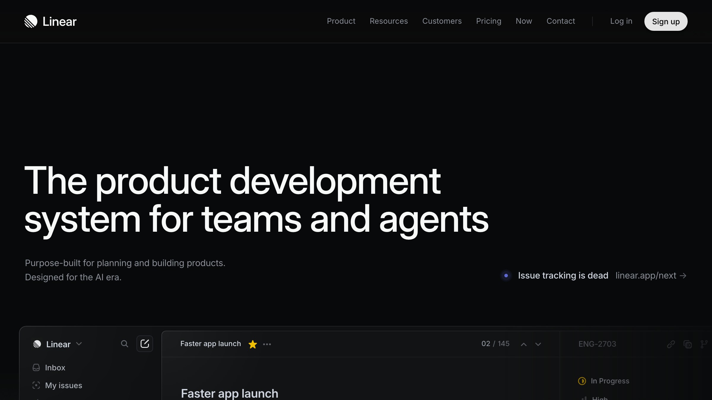
Linear का hero है "Linear is a purpose-built tool for planning and building products." कोई adjectives नहीं, कोई metaphors नहीं, कोई "reimagined for the AI era" नहीं। दूसरी line user को name करती है। यही पूरा काम है।
Stripe का homepage पाँच साल में दर्जनों बार evolve हुआ है। Headline नहीं हुई। यह हमेशा "Financial infrastructure for the internet" का कोई variant रहता है। Specific noun, specific audience, zero ornament।
Rule यह है: अगर कोई visitor आपकी headline ज़ोर से पढ़ने के बाद यह नहीं बता सकता कि आपका product क्या है, तो headline गलत है। Subheadlines context add कर सकते हैं, टूटे हुए hero को कभी नहीं बचा सकते।
2. Visual claim को anchor करता है
Visual के बिना hero एक press release है। गलत visual वाला hero एक mood board है। Visual को वो claim prove करनी है जो headline ने अभी-अभी की।
Ramp का hero actual product दिखाता है, real transaction rows वाला dashboard, fake UI वाला floating iPhone नहीं। Notion वो page दिखाता है जो आप actually उसमें बनाएँगे। Vercel एक deployment in progress दिखाता है। Framer एक editor दिखाता है जिसमें canvas motion में है।
Pattern यह है: hero visual वह product है जो headline ने promise की हुई चीज़ कर रहा है। उसका abstraction नहीं। उसका 3D render नहीं। वो चीज़ खुद।
3. एक primary CTA, बस
हर landing page का एक काम होता है। Hero में एक CTA होता है जो उस काम को reflect करता है। बाकी सब secondary है।
Stripe के hero में "Start now" primary है और "Contact sales" एक quieter secondary link है, button नहीं। Linear का है "Sign up" और एक "Watch demo" text link। Ramp "Get started" चुनता है और "See pricing" को ghost button में downgrade करता है।
2026 में primary CTAs high-contrast, single-verb, action-forward हैं। "Start your 14-day trial" एक CTA नहीं है, यह border वाला एक marketing sentence है। अच्छे hero CTAs दो या तीन words के होते हैं। "Start free." "Get started." "Try it." इन्हें ज़ोर से पढ़ें। अगर sentence जैसे लगें, words काटें।
कुछ माँगने से पहले Trust
Page का middle हिस्सा belief build करता है। Visitors आपको अपना email या credit card तब तक नहीं देंगे जब तक page उसे earn नहीं कर लेता।
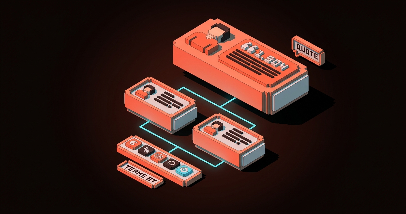
4. Social proof specific है, decorative नहीं
Logos का marquee कुछ prove नहीं करता। 40% opacity पर बारह gray icons 2019 के बाद बने हर SaaS page जैसे दिखते हैं और visitor अब उन्हें ignore करता है। आपको पता है कि reader उन्हें देखना बंद कर चुका है क्योंकि आप खुद उन्हें देखना बंद कर चुके हैं।
Specific proof काम करता है। एक real customer, एक real outcome के साथ। Role और company के साथ एक named testimonial। एक measurable result ("reduced onboarding time by 60%")। Quote के नीचे एक case study link। इन्हें fake करना मुश्किल है और visitors फर्क जानते हैं।
चुराने लायक hierarchy:
- Trust section के ऊपर real result के साथ एक named customer quote
- दो या तीन supporting quotes, छोटे, photos और roles के साथ
- नीचे एक compact logo strip, अगर बिल्कुल ज़रूरी हो, "Teams at..." जैसे caption के साथ
- नीचे सब के नीचे full case study library का link
Ramp और Linear दोनों यह अच्छे से करते हैं। Logos dessert हैं, main course नहीं।
5. Product दिखाओ, describe मत करो
हर feature section में product का वो visual होना चाहिए जो feature perform कर रहा हो। Copy describe करती है। Visuals prove करते हैं।
Notion का landing page 80% product screenshots है। Framer का page में embed किया हुआ एक live, running design editor है। Vercel का features page terminal output, real deploy previews, actual metrics दिखाता है।
Rule यह है: हर feature bullet के लिए पूछें "इसे होते दिखाने वाला सबसे छोटा visual क्या है?" अगर जवाब है "एक stock illustration," तो उसे screenshot से replace करें। अगर जवाब है "एक 3D icon," तो उसे product shot से replace करें। अगर feature दिखाया नहीं जा सकता, तो feature को rewrite करें।
6. Hierarchy selling कर रही है
बिना visual hierarchy के landing page equal-weight sections की एक दीवार है और reader point मिलने से पहले ही bounce कर जाता है। Hierarchy reading order control करती है, visual hierarchy वो तरीका है जिससे आप longer copy लिखे बिना attention direct करते हैं।
तीन hierarchy moves जो 2026 में अपना weight carry करते हैं:
- आप सोचते हैं उससे बड़ा hero type। Desktop पर 72 से 96px अब normal है, और reader की eye को शुरू करने के लिए वो anchor चाहिए।
- एक accent color, sparingly इस्तेमाल। CTA color page पर तीन या चार बार आता है, maximum। अगर दस बार दिखे, तो "act here" का मतलब छोड़ देता है और "हमने एक color चुना" का मतलब लेने लगता है।
- Dense sections को white space से तोड़ना। हर content section के आसपास breathing room चाहिए वरना reader उनमें से कोई नहीं पढ़ता।
CTA Discipline
Button वहाँ है जहाँ conversion होती है। ज़्यादातर pages button को गलत करते हैं क्योंकि वो इसे decision point की बजाय label की तरह treat करते हैं।
7. CTA ladder buyer readiness से match करता है
हर visitor खरीदने के लिए तैयार नहीं होता। Convert करने वाले pages हर reader को वो next step देते हैं जो उनकी current position से match करे, बिना primary path को clutter किए।
2026 में एक clean CTA ladder:
- खरीदने के लिए तैयार: primary hero CTA, scroll पर sticky
- ज़्यादा जानकारी चाहिए: relevant feature section के अंदर एक contextual secondary CTA ("See how it works")
- Proof चाहिए: trust block के अंदर एक case study link
- तैयार नहीं लेकिन interested: footer या exit-intent में एक newsletter या guide download
हर CTA का एक काम है। कोई भी primary के साथ compete नहीं करता। Ramp और Stripe दोनों इसी तरह ladder करते हैं, primary कभी dominance नहीं खोता।
8. Sticky CTAs long pages पर attention earn करते हैं
अगर आपका landing page दो viewports से लंबा है, तो primary CTA reader के साथ चलना चाहिए। Aggressive popup की तरह नहीं। एक quiet sticky element की तरह जो hero के exit होने के बाद appear होता है और तब तक available रहता है जब तक visitor convert नहीं हो जाता या चला नहीं जाता।
2026 का sticky CTA minimal है: desktop पर viewport के bottom पर एक thin bar, या mobile पर bottom-right में एक pill, primary action और एक secondary link के साथ। Scroll direction बदलने पर यह fade होता है ताकि कभी content block करता नहीं लगता।
Linear और Framer दोनों अब marketing pages पर sticky CTAs ship करते हैं। दोनों में से कोई aggressive नहीं है। दोनों काम करते हैं।
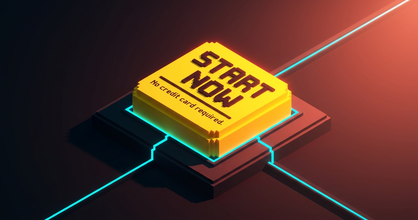
9. CTA micro-copy doubt remove करती है, urgency add नहीं
हर primary CTA के नीचे दो से छह words की micro-copy की एक line होती है। Best versions visitor की last objection को click करने से पहले handle करते हैं।
अच्छे examples:
- "No credit card required."
- "Free forever for up to 10 users."
- "Cancel anytime."
- "Setup in under five minutes."
बुरे examples:
- "Limited time offer!"
- "Join 50,000+ happy customers!"
- "Don't miss out!"
अच्छे ones friction reduce करते हैं। बुरे ones noise add करते हैं जिसे 2026 के sophisticated buyers पहले ही ignore करना सीख चुके हैं। अगर आपकी micro-copy game show जैसी पढ़ी जाए, तो delete करें।
Friction Engineering
आप जो भी input माँगते हैं वो एक cost है। 2026 के best landing pages उन inputs को हटाने में ruthless हैं जो खुद के लिए pay नहीं करते।
10. Forms minimum viable data माँगते हैं
SaaS industry का sign-up forms के लिए standard 2020 तक सात से नौ fields था। Conversion data एक दशक से clear है: हर additional field conversion की कीमत चुकाती है, और ज़्यादातर fields कभी उस marketing team ने इस्तेमाल नहीं किए जिन्होंने उन्हें माँगा था।
2026 का baseline initial form पर एक से तीन fields है। बाकी सब तब होता है जब user product के अंदर आ जाता है।
- Trial sign-up: email और password, या "Continue with Google।" बस इतना।
- Demo request: work email, company name, कुछ नहीं। Enrichment tools बाकी handle करते हैं।
- Newsletter: एक field, email।
Ramp का sign-up दो fields plus SSO है। Linear का SSO-first है email को fallback के साथ। Stripe का email और password है। उसके बाद हर field product के अंदर exist करती है, जहाँ user already committed है।
अगर आपके form में step one पर "Company size" dropdown है, तो delete करें। यह conversion पर एक tax है जो आप एक dashboard metric के लिए pay कर रहे हैं।
11. Progressive disclosure features की दीवार को replace करता है
पुराना pattern था landing page पर हर feature list करना। 2026 का pattern है सबसे ज़रूरी तीन features दिखाना, नीचे expandable "See all capabilities" के साथ।
Bento grids इसके लिए अभी का dominant shape है। Hero feature को एक large cell मिलती है, तीन या चार supporting features को छोटी cells मिलती हैं, और इससे ज़्यादा granular कुछ भी full features page के link के अंदर छुप जाता है।
Progressive disclosure pricing पर भी apply होती है। Stripe homepage पर full fee table नहीं दिखाता। वो headline number ("2.9% + 30 cents") दिखाता है और visitor को complete breakdown के लिए click through करने देता है। जो visitor fee structure की परवाह करता है वो एक click में वहाँ पहुँच जाता है। जो नहीं करता वो वैसे भी पूरी table कभी नहीं पढ़ता।
| पुराना pattern | 2026 pattern |
|---|---|
| 12+ bullets वाली feature wall | 3-5 hero features वाला Bento, बाकी link के पीछे |
| Landing page पर full pricing table | Headline price, pricing page पर full table |
| सभी integration logos एक साथ | Top 6, फिर "View all integrations" |
| Page पर सभी FAQ | Page पर 3-5, बाकी support/help पर |
12. Performance आखिरी conversion lever है
एक landing page जिसे paint होने में 4 seconds लगते हैं वो already अपने आधे visitors खो चुका है। Google के Core Web Vitals एक diagnostic हैं, goal नहीं। असली number है hero के readable होने और CTA के clickable होने तक का समय।
2026 के best landing pages mid-tier mobile पर 800ms से कम में first paint hit करते हैं। Vercel, Linear, और Stripe सभी 4G connection पर एक second से काफी कम benchmark करते हैं। वो वहाँ कम करके पहुँचते हैं: एक single variable font subset, एक static hero image, एक primary script, critical path में कोई third-party tracking नहीं।
अगर आपका page चार webfonts, एक chat widget, एक analytics script, और एक hero video इस्तेमाल करता है, तो आप conversion के लिए design नहीं कर रहे, आप Figma file के लिए design कर रहे हैं। Load time का हर 100ms measurable conversion loss है। Performance एक design decision है, engineering का नहीं।
2026 Kill List
कुछ patterns principles नहीं हैं, वो बचे-खुचे हैं। अगर आपका current landing page अभी भी इन्हें इस्तेमाल करता है, तो यह खुद को date कर रहा है।
- Context के बिना marquee logo strips। एक case study दस logos से हर बार जीतती है।
- Equal weight वाली three-column feature rows। Bento grid या prioritized stack से replace करें।
- चार CTAs वाले hero sections। एक चुनें। बाकी navigation हैं।
- बिना names के "Trusted by"। अगर customer का नाम नहीं ले सकते, तो trust claim मत करें।
- Autoplay hero videos। Heavy, distracting, scroll पर motion वाले static hero से कम converting।
- Primary CTA के रूप में gated content। जब तक आपका product gated content न हो, value को email field के पीछे मत छुपाएँ।
- Low-contrast CTAs। अगर button 5-second squint test में pop नहीं करता, तो यह button नहीं है।
- Hero headline में "AI-powered"। Reader को परवाह नहीं कि यह कैसे बना है। उन्हें परवाह है यह क्या करता है।
- Hero को block करने वाले cookie modals। Consent wall से शुरू होने वाला design already visitor को खो चुका है।
- CTA पर accessibility failures। Low color contrast एक design bug है, accessible color contrast guide देखें, और ship करने से पहले अपने ratios fix करें।
अगर इनमें से तीन या ज़्यादा आपके current page पर हैं, तो आप landing page नहीं चला रहे, आप 2022 के decisions की museum exhibit चला रहे हैं।
हर Principle के पीछे का Pattern
12 को वापस scroll करें। हर एक एक restraint है।
- Hero में adjectives काटें।
- बिना names के logos काटें।
- Form fields काटें।
- वो CTAs काटें जो primary नहीं हैं।
- वो features काटें जो cell earn नहीं करते।
- Load time काटें।
2026 में high-converting landing pages वो हैं जो subtraction से design किए गए हैं। हर वो element जो survive करता है अपनी जगह earn करता है। हर वो element जो नहीं करता delete हो जाता है। Page उन decisions का collection है जिन्हें designer ने easy बनाने से इनकार किया।
Measurable चीज़ें उससे follow होती हैं। Clarity scroll depth lift करती है। Proof time on page lift करता है। CTAs पर discipline click rate lift करती है। Minimum viable forms completion rate lift करते हैं। Performance एक साथ हर funnel metric lift करती है। इनमें से किसी के लिए redesign की ज़रूरत नहीं। इन सबके लिए ruthlessness की ज़रूरत है।
अपने current landing page पर एक section चुनें। वो जो आपको सबसे कम पसंद हो। इनमें से तीन principles को उस पर, order में, बिना कुछ नया add किए apply करें। इस हफ्ते ship करें। Numbers को move होते देखें।
अगर आप चाहते हैं कि आपका brand color palette और आपका landing page लड़ने की बजाय साथ काम करे, या अगर आप चाहते हैं कि जो page आपके पास है उसे 2022 templates की बजाय 2026 patterns के against rebuild किया जाए, तो Brainy hire करें। हम ऐसे landing pages ship करते हैं जो convert होते हैं क्योंकि वो principles का सम्मान करते हैं, इसलिए नहीं कि वो उस Figma file जैसे दिखते हैं जिसमें designer प्यार में पड़ गया। Related reading: web design trends 2026 उस broader pattern shift के लिए जिसके अंदर यह fit होता है।
FAQ
Landing page design में सबसे important principle क्या है?
Hero में clarity। अगर visitor आपका hero section ज़ोर से पढ़ने के बाद यह नहीं बता सकता कि आपका product क्या है, यह किसके लिए है, और उन्हें क्यों care करना चाहिए, तो fold के नीचे कुछ भी आपको नहीं बचाएगा। इस list का हर दूसरा principle उसी एक की सेवा में है। पहले hero fix करें।
Landing page पर कितने CTAs होने चाहिए?
एक primary, ज़्यादा से ज़्यादा तीन या चार बार इस्तेमाल। हर secondary CTA clearly quieter होना चाहिए (ghost button, text link, या feature block के अंदर contextual) और primary से अलग visitor intent serve करना चाहिए। चार या ज़्यादा competing CTAs वाले pages हर बार एक strong CTA वाले pages से कम convert करते हैं।
क्या long landing pages short ones से बेहतर हैं?
न ये, न वो। सही length वो है जितनी claim करने, उसे prove करने, और last objection हटाने में लगे। $19 के tool को $19,000 के platform से कम proof चाहिए। Buyer की readiness level से शुरू करें और वहाँ से back work करें। अगर आपका product trial sign-up है, तो शायद एक viewport चाहिए। अगर six-figure enterprise sale है, तो शायद छह चाहिए।
Taste से Landing Pages Design करना बंद करें
ज़्यादातर landing pages उसी तरह design होते हैं जैसे ज़्यादातर articles लिखे जाते हैं: author ऊपर से शुरू होता है, चलता रहता है, और रुकता है जब कहने को कुछ नहीं बचता। इसीलिए आप ऐसे page के साथ end up होते हैं जो scroll two तक visitor को खो देता है।
इसकी बजाय page को principle से design करें। उस एक sentence से शुरू करें जो hero को land करनी है। एक ऐसा proof piece चुनें जो trust block के ऊपर रहने के लिए काफी strong हो। वो एक CTA चुनें जो उस एक action को reflect करे जो आप चाहते हैं। बाकी सब काटें जब तक जो बचे वो load-bearing हो।
2026 में convert करने वाले pages creative वाले नहीं हैं। वो वो हैं जो किसी ऐसे ने design किए जो page के काम और designer के करने की चाहत के काम के बीच का फर्क जानता था। Page चुनें। Principles चुनें। Cuts ship करें।
Need a landing page built on principles, not templates? Brainy ships landing pages that convert.
Get Started


