
Hero Section Design: 8 पैटर्न जो 2026 में Convert करते हैं
Apple, Webflow, Hex, Mux, Klim, Loops, Liveblocks, Are.na के साथ आठ production hero section pattern teardown, और एक stage-fit framework।
Hero Section Design: 8 पैटर्न जो 2026 में Convert करते हैं
आपका hero section originality दिखाने की जगह नहीं है। यह आठ काम करने वाले patterns वाला एक decision matrix है, और ज़्यादातर teams गलत pattern चुनती हैं क्योंकि वे funnel stage के बजाय mood board से चुनती हैं।
Hero section, page का सबसे ज़्यादा over-designed हिस्सा है
ज़्यादातर hero sections designer के Figma खोलने से पहले ही fail हो जाते हैं। वे fail होते हैं क्योंकि किसी ने पहले सही सवाल नहीं पूछा: जब visitor यहाँ आता है तो वह पहले से क्या मानता है?
तीन visitor temperatures में से हर एक के लिए अलग hero की ज़रूरत है:
- Cold visitor: claim पर विश्वास करने से पहले proof चाहिए
- Warm visitor: जो वे पहले से आधा मानते हैं उस पर act करने के लिए clarity चाहिए
- Hot visitor: कोई friction नहीं चाहिए, खासकर वह six-second animation नहीं जो उन्होंने पहले भी देखी है
Hero कोई brand expression का मौका नहीं है। यह पहला conversion gate है। जितना friction यह पैदा करता है, उतने visitors pricing, demo request, या signup form तक पहुँचने से पहले ही चले जाते हैं।
वह single metric जिसे आपका hero control करता है वह यह है कि क्या कोई scroll करता है। बस यही पूरा काम है।
नीचे दिए गए आठ patterns design trends नहीं हैं। ये वे structures हैं जो production brands 2026 में real revenue के लिए use करते हैं।
हर एक specific conditions में काम करता है और दूसरी conditions में टूट जाता है। आपका काम वह pattern copy करना नहीं है जो Dribbble पर अच्छा लगता है। Pattern को उस signal से match करें जो आपका visitor लेकर आ रहा है।
आठ patterns एक नज़र में
| # | Pattern | किसके लिए Best | Primary mechanism | Load risk |
|---|---|---|---|---|
| 1 | Product-shot centered | Consumer hardware, established brands | Visual confidence | Low |
| 2 | Split-screen | Visible UI वाले B2B SaaS | Visual proof + claim | Low |
| 3 | Interactive demo | Product-led growth tools | Hands-on conviction | Medium |
| 4 | Video-first | Motion-native products | Category-fit medium | High |
| 5 | Big typographic statement | Type-led या cultural brands | Brand conviction | Low |
| 6 | Animated headline | Crisp value prop वाले SaaS | Attention + restraint | Low |
| 7 | Live collaborative demo | Real-time collaboration tools | Social proof via product | Medium |
| 8 | Brutalist minimal | Developer tools, design communities | Anti-marketing trust | Low |
बाएं से दाएं पढ़ें: हर pattern एक product type से map होता है, विश्वास जीतने के लिए specific psychological mechanism use करता है, और एक load risk carry करता है जो mobile performance को affect करता है। गलत pattern fast load होने पर भी गलत pattern ही रहता है। सही pattern slow load होने पर conversion killer बन जाता है।
Pattern 1: Product-shot centered, Apple template
Product ही argument है। यह pattern तभी use करें जब product दिखने में खूबसूरत हो और अकेले page को carry करने में सक्षम हो।
यह कहाँ fit होता है। Apple का iPhone page 2026 में भी product-shot hero run करता है क्योंकि hardware को object खुद convert करता है, perfectly lit, viewport scale पर। Product इतना खूबसूरत होना चाहिए कि वह अकेले page carry कर सके। अगर आपका product invisible है, यानी SaaS, API, या infrastructure, तो यह pattern झूठ है।
यह कैसे काम करता है। एक short, declarative headline और एक CTA के साथ centered hero image। Visual hierarchy तीन beats में चलती है:
- Product frame को carry करता है
- Claim plain language में product के नीचे आती है
- Action एक single CTA है, कोई alternative नहीं
White space structural है, decorative नहीं। Product के साथ attention के लिए कुछ compete नहीं करता। Apple का current iPhone page fold के ऊपर 15 words से कम run करता है, और हर word load-bearing है।
यह कहाँ टूटता है। जब teams यह pattern उन products के लिए borrow करती हैं जो कुछ दिखते ही नहीं। SaaS dashboard का screenshot iPhone नहीं है। Centered slot भरने वाली generic lifestyle photo product shot नहीं है। अगर आप hero fill करने के लिए metaphor image ढूंढ रहे हैं, तो आप गलत pattern use कर रहे हैं।
Pattern 2: Split-screen, जब product ही proof हो
Product ही evidence है और headline सिर्फ frame है। यह सबसे clean B2B pattern है जब आपका UI दिखाता है कि product क्या करता है, copy से बेहतर।
यह कहाँ fit होता है। Split-screen उन B2B SaaS products के लिए है जिनका UI खुद explain करता है। Hex ने 2026 में split-screen hero run किया जहाँ product notebook right half में था और value claim left पर।
यह कैसे काम करता है। Left half narrative carry करता है। Right half proof carry करता है। Layout cognitive load को cleanly divide करता है।
जो visitors पहले पढ़ते हैं वे left जाते हैं। जो visually scan करते हैं वे right जाते हैं। दोनों paths एक ही conviction की ओर ले जाते हैं। Best split-screen heroes product screenshot को copywriter से ज़्यादा persuasion work करने देते हैं।
यह कहाँ टूटता है। Split-screen fail होता है जब product screenshot को explanation की ज़रूरत हो। अगर visitor आपके right half को देखता है और दो seconds में समझ नहीं पाता, तो आपने hero को support ticket से replace कर दिया है। Screenshot एक नज़र में self-evident होना चाहिए। अगर उसे caption चाहिए, तो वह गलत काम कर रहा है।
Pattern 3: Interactive demo, जब देखना ही selling है
Product को touch करना पढ़ने से ज़्यादा fast persuasion है। इसे तब ship करें जब visitor की पहली objection हो "मुझे नहीं पता कि मैं यह कर सकता हूँ या नहीं।"
यह कहाँ fit होता है। Webflow का homepage 2026 में आपको headline पढ़ने से पहले canvas पर drag, drop, और interact करने देता है। यह उस product के लिए सही move है जिसकी value proposition tactile है।
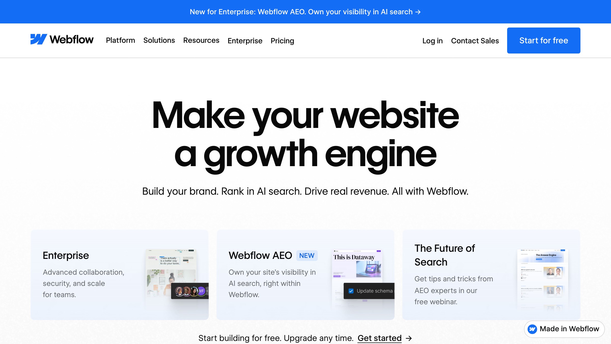
यह कैसे काम करता है। Hero एक embedded, interactive product environment load करता है जो simplified, constrained, और इतना real है कि "रुको, मैं यह कर सकता हूँ" वाला moment trigger हो।
CTA interaction zone के नीचे है, ऊपर नहीं। Webflow का structure कहता है, पहले product touch करो, फिर signup के बारे में बात करेंगे। Conviction call to action से पहले आती है।
यह कहाँ टूटता है। Performance। एक interactive hero JavaScript bundle है, और JavaScript bundles mobile Lighthouse scores को kill कर देते हैं। अगर आपका ज़्यादातर traffic mobile से आता है, तो इस pattern के लिए serious engineering investment चाहिए।
यह तब भी टूटता है जब demo इतना simplified हो कि real न लगे, या बिना tutorial के समझना इतना complex हो। Hero में confusion किसी demo से ज़्यादा बुरा है।
Pattern 4: Video-first, जब motion ही message हो
Hero में video तभी justified है जब product category और medium एक ही चीज़ हों। ज़्यादातर दूसरे products के लिए यह weak value proposition को cover करने की कोशिश में production budget है।
यह कहाँ fit होता है। Mux video infrastructure बनाता है। उनका 2026 का hero video use करता है क्योंकि product दिखाने का मतलब है video खुद दिखाना।
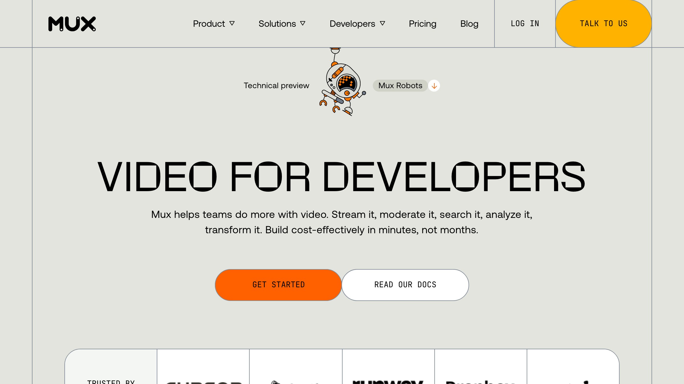
यह कैसे काम करता है। Mux एक muted looping video autoplay करता है जो उनके encoding pipeline की quality और smoothness demonstrate करता है। कोई controls नहीं, कोई pause button नहीं, कोई scrubber नहीं। यह headline और CTA के पीछे loop करता है।
Video decoration नहीं है, यह product demo है। देखने का एक second वह communicate करता है जो headline को 40 words में समझाना पड़ता। Medium और message एक ही चीज़ हैं।
यह कहाँ टूटता है। Bandwidth और load time। एक hero video जो mobile connection पर दो seconds में load न हो, play button वाले static image से worse convert करता है।
Video heroes को aggressive optimization चाहिए:
- Compressed WebM या AV1, MP4 नहीं
- Video load होते समय तुरंत serve होने वाला poster frame
- Smaller screens पर cost skip करने के लिए mobile पर lazy-load
ये तब भी टूटते हैं जब video generic B-roll हो खुले offices में खुश लोगों का। वह video कुछ नहीं कहता और कुछ न कहने के लिए आपको load time का नुकसान देता है।
एक hero चाहिए जो आपके specific audience को convert करे, generic landing page नहीं? Brainy landing pages ship करता है।
Pattern 5: Big typographic statement, जब brand ही claim carry करे
Type ही product है, या brand के पास इतनी authority है कि एक confident line page carry कर सके। Big type conviction signal करता है; इसे तभी use करें जब आप claim को back up कर सकें।
यह कहाँ fit होता है। Klim Type Foundry का homepage 2026 में type को ही hero की तरह use करता है। Headline उनके खुद के typefaces में से एक में set है, display scale पर, attention के लिए compete करने वाला और कुछ नहीं।
Pattern उस किसी भी brand के लिए extend होता है जिसके पास इतनी cultural authority हो कि statement visual support के बिना land करे।
यह कैसे काम करता है। Full-width display-scale typography। एक headline, एक optional sub। कोई product screenshot नहीं, कोई illustration नहीं, कोई lifestyle photo नहीं।
Type सब कुछ carry करता है। Line दोनों memorable और specific होनी चाहिए। Klim यह नहीं कहता "modern brands के लिए beautiful fonts।" वे कुछ ऐसा कहते हैं जिसमें weight हो।
Typesetting का confidence visitor के एक word पढ़ने से पहले product की quality signal करता है।
यह कहाँ टूटता है। जब brand इतना established नहीं है कि यह दाँव लगा सके। तीन months की runway वाला startup pure-type hero run करते हुए ऐसा लगता है "उन्हें illustrator afford नहीं था।" Big typographic statements के लिए earned brand authority या genuinely exceptional copy चाहिए। इन दोनों में से एक के बिना, यह pattern कितना भी अच्छा type set हो, empty लगता है।
Pattern 6: Animated headline, जब restraint ही differentiator हो
एक word move करता है बाकी सब still रहता है। यही contrast पूरा attention mechanism है, और जैसे ही ज़्यादा elements move करने लगते हैं, contrast खत्म हो जाता है।
यह कहाँ fit होता है। Loops attention capture करने और यह communicate करने के लिए animated cycling headline use करता है कि उनका product multiple use cases serve करता है। Animation minimal है: एक word या phrase measured pace पर swap होता है, particle explosion नहीं।
यह pattern तब काम करता है जब product के कई strong value propositions हों और एक static headline run-on sentence बने बिना उन सब को carry न कर सके।
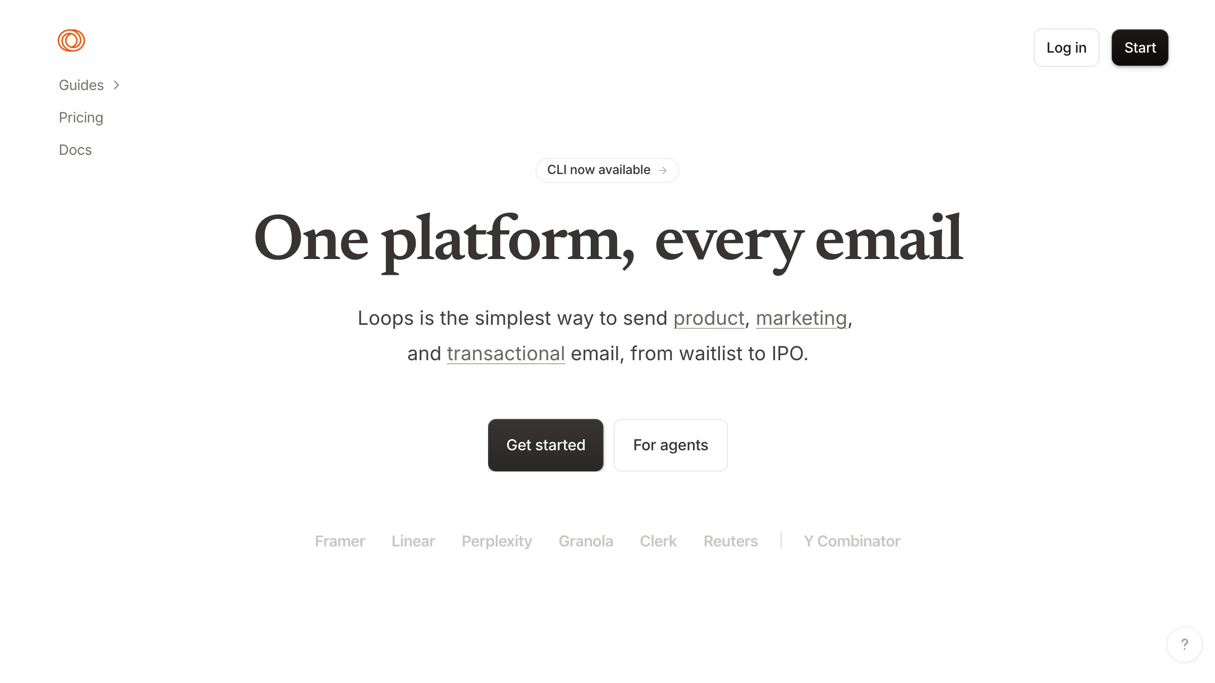
यह कैसे काम करता है। एक short headline जिसमें एक variable word या phrase एक short list के through animate होता है। Cycle इतना slow है कि पढ़ा जा सके, इतना fast कि progress indicator जैसा न लगे।
Page पर बाकी सब still है। वही stillness animation को land करवाती है। Loops animated line को minimal supporting copy और एक single clear CTA के साथ pair करता है।
यह कहाँ टूटता है। Animated headlines तीन predictable ways में fail होते हैं:
- Cycle words vague होते हैं ("transform," "elevate," "reimagine") और motion noise बन जाता है
- Motion real value proposition को support करने की जगह उसका substitute बन जाता है
- एक से ज़्यादा element move होने लगते हैं, और page push notification जैसा लगने लगता है
हर failure mode उस contrast को dilute करता है जो pattern को काम करवाता है।
Pattern 7: Live collaborative demo, जब social proof ही product हो
"यह अभी actually काम कर रहा है" का realization किसी भी headline से ज़्यादा powerful pitch है। इसे तब ship करें जब collaborative feature visible, real-time, और inherently compelling हो।
यह कहाँ fit होता है। Liveblocks real-time collaboration infrastructure बनाता है। उनका 2026 का hero multiple users के shared canvas पर live cursors दिखाता है, presence indicators के साथ जो बताते हैं document में कौन है।
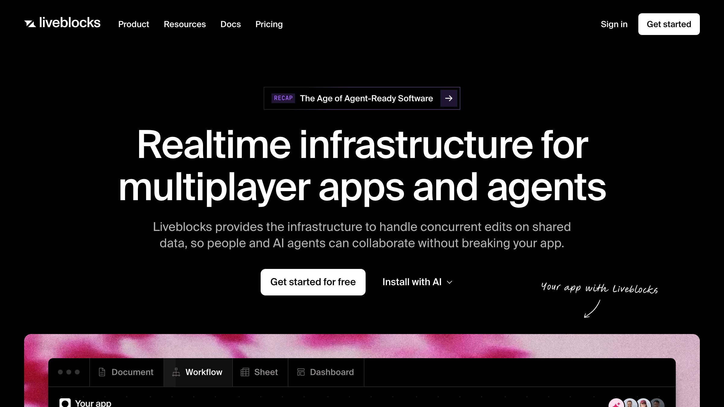
Product collaborative presence है। Hero collaborative presence demonstrate करता है। Alignment exact है। यह pattern तब काम करता है जब core product feature visible, real-time, और देखने में inherently compelling हो।
यह कैसे काम करता है। Hero एक product instance या high-fidelity simulation load करता है जो multiple users को simultaneously active दिखाता है। Liveblocks अपने demo में real WebSocket connections use करता है, इसलिए cursors और presence indicators genuine हैं।
Visitors को एहसास होता है कि वे recorded video नहीं देख रहे। वह realization conversion moment है। "यह अभी actually काम कर रहा है" किसी भी copywriter की headline से ज़्यादा powerful pitch है।
यह कहाँ टूटता है। Engineering complexity और demo fidelity। एक live demo hero जो glitch करे, lag करे, या इसलिए zero users दिखाए क्योंकि अभी page पर कोई नहीं है, किसी weak headline से ज़्यादा fast trust तोड़ता है। यह उन products के लिए भी fail होता है जहाँ collaboration core workflow के लिए secondary है। अगर आपके ज़्यादातर users अकेले काम करते हैं तो live multi-user demo hero मत बनाएं।
Pattern 8: Brutalist minimal, जब audience marketing से allergic हो
Anti-pattern ही positioning है। Brutalist minimal जानबूझकर गलत visitor को repel करता है और restraint के ज़रिए सही visitor का trust earn करता है।
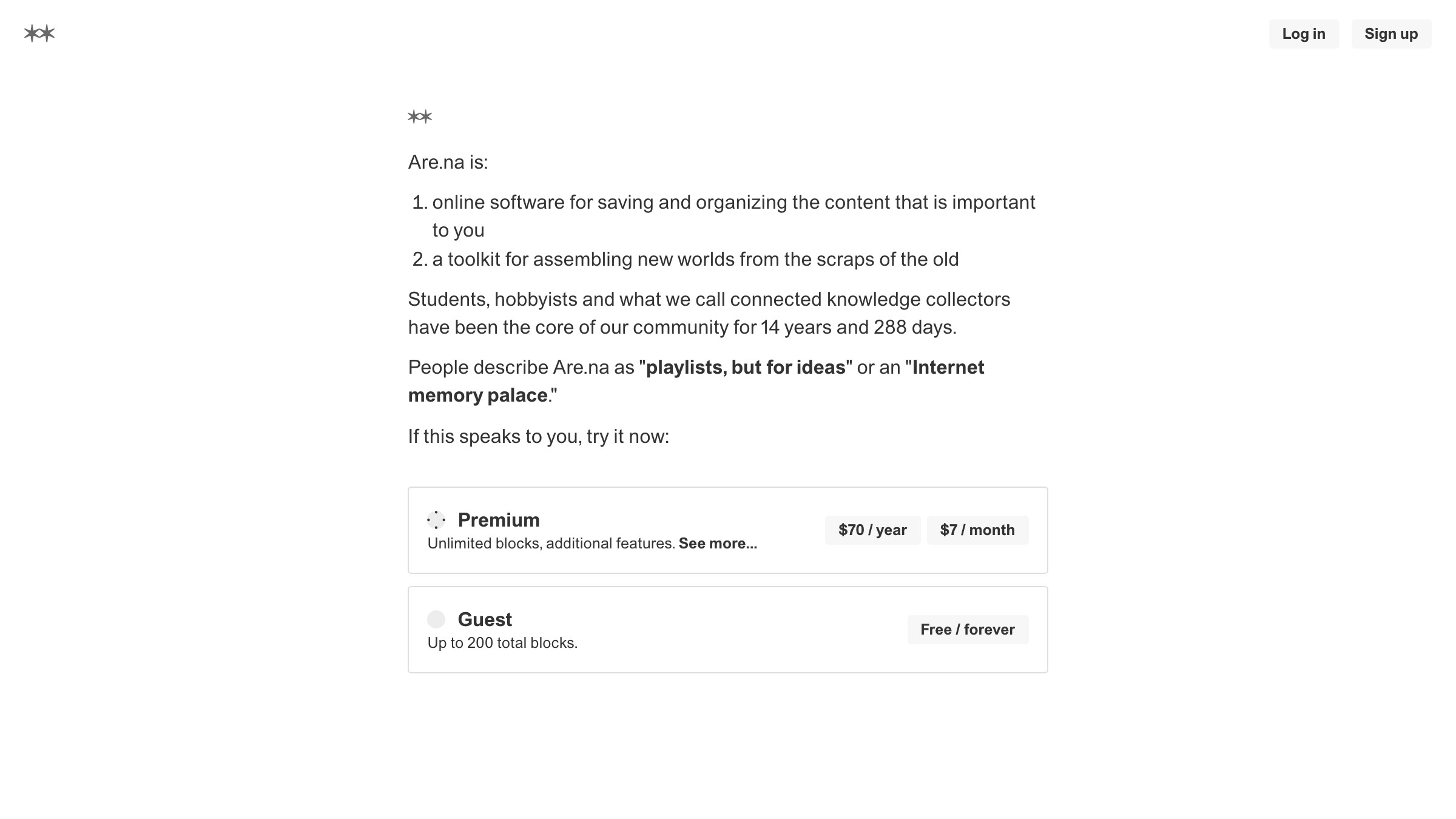
यह कहाँ fit होता है। Are.na का 2026 का homepage text का एक block है। कोई hero image नहीं, कोई animation नहीं, कोई gradient CTA button नहीं। यह plain language में describe करता है कि platform क्या है और एक sign-in field provide करता है।
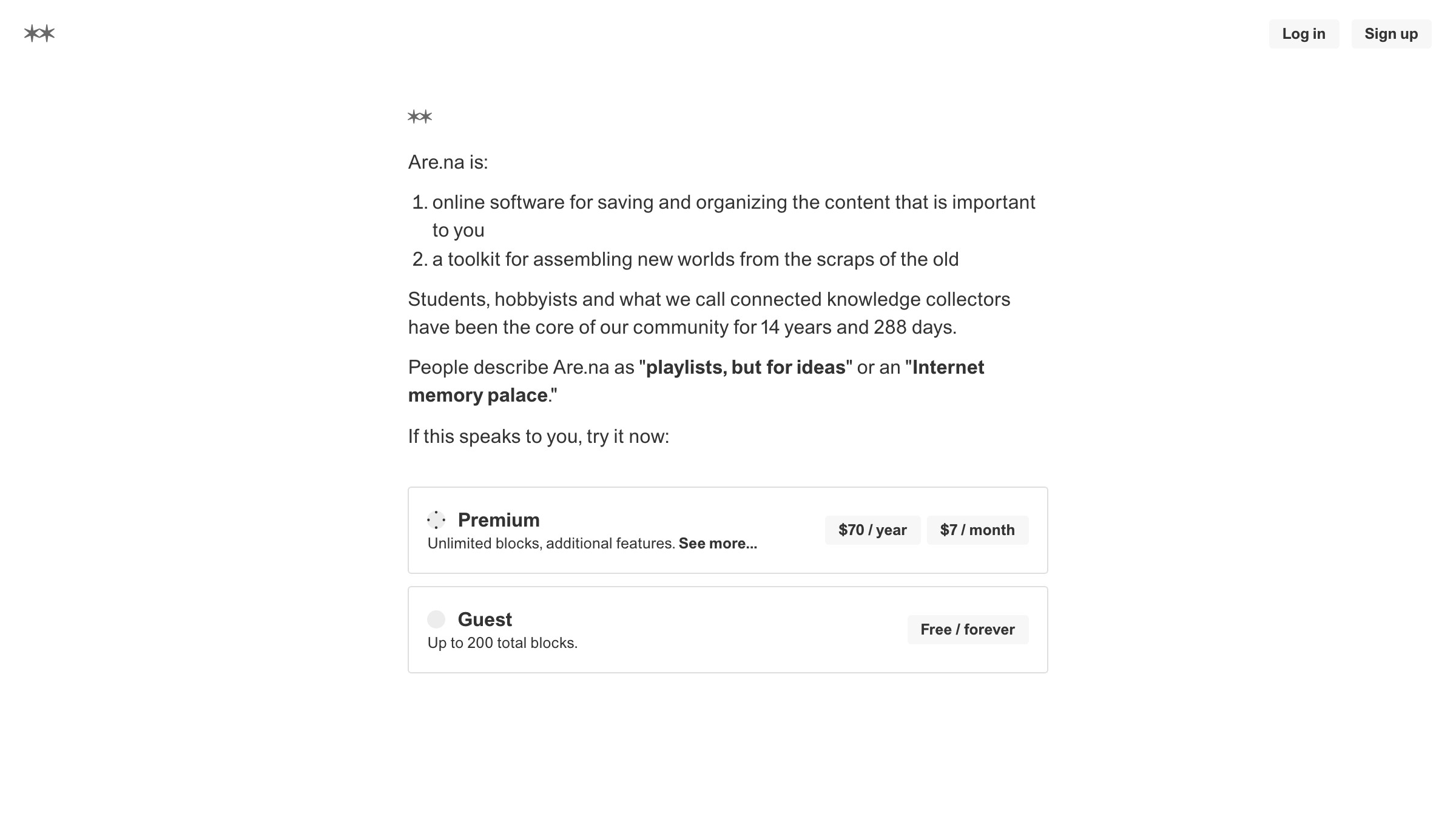
Are.na जिस audience को serve करता है (artists, researchers, designers जो curation algorithms पर trust नहीं करते) एक polished marketing hero से repel होते। Anti-pattern ही product positioning है।
यह कैसे काम करता है। कोई image नहीं। कोई motion नहीं। Typographic weight के अलावा minimal या zero visual hierarchy। Copy pitch की तरह नहीं, description की तरह पढ़ती है।
कोई भी interactivity functional है (search field, login form), कभी decorative नहीं। Brutalist minimal hero signal करता है: हम यहाँ आपको sell करने नहीं हैं। हम यहाँ काम करने हैं।
यह signal exactly उन audiences को self-select करता है जो ये products चाहते हैं, और बाकी सबको repel करता है। Repulsion एक feature है।
यह कहाँ टूटता है। जब brand यह pattern sophisticated दिखने के लिए use करे बिना उस community trust के जो इसे काम करवाती है। Are.na text-only hero run कर सकता है क्योंकि उनकी community project को जानती है और इसे बनाने वाले लोगों पर trust करती है। कोई नया B2B SaaS जिसकी कोई brand history नहीं है और जो brutalist minimal hero run कर रहा है, वह broken page की तरह लगता है, design choice की तरह नहीं।
अपने funnel stage के लिए सही pattern कैसे चुनें
ऊपर दिए गए आठ patterns tools हैं। सही tool चुनने के framework के दो axes हैं: आपका visitor arrive करते समय कितना aware है, और आपका product communicate करने में कितना complex है?
| Awareness level | Product complexity | Recommended patterns |
|---|---|---|
| Cold | One-line claim | Big type, animated headline |
| Cold | Demo चाहिए | Interactive demo, split-screen |
| Cold | Multi-feature | Split-screen, interactive demo |
| Warm | One-line claim | Product-shot, animated headline |
| Warm | Demo चाहिए | Interactive demo, live collaborative |
| Warm | Multi-feature | Split-screen, video-first |
| Hot (repeat/direct) | Any | Product-shot, brutalist minimal |
| Community-native | Anti-marketing | Brutalist minimal |
Cold traffic paid ads, social, या top-of-funnel SEO से आता है। ये visitors आपके brand को नहीं जानते और skepticism लेकर arrive करते हैं।
Big type cold visitors के लिए fail होती है जब तक कि line genuinely surprising न हो। Product-shot cold visitors के लिए fail होता है जब तक product immediately beautiful और legible न हो। Interactive demo और split-screen cold traffic earn करते हैं क्योंकि वे claim करने की जगह दिखाते हैं, और दिखाने के लिए brand trust की ज़रूरत नहीं।
Warm traffic email, referral, retargeting, या branded search के ज़रिए आता है। ये visitors पहले से मानते हैं कि आप relevant हो सकते हैं। Hero का काम "attention earn करने" से बदलकर "click earn करने" हो जाता है। Product-shot और animated headline यहाँ अच्छे काम करते हैं क्योंकि visitor decide करने से पहले एक moment spend करने को तैयार है।
Hot traffic, यानी direct या repeat visitors, brand को पहले से जानते हैं। Brutalist minimal और product-shot दोनों यहाँ काम करते हैं क्योंकि visitor persuasion mode से निकलकर action mode में है। उन्हें interactive demo से slow मत करें जो उन्होंने पहले ही देखी है।
Hero बाकी page में कैसे fit होता है इसके deeper breakdown के लिए, complete SaaS landing page anatomy और landing page design principles पढ़ें।
Ship करने से पहले चार-सवालों की checklist
Hero को production में push करने से पहले, यह चार सवाल run करें। हर एक specific failure mode से map होता है जो real products में हर हफ्ते ship होती है।
-
क्या यह pattern मेरे traffic temperature से match करता है? Cold traffic plus big typographic statement plus weak line बराबर hero जो कोई scroll नहीं earn करता। अपना traffic warm मान लेने से पहले UTM data और analytics check करें। ज़्यादातर teams overestimate करती हैं कि उनका traffic कितना warm है।
-
क्या fold के ऊपर visible proof है? Product screenshot, real customer name, या concrete number के बिना एक claim सिर्फ assertion है। Assertions के लिए trust चाहिए जो अभी earn नहीं हुई। Proof एक frame में trust earn करता है।
-
क्या exactly एक CTA है? दो CTAs focus split करते हैं। तीन CTAs decision paralysis create करते हैं। Hero options offer करने की जगह नहीं है। एक action, एक button, एक result।
-
क्या यह hero 4G connection पर 2.5 seconds में load होता है? Video heroes और interactive demos performance risks हैं जिन्हें measure करना होगा, assume नहीं। एक hero जो आपका Lighthouse performance score 70 से नीचे गिराता है, हर mobile visit पर, चुपचाप, हर दिन conversion cost कर रहा है।
अगर सभी चार pass हों, तो ship करें। अगर एक fail हो, तो कुछ और touch करने से पहले उस एक चीज़ को fix करें। Checklist sequential है: question 1, question 4 से ज़्यादा foundational है।
FAQ
Hero section "convert" क्या बनाता है?
Converting hero एक काम करता है: enough visitors को scroll, click, या sign up करवाना ताकि traffic cost justify हो। Conversion कोई specific button click नहीं है। Design करने से पहले अपना conversion event define करें, फिर measure करें कि hero उसे serve कर रहा है या नहीं।
Hero copy कितनी long होनी चाहिए?
जितनी short product allow करे। Apple का iPhone hero fold के ऊपर 15 words से कम run करता है। Target है एक headline, एक optional sub, एक CTA। उस count से ऊपर हर word को एक specific belief earn करनी होगी जो shorter version नहीं कर सकता।
क्या hero CTA पर "Get started" लिखना चाहिए?
Usually नहीं। "Get started" किसी भी product के लिए generic enough है, जिसका मतलब है यह आपके बारे में कुछ specific communicate नहीं करता। Best CTAs concrete होते हैं: "Try the demo," "Ship your first video," "Start for free, no card required."
मैं कैसे जानूँ कि मेरा hero काम कर रहा है?
Scroll depth, CTA click rate, और paid traffic से bounce rate। Organic traffic में selection bias होता है और यह आपके numbers को inflate करेगा। अगर 60-70% से ज़्यादा paid visitors बिना scroll किए bounce करते हैं, hero fail हो रहा है।
Existing hero improve करने का सबसे fast तरीका क्या है?
कुछ हटाएं। ज़्यादातर heroes scarcity से नहीं, complexity से fail होते हैं। Secondary CTA हटाएं, ambient animation हटाएं, sub-headline हटाएं। Constraints बाकी elements को harder काम करने पर मजबूर करते हैं।
अपने hero को default decision बनाना बंद करें
ज़्यादातर heroes इसलिए ship होते हैं क्योंकि Figma file में किसी ने कहा "चलो Linear जैसा कुछ करते हैं" और किसी ने काफी hard push back नहीं किया। वह hero design नहीं है। यह यह समझे बिना borrowed है कि यह Linear के specific traffic, product complexity, और audience awareness level के लिए क्यों काम करता है।
आठ patterns हैं। हर एक का एक use case, एक mechanism, और एक failure mode है। इस article में दिए गए brands (Apple, Hex, Webflow, Mux, Klim, Loops, Liveblocks, Are.na) ये patterns accident से नहीं use कर रहे। उन सभी heroes का result एक deliberate decision है इस बारे में कि page पर कौन land करता है और उस visitor को next step लेने से पहले क्या believe करना होगा।
Pattern को visitor से match करें। Discipline के साथ execute करें। Redesign करने से पहले measure करें कि यह काम किया या नहीं।
इस depth के ज़्यादा UI teardowns के लिए, landing page design playbook पढ़ें और ज़्यादा UI breakdowns browse करें। अगर आप चाहते हैं कि Brainy इसे build करे: Brainy को आपकी landing page ship करने दें।
Need a hero that converts your specific audience, not a generic landing page? Brainy ships landing pages.
Get Started