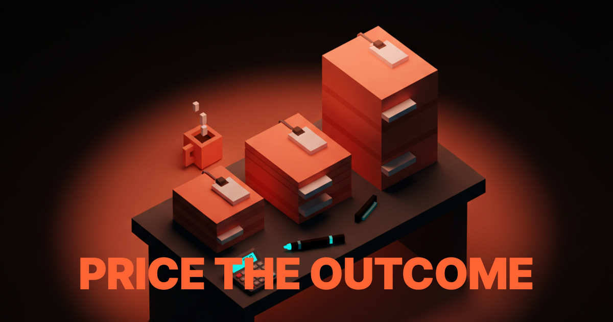
Design Portfolio: How to Build One That Actually Gets You Hired
A working designer's guide to portfolio construction. The five projects that matter, the case study structure that converts, and how to build a site that gets hiring managers to reply instead of scroll.

Hiring managers spend 90 seconds on a portfolio before deciding to interview. Most designers build portfolios optimized for their own ego, not for that 90-second window. The result is a beautifully shot homepage nobody reads past, five projects that all look the same, and a case study structure that buries every interesting decision under a wall of screenshots.
This paper is the working version. The five projects that actually move a portfolio from junior to senior, the case study structure that proves decision-making instead of taste, and how to build a site that gets a reply within 48 hours instead of another rejection email.
What a portfolio actually is
A portfolio is a bet on your next job, not a museum of your past ones. Every project has to be there for a reason. Every case study has to teach the reader something about how you think. Every decision on the site, from the homepage hierarchy to the case study length, is a hiring signal.
The portfolio that gets interviews is not the one with the most projects. It is the one where a hiring manager reads three case studies and walks away thinking, "I want this person in the room." That outcome is not an accident. It is a structure.
The visual hierarchy design breakdown covers how to control reading order on any page. The portfolio is the test case. If your portfolio does not have hierarchy, hiring managers do not finish it.
The five projects that actually matter
Most portfolios include eight to twelve projects. The hiring manager reads two. The design debate about "include everything" versus "curate heavily" is over. Curate. Five projects, maximum. Pick the five that tell a complete story.
Project 1: The flagship
One project where you owned the outcome from research to launch. Usually your strongest case study. It exists on the homepage, first fold. This is the project you want the hiring manager to read if they only read one, and for 40 percent of readers, that is all that happens.
The flagship is not the prettiest project. It is the one with the clearest decisions, the biggest scope, and the tightest through-line from problem to outcome. A modest project executed with full ownership beats a flashy project where you only touched three screens.
Project 2: The range-setter
A project that shows you can work in a visual register different from the flagship. If the flagship is a clean SaaS dashboard, the range-setter is an expressive brand identity. If the flagship is a consumer app with personality, the range-setter is a precise enterprise tool. Range proves you can adapt, which is half of what senior means.
The range-setter is often the second project on the homepage. It should read as distinctly different from the flagship at first glance, so the hiring manager registers the breadth without needing to read the case study.
Project 3: The depth piece
A project where you demonstrate an advanced specialty. Design systems architecture, accessibility work, research methodology, motion design, front-end implementation. Depth is what separates senior from middle-weight. Every senior designer has at least one area where they go deeper than a generalist needs to.
The depth piece is shorter than the flagship in case study length, but technically denser. It is the project where code snippets, token architecture diagrams, or research protocols appear. The design systems guide is an example of the kind of subject matter that lives well in a depth piece.
Project 4: The collaboration case
A project that proves you can work with other designers, engineers, or non-design stakeholders. This is the project where you write honestly about trade-offs, compromise, and what you shipped versus what you wanted to ship. Hiring managers weight this project heavily because it tells them what you will be like as a teammate, not as a solo act.
The collaboration case is often the hardest to write because it requires honesty. Projects that shipped without compromises usually do not exist, and a case study that claims otherwise reads as a lie.
Project 5: The personal or side project
One project that is not client work. A self-initiated exploration, a tool you built, a typography experiment, a game jam entry. This is where the portfolio proves the designer has taste outside the brief. The personal project does not have to be big. It does have to be specific.
Side projects matter more for early-career designers (where client work is limited) and for senior designers (where they show continued curiosity). Mid-career designers can sometimes skip this slot and replace it with a second depth piece.
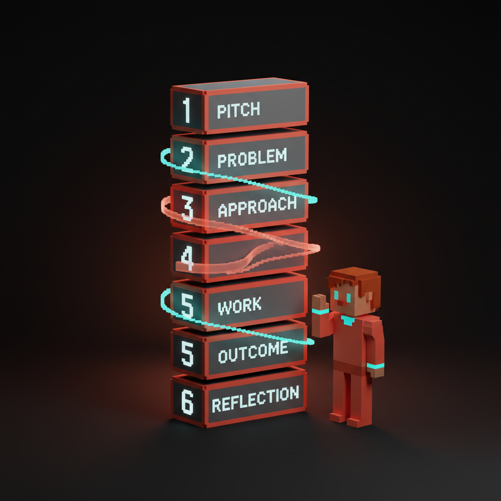
The case study structure that converts
Most case studies are structured as a slideshow of final screens with marketing copy between them. That is not a case study. That is a gallery. A real case study reads as a decision log.
The structure that works:
Section 1: The two-line pitch
Who was the client, what was the problem, what was your role. Two lines, no more. A hiring manager who reads nothing else should know what this project was and what you contributed.
Example: "Redesigned the checkout flow for a fintech client serving 2M users across 18 markets. I led UX, partnered with a brand designer and three engineers, and shipped a flow that reduced cart abandonment by 23 percent over the old baseline."
Section 2: The problem
One to three paragraphs on the actual problem. Not "users had a bad experience." Specific. Numbers, behaviors, friction points. The more concrete the problem, the more credible the solution.
The trap is stating the problem in terms a designer cares about instead of terms the business cares about. "The interface felt dated" is a designer problem. "17 percent of users abandoned at the payment screen" is a business problem. Write the second version.
Section 3: The approach
How did you attack the problem. What research did you do. What hypotheses did you form. What constraints shaped the work. This is the thinking section, and it is the reason hiring managers read case studies. They want to see how you move from problem to solution, not just that you arrived at a solution.
Do not skip the constraints. Every real project has them: budget, timeline, legacy code, regulatory requirements, stakeholder preferences. A case study that reads as unconstrained exploration reads as fiction. Constraints are the seasoning.
Section 4: The work
Show the artifacts. Research findings, wireframes, design explorations, final screens. This is where screenshots live, but they are in service of the story, not in place of it. Every screenshot has a caption that explains what decision it represents, not just what it looks like.
The common mistake is leading with polished final screens and burying the process. Flip it. Lead with the messy middle (the rejected directions, the research insights, the debated trade-offs), then show the final work as the conclusion of that thinking.
Section 5: The outcome
What happened after launch. Metrics, qualitative feedback, follow-on work, lessons learned. If you have hard numbers, use them. If you do not, use qualitative signals (testimonials, internal reception, what you would do differently).
Never fake numbers. A hiring manager who catches a fabricated conversion rate ends the interview before it starts. Honest "we did not measure this at the time, but the sales team reported stronger demo-to-trial conversion after the redesign" beats invented metrics every time.
Section 6: The reflection
One short paragraph on what you learned and what you would change. This is often the section that separates senior from mid-level. Juniors write case studies that claim everything worked. Seniors write case studies that include "we should have tested the new onboarding with five users before shipping it, because we caught two usability issues in the first week that would have been obvious in research."
Reflection is not self-flagellation. It is the proof of self-awareness. A case study without reflection reads as a designer who thinks they got everything right, which is the opposite of what hiring managers want to see.
Homepage rules
The homepage is the 10-second test. If it does not pass, the case studies never get read. Three rules.
Rule 1: Lead with work, not with you
The hero should be a preview of your strongest project, not a headshot, not a tagline, not a hero copy line about "crafting delightful experiences." Hiring managers do not care about you yet. They care about whether your work is in the zone they are hiring for. Show the work first, introduce yourself second.
The only exception is for well-known designers whose name is itself the hook. If you are not that designer, lead with the work.
Rule 2: The one-line positioning
Below or alongside the featured project, one line of text that positions you. Not a value proposition, a positioning. "Product designer for early-stage fintech." "Brand designer for consumer wellness." "UX systems designer for enterprise SaaS."
The positioning line filters the audience. A recruiter who is hiring for a brand designer at a wellness company sees your line and keeps reading. A recruiter who is hiring for enterprise SaaS when your line says fintech moves on, which is the correct outcome. The value-based pricing glossary covers the same logic for client work: position narrowly to attract the right work, not to rule out possibilities.
Rule 3: Navigation that does not fight you
A top navigation with exactly three to five items: Work, About, Contact, optionally Notes or Writing. The portfolio is a linear artifact. Hiring managers read it top to bottom on the first visit. Do not make them hunt.
Avoid case study filter menus, masonry grids that rearrange on hover, and animated navigation that hides itself. The homepage is already fighting for the hiring manager's attention. Do not add friction.
The about page
The about page is the second most-read page on a portfolio, after the flagship case study. Most designers treat it as a formality. It is not. The about page answers a specific hiring manager question: "What will this person be like to work with."
Three things to include:
A plain-language bio. Two to four paragraphs. Who you are, what you have done, what you care about. Write it like you would introduce yourself at a conference, not like a LinkedIn profile. Specifics and texture beat polish.
The people you have worked with. Not every company, but the ones that matter. A short list of clients, companies, or collaborators. If you can get a one-line testimonial from one of them, that one line is worth more than any paragraph you write about yourself.
Contact, prominently. The about page is where most hiring managers reach out. Put the email address in plain text (not behind a contact form), and put it twice: once at the top, once at the bottom. A contact form is a barrier. Remove the barrier.
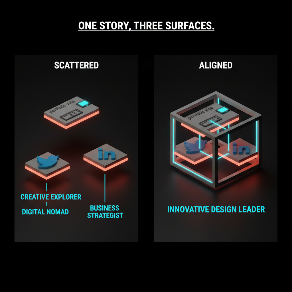
The work beyond the portfolio
Hiring managers do not stop at the portfolio. They check Twitter/X, LinkedIn, Dribbble, your personal site's notes section, and any long-form writing. Assume they are looking, and make sure what they find reinforces the story the portfolio tells.
This does not mean faking a presence. It means not contradicting yourself. A portfolio positioning you as a systems-minded senior designer, paired with a Twitter feed full of "just starting out in design, anyone have advice," sends a mixed signal. The fix is either updating the Twitter feed or acknowledging the portfolio is aspirational. Both are valid. Inconsistency is not.
Common portfolio failures
Four patterns that kill more portfolios than weak work does.
The endless project list. Twelve projects, none of them differentiated, the hiring manager scrolls past the first three. The fix is curation. Five projects, each telling a different part of the story. If a project does not answer a specific hiring question, cut it.
The hero without hierarchy. A beautiful homepage that does not tell the hiring manager what to read first. Fix: one featured project, one positioning line, everything else below the fold. The web design principles breakdown covers the same rules for any landing page, portfolios included.
The case study that hides the decisions. A wall of final screens, no process, no reflection. Hiring managers learn nothing about how the designer thinks, which is the entire point of a case study. Fix: use the six-section structure above. Lead with the thinking, support with the work.
The site that breaks on mobile. Portfolio sites that work on a 27-inch display and fall apart on a phone. Half of first reads happen on mobile. A portfolio that does not work there is a portfolio that does not work. The responsive design patterns that apply to any web design apply here too.
Portfolio updates as a habit
The portfolio that gets updated once every two years is a portfolio that is two years out of date on the day it gets opened. The fix is a small, regular update cadence instead of a massive rewrite every career inflection.
Quarterly: add or update one case study, review the homepage featured project, check that contact information is current.
Annually: revisit the positioning line, decide whether the five projects still tell the right story, retire anything that has aged out.
Every job search: aggressive edit. Rewrite the positioning for the role being targeted. Re-order the homepage to lead with the most relevant project. Update the about page to reflect the current target.
If you want help structuring case studies, positioning the site, or just hiring designers who already have this figured out, hire Brainy. We know what senior portfolios look like because we hire from them.
FAQ
How many projects should be in a design portfolio?
Five, maximum. Two or three are not enough for a senior portfolio. Eight or more dilutes the story. Five projects, curated to cover a flagship, a range-setter, a depth piece, a collaboration case, and a personal project, gives hiring managers enough evidence without overwhelming them.
How long should a portfolio case study be?
Long enough to tell the decision story, short enough that a hiring manager can scan it in five minutes. Typically 600 to 1500 words per case study, with screenshots and captions. The flagship case study can run longer. Shorter side projects can run to 300 words. What matters is that every section (pitch, problem, approach, work, outcome, reflection) is present.
Should I put my resume on my portfolio site?
Optional. Most portfolios link to a downloadable PDF resume or a LinkedIn profile rather than hosting the resume inline. If you do include one, put it on a separate page, not the homepage. The homepage is for the work.
Do I need a portfolio if I have a strong LinkedIn?
Yes. LinkedIn is a profile, not a portfolio. A strong LinkedIn gets you into a conversation with a recruiter. The portfolio is what gets you the interview. For any design role above junior, a portfolio is non-negotiable.
Should my portfolio show my process or just final work?
Both, but process is the differentiator. Final work shows that you can design. Process shows how you think. Hiring managers who already know you can design (they found you somehow) are reading the case study to understand the decision-making. The six-section case study structure balances both.
What is the biggest mistake designers make on portfolios?
Curating too lightly. Most portfolios include too many projects and not enough story about any of them. The fix is brutal editing: kill four projects to strengthen the remaining five, write decision-driven case studies instead of galleries, and lead the homepage with one strong featured piece instead of a grid of eight.
The portfolio is a bet
Every portfolio is a statement about who you want to work with next. The five projects are the argument. The case studies are the evidence. The homepage is the opening line. The about page is the closing.
Build it like you are betting your next job on it, because you are. Curate mercilessly. Structure every case study as a decision log. Update it quarterly. Make it work on mobile. Put your email in plain text.
If you want to hire designers who already passed this bar, or if you want help constructing case studies that convert at senior level, hire Brainy. The portfolio is the job application. Treat it like one.
Related reading
- Case Study Template for Designers
- Design Systems Guide
- Visual Hierarchy Design
- Web Design Principles
- UI Vs UX
Need a portfolio that reads as senior in 90 seconds? Brainy helps designers structure case studies that get hiring managers to stop scrolling. Or we just hire designers who already did.
Get StartedNot ready to hire? Run the free Business Genome, an 11-dimension diagnostic for your venture.
Get your free GenomeGet new papers by email
New Brainy papers in your inbox. Confirm once, unsubscribe anytime.