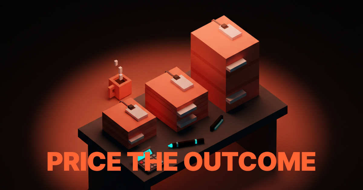
Design Case Study Template: How to Write Case Studies That Actually Win Work
A working template for design case studies that convert. The eight sections hiring managers read, the numbers you need to show, and how to present process without putting the reader to sleep.
Every hiring manager has a stack of design portfolios open in browser tabs right now. They are spending thirty seconds on each one. Maybe sixty if the hero does its job. The case study that wins is the one that answers the manager's real question in that window, not the one with the prettiest mockups.
This is the working template. Eight sections in a fixed order, the numbers that matter, and the process photos that actually pull weight. If your current portfolio reads like a school project, this is the rewrite pattern.
What hiring managers actually read
The hiring manager is scanning for evidence that you shipped something that moved a number. Everything else is context. Process diagrams, mood boards, and "my journey" paragraphs come second, not first. The case study that fails opens with the journey. The case study that wins opens with the outcome.
The designers who intuit this ship portfolios that convert. The designers who don't ship portfolios that "get good feedback" and no interviews. The difference is structural, not artistic.
The eight-section template
These eight sections, in this order, cover every case study a designer needs to write. Pillar projects get the full treatment. Smaller projects get a compressed version. The sections stay the same.

Section 1: The one-line outcome
Open with the result, not the setup. One sentence. What the design shipped and what changed.
"Redesigned checkout for a B2B SaaS, lifted conversion 32% in the first quarter." That is a case study opener. "I was excited to take on this project for a stealth-mode startup in the fintech space" is a case study that gets closed in five seconds.
Hiring managers cross-reference this opener against the rest of the page. If the rest backs it up, they keep reading. If the opener is vague (transformed the experience, reimagined the journey, created a new way to think about), they assume the numbers are missing because they are bad. Write the outcome as plainly as a headline in a business newspaper.
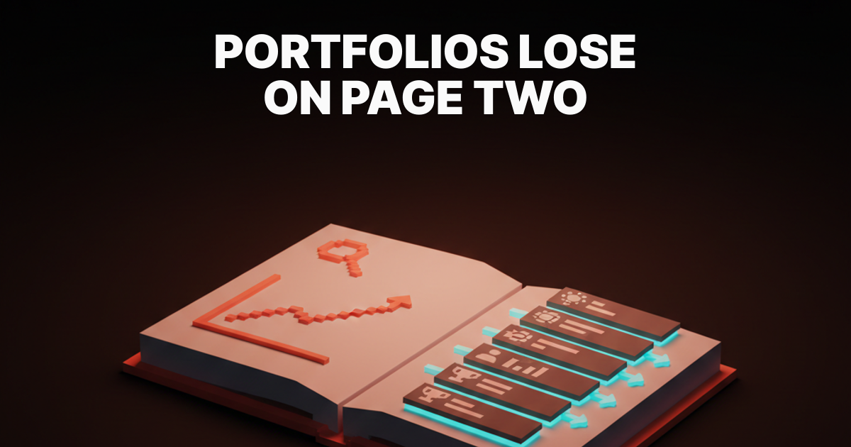
Section 2: The problem in one paragraph
The problem section is where most portfolios lose the reader. It reads as a literature review of the business. Hiring managers do not need the company history, they need the constraint that created the design challenge.
Two to four sentences, maximum. What was broken. Who it hurt. Why it stayed broken. That is the problem.
A good problem paragraph:
The checkout flow had a 63% abandon rate on the enterprise tier because procurement teams could not share a quote with finance without screenshots. The existing flow assumed a single buyer with a credit card. Fixing it meant redesigning for a committee purchase on a net-60 invoice.
No backstory. No "the client came to us." Straight to the constraint. The landing page design principles piece covers the same discipline for marketing copy. Same rule for case studies.
Section 3: The constraints
Case studies without constraints read as fiction. Every real project has them (timeline, team, platform, compliance, budget, existing system). Listing them earns trust because they prove the designer was working in the real world, not on a personal rebrand of a Fortune 500 brand.
Five to seven bullet points. Keep them concrete.
- Team of two designers, one engineer, one PM
- Six-week timeline from kickoff to ship
- Existing design system locked, additions only, no overrides
- Enterprise tier only, consumer checkout left alone
- Must integrate with existing SAP procurement flow
- Accessibility target of WCAG AA on day one
- No net-new backend work, front-end and integration only
Constraints are not complaints. They are proof the designer understood the box before they drew inside it.
Section 4: The process, compressed
Most portfolio case studies over-invest in process. They include every divergent sketch, every workshop artifact, every mood board. Hiring managers do not read those. They are looking for three things: did the designer frame the problem, did the designer validate the solution, did the designer ship what they designed.
Show evidence of each, once.
Framing evidence: one diagram, flow, or decision matrix that shows how the scope was defined. A journey map, a service blueprint, a competitive teardown summary, a decision log screenshot. One artifact, labeled with what it answered.
Validation evidence: one research or testing artifact. Usability test summary with two quotes, A/B test result, analytics screenshot showing the before state, a prototype iteration with annotated changes. One artifact, labeled with what it changed.
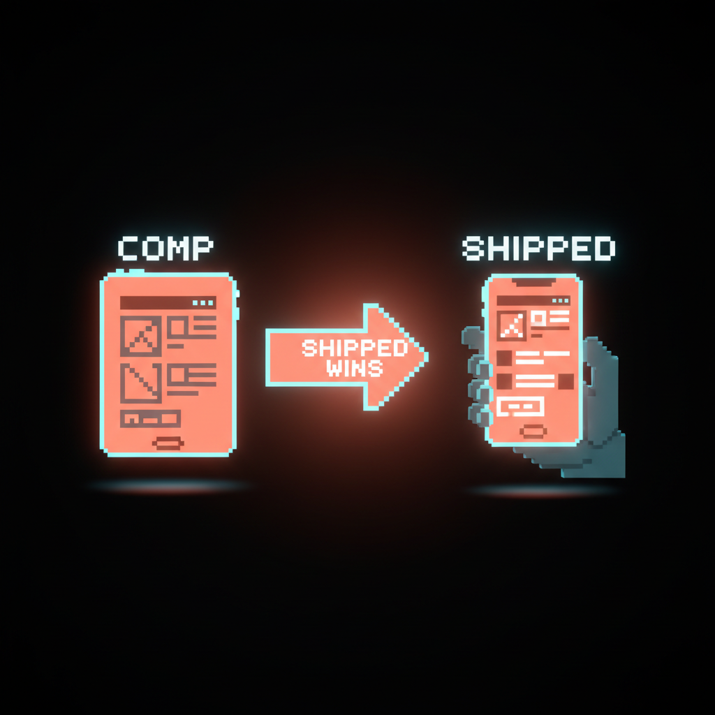
Shipping evidence: the actual deployed design. Not the final Figma comp. The deployed URL, the App Store screenshot, the recorded flow. Case studies that show Figma comps and never the shipped product read as paper designs.
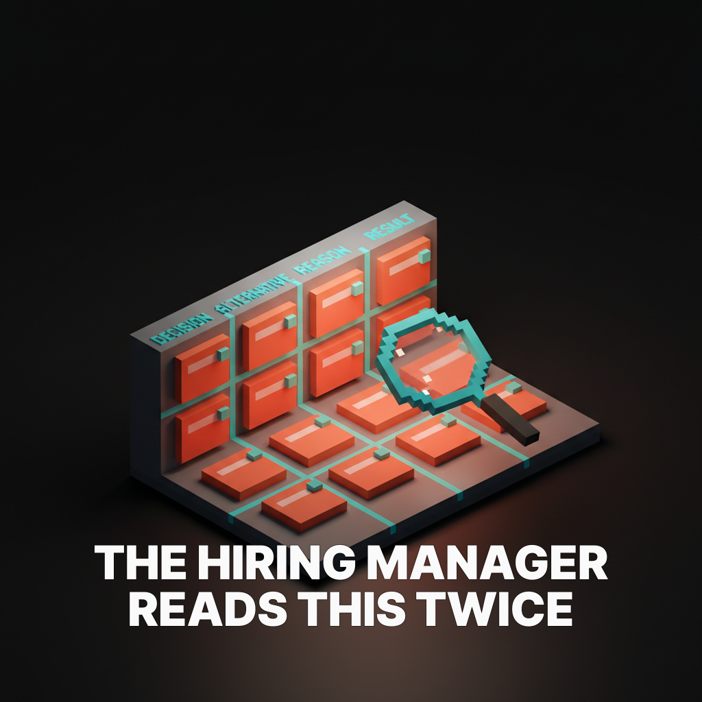
Section 5: The decision log
This is the section most designers skip. It is the section hiring managers read twice.
A decision log is a short list of non-obvious calls made during the project, with the trade-off and the result. It proves the designer had opinions that were tested against reality, which is the single most hireable signal a portfolio can carry.
Three to five entries. Template for each:
- Decision: what got picked
- Alternative: what got rejected
- Reason: the constraint or insight that drove the call
- Result: what happened after ship
Example:
- Decision: Quote sharing was rebuilt as a read-only public link instead of a native CC-to-finance flow.
- Alternative: In-product CC-to-finance with account creation required.
- Reason: Procurement and finance teams often belong to different systems and procurement would not wait for an account creation flow.
- Result: 71% of enterprise quotes were shared within 24 hours of generation, up from 12% before the redesign.
Decision logs are the closest a portfolio gets to a working interview. Write them first, then write the rest of the case study around them.
Section 6: The outcome, with numbers
The outcome section is the paycheck of the case study. Everything before it was the setup. The numbers here have to be real, specific, and attributable.
Three types of numbers work.
Business numbers. Revenue, conversion, retention, activation, time-to-value, CAC, LTV. These are the numbers hiring managers want first because they map directly to the reason the design team exists.
Product numbers. Task completion, error rate, support ticket volume, time on task, feature adoption. These prove the design changed user behavior, which proves the design was good.
Quality numbers. Accessibility audit score, core web vitals improvement, design system adoption, handoff time saved. These are the second-tier numbers, useful when the business and product numbers are unavailable (under NDA, too early to measure).
One from each bucket is plenty. Three numbers per case study beats ten because three specific numbers read as honest where ten reads as padded.
If the project is under NDA, say so plainly. Replace exact numbers with verifiable ranges ("a low-double-digit lift in conversion," "doubled activation"). Do not invent. Hiring managers have friends at every company, and they ask.
Section 7: Your role, plainly
Every case study needs a clear answer to the question the hiring manager is actually holding in their head: what did this designer personally do.
Two to three sentences. Use "I" when the work was solo, "our team of four" when it was not, and list the specific contribution either way.
Good:
I led the interaction design and owned the decision log. I paired with one engineer on the checkout flow and one PM on the scoping. Another designer on the team owned the visual system, which I applied but did not design.
Vague:
I led the end-to-end design process and collaborated closely with cross-functional partners to deliver a delightful user experience.
The vague version reads as a smoke screen. It always triggers more interview questions, not fewer. Write the plain version, save the interview for conversation you actually want to have.
Section 8: The reflection
One short paragraph. What you would do differently if you ran the project again.
This is the tell for seniority. Junior designers reflect in generalities ("I would iterate more with users earlier"). Senior designers reflect with specifics ("I underweighted the procurement integration timeline by four weeks and would have scoped it as a separate workstream on day one instead of folding it into the checkout project").
Reflection that is too positive ("everything went great") reads as a credibility flag. Reflection that is too negative ("I failed") reads as unprofessional. Reflection that is specific and tactical reads as someone who learned from the project and would learn from the next one.
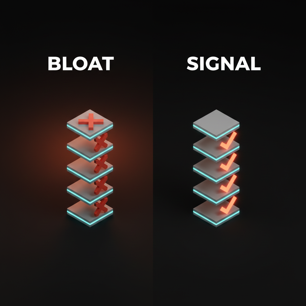
What to cut from most case studies
Most portfolio case studies are longer than they need to be, which is why hiring managers skim. Cut the following:
The "about the client" paragraph. If the client is well-known, the hiring manager already knows. If they are not, the context belongs in the problem statement, not a separate block.
The mood board. Almost never relevant to a hiring decision. Save mood boards for internal working files and client presentations where they earn their keep.
The divergent ideation grid. Nine concepts on a page, eight of which were rejected, is a workshop artifact, not a portfolio artifact. Show the final direction and the one alternative that was a real contender.
The unshipped comp reel. Beautiful comps of things that never shipped tell the hiring manager the designer might not ship. That is the wrong signal. Lead with shipped work, always.
The personal style essay. "My design philosophy" sections get skipped. If the philosophy is real, the case studies will demonstrate it without announcing it.
Case study length by seniority
The length of a case study changes with seniority, but the structure does not. The eight sections stay. The depth within them shifts.
| Seniority | Problem | Constraints | Process | Decisions | Outcome | Role | Reflection | Total length |
|---|---|---|---|---|---|---|---|---|
| Junior | 3 sentences | 5 bullets | 3 artifacts | 3 decisions | 2 numbers | 3 sentences | 3 sentences | 800 to 1200 words |
| Mid | 1 paragraph | 6 bullets | 3 artifacts | 4 decisions | 3 numbers | 3 sentences | 1 paragraph | 1200 to 1800 words |
| Senior | 1 paragraph | 7 bullets | 3 artifacts | 5 decisions | 3 to 5 numbers | 3 sentences | 1 paragraph | 1500 to 2200 words |
| Staff | 2 paragraphs | 7 bullets | 3 artifacts | 5 decisions with org tradeoffs | 5 numbers with attribution | 3 sentences | 1 paragraph | 1800 to 2500 words |
Anything past 2500 words is a case study nobody finishes. The rule for senior and staff roles is density, not length. More judgment per paragraph, not more paragraphs.
How to write the first draft
The fastest way to a publishable case study is to write in this order, which is not the order the reader sees.
- Write the decision log first. Three to five entries. This is the hardest part and the part everything else pivots on.
- Write the outcome section second. Pull the numbers before you write around them.
- Write the problem and constraints third. Now you know which constraints mattered because you know which decisions got driven by them.
- Write the process section fourth. Pick the three artifacts that earn their place.
- Write the role and reflection sections last. Short, honest, done.
- Rewrite the one-line outcome at the top last, after everything else is written. It is the last sentence drafted and the first one read.
This order forces the hard thinking up front. Designers who write in reading order usually end up with pretty prose and missing substance.
How to present process without boring the reader
Process sections are where most portfolios get skimmed to death. The fix is density, not deletion.
One annotated screenshot per artifact. Not a gallery of the entire working file. A single screenshot with three callouts explaining what the artifact answered.
A single prototype video, no longer than 30 seconds. Skip the unedited screen recording. Cut the prototype video into a tight loop that shows the key interaction, labeled.
Before and after, every time. Any comparison that includes a "before" is stronger than a comparison that does not. Even a pencil sketch next to the shipped product reads as progress. The wireframe glossary covers what kind of early artifacts carry weight.
A voxel, sketch, or low-fi frame instead of another polished comp. Contrast between low-fidelity thinking and high-fidelity shipping proves the designer worked through a problem rather than styling into a solution.
If you want a team that audits portfolios and rewrites case studies with hiring managers in the loop, hire Brainy. Portfolio reviews are one of our fastest-moving offerings for senior and staff designers in a job search.
The case study pass/fail test
Run every case study through five checks before it ships on your portfolio.
Scan test. Can a reader get the problem, approach, and outcome from the headlines and the first sentences alone. If not, the scanability is broken. The visual hierarchy design piece covers the structural fix.
Number test. Are there at least two real numbers on the page. If not, the case study is a story without a punchline.
Role test. Can a reader answer "what did this designer personally do" in under 10 seconds of reading. If not, the role section is too vague.
Decision test. Does the case study show at least three non-obvious decisions with tradeoffs named. If not, the designer looks like an executor, not a thinker.
Shipped test. Is there evidence the work actually shipped. A URL, a screenshot on a real device, an App Store link, a production code screenshot. If not, the case study is a speculative piece, not a professional one.
Five checks. Five minutes. Every case study, every time.
FAQ
How long should a design case study be?
Between 800 and 2500 words, depending on seniority. Junior case studies run 800 to 1200, mid-level 1200 to 1800.
Senior 1500 to 2200. Staff and principal case studies can stretch to 2500 if the decisions and numbers justify it. Anything longer loses the reader.
What should every design case study include?
Eight sections in order: a one-line outcome, a problem paragraph, constraints, a compressed process section, a decision log, measurable outcomes, a plain statement of your personal role, and a short reflection. Every case study needs all eight even if some are just two sentences.
How do you write a case study without breaking an NDA?
Replace specific numbers with verifiable ranges ("a low-double-digit lift in conversion") and replace named brands with the industry ("a fintech with over 100 enterprise customers"). State the NDA clearly at the top of the case study. Do not invent numbers or brands. Hiring managers check, and fabricated case studies end careers.
How do you show process without putting the reader to sleep?
Limit to three artifacts (one for framing, one for validation, one for shipping). Annotate every artifact with what it answered. Replace long prototype videos with 30-second cuts of the key interaction. Always include a before-and-after comparison. Density beats volume in every portfolio review.
What is the biggest mistake designers make in case studies?
Opening with the setup instead of the outcome. The first line of a case study should be the result of the project, not the excitement of starting it. Hiring managers scan top-down. If the outcome is buried on page two, the case study is already lost.
How do I write a case study if I haven't shipped the project yet?
Ship something first. Unshipped case studies read as speculative, and hiring managers discount them. If the project has to appear before ship, label it clearly as "in development" and focus the decision log and research sections. Never show unshipped comps as if they were real.
The portfolio is a sales page
Every case study is a sales page for the designer who wrote it. The product is the designer. The buyer is the hiring manager. The price is a forty-minute interview.
Sales pages that win are direct, specific, and honest. They open with the outcome, prove it with constraints and decisions, back it up with numbers, and close with a clear statement of who the seller is. Sales pages that lose hide the outcome behind process, pad the story with context, and leave the reader wondering what they actually bought.
Write the eight sections. Cut the bloat. Ship the case study. Then do it again for the next project, and the one after that, until the portfolio reads as a set of shipped bets that paid off, not a set of journeys you enjoyed.
If you want a team that audits, rewrites, and ships portfolios that convert into interviews, hire Brainy. We have run this template across product, brand, and UX portfolios and the structure holds every time.
Related reading
- Landing Page Design Principles
- Visual Hierarchy Design
- Presenting Brand Identity to Clients
- Brand Identity Design Pricing
Need a portfolio that lands interviews instead of silence? Brainy runs portfolio audits and rewrites with hiring managers in the loop.
Get StartedNot ready to hire? Run the free Business Genome, an 11-dimension diagnostic for your venture.
Get your free GenomeGet new papers by email
New Brainy papers in your inbox. Confirm once, unsubscribe anytime.