15 Brand Identity Examples जो असल में Convert करते हैं (और क्यों काम करते हैं)
Real brand identity examples एक ऐसी team द्वारा समझाए गए जो इन्हें बनाती है। ये 15 identities क्यों काम करती हैं, और आप अपने brand के लिए क्या चुरा सकते हैं।
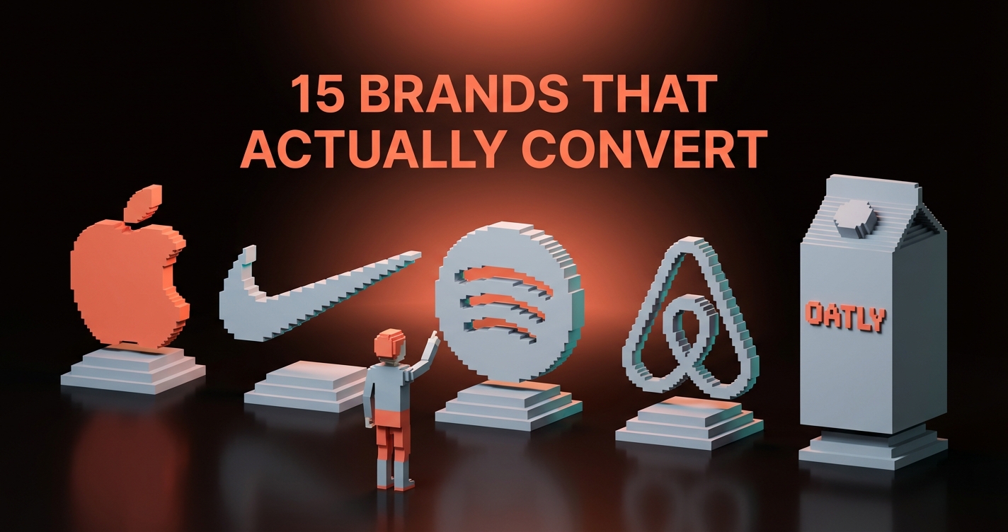
आप इस list में सबसे बेहतरीन brand identities को एक सेकंड से भी कम में पहचान सकते हैं। Apple. Nike. Patagonia. Stripe. उनके marks इतने गहरे muscle memory में उकेरे हुए हैं कि logo लगभग बेमानी हो जाता है।
इन brands में जो समान है वो कोई design choice नहीं है। वो एक commitment है। हर touchpoint एक ही कहानी कहता है, और वो कहानी हर visual decision के पीछे बैठी है। Logo तो बस वो हिस्सा है जो दुनिया के सामने आया।
यहाँ 15 identities हैं जिन्होंने वो पहचान अर्जित की है, और हर एक से वो exact lesson जो आप चुरा सकते हैं।
Brand Identity एक Logo नहीं है
एक brand identity वो complete system है जो आपको recognizable, consistent, और किसी से भी confuse न होने वाला बनाती है। कोई logo नहीं। कोई color palette नहीं। कोई font choice नहीं। एक system।
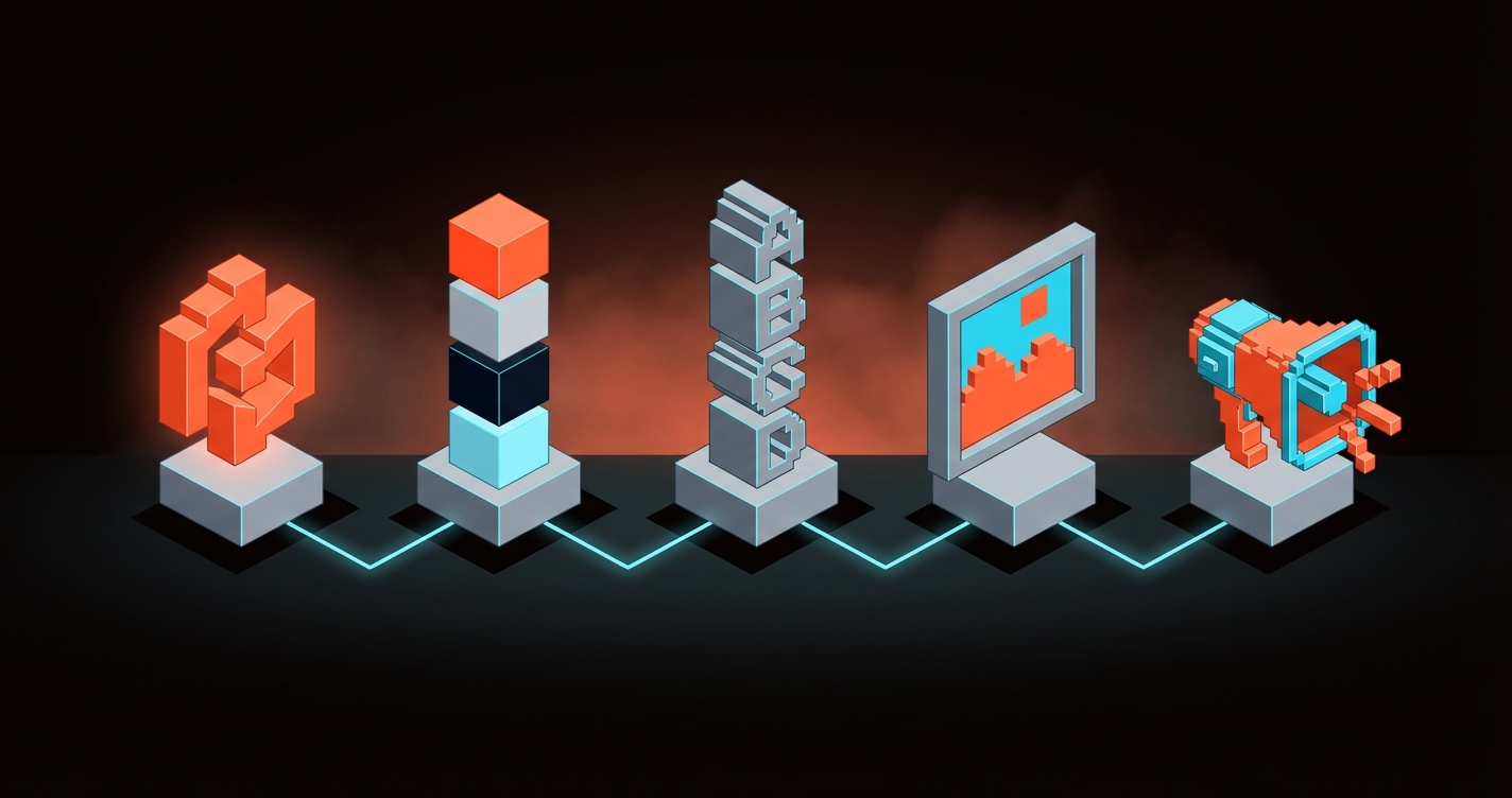
इस list की हर identity में तीन traits साझा हैं:
- बिना कठोरता के consistency। हर जगह एक जैसा, कभी boring नहीं।
- एक स्पष्ट point of view। एक शब्द पढ़ने से पहले ही आप जान लेते हैं वो क्या मानते हैं।
- Systematic thinking। हर element जुड़ा हुआ है। कुछ भी random नहीं।
इनमें से एक भी miss करें और आपके पास brand identity नहीं है। आपके पास graphics का एक collection है।
15 Brand Identities जो पढ़ने लायक हैं
हर section में आपको brand, वो क्यों काम करता है, और exact lesson मिलेगा जो आप चुरा सकते हैं।

Apple की identity subtraction पर बनी है, addition पर नहीं। Product ही identity है। Logo पर कोई gradients नहीं, कोई busy patterns नहीं, कोई visual noise नहीं।
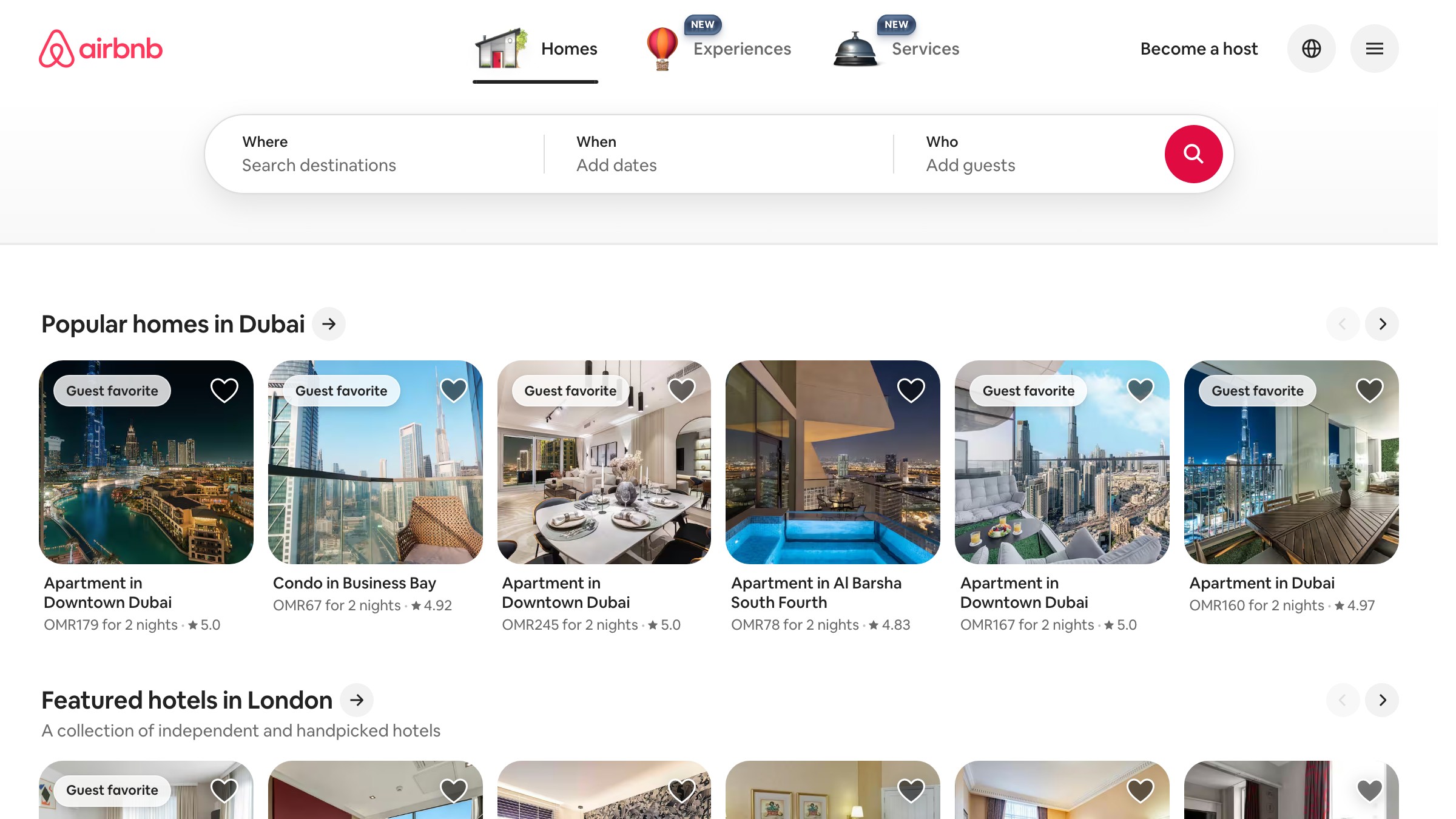
Belo एक साथ चार चीज़ें कहता है: लोग, जगहें, प्यार, और letter A. और ये सब बिना किसी चालाकी के। असली genius है वो custom typeface और illustration system जो हर Airbnb touchpoint को एक ही बातचीत जैसा feel कराता है।

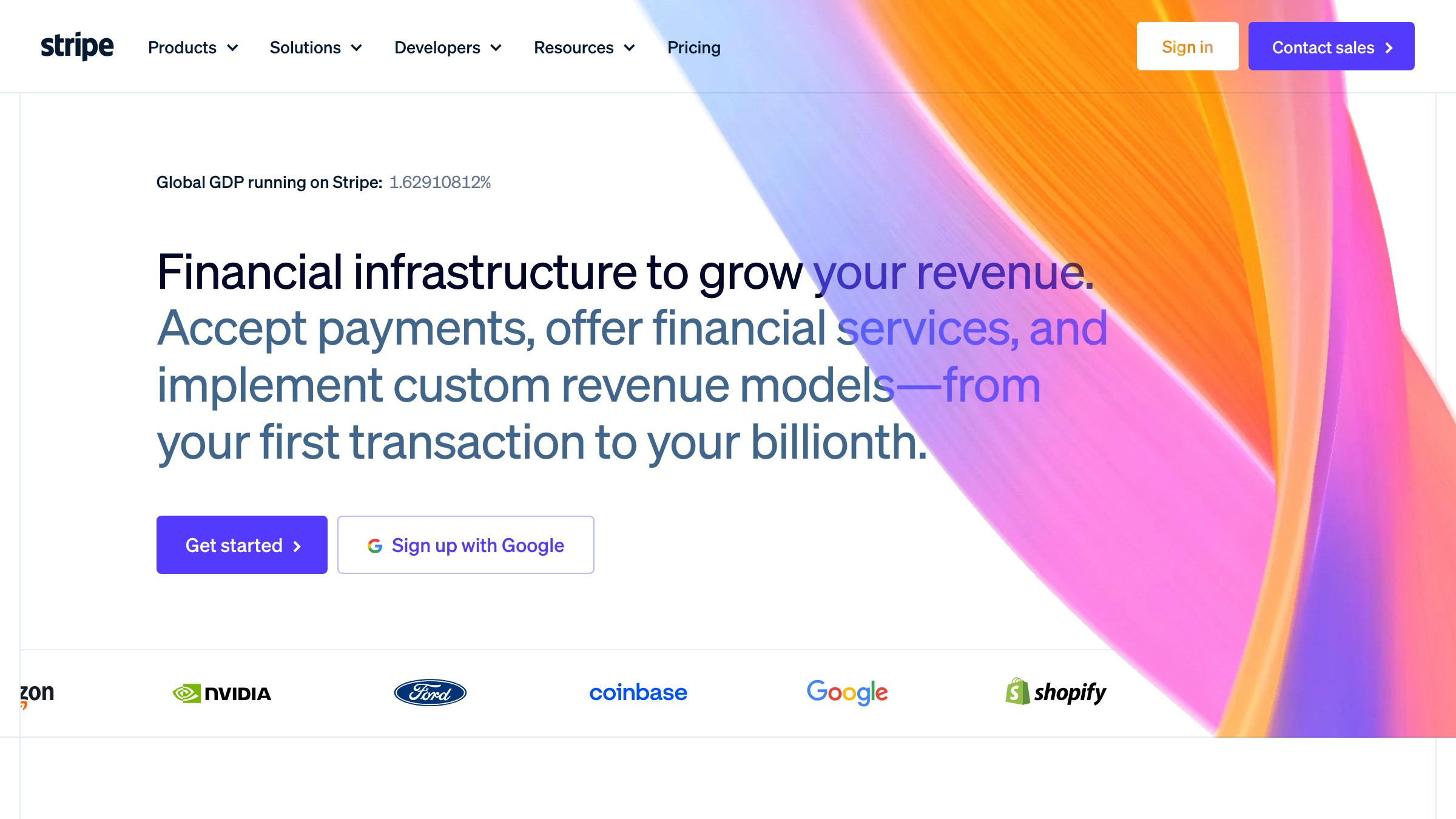
Stripe वो होता है जब engineers और designers असल में एक-दूसरे की इज़्ज़त करते हैं। Gradient system technically sophisticated लेकिन visually simple है। Typography confident है बिना शोरगुल के। उनकी identity का हर टुकड़ा कहता है "हम craft के बारे में serious हैं" बिना कभी वो शब्द इस्तेमाल किए।

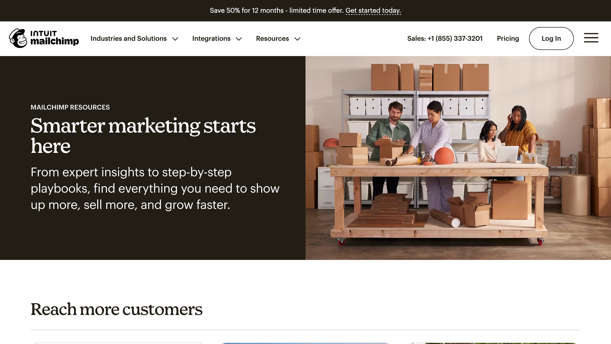
B2B brands को B2B brands जैसा दिखना ज़रूरी नहीं। Mailchimp ने hand-drawn illustrations, playful yellow, और एक थोड़ा अजीब mascot को commit किया, और कभी पीछे नहीं हटे। ज़्यादातर brands Freddie को कुछ safer बना देते। Mailchimp ने उसे अजीब रहने दिया।
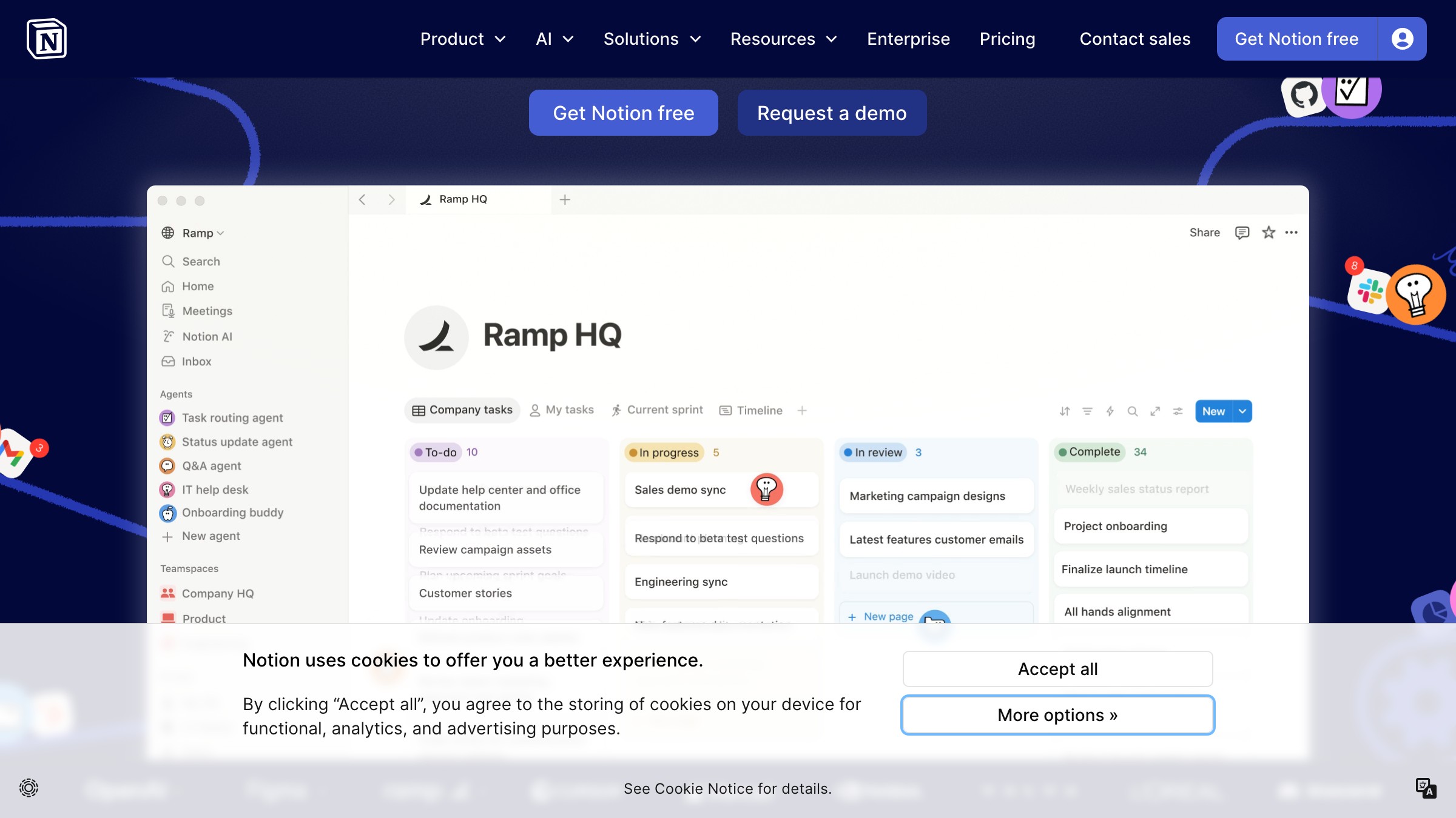
Notion की visual identity बिल्कुल Notion experience जैसी दिखती है। Clean, restrained, sketch-like illustrations। Identity और product एक ही idea को दो बार express करते हैं।

Linear का brand उसके changelog, docs, error states में रहता है। हर screenshot, हर feature announcement, हर email ऐसा लगता है जैसे एक ही दिमाग से निकला हो। यहीं असली identity रहती है।


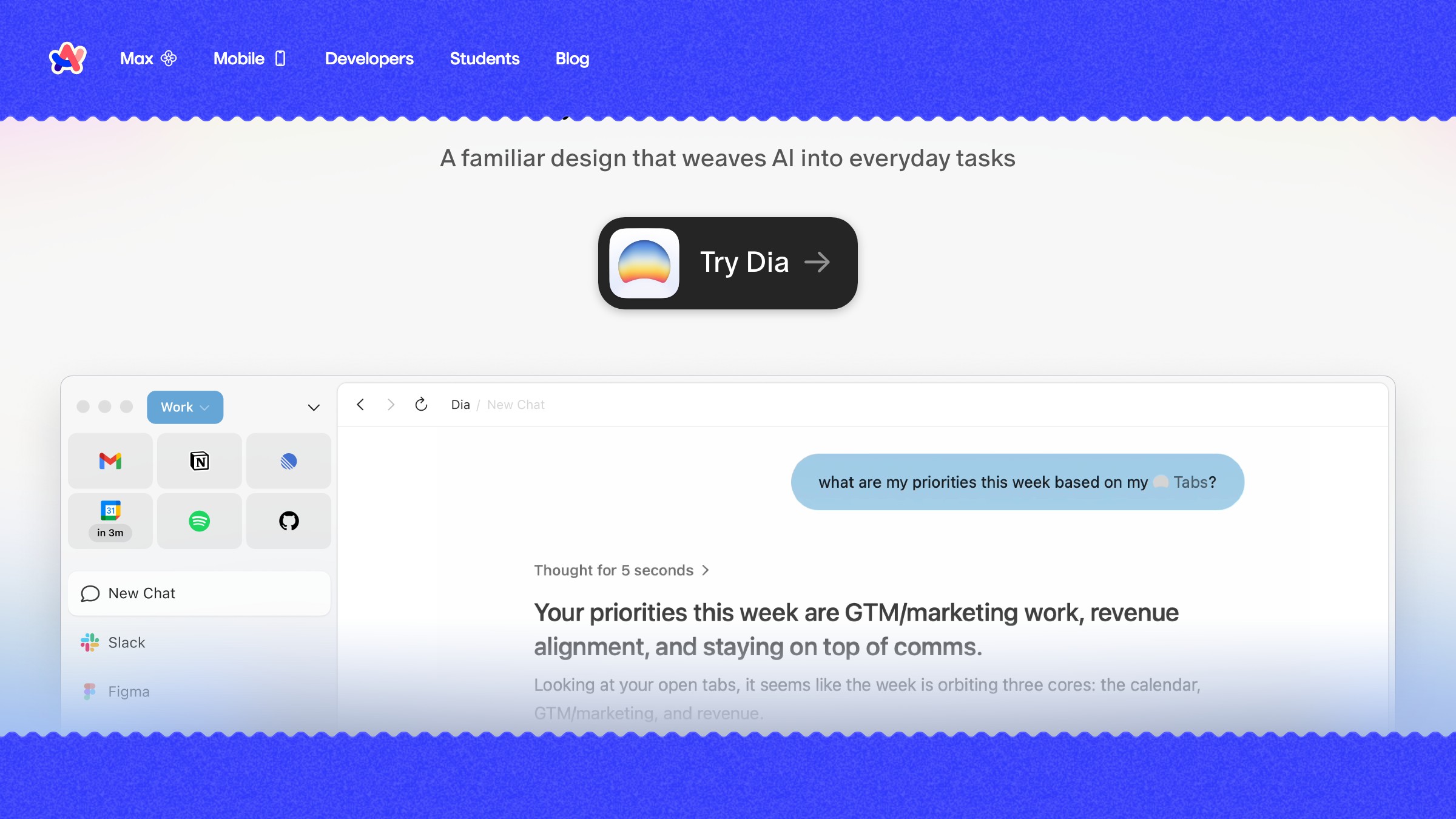
Arc ने एक browser को lifestyle brand जैसा feel कराया, लेकिन brand language ऊपर से थोपी नहीं गई। वो product के काम करने के तरीके में embedded है। Color decoration नहीं है, वो organization है।

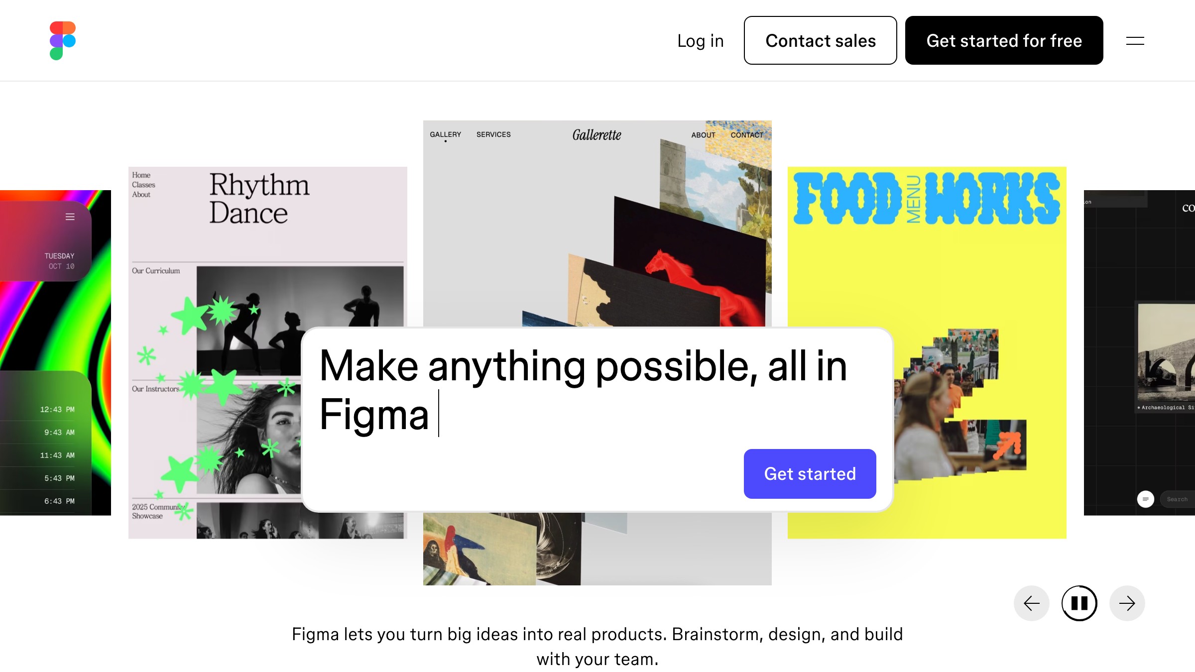
Figma का multi-colored logo, Config conference branding, और community-first asset strategy ने एक ऐसा brand बनाया जिस पर users ownership feel करते हैं। यही सबसे मुश्किल काम है और सबसे valuable भी।
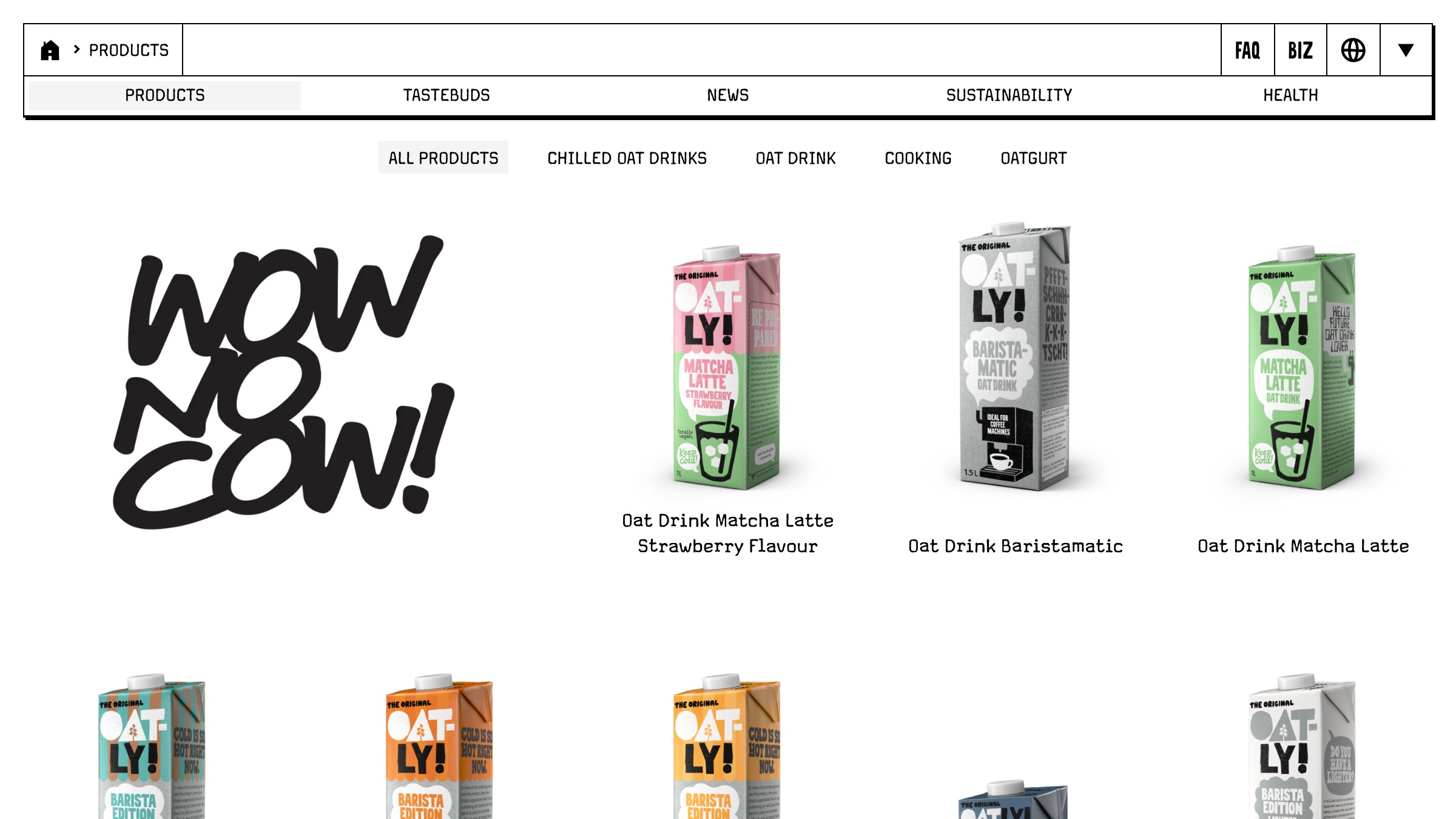
Oatly की hand-drawn typography और confrontational copy ऐसी लगती है जैसे किसी इंसान ने carton पर लिख दी हो। कुछ भी best practices follow नहीं करता। सब कुछ instantly recognizable है।

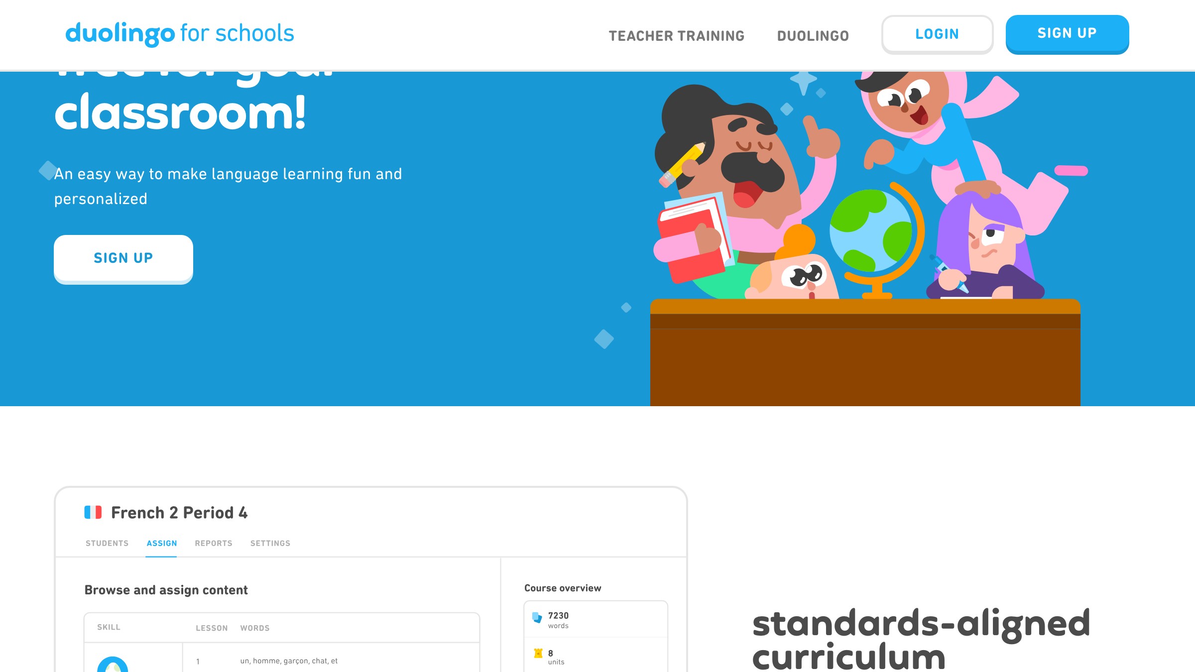
Duo सिर्फ एक mascot नहीं है। Duo एक content strategy है। Green सिर्फ एक color नहीं है। वो एक notification है जिसे आप ignore नहीं कर सकते। हर element brand recognition और user engagement दोनों का double duty करता है।

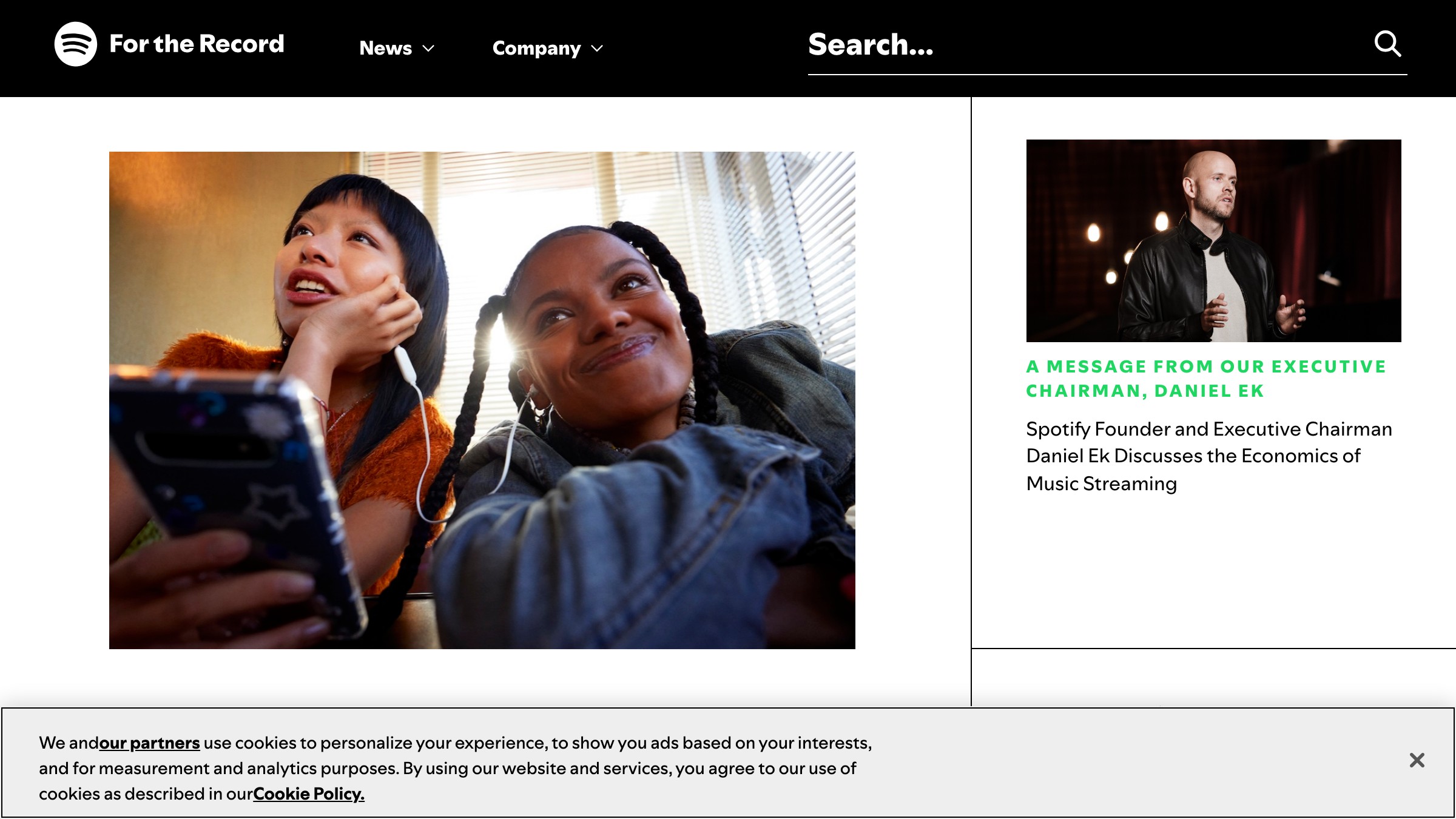
Spotify brand template इस्तेमाल नहीं करता। वो brand framework इस्तेमाल करता है। Duotone imagery, bold typography, data-as-design। हर साल, Wrapped prove करता है कि वो coherence खोए बिना flex कर सकते हैं।
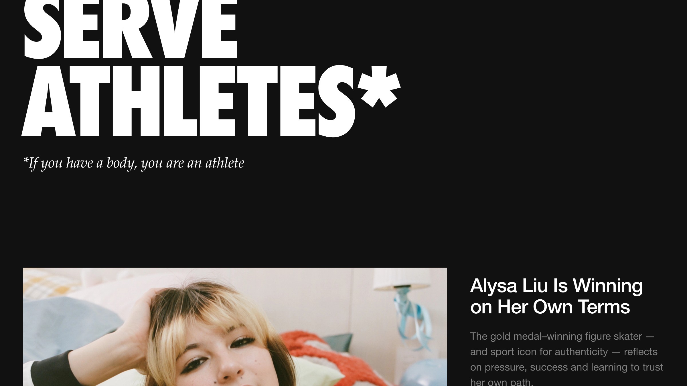
Swoosh को 97% global recognition मिली है, लेकिन Nike की असली identity logo नहीं है। वो attitude है। "Just Do It" कोई tagline नहीं है, वो एक worldview है जिसे हर touchpoint reinforce करता है।
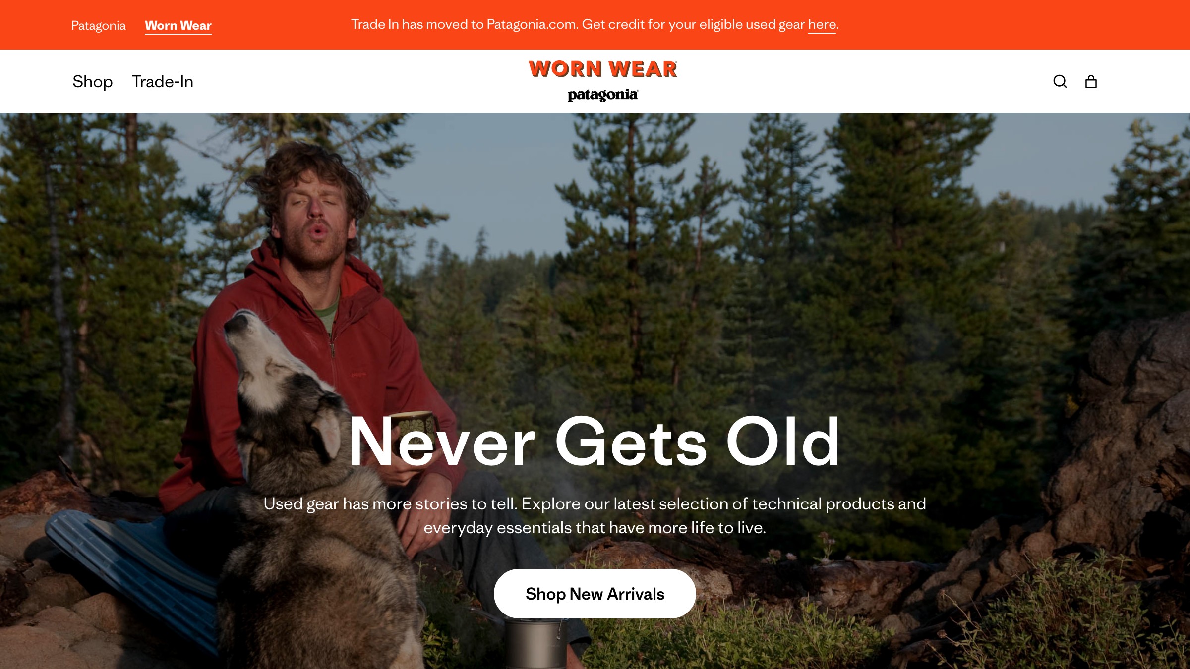
Patagonia का "Don't Buy This Jacket" campaign अब तक का सबसे on-brand advertising है। उन्होंने sales से पहले values रखी, और हर visual choice (mountain silhouette, earth tones, worn-in photography) उस conviction को reinforce करती है।

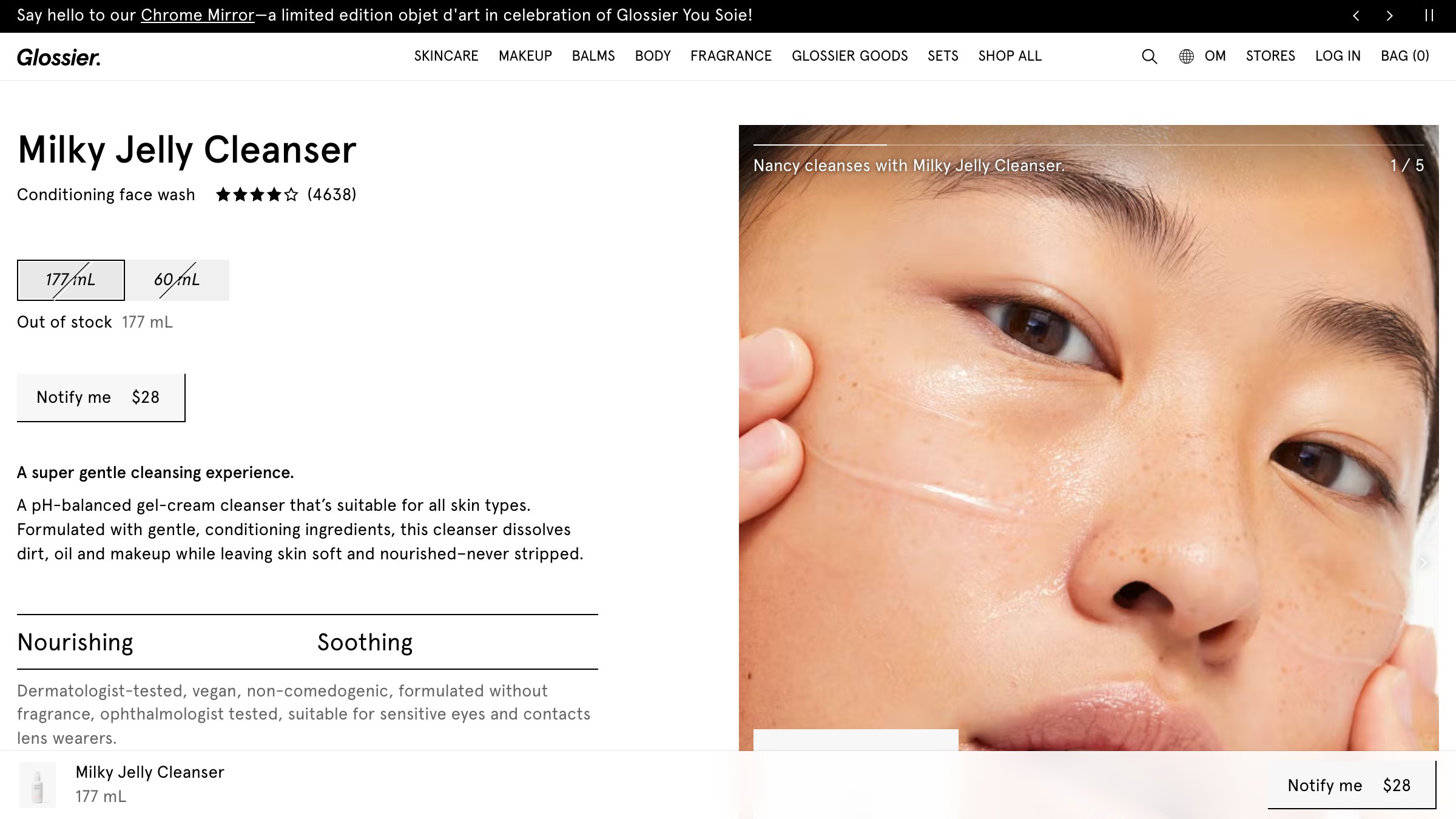
Glossier ने models की जगह अपने customers को brand का चेहरा बनाया। हर visual decision (millennial pink, minimal packaging, UGC strategy) उस philosophy को serve करता है। Identity accessible feel करती है क्योंकि इसे वैसा ही design किया गया था।

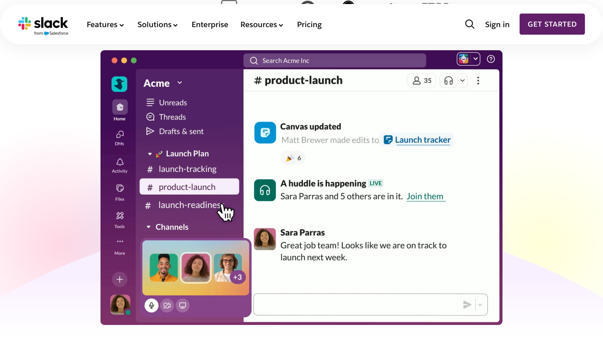
Slack ने एक productivity tool को friendly feel कराया। Saturated colors, rounded shapes, playful loading messages। Identity कहती है "काम miserable नहीं होना चाहिए," जो exactly वही promise है जो product करता है।
वो Pattern जिसके बारे में कोई बात नहीं करता
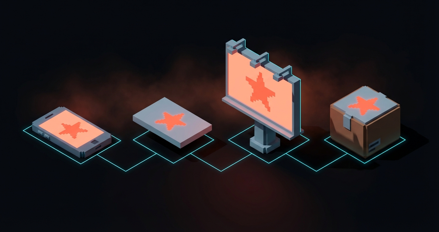
List को फिर से देखें। जो brands stick करते हैं वो वो नहीं हैं जिनके पास सबसे polished logos या सबसे बड़े design budgets हैं। वो वो हैं जहाँ हर touchpoint एक ही कहानी कहता है।
Apple की कहानी है "कम।" Oatly की कहानी है "अजीब ईमानदार है।" Nike की कहानी है "just do it।" Patagonia की कहानी है "planet sale से ज़्यादा मायने रखता है।"
आपकी brand identity कोई deliverable नहीं है। यह एक decision है इस बारे में कि आप क्या मानते हैं और हर जगह उसे एक ही तरह express करने का discipline।
यही पूरा खेल है।
FAQ
Brand identity के key elements क्या हैं?
Logo और variations, एक color system, typography (primary और secondary), imagery style, voice और tone guide, और वो rules कि ये सब एक साथ कैसे काम करते हैं। Rules individual elements से ज़्यादा मायने रखते हैं।
Brand identity design में कितना खर्च आता है?
Freelancers $2,000 से $15,000 charge करते हैं। Agencies $10,000 से शुरू होती हैं और enterprise systems के लिए $100,000+ तक जाती हैं। आप किसी logo file के लिए pay नहीं कर रहे। आप strategic thinking, system design, और consistency rules के लिए pay कर रहे हैं।
Brand identity create करने में कितना समय लगता है?
Scope के हिसाब से चार से बारह हफ्ते। जो कोई एक हफ्ते में full brand identity का promise करे वो corners काट रहा है। Research और strategy phase अकेले एक से तीन हफ्ते लेना चाहिए।
Ready to build a brand identity that actually works? Brainy has built identities for brands across every industry. Let us talk.
Get Started