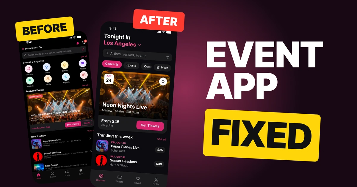
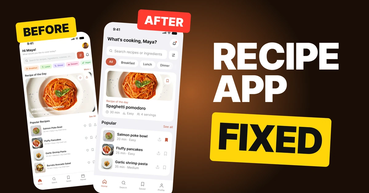
Tap Target Size: Why 24px Is Too Small and the 44pt and 48dp Rule to Use
A 24px icon is fine, a 24px place to tap is not. Apple asks for 44 pt, Android for 48 dp, and WCAG's 24 px is only a floor. Four fixes, rebuilt side by side, and the code to hand your developer.
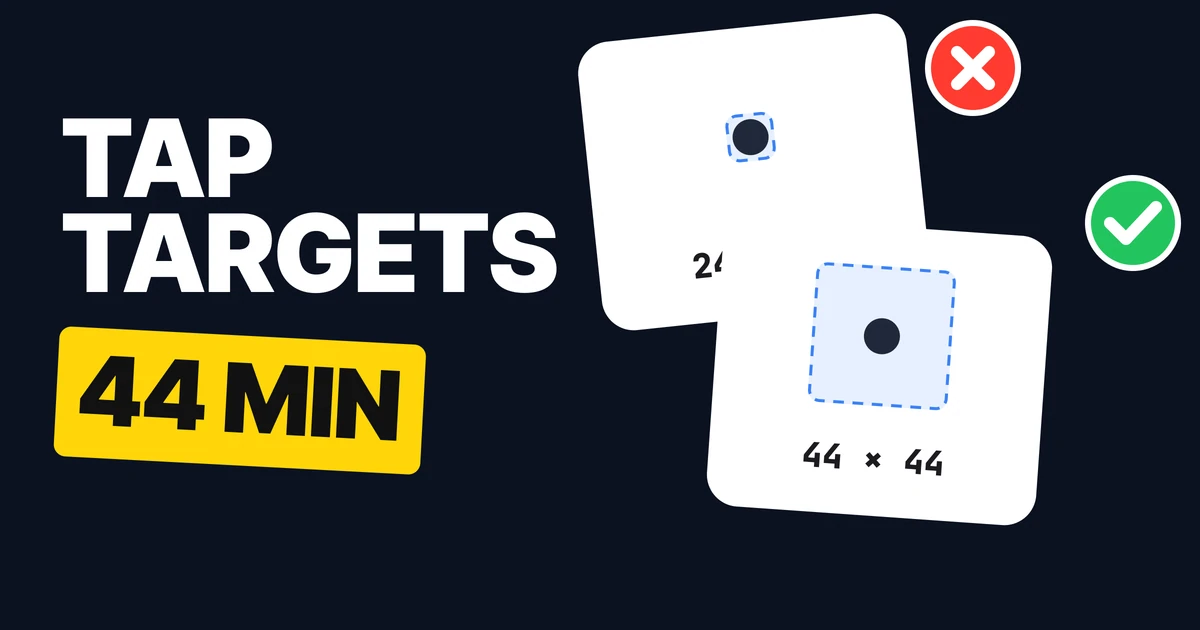
A 24 px icon is fine. A 24 px place to tap is not. People use a fingertip, often one-handed and on the move, and a target that small gets missed or hits its neighbor. Draw the icon small and the target big, and follow the numbers below.
Why 24 px is the number everyone draws
Icons are drawn at 24. Material Symbols, for example, ship with 24 px as the preferred size. So a designer hands over a 24 px icon, a developer makes the button the size of the icon, and the hit area ends up the size of a postage stamp.
The second source of the number is accessibility. WCAG 2.2 asks for pointer targets of at least 24 by 24 CSS pixels at level AA. That is a minimum, and it comes with exceptions. It is easy to read a floor as a goal, and a design that sits exactly on the floor passes a checker and still frustrates people.
The four numbers to know
| Source | Size | What it is |
|---|---|---|
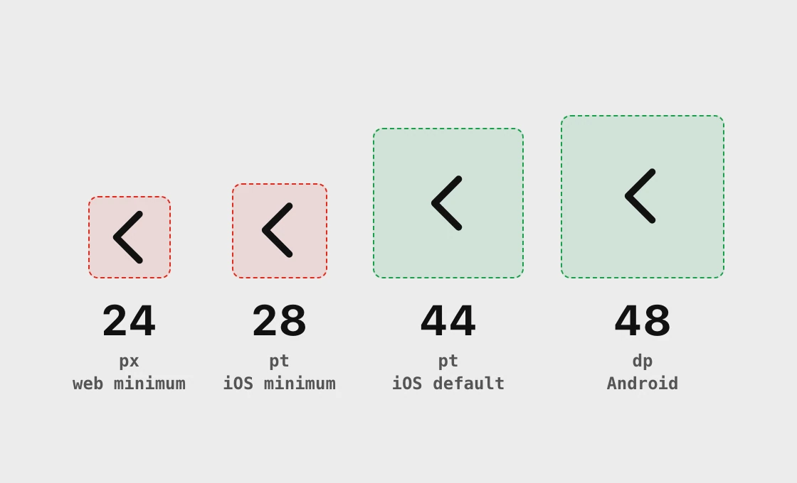
| Apple, iOS and iPadOS | 44 by 44 pt | The default control size |
| Apple, iOS and iPadOS | 28 by 28 pt | The smallest control size |
| Android, Material | 48 by 48 dp | The recommended touch target |
| WCAG 2.2, 2.5.8 (AA) | 24 by 24 CSS px | The minimum, with exceptions |
| WCAG 2.2, 2.5.5 (AAA) | 44 by 44 CSS px | The enhanced target |
Apple's own guidance is direct: a button needs a hit region of at least 44 by 44 points. Points, dp and CSS pixels are all density-independent units, so designers use them side by side on one grid, as the picture does.
One of the WCAG exceptions is worth knowing. Two undersized targets are allowed if a 24 px circle centered on each one does not touch the other target. That is a rule about spacing, and it is why a row of tiny icons set far apart can pass while the same icons packed together fail.
Fix 1: pad the icon out to 44
24 x 24 hit area
44 x 44 hit area
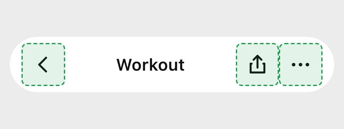
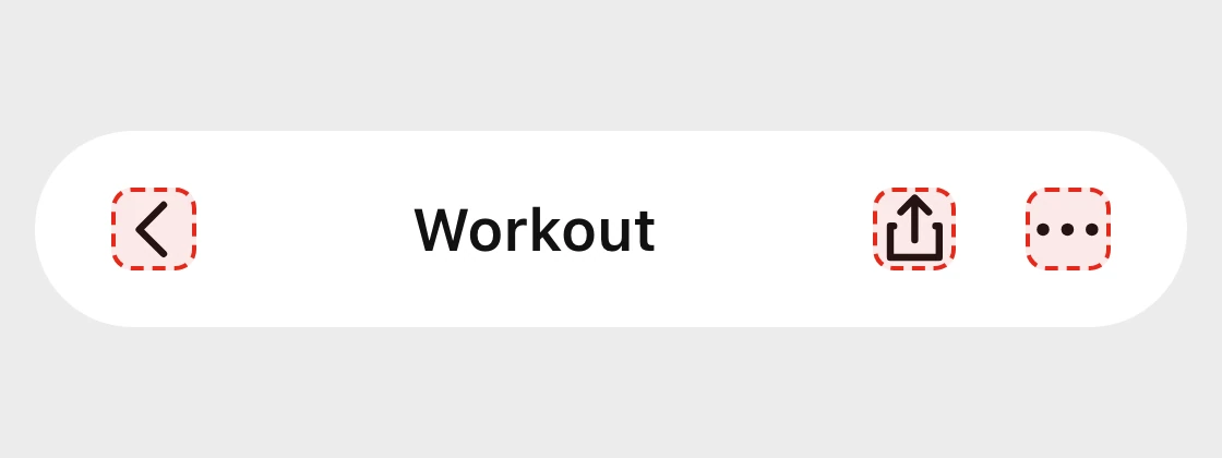
The hit area is the button's frame, not the picture inside it. So the fix is to size the button, not the icon: keep the glyph at 24 and give the button at least 44 on both sides. It applies to every small control that sits alone: the back arrow, the share and more buttons in a toolbar, the info button on a row, a favorite star, a checkbox, a stepper's plus and minus.
When two of them sit side by side, the boxes can touch. That is fine, since touching boxes leave no gap to miss.
Fix 2: let the whole row tap
Switch only
Whole row
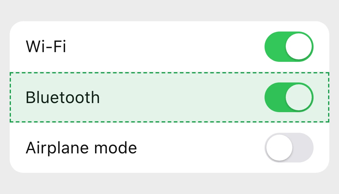
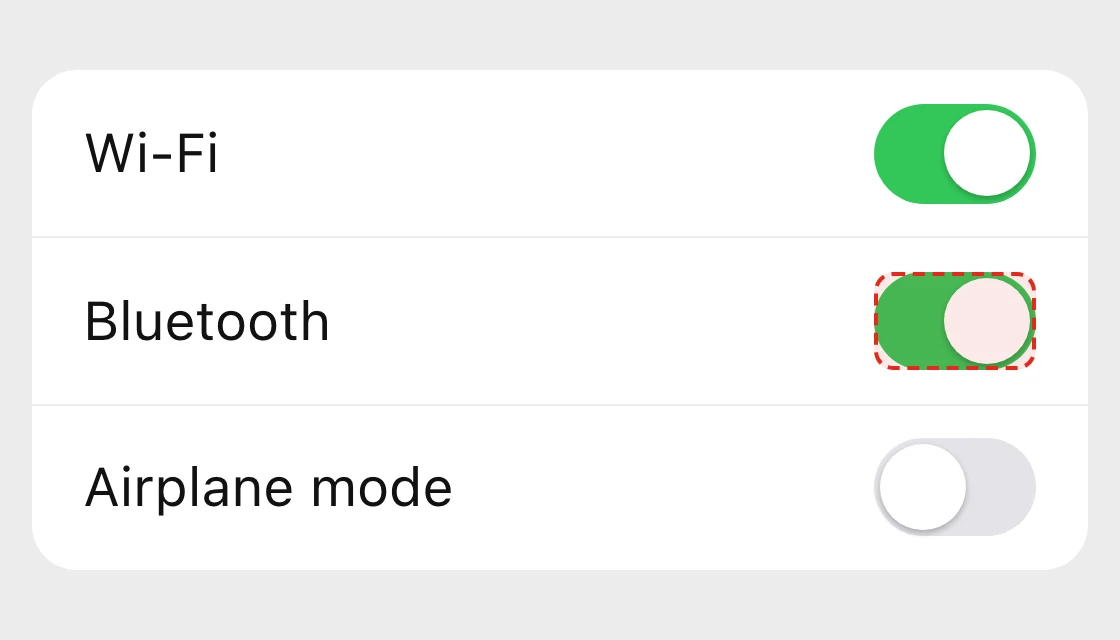
The row is already there, it is already readable, and it is far bigger than 44. Wrap the label and the control in one tappable element so the entire row toggles. It also helps people who use a screen reader or switch access, because there is one control with one name, not a label and a lonely switch.
Fix 3: give the close button a real target
16 x 16
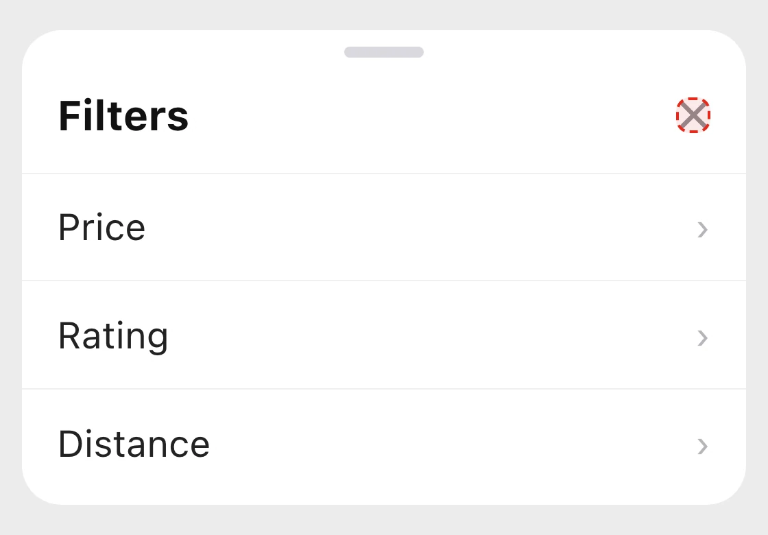
44 x 44
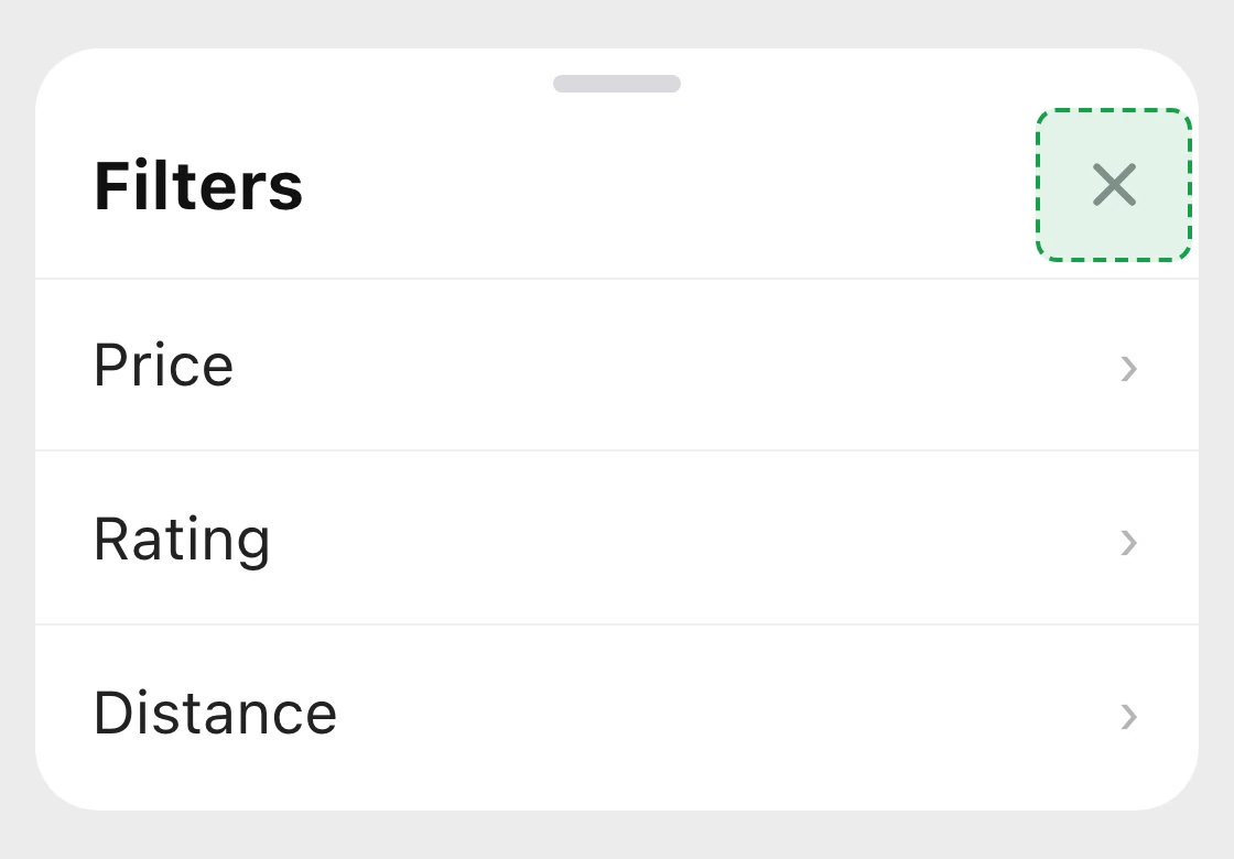
The same goes for the dismiss button on a banner, the clear button inside a search field and the small remove icon on a tag. Draw the mark light and the target heavy.
Fix 4: put the main action at the bottom
Top corner
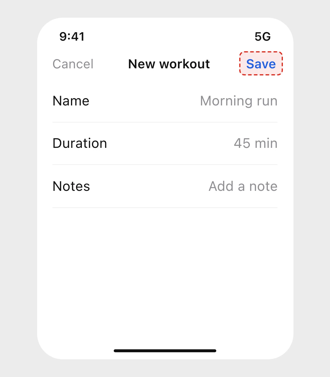
Bottom, full width
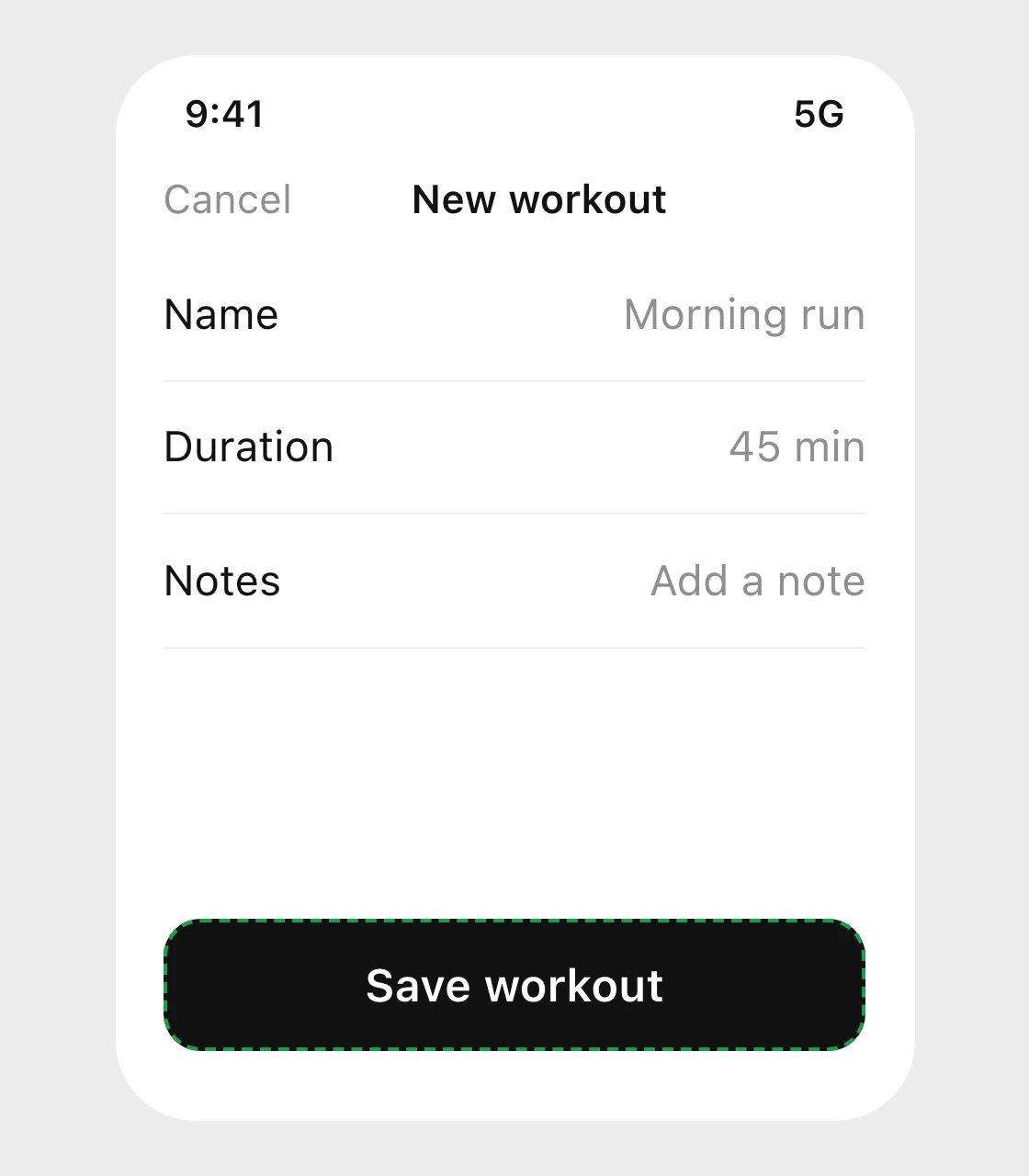
This one is a design rule, not a measured statistic: the point is that where a control sits matters as much as how big it is. The primary action goes low and wide. Cancel and other secondary actions can stay in the bar at the top.
How to build it
On the web, size the button, not the icon:
.icon-button {
  display: inline-grid;
  place-items: center;
  min-width: 44px;
  min-height: 44px;
}
.icon-button svg { width: 24px; height: 24px; }

/* one tappable row: label and switch together */
.row { display: flex; align-items: center; min-height: 44px; }
On Android, Google's guidance is to use android:minWidth and android:minHeight to set a lower bound when a control sizes itself from its content:
<ImageButton
    android:layout_width="wrap_content"
    android:layout_height="wrap_content"
    android:minWidth="48dp"
    android:minHeight="48dp" />
On iOS in SwiftUI, give the control a frame and make the whole frame respond:
Button(action: close) { Image(systemName: "xmark") }
    .frame(minWidth: 44, minHeight: 44)
    .contentShape(Rectangle())
The three snippets are our examples of the rule, not code copied from a platform.
Check your own screens in five minutes
- In your design file, draw every tappable thing as a 44 by 44 box, on top of the icon. Any box that does not fit is a target to enlarge.
- List rows, tabs, chips and pagination controls: is the whole item tappable, or only the part with the word in it?
- Find every close, clear and remove control. Each one needs its own 44.
- Find the one primary action per screen. Is it where the thumb is?
- On a real phone, with one hand, walk through the main flow. Anything you miss twice is too small.
FAQ
What is the minimum tap target size?
On iPhone, Apple's default is 44 by 44 points and the smallest control size is 28 by 28. On Android the recommendation is 48 by 48 dp. On the web, WCAG 2.2 sets a minimum of 24 by 24 CSS pixels at level AA, with exceptions.
How big should a button be on mobile?
At least 44 by 44 points on iOS and 48 by 48 dp on Android, in both width and height. A full-width primary button at the bottom of the screen is already well above both.
Does the icon itself have to be 44 px?
No. The icon can stay 24 px or smaller. What has to be 44 is the area that responds to a tap, which is the button around the icon. Add padding or a minimum width and height to the button.
Is a 24 by 24 px target enough for WCAG?
For level AA, yes, in most cases: the criterion asks for at least 24 by 24 CSS pixels, with exceptions for spacing, inline links and a few others. The enhanced level, AAA, asks for 44 by 44. Passing AA is a minimum for compliance, not a good size to design for.
What is the difference between pt, dp and px?
They are all density-independent units. A point is iOS's unit, a dp is Android's and a CSS pixel is the web's. They are not physically identical, but designers lay them out on the same grid, so 44 pt and 48 dp are treated as roughly the same size.
Where should the main button go on a phone?
At the bottom of the screen, full width, where the thumb rests. Put secondary actions such as Cancel in the top bar. This is a layout rule of thumb, not a measured figure.
Sources
- Apple Human Interface Guidelines, Accessibility: iOS and iPadOS default control size 44 by 44 points, minimum control size 28 by 28 points.
- Apple Human Interface Guidelines, Buttons: a button needs a hit region of at least 44 by 44 points.
- Android Accessibility Help, Touch target size: at least 48dp wide and high, and
android:minWidthandandroid:minHeightas the lower bound for sized-by-content controls. - W3C, WCAG 2.2, 2.5.8 Target Size (Minimum): at least 24 by 24 CSS pixels at AA, including the spacing exception, and 2.5.5 Target Size (Enhanced): 44 by 44 at AAA.
- Google Fonts, Material Symbols guide: 24 px as the preferred icon size.
- The screens above are our own examples. The bottom-placement advice is a design rule, not a statistic.
- More one-rule posts like this one on UX Brainy.
Want every tap in your app to land the first time? Our team designs and builds mobile UI with the hit areas decided once, in the system.
Get StartedGet new papers by email
New Brainy papers in your inbox. Confirm once, unsubscribe anytime.