Smart Home App Design: A Home Screen Redesign, Before and After
A smart home app home screen that reads like a settings page, and the same screen fixed: the room and what is on in one line, swipeable room tabs, wide device tiles and real scene pills. Every change side by side, with the free Figma file.
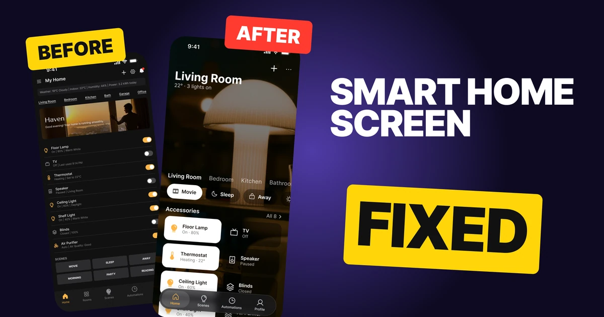
A smart home app has one job on its home screen: show which room you are in and let you change what is on, in one tap. The first draft below has every control, but it lists eight identical rows with tiny status lines, hides the rooms in underlined text and leaves the scenes for last as six small buttons. It looks like a settings page, so using it feels like configuring, not living.
The fix keeps every function and changes how they are shown. The room comes first, devices become tiles that light up when on, and scenes become pills you can reach with a thumb.
The whole screen, before and after
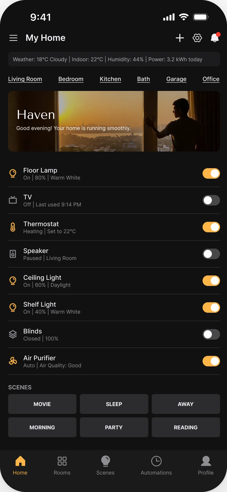
Junior draft
Fixed
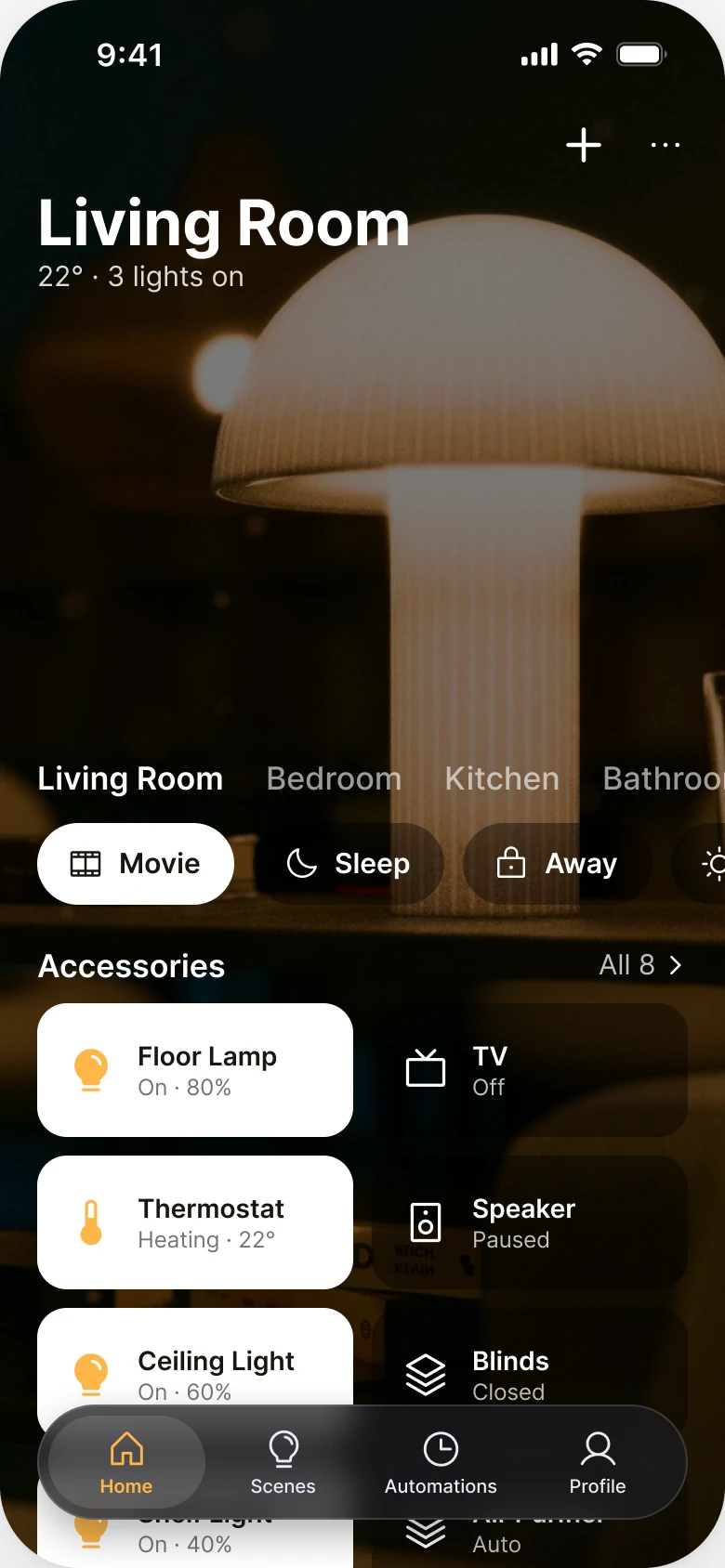
On the left, nothing leads. The header, a stats strip, six links, a photo banner, eight rows and six buttons all sit at the same weight. The device rows are the biggest block, and they are all equally big, so a TV that is off looks as important as the thermostat that is heating.
On the right, the screen answers two questions in order: where am I, and what is on. The photo is the room, not a banner about the app. State is carried by color, so the user reads the grid at a glance.
What changed, measured
| Junior draft | Fixed | |
|---|---|---|
| Header | Menu, title, plus, settings, bell, then a weather line | Room name at 34 bold, "22° · 3 lights on" under it |
| Rooms | Six underlined links, 14 px left margin and 12 px right | Plain tabs at 17 that swipe off the right edge |
| Devices | Eight rows, 9 px status lines, 30 x 18 switches | Tiles 72 tall, radius 16, in two columns, name 14 and state 12 |
| State | A tiny switch | White tile with an amber icon means on |
| Scenes | Six capital-letter buttons under a "SCENES" label | Pills 44 tall, the active one lit |
| Photo | A small banner with a greeting | The room itself, full screen, under one flat 52% black layer |
| Tabs | Five, mixed filled and outline icons | Four in a floating 62 px bar, the tiles run under it |
| Accent | Amber on switches and icons | One amber, on the on tiles and the active tab |
Fix 1: say the room, then what is on
Before
After

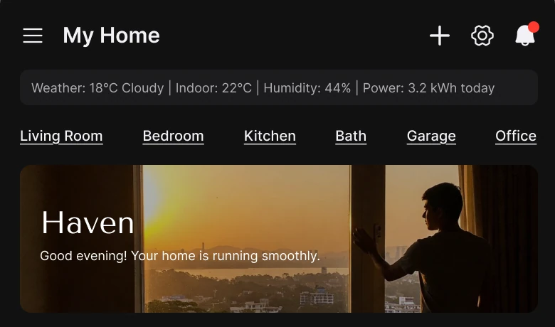
A header with a menu icon, My Home, plus, settings and a bell with a red dot, a weather strip reading 18°C Cloudy, Indoor 22°C, Humidity 44%, Power 3.2 kWh, six underlined room links and a photo banner reading Haven, against Living Room in large bold type with 22° · 3 lights on under it, over the room photo, with a plus and a three dot menu.
The draft header tries to be a control panel. It carries three actions, a four-part weather line and a greeting that says the home is "running smoothly", which is not information. The user already knows nothing is wrong, because nothing is flashing.
The fix gives the screen a subject. "Living Room" is the title, and one line under it holds the two facts people check: the temperature and how many lights are on. The three lights are the Floor Lamp, Ceiling Light and Shelf Light that are on in the draft, so nothing was invented. Weather, humidity and power open from the three dots, and the bell and gear move to Profile.
This is the pattern Apple Home uses: a room name with its live state on top.
Rule to reuse: put the place first and one line of live state under it. Move the rest behind a menu.
Fix 2: plain room tabs that swipe
Before

After

Six underlined links in a row: Living Room, Bedroom, Kitchen, Bath, Garage, Office, against Living Room in bold white and Bedroom, Kitchen and Bathroom in gray, running off the right edge.
Underlined text reads as a link in a paragraph, not as a choice between rooms. Six of them also fill the width, so the user cannot tell which room is open. Underline is the loudest tool on the page for what is the quietest element.
Plain tabs fix both. The selected room is white and the others are gray, so the current room is the only bright one. The row runs off the right edge on purpose, which shows it swipes and lets the list grow past six rooms without a new layout. Bathroom and Office are one swipe away, and Garage opens from the dots.
Rule to reuse: show selection with color, not underline, and let a row of choices run off the edge.
Fix 3: tiles instead of rows
Before
After
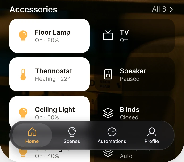
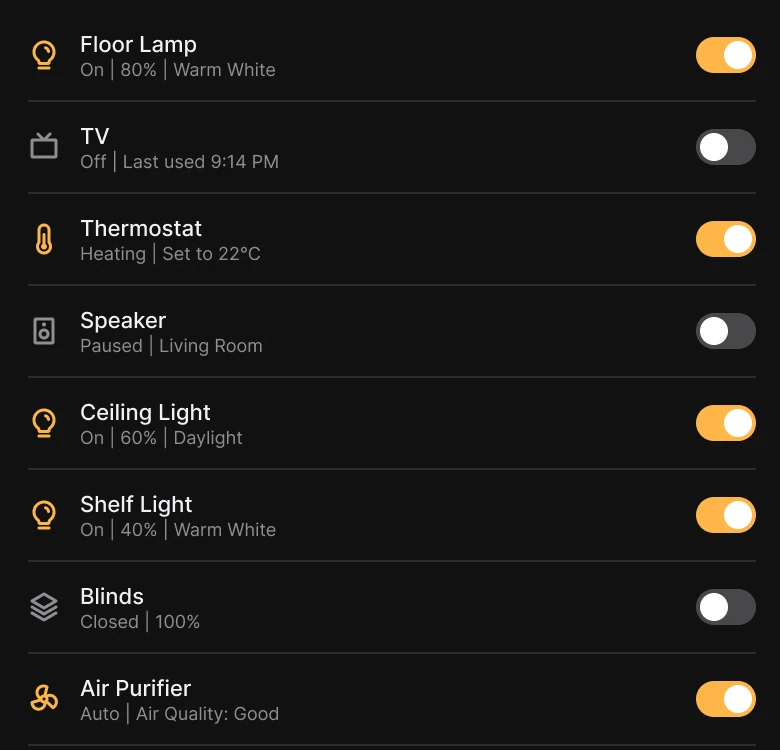
Eight identical rows with an icon, a name, a gray status line like On, 80%, Warm White and a small amber or gray switch on the right, against wide rounded tiles in two columns: Floor Lamp and Thermostat in white with amber icons, TV and Speaker dark with white icons, and Ceiling Light and Blinds starting below.
The rows cost the most. Each one needs the user to find a 9 px line, read "On | 80% | Warm White" and then find a 30 x 18 switch to tap. Eight of them are a column of text with nothing to separate the on devices from the off ones.
A tile is a button. The whole tile is the tap target, the name is 14 and the state is 12, and color does the job of the switch: white with an amber icon is on, dark with a white icon is off. The user can scan eight devices in one look and see that two are on in the first rows. The tiles also run under the floating tab bar, which tells the user the list continues.
Nothing was dropped. The draft's Ceiling Light, Shelf Light, Blinds and Air Purifier sit behind "All 8" under Accessories, so every device is still reachable.
Rule to reuse: when every item has an on and off state, show the state with the item's own color, and make the whole card the target.
Fix 4: real scene pills
Before
After

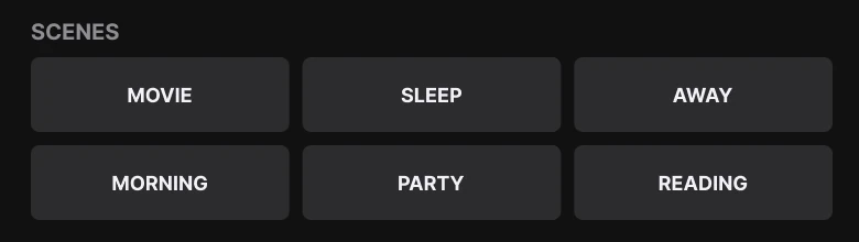
A small SCENES label over six equal gray buttons in capital letters: Movie, Sleep, Away, Morning, Party, Reading, against a row of rounded pills with icons: Movie lit in white, Sleep and Away dark, the next one running off the edge.
Scenes are the best part of a smart home app, because one tap changes the whole room. In the draft they sit at the bottom, under eight rows, as six identical gray buttons. They look like a form, and none of them says which scene is active.
The fix moves scenes up, right under the room tabs, and gives each an icon. They are 44 tall, so they work with a thumb, and the active scene is lit white. Party swipes in the pills and Reading is in the Scenes tab.
Rule to reuse: put the highest-value action where the thumb is, and show which one is active.
The smaller fixes
- Every function stays. Ceiling Light, Shelf Light, Blinds and Air Purifier sit behind All 8. Weather, humidity and power open from the dots in the header. Bell and gear move to Profile, which carries the badge dot.
- Even margins. The draft has 14 px on the left and 12 px on the right. The fixed screen uses one margin on both sides.
- One accent. Amber appears only on the on tiles' icons and the active tab. In the draft it is on every switch and several icons.
- A flat dim layer. One 52% black layer sits over the photo, no gradient and no glow, so the lamp stays readable and the books dim.
- Fewer tabs. Four tabs in a floating 62 px bar replace five tabs with mixed filled and outline icons.
- Type scale. Text runs from 12 to 34 pt, with 10 pt tab labels, in place of the draft's 9 to 15 px.
Audit your own smart home screen
| Question | Why it matters |
|---|---|
| Does the screen say which room it is? | Control depends on place |
| Is the on and off state visible without reading? | Color is faster than a 9 px line |
| Is the whole device a tap target? | A small switch is hard to hit |
| Are scenes within thumb reach and is the active one marked? | They are the highest-value action |
| Do rooms show selection with color? | Underline reads as a link |
| Is amber, or any accent, used for one meaning? | An accent works once |
Get the Figma file
The free file has the junior draft, the fixed screen and every part as a component.
Free Figma file
Smart home screen redesign, before and after
Both screens and every part as a Figma component. Free, view only, duplicate it to your drafts.
FAQ
How should a smart home app home screen be designed?
Lead with the room name and one line of live state, such as "22° · 3 lights on". Show devices as two-column tiles where color means on, put scenes in pills near the top, and move weather and settings behind a menu.
Should a smart home app use tiles or lists for devices?
Tiles, for a home screen. The whole tile is the tap target and color shows state at a glance. A list is fine for a long settings or history view.
How do you show a device is on in a smart home app?
With the tile itself: a white card with an amber icon for on and a dark card with a white icon for off, so no one has to read a status line or find a small switch.
Where should scenes go in a smart home app?
Near the top, under the room tabs, as pills the thumb can reach with the active scene lit. Scenes change a whole room in one tap, so they should not sit under eight rows.
How many tabs does a smart home app need?
Four is enough: Home, Scenes, Automations and Profile. Rooms live in the swipeable tabs on the home screen.
Why not underline room names in a smart home app?
Underline reads as a link in text. Plain tabs, with the selected room in white and the others in gray, show which room is open and let the row swipe.
Sources
- Both screens are our own, designed and measured in Figma. The app, Haven, and its devices are made up. The numbers are consistent: three lights are on in both screens, the Floor Lamp is at 80% and the thermostat is set to 22° on both.
- Pattern studied: Apple Home, with a room name and its state on top, tiles for accessories and scenes as pills. Text sizes follow iOS (12 to 34 pt, 10 pt tab labels).
- Icons are from Phosphor (MIT). Photos from Pexels: Yusuf P and Jan Vee.
- First published as a carousel on App Brainy.
Want this for your own app? Our team redesigns app screens like this one, from the first audit to the finished components.
Get StartedGet new papers by email
New Brainy papers in your inbox. Confirm once, unsubscribe anytime.