नेविगेशन डिज़ाइन पैटर्न: वेब और मोबाइल के लिए 9 मेनू लेआउट
नौ नेविगेशन डिज़ाइन पैटर्न जो हर डिज़ाइनर को पता होने चाहिए, top bar से लेकर command palette तक, असली उदाहरणों और स्पष्ट सलाह के साथ कि कब किसका उपयोग करें।
नेविगेशन डिज़ाइन पैटर्न: वेब और मोबाइल के लिए 9 मेनू लेआउट
नेविगेशन कोई मेनू नहीं है। यह एक वादा है कि चीजें कहाँ रहती हैं। जब यह काम करता है, तो यूज़र बिना सोचे प्रोडक्ट में आगे बढ़ते हैं। जब यह फेल होता है, तो वे चले जाते हैं।
यूज़र नेविगेशन पढ़ते नहीं। वे इसे स्कैन करते हैं, इस पर भरोसा करते हैं, और इसे केवल तब नोटिस करते हैं जब यह फेल हो जाता है।
यही असली डिज़ाइन समस्या है। नेविगेशन कोई ऐसा फीचर नहीं है जिसे सेलिब्रेट किया जाए, यह एक इन्फ्रास्ट्रक्चर है जिसे अदृश्य बनाना होता है। अपनी information architecture या यूज़र के context के लिए गलत पैटर्न चुनना एक chain reaction शुरू कर देता है: लोगों को सेक्शन नहीं मिलते, वे खुद को orient नहीं कर पाते, और वे कभी यह mental model नहीं बना पाते कि आपका प्रोडक्ट कैसे काम करता है।
नौ पैटर्न लगभग हर case को cover करते हैं। नीचे हर एक का सीधा breakdown है, यह किस चीज़ में अच्छा है, कहाँ टूटता है, और इसे कब चुनना चाहिए।
नेविगेशन असल में किस लिए है
नेविगेशन यूज़र के लिए एक सवाल का जवाब देता है: यहाँ से मैं कहाँ जा सकता हूँ? इसे साफ तरीके से जवाब दें और वे आगे बढ़ेंगे। उन्हें ढूंढने पर मजबूर करें और वे चले जाएंगे।
नेविगेशन का structural काम है कि आपकी information architecture को एक ऐसे सिस्टम के रूप में represent करे जिस पर यूज़र भरोसा कर सकें। इसका मतलब है consistency, stability, और प्रोडक्ट में जो actually है उसका ईमानदार प्रतिबिंब। नेविगेशन जो pages के बीच बदलता रहता है, URLs से अलग labels दिखाता है, या primary paths को secondary के नीचे दबा देता है, वह एक design failure है, चाहे dropdown animation कितना भी polished हो। Amazon इसीलिए सैकड़ों millions प्रोडक्ट्स में हर page पर same primary navigation रखता है।
इसका practical मतलब यह है कि आप navigation pattern दो inputs के आधार पर चुनते हैं: आपकी IA कितनी गहरी और चौड़ी है, और लोग प्रोडक्ट को किस context में use करते हैं। बाकी सब कुछ, visual style, animation, color, इन दो decisions से follow होता है।
Top navigation bar
Horizontal top bar वेब का default इसलिए है क्योंकि यह काम करता है। Desktop scale पर यह header में roughly पाँच से सात primary sections fit करता है, उन्हें हमेशा visible रखता है, और उसी तरह mirror करता है जैसे लोग पढ़ते हैं: बाएँ से दाएँ, ऊपर से नीचे।
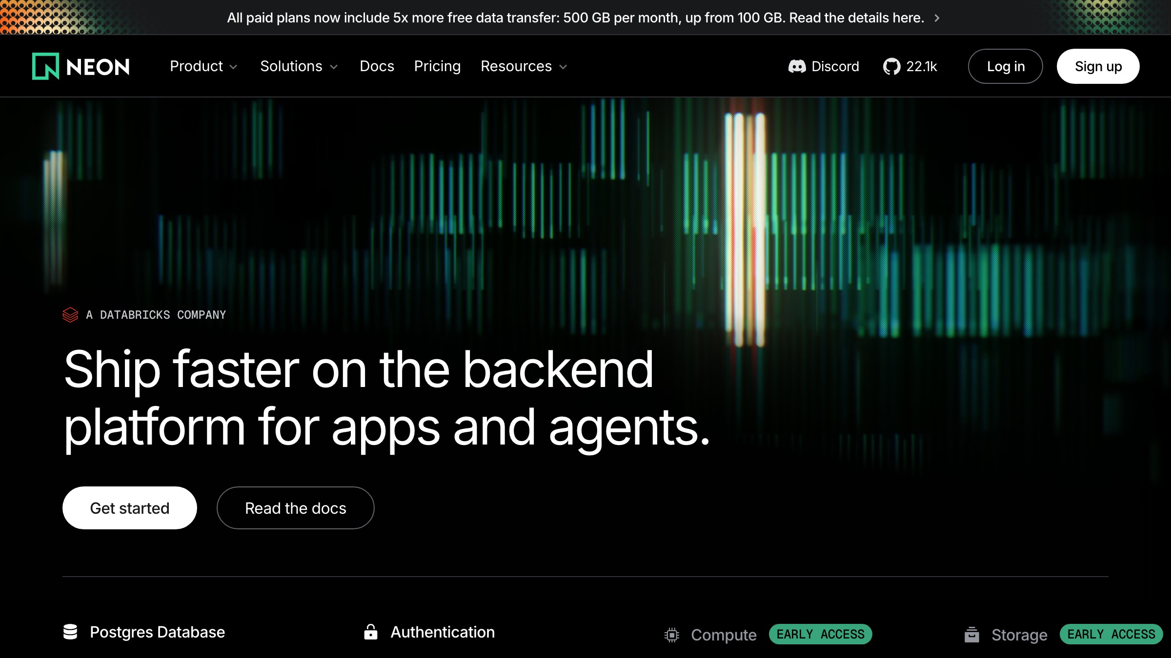
Neon (neon.tech) इसका एक clean version चलाता है। बाईं तरफ wordmark, बीच में primary nav links, दाईं तरफ sign-in और एक CTA button। कुछ भी hidden नहीं, कुछ भी nested नहीं, कोई cognitive overhead नहीं। अपने best पर, एक top bar किसी साइट की structure की पूरी कहानी बिना किसी interaction के एक single row में बता देता है।
Failure mode है cramming। नौ links, दो dropdowns, एक utility menu, और एक search icon वाला top bar एक navigation pattern नहीं है, यह एक panic attack है। इस पैटर्न की hard ceiling लगभग छह या सात items की है, उसके बाद restructuring ज़रूरी है।
Top bars को भी एक planned mobile fallback की ज़रूरत होती है। छोटी screens पर horizontal layout के लिए कोई जगह नहीं है। अगर आप design time पर यह तय नहीं करते कि small-viewport experience क्या होगी, तो आप बाद में hamburger menu bolt-on करेंगे, जो नई problems लाता है।
Hamburger menu
Hamburger menu (तीन stacked lines, tap पर एक drawer या overlay खुलता है) navigation को एक extra interaction के पीछे छुपा देता है। यह screen real estate बचाता है। साथ ही यह आपके प्रोडक्ट के हर section को कम discoverable भी बना देता है।
इस पर research ambiguous नहीं है। NNGroup ने पाया कि mobile पर tabbed navigation discoverability और task completion rates में hamburger menus को consistently outperform करता है। जब आप navigation छुपाते हैं, लोग इसे कम use करते हैं। Hamburger के पीछे के items को lower priority के रूप में register किया जाता है, क्योंकि visually वे हैं भी।
इसका मतलब यह नहीं कि hamburger गलत है। इसका मतलब है कि यह एक trade-off है। गहरे, कम-accessed sections वाली sites के लिए, यह trade-off acceptable है। जिन apps को लोग daily खोलते हैं, उनके लिए यह आमतौर पर एक गलती है।
Instagram ने primary navigation को hamburger के पीछे रखने की कोशिश की और course reverse किया, core sections को bottom tab bar पर move कर दिया। सबक स्पष्ट है: hamburger का use secondary paths, settings, और infrequent destinations के लिए करें। इसे उन actions के लिए कभी use न करें जो define करते हैं कि किसी ने प्रोडक्ट क्यों खोला।
Persistent sidebar
एक persistent sidebar navigation का एक full column screen के बाईं तरफ pin करता है और यूज़र के scroll करते समय visible रहता है। यह dashboards, design tools, और deep documentation का dominant pattern है, क्योंकि spatial permanence ही इसका feature है।
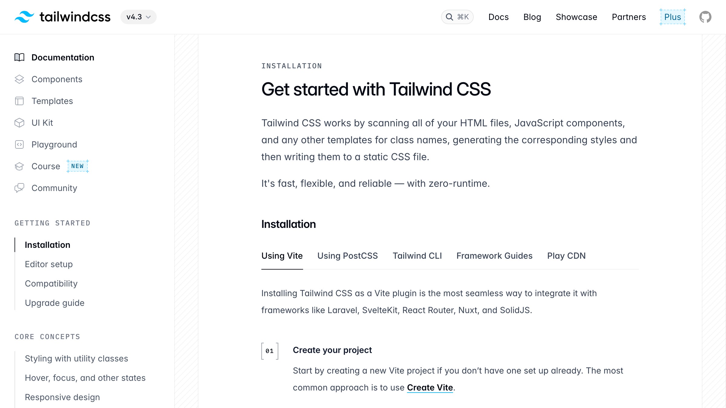
Tailwind CSS docs इसे exactly सही use करते हैं। Left sidebar documentation के हर section को hold करता है, grouped और scrollable, जबकि content बाकी width occupy करता है। यूज़र हमेशा जानते हैं कि वे कहाँ हैं, कहाँ जा सकते हैं, और पूरी information space कैसे organized है। Deep reference material में यह spatial awareness पूरा point है जहाँ लोग constantly sections के बीच jump करते हैं।
Slack, Notion, और Figma सभी इसी कारण से app scale पर persistent sidebars use करते हैं। Sidebar map है। इसे हटाने का मतलब होगा कि यूज़र हर navigation action के साथ उस mental model को rebuild करें, जो एक cost है जो उन्हें नहीं चुकानी चाहिए।
Cost है horizontal screen real estate। 13-inch laptop पर, एक persistent sidebar आपके content area के 250 से 300 pixels use करता है। Mobile पर इसके लिए कोई जगह नहीं है।
Responsive sidebars छोटी screens पर drawer या hamburger में collapse हो जाते हैं, जो वही discoverability problems फिर से लाते हैं जिनसे आप बचने की कोशिश कर रहे थे। इसे शुरू से ही उन tokens से wire करें जो nav को consistent रखते हैं, वरना आप बाद में इसे patch करते रहेंगे।
Bottom tab bar
Bottom tab bar mobile screen के नीचे तीन से पाँच icons को anchor करता है, सीधे thumb zone के अंदर। यह native mobile apps का standard है और, 2026 तक, किसी भी web product का default है जिसे लोग अपने phones पर daily खोलते हैं।

Instagram, Spotify, और YouTube सभी अपने primary mobile navigation के लिए इस pattern का use करते हैं। ये coincidences नहीं हैं। Bottom bar इसलिए exist करता है क्योंकि phone screen का top area एक thumb से reach करने के लिए सबसे कठिन जगह है, और navigation को constantly tap किया जाता है। Primary destinations को नीचे move करना physical effort को उस तरह से कम करता है जो हज़ारों daily sessions में compound होता है।
पाँच items hard ceiling है। पाँच से ज़्यादा, icons shrink होते हैं और labels cut हो जाते हैं। अगर आपके प्रोडक्ट में पाँच से ज़्यादा primary sections हैं, तो यह एक information architecture problem है जो navigation problem के रूप में disguise है। Pattern चुनने से पहले restructure करें।
2026 में, bottom tab bar किसी भी product का default है जिसे लोग mobile पर कम से कम daily खोलते हैं। अगर आप एक consumer mobile product या mobile-first progressive web app design कर रहे हैं और bottom bar use नहीं कर रहे, तो आपको एक specific reason चाहिए। "हमने पहले desktop के लिए design किया" वह reason नहीं है।
Mega menu
Mega menu एक single top navigation item को links, categories, और कभी-कभी preview tiles के एक wide, multi-column panel में expand करता है। यह large catalogs और complex hierarchies वाली sites के लिए बना है जो एक simple dropdown में fit नहीं होती बिना unusable हुए।
Amazon इसका एक extreme version अपने "All" menu के नीचे चलाता है। Dozens of categories with subcategories, columns और groups में organized, सब एक panel में visible। यह pattern catalog pressure में काम करता है क्योंकि यह hierarchy में multiple clicks की ज़रूरत के बिना depth surface करता है। सब कुछ एक view में scannable है।
समस्या यह है कि mega menus design से ही desktop-only pattern हैं। एक multi-column dropdown panel mobile पर translate नहीं होता। जो sites इन्हें use करती हैं उन्हें small screens के लिए एक completely separate navigation strategy की ज़रूरत होती है, जो design और maintenance surface area को double कर देती है।
Mega menus shallow sites पर भी fail होते हैं। बारह pages mega menu justify नहीं करते। यह pattern एक complexity imply करता है जो आपको अपनी actual content depth से earn करनी होती है, भविष्य की growth के बारे में optimism से नहीं।
Breadcrumbs
Breadcrumbs homepage से current page तक का path दिखाते हैं: Home > CSS > Grid। ये primary navigation नहीं हैं। ये orientation navigation हैं, और एक precise function serve करते हैं।
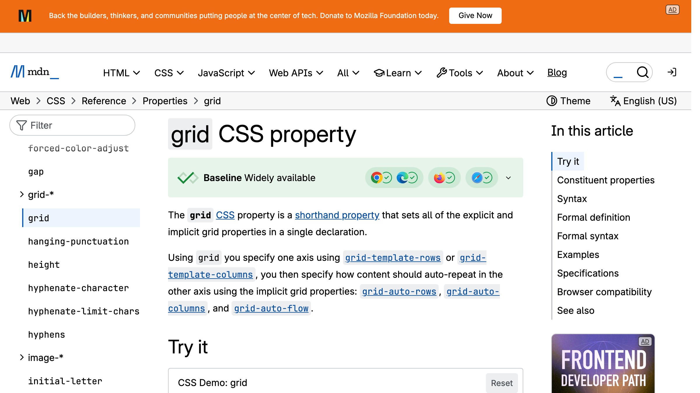
MDN हर reference page पर breadcrumbs use करता है। जब आप Google search से CSS grid documentation पर land करते हैं, तो breadcrumb trail आपको instantly बताती है कि यह page CSS के अंदर रहती है, जो References के अंदर रहती है। वह context एक three-level hierarchy को एक single line में collapse कर देती है जिसे parse करने के लिए किसी interaction की ज़रूरत नहीं।
Flat sites पर Breadcrumbs useless हैं। अगर आपका पूरा product दो levels deep है, तो breadcrumbs कोई orientation value दिए बिना visual clutter add करते हैं। वे documentation sites, e-commerce hierarchies जैसे Home > Men > Jackets > Waterproof, और किसी भी site पर अपनी जगह earn करते हैं जहाँ यूज़र regularly search के through deep land करते हैं।
वे दूसरे patterns के साथ pair करते हैं न कि उन्हें replace करते हैं। Breadcrumbs content के ऊपर बैठते हैं, एक top bar या sidebar को supplement करते हैं। अधिक web और UI design breakdowns के लिए, वही logic apply होता है: secondary navigation elements को primary pattern को support करना चाहिए, compete नहीं।
Command palette
Command palette एक keyboard-triggered overlay है, जो आमतौर पर Cmd+K या Ctrl+K से summon होता है, जो text input accept करता है और ranked actions, navigation targets, और search results return करता है। Linear, Raycast, Slack, और Figma सभी इसे एक first-class navigation surface के रूप में ship करते हैं।
2026 में, command palette एक power-user trick से serious productivity software में एक primary navigation mechanism तक graduate हो गया है। Linear का Cmd+K आपको दो seconds से कम में किसी भी issue, project, या workspace action तक पहुँचाता है। Raycast लगभग पूरी तरह इस pattern के आसपास बना है। ये products typed intent को किसी भी menu hierarchy से ज़्यादा direct path मानते हैं, क्योंकि keyboard habits वाले लोगों के लिए यह है भी।
Failure mode है invisibility। जो users shortcut के exist होने को नहीं जानते वे कभी exploration के ज़रिए इसे discover नहीं करेंगे। Command palettes first-time users या उन लोगों के लिए visible navigation replace नहीं कर सकते जिनकी keyboard-first habits नहीं हैं। Products जो सारी navigation Cmd+K के पीछे छुपा देते हैं, हर new user को stranded छोड़ देते हैं।
सही use है augmentation, replacement नहीं। Command palette को अपने sidebar या top bar के alongside run करें। Keyboard-native users को menu completely skip करने दें।
बाकी सबको visually navigate करने दें। दोनों paths exist करने ज़रूरी हैं।
Sticky और shrinking headers
Sticky header यूज़र के scroll करते समय viewport के top पर fixed रहता है। Shrinking header वही करता है लेकिन यूज़र के एक scroll threshold pass करने के बाद अपनी height कम कर देता है, navigation तक access sacrifice किए बिना vertical space reclaim करता है।
दोनों patterns लंबे pages पर navigation को accessible रखते हैं बिना top तक scroll back करने की ज़रूरत के। Content-heavy pages पर, यह एक real usability improvement है। GitHub repository pages पर एक sticky header use करता है ताकि primary navigation, search, और repo context हमेशा view में रहे जब आप issues, code, और discussions के through scroll करते हैं।
Cost है vertical screen space। 60 से 70 pixels का sticky header हर scroll position से वह height claim करता है। 768-pixel-tall tablet पर, यह viewport का close to 10 percent है जो navigation से permanently occupied है। Shrinking headers scroll के बाद लगभग 40 pixels तक reduce होकर उसमें से कुछ recover करते हैं, लेकिन उन्हें intentional लगने के लिए careful implementation चाहिए, broken नहीं।
Short pages पर sticky headers से बचें जहाँ यूज़र quickly नीचे पहुँच जाता है। यह pattern long, content-dense pages पर अपनी worth earn करता है जहाँ top पर वापस जाने के लिए significant scroll की ज़रूरत होगी।
Fat footer
Fat footer एक wide, multi-column footer है जो secondary navigation, link categories, legal pages, और contact information hold करता है। यह primary navigation नहीं है। यह उन users के लिए एक second chance है जो main content के through scroll करते हैं बिना वह पाए जो उन्हें चाहिए था।
Tailwind CSS, Stripe, और ज़्यादातर SaaS marketing sites product links, documentation, company pages, legal, और social links covering करने वाले चार से छह columns के साथ fat footers run करते हैं। ये main content experience में viewport height में कुछ भी cost नहीं करते और उन users के लिए एक useful map provide करते हैं जो कुछ specific ढूंढते हुए नीचे पहुँचते हैं।
Fat footers live navigation से SEO के लिए ज़्यादा important हैं। Fat footer में हर link एक crawlable path है। वे उन main ways में से एक हैं जिनसे search engines एक site पर secondary और tertiary pages discover करते हैं। Pure usability perspective से, ज़्यादातर users कभी footer तक scroll नहीं करते, लेकिन जो करते हैं वे deliberate search पर होते हैं।
Logged-in product experiences के अंदर fat footer skip करें। Notion editor के अंदर आपको marketing footer नहीं दिखाता। यह pattern marketing sites और documentation hubs से belong करता है जहाँ anonymous और new users freely browse करते हैं।
सही pattern कैसे चुनें
सही navigation pattern दो inputs से follow होता है: आपकी information architecture की depth और वह context जिसमें लोग product use करते हैं। बाकी सब कुछ इन दो factors का consequence है।
| Product Type | IA Depth | Primary Platform | Recommended Pattern |
|---|---|---|---|
| Marketing site | Shallow | Desktop + mobile | Top bar + fat footer |
| SaaS marketing, large catalog | Medium to deep | Desktop + mobile | Top bar + mega menu (desktop), hamburger (mobile) |
| Documentation | Deep | Desktop | Persistent sidebar + breadcrumbs |
| Dashboard या design tool | Medium to deep | Desktop | Persistent sidebar |
| E-commerce | Deep | Desktop + mobile | Mega menu (desktop), bottom bar या hamburger (mobile) |
| Consumer mobile app | Medium | Mobile | Bottom tab bar |
| Productivity या developer tool | Deep | Desktop + keyboard | Persistent sidebar + command palette |
| Editorial या blog | Shallow | Desktop + mobile | Top bar + sticky header on long reads |
Patterns को combine करना normal और expected है। ज़्यादातर serious products दो या तीन use करते हैं। Tailwind CSS documentation site-level navigation के लिए top bar, docs navigation के लिए persistent sidebar, और page-level orientation के लिए breadcrumbs use करता है। वे तीन patterns बिना overlap किए एक साथ navigation hierarchy के तीन distinct levels address करते हैं।
Brainy designers को तेज़ और sharper calls लेने में help करता है, उस काम पर जो actually ship होता है। देखें हम creators के लिए क्या बना रहे हैं।
नेविगेशन की वे गलतियाँ जो चुपचाप usability को मार देती हैं
Hamburger menu में primary actions छुपाना। अगर users को एक feature daily चाहिए, तो यह एक extra tap के पीछे नहीं रह सकता। Hamburger पर click-through rate measure करें। अगर यह 30 percent से कम है, तो अंदर के paths आपके ज़्यादातर users को invisible हैं।
Surfaces के across inconsistent labeling। Dashboard पर "Insights", onboarding email में "Reports", help docs में "Analytics", सब एक ही destination की तरफ pointing। Navigation एक vocabulary है। हर synonym यूज़र के mental model में एक question mark है।
Current location पर active state नहीं। Users को पता होना चाहिए कि वे कहाँ हैं। Current nav item पर active state सबसे basic orientation signal है जो available है। इसे omit करना users को URL पढ़ने पर force करता है, जो एक failure mode है जो आपने product में design किया।
Navigation जो page या section के हिसाब से shift होता है। अगर sidebar उस section के हिसाब से rearrange होता है जिसमें यूज़र है, तो आपने वह spatial memory तोड़ दी है जो उन्होंने बनाई थी। Navigation एक fixed map होनी चाहिए। जिन products में position के हिसाब से map बदलती है, वे user confidence नहीं बनाते, वे उसे destroy करते हैं।
Nesting का overuse। Three-level deep dropdown लगभग हमेशा एक information architecture problem है जो UI में incorrectly surface हो रही है। पहले structure flatten करें। Nested menus slow to scan होते हैं, touch पर use करना impossible होता है, और hover पर open रहने के लिए precise mouse control चाहिए।
scan के लिए बने layout patterns के लिए, वही principle apply होता है: structure और orientation decoration से पहले आते हैं। Navigation जो orient करने में fail होता है वह best case में decoration है, worst case में friction।
FAQ
वेब पर सबसे commonly used navigation pattern कौन सा है?
Horizontal top navigation bar desktop sites के लिए सबसे common pattern है। Mobile apps और daily-use products के लिए, bottom tab bar standard बन गया है। ज़्यादातर real products दोनों use करते हैं, desktop पर top bar और mobile पर bottom bar, एक consistent information architecture पर।
Hamburger menu कब use करना चाहिए?
Hamburger menu का use mobile पर secondary या infrequently used navigation के लिए करें, primary sections के लिए नहीं। अगर एक यूज़र को आपका product जो core काम करता है वह करने के लिए hamburger खोलना पड़े, तो architecture को restructuring की ज़रूरत है, बेहतर icon की नहीं।
Navigation bar में कितने items होने चाहिए?
Horizontal top bar के लिए पाँच से सात items accepted ceiling है, और mobile पर bottom tab bar के लिए पाँच। उन counts से ज़्यादा pattern fail होने लगता है, items भीड़ जाते हैं, labels truncate हो जाते हैं, और scanning जितना return करती है उससे ज़्यादा cost करती है।
क्या मैं एक site पर multiple navigation patterns use कर सकता हूँ?
न केवल कर सकते हैं, आपको करना चाहिए। ज़्यादातर real products दो या तीन patterns use करते हैं जो navigation hierarchy के different levels address करते हैं। Documentation sites commonly site navigation के लिए top bar, section navigation के लिए persistent sidebar, और page location के लिए breadcrumbs combine करती हैं।
हर pattern एक distinct layer handle करता है बिना overlap किए। गलती है multiple patterns use करना जो collaborate करने के बजाय compete करें।
Navigation SEO को कैसे affect करता है?
आपके top bar, sidebar, और fat footer में links page authority pass करते हैं और search engines को pages discover और index करने में help करते हैं। Breadcrumbs structured data add करते हैं जो search results में path information directly surface कर सकती है। Navigation आपकी SEO architecture का हिस्सा है और इसे day one से उसी तरह treat किया जाना चाहिए, बाद में patch नहीं किया जाना चाहिए।
लोगों को ढूंढने पर मजबूर करना बंद करें
Navigation तब invisible होता है जब यह काम करता है और तब infuriating जब नहीं करता। Goal कभी एक beautiful menu नहीं है। Goal वे users हैं जो arrive करें, orient हों, move करें, और return करें बिना friction के एक भी moment के।
नौ patterns लगभग सब कुछ cover करते हैं: top bar marketing sites और broad reference के लिए, persistent sidebar deep tools और documentation के लिए, bottom tab bar daily-use mobile के लिए, mega menu catalog depth के लिए, breadcrumbs hierarchical orientation के लिए, command palette speed-first productivity tools के लिए, sticky headers long-form content के लिए, hamburger secondary paths के लिए fallback के रूप में, और fat footer marketing sites के लिए second-chance map के रूप में।
IA depth और usage context के आधार पर चुनें। जब आपके product में navigation hierarchy के multiple levels हों तो दो या तीन patterns layer करें। उन mistakes से बचें जो चुपचाप compound होती हैं: hidden primary actions, inconsistent labels, missing active states, shifting nav structures, और excessive nesting।
Brainy Papers पर और web और UI design breakdowns explore करें, या Brainy creator community के साथ build करें और 2M+ designers के साथ craft sharpen करें जो fundamentals को सही करने की परवाह करते हैं।
Brainy helps designers make sharper calls, faster, on the work that actually ships. See what we are building for creators.
Get Started