Mobile Font Size: Why Body Text Is Not 12px and the Sizes to Use
Body text on a phone is 17 pt on iOS and 16 sp on Android. Twelve is a caption and 11 is the floor. Set inputs at 16 px so Safari does not zoom, and let text grow. All 11 iOS sizes included.
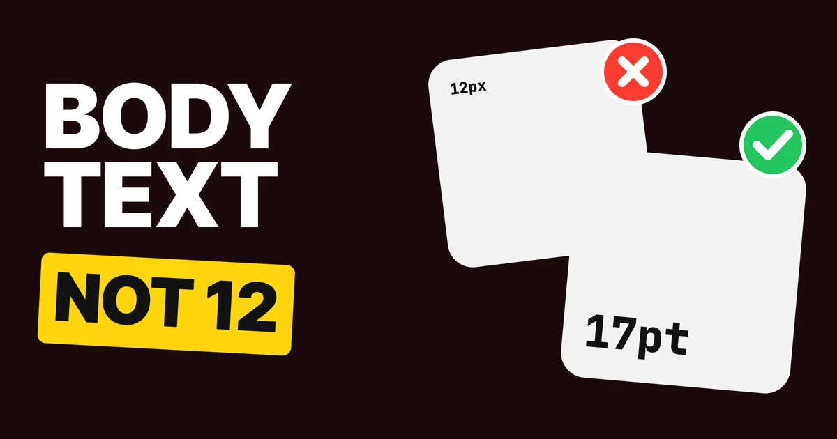
Body text on a phone is not 12 px. Apple's default body size is 17 points and Material's is 16. Twelve is a caption, and a screen set in captions is a screen people squint at. Below are the four rules and the full set of iOS sizes to take them from.
Why 12 px keeps showing up
Mockups are drawn on a big monitor, with the design zoomed to fit. At that distance 12 looks tidy and 17 looks loud. So the sizes get picked by how neat they look in the frame, and the frame is not the phone.
Then the phone is held at arm's length, in sunlight, by someone walking. The same 12 px is now small, glary and moving. Neat in the file, tiring in the hand.
The fix is to stop choosing sizes by eye. Both platforms publish a type scale, and the sizes in it were tested on real devices at real reading distances. Take your numbers from there.
Fix 1: body at 17
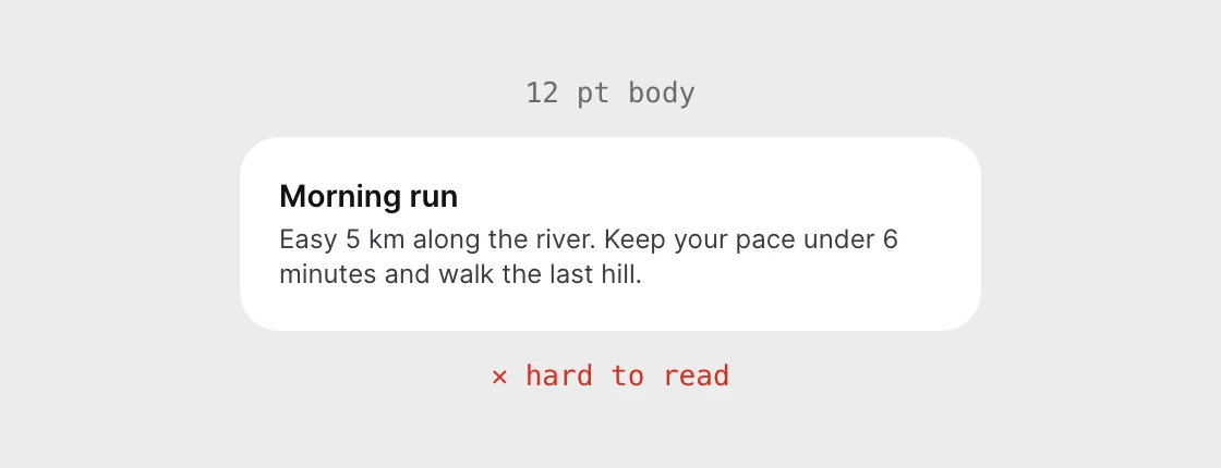
12 pt body
17 pt, iOS Body
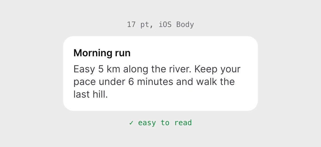
On iPhone the default Body style is 17 pt with 22 pt of line height. On Android, Material's Body Large is 16 sp with 24 sp of line height. On the web, the browser default is 16 px. Three platforms, three different units, and one answer: body copy lives at 16 to 17.
Longer text asks the most of this rule. A one-line label can be small and survive. A paragraph someone has to read to the end cannot. If the screen has a paragraph on it, it should be set at body size, and the extra line it creates is the price of being read.
Fix 2: nothing under 11
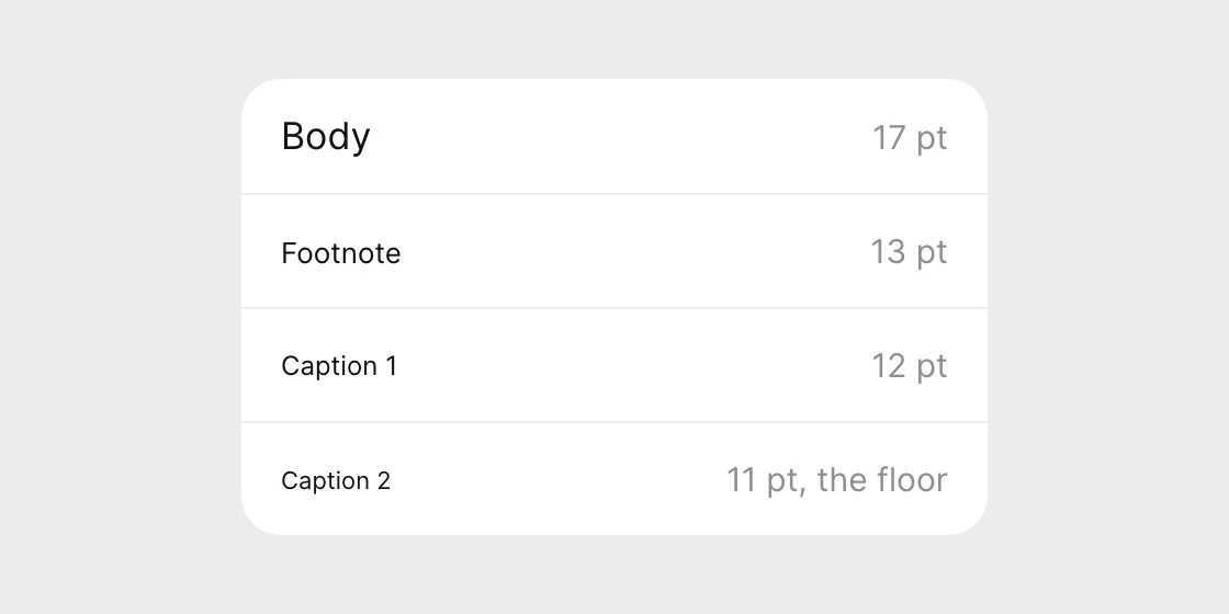
Twelve is not banned. It has a name: Caption 1. It is meant for the small print under a photo or a timestamp, text that is allowed to be missed. Body copy is not that.
Eleven is the floor. Caption 2 on iOS is 11 pt, and it is the smallest text style Apple ships. Material's smallest style, Label Small, is also 11 sp. When both platforms stop at the same number, a design that goes below it is writing text neither system would.
Use the small styles for secondary information only: timestamps, units, legal lines, the tiny label under a tab icon. If it is information someone needs to act on, it is not a caption.
Fix 3: inputs at 16
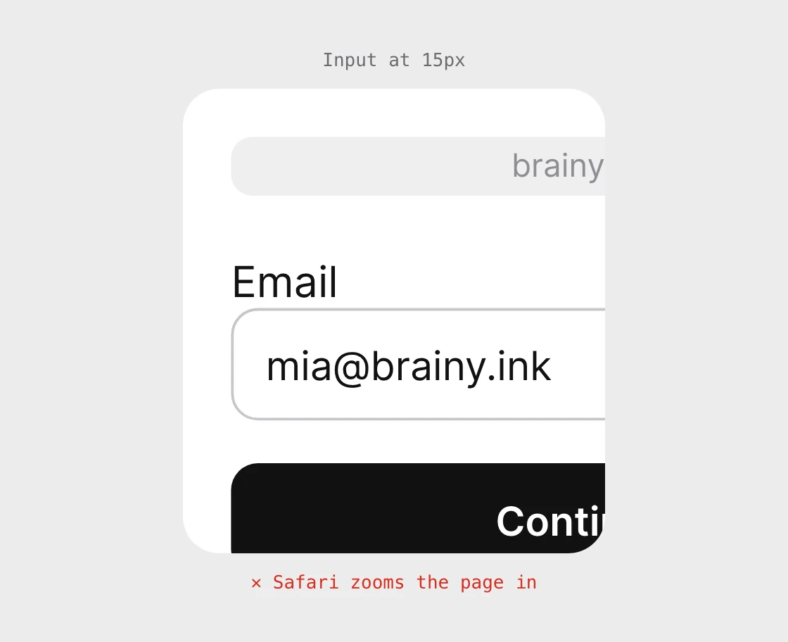
Input at 15 px
Input at 16 px
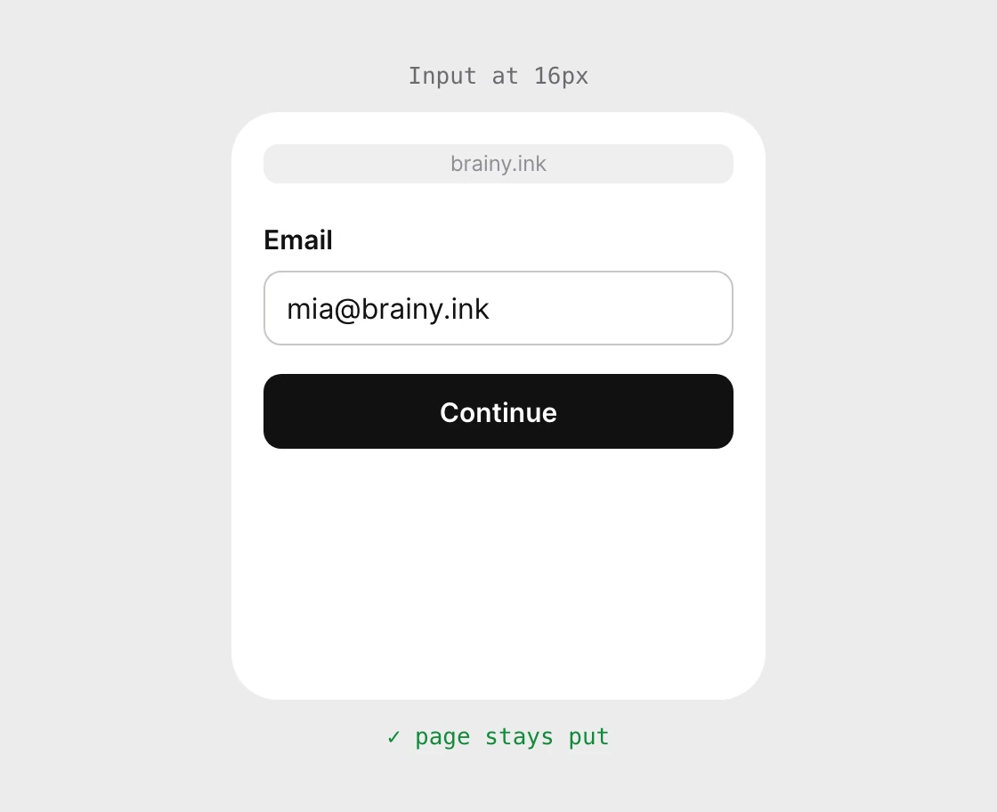
This one is a web rule, and it surprises people because nothing about the field looks wrong. iOS Safari zooms into a text input when its font size is smaller than 16 px. At 16 px or more it does not. The zoom does not undo itself, so the person has to pinch back out before they can see the rest of the form.
The fix is one line of CSS, and it should not be "turn off zooming" in the viewport tag. Blocking zoom takes a tool away from people who need it. Set the input type size instead.
Fix 4: let it grow
Fixed height
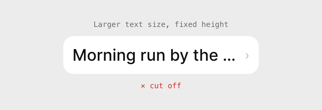
Lines wrap

Your 17 is a starting point, not a promise. People raise their text size in Settings, and iOS lets them go far past the default into its accessibility sizes, where Body reaches 28 pt at the first step and 53 pt at the largest. Android users do the same with font scale.
Test your screens at the biggest sizes before they ship. Look for three things: text cut off with an ellipsis, text that overlaps its neighbor, and a button label that no longer fits. The cure is the same each time. Let the line wrap, let the row grow, and stop fixing heights.
On the web the same idea means sizing text in rem rather than px, so it follows the browser's own text size setting. WCAG asks that text can be resized up to 200 percent without losing content or function.
All 11 iOS text sizes
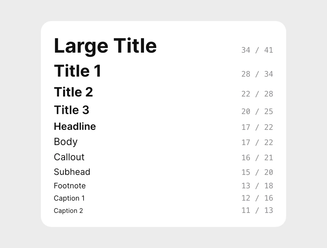
| Style | Size / line height (pt) | Use it for |
|---|---|---|
| Large Title | 34 / 41 | The top of a main screen |
| Title 1 | 28 / 34 | Section screens |
| Title 2 | 22 / 28 | Sub-sections |
| Title 3 | 20 / 25 | Card and group titles |
| Headline | 17 / 22 | Row titles, semibold |
| Body | 17 / 22 | Paragraphs and reading text |
| Callout | 16 / 21 | Supporting text |
| Subhead | 15 / 20 | Secondary lines under a title |
| Footnote | 13 / 18 | Notes and metadata |
| Caption 1 | 12 / 16 | Small print |
| Caption 2 | 11 / 13 | The floor |
These are the sizes at iOS's default Large text setting. Only eleven of them exist for a reason: a short scale is easy to hold in your head and easy to keep consistent across every screen.
Android's equivalents are Body Large at 16 / 24 and Label Small at 11 / 16 in Material 3.
Hand this to your developer
:root {
  --text-body: 1.0625rem;   /* 17 px, iOS Body */
  --text-callout: 1rem;
  --text-footnote: 0.8125rem;
  --text-floor: 0.6875rem;  /* 11 px, never lower */
}

body { font-size: var(--text-body); line-height: 1.3; }

/* 16 px or more stops iPhone Safari zooming into the field */
input, select, textarea { font-size: 1rem; }
On iOS, use the system text styles (.body, .footnote) so Dynamic Type works for free. On Android, set text in sp, not dp, so it follows the font scale setting.
FAQ
What is the minimum font size for a mobile app?
11, on both platforms. Caption 2 on iOS is 11 pt and Label Small in Material 3 is 11 sp. Anything people need to read to act should be much larger.
What font size should body text be on iPhone?
17 pt. That is the default of the iOS Body style, with a line height of 22 pt, and it scales up when the person raises their text size.
What font size should body text be on Android?
16 sp. That is Body Large in Material 3, with a line height of 24 sp.
Is 12px too small for body text?
For body text, yes. It sits in the iOS Caption 1 style, which is meant for small print. Reading text should be 16 to 17.
Why does my page zoom in when I tap an input on iPhone?
iOS Safari zooms into text inputs whose font size is smaller than 16 px. Set the input at 16 px or larger and it stops.
Should I let text scale with the system setting?
Yes. People raise their text size in Settings for good reasons, so design rows and buttons that wrap and grow instead of cutting text off.
Sources
- Apple Human Interface Guidelines, Typography: the iOS text styles at the default Large size, in points. Body 17/22, Callout 16/21, Subhead 15/20, Footnote 13/18, Caption 1 12/16, Caption 2 11/13, Large Title 34/41, Title 1 28/34, Title 2 22/28, Title 3 20/25, Headline 17/22. Body is 28/34 at the first accessibility size and 53/62 at the largest.
- Material Design 3, Typography: Body Large 16/24 sp, and Label Small 11/16 sp as the smallest style.
- CSS-Tricks, 16px or Larger Text Prevents iOS Form Zoom (Chris Coyier, 2021): iOS Safari zooms into inputs set at 15 px or less, not at 16 px or more.
- WCAG 2, 1.4.4 Resize Text: text can be resized up to 200 percent without loss of content or function.
- The specimens on this page are set in Inter at Apple's sizes, not in Apple's own SF Pro. The sample card and row text are invented for this page.
- First published as a carousel on UX Brainy.
Want type that stays readable on every phone and every text size setting? Our team designs and builds mobile UI with the type scale decided once.
Get StartedGet new papers by email
New Brainy papers in your inbox. Confirm once, unsubscribe anytime.