Link Color: Why #0000FF Fails and the 8 Link Colors to Use Instead
Pure blue is the first link color everyone picks and the wrong one next to body text and on dark screens. Underline it, lighten it on dark, show visited links, keep the focus ring. Eight codes included.
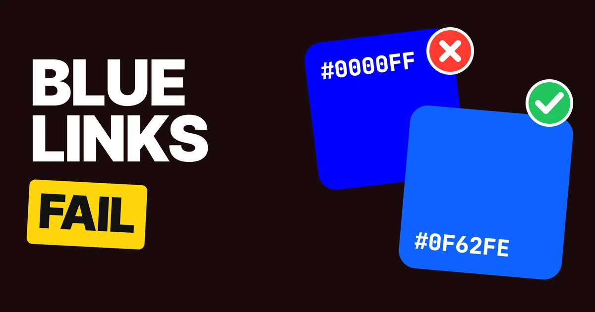
The right link color is a slightly softer blue that you also underline, not #0000FF on its own. Pure blue is the first link color everyone picks, and it fails in two places: next to black body text, and on dark screens. Here are the four fixes and the eight colors to hand your developer.
Why #0000FF fails
Nobody decides to use #0000FF. It arrives. It is the blue keyword in CSS and the first saturated blue in every color picker.
Browsers themselves ship a slightly different default, #0000EE for a link and #551A8B for a visited one, and they underline both. The underline is part of the original deal. Designers remove it to look clean and keep the blue.
Then the blue has to do the job alone. Pure blue is very dark. Set it inside a paragraph of near-black text and the two read almost the same to anyone who has trouble telling colors apart. On a dark screen it is worse: #0000FF sinks into the background.
A link is three things: a color, a line and a state.
Fix 1: underline it
Color only
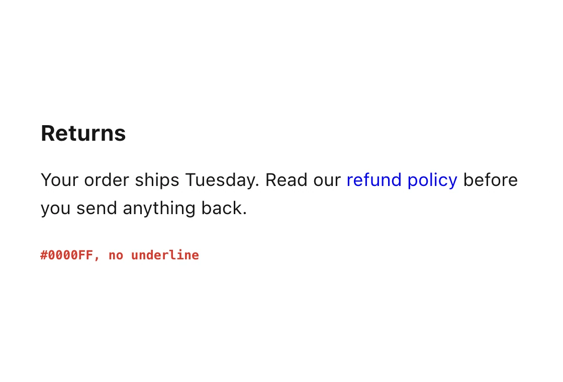
Underlined
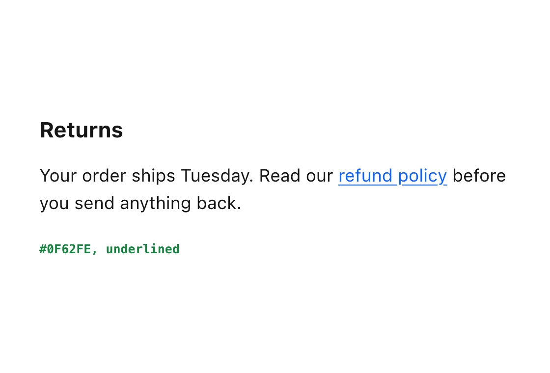
The rule behind this is WCAG 1.4.1, use of color.
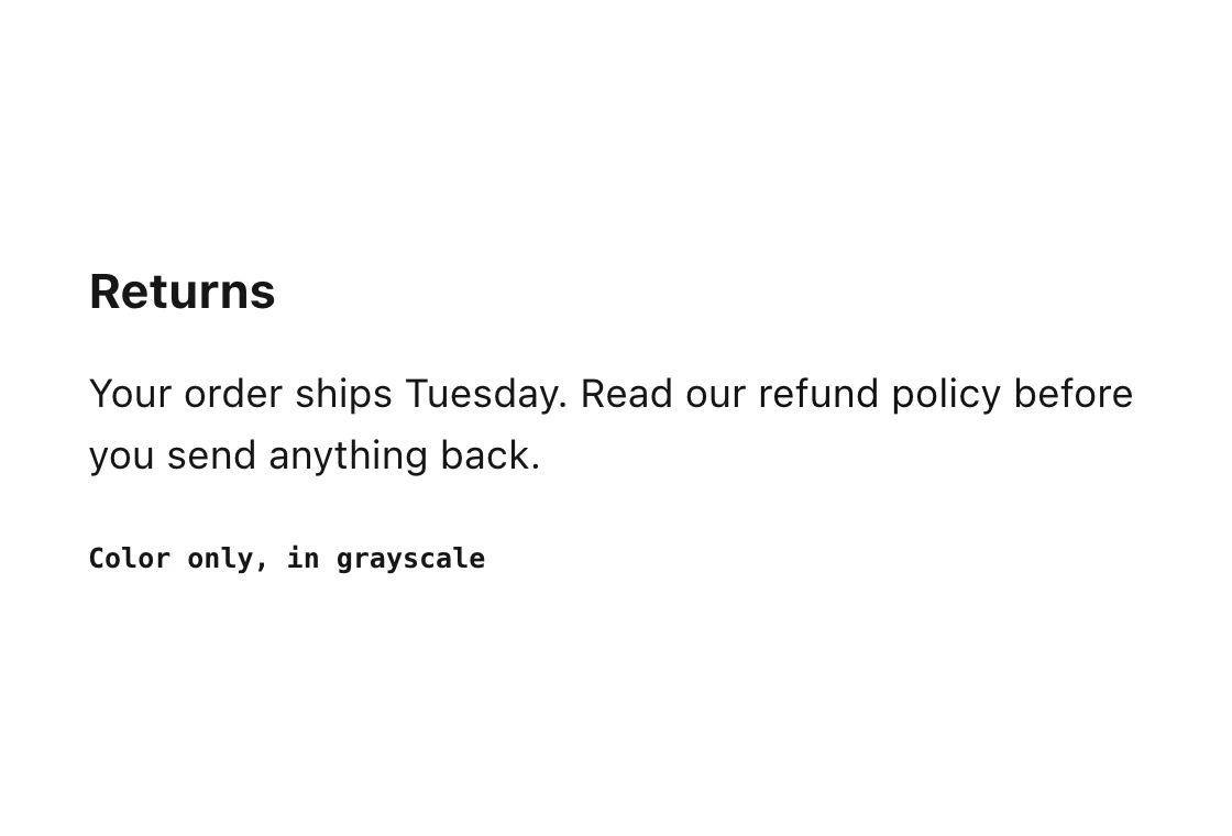
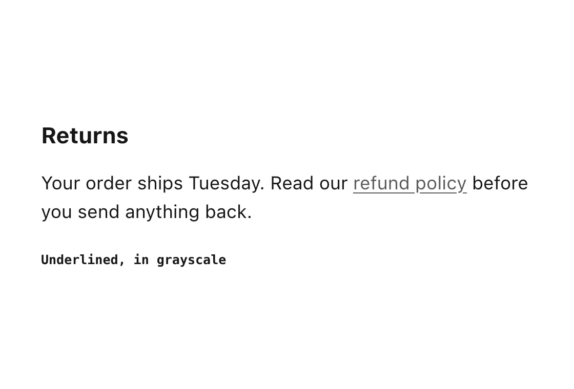
A link marked by color alone has to stand out clearly from the text around it. Pure blue next to pure black does not, and #0F62FE next to #161616, the text color we use here, does. An underline removes the problem entirely, because the link no longer depends on color.
Underline links inside running text. Navigation bars, buttons and cards are different: their position and shape already say "clickable", so an underline there is optional.
Color only, grayscale
Underlined, grayscale
Fix 2: lighten it on dark
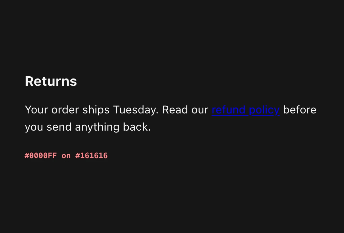
#0000FF on dark
#78A9FF on dark
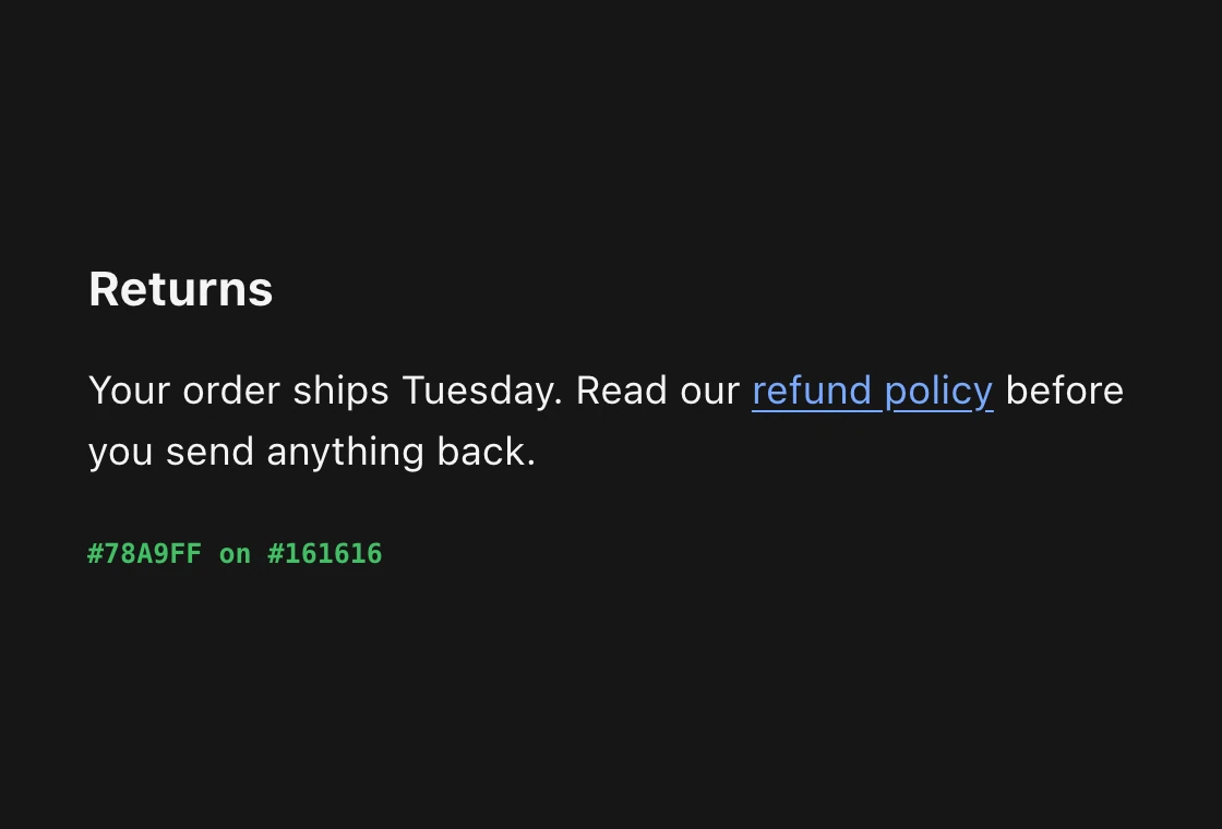
It is not close. #0000FF on #161616 is too dark to read at body size, and #78A9FF on the same background reads easily. The saturated colors that work on white get lighter and softer on dark, the same move we make for error colors.
Keep two blues and switch them with the theme: #0F62FE on light screens, #78A9FF on dark ones. Hover gets one step further along: #0043CE on light, #A6C8FF on dark.
Fix 3: show where people have been
Every link looks new
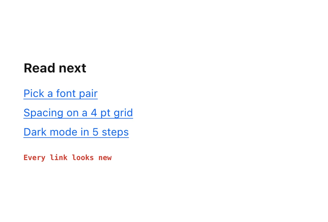
Visited turns purple
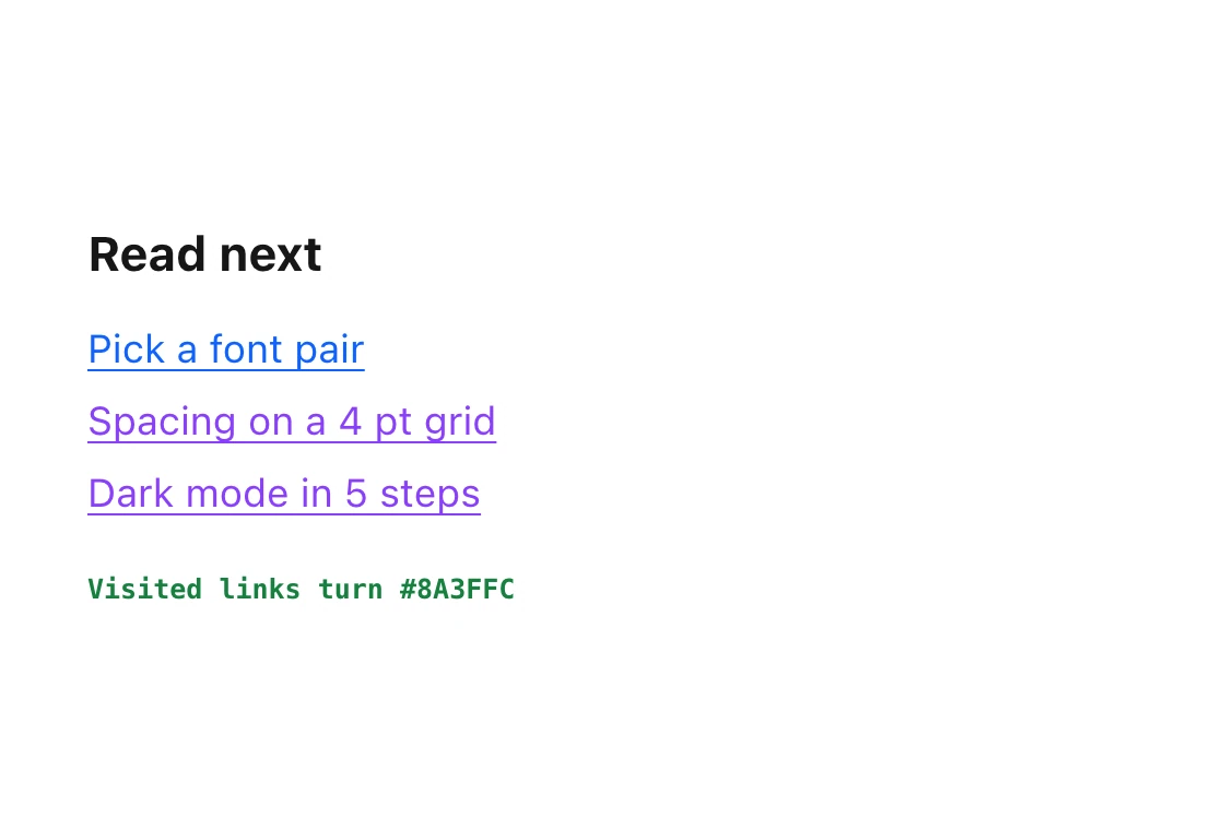
Nielsen Norman Group has argued this since 2004: people get lost and move in circles when visited and new links share one color. Purple is the convention, and browsers have used it since the beginning. Use #8A3FFC on light screens and #BE95FF on dark ones. It costs one CSS rule: a:visited.
Fix 4: keep the focus ring
outline: none
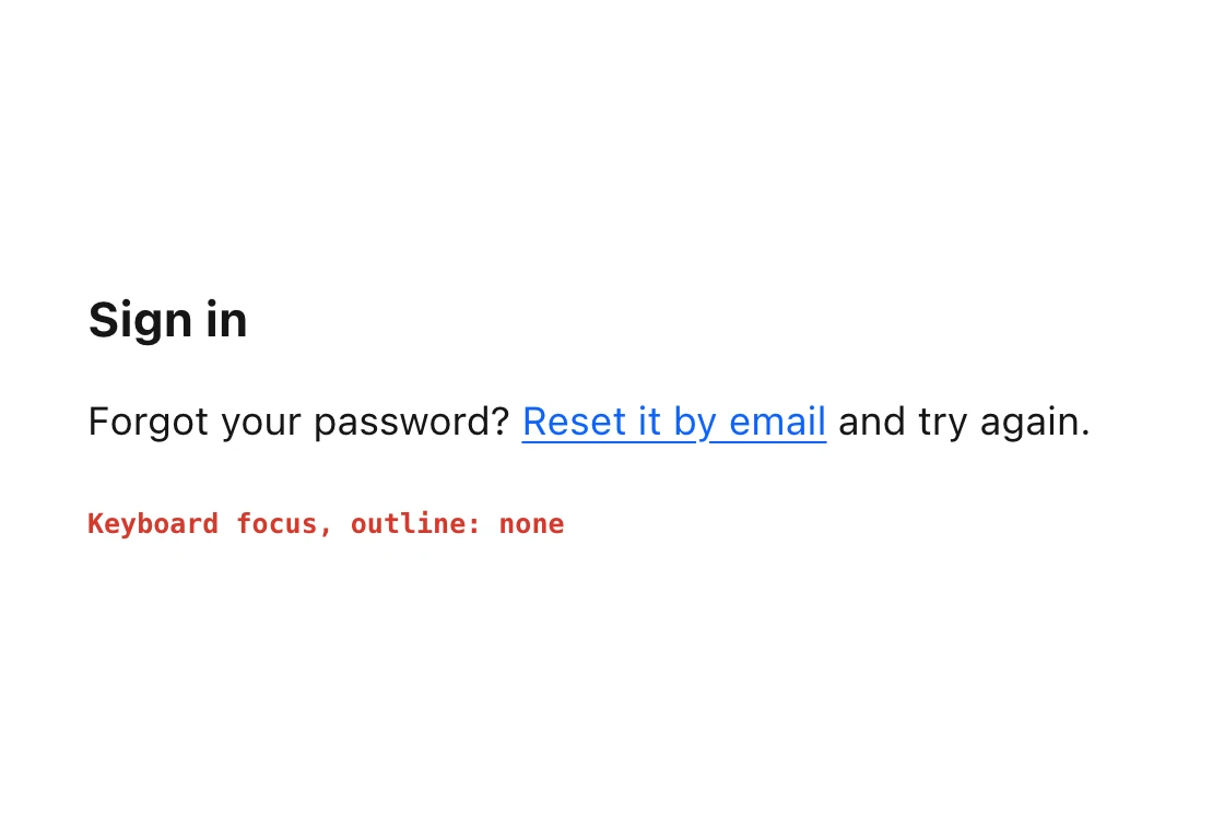
2px #0F62FE ring
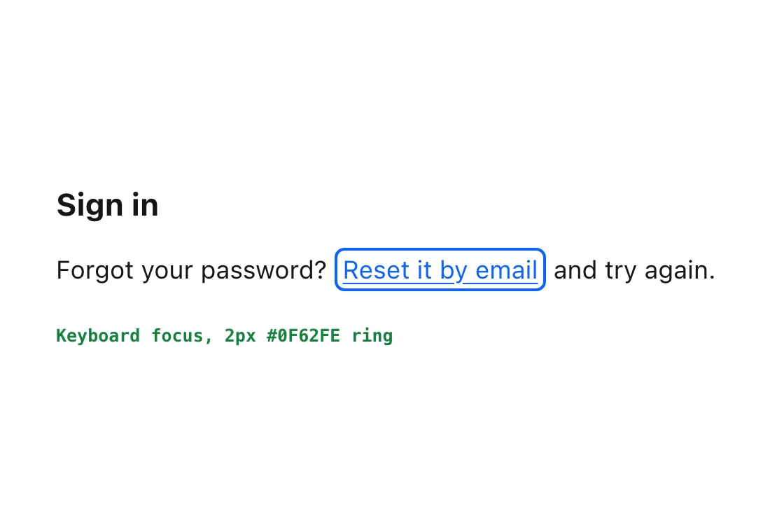
Keyboard users, switch users and anyone whose mouse hand is tired depend on the focus ring.
Removing it with outline: none and putting nothing in its place fails WCAG 2.4.7, focus visible. If the default browser ring clashes with your design, replace it. Do not delete it.
A 2px ring in the link color, with a small offset, is the safe version. WCAG 2.2 describes the strongest form as a perimeter of at least 2 CSS pixels.
The 8 link colors, light and dark
Tap any chip to copy its code.
| Role | Light | Dark | Use it for |
|---|---|---|---|
| Text | #161616 | #F4F4F4 | Body copy around the link |
| Link | #0F62FE | #78A9FF | Every link in its resting state |
| Hover | #0043CE | #A6C8FF | Pointer over the link |
| Visited | #8A3FFC | #BE95FF | Links already opened |
These are IBM Carbon's link tokens, read from its published theme values.
Hand this to your developer
:root {
  --color-text: #161616;
  --color-link: #0F62FE;
  --color-link-hover: #0043CE;
  --color-link-visited: #8A3FFC;
}

@media (prefers-color-scheme: dark) {
  :root {
    --color-text: #F4F4F4;
    --color-link: #78A9FF;
    --color-link-hover: #A6C8FF;
    --color-link-visited: #BE95FF;
  }
}

a { color: var(--color-link); text-decoration: underline; text-underline-offset: 0.15em; }
a:visited { color: var(--color-link-visited); }
a:hover { color: var(--color-link-hover); }
a:focus-visible { outline: 2px solid var(--color-link); outline-offset: 3px; }
Order matters: :link, :visited, :hover, :focus, :active is the classic sequence, and a hover rule placed before the visited rule never wins on a visited link. The :focus-visible selector shows the ring for keyboard users and skips it for mouse clicks, so nobody has a reason to remove it.
The numbers behind "easy to read"
| Pair | Contrast |
|---|---|
| #0000FF on white | 8.6 to 1, passes, and is still too close to black text |
| #0000FF on #161616 | 2.1 to 1, fails |
| #0F62FE on white | 5.0 to 1 |
| #0043CE on white | 7.8 to 1 |
| #8A3FFC on white | 5.0 to 1 |
| #78A9FF on #161616 | 7.7 to 1 |
| #A6C8FF on #161616 | 10.6 to 1 |
| #BE95FF on #161616 | 7.7 to 1 |
The first row is why a checker is not enough. Pure blue on white passes by the number. It fails the real test, which is whether a link looks different from the black text next to it.
FAQ
What color should links be?
A medium blue such as #0F62FE on light backgrounds and a lighter blue such as #78A9FF on dark ones, with an underline in body text.
Is #0000FF a good link color?
Not on its own. It reads fine on white, but it is too close to black body text for people who cannot see the blue, and on dark backgrounds it almost disappears.
Should links be underlined?
Yes, inside paragraphs. WCAG 1.4.1 says color alone cannot mark a link unless it clearly stands out from the surrounding text, and an underline removes that dependence.
What color should visited links be?
Purple. Browsers default to #551A8B, and design systems such as IBM Carbon use #8A3FFC on light screens and #BE95FF on dark ones.
What link color works in dark mode?
A lighter blue. #78A9FF reads easily on #161616, where #0000FF is too dark to read at body size.
Can I remove the focus outline on links?
Only if you replace it with another visible indicator. Removing it with nothing in its place fails WCAG 2.4.7, focus visible.
Sources
- HTML Living Standard, Rendering: the default style sheet sets
:linkto #0000EE,:visitedto #551A8B and underlines links. #0000FF is the CSS named colorblue. - IBM Carbon color tokens, read from @carbon/themes 11.40.0: link-primary #0F62FE, hover #0043CE, visited #8A3FFC on the white theme; #78A9FF, #A6C8FF, #BE95FF on the g100 theme.
- WCAG 2, 1.4.1 Use of Color and technique G183.
- WCAG 2.4.7 Focus Visible and 2.4.13 Focus Appearance.
- Nielsen Norman Group, Change the Color of Visited Links (Jakob Nielsen, 2004).
- Contrast ratios computed with the WCAG relative luminance formula. The sample text is invented for this page.
- First published as a carousel on UX Brainy.
Want links, forms and every other state designed as one system? Our team designs and builds product UI that holds up in light and dark.
Get StartedGet new papers by email
New Brainy papers in your inbox. Confirm once, unsubscribe anytime.