Language Learning App Design: A Home Screen Redesign, Before and After
A language learning app home screen that spells its stats in one 9 px sentence and lists a unit as twelve equal rows, and the same screen fixed: plain counters, a solid unit banner, a road of nodes and one Start bubble. Every change side by side, with the free Figma file.
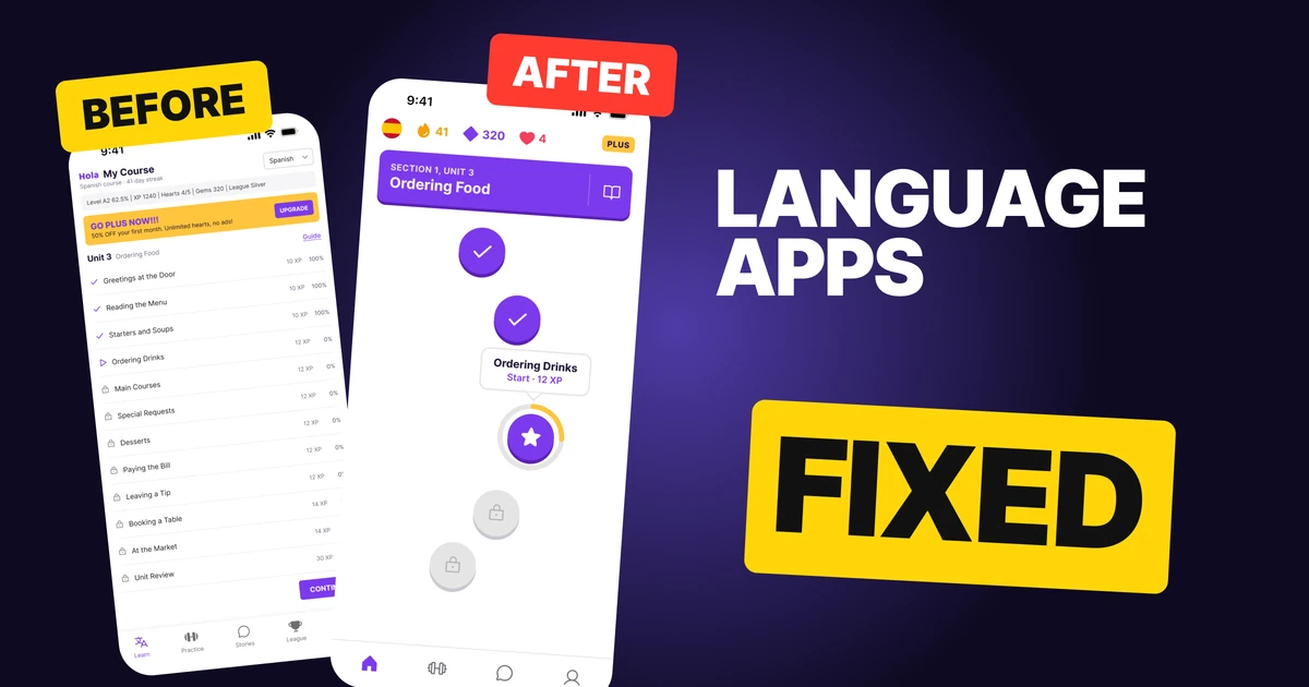
A language app has one job on its home screen: get the learner into today's lesson. The first draft below has everything a learner needs, but it reads like a school report. The stats are one grey sentence, the unit is twelve equal rows with percentages, a loud banner sells a subscription, and the next step is a small CONTINUE at the bottom.
The fix keeps every function and changes how it looks and where it sits. The stats become four plain counters, the unit becomes a solid banner, the list becomes a road of nodes, and one bubble says Start.
The whole screen, before and after
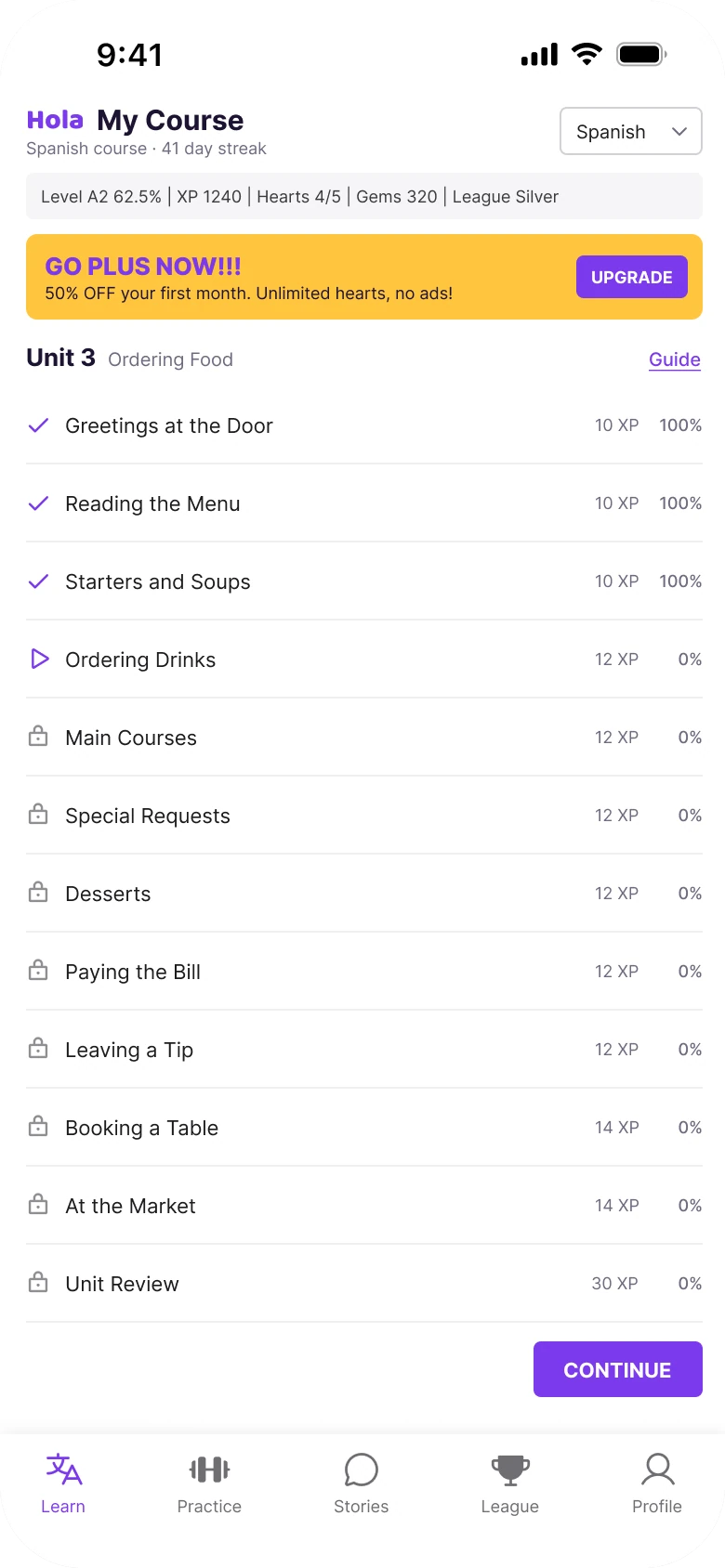
Junior draft
Fixed
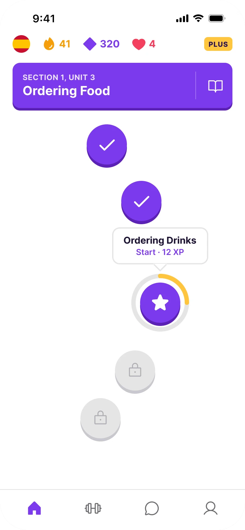
On the left, everything has the same weight. The 9 px stats line, the loud yellow banner, the twelve rows and the CONTINUE button all ask for attention at once, and none of them says "tap me first".
On the right, the screen reads top to bottom in the order a learner thinks: how am I doing, which unit is this, where am I on it, what do I tap. There is one road, one bubble and one action.
What changed, measured
| Junior draft | Fixed | |
|---|---|---|
| Stats | One sentence, 9 px | Flag, streak, gems, hearts in 16 px bold, a small PLUS tag |
| Unit | A line of text, "Unit 3 Ordering Food", and a Guide link | A 350 x 76 purple banner, 20 px title, 4 px darker bottom edge |
| Lessons | Twelve 42 px rows, 11 px names, 9 px XP and percent | A road of 64 px nodes, one name shown |
| Next step | A 91 x 30 CONTINUE in caps at the bottom | A Start bubble on the current node |
| Margins | 14 left, 12 right | 20 on both sides |
| Tabs | Five, mixed filled and outline icons | Four, icon only, one style |
Fix 1: keep the stats on one plain line
Before
After

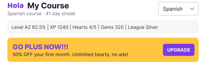
The header of the draft: Hola My Course with Spanish course, 41 day streak under it and a Spanish dropdown, then a grey bar reading Level A2 62.5%, XP 1240, Hearts 4/5, Gems 320, League Silver, then a yellow banner reading GO PLUS NOW with 50% off your first month and an UPGRADE button. Against one row: a Spanish flag, a flame with 41, a gem with 320, a heart with 4 and a small yellow PLUS tag.
The draft spells its stats out as a sentence: "Level A2 62.5% | XP 1240 | Hearts 4/5 | Gems 320 | League Silver". It is 9 px, it is grey, and it has to be read like text. A learner who opens the app every day does not want to read their own numbers, they want to glance at them.
The fix gives each number an icon and a color: a flame for the 41 day streak, a gem for 320, a heart for 4. They sit on one row at 16 px bold, so the eye picks them up in one pass. The Spanish dropdown becomes the flag, which opens the language list. The "GO PLUS NOW!!!" banner, with its 50% off and UPGRADE button, shrinks to a small PLUS tag at the end of the row, and the offer opens from it.
Level, XP and League Silver moved to the Profile tab. They matter, but not every time the app opens.
Rule to reuse: show the numbers a learner checks daily as icons, and move the rest one tap away.
Fix 2: give the unit a solid banner
Before

After
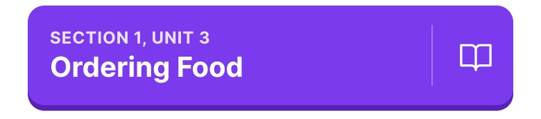
A line of text reading Unit 3 in bold and Ordering Food in grey, with an underlined Guide link at the right. Against a solid purple banner with SECTION 1, UNIT 3 in small capitals, Ordering Food in 20 px white, a hairline divider and a book icon, with a darker edge along the bottom.
In the draft, the unit is a label. "Unit 3" and "Ordering Food" sit on a line with a text link, and nothing says that this is the heading everything below belongs to.
The fix makes it a banner: 350 by 76, radius 12, brand purple, a title at 20 px and a 4 px darker bottom edge that makes it look pressable. It is the one large block of color on the screen, so the learner knows which unit they are in without reading. The Guide link becomes the book icon on the right, behind a hairline divider, so it is still one tap away.
Rule to reuse: when a screen has a heading that everything below belongs to, give it a block of color, not a line of text.
Fix 3: turn the list into a road
Before
After
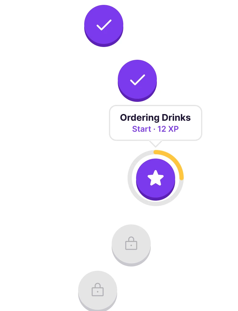
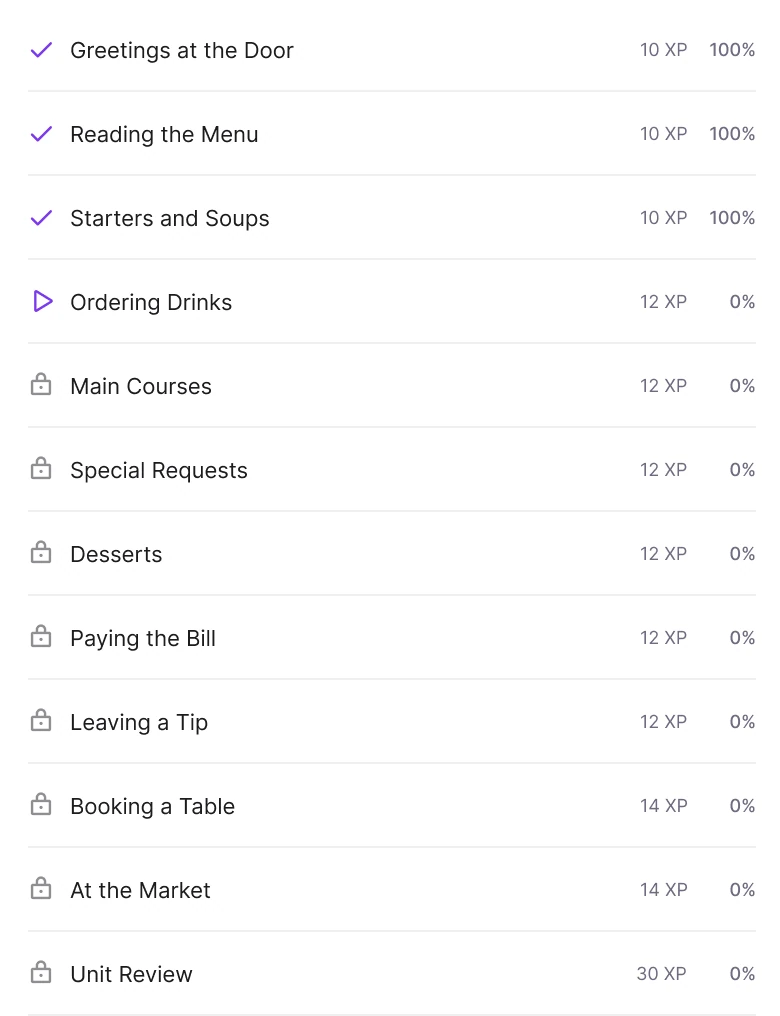
Twelve rows in a list, each with an icon, a name and XP and percent at the right: three with purple checks and 100%, Ordering Drinks with a play icon and 0%, then eight with grey locks and 0%, from Main Courses to Unit Review. Against a winding road of five chunky circles: two purple checked nodes, one purple star node with a yellow ring, and two grey locked nodes.
This is the fix that carries the whole screen. In the draft, every lesson is one 42 px row with an 11 px name and two 9 px numbers. Twelve rows of the same size say that twelve things are equally important, and the learner has to find the one that is not done.
The road says it with shape and color alone. Finished nodes are purple with a check, the current node is purple with a star and a progress ring, and the locked ones are grey with a lock. Each node is 64 px with a 5 px darker bottom edge, and the ring around the current one is 92 px, three of twelve lessons filled in yellow. You can read the state of the unit from across the room, with no text.
Nothing is lost. The names open from the nodes, the XP is shown in the bubble for the current lesson, and the 100% became the check while the 0% became the lock. The other lessons are further down the road. Duolingo made this path the standard for learning apps, and it works for the same reason here: progress is something you walk along, not something you read.
Rule to reuse: when items have a state and an order, show the state with shape and color and the order with position.
Fix 4: put one Start bubble on the current node
Before

After
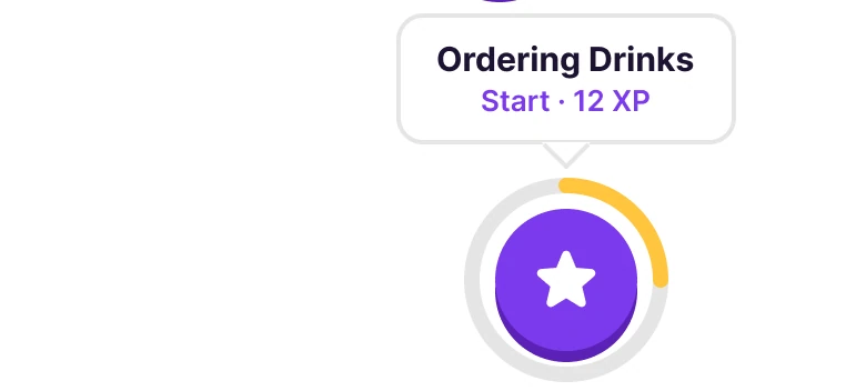
A small purple button reading CONTINUE in capitals at the bottom right, under the list. Against a white bubble with a hairline border reading Ordering Drinks and Start, 12 XP, with a pointer down to the purple star node inside its yellow ring.
In the draft, the next step is a 91 by 30 CONTINUE button under twelve rows. It is far from the lesson it starts, so the learner has to connect the two. It is also in capitals, the same as the UPGRADE button above, so it does not look like the main action.
The fix puts the action on the thing it acts on. A bubble above the current node names the lesson, "Ordering Drinks", and says "Start · 12 XP". It has a 2 px hairline and no shadow, so it reads as part of the road. Only the current lesson is named, so there is only one thing to tap.
Rule to reuse: put the main action next to the object it acts on, and name the object in the action.
The smaller fixes
- Every function stays. The Spanish dropdown is the flag. The My Course title is the Learn tab. League Silver and the League tab moved to the Profile tab. The offer opens from the PLUS tag.
- One margin. The draft has 14 px on the left and 12 px on the right. The fixed screen uses 20 on both sides, with 16 between blocks.
- One accent pair. Purple (#7C3AED) is the action color on the banner and the nodes. Sun (#FFC53D) is only the progress ring and the PLUS tag.
- Type scale. The draft runs 9 to 15 px. The fixed screen runs larger, with 16 px counters and a 20 px unit title.
- A flat tab bar. Five tabs with mixed filled and outline icons become four icons in one style, with no labels.
- No shadows. The depth comes from the darker 4 and 5 px bottom edges, not from drop shadows.
Audit your own learning screen
| Question | Why it matters |
|---|---|
| Can a returning learner read their streak in one glance? | Daily numbers should be icons, not sentences |
| Is the unit heading a block of color? | It tells the learner where they are |
| Does the lesson list show state without text? | Shape and color read faster than a percent |
| Is there exactly one primary action? | Two main buttons mean none is main |
| Is the action next to the lesson it starts? | Distance forces the learner to connect them |
| Is the upgrade offer smaller than the lesson? | Selling above learning pushes people away |
Get the Figma file
The free file has the junior draft, the fixed screen and every part as a component.
Free Figma file
Language learning screen redesign, before and after
Both screens and every part as a Figma component. Free, view only, duplicate it to your drafts.
FAQ
How should a language learning app home screen be designed?
Show a few plain counters at the top, a solid unit banner, a road of lesson nodes where state is shown by color and shape, and one Start bubble on the current lesson. The learner should see where they are and what to tap without reading.
Why do language apps use a path instead of a list?
A path shows state and order at a glance. Finished, current and locked lessons look different, so the learner does not have to read twelve rows to find the next one.
What stats should a language app show on the home screen?
The ones a learner checks every day: the streak, the gems or points and the hearts. Level, XP and league can sit on the profile tab.
Where should the upgrade offer go in a learning app?
As a small tag in the stats row that opens the offer. A large banner above the lessons competes with the lesson for attention.
How big should a lesson node be?
About 64 px, which is a comfortable thumb target. The fixed screen uses 64 px nodes with a 5 px darker bottom edge and a 92 px ring on the current one.
Sources
- Both screens are our own, designed and measured in Figma. The app, Hola, and all its data are made up. The numbers agree on both screens: the 41 day streak, 320 gems, 4 hearts, and lesson 4 of 12, Ordering Drinks, at 12 XP.
- Pattern studied: Duolingo's learning path, and Babbel.
- Icons are from Phosphor (MIT). The wordmark is Baloo 2 ExtraBold. There are no photos.
- First published as a carousel on App Brainy.
Want this for your own app? Our team redesigns app screens like this one, from the first audit to the finished components.
Get StartedGet new papers by email
New Brainy papers in your inbox. Confirm once, unsubscribe anytime.