CSS Gradient Colors: Why Gradients Turn Gray in the Middle and 3 Ways to Fix It
Blend blue into yellow and the middle turns gray, because hex colors mix in RGB. Add a middle stop, blend in OKLCH or pick neighbors on the color wheel. Five ready gradients included.
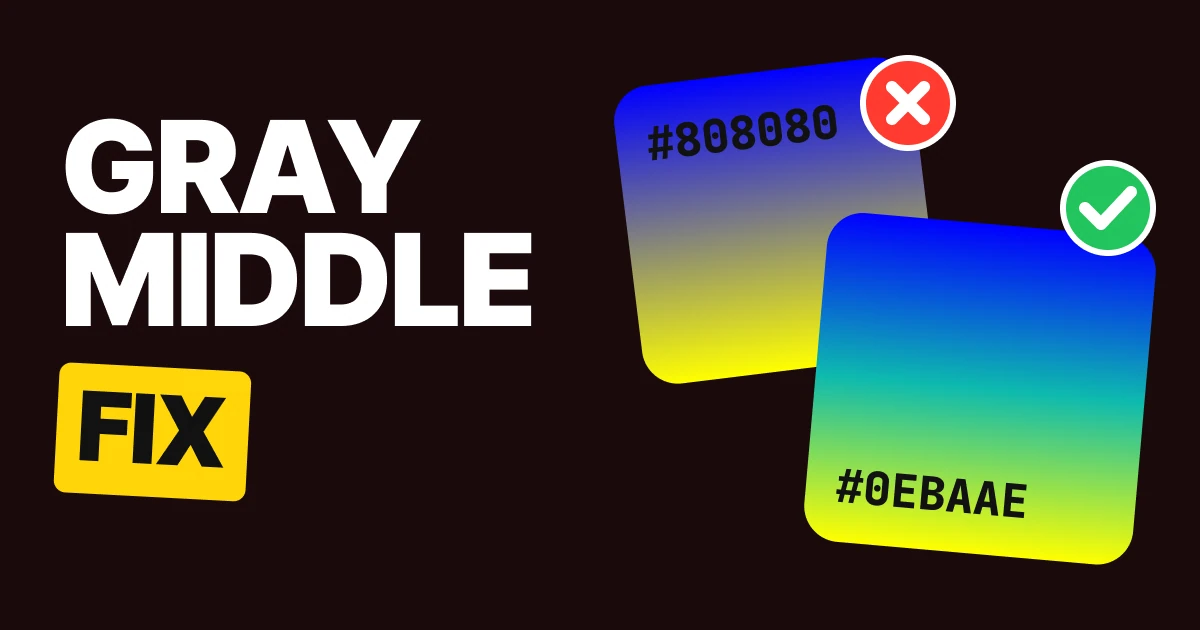
A gradient turns gray in the middle because the browser blends hex colors in RGB, and two colors that sit opposite each other cancel out halfway. The fix is to give the middle a color on purpose, or to change how the blend is calculated. Here are three fixes and five gradients you can paste.
Why the middle goes gray
Look at a gradient that looks muddy and ignore the ends. The ends are fine. You chose them. The middle is the part nobody chose.
A gradient is a blend, and a blend needs math. Hex colors are RGB values, so by default the browser mixes them channel by channel.
Halfway between blue and yellow, red is halfway between 0 and 255, green is halfway between 0 and 255, and blue is halfway between 255 and 0. Every channel lands near 128. Equal red, green and blue is the definition of gray.
#0000FF to #FFFF00

With a #0EBAAE middle stop

This is not your monitor and not a compression problem. It is arithmetic, and it shows up whenever the two colors are far apart on the color wheel. Blue and yellow are close to exact opposites, which is the worst case.
Fix 1: add a middle stop
The most direct fix is to stop leaving the middle to chance. Add a third color stop at 50% that is a color you picked.
background: linear-gradient(90deg, #0000FF, #0EBAAE, #FFFF00);
#0EBAAE is a teal that sits between blue and yellow in perceived color. The blend now runs blue to teal, then teal to yellow, and neither half ever crosses gray.
This works in every browser and needs no new syntax, so it is the safe choice for a design that must look the same everywhere. Pick the middle color by eye, then check it next to both ends. The cost is that you now own three colors instead of two.
Fix 2: blend in OKLCH
The other fix changes the math instead of adding a color. CSS lets you choose the color space the blend happens in, and OKLCH describes color as lightness, chroma and hue. Chroma is how colorful a color is, so a blend that keeps chroma stays colorful.
background: linear-gradient(in oklch, #0000FF, #FFFF00);
With in oklch the browser travels around the color wheel, going through greens and teals, instead of straight through the gray center. You keep two colors and the code stays short. MDN documents this as the color interpolation method inside the gradient function, and legacy hex colors only use RGB when you do not choose one, to stay compatible with older pages.
Two things to know. Some of the colors on that trip can fall outside what a screen can show, so browsers clip them to the nearest displayable value. And the route it takes is the short way around the wheel, so check that the path it picks is one you like. Our guide to OKLCH color in modern CSS covers the space in more depth.
Fix 3: pick neighbors
The third fix does not touch the code. It chooses colors that cannot cancel each other out.
#0066FF to #FF8800

#6440E0 to #E040A0

Opposite colors mix to gray. Neighbors mix to something between them that is still a color. If a brand pairs two opposites, you can still use them in a gradient: put a middle stop between them, or blend in OKLCH.
Blue to orange, default blend
Blue to orange, in oklch

How to check your own gradient
- Look at the middle, not the ends.
- Name the color you see there. If the name is gray, brown or mud, as with #808080 or #807780, that is the problem.
- Pick one of the fixes above and compare the two versions side by side.
A gradient is only as good as its worst point, and its worst point is almost always the middle.
Five gradients to steal
Each one was checked for a middle that stays colorful. The first has a built-in middle stop. The other four use neighboring hues. Tap a code to copy it.





| Gradient | Start | Middle | End | Why it works |
|---|---|---|---|---|
| Blue, teal, yellow | #0000FF | #0EBAAE | #FFFF00 | Opposite ends, rescued by a real middle stop |
| Violet to pink | #6440E0 | none | #E040A0 | Neighbors on the wheel |
| Blue to teal | #2F5BEA | none | #14B8A6 | Neighbors on the wheel |
| Orange to hot pink | #FF7A00 | none | #FF2E93 | Neighbors on the wheel |
| Green to lime | #00A86B | none | #C6F432 | Neighbors on the wheel |
Hand this to your developer
.gradient-sunrise   { background: linear-gradient(90deg, #0000FF, #0EBAAE, #FFFF00); }
.gradient-violet    { background: linear-gradient(90deg, #6440E0, #E040A0); }
.gradient-ocean     { background: linear-gradient(90deg, #2F5BEA, #14B8A6); }
.gradient-sunset    { background: linear-gradient(90deg, #FF7A00, #FF2E93); }
.gradient-meadow    { background: linear-gradient(90deg, #00A86B, #C6F432); }

/* Two opposite colors, no middle stop: choose the blend space instead. */
.gradient-opposites { background: linear-gradient(in oklch, #0066FF, #FF8800); }
If a browser does not understand in oklch, it ignores the whole declaration. Write a plain linear-gradient(...) line first as a fallback, then the OKLCH line after it.
FAQ
Why does my gradient turn gray in the middle?
Hex colors blend in RGB, and two colors far apart on the color wheel average out to gray. Blue #0000FF and yellow #FFFF00 meet at #808080.
How do I stop a CSS gradient from looking muddy?
Add a middle color stop with real color, blend in OKLCH with linear-gradient(in oklch, ...), or choose two colors that sit next to each other on the wheel.
What does "in oklch" do in a CSS gradient?
It tells the browser to blend the colors in the OKLCH color space instead of RGB, so the middle keeps its color instead of dropping to gray.
What gradient colors look good together?
Neighbors on the color wheel, such as violet #6440E0 to pink #E040A0 or green #00A86B to lime #C6F432. Their blend stays bright the whole way across.
Do all browsers support gradients in OKLCH?
Modern browsers do, but a browser that does not will drop the declaration. Add a plain gradient line before it as a fallback.
Why does blue to yellow turn gray and not green?
Because the blend takes the straight path through RGB, where the average of the two is gray. A green middle only appears if you add it as a stop or blend in OKLCH.
Sources
- CSS Color Module Level 4, interpolation: legacy sRGB colors such as hex interpolate in sRGB by default, and other spaces are chosen with the color interpolation method.
- MDN, linear-gradient(): the
<color-interpolation-method>syntax,in oklch. - MDN, OKLCH color: lightness, chroma and hue.
- The halfway point of (0, 0, 255) and (255, 255, 0) is (127.5, 127.5, 127.5), which is #808080 with OKLCH chroma 0. The mid-points of #0066FF to #FF8800 (#807780) and #6440E0 to #E040A0 (#A240C0) were computed in sRGB by us. The bars on this page were rendered from those calculations, and the OKLCH bar clips colors outside the screen range, as browsers do.
- First published as a carousel on UX Brainy.
Want gradients, color and every other detail designed as one system? Our team designs and builds product UI that holds up on every screen.
Get StartedGet new papers by email
New Brainy papers in your inbox. Confirm once, unsubscribe anytime.