Chat App Design: A Chat List Redesign, Before and After
A junior chat list with four header icons, six filters running off the screen and a full date on every row, and the same screen fixed. Every change side by side, the reason behind each, and the free Figma file.
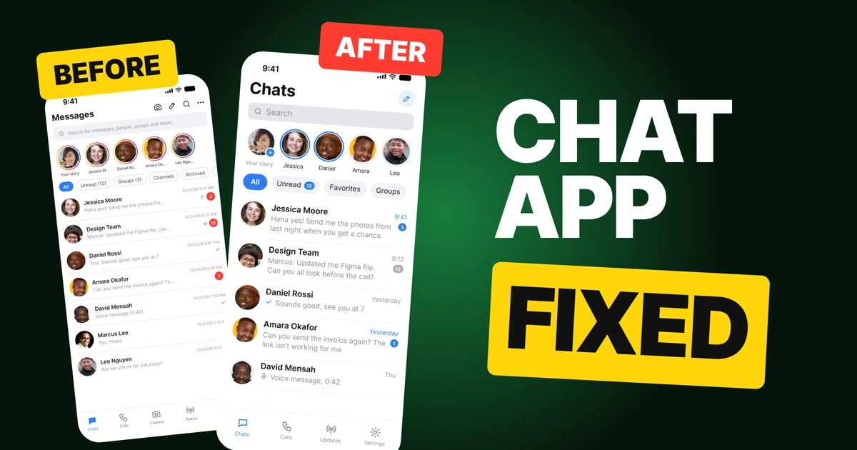
A chat list has one job: show who wrote, what they said and whether it needs an answer. The first draft below has every feature a messaging app could want, and it says all of them at once: four icons in the title bar, a search field that explains itself, six filters that run off the edge and a full date on every row. The fix keeps the same people and the same messages and gives each part of the screen one job.
The whole screen, before and after
Junior draft
Fixed
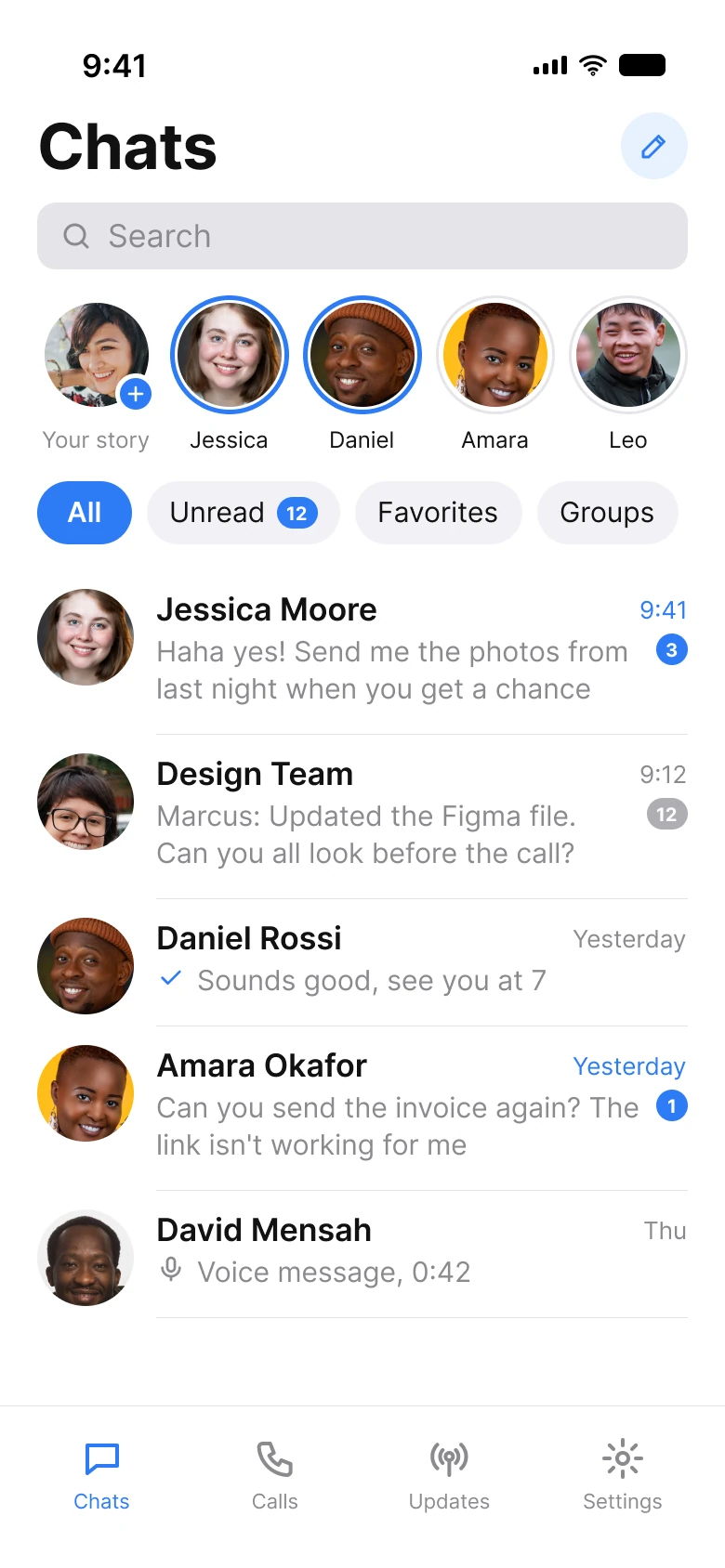
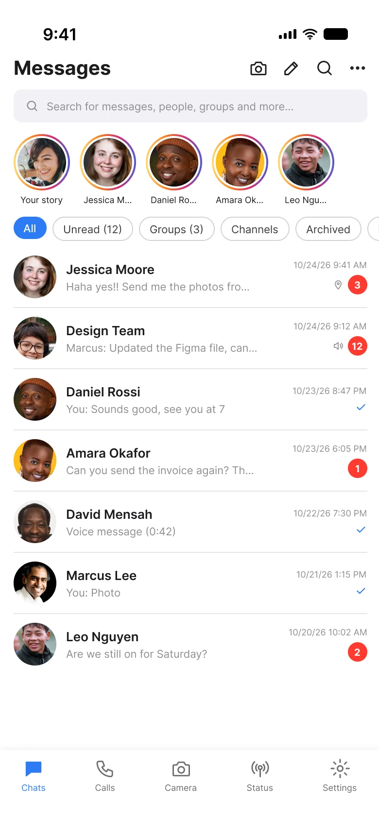
On the left, the eye meets four icons, a 47-character search hint, five identical rainbow rings, a row of filters that does not finish and seven rows of one-line messages with a date and a badge each. On the right, the eye meets a large title, one button, one search field, five faces, four chips and five rows that read like sentences.
| Junior draft | Fixed | |
|---|---|---|
| Header icons | 4 | 1 |
| Search hint | 47 characters | "Search" |
| Filter chips | 6, running off the screen | 4, all visible |
| Row time | "10/24/26 9:41 AM" | "9:41", "Yesterday", "Thu" |
| Unread badge | 20 px red | 17 px blue, gray when muted |
| Tabs | 5 | 4 |
| Side margin | 14 px left, 12 px right | 20 px on both sides |
| Text sizes | 9 to 20 px | 11 to 28 pt |
Fix 1: one action in the title, a search that says Search
Before

After
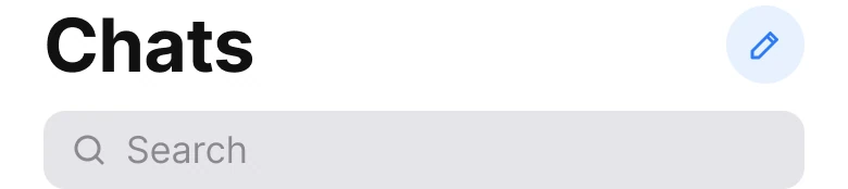
Four icons and a search field that lists what it searches, against one button and the single word Search.
The draft's title bar holds a camera, a pencil, a magnifier and a menu. The magnifier sits above a search field that has its own magnifier, so the screen offers the same search twice.
The fix keeps the one action people come here for, writing a new message, and gives it a soft round button in the brand blue. The title grows to a large title, the same pattern iOS uses, so the screen says where you are before anything else. The search field says "Search". The draft's 47 characters, "messages, people, groups and more", described a field everyone already knows how to use.
The rule to reuse: a title bar gets one action, and a field named Search does not need a sentence.
Fix 2: a ring that means new
Before

After

Five identical rainbow rings and cut names, against blue for new, gray for seen and whole first names.
When every ring looks the same, a ring carries no information. The draft gives all five stories the same gradient, so a story you have watched looks exactly like one you have not, and the names are cut to "Jessica M..." and "Daniel Ro...".
The fix gives the ring a meaning. A 2.5 px blue ring means new. A 1.5 px gray ring means seen.
Your own story sits first with a small plus on it, and each name is a whole first name: Jessica, Daniel, Amara, Leo. Short names fit, and a first name is what people call each other.
The rule to reuse: use color to separate two states, and show only the state that needs attention in a color.
Fix 3: four chips, one style, the count on its chip
Before

After

Six outlined chips in a row wider than the screen, against four chips that fit, with the count as a badge.
The draft has six chips in a 434 px row on a 364 px column. The sixth is cut in half, so the screen shows the person that there is more and gives no clue what it is. Counts sit in brackets in the labels, "Unread (12)" and "Groups (3)", which makes every label a different length.
The fix keeps four: All, Unread, Favorites and Groups. The chosen one is filled blue, the others are soft gray. The unread count moves onto its own chip as a small blue badge, because it is the one number people want and it is the same badge they will see on the rows below. Groups lost its count.
Channels and Archived left the row. They are real features, and this redesign does not draw where they go, so a full app still needs a place for them.
The rule to reuse: a row of filters should end inside the screen, and the chosen one should be the only filled one.
Fix 4: rows with the person, two lines and a short time
Before
After
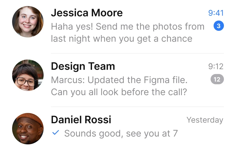
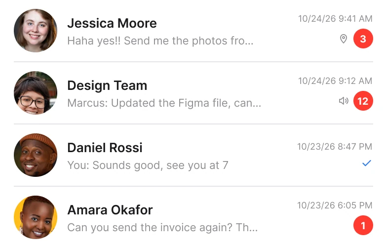
One cut line, a full timestamp and a red badge with an icon, against two lines, a short time and one quiet badge.
A row is a message in miniature, and the draft cuts the message after about five words: "Haha yes!! Send me the photos fro...". The space went to the date, "10/24/26 9:41 AM", and to a small pin or speaker icon beside a red badge. A date with the year and the seconds of the minute is the least useful thing on a row for a message that came this morning.
The fix gives the preview two lines, so "Haha yes! Send me the photos from last night when you get a chance" is readable without opening the chat. The time is short: "9:41" today, "Yesterday", then "Thu".
An unread chat gets its time in blue and a 17 px blue badge. The muted group, Design Team, gets a gray badge so it counts without calling. Avatars grow to 52 px, and a voice message gets a small microphone in front of its length.
The rule to reuse: spend the row's space on the message, and write the time the way people say it.
The smaller fixes
- One left edge. The draft used 14 px on the left and 12 px on the right. The fix uses 20 px on both sides, with the dividers starting after the avatar.
- One color for attention. The draft's badges are red, rings are orange to purple and the unread chip is outlined. The fix uses the brand blue #2E7CF6 for new, selected and unread, and gray for everything quiet.
- A real type scale. Text went from 9 to 20 px to iOS text sizes of 11 to 28 pt, with the large title on top.
- Four tabs, not five. The draft's Chats, Calls, Camera, Status and Settings became Chats, Calls, Updates and Settings. The camera left the tab bar.
- Bigger faces. Avatars in the list grew to 52 px, so the person is the first thing a row shows.
Audit your own chat list
| Question | Why it matters |
|---|---|
| How many actions sit in the title bar? | One action is found, four are scanned |
| Does the search field describe itself in a sentence? | The word Search is already enough |
| Does each ring or dot mean exactly one thing? | A style used for everything says nothing |
| Does the filter row end inside the screen? | A cut chip hides what it offers |
| Is the preview at least two lines? | Readers should not open a chat to read it |
| Are times written the way people say them? | "Yesterday" is faster than a date with a year |
Get the Figma file
The free file has both screens as components, every fix as a before and after pair, the color variables and the iOS text styles.
Free Figma file
Chat list, before and after
Both screens and every fixed part as Figma components. Free, view only, duplicate it to your drafts.
FAQ
What should a chat list screen show on each row?
The person, two lines of the latest message, a short time and one small badge for unread. Leave out the full date, the extra icons and any second badge.
How many filters should a messaging app show?
Four chips are enough on the main list: All, Unread, Favorites and Groups. Put the rest, such as Archived, behind a menu or on another screen, and make sure the row never runs off the edge.
How do you design story rings in a chat app?
Use one color for new and a quiet color for seen, so the ring carries information. Our fix uses a blue ring for new and a thin gray ring for seen, with whole first names under the faces.
How should a chat app show the time of a message?
As short as a person would say it: the time for today, then "Yesterday", then the weekday. Save full dates for the chat itself.
What font sizes should a chat app use?
Use the platform text scale. The fixed screen uses iOS sizes from 11 to 28 pt, with a large title for the screen name.
Sources
- Both screens are our own, designed and measured in Figma. The names and messages are made up for the exercise.
- Photos via Pexels by Татьяна Танатова, Iphanyi Ezemenari, pessoas uem, Son Hoa Nguyen, Ajan Yogi, Tamra Creatives Agency, Kenneth Surillo and kaleef lawal.
- Apple Human Interface Guidelines: Typography, for the iOS text sizes and the large title used in the fixed screen.
- Apple Human Interface Guidelines: Accessibility, for the 44 pt touch target size.
- First published as a carousel on App Brainy.
Want this for your own app? Our team redesigns app screens like this one, from the first audit to the finished components.
Get StartedGet new papers by email
New Brainy papers in your inbox. Confirm once, unsubscribe anytime.