Calendar App Design: A Day Screen Redesign, Before and After
A calendar day screen where five events, a month grid and a red alert all shout at once, and the same screen fixed: a quiet timeline, one row for the next meeting, a week strip and one Day menu. Every change side by side, with the free Figma file.
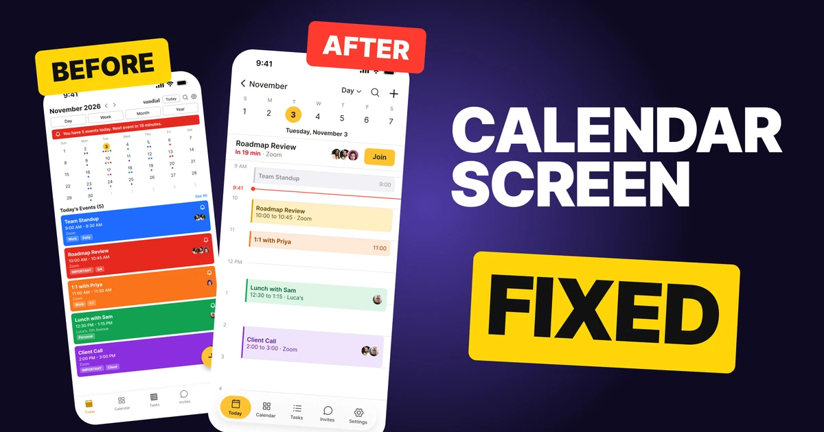
A calendar day screen has one job: tell you what is next and how much of the day is left. The first draft below knows the whole day, but it paints five events in five loud colors, adds a month grid and puts a red alert on top, so nothing looks more important than anything else. A meeting 19 minutes away gets the same weight as lunch.
The fix keeps every function and changes the weight. Long meetings look long, free time is simply empty, and the one meeting that matters right now gets its own calm row.
The whole screen, before and after
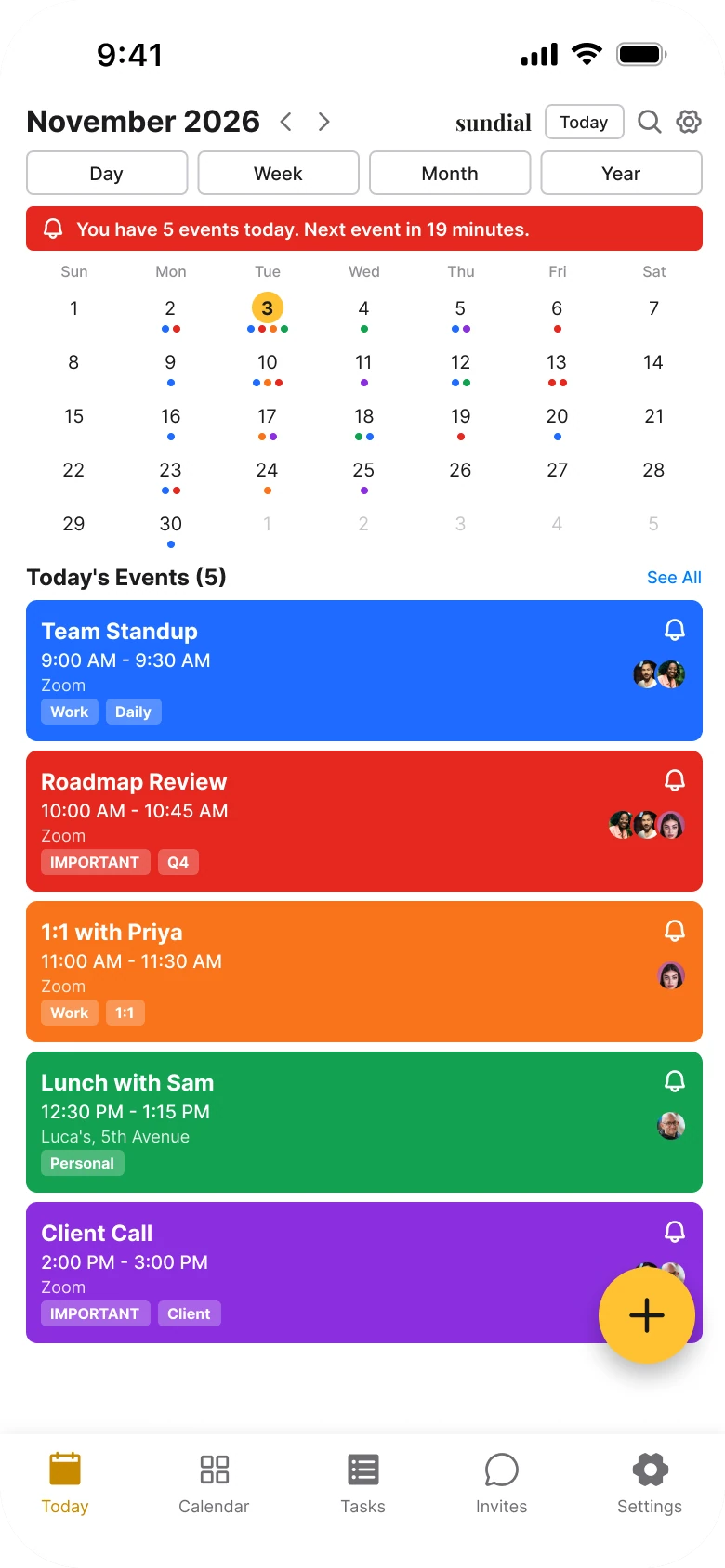
Junior draft
Fixed
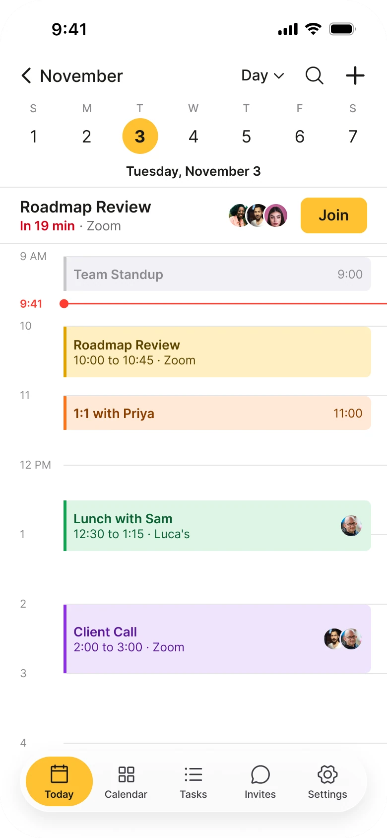
On the left, the eye has nowhere to land. The header, four buttons, a red banner, a month grid and a stack of saturated cards all fight for the first look. The event cards are the loudest thing on the screen, and they are all equally loud. Red is used twice: once for an alert and once for an event, so red stops meaning anything.
On the right, the screen has a clear order from top to bottom: where am I in the week, what is next, and what does the rest of the day look like. Color is quiet and used for one thing, which is telling events apart.
What changed, measured
| Junior draft | Fixed | |
|---|---|---|
| Events | Five full-color cards, each with a bell, avatars and tags | Pale tinted blocks with a 3 px color bar, radius 6 |
| Time | Not shown, the cards are the same height | A timeline at 70 px an hour, so length shows |
| Next meeting | A red alert banner with a sentence | One 76 px row: "In 19 min", people and a 36 px Join button |
| Date picker | A 158 px month grid with colored dots | A week strip, one 36 px solid circle on today |
| Views | Four equal 24 px buttons | One small Day menu |
| Header icons | Small, mixed | 24 px, plain |
| Margins | 14 px left, 12 px right | Even, edge to edge rows |
| Text sizes | 8 to 16 px | A readable scale from one size per role |
| Floating button | 52 px, sitting over the last card | None, add is a plus in the header |
| Tab bar | Five tabs | Five tabs in a 62 px floating bar with the day running under it |
Fix 1: turn the cards into a timeline
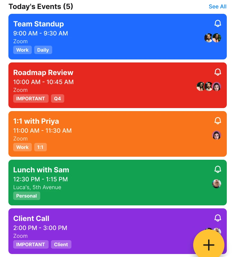
Before
After
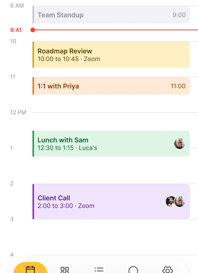
Five stacked full-color cards, blue, red, orange, green and purple, all the same height, each with a bell, avatars and tags, against a timeline with hour labels, a gray past meeting, a red line at 9:41 and four pale blocks with a thin color bar, where lunch and the client call are taller than the one to one.
A list of cards says "here are five things" and nothing else. A one hour check-in and a three hour workshop take the same space, and the gaps between them, which are the part of a calendar people actually want to see, are invisible.
A timeline gives the day a shape. A 45 minute meeting is a short block, a long one is a tall block, and free time is white space you can see. The color moved from the whole card to a thin bar on the left and a pale tint behind, so the text can be read at once and the color still tells a work call from lunch.
Two small touches carry meaning. Team Standup is gray because it is over. A red line marks 9:41, so you can see exactly where you are in the day.
Rule to reuse: show time as space, and keep the loud color for the one thing that is happening now.
Fix 2: one calm row for what is next
Before

After

A red banner with a bell and the sentence You have 5 events today. Next event in 19 minutes, against a white row reading Roadmap Review, then In 19 min in red with Zoom beside it, three small avatars and a yellow Join button.
The draft's alert tries to tell you three things in a sentence: how many events there are, that one is next, and when. It reads like an error. Nobody needs the count of events today, because the screen shows them.
The fix answers the one question people have when they open a calendar: what is next, and can I join it? The name is first, "In 19 min" in red is the only red on the screen, and a 36 px Join button sits where a thumb can reach it. The times add up: the status bar says 9:41 and Roadmap Review starts at 10:00.
The pattern is the same one Notion Calendar uses for its join button: the meeting, the countdown and one action.
Rule to reuse: replace a banner that describes the day with a row that helps with the next move.
Fix 3: trade the month for a week
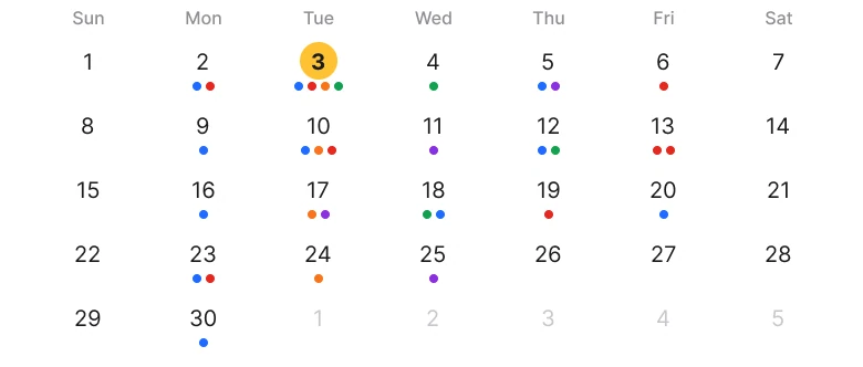
Before
After
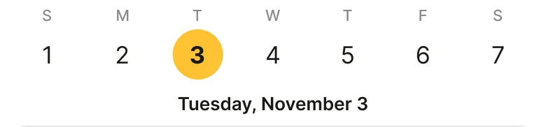
A full month grid, five rows of numbers with small colored dots under many of them and today in a small yellow circle, against a single week row with one letter above each number, a large solid yellow circle on Tuesday the 3rd and the line Tuesday, November 3 under it.
A month grid answers a question a day screen is not asking. It spends 158 px of a phone to show 30 days of colored dots, and the dots look like the cards below them, so the screen has two competing summaries of the same thing.
A week strip keeps what a day view needs: today and the days next to it. One solid circle marks today and the full date sits right under it in words. The month is still there: November in the header goes back to the month view, and a swipe on the strip moves a week.
Rule to reuse: show the zoom level the screen is about. A day screen needs a week, not a month.
Fix 4: fold four buttons into one menu
Before

After

A header with November 2026, two chevrons, a wordmark, a Today chip, search and settings icons, and under it four equal outlined buttons: Day, Week, Month and Year, against a header with a back arrow and November, a small Day menu with a chevron, a search icon and a plus icon.
Four equal buttons say all four views are equally likely. They are not: people sit in one view and rarely change it. The buttons take a full row, and they look like the cards that sit below them.
The fix folds them into one small menu that shows the current view. Week, Month and Year are one tap away. Search and add become plain 24 px icons, Settings stays in the tab bar, and the wordmark goes, because the screen is the product and Apple Calendar has none either.
Rule to reuse: when options are used unequally, show the current one and hide the rest behind it.
The smaller fixes
- Every function stays. The arrows are a swipe on the week strip. The bell, the tags and the place on each event open with the event.
- The same events. All five events are on both screens, each keeping its old color as a tint. Team Standup is gray because it is over, and Roadmap Review is the brand yellow because it is next.
- A floating tab bar. At 62 px, with the day running under it, the screen uses the full height and the tab bar stops looking like a separate box.
- No floating button. The 52 px plus used to sit over the last card and its people. It is a header icon now.
- Even margins. The draft has 14 px on the left and 12 px on the right. The fixed rows run edge to edge on one grid.
- Zoom on both. Roadmap Review is on Zoom on both screens, so Join means something.
Audit your own calendar screen
| Question | Why it matters |
|---|---|
| Does a long meeting look long? | Length is the first thing a calendar should show |
| Is free time visible as empty space? | People open a calendar to find gaps |
| Is there one row for what is next? | It is the question asked most |
| Is red used for one thing only? | A warning color works once |
| Does the date picker match the view? | A month grid on a day screen is a second summary |
| Are rarely used views folded away? | Equal buttons imply equal use |
Get the Figma file
The free file has the junior draft, the fixed screen and every part as a component.
Free Figma file
Calendar day screen redesign, before and after
Both screens and every part as a Figma component. Free, view only, duplicate it to your drafts.
FAQ
How should a calendar app day view be designed?
As a timeline where block height equals meeting length, with quiet tints and a thin color bar, free time left empty and a line for the current time. Put the next meeting in one row above it.
How do you show the next meeting in a calendar app?
In one row with the meeting name, a countdown such as "In 19 min", the people and a Join button when there is a call. Avoid a banner that counts the day's events.
Should a calendar app show a month grid on the day screen?
Usually no. A week strip with one solid circle on today gives the context a day view needs, and the month stays one tap away from the header.
How many view buttons does a calendar app need?
One. Show the current view in a small menu, here Day, and put Week, Month and Year inside it.
Why are full color event cards bad in a calendar?
When every event is saturated, every event looks urgent and color stops separating them. A pale tint with a thin color bar keeps the category and lets the text be read.
What color should a calendar's join button be?
The brand color, as the one filled button on the screen, and keep red for the countdown only.
Sources
- Both screens are our own, designed and measured in Figma. The app, Sundial, the people and the events are made up. The times are consistent: the status bar says 9:41, Roadmap Review starts at 10:00, and November 3, 2026 is a Tuesday.
- Text and contrast checks: ink #1B1A17 on the marigold #FFC233 is 10.8 to 1. Event text on its tint is 8.1 (yellow), 6.5 (orange), 6.8 (green) and 8.4 (purple) to 1. The red "In 19 min", #D70015, on white is 5.4 to 1.
- Pattern studied: Apple Calendar's day view (back to the month top left, search and add as plain icons, a week strip with one solid today, tinted blocks with a color bar, empty space as free time) and the join button of Notion Calendar.
- Wordmark in the before screen: Playfair Display Bold. Avatar photos from Pexels: Peter Platou, Son Hoa Nguyen, Luthfi Ramaditya and Carlos Gutierrez.
- First published as a carousel on App Brainy.
Want this for your own app? Our team redesigns app screens like this one, from the first audit to the finished components.
Get StartedGet new papers by email
New Brainy papers in your inbox. Confirm once, unsubscribe anytime.