
Variable Fonts: डिज़ाइनर्स का 2026 वर्किंग गाइड
Variable fonts असल में क्या करते हैं, ये font families की जगह क्यों लेते हैं, Inter, Recursive, Apple SF Pro, IBM Plex के teardowns और एक picking framework के साथ।
Variable fonts ने छह files ship करने की जगह एक ऐसी file ship करना संभव किया जो छह काम करती है, और ज़्यादातर teams ने अभी तक यह बदलाव नहीं किया। यही पूरा तर्क है। नीचे सब कुछ उसी का सबूत है।
2026 में किसी brand typeface के लिए चार static font files लोड करने का मतलब है performance का टैक्स भरना और design range को बेकार छोड़ना। यह गाइड mechanics, चार production teardowns, एक असली performance नंबर, और एक छह-सवालों का framework कवर करता है जिसका इस्तेमाल करके आप सोमवार तक एक variable font चुन और ship कर सकते हैं।
Variable font असल में होता क्या है
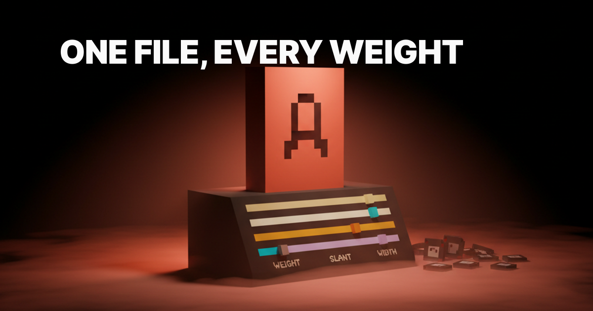
Variable font एक single font file है जो एक या उससे ज़्यादा axes पर एक continuous design space encode करती है। Weight सबसे जाना-पहचाना axis है: Regular file और Bold file अलग-अलग ship करने की बजाय, आप एक ऐसी file ship करते हैं जो 100 से 900 तक कोई भी weight render कर सके। Type designers standard set से परे custom axes भी define कर सकते हैं, और यहीं से चीज़ें दिलचस्प होती हैं।
OpenType variable font spec (OT 1.8, 2016 में जारी) ने इसे संभव बनाया। Font file एक default master और हर axis endpoint के लिए delta values store करती है। Rendering engine interpolate करता है। Designer, या CSS, runtime पर exact value dial करता है।
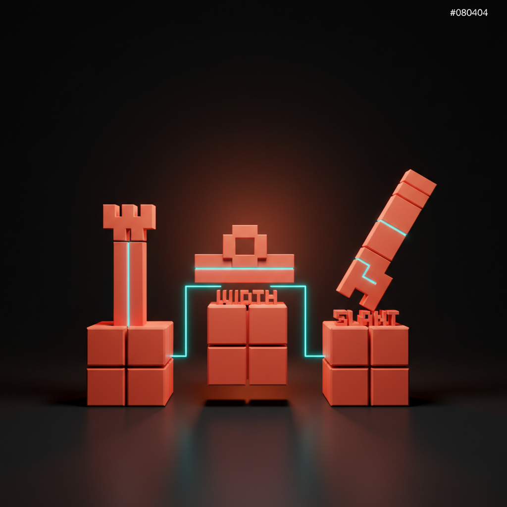
पाँच standard registered axes:
- Weight (
wght): thin से black तक, सबसे जाना-पहचाना axis - Width (
wdth): compressed से expanded तक - Slant (
slnt): oblique angle को control करता है - Optical size (
opsz): caption बनाम display sizes के लिए letterforms को adjust करता है - Italic (
ital): roman से italic तक एक continuous value के रूप में
Custom axes चार-अक्षर के uppercase codes इस्तेमाल करते हैं और type designers को ऐसे expressive ranges बनाने देते हैं जो कोई static font नहीं दे सकती।
एक नज़र में चार teardowns
चार production variable fonts, चार अलग-अलग कारण उन्हें ship करने के।
| Font | Designer | Custom Axes | Primary Use Case | File (~variable) |
|---|---|---|---|---|
| Inter | Rasmus Andersson | None | Product UI, SaaS, dashboards | ~310 KB |
| Recursive | Stephen Nixon (Arrow Type) | Mono, Casual, Expression | एक file से Code + marketing | ~580 KB |
| Apple SF Pro | Apple | Optical size | OS-level, हर Apple platform | Bundled |
| IBM Plex | Bold Monday + IBM | None | Product और marketing में corporate design system | ~200 KB प्रति style |
हर font एक ही समस्या का अलग version हल करता है: एक file ship करो, हर context cover करो।
Inter: वह variable font जो designers असल में ship करते हैं
Inter, Rasmus Andersson का screens के लिए typeface है, और यह अभी production में सबसे ज़्यादा ship किया जाने वाला variable font है। rsms.me/inter पर उपलब्ध variable version में एक ही file में 100 से 900 तक weight और italic शामिल है।
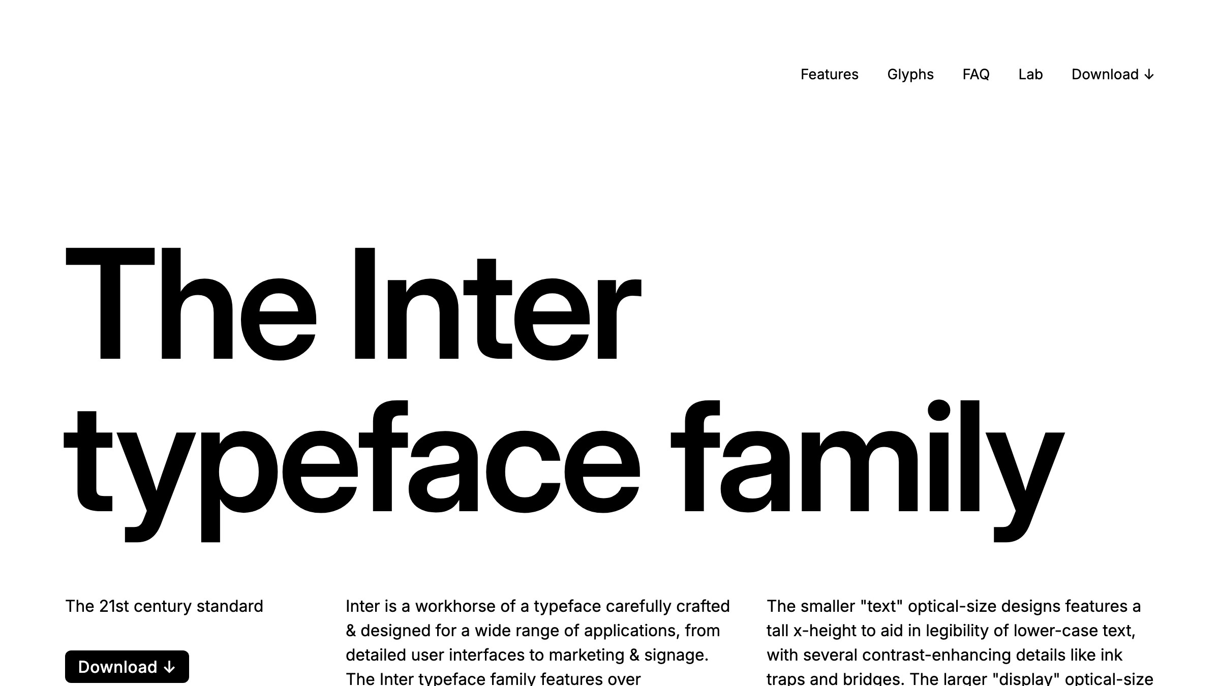
Inter के लिए honest case साधारण और सही है। इसकी tight metrics है, गहरी Latin और Cyrillic coverage है, और इसे शुरू से ही low-DPI screens पर छोटे sizes के लिए design किया गया था।
यह कोई personality typeface नहीं है। यह infrastructure है। जब काम readable body copy, readable labels, readable data tables का हो, तो Inter रास्ते में नहीं आता।
Notion, Linear, और दर्जनों अन्य SaaS products चलाने वाली teams Inter या उसका कोई derivative इस्तेमाल करती हैं। इसे चुनना आपका UI generic नहीं बनाता; यह आपके type choice को non-issue बना देता है ताकि आप creative budget spacing, sizing, और hierarchy पर खर्च कर सकें।
Recursive: जब axes typeface को design करते हैं, सिर्फ weight को नहीं
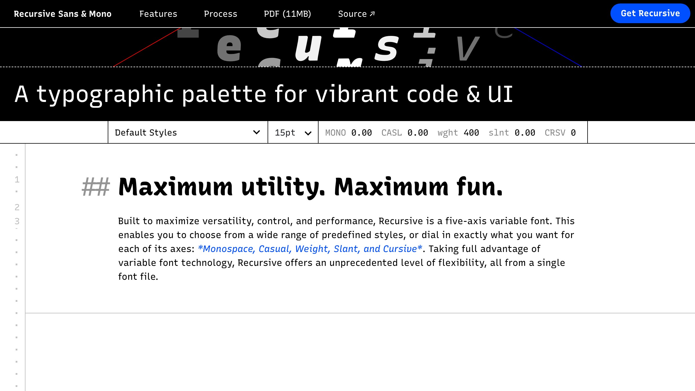
Arrow Type के Stephen Nixon का Recursive, custom axis का canonical उदाहरण है जो बदलता है कि typeface है क्या, न कि सिर्फ यह कि वह कितना heavy लगता है। मुख्य axis है Monospace (MONO), जो font को continuously proportional से monospaced में shift करता है। दूसरा axis, Casual (CASL), एक formal linear construction से एक expressive, informal stroke की तरफ ले जाता है।
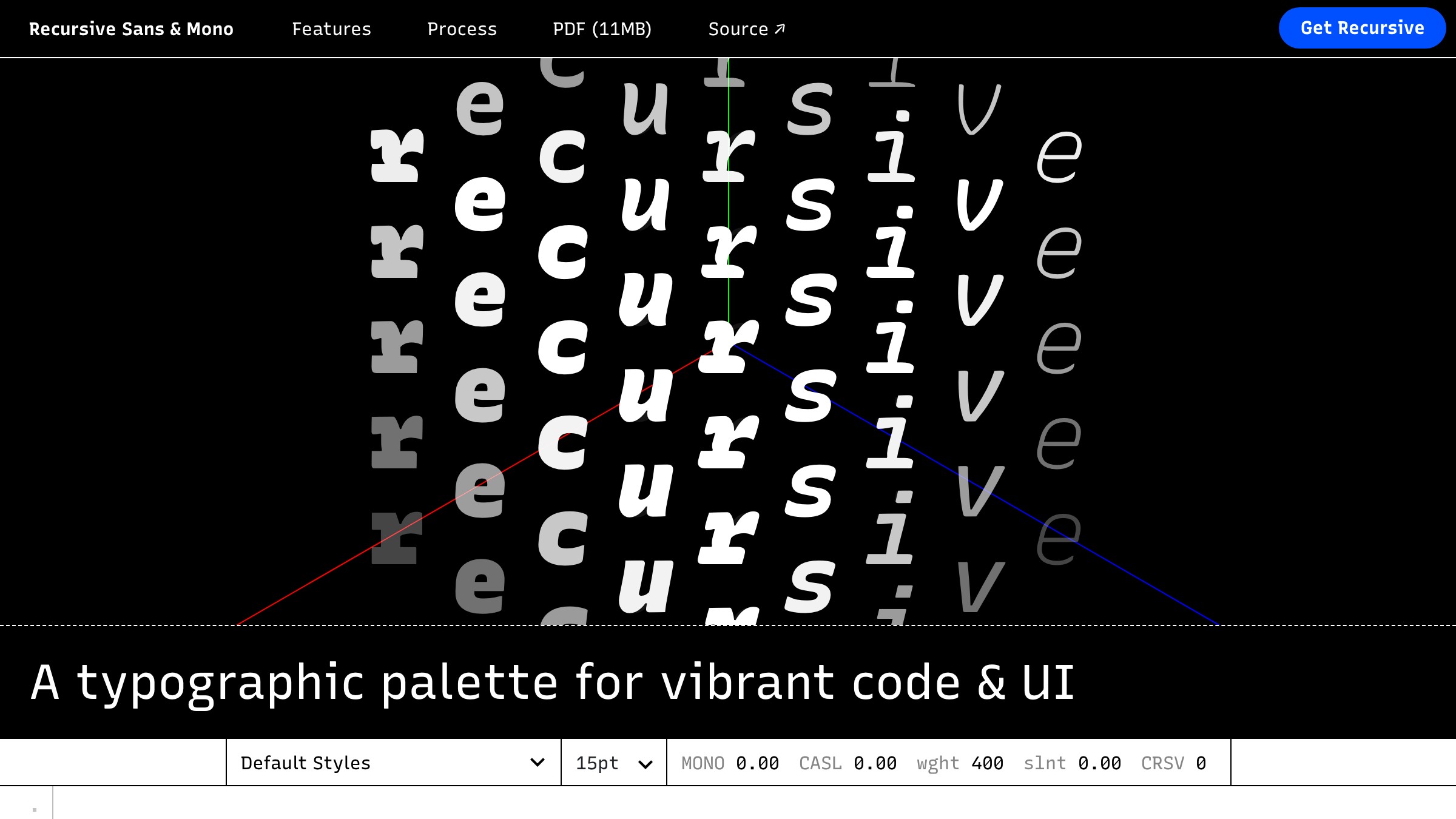
इसका मतलब है कि एक Recursive file आपके marketing headline, body copy, और code blocks serve कर सकती है। MONO और CASL पर अलग-अलग values, वही file। बचत सिर्फ file count में नहीं है; brand coherence में है। Code samples prose के साथ visually rhyme करते हैं क्योंकि वे एक skeleton share करते हैं।
Performance का tradeoff असली है: Recursive की variable file लगभग 580 KB की होती है क्योंकि यह एक wider design space carry करती है। किसी ऐसे product के लिए जो पूरी axis range इस्तेमाल करता है, यह सब कुछ के लिए एक request है। किसी ऐसे product के लिए जिसे हर axis पर सिर्फ एक stop चाहिए, एक targeted static subset ज़्यादा lean है। Commit करने से पहले जानें कि आप क्या खरीद रहे हैं।
Apple SF Pro: OS-level standard के रूप में variable
Apple, SF Pro और SF Compact को हर modern Apple OS के अंदर variable fonts के रूप में ship करता है। Optical size axis (opsz) primary lever है: font automatically अपने letterform construction को caption sizes बनाम display sizes के लिए adjust करता है, designer की दखल के बिना spacing को tighten और stroke weight को adjust करता है।
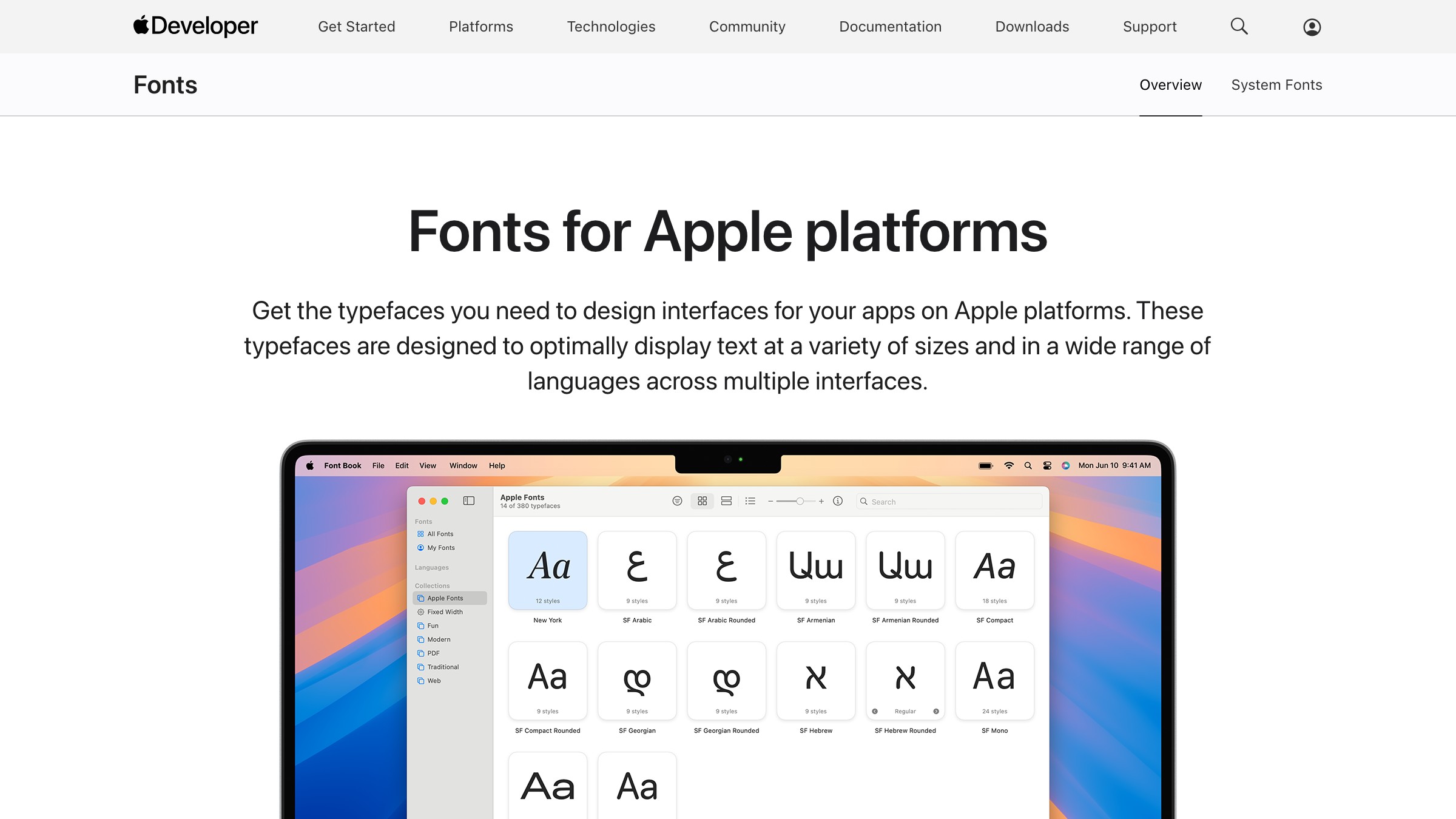
यह variable fonts को platform standard के रूप में स्वीकार करने का upstream तर्क है। Apple और Google दोनों variable को default मानते हैं; static file legacy format है। जब OS, browser, और rendering stack सभी variable format के इर्द-गिर्द बने हैं, तो static files ship करना WebP की जगह GIF ship करने जैसा लगता है।
Apple के HIG के अंदर काम करने वाले designers सीधे web पर SF Pro load नहीं कर सकते (licensing)। लेकिन optical size axis pattern किसी भी ऐसे variable font के साथ पूरी तरह reproducible है जो opsz support करता है, और यह इस बात का concrete तर्क है कि axes weight से परे क्यों मायने रखते हैं।
IBM Plex: corporate design system के अंदर variable
IBM Plex, Bold Monday का IBM के लिए commissioned typeface है, और यह किसी corporate design system को scale पर anchor करने वाले variable font का सबसे स्पष्ट उदाहरण है। Plex में Serif, Sans, Mono, और Math शामिल हैं, जिनमें Sans और Serif के लिए variable versions उपलब्ध हैं।
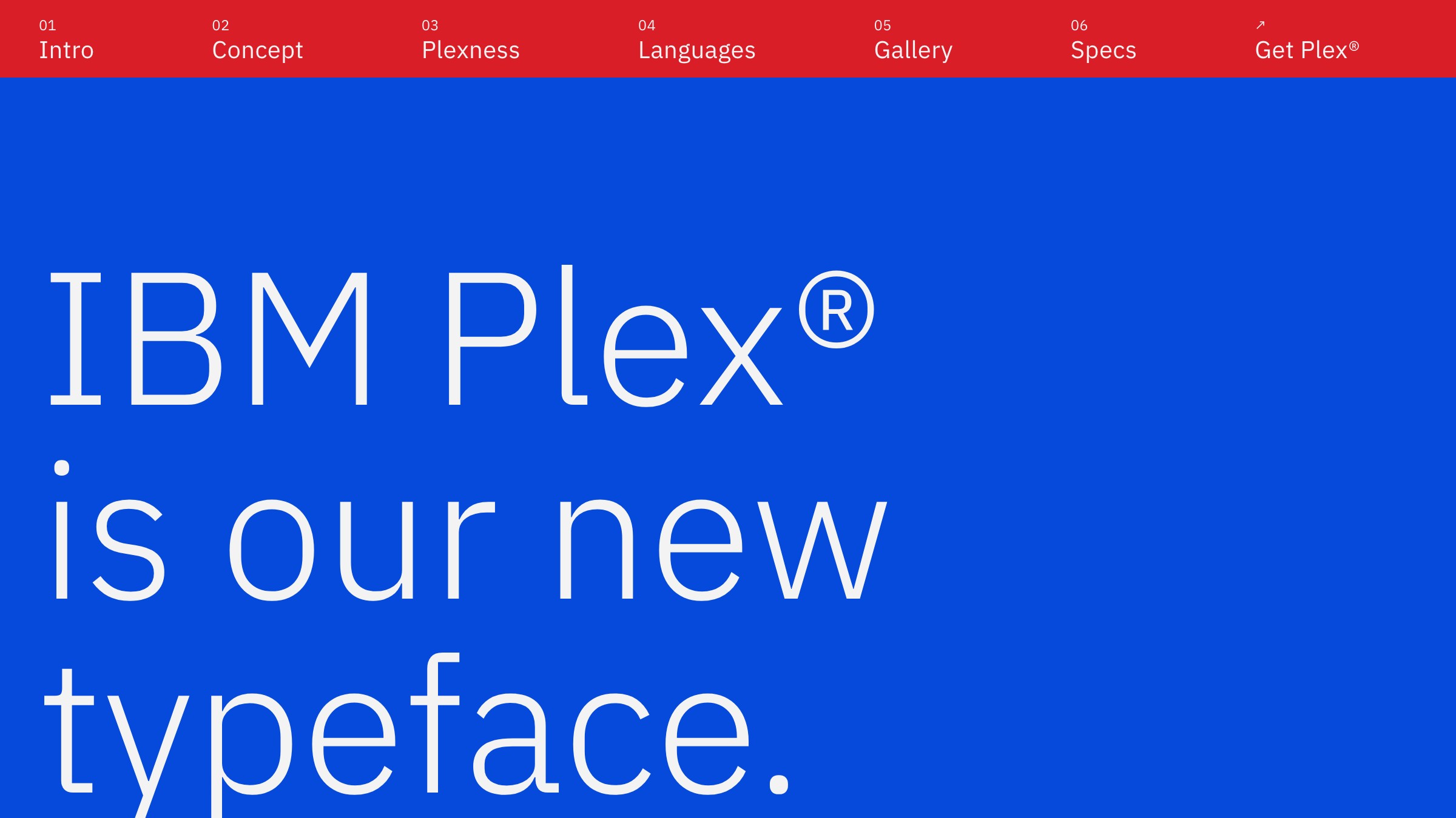
IBM का business तर्क था: एक type family, files का एक set, हर product surface, हर भाषा। Plex, IBM के cloud products, marketing, developer documentation, और print पर ship होता है। Variable Sans वही brand signal carry करता है चाहे वह data table में 11px पर render हो या billboard में 72px पर। यह consistency आकस्मिक नहीं है; यही वह चीज़ है जो एक coherent variable backbone के साथ type system commission करना खरीदता है।
Multiple product surfaces और लंबी shelf life वाले brands वह जगह हैं जहाँ Plex अपनी value साबित करता है। यह वह teardown है जिसे किसी के सामने रखना चाहिए जो proper type system में investment पर सवाल उठाए।
क्या आपको एक type system चाहिए जो हर channel survive करे और एक file में ship हो, छह में नहीं? Brainy brand identity ship करता है।
एक नंबर में performance का तर्क
Inter variable एक single file के रूप में लगभग 310 KB का है। Inter Regular और Inter Bold को static files के रूप में ship करने पर combined लगभग 280 KB बनता है। ऐसा लगता है static जीता। लेकिन ऐसा नहीं है।
| Static fonts | Variable font | |
|---|---|---|
| HTTP requests | 2 | 1 |
| Weight range | Fixed stops (400 और 700) | 100 से 900, continuous |
| Axis variation | None | सभी registered axes |
| Design range | Ship किए गए weights तक सीमित | Axis support करता हो वह कोई भी value |
किसी ऐसे UI के लिए जो तीन या चार weights इस्तेमाल करता है, variable file request count में अकेले ही खुद का खर्च निकाल लेती है। एक marketing site जो display weight को precisely dial करता है, उसे design control मिलता है जो static fonts किसी भी file size पर नहीं दे सकते।
Subsetting math को sharpen करता है। Fonttools और Google Fonts का subsetting API जैसे tools आपको variable font को सिर्फ उन axes और glyphs तक trim करने देते हैं जिनकी आपको ज़रूरत है। Latin characters के लिए properly subsetted variable Inter जिसमें सिर्फ weight और italic हो, 100 KB से काफी कम चलता है।
इस हफ्ते variable font कैसे चुनें
छह सवाल, 2026 production budgets के लिए design किए गए। इन्हें क्रम में answer करें। आखिरी answer जो clear outcome देता है, वही आपकी pick है।
| # | सवाल | Rule |
|---|---|---|
| 1 | क्या brand typeface पहले से variable है? | अगर हाँ, तो उसे इस्तेमाल करें। Switch की ज़रूरत नहीं। |
| 2 | क्या यह primarily UI या SaaS product है? | Inter से शुरू करें। यह सही तरीके से boring है। |
| 3 | क्या आपको code blocks को prose के साथ visually match करना है? | Recursive देखें। MONO axis इसी के लिए बना है। |
| 4 | क्या आपको weight और italic variation से ज़्यादा चाहिए? | Commit करने से पहले axis list check करें। ज़्यादातर fonts सिर्फ wght offer करते हैं। |
| 5 | क्या file size एक hard constraint है (aggressive performance budget)? | उन axis ranges और glyphs तक subset करें जो आप actually इस्तेमाल करते हैं। |
| 6 | क्या यह एक long-lived design system है, कोई one-off project नहीं? | शुरू से ही variable के साथ कोई typeface commission या license करें। Retrofit मत करें। |
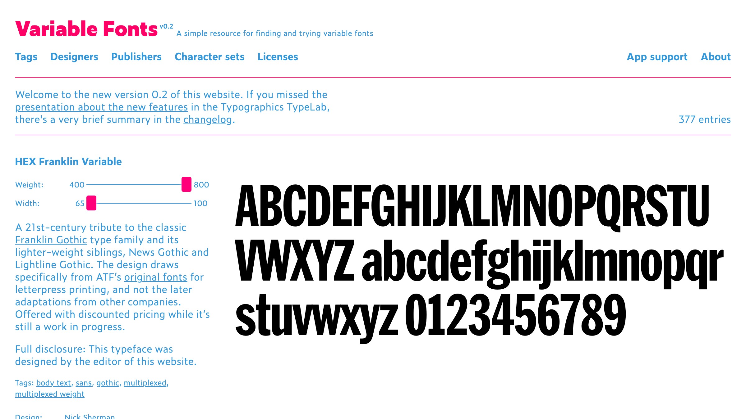
किसी भी pick पर commit करने से पहले check करने वाला catalog v-fonts.com है। यह उपलब्ध सबसे comprehensive variable font index है और download करने से पहले axes live test करने देता है।
Variable fonts को secondaries के साथ pair करने के लिए, हमारा font pairing guide देखें। यह broader typography stack में कैसे fit होता है, उस breakdown में hierarchy, scale, और spacing cover होती है।
FAQ
क्या variable fonts सभी browsers में काम करते हैं?
हाँ, 2026 तक। Variable fonts को Safari 11, Chrome 66, Firefox 62, और Edge 17 से broad support मिली हुई है।
एकमात्र concern बहुत पुराने Android WebView instances हैं। अगर आपके analytics Android 4-era browsers से significant traffic दिखाते हैं, तो test करें। बाकी सभी के लिए, confidence के साथ ship करें।
क्या CSS में variable fonts implement करना ज़्यादा मुश्किल है?
font-variation-settings property समझने के बाद static fonts से ज़्यादा मुश्किल नहीं। आप axis values उसी तरह declare करते हैं जैसे font-weight declare करते हैं। Weight variation अक्सर existing font-weight property के ज़रिए पूरी तरह handle हो जाता है क्योंकि browsers इसे automatically wght axis से map करते हैं। Custom axes directly font-variation-settings में चार-अक्षर के tags इस्तेमाल करते हैं।
क्या मैं Google Fonts से variable font इस्तेमाल कर सकता हूँ?
हाँ। Google Fonts कई typefaces के variable versions serve करता है, जिनमें Inter, Recursive, और Roboto Flex शामिल हैं। Individual weights की बजाय variable file request करने के लिए Google Fonts URL में :ital,wght@0,100..900;1,100..900 (या appropriate axis range) append करें। Syntax Google Fonts developer page पर documented है।
क्या variable font हमेशा multiple static files से छोटा होता है?
हमेशा नहीं। Variable font पूरी design space encode करता है, जो raw file को single static weight से बड़ा बना सकता है। Variable का case है एक request plus axis range, न कि raw file size। ज़्यादातर production use cases के लिए subsetting gap को जल्दी बंद कर देता है।
मुझे static fonts के साथ कब रहना चाहिए?
जब आप किसी typeface का सिर्फ एक weight हमेशा इस्तेमाल करते हों और expand करने की कोई योजना न हो। Subsetted static Regular genuinely किसी ऐसे variable font से leaner है जिसे आप single stop पर इस्तेमाल कर रहे हैं। Variable advantage axis usage के साथ compound होता है। अगर आप एक weight और एक style इस्तेमाल करते हैं, तो static ठीक है।
छह font files ship करना बंद करें जब एक की ज़रूरत है
Variable fonts के लिए तर्क speculative नहीं है। Apple, SF Pro को हर platform पर variable के रूप में ship करता है। IBM Plex एक ऐसे system को anchor करता है जो cloud products, developer docs, और print cover करता है।
Rasmus Andersson का Inter उन आधे SaaS interfaces का default typeface है जो आप रोज़ इस्तेमाल करते हैं। Format experimental नहीं है; यह current standard है जिसे ज़्यादातर project-level design work ने अभी तक adopt नहीं किया है।
ऊपर के teardowns से एक font चुनें, इसे छह-सवालों के framework से चलाएं, v-fonts.com या Google Fonts से variable file pull करें, और इसे इस हफ्ते ship करें।
Performance का तर्क असली है। Design range का तर्क असली है। "हमें पहले अपनी font loading strategy audit करनी होगी" वाला तर्क सोमवार से शुरू करने का कारण है, इंतज़ार करने का नहीं। More typography breakdowns के लिए, पूरी library वहाँ है।
Need a type system that survives every channel and ships in one file, not six? Brainy ships brand identity.
Get Started