Variable Fonts in Production: How to Ship Them Without Wrecking Performance
A working guide to variable fonts in production. The four axes worth shipping, the subsetting strategy that cuts file size in half, and the loading recipe that keeps the page from jumping.
Variable Fonts in Production: How to Ship Them Without Wrecking Performance
A variable font is one file with infinite weights, and the teams shipping them right are saving bytes and unlocking expressiveness. The teams shipping them wrong are loading 800-kilobyte fonts and blocking first paint for animations no one will see. The difference is not the font choice. It is the production strategy.
A variable font is one file with infinite weights
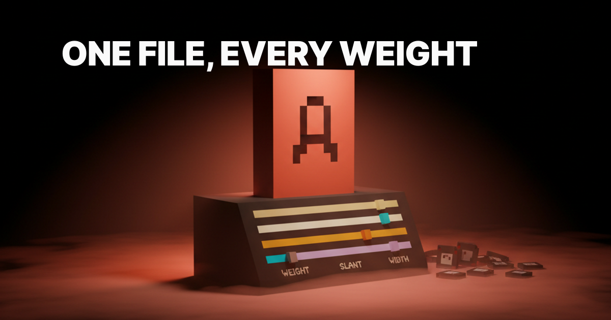
A variable font ships every weight, slant, and width inside a single file with axes you can interpolate between, which is the entire pitch and also the entire tradeoff. One network request replaces four to seven static font requests. The file is larger than any individual static weight, but smaller than the full static weight set combined. That is the deal.
The format is OpenType with embedded variation data. The browser interpolates between axis endpoints at render time, which means you get font-weight: 350 or font-weight: 723 for free, not just the integers the type foundry chose to ship. This is what makes the hover-weight animation pattern possible, and what makes a careless implementation load a 600-kilobyte file for a site that only uses two weights.
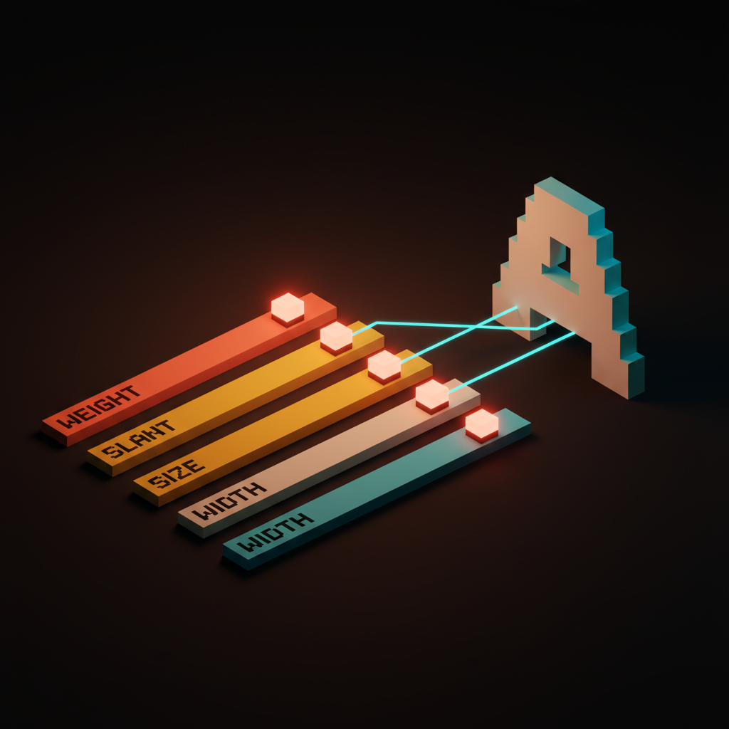
The four axes worth shipping
Weight, slant, optical size, width. Most production sites need two or three of these, and shipping more axes than you use is wasted bytes.
The OpenType spec defines five registered axes: weight (wght), width (wdth), slant (slnt), italic (ital), and optical size (opsz). Beyond those, foundries can define custom axes for anything from grade to expressiveness. Custom axes are fun in a type specimen. They are almost never worth the file size in production. Stick to the registered four unless your design explicitly demands something else.
| Axis | CSS Property | Typical Range | When to Use |
|---|---|---|---|
Weight (wght) | font-weight | 100–900 | Almost always |
Width (wdth) | font-stretch | 75%–125% | Editorial, responsive headers |
Slant (slnt) | font-style: oblique Xdeg | -15deg to 0deg | Real italic replacement or animation |
Optical size (opsz) | font-optical-sizing | 6–144 | Display and body from one file |
Weight is the workhorse
The weight axis replaces the four to seven static weight files most sites ship, and it is the axis that pays for variable fonts on its own. A site shipping Regular, Medium, SemiBold, Bold, and ExtraBold as static files is making five font requests. A variable font with a weight axis makes one, and delivers every intermediate value for free.
The CSS is font-weight: 300 through font-weight: 900 on any element. Intermediate values like font-weight: 450 are valid and render correctly. Check the foundry's axis range documentation before assuming a variable font spans the full 100 to 900 range. Some ship a narrower range and will clamp silently, which produces subtle but ugly steps instead of smooth transitions.
Slant unlocks real italics
A real slant axis lets you go from upright to italic at any value, which most static font pairs cannot do without a second file. The distinction between slnt (slant) and ital (italic) matters: slant is a continuous range from upright to oblique, while italic is a binary toggle that switches to a separate, optically corrected italic design.
For body text, the italic axis with a proper optical italic is almost always the right choice. For headlines you plan to animate, slant is the axis you want. The CSS is font-style: oblique -10deg, with the degree value mapping to the axis range. Test the slant at your actual headline size before committing to a value. Extreme slant angles look worse at small sizes than the foundry's type specimen suggests.
Optical size keeps display type alive
Optical size adjusts contrast, x-height, and detail by rendered size, which is the difference between a display face and a body face built into a single font. A typeface designed for 12px body text has simplified details, open counters, and generous spacing. A display cut at 80px has sharper contrast, tighter spacing, and more refined details. Optical size gives you both from one file.
The CSS property is font-optical-sizing: auto, which lets the browser apply the right optical settings based on the declared font-size. You can also set it manually with font-variation-settings: 'opsz' 72 for a 72px heading. Fonts that support this axis properly, Inter Display versus Inter Text being the canonical example, were designed with optical size as a first-class feature. Fonts that add an opsz axis as an afterthought rarely deliver a meaningful visual difference. Know which one you are buying.
Width is the editorial axis
A width axis lets you compress headlines and expand pull quotes without swapping fonts, which is the move that makes editorial layouts sing. The CSS property is font-stretch, and it takes percentage values: font-stretch: 75% for condensed, font-stretch: 125% for expanded.
This axis earns its file size on sites with responsive editorial layouts. A headline at 120px on desktop might want to be condensed to fit the column at 375px mobile, and a width axis handles that with a single @media query instead of a second font load. Roboto Flex ships one of the widest width axis ranges in a production-ready variable font, and it is worth studying if you plan to use this axis seriously. For marketing sites with fixed-width headers, skip it entirely.
Variable versus static, the decision tree
Variable fonts win when you use three or more weights, you animate the type, or you need optical size. Otherwise, stay static. The break-even point is typically two to three weights, and the math changes depending on your language coverage requirements.
| Scenario | Best Choice | Reason |
|---|---|---|
| 1–2 weights, no animation | Static | Smaller total bytes |
| 3+ weights | Variable | One file beats three files |
| Weight or slant animation | Variable | Only possible with variable |
| Optical size needed | Variable | Saves a second font load |
| Narrow Latin only, single weight | Static | No benefit to variable |
| Multi-locale, many languages | Variable with subsetting | One base file, locale extensions |
A site shipping Regular and Bold is probably better off with two static files totaling 40 to 60 kilobytes than one variable font at 120 to 200 kilobytes. The math tips decisively for variable once you cross three weights or add animation to the requirements.
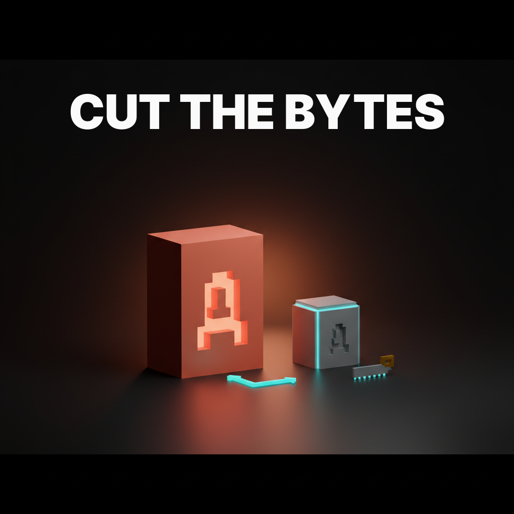
Subsetting cuts the file in half
Subsetting drops glyphs you do not use, and on a marketing site that means a 600-kilobyte variable font becomes 200 kilobytes without a visible change. A full variable font ships every glyph the foundry designed: Latin, Latin Extended, Cyrillic, Greek, mathematical operators, currency symbols, and ligatures you will never use. A subsetted variable font ships only what your content needs.
The tool for this is pyftsubset from the fonttools library. A basic Latin subset command:
pyftsubset font.woff2 \
  --output-file=font-subset.woff2 \
  --flavor=woff2 \
  --unicodes=U+0000-00FF,U+0131,U+0152-0153,U+02BB-02BC,U+02C6,U+02DA,U+02DC,U+2000-206F,U+2074,U+20AC,U+2122,U+2191,U+2193,U+2212,U+2215,U+FEFF,U+FFFD \
  --layout-features="kern,liga,calt,rlig"
Keep kern, liga, calt, and rlig layout features. Strip everything else unless the design explicitly uses it. Run the output through a WOFF2 compressor if the tool did not handle compression automatically.
Latin, Latin-extended, and language ranges
The right subsetting strategy is one Latin file plus one language extension file per locale, loaded only when needed. Most marketing and product sites serve primarily Latin content. Ship the Latin subset as the default, and load extended character sets via the unicode-range descriptor in @font-face, which tells the browser to fetch a file only when it encounters matching characters on the page.
@font-face {
  font-family: 'YourFont';
  src: url('/fonts/yourfont-latin.woff2') format('woff2');
  font-weight: 100 900;
  font-display: swap;
  unicode-range: U+0000-00FF, U+0131, U+0152-0153, U+02BB-02BC,
                 U+02C6, U+02DA, U+02DC, U+2000-206F, U+2074,
                 U+20AC, U+2122, U+2191, U+2193, U+2212, U+2215,
                 U+FEFF, U+FFFD;
}

@font-face {
  font-family: 'YourFont';
  src: url('/fonts/yourfont-latin-ext.woff2') format('woff2');
  font-weight: 100 900;
  font-display: swap;
  unicode-range: U+0100-024F, U+0259, U+1E00-1EFF, U+2020,
                 U+20A0-20AB, U+20AD-20CF, U+2113, U+2C60-2C7F,
                 U+A720-A7FF;
}
The browser downloads only the files that match characters on the current page. A French page loads the Latin Extended file. An English page does not. This is how Google Fonts ships at scale, and it is the right pattern to copy for your own variable fonts.
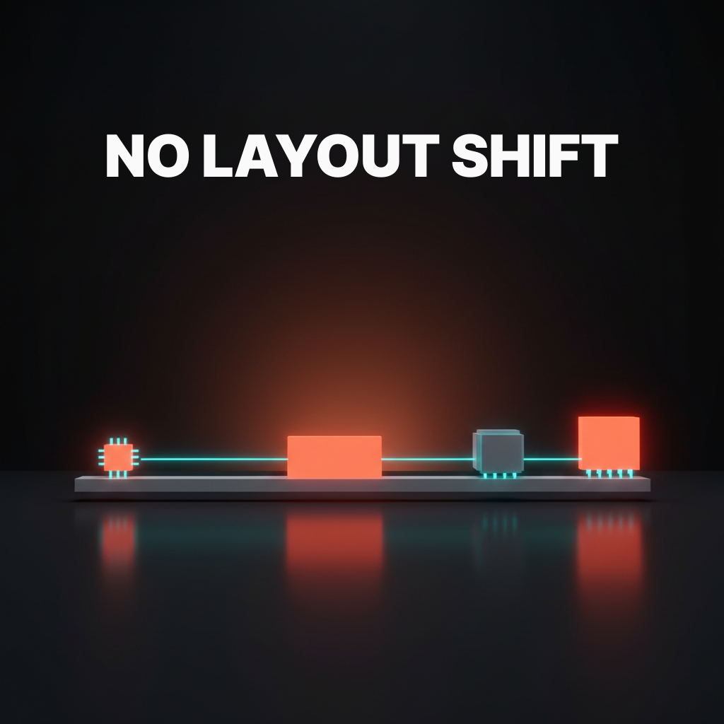
Loading without jank
A variable font that loads after first paint will shift the layout, and the loading recipe is preload plus font-display swap plus a metric-matched fallback. This is not optional. A variable font is larger than a single static weight, which means it takes longer to arrive, which means the window for layout shift is wider.
The preload link goes in the <head>, before any stylesheet:
<link
  rel="preload"
  href="/fonts/yourfont-latin.woff2"
  as="font"
  type="font/woff2"
  crossorigin
>
The font-display: swap declaration in your @font-face tells the browser to render with the fallback immediately and swap in the variable font when it arrives. A variable font is one file with infinite weights, and the wrong loading strategy will load it twice for nothing if you mix preload and non-preload declarations across stylesheets. One preload per subset file. That is the entire rule.
Want variable fonts that ship at half the bytes and never jank the page? Hire Brainy and we will ship your production typography stack with the right axes, the right subsets, and the loading recipe that keeps Lighthouse green.
Metric-matched fallbacks
A metric-matched system fallback uses size-adjust, ascent-override, and descent-override to make the fallback render at the same rhythm as the variable font. Without this, font-display: swap trades invisible text for a layout shift when the variable font arrives. With metric matching, the swap is visually imperceptible.
@font-face {
  font-family: 'YourFont Fallback';
  src: local('Arial');
  ascent-override: 90%;
  descent-override: 22%;
  line-gap-override: 0%;
  size-adjust: 107%;
}
The exact values depend on your variable font. Tools like Fontaine and next/font generate these values automatically. If you are building on Next.js, next/font handles the entire fallback chain. If you are not, Fontaine is the fastest path to correct override values without calculating them by hand.
Four animation patterns variable fonts unlock
Hover-weight, scroll-weight, hover-slant, and reveal-width. These four animations are only possible with variable fonts, and they earn the file size when used sparingly. Throw all four on one page and it reads as a tech demo, not a design.
Hover-weight transitions font-weight from 400 to 700 on hover. The interpolation is smooth because the axis data is in the font. transition: font-weight 0.15s ease on the element is the entire CSS. It works on navigation links, call-to-action text, and interactive labels.
Scroll-weight drives font-weight from the scroll position using a JavaScript scroll listener that maps scrollY to a value in the axis range. Keep the range tight: 300 to 700 reads as intentional, 100 to 900 reads as a bug. It belongs on hero sections where type gets heavier as the user scrolls into content.
Hover-slant transitions font-style: oblique 0deg to font-style: oblique -10deg on hover. It is the subtler alternative to hover-weight and reads as more refined on navigation links and inline interactive elements. Combine it with hover-weight only if the typeface was designed to support both simultaneously.
Reveal-width animates font-stretch as part of an entry animation. Text enters at font-stretch: 75% and expands to font-stretch: 100% over 400ms. Combined with a fade-in, it is one of the cleanest typographic reveal patterns available. Skip it on body text. It belongs on display type and hero headlines only.
Seven sites shipping variable fonts at scale
GitHub, Stripe Press, Vercel, Linear, The New York Times, Apple Music, and Figma each ship variable fonts in production, and the patterns they share are the ones worth copying.
GitHub ships Mona Sans and Hubot Sans, both custom variable fonts built for the GitHub brand. Weight axis only in most UI contexts. No animation except in occasional marketing sections. File sizes are tight because they subset aggressively by language group.
Stripe Press uses a custom display variable font for editorial headlines. They push the weight axis hard, with display headlines at heavy weights and captions at light weights from a single file. Optical sizing is apparent at larger headline sizes. It is the most editorially ambitious variable font use on this list.
Vercel ships Geist, their own variable font, across Geist Sans and Geist Mono. Weight axis covers the full range. The font is open source, Latin subsetting is clean, and it loads fast enough to serve as a reference for what a well-shipped variable font looks like in a production Next.js app.
Linear ships Inter as a variable font. The weight axis ranges across UI weights, staying in the narrower optical weight range appropriate for a dense UI. It is the most conservative use on this list and also one of the most correct for a data-dense product interface where animation would be noise.
The New York Times uses a custom variable serif for display type. The weight and optical size axes are both active, and the transitions between display and body use the optical size axis to shift character rendering. This is as sophisticated as variable font production usage gets at editorial scale.
Apple Music ships San Francisco in its variable form with both weight and optical size axes active. The axis transitions between large and small type are smooth enough that most users do not notice the font is variable, which is the correct goal. The font should disappear into the reading experience.
Figma ships Inter Display as a variable font across the application. If you are doing display typeface selection for a product UI, study how Figma balances Inter at small UI weights versus Inter Display at large heading sizes. The weight range discipline is worth copying directly.
The pre-deploy variable font checklist
Run this before shipping a variable font and you will catch the bugs that bite in production.
- Subsetting verified. Run
pyftsubsetwith your target unicode ranges. Confirm the Latin subset file is under 200KB. Spot-check that characters your content uses are present in the output. - Axes documented. Know which axes the font ships and the min and max range for each. Do not declare
font-weight: 800if the axis tops out at 700. It will clamp silently and your design will be wrong. - Preload set. One
<link rel="preload">per subset file, in the<head>, withcrossoriginattribute, pointing to the primary Latin file only. Preloading a file you do not use wastes bandwidth. - font-display configured. Every
@font-faceblock hasfont-display: swap. Confirm in DevTools Network tab that fonts are not render-blocking any critical path resources. - Fallback metrics matched. A
@font-faceblock for the system fallback withsize-adjust,ascent-override, anddescent-overridecalculated. Verify by throttling to Slow 3G in DevTools and checking for layout shift on load. CLS should be 0 or near 0. - Axes used by design confirmed. Every axis declared in CSS is actually used in the final design. Axes in the font file but not in CSS still add bytes. If you are not using width, consider axis-range subsetting to trim those bytes.
- Lighthouse score checked. Run Lighthouse on the production URL with the font in place. Font-related LCP and CLS should be green. If they are not, the fallback metrics are wrong or the preload is missing.
- CORS headers confirmed. Variable fonts loaded from a CDN or external origin need
Access-Control-Allow-Originheaders. Check the Network tab for CORS errors. A CORS failure produces a silent font fallback that is hard to diagnose in production.
FAQ
What is a variable font and how is it different from a static font?
A variable font is a single font file that contains the full range of a typeface's design, controlled by axes like weight, width, slant, and optical size. A static font is a single snapshot at one weight and style. The practical difference is that a variable font lets you use font-weight: 350 or animate weight smoothly in CSS, while static fonts only allow the specific values the foundry chose to ship as separate files.
Do variable fonts actually improve performance?
It depends on how many weights you are loading. If you are shipping two static weights totaling 60KB, switching to a 180KB variable font is a performance regression. If you are shipping five weights totaling 300KB, switching to a 120KB subsetted variable font is a clear win. The performance case for variable fonts is real, but it only applies once you cross the three-weight threshold and subset correctly.
What is the best variable font for UI design?
Inter is the most widely deployed variable font in UI design. Its weight axis is well-calibrated for screen use, it subsets cleanly, and Figma ships it as a production reference. Roboto Flex is the right choice when you need a wide axis range for responsive editorial layouts. Recursive is worth studying if you want both a variable sans and a variable mono from one type family. For web design principles that call for a more expressive display face, Fraunces and Playfair Display both ship strong optical size and weight axes.
How do I use font-variation-settings in CSS?
font-variation-settings is the low-level property for setting variable font axes directly using the four-letter axis tag and a numeric value: font-variation-settings: 'wght' 450, 'wdth' 85. For registered axes like weight and width, prefer the high-level CSS properties (font-weight, font-stretch) because they inherit and compose correctly. Use font-variation-settings only for custom axes that do not have a high-level CSS property.
Can variable fonts cause layout shift?
Yes, and they are more likely to cause layout shift than static fonts because the file is larger and takes longer to load. The fix is font-display: swap combined with a metric-matched fallback. This combination makes the swap visually imperceptible. Without the metric-matched fallback, font-display: swap trades invisible text for a visible layout jump when the font arrives. Both problems are solved together or not at all.
Are variable fonts supported in all browsers?
Variable fonts are supported in all modern browsers: Chrome, Firefox, Safari, and Edge. The baseline is solid enough that you do not need a static font fallback for browser compatibility. The percentage of users on a browser that does not support variable fonts is under one percent for most production sites. Provide a system font fallback for that edge case, not a static font stack.
How does variable font subsetting work?
Subsetting removes glyphs from the font file that your content will never render, using a tool like pyftsubset from the Python fonttools library. You specify the unicode character ranges you need, and the tool strips everything else. A full variable font might ship 3,000 glyphs. A Latin-only subset keeps around 250. The result is identical visual output for Latin content at roughly one-third the file size. See the subsetting glossary entry for the full command reference.
The shift variable fonts actually unlock
Variable fonts are not a typography curiosity. They are a way to ship more expression at lower bytes, and the teams treating them as production tooling are the ones doing better typography for less network cost.
The Figma variables architecture that drives modern design systems maps naturally to variable font axes. A font-weight token in Figma is an axis value in the font. Pair a well-structured token system with a properly subsetted variable font and you get design decisions that propagate from design file to production without ambiguity. Pair that with an OKLCH color system on hover states and you build product interactions that feel considered rather than assembled.
The bar for production variable fonts is not "did we ship a variable font." The bar is subsetted correctly, preloaded properly, fallback metrics matched, and only the axes the design uses. That is the standard that separates teams doing production typography from teams doing typography theater.
Want variable fonts that ship at half the bytes and never jank the page? Hire Brainy and we will ship your production typography stack with the right axes, the right subsets, and the loading recipe that keeps Lighthouse green.
Want variable fonts that ship at half the bytes and never jank the page? Brainy ships production typography stacks with the right axes, the right subsets, and the loading recipe that keeps Lighthouse green.
Get Started