Display Typeface Selection: How to Pick a Headline Font That Actually Fits
A working guide to display type selection. The four-question framework, the seven categories that cover modern display use, the pairing rules with body type, and the matching test that catches bad picks early.
Display Typeface Selection: How to Pick a Headline Font That Actually Fits
A display typeface is the loudest choice
The display typeface decides the personality of the brand at every headline-sized moment, and most other typographic decisions follow it. It is the first thing a reader registers, the tone that colors every headline, hero, and pullout across the entire system. Get it right and it earns its keep for years. Get it wrong and it becomes the thing a creative director notices on year two and cannot unsee.
Most designers pick on vibe. They scroll a foundry catalog, find something that looks right at 96 pixels in a moodboard, and ship it. That works right up until the system has to scale, until the brand matures, until the type has to carry product copy at 32 pixels. The vibe method does not hold, and the designers picking on vibe alone are the ones burning budget on a refresh in eighteen months when the type stops fitting the product.
Display versus text, the actual difference
A display typeface is designed to be set large, where contrast, detail, and personality earn their keep. A text typeface is designed to disappear at small sizes, trading personality for legibility across long reading distances.
The design difference is real and measurable. Display faces carry higher contrast between thick and thin strokes, more pronounced optical details, more expressive terminals and curves. Set a display face at 12 pixels and those details become noise. Set a text face at 96 pixels and it reads like a missed opportunity.
Some modern families bridge this with optical size variants, but the underlying truth remains: display typefaces are built for presence, text typefaces are built for endurance. Deploying one as if it were the other is one of the most common and most visible typographic mistakes in production. If you want to go deeper on the technical side, variable fonts in production covers optical sizing in a variable axis context.
The four selection questions
Voice, register, size range, longevity. Run any candidate display face through these four and the bad picks fall out fast. This is not a taste test. It is a diagnostic, and each question eliminates candidates that fail to fit the actual conditions the typeface will live in.
The four questions work in sequence. A face might pass voice and fail longevity. Another might pass all four but break down in size range. The framework is not looking for the most beautiful typeface. It is looking for the one that survives the actual system.
Question one, what is the voice
The voice question is whether the brand is warm, technical, editorial, expressive, or restrained, and the typeface has to land on the same coordinate. A typeface communicates before it says anything. The letterform shapes, the stroke weight, the terminals, all of it is already talking by the time a reader hits the first word.
A humanist sans with soft opticals says warmth, approachability, something human-made. A geometric grotesque with tight spacing says precision, systems, scale. A high-contrast modern serif says authority, intelligence, craft. These are not rules invented by typographers. They are patterns readers have absorbed from decades of design context, and a misaligned display voice breaks brand trust at a level most clients cannot articulate but immediately feel.
Question two, what is the register
Register is how loud the brand is allowed to be. A premium financial product cannot use the same display weight as a music app, and register is not the same as voice: a brand can be warm and quiet, or technical and loud.
Display faces exist on a loudness spectrum from invisible-authority (quiet modern serifs) to unmissable-statement (expressive display with swashes, stencil cuts, or extreme proportions). The right register question is not "what do we want to say" but "how loudly are we allowed to say it." Most B2B and SaaS brands should sit medium-quiet to medium-loud. Premium brands almost always go quieter than their designers initially want.
Question three, what is the size range
A typeface that sings at 96 pixels can collapse at 32 pixels, and the size range determines whether you need optical size axes or two separate faces. This is a production constraint, not an aesthetic preference.
If the display typeface only carries hero headlines at 80 pixels and above, almost any strong display face will hold. The moment it drops to 32-to-40 pixels for section headers, subheadings, or card titles, the selection criteria change. Look for a display face with an optical size range, or plan for a second face that handles the middle zone. Deploying a high-contrast modern serif at 28 pixels without an optical size axis is a legibility problem waiting for a bug report.
Question four, what is the longevity
A display face has to age, and trendy details carry a refresh debt nobody talks about. Hyper-stretched, hyper-condensed, and hyper-stenciled display faces are interesting for eighteen months and then they become the embarrassing logo from the last rebrand.
The longevity question is not "is this typeface timeless" because nothing is timeless. It is "what is the half-life of this typeface's most distinctive detail." A typeface with extreme horizontal compression will read as dated the moment a different design moment takes over. A grotesque with balanced proportions and mild personality will last ten years without looking like it was designed in a specific month of a specific year. A trendy display face is a refresh waiting to happen, and most brands cannot afford the next one yet.
The seven display categories
Geometric grotesque, humanist sans, modern serif, transitional serif, display script, expressive display, monospace display. Most modern brand work lives in one of these seven, and knowing which category a candidate belongs to tells you what it is optimized for before you set a single word.
| Category | Optimized For | Common Risk | Example Faces |
|---|---|---|---|
| Geometric grotesque | Tech, product, SaaS | Coldness without a warm system | Inter Display, Söhne, GT America |
| Humanist sans | Consumer, editorial | Lacks authority at scale | Freight Sans, Aktiv Grotesk |
| Modern serif | Premium, editorial | Fragility below 32px | Tiempos, GT Sectra, Lyon Display |
| Transitional serif | Institutional, legal | Reads as a bank | Chronicle Display, Söhne Schmal |
| Display script | Luxury, fashion | Illegible at speed | Canela, Cormorant |
| Expressive display | Entertainment, culture | Half-life of eighteen months | Stencil cuts, extreme variable novelty |
| Monospace display | Technical, code-adjacent | Coldness, novelty ceiling | Geist Mono, Pitch Display |
Geometric grotesque, the modern default
Geometric grotesques like Inter Display, Söhne, and GT America are the default for tech and product brands, and they age well because they refuse to date themselves. The proportional balance and neutral construction read as capable without announcing a design moment.
The risk is coldness. A geometric grotesque without careful pairing, sizing, and weight selection becomes an undifferentiated stack of silicon-valley-adjacent text. The typeface is forgiving but it is not interesting on its own. The system around it has to do the emotional work the typeface declines to do.
Modern serifs are back
Modern serifs like Tiempos, GT Sectra, and Lyon Display anchor editorial brands and premium product positioning, and they read smarter than they look. The high-contrast stroke differentiates immediately from the grotesque-heavy baseline of most product design.
The risk is fragility. High-contrast serifs require careful optical size management and break down fast below 32 pixels. They also carry a register implication: a modern serif is inherently elevated, and if the product cannot support that register, the type creates a false promise. This category has excellent longevity when matched to the right brand, but looks like cosplay when forced onto a product that has not earned it. For more on how brands build lasting typographic identities, see brand identity examples.
Expressive display is for short use
Expressive display faces are the most fun and the most dangerous, and they earn their place only when the rest of the system is quiet. They carry maximum personality and minimum flexibility.
The mistake is treating an expressive display face as a primary system font. It is not. It is a specialized tool for specific moments: a campaign, a product launch, a hero section with one headline. When expressive display touches everything, nothing reads as expressive. The contrast is the point. If you are selecting an expressive face, the longevity question from question four is the most important filter to apply.
Want a display typeface that fits the brand on day one and still fits on year five? Brainy picks display type with a method, runs the matching test, and ships pairings that aged better than the brands they came from. Hire Brainy.
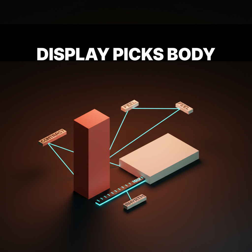
The pairing rules with body type
Display picks body, not the other way around, and the three rules are: contrast in role, alignment in feel, and a shared rhythm in measure.
Contrast in role means the body typeface should not compete with the display face for personality. If the display face is expressive, the body should be neutral. If the display face is a modern serif, the body should be a simple readable grotesque. Two opinionated typefaces fighting for the same attention is one of the clearest signals of a junior type decision.
Alignment in feel means the two faces should share an underlying sensibility even when they look different. Söhne as display with Freight Text as body works because both have warm, considered proportions. Inter Display paired with a decorative script looks like a collision between two different brands' stylesheets.
A shared rhythm in measure means the two typefaces should have compatible x-heights and optical sizes that allow text to sit comfortably across different contexts without constant rescaling. This is the rule most designers skip until a layout breaks in production.
The five-minute matching test
Before committing to a display face, run this test: render the brand name, render a headline, render a pull quote, render a numeral, and render at three sizes.
Brand name render. Set the brand name in the candidate display face at 64 pixels. Does it hold the brand weight? Does it look like it belongs to this company or a different one? The personality should land without additional context.
Headline render. Set a real headline from the brand's content at 48 pixels. Not lorem ipsum. A real headline. The test breaks immediately if the face cannot carry actual words with meaning attached to them.
Pull quote render. Set one sentence at 32 to 36 pixels, the zone where display faces start to stress. If the contrast holds and the personality does not collapse, it will survive production.
Numeral render. Set a price, a date, or a stat in the face. Numerals expose the quality of a typeface faster than any other character set. Bad numerals reveal a face not worth using.
Three sizes. Render the same line at 96, 48, and 28 pixels. The face should communicate the same personality at each size, even when the detail level changes. If the personality breaks at 28 pixels, you need an optical size variant or a different face.
Pass all five and the face is worth a full system build. Fail one and you found a production problem early enough to avoid paying for it twice. This test takes five minutes. Run it before committing.

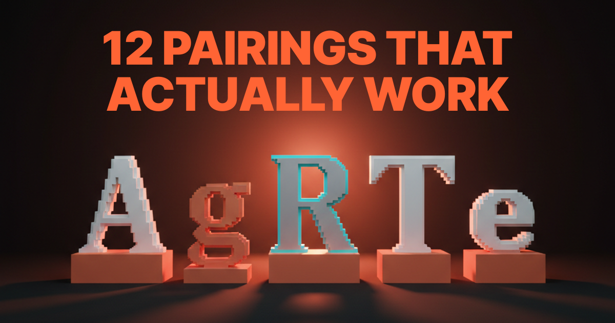
Seven brands that picked display type that aged well
Stripe Press, Linear, Apple, Vercel, Notion, Substack, and Figma each picked display type that holds up, and the patterns are worth studying.
Stripe Press uses Söhne as its primary display face. It works because Söhne is warm enough to avoid the clinical read that kills editorial brands and precise enough to carry Stripe's authority register. The pairing holds five years in.
Linear runs Inter Display at tight tracking, which is almost the default geometric grotesque choice, but the implementation discipline is impeccable. The face never breaks even at small product UI sizes because Inter was built for this range from day one.
Apple uses SF Pro Display with optical size switching as a system. The face is invisible in the best sense: it communicates Apple's precision without announcing itself. Longevity is essentially unlimited because the face is a controlled proprietary asset.
Vercel migrated to Geist, their own face, which is the only guaranteed longevity strategy: own the typeface. Geist carries the technical register without the coldness of a generic geometric grotesque, and no other brand can claim it.
Notion uses Lyon Display in select hero and editorial contexts. Lyon is a high-contrast oldstyle face that differentiates immediately from the grotesque baseline of the productivity tool category, giving Notion an intellectual register the product earns.
Substack uses Söhne as the primary display layer across publication headers. The face signals editorial seriousness while remaining readable at newsletter-body sizes where the system has to flex considerably.
Figma uses Whyte in brand and marketing contexts. Whyte has a slightly softened grotesque construction that reads as approachable-premium, which matches Figma's positioning as the collaborative professional tool rather than the purely technical one.
Three brands that did not
Some brands picked trend-heavy display faces that aged badly, and the rebrands they triggered are cautionary tales.
The most common failure pattern is the hyper-condensed expressive display face selected during a design moment where that compression looked cutting-edge. Eighteen months later the compression is everywhere and the brand looks like a follower instead of a reference. The rebrands triggered by this pattern are expensive, disruptive, and avoidable by running the longevity question before committing.
The second pattern is a mismatch between display register and product register. A consumer wellness brand that picks a high-contrast modern serif to telegraph luxury is making a register promise the product experience cannot keep. The type says one thing, the UX says another, and users do not trust either side.
The third pattern is a display face selected for a campaign that leaks into the brand system. A limited-use expressive face that was never meant to be the permanent brand face becomes the brand face because no one documented the distinction explicitly. By the time the problem is visible, it is in the style guide, the print materials, and a dozen digital templates. The pattern across all three: the longevity and register questions were skipped, not because the designers did not know better, but because a tight timeline and a compelling moodboard made the skip feel reasonable at the time.
FAQ
What is a display typeface exactly?
A display typeface is designed to be set at large sizes, typically 36 pixels and above, where contrast, personality, and optical detail earn their keep. It is distinct from a text typeface, which is designed to be legible at reading sizes. Most modern brands use both: a display face for headlines and hero moments, a text face for body copy and UI text.
Can I use one typeface for both display and body?
Sometimes. A few typefaces have optical size ranges wide enough to handle both roles. Inter is the most common example in product design. But most display faces are not built for small-size legibility, and most text faces are not built for large-size presence. Two-face systems are usually the right call for anything beyond a lean product UI.
How much should I spend on a display typeface?
The range runs from open-source faces like Inter Display at zero cost to licensed faces like Söhne or GT America at several hundred to several thousand dollars per year depending on usage tier. The question is not the cost, it is the return. A typeface that fits the brand for five years is not expensive. A typeface that triggers a rebrand in eighteen months costs significantly more than the license.
Is Inter Display a good display typeface?
Inter Display is technically excellent and has broad range, but it has become a default that carries its own associations. If the goal is differentiation, Inter Display is a hard choice to justify unless the implementation is exceptional. If the goal is reliability and system-wide coverage, it is hard to beat.
How do I know if my display and body typefaces are paired correctly?
Run the alignment-in-feel check: do the two faces share an underlying sensibility even when they look different? Then run the contrast-in-role check: is one clearly the personality face and the other clearly the legibility face? Set both at size and read them on the same page. If you can tell which one is the display face within one second, the pairing is working.
Do display typefaces need optical size variants?
If the display face will be deployed below 36 pixels, yes. High-contrast display faces break down at small sizes in ways that affect both legibility and brand perception. Either select a face with an optical size axis (covered in depth in variable fonts in production) or select a second face for the smaller range.
What is the most common display selection mistake?
Picking on visual impression at one size. A face that looks great in a moodboard at 96 pixels on a dark background may collapse completely at 32 pixels in a product context on white. Run the five-minute matching test before committing. It takes five minutes and it catches every expensive mistake before it ships.
The shift display selection actually unlocks
A well-picked display typeface is a brand asset that earns interest, and a badly picked one is a refresh waiting to happen.
The framework in this piece is not design theory. It is the decision log that prevents the post-launch type conversation, the one where a creative director realizes the display face is not holding up and the team has to explain to a client why a font that looked right in the pitch deck reads as wrong in production.
Good display selection is not about finding the most beautiful typeface. It is about finding the one that fits the voice, holds the register, survives the size range, and ages without embarrassment. The web design principles that hold up at scale all share the same logic: decisions that were made with real constraints in mind last longer than decisions made with a moodboard. Sonic brand identity follows the same discipline in a different medium: the choices that persist are the ones made with the full system in mind, not just the moment.
Run the four questions. Run the matching test. The bad picks fall out before they ship, and the good ones become brand assets that outlast the campaigns they were selected for.
If the brand needs display type that works on day one and still works on year five, hire Brainy. We pick display type with a method, run the matching test, and ship pairings that have aged better than the brands they came from.
Want a display typeface that fits the brand on day one and still fits on year five? Brainy picks display type with a method, runs the matching test, and ships pairings that aged better than the brands they came from.
Get Started