Task App Design: A Today Screen Redesign, Before and After
A junior task app screen with progress as a fraction with two decimals, five colored filter chips, a red due date on every task and a floating button over the last one, and the same screen fixed. Every change side by side and the free Figma file.
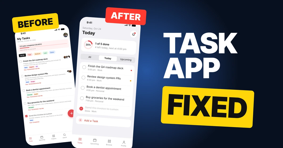
A task app has to feel like help. The first draft below knows exactly what is due today, and then says it with a red date on every line, colored chips for every priority and a button parked on top of the last task. It reads like an alarm. The fix keeps every task and every fact and lowers the alarm to the level of a calm list.
The whole screen, before and after
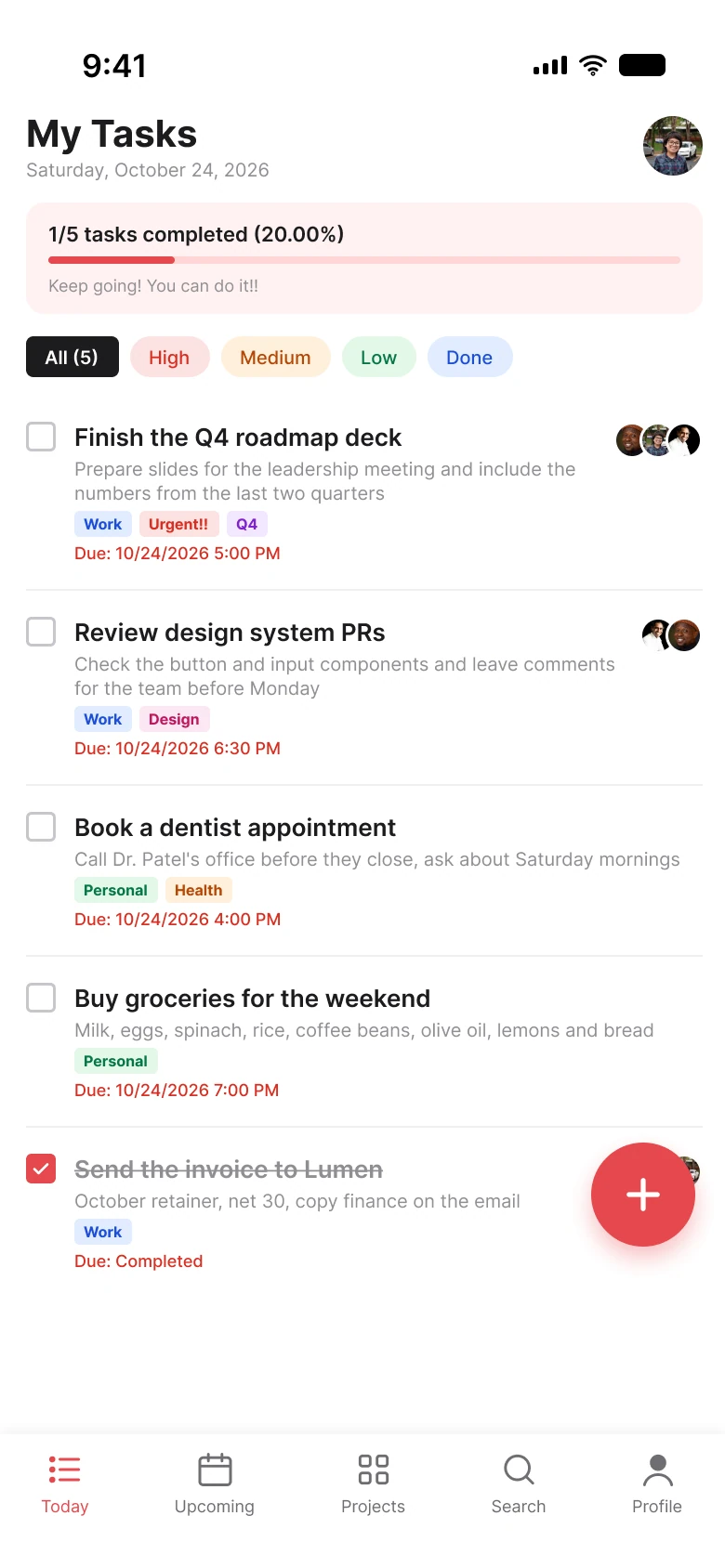
Junior draft
Fixed
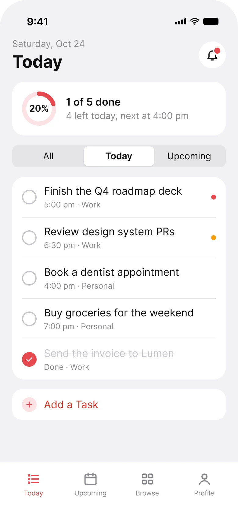
On the left, every task carries a description, up to three tags, a red date and a stack of faces. On the right, every task is a line and a half, and the list is the first thing the eye lands on.
Count what the eye has to process. The draft has a tinted progress box, five filter chips in five colors, and on each task a description, colored tags, a red due date and often a cluster of avatars. The fixed screen has a ring, a three-part switch and a list.
| Junior draft | Fixed | |
|---|---|---|
| Progress | "1/5 tasks completed (20.00%)" and a bar | a ring at 20% and "1 of 5 done" |
| Filters | 5 chips in 5 colors | 3 words in one switch |
| Colored tags per task | up to 3 | 0 |
| Due dates in red | every task | none |
| Priority shown by | a colored chip filter and a tag | one small dot |
| Add a task | a 56 px floating button over the list | a row at the end of the list |
| Tabs | 5 | 4 |
| Side margin | 14 px left, 12 px right | 20 px on both sides |
| Text sizes | 8 to 20 px | 11 to 28 pt |
Fix 1: progress as a ring and one sentence
Before

After
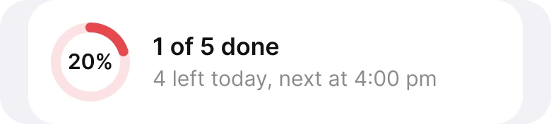
A fraction, a percentage with two decimals, a bar and a cheer, against a ring and a sentence.
The draft says the same thing three times: "1/5", "20.00%" and a bar that is a fifth full. The two decimals are the giveaway: "20.00%" is a number a program printed, not one a person needs. And the line under it is small, grey and ends in two exclamation marks.
The fix picks one picture, a ring at 20%, and one sentence with the two facts that matter: one of five done, four left. The sentence ends with the useful part, "next at 4:00 pm", which tells the user what to do next instead of cheering them on.
The ring is drawn in the brand red, the same red as the add row and the active tab.
Fix 2: filter by when, not by color
Before

After

Five chips for priority and status in five colors, against three words in one switch.
The draft's chips mix two questions. High, Medium and Low ask how important a task is, Done asks what state it is in and All (5) asks for everything. The five chips use five colors with two corner radii, so even the shapes do not agree.
To use them a user must first learn that red means urgent, orange means middle and green means low, and
The fix asks one question, the one people ask of a to do list: when. All, Today and Upcoming are three words in a single switch, which reads as one control with one selected state, and it matches the tabs below: the Today tab, the Upcoming tab. Priority did not disappear. It moved to the rows, as a small dot (fix 3).
Fix 3: a task is a line and a half
Before
After
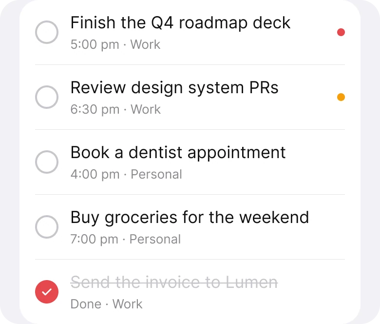
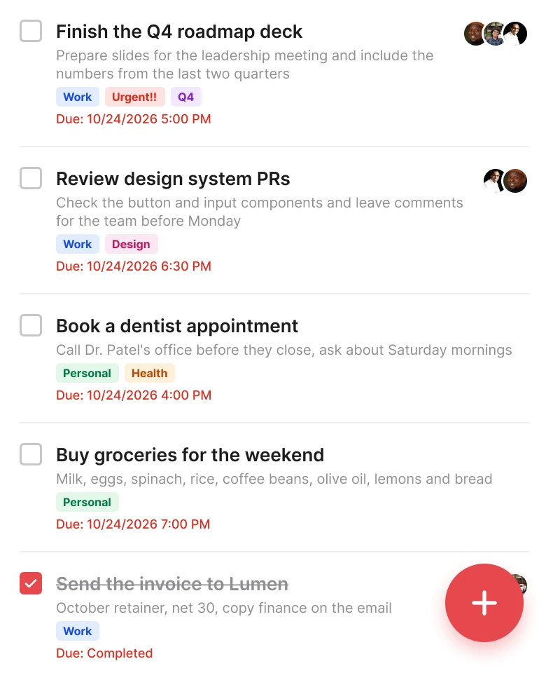
Title, description, tags, a red due line and avatars on each task, against a title, a time and a list.
Each draft task can carry five kinds of information: a description, up to three colored tags, a red "Due: 10/24/2026 5:00 PM", a group of avatars and a checkbox. "Urgent!!" appears as a tag on a task that is already red in the due line. Every task is due today, and every due date is red, so red stops meaning late and starts meaning "there is a task".
The fix gives each task one title and one grey line: the time, and the list it belongs to. "5:00 pm, Work". The date is gone because the header already says which day it is.
The tags collapsed into the list name. Priority became one small dot on the right, red for the first task and orange for the second, with no dot where there is nothing to flag. The finished task stays in the list, struck through and labeled "Done", with a filled check in the brand red.
The tasks sit in one white card with a thin divider between them, so the list reads as one thing.
Fix 4: "Add a Task" at the end of the list
Before
After

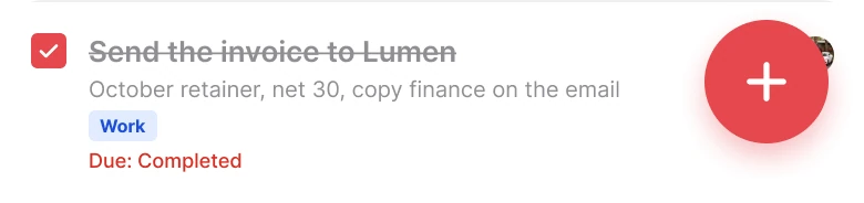
A floating button that covers the last task, against a row at the end of the list.
A floating button follows the user and covers whatever is under it. In the draft it sits on top of the last task, cutting off the avatars at the right of the row, and it is the heaviest object on the screen: 56 px, saturated red, with a shadow.
The fix does what a list does: it ends with the thing you can add to it. "Add a Task" sits in a row right where the last task finishes, with a small plus and the same red as the other actions. There is no shadow and nothing is covered. A reader scrolling a list is already looking at the end of it, so the add action is found in the place the eye stops.
The smaller fixes
- Four tabs, not five. Today, Upcoming, Browse and Profile replace Today, Upcoming, Projects, Search and Profile.
- One margin. The draft used 14 px on the left and 12 px on the right. The fix uses 20 px on both sides.
- A real header. "My Tasks" with a full date became a small "Saturday, Oct 24" over a large "Today", and the avatar became a bell.
- One red. The brand red,
#E5484D, covers the ring, the add icon and the active tab. Red text uses a deeper#D92D20, so it stays readable. - A real type scale. Text went from 8 to 20 px to the iOS sizes of 11 to 28 pt.
Audit your own task app
| Question | Why it matters |
|---|---|
| Does a number appear in two forms, such as 1/5 and 20%? | Pick the one picture and one sentence |
| Do the filters ask one question? | Mixing importance and state makes users decode |
| Is red used for anything besides action and urgent? | If everything is red, nothing is late |
| Can a task be read in a line and a half? | Lists are scanned, not read |
| Does the add button cover content? | A floating button hides the last item |
| Is the date on rows when the screen is already one day? | Repeating the day is noise |
Get the Figma file
The free file has both screens as components, every fix as a before and after pair, the color variables and the iOS text styles.
Free Figma file
Task app today screen, before and after
Both screens and every fixed part as Figma components. Free, view only, duplicate it to your drafts.
FAQ
What should a task app today screen show?
Today's progress, a way to switch between All, Today and Upcoming, the list of tasks with their times, and an Add a Task action. Descriptions and long dates can wait on the task detail.
How should a task app show progress?
As a ring or a bar plus one sentence, such as "1 of 5 done". Do not print the same number as a fraction, a percentage and a bar. If you show a percentage, round it.
How should a task app show priority?
With a small dot, or a flag, on the rows that need it, not with colored tags on every task. Priority can also be a filter or a sort, but it does not need to be the main one.
Should a to do app use a floating add button?
A floating button is common, but on a list screen it can cover the last item. An "Add a Task" row at the end of the list covers nothing and sits where the eye stops.
What should the filters of a to do app be?
The questions people ask: all, today and upcoming. Keep one question per control, and do not mix a priority filter with a status filter in the same row.
Sources
- Both screens are our own, designed and measured in Figma. The tasks, the people and the client are made up for the exercise. 1 of 5 tasks done is 20%.
- Photos via Pexels by pessoas uem, Iphanyi Ezemenari and Ajan Yogi.
- Apple Human Interface Guidelines: Typography, for the iOS text sizes used in the fixed screen.
- Apple Human Interface Guidelines: Color, on not relying on color alone to carry meaning.
- First published as a carousel on App Brainy.
Want this for your own app? Our team redesigns app screens like this one, from the first audit to the finished components.
Get StartedGet new papers by email
New Brainy papers in your inbox. Confirm once, unsubscribe anytime.