Sneaker App Design: A Product Page Redesign, Before and After
A sneaker product page with four icons and three badges on the photo, a price lost among five numbers and sizes that do not show which one is picked, and the same page fixed. Every change side by side, the reason behind each, and the free Figma file.
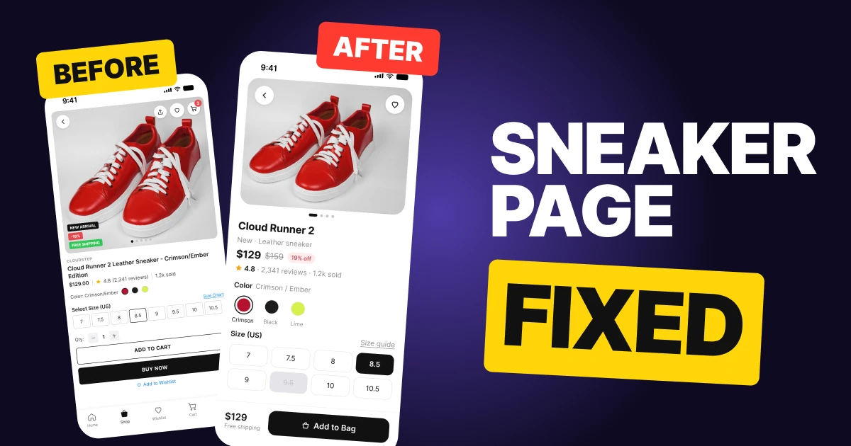
A shopper opens a sneaker page to answer three questions: what does it look like, what does it cost, and does it come in my size. The first draft below has all three answers and makes the shopper hunt for them. The fix keeps the same product and the same price, and puts the answers in the order the shopper asks.
The whole screen, before and after
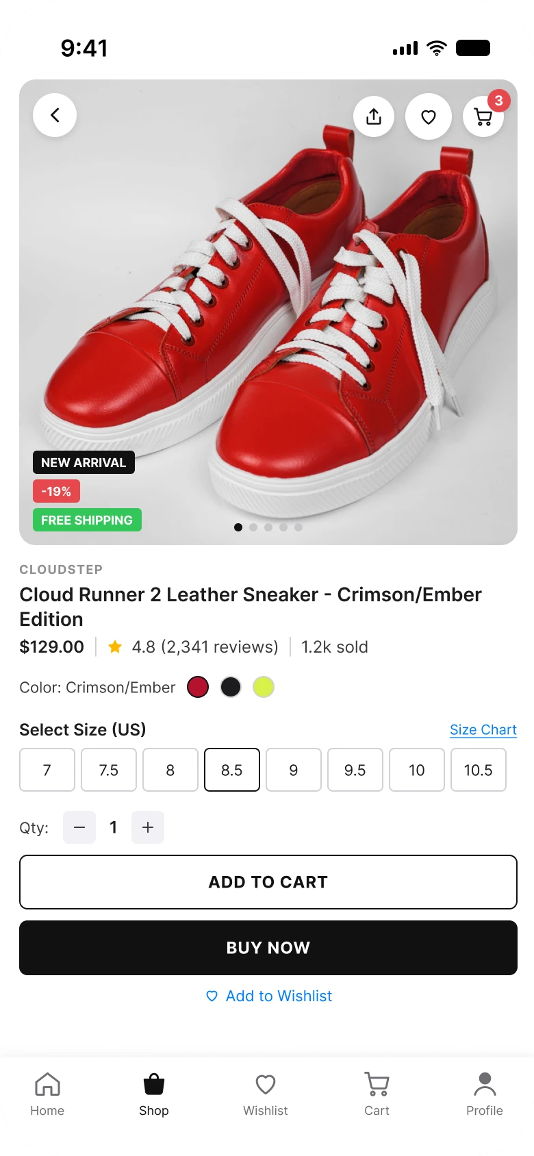
Junior draft
Fixed
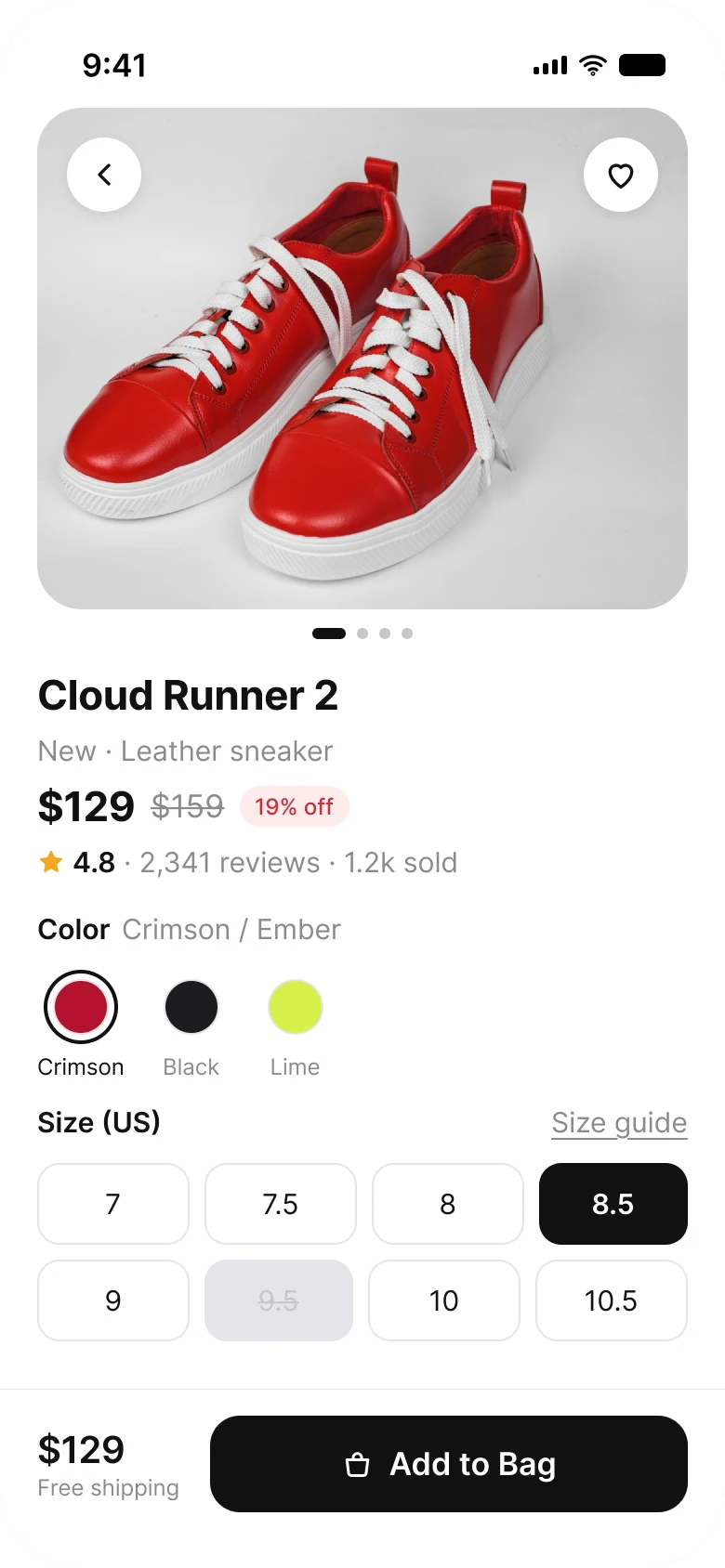
On the left, the shopper meets seven small marks on the photo before the product name. On the right, the photo comes first, then the name and the price, and the only dark button is the one that buys.
| Junior draft | Fixed | |
|---|---|---|
| Icons on the photo | 4 | 2 |
| Badges on the photo | 3 | 0 |
| Price | One of 5 numbers in a row | Its own line, old price struck, 19% off beside it |
| Size boxes | 41 by 32 px, one row of 8 | 44 px chips, a grid of 2 rows |
| Picked size | A 1 px border | Filled #111111 |
| Sold-out size | Looks like the rest | Struck through on gray |
| Buy buttons | 2 caps buttons and a link | 1 button in a sticky bar |
| Tabs | 5 | None |
| Side margin | 14 px left, 12 px right | 20 px on both sides |
| Text sizes | 9 to 14 px | 12 to 22 pt |
Fix 1: a photo with nothing on it
Before
After
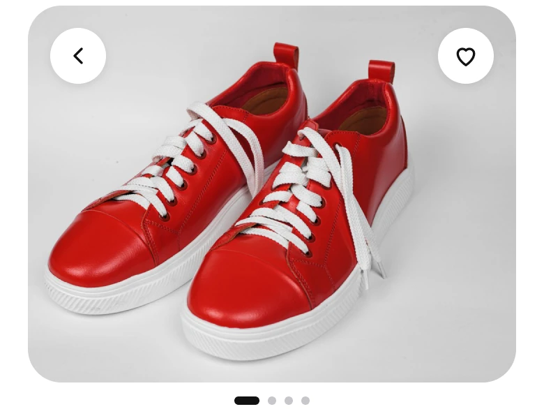
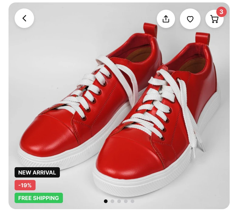
Four icons and three badges across the photo, against a back button and a save button.
The draft puts the whole store on the product. Back, share, save and a cart with a red "3" run along the top. "New arrival", "-19%" and "Free shipping" stack at the bottom left, over the toe of the shoe.
The fix keeps two 40 px round buttons on the photo: back and save. The rest moved to where it belongs. The discount sits beside the price, the shipping line sits under the total in the bottom bar, and the dots that count the photos sit under the photo.
The rule to reuse: a product photo is the product. Anything that does not help the shopper judge the shoe belongs somewhere else.
Fix 2: the name first, then the price
Before

After
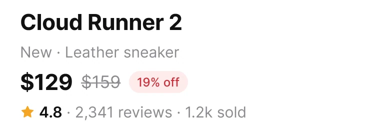
A price in a row of numbers, against a price on its own line.
The draft sets the brand in 9 px gray capitals, a product name that wraps to two lines, then one row: "$129.00 | 4.8 (2,341 reviews) | 1.2k sold". Five numbers share a line at the same size, and the price has to be found among them.
The fix gives the name its own line in large type. The price gets a line of its own: "$129" in large type, the old "$159" struck through next to it and a small "19% off" chip. The rating, the reviews and the sales sit below in a quieter line, because they support the decision and the price makes it. Both screens carry the same numbers: 129 divided by 159 is 0.81, so 19% off is true.
The rule to reuse: when several numbers share a line, one is the one the shopper needs. Give it its own line and size.
A price rule to check
A struck-through price has a legal side in some places.
Fix 3: sizes that show what is picked
Before
After
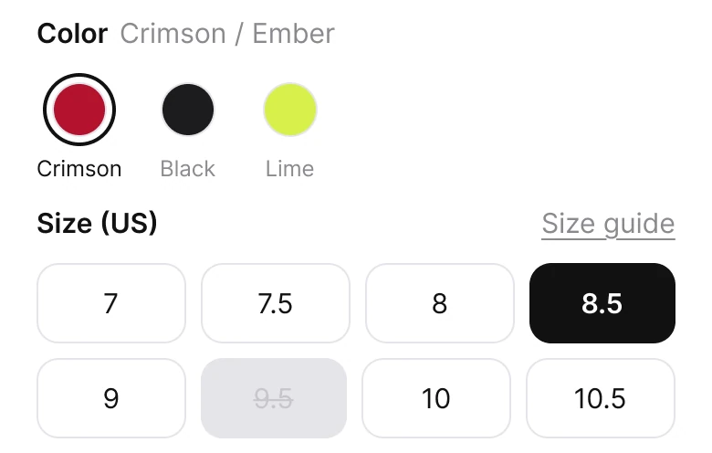
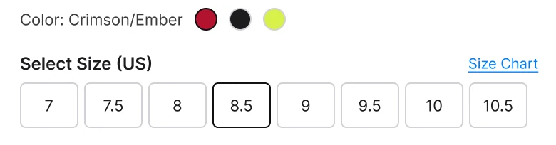
Eight small boxes, against a grid of chips with states you can see.
The draft's size boxes are 41 by 32 px in one row. The picked size, 8.5, has a 1 px darker border, and the sold-out 9.5 looks like the sizes in stock. The three color dots have no names.
The fix makes each size a 44 px chip in two rows of four. The picked one is filled #111111 with white text. The sold-out one is struck through on gray, so it reads as unavailable before anyone taps it. The colors get names under the swatches: Crimson, Black and Lime, with the picked one ringed.
The 44 px height matters. Apple's guidance is a tap target of at least 44 by 44 points, and a 32 px box in a row of eight is easy to miss.
The rule to reuse: every option needs three visible states, available, picked and unavailable. Say each one with fill, not with a hairline.
Fix 4: one bar that buys
Before
After
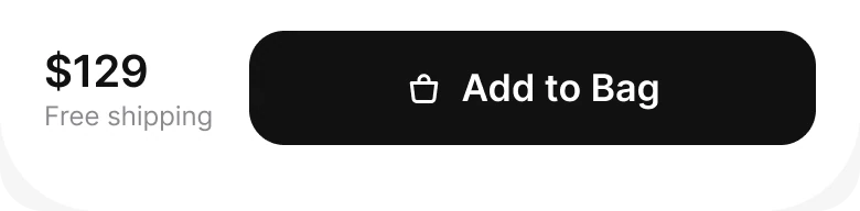
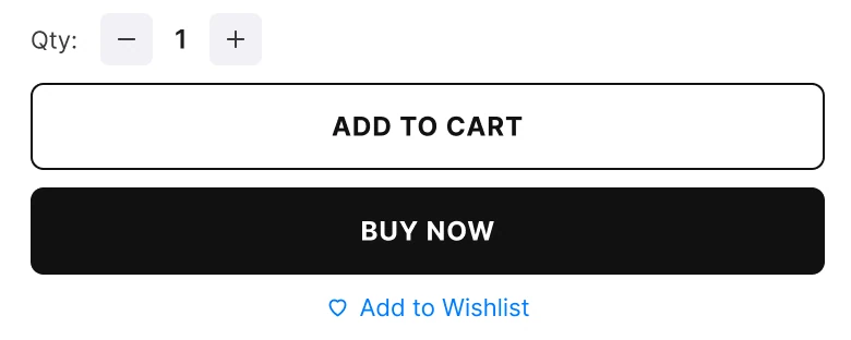
Two caps buttons and a link, against the price and one button.
The draft closes with a quantity stepper, an outlined "ADD TO CART", a black "BUY NOW" and a small "Add to Wishlist" link. Two buttons of nearly the same weight make the shopper pick a way to buy, and they scroll away with the page.
The fix closes with one bar that stays at the bottom: "$129", "Free shipping" under it, and one black "Add to Bag" button. Wishlist is the save button on the photo. The tab bar left too, since five tabs under a buy bar compete with it.
The rule to reuse: give the main action one button, and keep the price next to it.
The smaller fixes
- One left edge. The draft's margins were 14 px on the left and 12 px on the right. The fix uses 20 px on both sides.
- A real type scale. Text went from 9 to 14 px to iOS sizes of 12 to 22 pt.
- Sentence case. "ADD TO CART" and "BUY NOW" in capitals became "Add to Bag".
- A quieter link. "Size Chart" in blue became "Size guide" in gray, since it supports the choice and is not the choice.
Audit your own product page
| Question | Why it matters |
|---|---|
| Is the photo free of anything but back and save? | The shopper came to look at the product |
| Is the price on a line of its own? | It is the number every shopper looks for |
| Can you tell the picked size from across the room? | A hairline border is not a state |
| Is a sold-out size different before it is tapped? | It saves a failed tap |
| Does the price stay on screen while the page scrolls? | The price and the action belong together |
FAQ
What should a sneaker product page show first?
The photo, with nothing on it but back and save. Then the name, then the price on its own line.
How do you design a size selector for shoes?
Make each size a chip of at least 44 px, fill the picked one in a dark color, and cross out the sizes that are sold out. A hairline border around the picked size is too faint to read.
How should a sale price be shown on a product page?
Show the current price large, the old price struck through next to it and the percentage off in a small chip. Both screens here use $129, $159 and 19% off. Check the local rules on which old price you may show.
Should a product page have both Add to Cart and Buy Now?
One main button is clearer. Two buttons of the same weight make the shopper pick a way to buy before they have decided to buy.
Should a product page have a tab bar?
Not on this screen. The page has one job, and a tab bar under the buy bar competes with it.
Sources
- Both screens are our own, designed and measured in Figma. The product name, the brand, the prices and the reviews are made up.
- Product photo via Pexels by Ahimsa - OM.
- Apple Human Interface Guidelines: Typography, for the iOS text sizes used in the fixed screen.
- Apple Human Interface Guidelines: Accessibility, for the 44 pt touch target size.
- European Commission notice on the interpretation of Article 6a of Directive 98/6/EC, for the prior price rule.
- First published as a carousel on App Brainy.
Want this for your own app? Our team redesigns product pages and shop apps like this one, from the first audit to the finished components.
Get StartedGet new papers by email
New Brainy papers in your inbox. Confirm once, unsubscribe anytime.