Podcast App Design: A Home Screen Redesign, Before and After
A junior podcast app home screen with a hairline of progress, three icons on every chart row and six genre colors, and the same screen fixed. Every change side by side, the reason behind each, and the free Figma file.
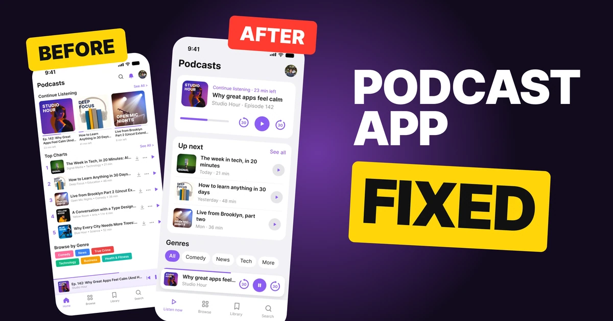
The most common thing a person does in a podcast app is pick up where they left off. The first draft below has everything a listener needs, and it hides that one thing: the episode they were halfway through sits in a small card with a hairline of progress, between three covers. The fix keeps the shows, the chart and the genres, and makes the paused episode the biggest thing on the screen.
The whole screen, before and after
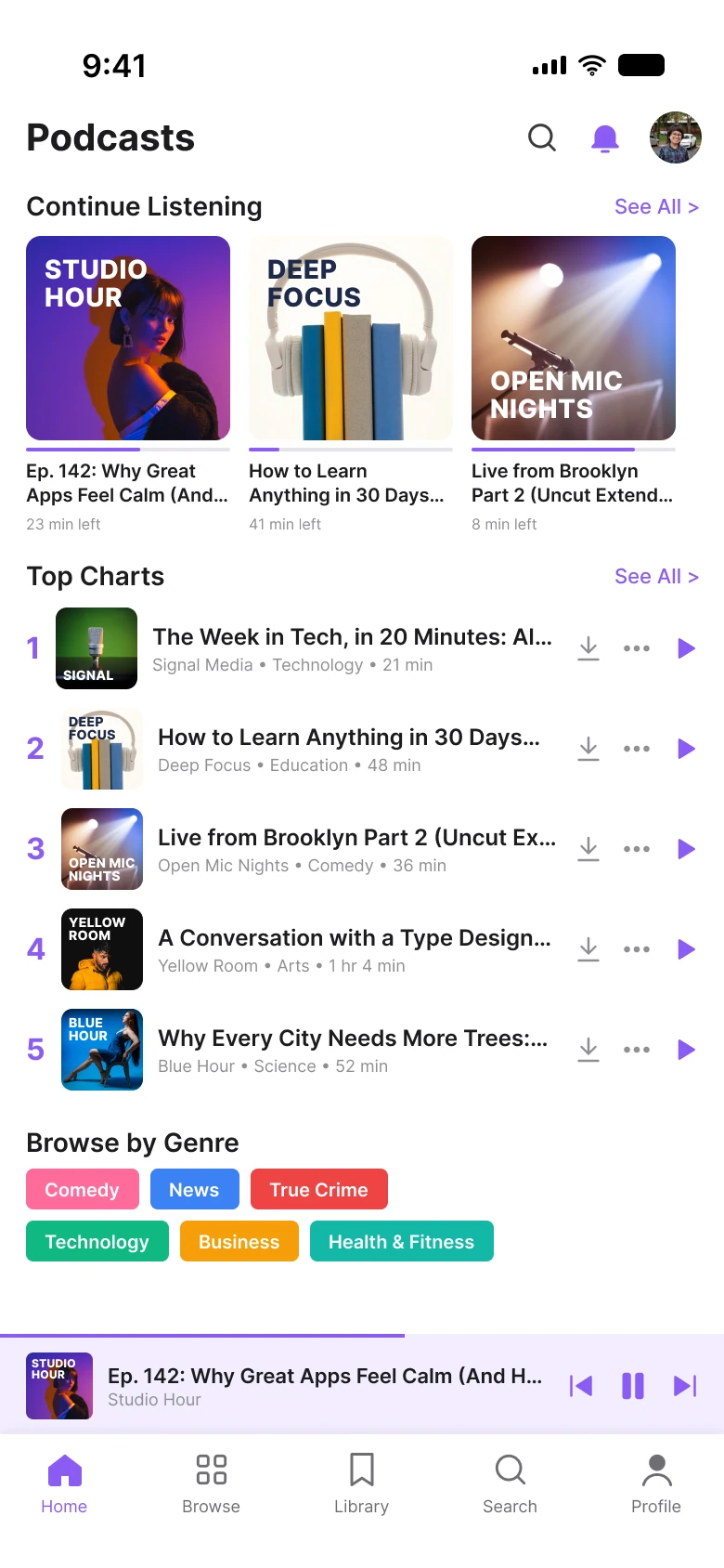
Junior draft
Fixed
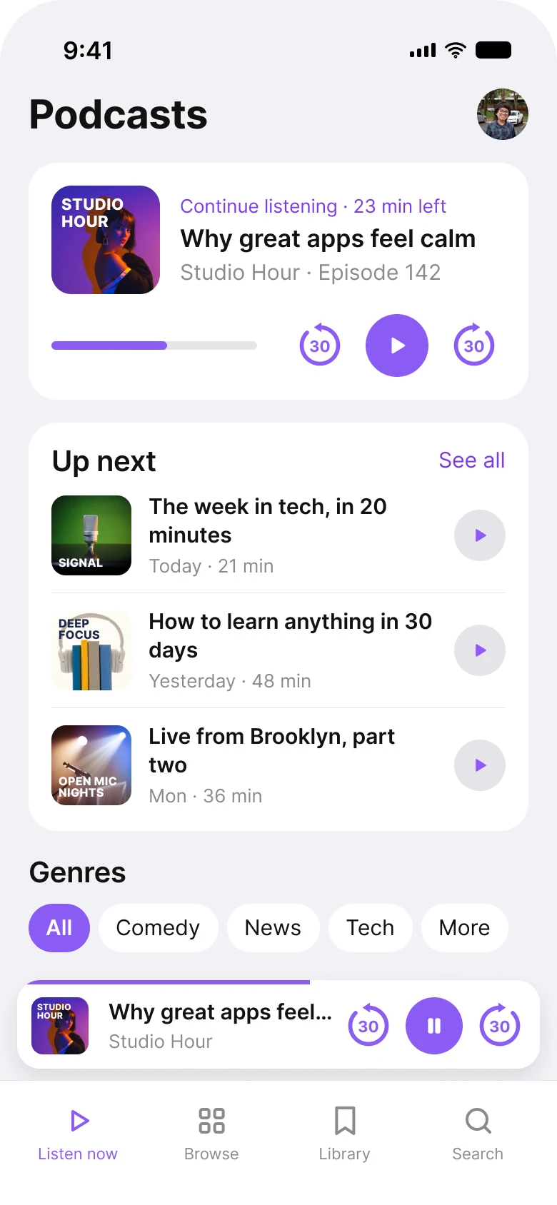
On the left, the person's episode is one of three equal covers with 2 px of progress under it, and the chart rows each end in three icons. On the right, the paused episode has its own card with a 6 px progress bar and three big controls, and the list rows end in one button.
| Junior draft | Fixed | |
|---|---|---|
| Paused episode | One of 3 covers, 2 px progress line | One card, 6 px progress bar, 3 controls |
| Icons on each list row | 3 | 1 |
| Genre colors | 6 | 1 |
| Mini player controls | Previous, pause, next | Back 30, pause, forward 30 |
| Tabs | 5 | 4 |
| Side margin | 14 px left, 12 px right | 20 px on both sides |
| Text sizes | 8 to 20 px | 11 to 28 pt |
Fix 1: one big card for the episode you left
Before
After
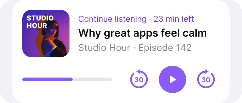
Three covers with a hairline of progress, against one card with the time left and the controls.
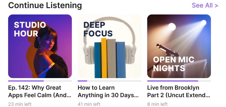
The draft's "Continue Listening" is a shelf. Three covers sit side by side at the same size, each with a 2 px line of progress, a title cut at "Ep. 142: Why Great Apps Feel Calm (And..." and "23 min left" in small gray type. To resume the one that matters, a listener opens an episode, waits for a player and presses play.
The fix gives the paused episode a card. The cover, a purple label, "Continue listening · 23 min left", the full title, "Why great apps feel calm", and the show, "Studio Hour · Episode 142", sit on top. Below, a 6 px progress bar sits beside three controls: back 30, play and forward 30. The two other covers left this section.
The back and forward 30 buttons are a circular arrow with 30 inside it, in 44 px targets, the pattern Audible uses. A listener who got interrupted can step back half a minute without leaving the home screen.
The rule to reuse: the thing the person was doing is the most likely next action, so give it a card and its controls.
Fix 2: two-line titles and one play button
Before
After
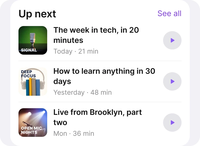
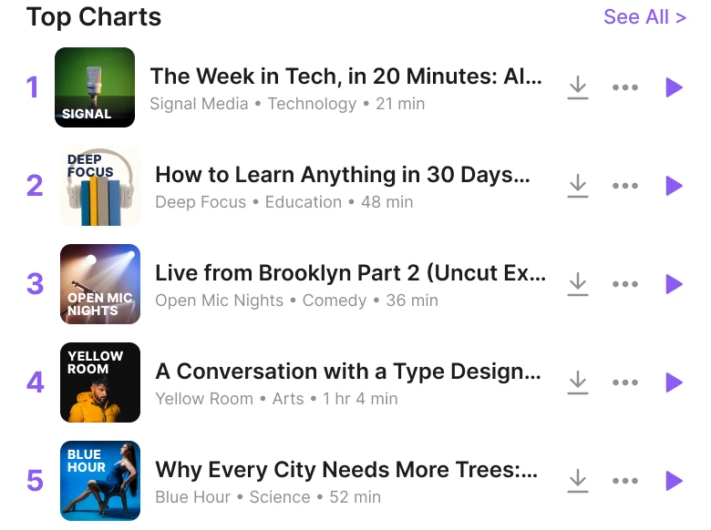
Cut titles, rank numbers and three icons, against whole titles and one play button.
The draft's chart rows each end in a download arrow, a three dot menu and a play triangle, so the title has to fit in what is left, and it does not: "The Week in Tech, in 20 Minutes: Al...", "How to Learn Anything in 30 Days...", "Live from Brooklyn Part 2 (Uncut Ex...". The rank is a big purple number, and under every title a line holds the show, the category and the length.
The fix lets the title wrap to two lines,: "The week in tech, in 20 minutes". Under it goes one line, the day and the length, "Today · 21 min". At the right sits one round play button, which is the only action a row needs, and its target is big enough to hit. The download and the menu are not on the row, and this redesign does not draw where they go.
This redesign changed the job of the list as well as its looks. Five ranked "Top Charts" rows became three "Up next" rows, so a real app still needs a place for the chart.
The rule to reuse: let the title wrap, because a title that is cut cannot be read, and give each row one action.
Fix 3: genres in one style
Before

After

Six solid colors on two rows, against one row of pills with one filled.
The draft's genre tags are pink, blue, red, green, orange and teal, each in solid white text. They take two rows.
The fix is one row of pills in one style. "All" is filled in the brand purple, #8B5CF6, and the rest are white. "More" sits at the end for the genres that do not fit. A filled pill is the only one that means something, which is "this is what you are looking at".
The rule to reuse: color should say which one is chosen. It should not say which one is which.
Fix 4: a mini player with the controls people use
Before

After

Previous, pause and next, against back 30, pause and forward 30.
A mini player has the least space on the screen, so every control in it has to earn its place. The draft's three are previous, pause and next. Previous and next skip to another episode.
The fix uses back 30, pause and forward 30. The cover and the title, "Why great apps feel...", stay at the left, with the show under it. The progress line runs along the top edge of the player, so it shows how far along the episode is without taking a row.
The rule to reuse: a mini player should have the three buttons people actually use while they are listening.
The smaller fixes
- One left edge. The draft's margins were 14 px on the left and 12 px on the right. The fix uses 20 px on both sides and 16 px between cards.
- One brand purple. The fix uses #8B5CF6 for fills and the play buttons, and a darker #7C3AED for small purple text, which needs more contrast to read.
- A real type scale. Text went from 8 to 20 px to iOS sizes of 11 to 28 pt.
- A bigger title, a smaller header. The draft's header held a search icon, a bell and an avatar. The fix keeps the avatar and a large "Podcasts" title.
- Four tabs, not five. Home, Browse, Library, Search and Profile became Listen now, Browse, Library and Search. The profile is the avatar in the header.
Audit your own podcast app
| Question | Why it matters |
|---|---|
| Is the paused episode bigger than the other covers? | It is the most likely next tap |
| Can a listener skip back 30 seconds from the home screen? | Interrupted listeners need it first |
| Do titles wrap, or are they cut? | A cut title cannot be read |
| How many icons end each row? | One action is found, three are scanned |
| Does genre color mean one thing? | Color should mark the chosen one |
| Does the mini player have the buttons people use? | Back and forward 30 are the ones audiobook and podcast people use most |
Get the Figma file
The free file has both screens as components, every fix as a before and after pair, the color variables and the iOS text styles.
Free Figma file
Podcast home screen, before and after
Both screens and every fixed part as Figma components. Free, view only, duplicate it to your drafts.
FAQ
What should a podcast app home screen show first?
The episode the listener was halfway through, on one big card with the time left, play, and back and forward 30. Charts, genres and new shows come after it.
What buttons should a podcast mini player have?
Back 30, pause and forward 30. Previous and next episode jump to another episode, so leave them for the full player.
How do you design a continue listening section?
One card for the latest paused episode, with the cover, the full title, the show, the time left and a progress bar, plus the controls to resume. Do not give it the same size as the other covers.
How should a podcast app list episodes?
Let the title wrap to two lines, put the day and length in one gray line and end the row with one play button. Move download and the menu to the episode page.
How do you design genre filters for a podcast app?
One row of pills in one style, with the selected one filled in the brand color and More at the end. Six colors on six tags make color mean nothing.
What font size should a podcast app use?
The platform text scale. The fixed screen uses iOS sizes from 11 to 28 pt, with a large title.
Sources
- Both screens are our own, designed and measured in Figma. Show names, episodes and people are made up; the covers are photos with the show name set on them.
- Photos via Pexels by Jace Oner, Somogro Bangladesh, Sound On, Brett Sayles, Ali Dashti, frank minjarez and pessoas uem.
- Apple Human Interface Guidelines: Typography, for the iOS text sizes used in the fixed screen.
- Apple Human Interface Guidelines: Accessibility, for the 44 pt touch target size.
- First published as a carousel on App Brainy.
Want this for your own app? Our team redesigns app screens like this one, from the first audit to the finished components.
Get StartedGet new papers by email
New Brainy papers in your inbox. Confirm once, unsubscribe anytime.