Meditation App Design: A Home Screen Redesign, Before and After
A junior meditation app home screen with five mood colors, white words on a pale photo and a paragraph for progress, and the same screen fixed. Every change side by side, the reason behind each, and the free Figma file.
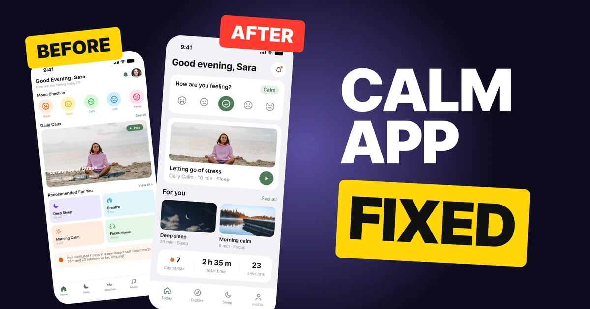
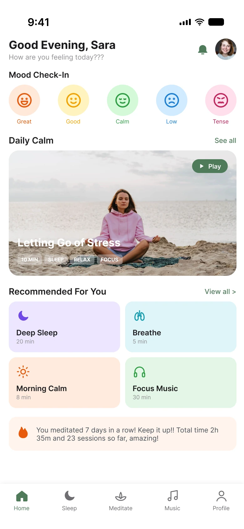
A meditation app has one promise: the screen makes you calmer than you arrived. The first draft below wants that, and then undercuts it with nine colors, white words on a pale photo and a paragraph where the numbers should be. The fix keeps every feature and takes the volume down.
The whole screen, before and after
Junior draft
Fixed
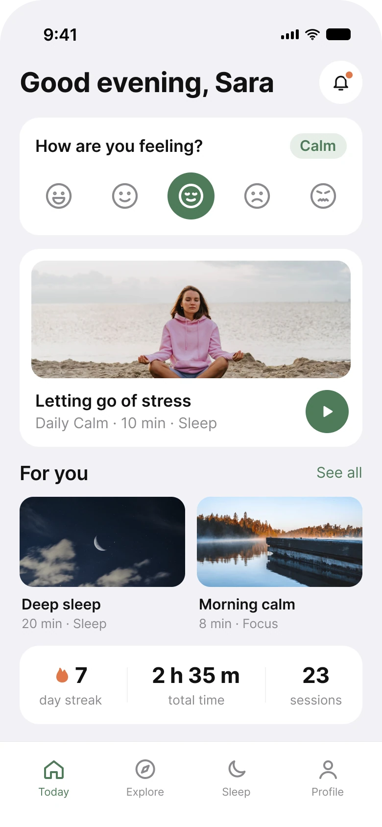
The left screen is friendly and loud. The right one is the same product at a lower volume, and the lower volume is the feature.
Count what the eye has to sort on each side. The draft shows five mood colors and four tile colors, plus a peach box and a photo with text on top, before anyone reads a word. The fixed screen has one brand sage, #4F7A5A, and a peach flame, #E0784A, kept for the one thing that means streak.
| Junior draft | Fixed | |
|---|---|---|
| Colors in the mood check | 5 | 1, plus grey |
| Colors in the recommended tiles | 4 | 0, photos instead |
| Text on top of a photo | title and 4 tags | none |
| Progress | one sentence | 3 numbers |
| Tabs | 5 | 4 |
| Side margin | 14 px left, 12 px right | 20 px on both sides |
| Text sizes | 8 to 18 px | 11 to 28 pt |
Fix 1: ask the mood question once, in one color
Before
After
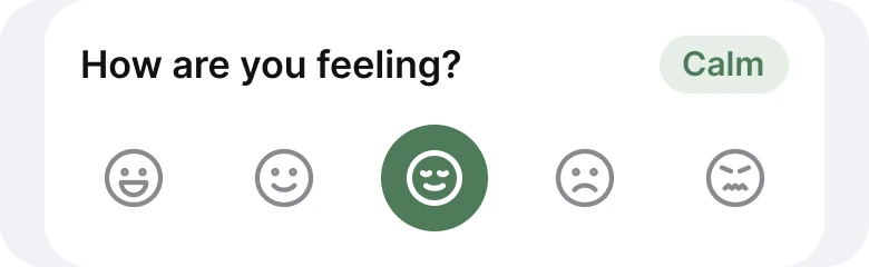
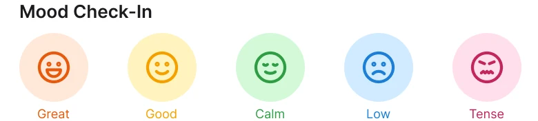
Five colored circles with a word under each, against one question, five quiet faces and one picked answer.
A mood check is a question with five answers. In the draft each answer has its own color, so before the user has chosen anything the row already looks answered, and nothing shows what is selected. Color is doing the job of decoration, not of information.
The fix draws all five faces in the same grey and fills only the one that was picked, in the brand green, with its word in a chip beside the question: "Calm". Now color means exactly one thing: this is the current state. The words under the faces are gone from the row because the chip says the word for the picked face, once.
The principle carries to any app with a rating or a choice: if every option is colored, color tells the user nothing. Keep options neutral and spend the accent on the selection.
Fix 2: the photo on top, the words underneath
Before
After
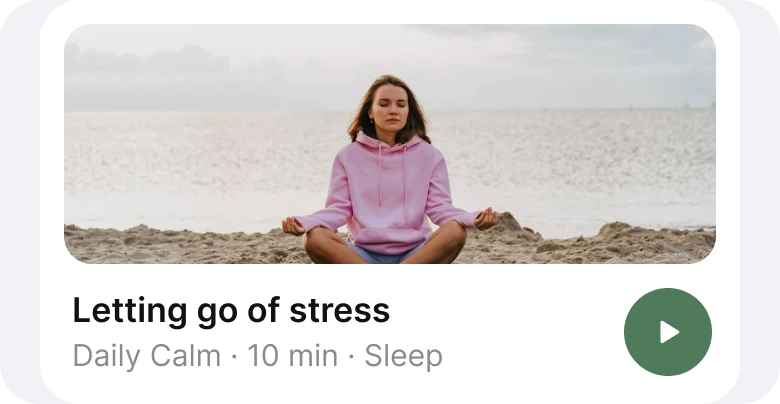
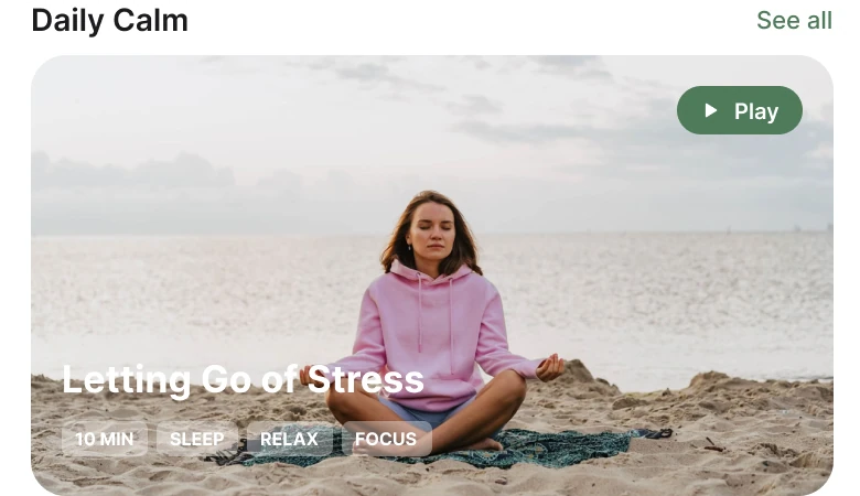
White words and four tiny tags on a pale beach photo, against a photo with the title, the time and one play button under it.
The draft sets a 17 px white title and four 8 px tags straight onto bright sand and sea. White on a pale photo is the weakest pairing there is, and the tags are the smallest text on the screen at the point where the user decides what to play. A text sitting on a photo also changes with every photo: the day a darker image arrives, the layout reads differently.
The fix moves every word onto the card, under the photo, in dark text on a plain surface. The photo is now just a photo. Four tags shrink to one line of meta, "Daily Calm, 10 min, Sleep", and the Play pill in the corner becomes a round button at the end of the line, where a thumb already is. The same session now has one title, one duration and one action.
The rule to reuse: if the words matter, give them their own surface. Text over a photo is a decision to accept that some photos will break it.
Fix 3: two photo cards instead of four colored tiles
Before
After
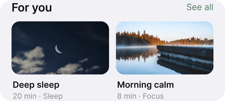
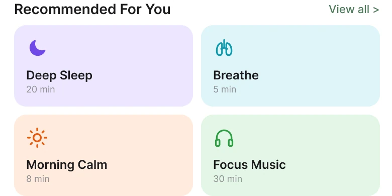
Four pastel tiles with an icon each, against two photo cards that show what the session feels like.
The tiles do not look like anything. A purple box with a moon says "sleep" in the same flat way a blue box with lungs says "breathe", and the four colors cost the screen its calm. The photos show the thing: a night sky for a sleep session, a misty lake for a morning one. In a meditation app the image is part of the product, because it sets the mood before the audio does.
The fixed row shows two cards, and each carries its name, its length and its category on two lines. Two cards leave each photo wide enough to read. The Breathe and Focus Music tiles are not on this screen, and the section is retitled from "Recommended For You" to "For you", since a list on a home screen is already for you.
Fix 4: three numbers instead of a paragraph
Before

After
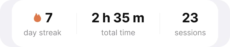
A sentence with the same three facts buried in it, against the three facts as numbers with labels.
Both versions say the same thing: seven days in a row, two hours thirty-five minutes in total, twenty-three sessions. The draft packs them into one sentence with two exclamation marks and a "so far, amazing!". A reader has to read the whole sentence to find the number they came for, and a number cannot be compared at a glance when it lives inside a clause.
The fix gives each fact its own column: a big number and a small label. The flame, in peach, sits next to the streak because the streak is the number that makes people come back tomorrow. Now a user checks their progress in the time it takes to look.
The smaller fixes
- Four tabs, not five. Today, Explore, Sleep and Profile replace Home, Sleep, Meditate, Music and Profile. Meditate and Music no longer have tabs of their own.
- One margin. The draft used 14 px on the left and 12 px on the right. The fix uses 20 px on both sides and 14 px between cards.
- A cleaner greeting. "How are you feeling today???" is gone from the header, because the mood card asks it, once, with one question mark.
- One header action. The bell stays and gets a small dot. The avatar is gone from the header, and Profile is still a tab.
- A real type scale. Text went from 8 to 18 px to the iOS sizes of 11 to 28 pt, so the smallest text is readable and the title is clearly a title.
- Quiet section links. "View all >" became "See all", the same words on every section.
Audit your own wellness app
| Question | Why it matters |
|---|---|
| Does every option in a choice have its own color? | If all are colored, none says "selected" |
| Is any text sitting on a photo? | The next photo may break it |
| Can a streak or a total be read at a glance? | Numbers hidden in sentences are skipped |
| Do session cards show what the session feels like? | Calm is sold with images |
| Is there more than one accent color? | Each extra color is one more thing to decode |
| Do two tabs lead to the same place? | Duplicate doors hide the structure |
Get the Figma file
The free file has both screens as components, every fix as a before and after pair, the color variables and the iOS text styles.
Free Figma file
Meditation app home screen, before and after
Both screens and every fixed part as Figma components. Free, view only, duplicate it to your drafts.
FAQ
What should a meditation app home screen show?
A greeting, one mood question, today's session as a single photo card with one play button, a short row of suggestions and the user's progress. Everything else can wait one tap away.
How should a mood check-in look in an app?
Five equal, quiet options with one question above them. Color only the option the user picks and say its word once. If every face has its own color, nothing tells the user what is selected.
Is it okay to put text on top of a photo in an app?
Only when the text sits on a controlled area, such as a dark overlay, and passes the contrast minimum. On a bright, changing photo, put the words on a plain surface under the image instead.
How do you show streaks and progress in a wellness app?
As a few numbers with labels, such as day streak, total time and sessions. A streak earns a small accent, such as a flame. A sentence of encouragement is not a replacement for the number.
How many tabs should a meditation app have?
Four or five. If two tabs lead to the same library, merge them. The fixed screen went from five tabs to four.
Sources
- Both screens are our own, designed and measured in Figma. The user, the sessions and the numbers are made up for the exercise.
- Photos via Pexels by Татьяна Танатова, olia danilevich, Felipe Barboza and Jean-Daniel Francoeur.
- Apple Human Interface Guidelines: Typography, for the iOS text sizes used in the fixed screen.
- W3C: Web Content Accessibility Guidelines 2.2, Contrast (Minimum), for text on images and backgrounds.
- First published as a carousel on App Brainy.
Want this for your own app? Our team redesigns app screens like this one, from the first audit to the finished components.
Get StartedGet new papers by email
New Brainy papers in your inbox. Confirm once, unsubscribe anytime.