Home Services App Design: A Home Screen Redesign, Before and After
A home services app home screen with twelve tiny categories, a red discount banner and pros buried in 8 px facts, and the same screen fixed: one plain question, one slim offer line, three tiles and a More, and pros shown by name, rating and next opening. Every change side by side, with the free Figma file.
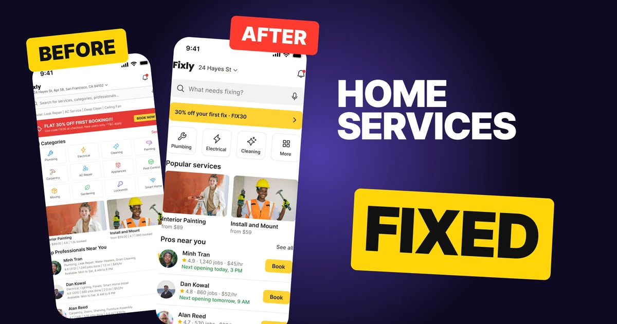
A home services app has one job on its home screen: get someone from "something is broken" to a booked pro in as few taps as possible. The first draft below has everything a homeowner needs, but it makes them hunt. It asks them to search "services, categories, professionals", shouts 30% off in a red banner, lays out twelve categories with 8 px labels and buries every pro in lines of 8 px facts.
The fix keeps every function and changes the order. One plain question comes first, the offer shrinks to one line, three categories carry the screen, and each pro shows only what people pick on.
The whole screen, before and after
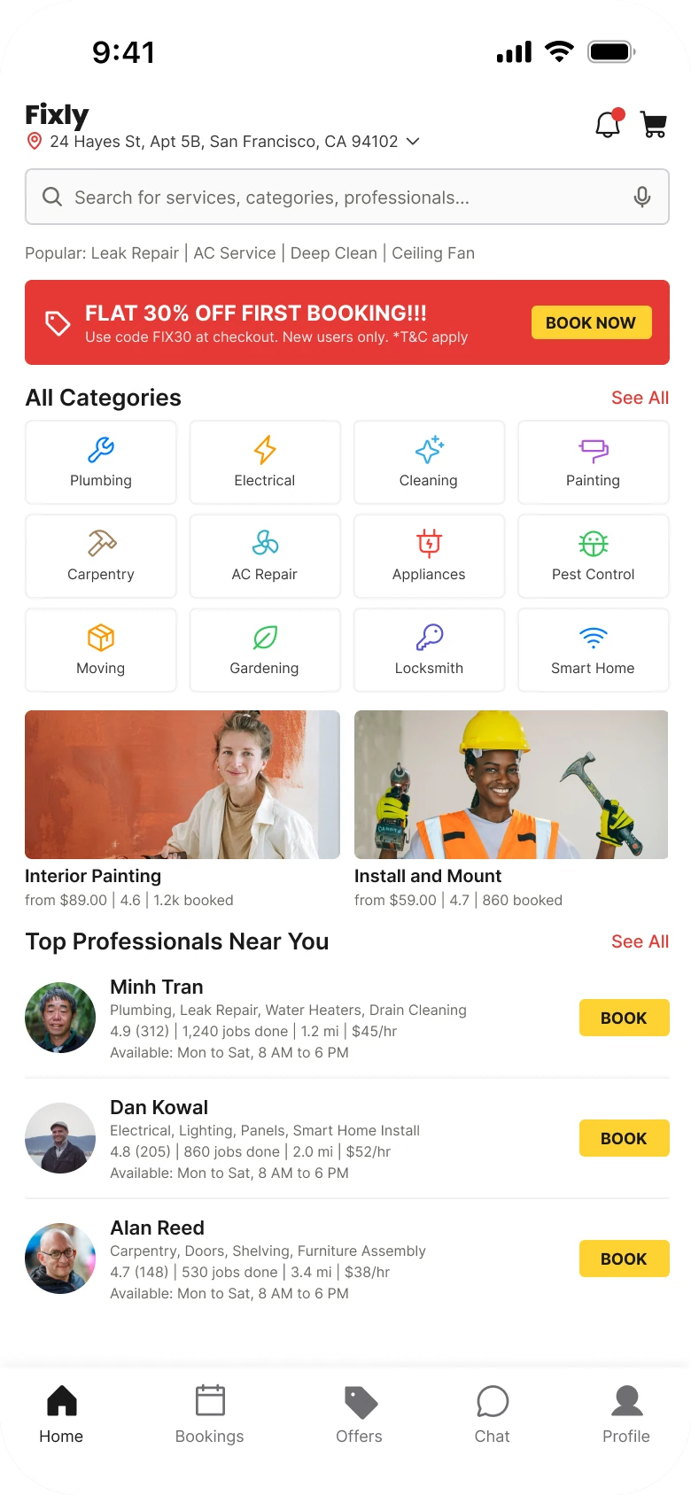
Junior draft
Fixed
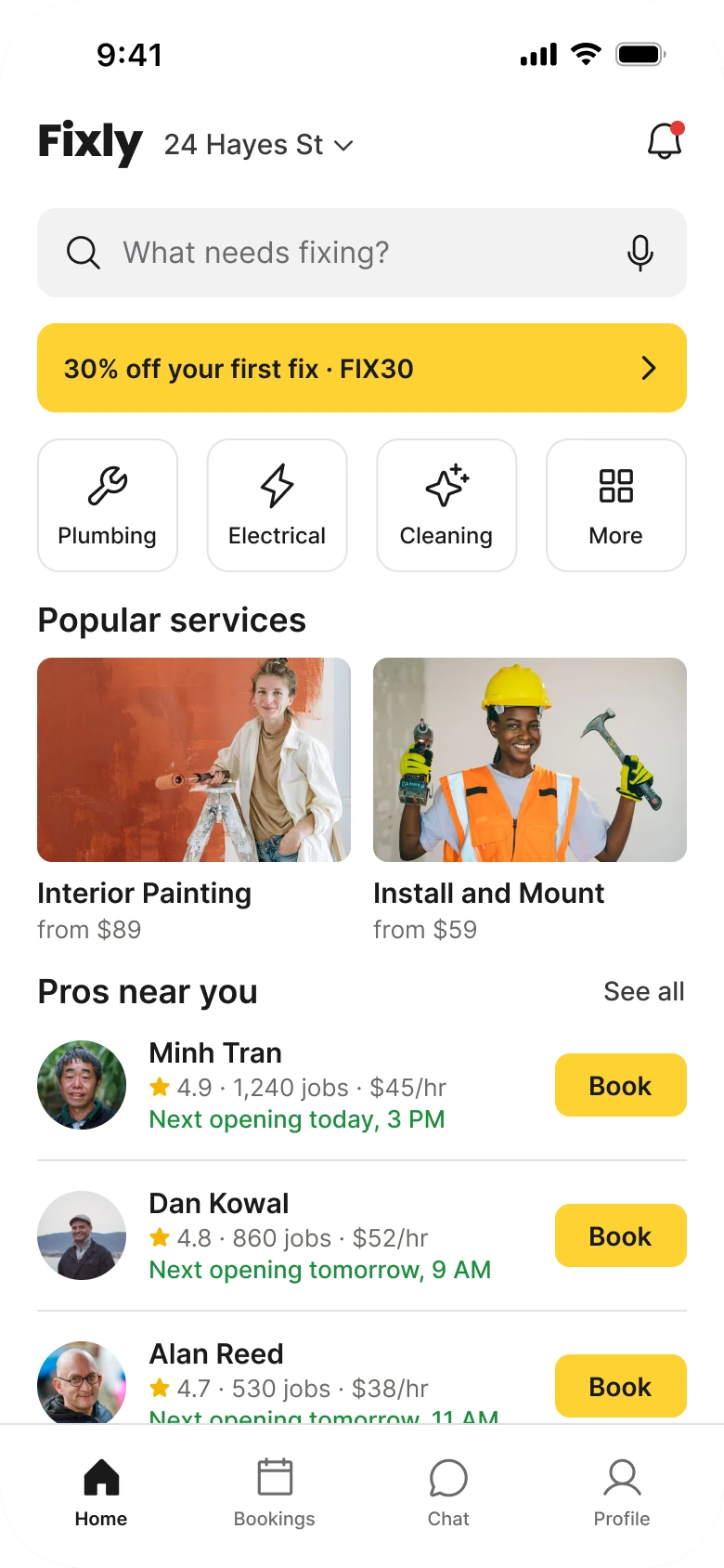
On the left, a dozen things ask for attention at the same weight. The red banner is the loudest object, the twelve tiles are the biggest block, and the actual people who will do the work sit at the bottom in type small enough to need a squint.
On the right, the screen reads in the order a homeowner thinks: what is wrong, is there a deal, what kind of job is it, who can come. The text runs 12 to 18 px against the draft's 8 to 15 px, the margin is 20 on both sides, and nothing sits in a card.
What changed, measured
| Junior draft | Fixed | |
|---|---|---|
| Search | A 32 px field, placeholder "Search for services, categories, professionals..." | A 48 px grey field, "What needs fixing?", mic kept |
| Offer | Red banner, "FLAT 30% OFF FIRST BOOKING!!!", small print, a BOOK NOW button | One 48 px yellow line, "30% off your first fix · FIX30" |
| Categories | Twelve tiles, 18 px icons, 8 px labels | Three tiles and a More, 26 px icons, 12 px labels |
| Pros | Four lines of 8 px facts, capital BOOK button | Name, one rating line, next opening, one 34 px Book button |
| Margins | 14 left, 12 right | 20 on both sides |
| Tabs | Five, mixed filled and outline icons | Four, one style, a hairline above |
Fix 1: ask one plain question
Before

After

A thin outlined search field reading Search for services, categories, professionals with a mic, over a line of popular searches: Leak Repair, AC Service, Deep Clean, Ceiling Fan. Against a tall grey field with a magnifier, the words What needs fixing and a mic.
"Search for services, categories, professionals" is a database label. It asks the user to decide whether they are looking for a service, a category or a person before they type a word. Nobody arrives at a plumbing app thinking in those terms. They arrive thinking "the sink is leaking".
"What needs fixing?" is the question the app exists to answer, so the user can type the problem in their own words. The field grows from 32 to 48 px, so it is a real tap target, and the mic stays for the moment a hand is wet. The popular searches, Leak Repair, AC Service, Deep Clean and Ceiling Fan, open from the field when it is tapped, so nothing is lost and the screen drops a line of 9 px text.
Rule to reuse: write the placeholder as the user's problem, not as your information architecture.
Fix 2: turn the banner into one line
Before

After

A red banner with a tag icon, FLAT 30% OFF FIRST BOOKING in capitals with three exclamation marks, small print reading Use code FIX30 at checkout, New users only, T and C apply, and a yellow BOOK NOW button. Against one slim yellow line reading 30% off your first fix, FIX30, with a chevron.
The red banner has three jobs and does none of them well. Red reads as an error or a warning, the exclamation marks read as spam, and the fine print is the only place the code lives. Its BOOK NOW button also competes with the BOOK buttons on the pros below.
The fixed line says the same thing in one breath: the discount, who it is for, and the code. It is yellow, which is the app's one action color, and the whole line is the button, so the chevron replaces BOOK NOW. There is no photo and no shout. A first-time user still sees the deal, and a returning user is not shouted at every time they open the app.
Rule to reuse: an offer is a line, not a billboard. Give the code to the user and make the line itself tappable.
Fix 3: cut twelve categories to three and a More
Before
After
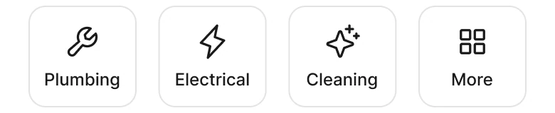
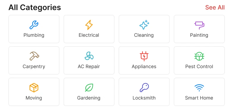
An All Categories heading with a See All link over twelve small outlined tiles in three rows of four, each a different color icon with an 8 px label: Plumbing, Electrical, Cleaning, Painting, Carpentry, AC Repair, Appliances, Pest Control, Moving, Gardening, Locksmith, Smart Home. Against four larger outlined tiles with plain ink icons: Plumbing, Electrical, Cleaning and More.
Twelve colored icons in a grid look organized, but the user has to read twelve labels to find theirs. Worse, a homeowner with a leak often does not know which category it belongs to. Is a dripping ceiling Plumbing, Painting or Carpentry? A wide menu does not help that person, it makes the guess harder.
The fix works at two levels. The search field takes the problem in plain words, so the user who does not know the category never has to guess one. The three tiles cover the most common jobs, and More opens the other nine, Painting, Carpentry, AC Repair, Appliances, Pest Control, Moving, Gardening, Locksmith and Smart Home. The tiles are 76 by 72 with 26 px icons and 12 px labels, and the icons turn plain ink, because twelve different icon colors were noise, not information.
Nothing was removed. All twelve categories are still one tap away. Thumbtack takes the same approach, a search for the job first and a short list of categories under it.
Rule to reuse: show the few that most people need and let the rest sit behind a More. Let the search handle the people who do not know the category.
Fix 4: show each pro the way people pick one
Before
After
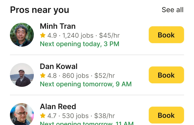
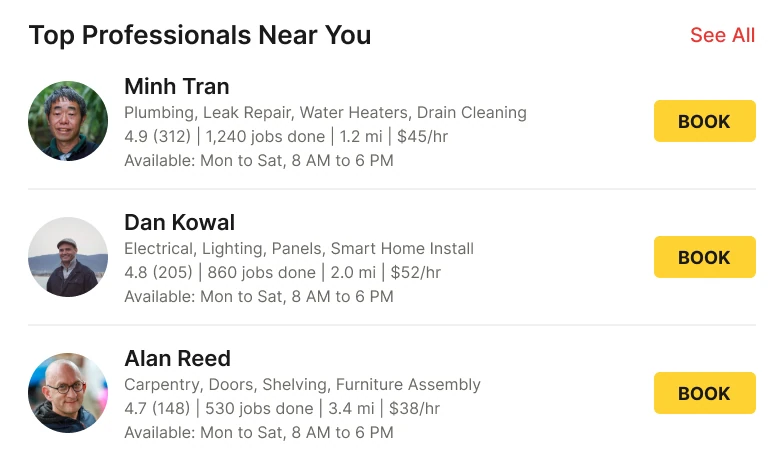
Three professionals, each with a 40 px photo, a name, a gray line of skills such as Plumbing, Leak Repair, Water Heaters, Drain Cleaning, a line reading 4.9 (312), 1,240 jobs done, 1.2 mi, 45 dollars an hour, a line reading Available Mon to Sat, 8 AM to 6 PM, and a capital BOOK button. Against three professionals with a 48 px photo, a name, a star with 4.9, 1,240 jobs and 45 dollars an hour, and the next opening in green, such as Next opening today, 3 PM, with a Book button.
The draft lists everything it knows about each pro: skills, rating, review count, jobs, distance, rate and weekly hours. That is seven facts in 8 px type, and the three pros look identical, so the user has no way to compare them. The hours line is the same for all three, so it carries no information.
People pick a pro on three things: who they are, whether others trust them, and when they can come. So the fix shows a name, one line of "4.9 · 1,240 jobs · $45/hr", and the next opening in green, such as "Next opening today, 3 PM". The time is the new fact, and it replaces the generic weekly hours with the one a booking needs.
Skills, distance and full hours move to the pro's own page. The photo grows from 40 to 48 px and the Book button from 21 to 34 px tall, so it is a real tap target.
The numbers are the same on both screens. Minh Tran is 4.9, 1,240 jobs and $45/hr in both.
Rule to reuse: show the facts people choose on, and move the rest to the detail page.
The smaller fixes
- Every function stays. The long address opens from "24 Hayes St" and its chevron. The mic stays in the search field. The Offers tab folded into the offer line, and the cart became the Bookings tab.
- One margin. The draft has 14 px on the left and 12 px on the right. The fixed screen uses 20 on both sides.
- One accent. Yellow is the action color, on the offer and every Book button. In the draft, red, yellow and twelve icon colors all compete.
- Four tabs, one icon style. Five tabs with mixed filled and outline icons become four in one style, over a flat 78 px bar with a hairline.
- A bigger wordmark, a shorter address. The wordmark grows to 24 px and the address drops its street line and city, because the user knows where they live.
- Type scale. Text runs 12 to 18 px in place of 8 to 15 px.
- See all stays. The rest of the pros are behind See all, and the third pro runs on past the tab bar so the list reads as longer.
Audit your own home services screen
| Question | Why it matters |
|---|---|
| Does the search field ask about the user's problem? | People think "leak", not "category" |
| Can someone who does not know the category still start? | Most people with a problem do not |
| Is the offer a line, and is the code visible? | A banner competes with the real buttons |
| How many categories show before a More? | More than about four makes everyone read all of them |
| Does each pro show a name, a rating and a time? | Those are the three things people choose on |
| Is the Book button a real tap target? | 21 px is too small for a thumb |
Get the Figma file
The free file has the junior draft, the fixed screen and every part as a component.
Free Figma file
Home services screen redesign, before and after
Both screens and every part as a Figma component. Free, view only, duplicate it to your drafts.
FAQ
How should a home services app home screen be designed?
Start with one plain question such as "What needs fixing?", then one slim offer line, three or four category tiles with a More, and a short list of pros. Show each pro by name, rating and next opening, with one Book button.
How many categories should a home services app show?
Three or four on the home screen, with a More for the rest. Twelve tiles make everyone read every label, and people with a problem often do not know which category it belongs to.
Should a services app use a search bar or categories?
Both, in that order. A search field that asks about the problem takes the people who do not know the category, and a few tiles cover the common jobs for the people who do.
What should a professional's card show in a services marketplace?
A name, a rating with jobs done and rate, and the next available time. Skills, distance and full hours belong on the pro's own page, because they do not help someone choose between three options.
How should a discount be shown in a home services app?
As one slim line with the offer and its code, where the whole line is tappable. A red banner with exclamation marks reads as spam, and its button competes with the Book buttons.
Sources
- Both screens are our own, designed and measured in Figma. The app, Fixly, the people, the address and the prices are made up. The offer, 30% off with the code FIX30, and Minh Tran's 4.9, 1,240 jobs and $45/hr are the same on both screens.
- Pattern studied: Thumbtack, with a search for the job first and a short list of categories under it.
- Icons are from Phosphor (MIT). Photos are from Pexels: Ivan S, Kindel Media, Son Hoa Nguyen and Mahmoud Yahyaoui.
- First published as a carousel on App Brainy.
Want this for your own app? Our team redesigns app screens like this one, from the first audit to the finished components.
Get StartedGet new papers by email
New Brainy papers in your inbox. Confirm once, unsubscribe anytime.