Design Twitter Taught You the Wrong Things
A retrospective on what Design Twitter actually taught a generation of designers, the thread-guru pattern, portfolio worship, the Linear-imitator era, and the survivorship bias of who got loud.

Design Twitter is gone. The room scattered to Threads, Bluesky, Mastodon, and group chats nobody outside the group can see. From the other side of that migration, the patterns are easier to read. A lot of what the room taught a generation of designers was wrong.
Not wrong in a vague way. Wrong in specific, name-able ways. The thread-guru pattern. Portfolio worship. The Linear-imitator era.
Engagement confused with taste. A survivorship-bias funnel that put the same voices on repeat for six years and called it consensus. This is the post-mortem.
The platform died and left a generation with bad taste
A whole cohort of designers learned what good looks like from a feed optimized for screenshots. That feed rewarded a narrow visual vocabulary, a narrow career story, and a narrow definition of craft. Designers absorbed the vocabulary, told the career story, and adopted the definition without checking whether any of it survived contact with real product work.
The platform did one thing well. It made a small number of designers extremely visible to a much larger group of designers who had never shipped anything that mattered. Visibility looked like authority. Authority shaped taste.
Taste shaped what got built. Six years later, the products built by that taste look more or less identical, and the why every SaaS looks the same breakdown is the visible artifact of that flattening.
The thread-guru pattern was a content business, not a craft lesson
The thread-guru pattern is a specific format. A hook line, a hot take, a numbered list, a call to action, and somewhere near the bottom a thin layer of substance. The format optimizes for engagement on a timeline. It does not optimize for anything else.
Designers reading those threads thought they were absorbing craft wisdom. They were absorbing a content business. The thread guru was running a personal brand, not teaching a discipline.
The advice that worked on a timeline was the advice that drove follows, not the advice that survived a real client review or a real engineering constraint. Reasonable advice does not go viral. Confident, simplified, slightly wrong advice does.
The corrected version is boring. Most craft is. It looks like a long argument with constraints, a hundred small decisions nobody screenshots, and a final product that nobody can summarize in seven slides. If a piece of advice fits in a thread, it is probably either obvious or wrong, and the thread format hides which one it is.
Portfolio worship made designers worse, not better
The portfolio became the artifact, and the artifact became the work. Designers spent more time presenting case studies than learning how to ship. A six-month project compressed into a fourteen-frame Figma deck with one big hero shot, three numbered insights, and a moody dark-mode mockup of a feature that never went into production.

The reward function was screenshot-friendliness. The reward function was not "did the user retention improve" or "did the team trust this person to make decisions" or "did the product survive the quarter." None of that fits in a portfolio frame. So none of that got optimized for. The portfolio became a visual identity exercise dressed up as a craft record.
The corrected version is a portfolio that includes the ugly stuff. The pivot. The dropped feature. The argument with the PM that was right. The constraint that killed the prettier version.
A portfolio that only shows the polished frames is a portfolio of someone who has never been responsible for a result, and now that designers are PMs too, per the designers-are-PMs-now read, that record matters more than the deck.
The Linear-imitator era flattened every product
Somewhere around 2022 the room agreed that products should look like Linear. Dark theme, command palette, minimal sidebar, gradient stripe across the top, a specific kind of muted serif on the marketing page. The aesthetic was strong. The thinking behind it was load-bearing for Linear and almost nothing else.

Stripe had a similar effect a few years earlier. Vercel and Figma added their own versions. Each one became a target the rest of the room copied. The copy was always the surface. The thinking, the data model, the discipline of you do not need a design system yet, the actual reasons those teams shipped what they shipped, never came across the screenshot.
The corrected version is to copy the thinking, not the surface. Linear's command palette works because Linear's data model has objects that map cleanly to commands. Stripe's marketing pages work because Stripe's pricing has a pricing page problem they actually solved, not because they used a particular shade of off-white. If the surface is not anchored to the thinking, you get a SaaS that looks the same as every other SaaS and a product that does not survive.
Engagement is not the same as taste
The room confused engagement metrics with taste signals for the entire run of the platform. A post that did 5,000 likes did not mean the take was right. It meant the take fit a format that drove likes. Those are different problems.
The format selected for hot takes, contrarian one-liners, screenshot-bait carousels, and confident generalizations. It selected against nuance, hedging, long arguments, and "it depends." Designers reading the feed learned to write like the feed. Then they learned to think like the feed. Then they hired and reviewed work like the feed.
The corrected version is to read the products, not the posts. The designers building the most interesting work in 2026 are mostly not posting. They are inside teams shipping things that do not fit on a timeline. The signal moved off the platform years before the platform died, and the room did not notice because the room was watching the platform.
The loud designers were not always the working designers
The survivorship-bias funnel was the worst part. The room saw a small set of designers post a lot, do well on the timeline, and become the public face of the discipline. The room did not see the much larger set of designers who shipped great work, did not post, and never made it into the conversation.

A timeline filters for the people willing to perform on a timeline. That is a real skill, but it is not the same skill as designing a product. The room kept treating the visible designers as the best designers. The visible designers were the best at being visible, which is a tautology that nobody wanted to say out loud while the platform was alive.
The corrected version is to look at who is doing the work, not who is doing the posting. Talk to PMs about which designers they trust. Look at which products feel right two years after launch, including their loading states and their onboarding without onboarding. Find the designer credit. That is a much smaller list than the timeline list, and there is almost no overlap.
Five lessons Design Twitter got wrong, and the corrected version
The save asset. Screenshot it.
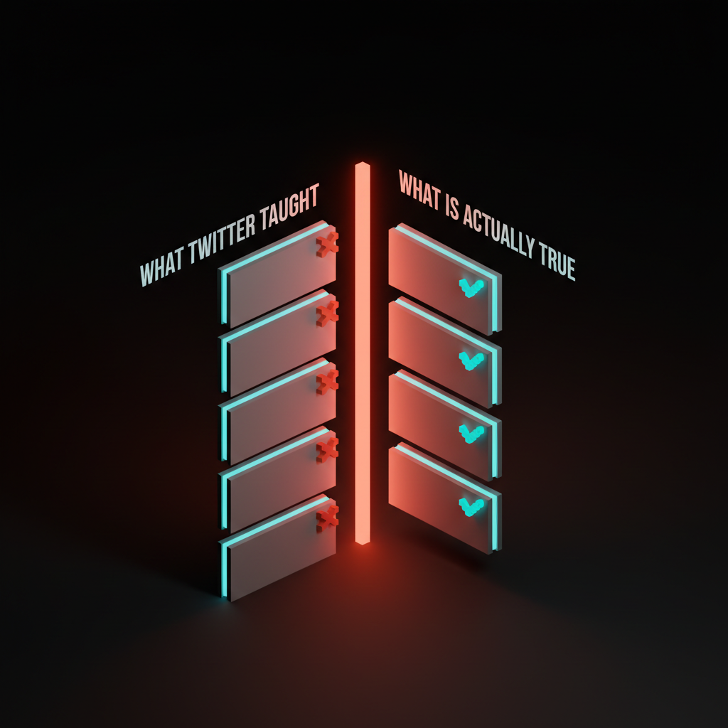
| What Design Twitter taught | The corrected version |
|---|---|
| Threads are how you teach craft. | Long arguments with constraints are how you teach craft. Threads sell personal brands. |
| Your portfolio is the artifact. | The shipped product, the team's trust, and the user outcome are the artifact. The portfolio is a receipt. |
| Copy Linear, Stripe, Vercel. | Copy their thinking. Their surface only works because of their data model and their constraints. |
| Engagement is taste. | Engagement is format-fit. The most interesting designers in 2026 are not posting. |
| The loud voices are the best voices. | The loud voices are the most timeline-shaped voices. Look at the work, not the feed. |
What to keep, what to drop
Not everything Design Twitter taught was wrong. The room had real upside. It made designers visible to teams who would never have found them through traditional channels. It surfaced specific craft moves, like skeleton screens, optimistic UI, and microcopy as design, that genuinely raised the floor of the discipline. It made the conversation about design systems faster and broader than any conference circuit could have.
Keep the access. Keep the cross-pollination. Keep the specific craft moves that survived contact with real products.
Drop the format. Drop the worship. Drop the timeline-shaped career advice that told a generation of junior designers to spend their first three years on a personal brand instead of on getting good. Drop the cargo-culted heroes. Drop the assumption that the room agreed on something just because the same fifteen people retweeted each other for a week.
The corrected version of the discipline does not have a timeline. It has products, teams, constraints, and a much quieter form of taste. The room scattered, and the scattering is good. Whatever rebuilds in 2026 should not be optimized for engagement.
FAQ
Was anything Design Twitter taught actually right?
Yes, in narrow places. Specific craft patterns like skeleton screens, optimistic UI, microcopy as design, and the case for systems thinking all got faster and broader because of the platform. The format did not invalidate the content. The format only distorted which content traveled.
How do I rebuild my taste after a decade of Design Twitter?
Start by reading products, not posts. Use real software for a month, take notes on what feels right and what feels off, and trace each one back to the design decision behind it. Then talk to working designers off the timeline, the ones inside teams who never built a personal brand. The list is shorter than you think and easier to find than the room implied.
Is Design Twitter coming back somewhere else?
Pieces of it are on Threads, Bluesky, and group chats. The format will follow the platform that rewards engagement next, because the format follows the reward function. The corrected move is not to find the next room. The corrected move is to stop optimizing for any room and start optimizing for shipped work.
CTA
Want a design partner that ignores the loudest voices and ships products that survive a quiet year? Brainy designs systems that are not optimized for the timeline. We build the part that does not fit in a thread, the discipline that does not screenshot well, and the products that look right two years after launch when the feed has already moved on. Hire Brainy when you want the work, not the post about the work.
Want a design partner that ignores the loudest voices and ships products that survive a quiet year? Brainy designs systems that are not optimized for the timeline.
Get StartedNot ready to hire? Run the free Business Genome, an 11-dimension diagnostic for your venture.
Get your free GenomeGet new papers by email
New Brainy papers in your inbox. Confirm once, unsubscribe anytime.