Profile Screen Design: An App Profile and Settings Redesign, Before and After
A profile screen that is one flat list of thirteen rows, and the same screen fixed: one identity row, a real membership card, grouped settings that show their state, and a quiet Log Out. Every change side by side, with the free Figma file.
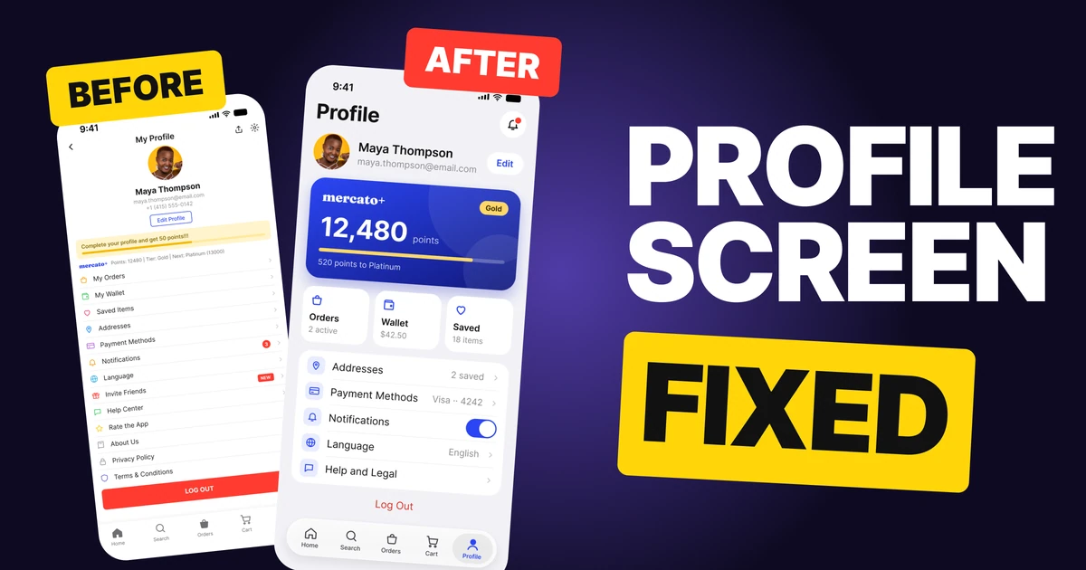
A profile screen has three jobs: show who you are, show what you have, and give you a place to change things. The first draft below does all three, but it does them in one flat list of thirteen rows, with the points squeezed into a single small line and Log Out as the loudest thing on the screen. It is a junk drawer: everything is in there, and nothing is easy to find.
The fix keeps every feature. It gives each job its own block and lets the rows show their state, so most settings can be read without opening them.
The whole screen, before and after
Junior draft
Fixed
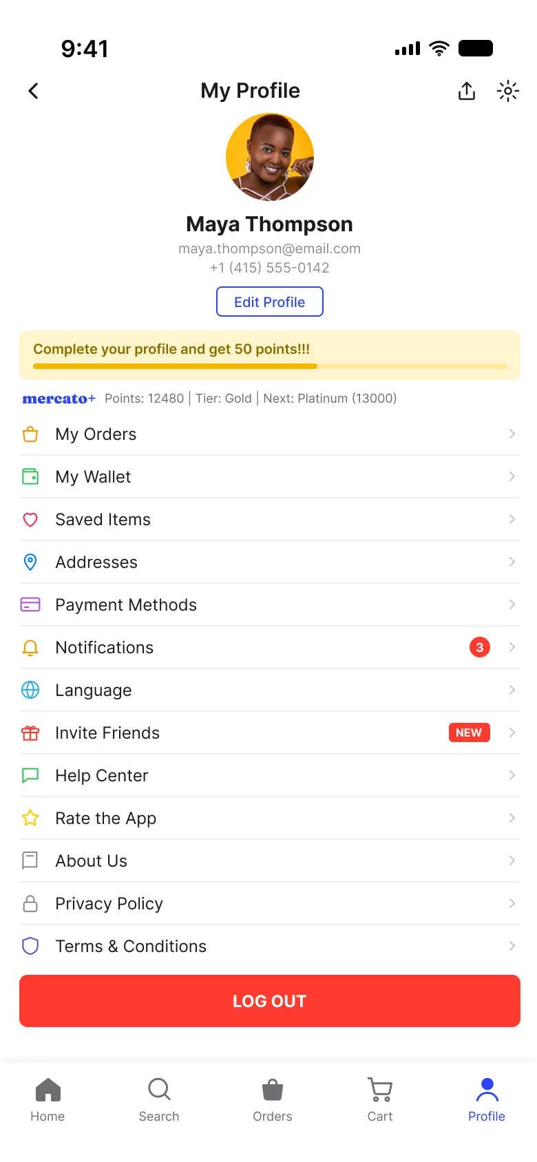
On the left, everything has the same weight. The avatar, the name, the email and the phone number are stacked in the middle, the nag banner sits right above the points, and then thirteen rows run down the page, each with its own icon color. The wide red button at the bottom is the strongest color on the screen, so the last thing the eye finds is the one action nobody should hit by accident.
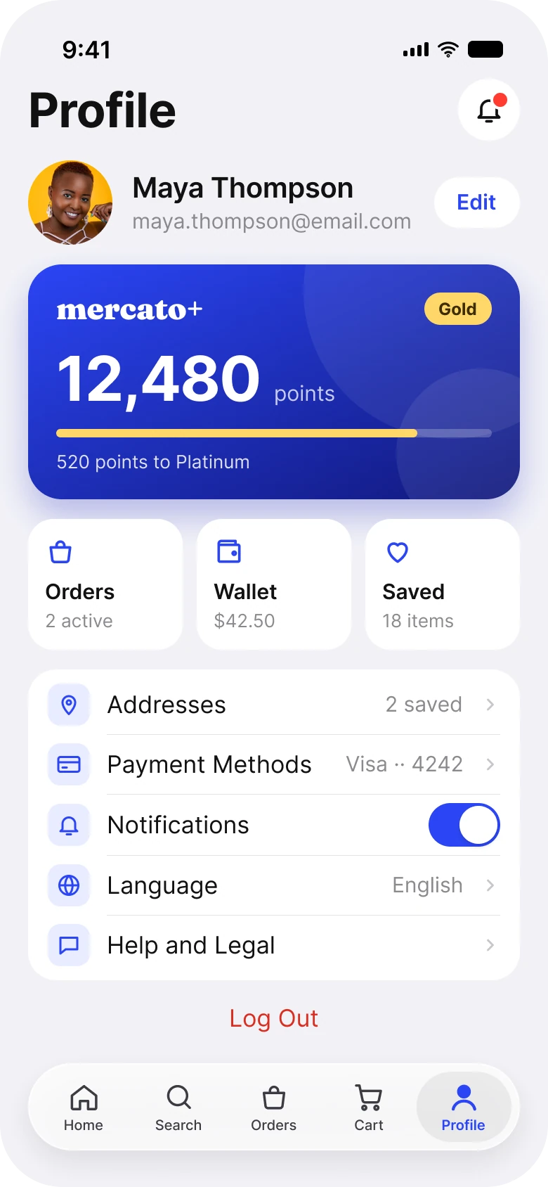
On the right, the screen has four blocks and one color. The identity row is short, the card carries the points, and the tiles and the settings list hold everything else. The brand cobalt appears on the card, the Edit button and the active tab, and red appears once, on Log Out, as plain text.
What changed, measured
Every difference on one screen, from the two Figma frames:
| Junior draft | Fixed | |
|---|---|---|
| Identity | Centered stack: avatar, name, email, phone, Edit Profile | One row: avatar, name, email, small Edit button |
| Points | One 9 pt line: "Points: 12480 | Tier: Gold | Next: Platinum (13000)" | A card with a 44 pt number and "520 points to Platinum" |
| Menu | 13 rows in one list, 7 icon colors | 3 tiles and 5 grouped rows, 1 icon tint |
| Row state | Only Notifications (a badge) and Invite Friends (a tag) | Count, balance, card, language and a switch, all visible |
| Log Out | A 38 px red button, full width | 17 pt red text, centered |
| Tab bar | 5 tabs, mixed filled and outline icons | 5 tabs in a floating bar, one icon style |
| Margin | 14 left, 12 right | 20 on both sides |
Fix 1: one row for who you are
Before
After

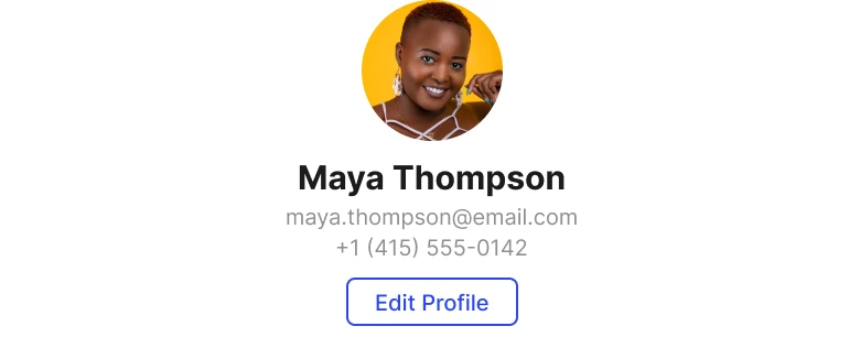
A centered avatar, the name, an email, a phone number and an outlined Edit Profile button, with a yellow banner under them, against one row: the avatar on the left, the name and email beside it and a small Edit pill on the right.
The centered stack spends about 160 points of height to say a name and an email. The phone number is the least useful line in it, and the Edit Profile button is a full outlined control that competes with everything below it.
The fix is one row: the avatar on the left, the name and email next to it, and Edit as a small pill at the end. The block is 60 points tall instead of 158, so the next block starts higher. The nag banner, "Complete your profile and get 50 points!!!", is gone from the top of the screen. A request to finish your profile belongs after a first run or inside Edit, not above the thing you came to see.
Rule to reuse: a person knows their own name. Give identity one row and give the room to what changes.
Fix 2: turn a line of text into a card
Before

After
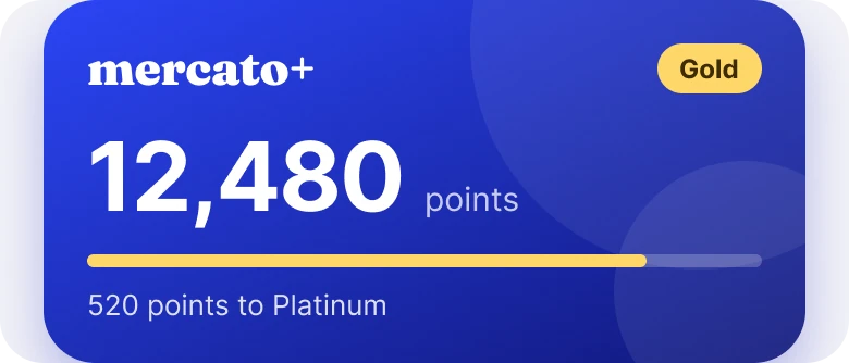
A small wordmark followed by "Points: 12480 | Tier: Gold | Next: Platinum (13000)" in one line of tiny text, against a deep blue card with the wordmark, a Gold tag, 12,480 in large type, a progress bar and "520 points to Platinum".
The points are the reason a member opens this screen, and the draft sets them in the smallest type on the page. The numbers are all there, but the reader has to do the subtraction: 13,000 minus 12,480.
The fix does the subtraction for them. The card shows the points at 44 pt, the tier as a gold tag, a bar that is 83 percent full and the sentence "520 points to Platinum". Gold starts at 10,000, so 12,480 sits most of the way to the next tier, and the bar shows it at a glance. The card also uses the brand cobalt and the one gold of the tier, which makes it the strongest block on the screen, and that is correct: it is the one thing here that rewards the person looking at it.
Rule to reuse: show the result of the sum, not the numbers that go into it.
Fix 3: group the settings and show their state
Before
After
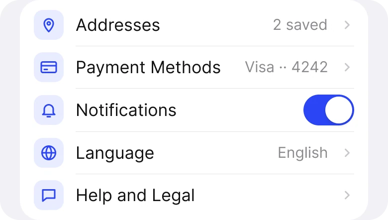
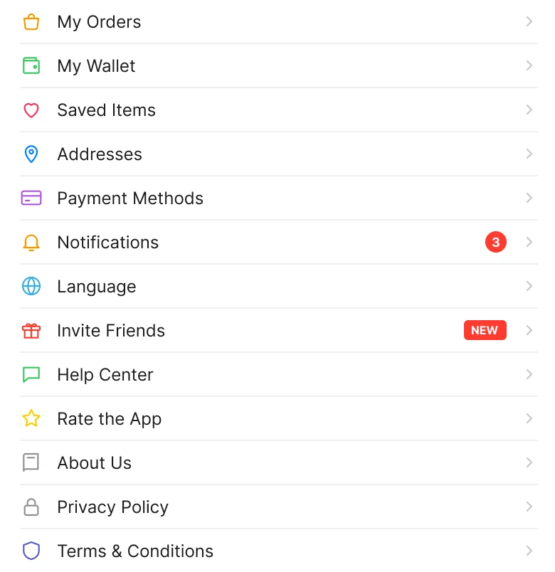
Thirteen rows in one list, from My Orders to Terms and Conditions, each with its own colored icon and a chevron, against three tiles (Orders, Wallet, Saved) and one white group of five rows: Addresses, Payment Methods, Notifications, Language and Help and Legal.
Thirteen rows with the same size, the same chevron and seven icon colors have no order. My Orders and Terms and Conditions look equally important, and the draft tells you nothing about what is behind a row until you tap it.
The fix sorts the list by how often people use it:
- Orders, Wallet and Saved become tiles. They are the three places people go most, so they get large targets and a live fact each: "2 active", "$42.50" and "18 items".
- Settings sit in one group. Addresses says "2 saved", Payment Methods says "Visa ·· 4242" and Language says "English". The person can check them without a tap.
- Notifications becomes a switch. It is an on and off choice, so it does not need its own screen.
- The rarely used rows move behind Help and Legal. Invite Friends, Rate the App, About Us, Privacy Policy and Terms still exist, one tap further in.
Every row from the draft is still reachable. Nothing was deleted, it was put where its frequency says it belongs. The icons also share one tint, so the color on the screen means something: the brand marks the active, tappable things.
Fix 4: make Log Out quiet
Before

After

A full-width red button with white capital letters reading LOG OUT, against the words Log Out in red, 17 pt, centered with space around them.
A solid red button is the loudest control on the draft screen, and it asks to be pressed. Logging out is rare and mildly destructive, since it drops the person back to a sign-in. It should be easy to find and hard to hit by mistake.
The fix keeps the red, because red still tells you this is a leaving action, and takes away the fill. It is plain text under the settings group, with space around it. It is still one tap away, but it no longer pulls the eye.
The smaller fixes
- A large title instead of a nav bar. "My Profile" with a back arrow, a share icon and a sun icon became "Profile" at 34 pt. The tab bar already says where you are, so the back arrow is gone, and the notification bell is the only icon left.
- One margin. The draft uses 14 on the left and 12 on the right. The fix uses 20 on both sides and 14 between blocks.
- One type scale. Text in the draft runs from 8 to 15 px. The fix uses iOS sizes from 11 to 34 pt.
- One accent. The draft has seven icon colors, a yellow banner and a red button. The fix has the brand cobalt, one gold for the tier and red for Log Out.
- A floating tab bar. The five tabs stay, but they use one icon style with only the active tab filled.
Audit your own profile screen
| Question | Why it matters |
|---|---|
| Is identity one row? | A person knows their name, so it should not take 160 points |
| Can you read the points or the status in one second? | A summary in small text makes the reader do the maths |
| Are the most used places bigger than the rarely used ones? | Equal rows hide what matters |
| Does each settings row show its current value? | The state is the answer to most visits |
| Is there more than one accent color? | Seven icon colors mean nothing |
| Is Log Out louder than Edit? | The rare action should be the quiet one |
Get the Figma file
The free file has both screens, with the fixed blocks as components.
Free Figma file
Profile screen redesign, before and after
Both screens and every part as a Figma component. Free, view only, duplicate it to your drafts.
FAQ
What should a profile screen in an app show?
Who the person is, what they have, and a way to change their settings. Put identity in one short row, put the points, balance or plan in a card and group the settings below.
Where should the Log Out button go on a profile screen?
At the bottom of the settings, below the last group, as plain text. It should be reachable, but never the loudest control on the page.
How many rows should a settings list have?
Five to seven in the first view works well. Move the rarely used ones, such as legal pages and app rating, behind one row like Help and Legal.
Should settings rows show their current value?
Yes. A value such as "English" or "Visa ·· 4242" answers the question without a tap, and a switch is better than a row for a simple on or off choice.
How do you show loyalty points on a profile screen?
As a card with the number large, the current tier as a tag and one sentence on what is next, such as "520 points to Platinum". Do the subtraction for the reader.
Sources
- Both screens are our own, designed and measured in Figma. The app, the member and the numbers are made up.
- Text sizes follow the iOS type scale in Apple's Human Interface Guidelines.
- Avatar photo: Tamra Creatives Agency on Pexels.
- First published as a carousel on App Brainy.
Want this for your own app? Our team redesigns app screens like this one, from the first audit to the finished components.
Get StartedGet new papers by email
New Brainy papers in your inbox. Confirm once, unsubscribe anytime.