Toast vs Banner: When to Use Each in a Mobile App
A toast confirms what just happened and fades. A banner stays until the problem is fixed. The one question that decides it, both patterns rebuilt on a real inbox, and a decision table for ten common cases.
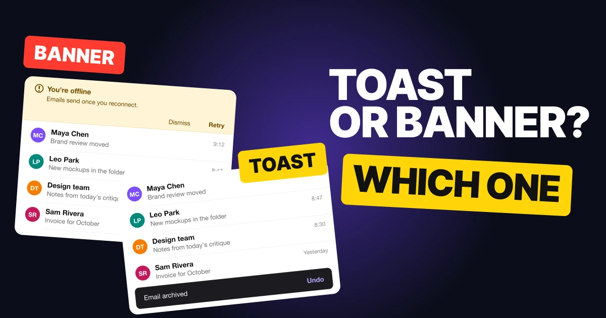
Toasts and banners both tell people something without stopping them, so teams treat them as one thing. They are not. One reports what just happened and leaves on its own, the other reports what is still true and stays until someone deals with it. Below: the question that decides it, both patterns rebuilt on an inbox, and a decision table.
The one question: will it still be true in ten seconds?
If the message describes something that already happened and is now over, it is a toast. If it describes a state that is still going and will keep going until someone acts, it is a banner.
That single question settles most cases before anyone argues about looks. It also explains every other difference between the two: a toast can fade because losing it costs nothing, and a banner has to stay because losing it costs the person their data, their work or their trust in the app.
The toast: confirm what just happened
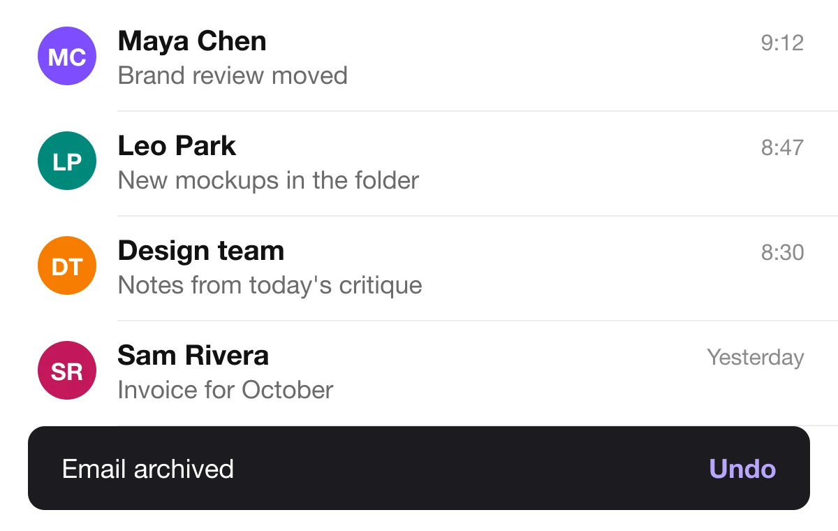
A toast, called a snackbar in Material Design, is a short message that slides in, waits a few seconds and leaves. It is right when:
- It confirms something the person just did. Email archived, link copied, item added to the cart.
- Missing it costs nothing. The action worked. The person lost no information by looking away.
- One action is enough. Material's guidelines allow a snackbar a single action, and the useful one is Undo.
Keep it to one line of text and one text action. Material says a snackbar may contain a text action but no icons, and that the action should not be "Dismiss" or "Cancel", because the toast already dismisses itself.
Where it fails: anything people have to read, act on or come back to. A toast takes its own timing out of the reader's hands.
The banner: say what is still true
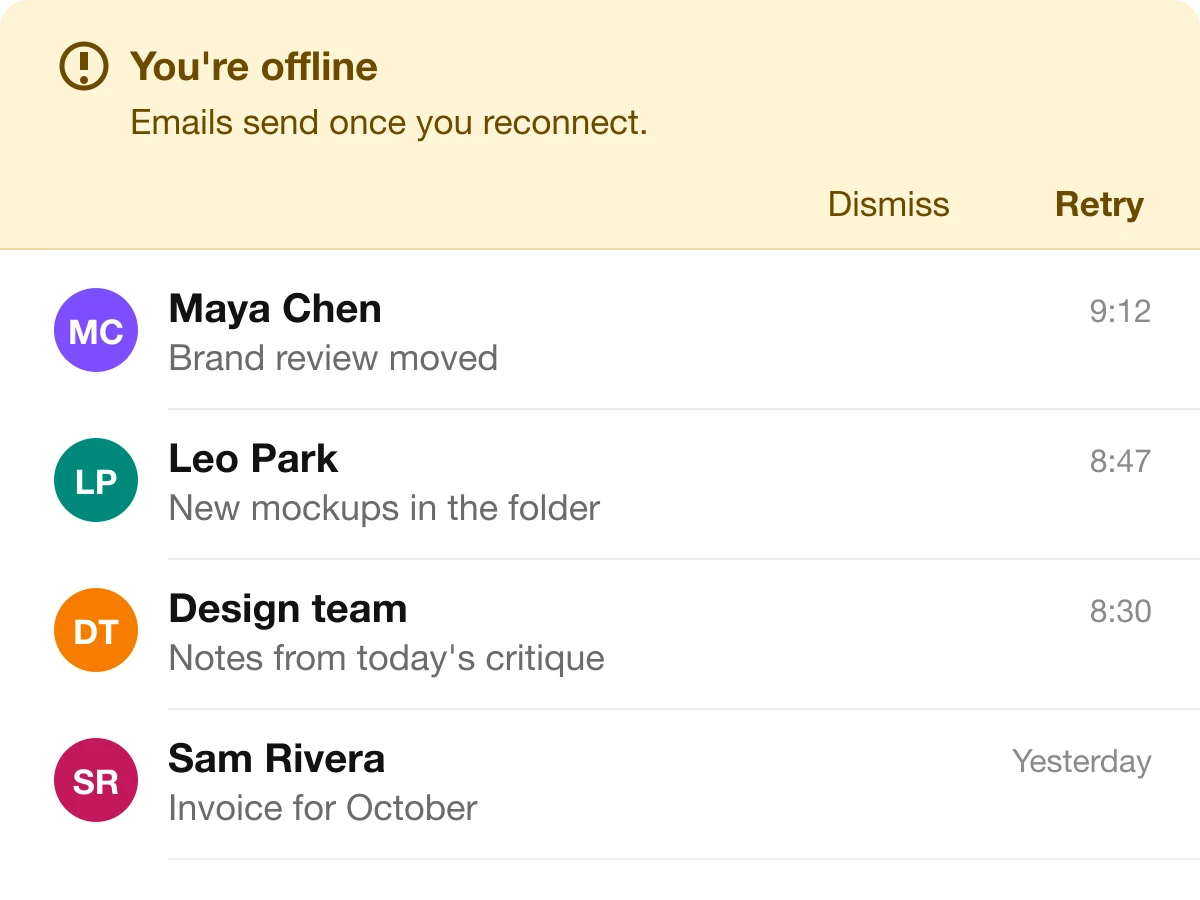
A banner is a message pinned to the top of the screen, below the app bar. It is right when:
- The state lasts until someone fixes it. Offline, payment failed, storage full, email not verified.
- It is too important to fade. If people miss it, they keep working on a wrong assumption.
- They can fix it now or keep going. A banner is not a modal. The screen underneath still works.
Material describes a banner as persistent and non-modal: it needs a user action to go away, and people can ignore it or use it at any time. Give it a plain title, one line of explanation and the actions that fix the problem, such as Retry.
Where it fails: confirmations. A banner that says "Email archived" and stays until dismissed turns every routine tap into a chore.
Never put an error in a toast
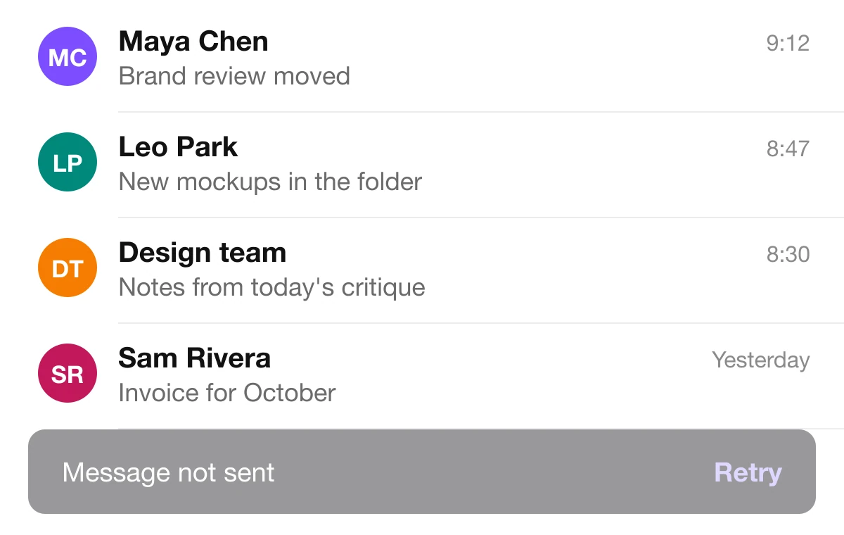
Wrong: an error in a toast
Right: an error in a banner
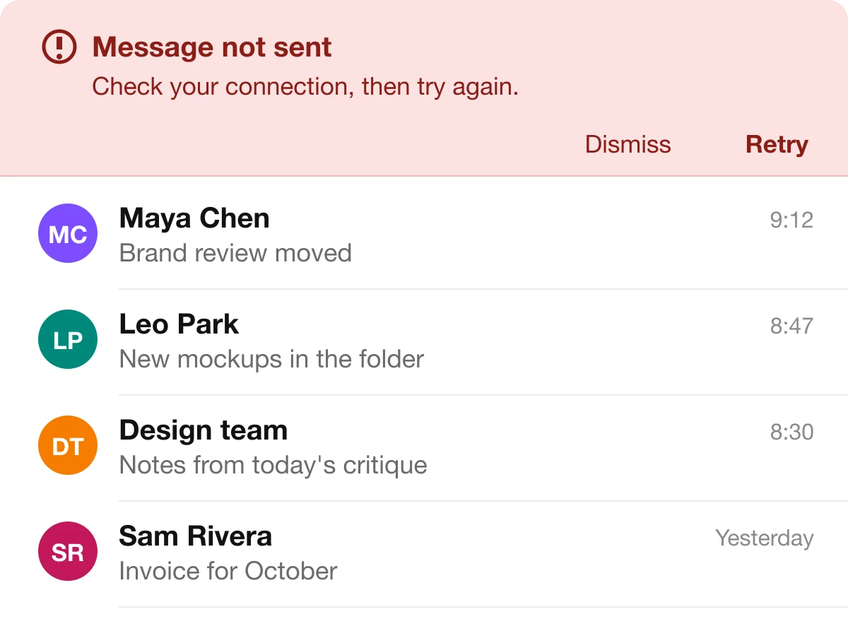
The left screen is the most expensive mix-up. The message failed to send, the toast fades after a few seconds, and the person who looked at their coffee never knows. They think it went out.
Nielsen Norman Group calls a toast "appropriate for passive notifications" and a bad way to implement an error message. In their testing, one mobile user waited five minutes because she missed an error that faded after five seconds. The same words in a banner stay put, carry a Retry and wait for the person to come back.
Toast or banner: a decision table
| Situation | Pick | Why |
|---|---|---|
| Email archived | Toast | It just happened, and Undo covers a mistake |
| Link copied | Toast | Pure confirmation, nothing to keep |
| Item added to cart | Toast | Done, with an optional View cart action |
| Message not sent | Banner | An error must stay until it is fixed |
| You're offline | Banner | A state that lasts until the connection returns |
| Payment method expired | Banner | True until the person updates it |
| Changes saved | Toast | A one-time confirmation |
| Storage almost full | Banner | Still true, and people can act now or later |
| Delete a project for everyone | Neither | A decision that must be made first. Use a modal |
| Announce a new feature | Neither | Nobody has to act. Use an inline card |
Who does it well
You can check these on your phone today:
- Gmail confirms an archive with a one-line toast and an Undo, and leaves the inbox untouched.
- Slack and Shopify's Polaris design system use an amber banner at the top for connection trouble, a state that lasts.
- Sonner, the toast library, keeps toasts to one line, one text action and a small radius, which is the proportion worth copying.
Material's guidance sits behind all of these: snackbars give brief feedback at the bottom of the screen and disappear after a timeout, while banners hold an important, succinct message at the top and stay until the person acts.
FAQ
What is the difference between a toast and a banner?
A toast is a brief message that appears, fades on its own and confirms something that just happened. A banner is a persistent message that stays at the top of the screen until the person acts, and it reports a state that is still true.
When should I use a toast notification?
When people have just done something and you want to confirm it: archived, copied, saved, added. Keep it to one line and at most one action, usually Undo.
When should I use a banner?
When a condition lasts until it is fixed, such as being offline, a failed payment or a full storage quota. Put it at the top, give it a clear title and offer the action that resolves it.
Should errors be shown in a toast?
No. A toast fades, so a person who looks away never learns what went wrong. Show errors inline or in a banner that stays until the problem is fixed.
Is a snackbar the same as a toast?
Yes in practice. Material Design calls the pattern a snackbar: a brief message at the bottom of the screen that disappears after a timeout and may carry one action.
Sources
- Snackbars and Banners, Material Design guidelines. The banner wording is quoted in Flutter's MaterialBanner documentation.
- Kim Flaherty, Indicators, Validations, and Notifications: Pick the Correct Communication Option, Nielsen Norman Group.
- First published as a carousel on UX Brainy.
Get new papers by email
New Brainy papers in your inbox. Confirm once, unsubscribe anytime.