Crypto Wallet App Design: A Wallet Home Screen, Before and After
A crypto wallet home screen with a 12 px balance, a seven column coin table and six caps buttons, and the same screen fixed: one big balance, a line chart, four round actions and a list of real coin marks. Every change side by side, with the free Figma file.
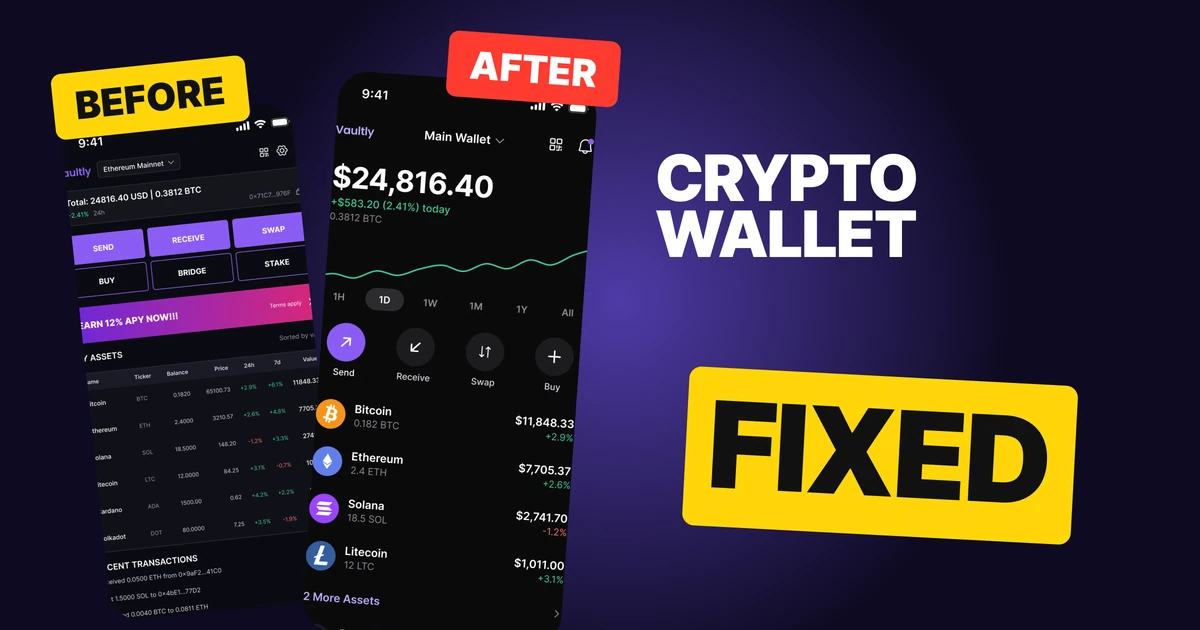
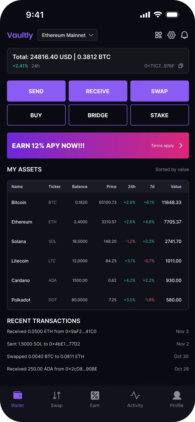
A crypto wallet home screen has one job: tell a person what they hold and let them move it. The first draft below has every feature on it, and it reads like a trading floor: the balance is a 12 px line, the coins run across seven columns of 8 px type, six caps buttons fill two rows, and a promo banner shouts over all of it.
The fix keeps every function and changes what comes first: one big balance, a chart, four actions, then a list people can read at a glance. This is a design study only. The app, the wallet and every figure are made up, and nothing here is advice on what to buy, sell or hold.
The whole screen, before and after
Junior draft
Fixed
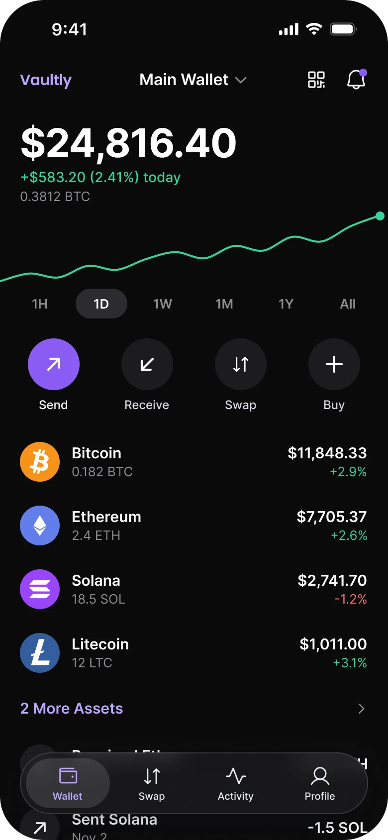
On the left, everything has the same weight. The balance, the promo, the buttons and the table all sit between 8 and 15 px, and every block is wrapped in its own border, so the eye has no order to follow. The loudest thing on the screen is an offer, not the person's money.
On the right, the screen reads top to bottom as the questions a holder asks: how much do I have, how is it moving, what do I want to do, and what is in it. Violet is used once, on Send. Green and red mean up and down.
What changed, measured
| Junior draft | Fixed | |
|---|---|---|
| Balance | "Total: 24816.40 USD | 0.3812 BTC" in a 12 px line, in a box | $24,816.40 at 40 pt bold, no box |
| Change | "+2.41%" at 9 px | "+$583.20 (2.41%) today" at 14 pt |
| Chart | None | A full width line, 2 px, with a dot at its end |
| Actions | Six caps buttons in two rows | Four round buttons with labels |
| Promo | A gradient banner, "Earn 12% APY now!!!" | Gone from the first screen |
| Coins | A seven column table at 8 to 9 px | Rows of 64 px with a 40 px coin mark |
| Margins | 14 left and 12 right | 20 on both sides |
| Tab bar | Five tabs, mixed filled and outline icons | Four tabs, one outline style |
Fix 1: one big number and a line
Before
After
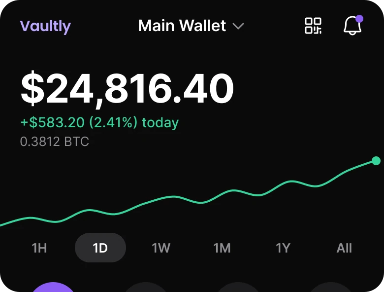
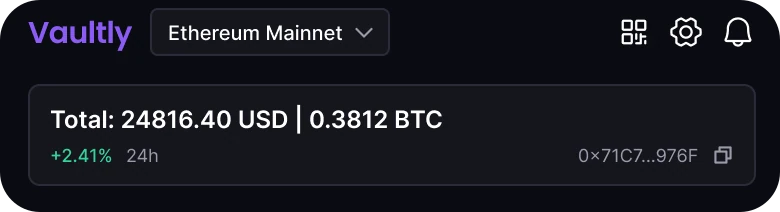
A header with a Vaultly wordmark, an Ethereum Mainnet dropdown and three icons above a bordered box reading Total: 24816.40 USD | 0.3812 BTC with +2.41% 24h and a copy address on the second line, against a header with a small wordmark, Main Wallet and two icons, then $24,816.40 in large type, +$583.20 (2.41%) today in green, 0.3812 BTC in grey, a green line chart and a row of ranges from 1H to All with 1D selected.
The draft treats the balance as a label and a value: "Total:" then the number, then a pipe, then a second currency, all in one 12 px line, inside a bordered box. The one figure a person opens a wallet to see is the same size as the helper text beside it. The +2.41% sits at 9 px with the word "24h" next to it and the wallet address across from it.
The fix gives the balance the whole line and the biggest type on the screen. The change gets its own line in the gain color, written as a dollar amount and a percentage so it answers "how much" and "how fast" together. The BTC amount drops to a quiet grey line. Under them is one line chart, edge to edge, with a dot at the end to mark now, and a row of ranges with a pill on the active one.
The header got smaller to make room. The network dropdown became "Main Wallet", a name people recognize, and the gear moved to the Profile tab. QR and bell stay as two plain 24 px icons.
Rule to reuse: make the one number people came for the biggest thing on the screen, and let the chart show direction so the number does not have to.
Fix 2: four actions, not six buttons
Before
After
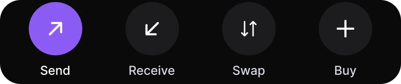
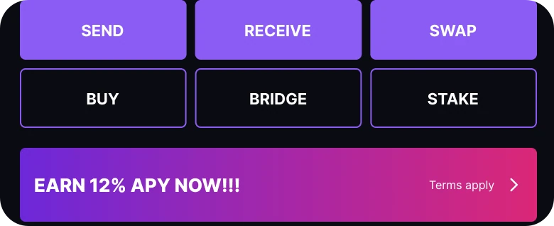
Two rows of three caps buttons, SEND, RECEIVE and SWAP filled violet over BUY, BRIDGE and STAKE outlined in violet, and a pink to purple banner reading EARN 12% APY NOW!!! with Terms apply, against four round buttons, Send in violet with an arrow, Receive, Swap and Buy in dark grey, each with a label under it.
Six buttons of the same size say that six things matter equally. Three are filled and three are outlined, which suggests a ranking, but nothing says why Buy is less important than Receive. Below them a banner in a gradient promises 12% for doing something, with "Terms apply" in small type, and it is the largest block of color on the screen.
The fix keeps four verbs people use every day: Send, Receive, Swap and Buy. Each is a round button with an icon and a 12 px label under it, spaced evenly across the width. Only Send is violet, because sending is the action with consequences, and the others are quiet grey circles.
Nothing was deleted. Bridge sits inside Swap, and Stake and the Earn offer moved to each coin's page, where they apply to one asset instead of the whole wallet. The banner is gone from the first screen because an offer that sits above a person's balance competes with it.
Rule to reuse: show the four things most people do, and put the rest where their context is.
Fix 3: a list people can read
Before
After
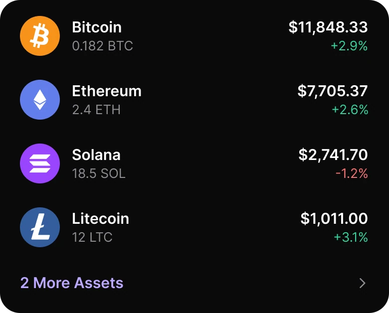
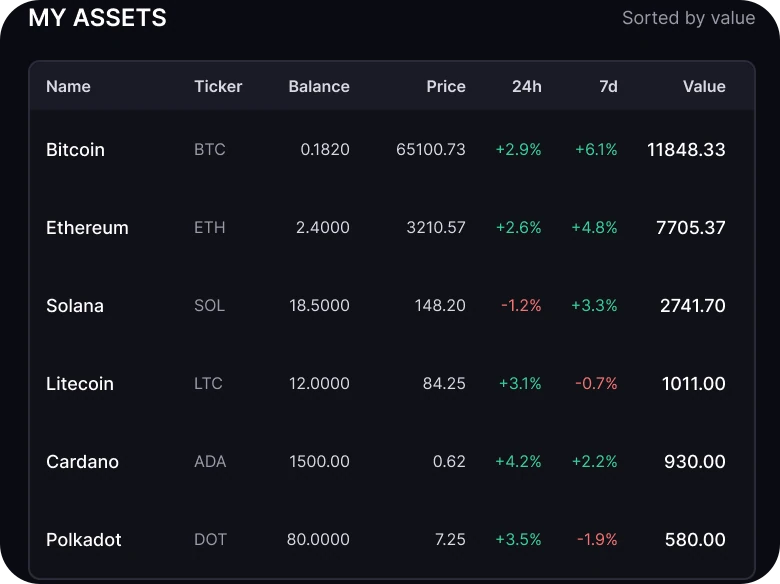
A My Assets title with Sorted by value, then a bordered table with columns Name, Ticker, Balance, Price, 24h, 7d and Value and six rows from Bitcoin to Polkadot in 8 to 9 px type, against four rows each with a round coin mark, the name over the amount on the left, and the value over the change on the right, then a 2 More Assets link.
A seven column table is a spreadsheet. Name and ticker say the same thing twice, balance and price and value are three numbers to multiply in your head, and 24h and 7d are two more percentages in red and green. At 8 to 9 px none of it can be read at arm's length, and the first column has no logo, so each coin is found by reading.
The fix keeps one question per row: what is it, how much do I have, what is it worth, and is it up. The left side holds the coin mark, the name and the amount. The right side holds the value and today's change, colored green or red. The marks are the real Bitcoin, Ethereum, Solana and Litecoin logos on solid circles in each coin's own color, so a person finds Bitcoin by orange before they read the word.
Rows are 64 px tall, which gives each a comfortable tap target, with text at 15 for names and values and 13 for amounts and changes. Price, 7 day change and trend lines are one tap away, on the coin's own page. Cardano and Polkadot sit behind "2 More Assets", and the list runs under the floating tab bar so the screen reads as scrollable.
Rule to reuse: when a table has more than four columns, ask which two questions the person asks first, and move the rest one tap away.
The smaller fixes
- Every function stays reachable. The network dropdown is the Main Wallet chevron. The wallet address is behind Receive and the QR. The gear lives in Profile. The BTC total is the grey line under the balance.
- The same figures on both sides. The values add up: 11,848.33 + 7,705.37 + 2,741.70 + 1,011.00 + 930.00 + 580.00 = 24,816.40. You are comparing layout and nothing else.
- Recent transactions moved to the Activity tab. Two recent rows continue under the tab bar, so the home screen still shows that there is more.
- A flat ground. The fixed screen has one near-black ground, with no card, no gradient and no glow. Only the tab bar is glass.
- 20 px margins on both sides. The draft used 14 on the left and 12 on the right.
- Four tabs, one icon style. The draft had five tabs with mixed filled and outline icons, and an Earn tab for the banner. The Earn tab is gone with the banner.
- Prices with thousands separators and a currency sign. "11848.33" became "$11,848.33".
Audit your own wallet screen
| Question | Why it matters |
|---|---|
| Is the balance the largest text on the screen? | It is the reason people open the app |
| Can you see direction without reading a percentage? | A line chart does it in one glance |
| How many buttons are in the open? | Keep the four most used |
| Does a promo sit above the balance? | It competes with the one number that matters |
| How many columns does the coin list have? | More than four is a spreadsheet |
| Does every coin have a recognizable mark? | People find it by color and shape first |
| Are gains and losses the only colors with meaning? | Spend an accent once, on the main action |
Get the Figma file
The free file has the junior draft, the fixed screen and every part as a component.
Free Figma file
Crypto wallet screen redesign, before and after
Both screens and every part as a Figma component. Free, view only, duplicate it to your drafts.
FAQ
How should a crypto wallet home screen be designed?
In the order a holder asks: how much, how is it moving, what do I do, what is in it. Use a large balance, a line chart, four round actions and a list of coin rows.
What should a crypto wallet app show first?
The total balance in one large number with today's change under it. Promotions and secondary tools belong lower or on the pages where they apply.
How many buttons should a wallet home screen have?
Four is enough for the first screen: Send, Receive, Swap and Buy. Move Bridge, Stake and other tools to the screens where they make sense.
How do you design a crypto asset list?
One row per coin: a recognizable mark, the name and amount on the left, the value and change on the right. Put price and trend on the coin's own page.
What colors should a wallet app use?
One accent for the main action, and green and red only for gains and losses, so the colors keep a single meaning.
Sources
- Both screens are our own, designed and measured in Figma. The app, the wallet, the addresses and every figure are made up. This is a design study, not financial advice.
- Measured: before, margins 14 left and 12 right, text 8 to 15 px, the balance at 12 px, "+2.41%" at 9 px, six caps buttons in two rows, a seven column table at 8 to 9 px, five tabs. After, margin 20, the balance at 40 bold, the change at 14, four 52 px action circles with 12 px labels, 64 px asset rows with 40 px coin marks, violet #8B5CF6 on Send only, gain green #34D399.
- Patterns studied: Coinbase and Phantom for the balance, the actions and the asset rows.
- Coin marks: the Bitcoin, Ethereum, Solana and Litecoin logos from simple-icons (CC0). Icons: Phosphor (MIT).
- First published as a carousel on App Brainy.
Get new papers by email
New Brainy papers in your inbox. Confirm once, unsubscribe anytime.