Flight Results Screen Design: A Flight Booking App, Before and After
A flight results screen that opens with a red 40% off banner, six chips and six identical rows, and the same screen fixed: the trip on top, a strip of prices by day, three sorts, and rows that lead with the times. Every change side by side, with the free Figma file.
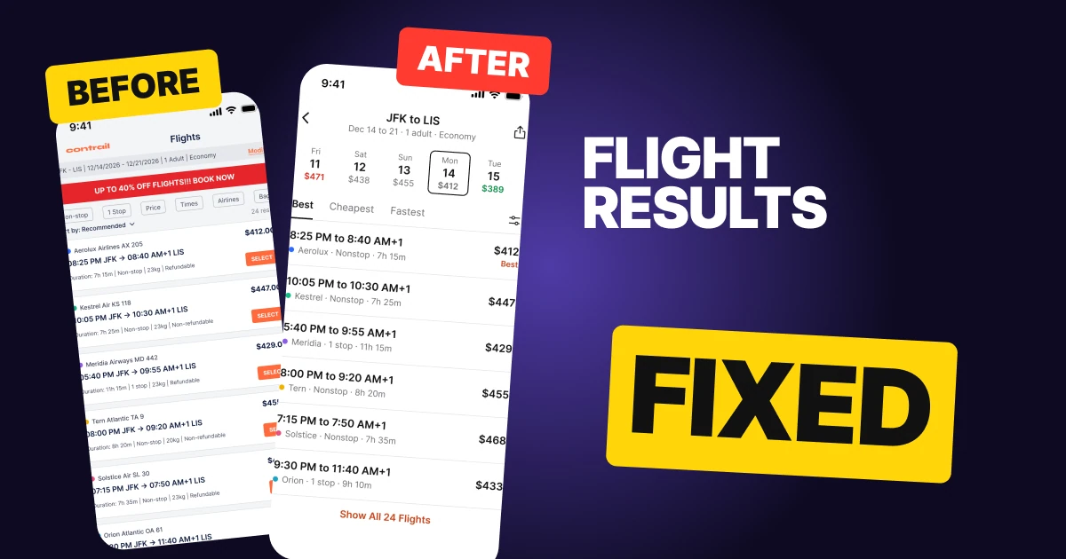
A flight results screen has one job: help a person compare flights and pick one. The first draft below can do that, but it opens with a 10 px summary, a red banner shouting 40% off, six filter chips and a sort dropdown, and only then shows six rows of small type that all look the same. It reads like a spreadsheet.
The fix keeps every function and changes what comes first: the trip, then the prices by day, then the three sorts people want, then rows that lead with the times.
The whole screen, before and after
Junior draft
Fixed
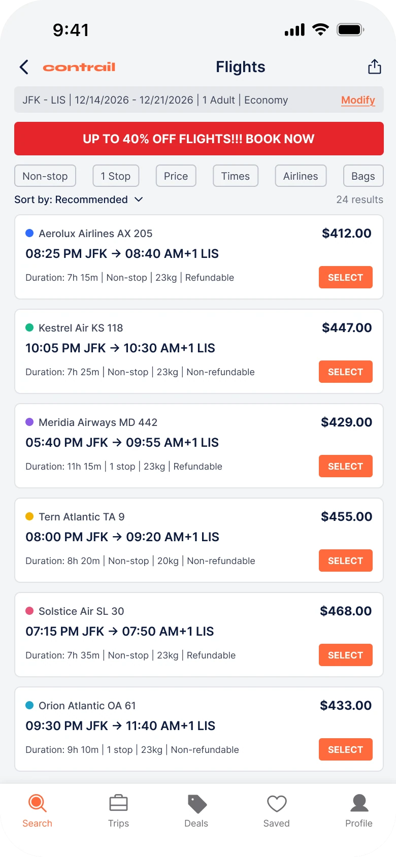
On the left, everything has the same weight. The summary, the promo, the chips, the sort line and the rows all use 9 to 15 px type, so the eye has no order to follow. The loudest thing on the screen is a discount that is not a flight.
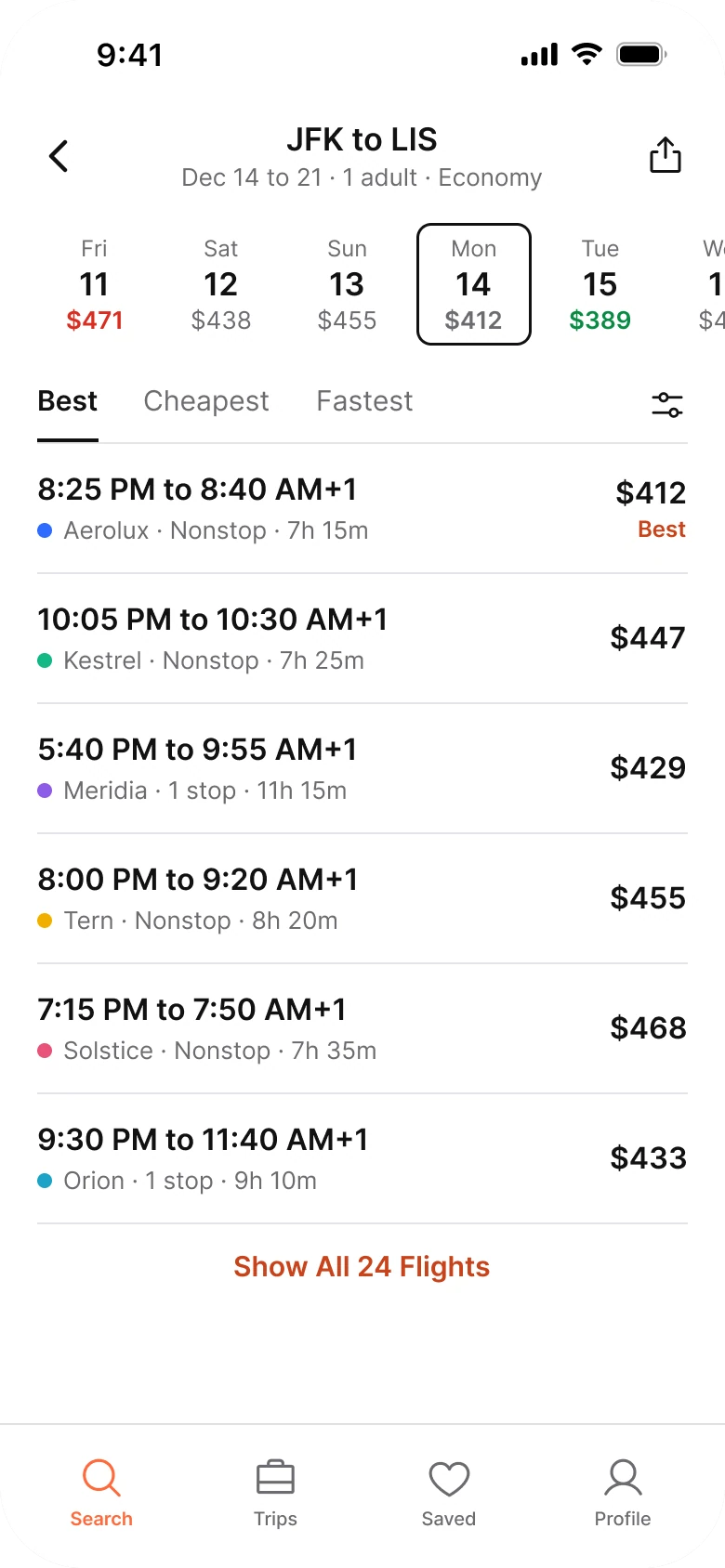
On the right, the screen reads top to bottom as the questions a traveler asks: where am I going, which day is cheapest, how do I want to rank these, and which flight. One orange accent is left, on the active tab and on "Best", and the colors green and red mean cheap and dear.
What changed, measured
| Junior draft | Fixed | |
|---|---|---|
| Trip summary | A 10 px line in a gray bar | "JFK to LIS" at 17 pt over a 13 pt grey line |
| Header | Wordmark, title and share | Back, trip and share |
| Promo | A red all-caps banner, "40% off" | A strip of days with a price under each |
| Filters | Six 10 px chips and a dropdown | Three text sorts, filters behind one icon |
| Rows | Boxed, with a 22 px SELECT in 9 px caps | Flat, a hairline, the whole row is the tap |
| Price | "$412.00" | "$412" |
| Tab bar | Five tabs, mixed filled and outline icons | Four tabs, one outline style |
| Margins | 14 left and 12 right | 20 on both sides |
| Text sizes | 9 to 15 px | 13 to 17 pt |
Fix 1: put the trip on top, in two lines
Before

After

A header with a back arrow, a contrail wordmark, the title Flights and a share icon above a gray bar reading JFK - LIS | 12/14/2026 - 12/21/2026 | 1 Adult | Economy with an orange Modify link, against a header with a back arrow, JFK to LIS in large type, Dec 14 to 21 · 1 adult · Economy in grey under it, and a share icon.
The draft says "Flights" in the title, which the person already knows, then repeats the trip in a second bar at 10 px, with slashes and pipes between the values. Dates written as 12/14/2026 have to be decoded, and a pipe between every fact makes each one look equally unimportant.
The fix makes the trip itself the title. "JFK to LIS" is what the person searched for, so it is what the screen says, and the dates, passengers and cabin sit under it in one quiet line. The wordmark left, because the brand is not what this screen is for. Modify did not go away: tapping the trip title opens the search again.
Rule to reuse: let the title be the thing the person asked for, and cut every word they already know.
Fix 2: replace the promo with the real saving
Before

After

A full width red banner reading UP TO 40% OFF FLIGHTS!!! BOOK NOW in white capitals, against a row of day tiles, Fri 11 $471 in red, Sat 12 $438, Sun 13 $455, Mon 14 $412 selected in a dark outline, Tue 15 $389 in green and Wed 16 running off the right edge.
The banner is the largest block of color on the screen and it promises a discount "up to" 40% that none of the six rows below it shows. It also pushes the flights further down. A promise with three exclamation marks is not information.
The strip does what the banner pretended to do. Each tile holds a weekday, a date and the lowest price that day, so the cheaper trip is visible without opening anything: Tuesday at $389 is $23 under Monday's $412, and Friday at $471 is the dearest day. Green marks the cheapest and red the priciest, and the selected day gets a 1.5 px ink border instead of a fill, so the colors keep their one meaning. The strip runs off the right edge on purpose: the cut-off tile tells the thumb it scrolls.
Rule to reuse: show the saving as data inside the flow, and not as a banner on top of it.
Fix 3: three sorts instead of six chips
Before

After

Six outlined chips, Non-stop, 1 Stop, Price, Times, Airlines and Bags, above a line reading Sort by: Recommended with a chevron and 24 results on the right, against three text tabs, Best underlined, Cheapest and Fastest, and a small sliders icon on the right edge.
Six chips at 10 px mix two different jobs. Non-stop, 1 Stop, Airlines and Bags narrow the list, while Price and Times reorder it. The person has to work out which is which before they tap, and "Sort by: Recommended" then sits underneath as a second ranking control.
Travelers mostly want one of three rankings: the best overall, the cheapest, or the fastest. Those become tabs, written as text, with a 2 px underline on the active one. "Recommended" became "Best", which says what you get. The six chips did not vanish: they open from the sliders icon, which is where filters live in most apps people already use.
Rule to reuse: keep the one or two controls most people use in the open, and move the rest one tap away.
Fix 4: lead every row with the times
Before
After
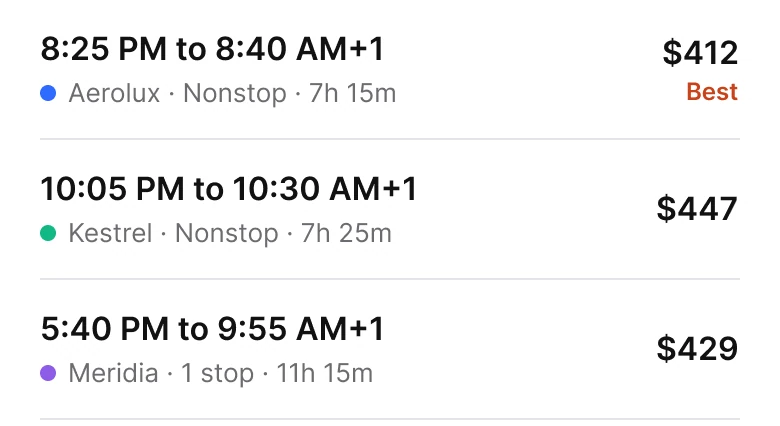
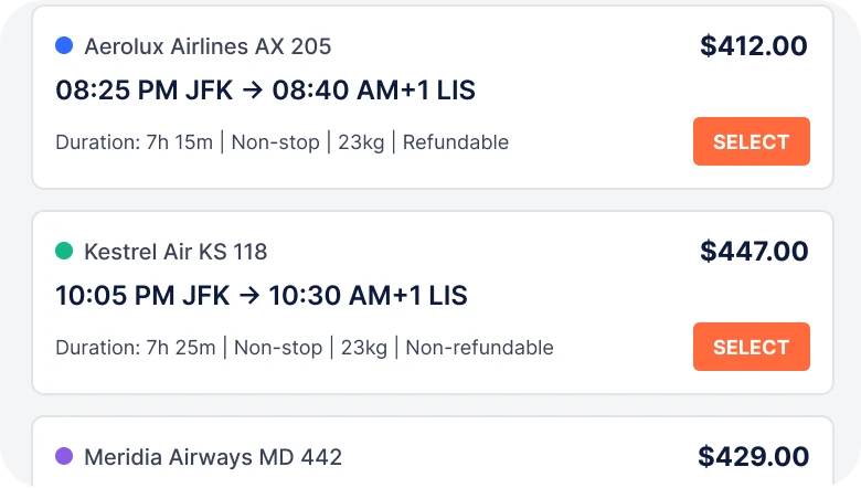
Three boxed rows, each with a colored dot, an airline name and flight number, a price with cents, a line like 08:25 PM JFK → 08:40 AM+1 LIS, a 9 px Duration, stops, bag and refund line and an orange SELECT button, against three flat rows separated by hairlines, each with 8:25 PM to 8:40 AM+1 in bold, a colored dot with the airline, Nonstop and 7h 15m in grey under it, and the price on the right with Best in orange under the first.
Comparing flights means comparing times and prices. In the draft, the first line of each row is the airline and a flight number, AX 205, which nobody chooses by, and the times come second. The duration, stops, bags and refund terms then share one 9 px line, and every row gets a button of its own, so six rows carry six identical orange blocks.
The fix reorders each row by what people compare. The times come first in bold, the airline, stops and duration follow in grey, and the price sits on the right at the same size as the times, so a column of prices reads down the screen.
The button is gone because the whole row is the tap. Cards became hairlines, so the six flights read as one list and not six boxes. "Best" is marked once, on the first row, in the accent color.
Rule to reuse: order a row by the way people compare, not by the way the database stores it.
The smaller fixes
- Every function stays. Modify opens from the trip title. Filters open from the sliders icon. Bags and refund terms are inside the row. The other flights open from "Show All 24 Flights".
- The same flights on both sides. The airlines, times and prices match, so you are comparing layout and nothing else. The airlines are made up and carry a colored dot, not a logo.
- Prices without cents. "$412.00" became "$412". Flight fares are whole numbers to the eye, and two extra digits at the end of every price add noise.
- Times in 12 hour form without a leading zero. "08:25 PM" became "8:25 PM".
- A white ground and 20 px margins. The draft used 14 on the left and 12 on the right. The fixed screen uses 20 on both sides.
- Four tabs, one icon style. The draft had five tabs with mixed filled and outline icons. The Deals tab is gone because the date strip does its job, and every icon is outline.
- Text from 13 to 17 pt. The draft ran from 9 to 15 px, most of the screen at 10.
Audit your own results screen
| Question | Why it matters |
|---|---|
| Is the title the thing the person searched for? | "JFK to LIS" beats "Flights" |
| Does a discount banner sit above the results? | It pushes the flights down and promises what the rows do not show |
| Can you see the cheapest day without leaving the screen? | A price by day strip answers it in one glance |
| Are there more than three controls in the open? | Group the rest behind one icon |
| What does each row start with? | Start with what people compare |
| Does every row have its own button? | Make the whole row the tap |
| Are prices aligned on one edge? | A column reads faster than a scatter |
Get the Figma file
The free file has the junior draft, the fixed screen and every part as a component.
Free Figma file
Flight results screen redesign, before and after
Both screens and every part as a Figma component. Free, view only, duplicate it to your drafts.
FAQ
How should a flight results screen be designed?
In the order the traveler decides: the trip, the day, the ranking, then the flight. Use a title like "JFK to LIS", a strip of days with prices, three sorts, and flat rows that lead with the times.
What should a flight search results page show first?
The trip the person searched for, in plain words, and then the prices of the nearby days. A promo banner above the flights delays the one thing they came to compare.
How do you design a price calendar for flights?
Use a horizontal strip of tiles, each with a weekday, a date and a price. Color the cheapest green and the dearest red, mark the selected day with a border, and let the strip run off the edge so it reads as scrollable.
How many filters should a flight results screen show?
Keep the two or three most used in the open, here Best, Cheapest and Fastest as sorts, and put stops, times, airlines and bags behind a filter icon.
What should each flight row show?
The departure and arrival times, the airline, the number of stops, the duration and the price. Lead with the times and the price, because those are what people compare.
Should flight results show prices with cents?
Fares are compared as whole numbers, so "$412" reads faster than "$412.00". Show the exact amount at checkout.
Sources
- Both screens are our own, designed and measured in Figma. The app, its wordmark, the airlines, flight numbers, times and prices are made up. New York is 5 hours behind Lisbon in December, so 8:25 PM plus 7h 15m lands at 8:40 AM, and December 14, 2026 is a Monday.
- Measured: before, margins 14 left and 12 right, text 9 to 15 px, a 10 px summary, a red all-caps promo, six 10 px chips, six rows with a 22 px SELECT in 9 px caps, five tabs. After, margin 20, a 17 pt title over a 13 pt line, day tiles 62 by 66 pt at radius 8, text tabs at 15 pt with a 2 px underline, six rows with 16 pt times and prices, cheapest day #0A8A43, dearest #D92D20, brand orange #FF6A3D only on the active tab and "Best".
- Patterns studied: Google Flights for the navigation, the sort tabs and the rows, and Hopper for the price calendar.
- Icons: Phosphor (MIT).
- First published as a carousel on App Brainy.
Get new papers by email
New Brainy papers in your inbox. Confirm once, unsubscribe anytime.