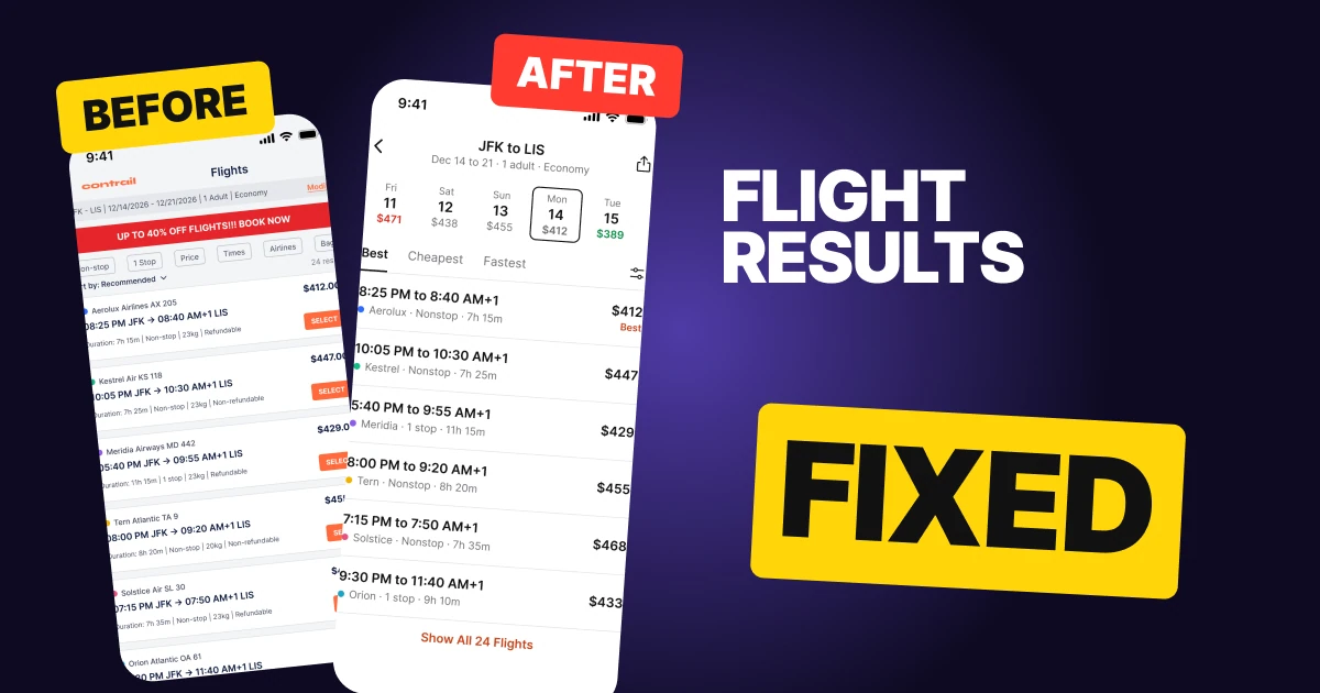
Habit Tracker App Design: A Home Screen Redesign, Before and After
A habit tracker home screen with a 10 px stats sentence and 56 tiny checkboxes, and the same screen fixed: one orange ground, a 64 px streak, seven day rings, big habit rings and a plus in the header. Every change side by side, with the free Figma file.
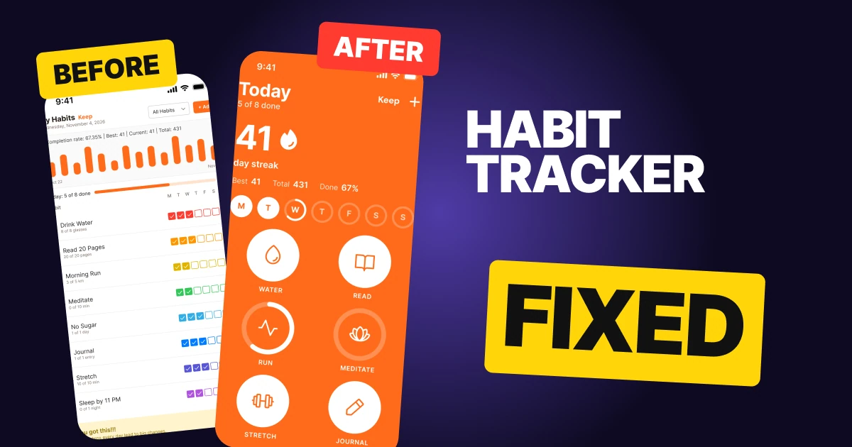
A habit tracker has one job on its home screen: make today's habits easy to do and the streak easy to feel. The first draft below has every function a habit app needs, and it still feels like homework. The stats are one tiny sentence, the habits are eight rows of seven checkboxes in eight colors, and a floating plus sits on top of a quote.
The fix keeps every function and changes how it looks. One orange ground carries the whole screen, the streak becomes the biggest thing on it, the week becomes seven rings, and the habits become big rings you can tap.
The whole screen, before and after
Junior draft
Fixed
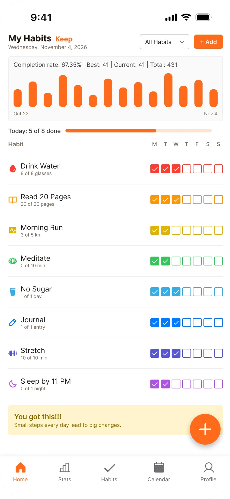
On the left, everything has the same weight. The 10 px stats line, the bar chart, the eight rows and the quote all ask for attention at once, and nothing says what matters today.
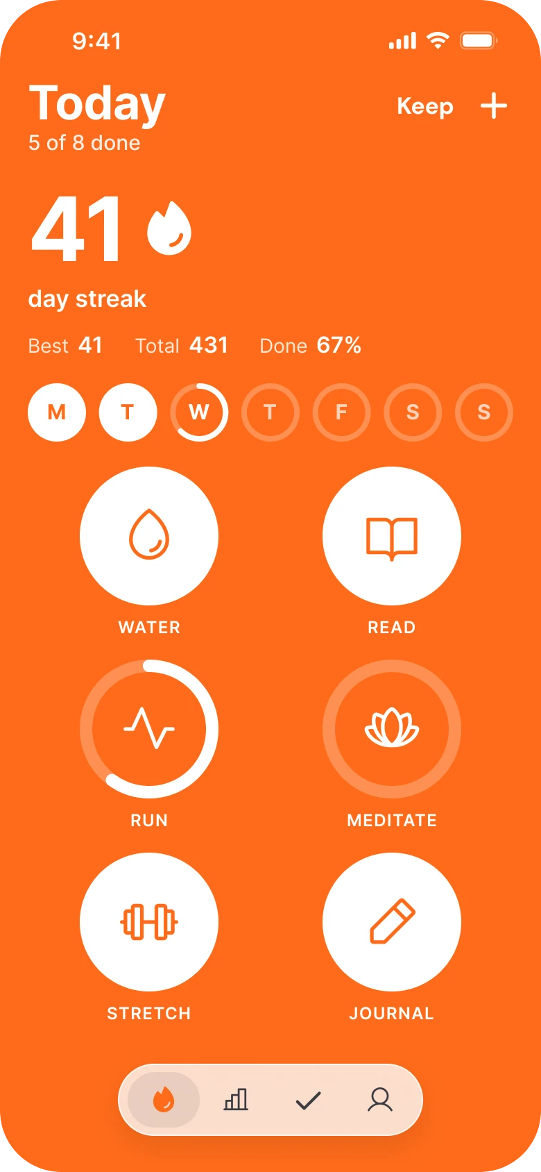
On the right, the screen reads top to bottom in the order a person thinks: what day is it, how long is my streak, how is this week going, what is left to do.
What changed, measured
| Junior draft | Fixed | |
|---|---|---|
| Stats | One 10 px sentence: completion rate, best, current, total | Streak at 64 px with a flame, Best, Total and Done on one flat line |
| Week | Letters M to S above the checkboxes | Seven 42 px rings, today's partly filled |
| Habits | Eight rows, seven 15 px checkboxes each (56 boxes) in eight colors | Six 100 px rings, one white on orange |
| Add | A text button and a 52 px floating plus over the quote | One plus in the header |
| Margins | 14 left, 12 right | 20 on both sides, 18 between blocks |
| Tabs | Five, mixed filled and outline icons | Four icons in one small capsule |
Fix 1: put the streak on the screen
Before
After
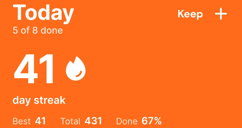
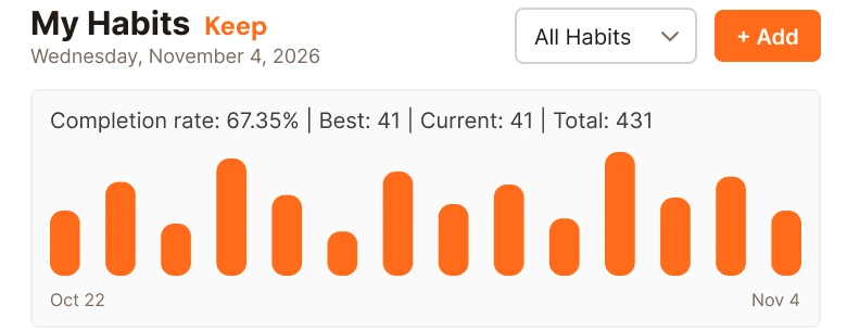
The top of the draft: My Habits with the date, an All Habits dropdown and an Add button, then a grey card reading Completion rate: 67.35% | Best: 41 | Current: 41 | Total: 431 over fourteen orange bars. Against the same top on solid orange: Today, 5 of 8 done, a plus, and a 64 px 41 with a white flame over the words day streak, with Best 41, Total 431 and Done 67% on one line.
The draft spells its numbers as a sentence at 10 px, then adds a bar chart that has no labels beyond two dates. The reader has to parse it, and the one number a habit app lives on, the streak, appears twice as "Best: 41" and "Current: 41".
The fix says it once. 41 at 64 px with a flame beside it, and the words "day streak" under it. Best, Total and Done sit on one flat line at a small size, because they are context, not the headline. The completion rate was 67.35%, and it now reads 67%, which is as precise as a person needs.
Rule to reuse: find the one number your users open the app to see, and make it the biggest thing on the screen.
Fix 2: turn the day letters into rings
Before

After

The draft: Today 5 of 8 done with a thin orange progress bar, and a row of seven small letters, M T W T F S S, over the checkbox columns. Against a row of seven rings: Monday and Tuesday filled white, Wednesday a ring that is partly filled, and Thursday to Sunday faint outlines.
In the draft, the week is a column header. To see how this week is going you have to read down a column of checkboxes, and today's progress is a separate bar above it.
The fix makes each day a 42 px ring. A full white circle is a day with everything done, a partial ring is today, and a faint outline is a day that has not happened yet. Wednesday's ring is filled to 62.5%, which is the 5 of 8 habits done today. So the "Today: 5 of 8" bar is no longer a separate element, it is the ring for today.
Rule to reuse: when a header and a progress bar describe the same thing, make the header the progress bar.
Fix 3: one big ring per habit
Before
After
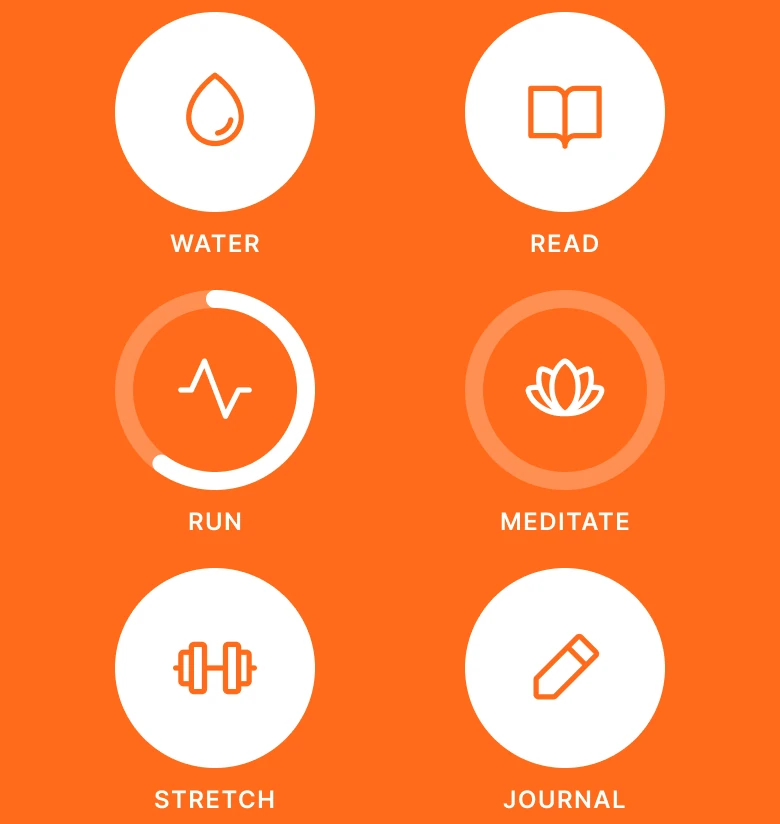
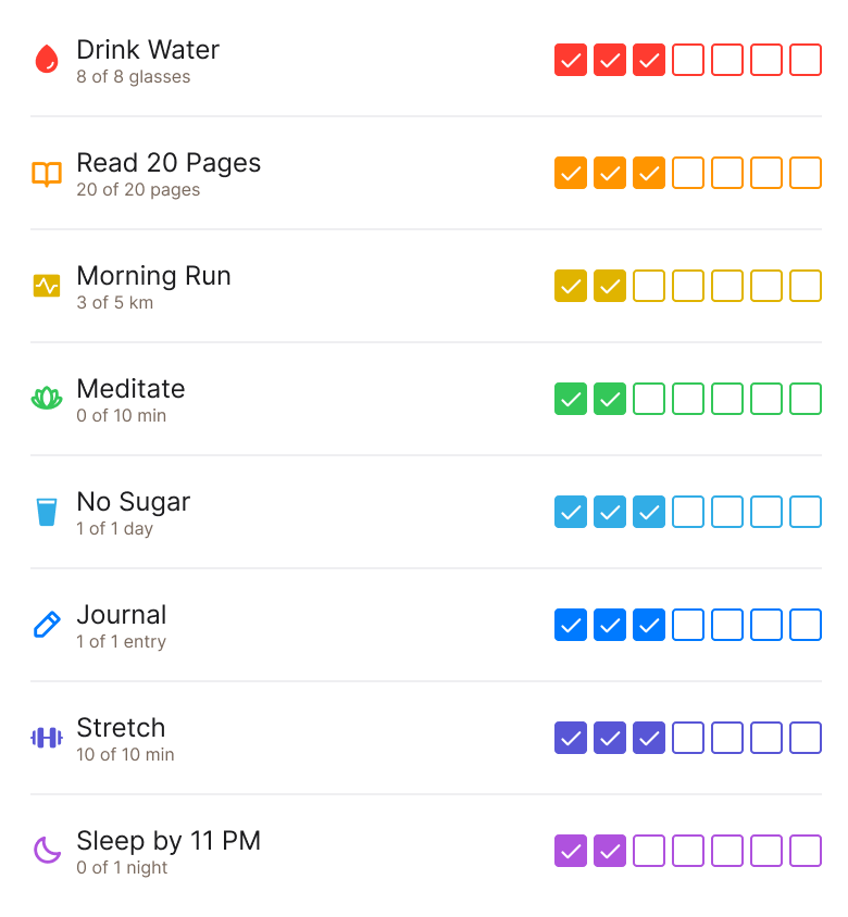
Eight habit rows, Drink Water, Read 20 Pages, Morning Run, Meditate, No Sugar, Journal, Stretch and Sleep by 11 PM, each with a small icon, a two line label and seven checkboxes in its own color, from red to purple. Against six white rings on orange in two columns: Water, Read, Stretch and Journal as full circles, Run as a 60% ring and Meditate as an empty track, each with an icon inside and a caps label under it.
This is the fix that carries the screen. The draft has 56 checkboxes, each 15 px wide, in eight colors. That is far below the 44 by 44 point minimum touch target Apple recommends, so the part you tap most is the hardest to hit. The colors add nothing either, because the label already says which row you are on.
The fix gives each habit one 100 px ring. State needs no reading: a full white circle is done, a partial ring is in progress and an empty track is not started.
Water, Read, Stretch and Journal are full. Run is 3 of 5 km, so a 60% ring. Meditate is 0 of 10 minutes, so an empty track. The labels are 12 px caps under each ring, so the screen shows six names and no sentences.
The numbers still agree. Run's "3 of 5 km" became the ring's fill, and the detail is one tap inside the habit. Nothing is lost, it moved a level down.
Rule to reuse: show state with shape, and keep text for the name. A person can read a ring in the time it takes to look at it.
Fix 4: move the plus into the header
Before

After

The bottom of the draft: a yellow card reading You got this!!! and Small steps every day lead to big changes, with a 52 px orange plus button floating over its right end. Against the new header: Today with 5 of 8 done on the left, Keep and a white plus on the right.
In the draft, the floating plus covers the end of the quote. There are also two ways to add a habit, the "+ Add" text button in the header and the floating plus, so one of them is always redundant.
The fix keeps one plus, in the header, where nothing sits under it. The quote is gone: a habit app does not need to tell someone they got this when the screen already shows a 41 day streak.
Rule to reuse: one action, one place. A floating button that covers content is paying for itself with someone else's space.
The smaller fixes
- Every function stays. The date and today's count sit in the header. Six of the eight habits show, and No Sugar and Sleep by 11 PM are the next row, one scroll down. All Habits is the Habits tab. The bar chart is on the Stats tab. The Calendar tab became the week rings.
- One margin. The draft has 14 px on the left and 12 on the right. The fixed screen uses 20 on both sides, with 18 between blocks.
- One color. A single brand orange (#FF6B1A) is the ground, and everything on it is white. The draft used eight colors for eight habits.
- Type scale. The draft runs from 8 to 15 px. The fixed screen runs Today at 34 pt, the streak at 64 pt, and 12 px labels.
- No cards, no shadows. The grey stats card and the yellow quote card are gone. Rings and spacing group the content instead.
- A smaller tab bar. Five tabs with mixed filled and outline icons become four icons in one style, inside a small capsule.
Audit your own habit screen
| Question | Why it matters |
|---|---|
| Is the streak the biggest number on the screen (ours is 41 at 64 px)? | It is the reason people open the app |
| Can you read this week without reading letters? | Rings show state faster than a column header |
| Is each habit one big target? | Small checkboxes are hard to hit |
| Does a color mean something? | Eight colors with no meaning is noise |
| Is there one way to add a habit? | Two plus buttons means one covers something |
| Is today's progress shown once? | A bar and a ring saying the same thing compete |
Get the Figma file
The free file has the junior draft, the fixed screen and every part as a component.
Free Figma file
Habit tracker redesign, before and after
Both screens and every part as a Figma component. Free, view only, duplicate it to your drafts.
FAQ
How should a habit tracker home screen be designed?
Put the streak first and large, show the current week as a row of rings, give each habit one big ring that fills as it is done, and keep a single add button in the header. A person should see how they are doing and what is left without reading.
How do you show a streak in an app?
As one big number with an icon, such as 41 at 64 px with a flame, and the words "day streak" under it. Best, total and completion rate can sit on one small line beneath.
How big should a habit checkbox or ring be?
Apple recommends touch targets of at least 44 by 44 points. The draft's 15 px checkboxes are far below that. The fixed screen uses 100 px rings for habits and 42 px rings for days.
Should a habit tracker use a different color for each habit?
Not unless the color means something. The label already names the habit, so one brand color with the ring's fill as the only variable keeps the screen calm.
Where should the add button go in a habit app?
In the header, where nothing sits under it. A floating button over the content covers the last thing in the list.
Sources
- Both screens are our own, designed and measured in Figma. The app, Keep, and all its data are made up. The numbers agree on both screens: the 41 day streak, Total 431, 67% (67.35% before), and 5 of 8 habits done today as Wednesday's ring at 62.5%.
- Touch target size: Apple Human Interface Guidelines, Accessibility, which recommends a minimum control size of 44 by 44 points.
- Pattern studied: the ring and streak patterns in Streaks.
- Icons are from Phosphor (MIT). The wordmark is DM Sans Bold. There are no photos.
- First published as a carousel on App Brainy.
Get new papers by email
New Brainy papers in your inbox. Confirm once, unsubscribe anytime.