Best Line Length for Reading on Screens: 45 to 90 Characters, Not 100%
The best line length for reading on screens is about 45 to 90 characters. Cap the column at 65ch on desktop, keep phones to one column of about 38, and give long lines more line height.
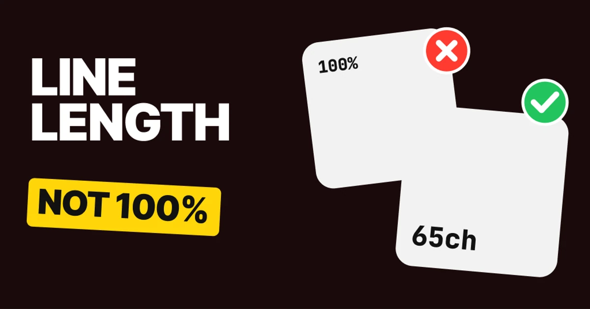
Text that runs the full width of the screen is tiring to read. The eye has to travel a long way along each line, then find the start of the next one, and on a wide line that jump is where people lose their place. The fix is a narrower column, and below are the numbers to set it with.
Why full-width text is hard to read
A line of text is a track for the eye. The reader follows it to the right edge, snaps back to the left, and has to land on the next line, not the one above or below it. The longer the track, the longer that snap-back, and the easier it is to land on the wrong line and read the same words twice.
Designers rarely feel this while designing, because the mockup is a few paragraphs on a canvas. The problem shows up on the live page, on a wide monitor, where "fill the container" quietly turns a paragraph into a ribbon.
Print solved this long ago. A paperback page is about 4 inches wide, and the text on it is set to a fixed measure. The screen has no page edge, so the measure has to be set on purpose.
Fix 1: 45 to 90 characters
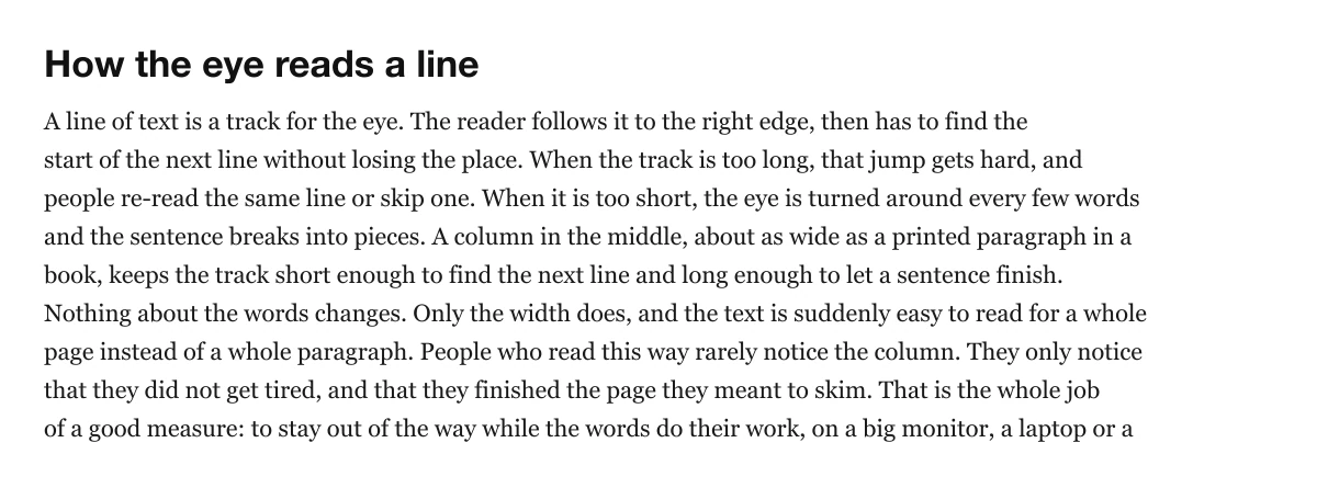
About 100 characters a line
About 65 characters a line
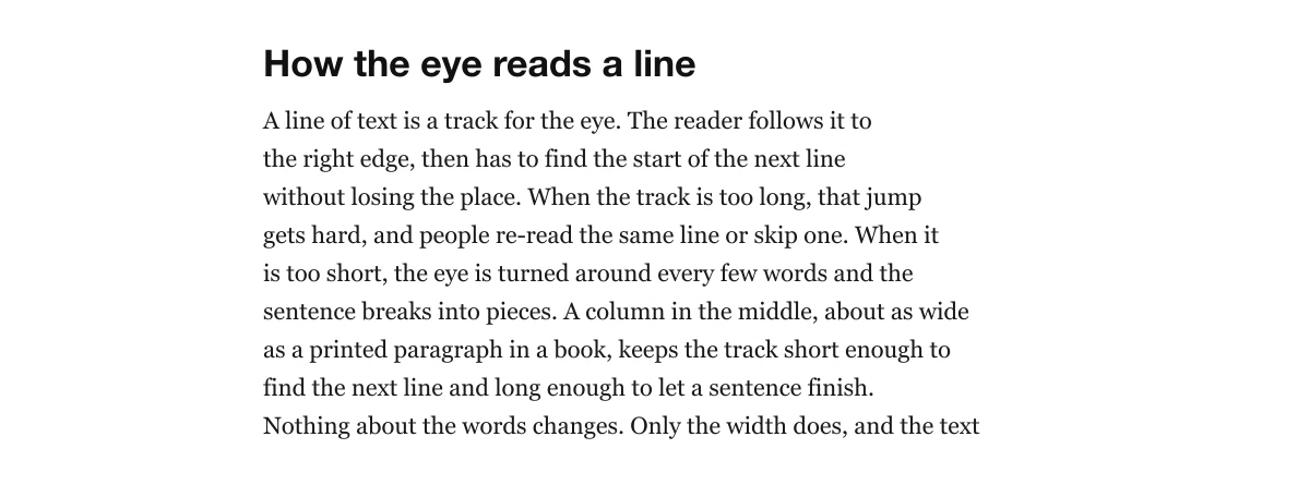
Count characters including spaces. Butterick's Practical Typography gives 45 to 90 as the range for an average line, and 60 to 75 is the common target for text people read for more than a minute. A single sentence in a card can sit anywhere in that range. An article should sit near the middle.
Measure it on your real page, in your real font, by counting a few full lines and averaging them. Do not count the last line of a paragraph, because it is short for a reason that has nothing to do with the column.
Fix 2: cap the column on desktop
Full width, about 135 characters
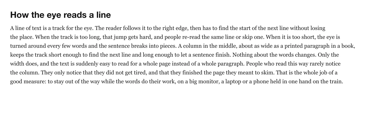
Capped at 65 characters

The long-form pages people read the most already do this. In a 1920 px wide Chrome window, we measured Wikipedia's text column at 948 px, about 89 characters a line. Lenny's Newsletter on Substack is 728 px, about 77, and MDN is 752 px, about 77. None of them runs edge to edge.
White space at the sides is not wasted. It is what lets the column be narrow. If the page feels empty, put something useful in that space (a table of contents, notes, related links), and leave the text column alone.
Fix 3: one column on a phone
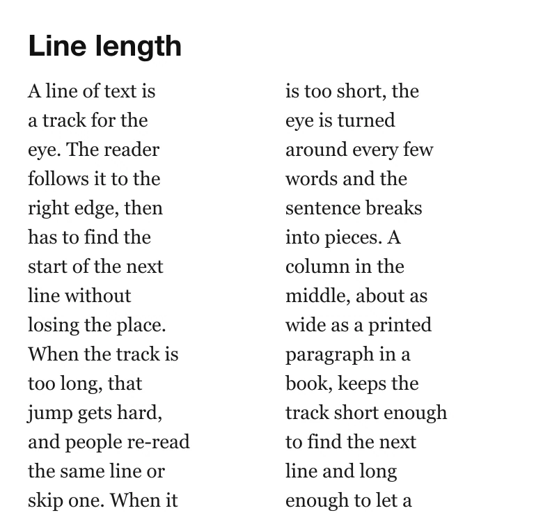
Two columns, about 16 characters
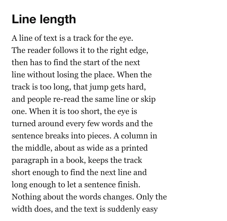
One column, about 38 characters
Short lines fail in the opposite way. The eye makes its snap-back every few words, so the reader spends the effort on the jumps and loses the sentence. Ragged breaks also leave odd gaps where a long word has to wrap alone.
On a phone, a common range is 35 to 45 characters. That is a practice number, not a standard, and it follows from the screen: a phone is narrow, text at a readable size fits roughly that many characters, and so the answer is a single column that fills the width minus a margin. Do not split it to look like a magazine.
Fix 4: longer lines need more air
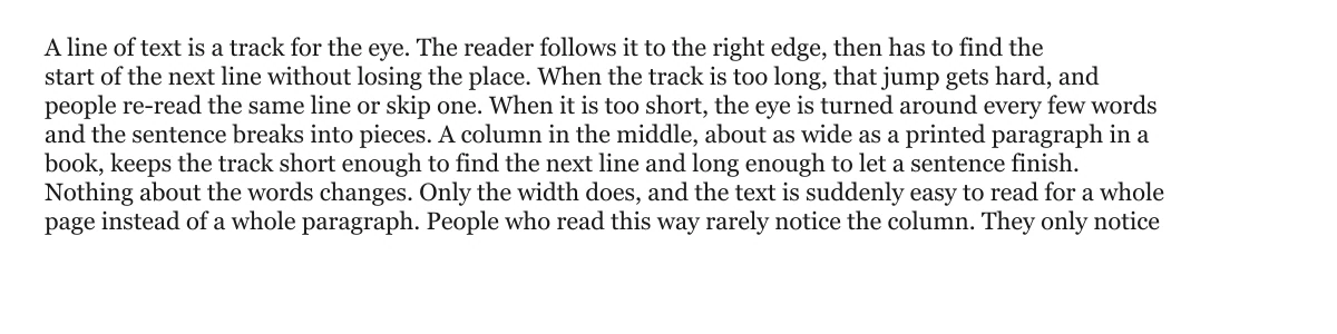
Wide text at 120% line height
Wide text at 160% line height
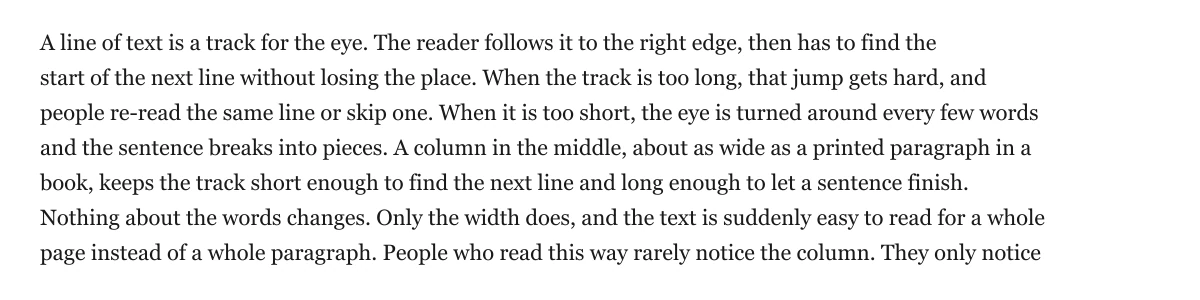
A short line can sit at 120 to 140 percent without trouble, because the next line is always close. A long line is the opposite: the eye has to cross a lot of text on the way back, and tight leading makes it easy to drop onto the wrong row.
So the two settings are linked. If you cannot narrow the column, open up the line height. If you narrow the column, you can bring the line height down a little. Treat them as one decision.
The cheat sheet
| Use | Characters a line |
|---|---|
| Long reads | 60 to 75 |
| Most text | 45 to 90 |
| Phone | 35 to 45 |
| Hard limit for long reads | 80 |
| In CSS | max-width: 65ch |
The 80-character limit comes from WCAG 2.2 success criterion 1.4.8, a AAA criterion, which asks that blocks of text are no more than 80 characters or glyphs wide. Treat it as the ceiling, not the target.
Hand this to your developer
/* Reading column: about 65 characters, centered */
.prose {
  max-width: 65ch;
  margin-inline: auto;
  padding-inline: 1rem;
  line-height: 1.6;
}

/* Phone: one column, never multi-column text */
@media (max-width: 600px) {
  .prose { column-count: 1; }
}
One catch: the ch unit is the width of the font's zero, not the average letter. In a serif with a narrow zero, 65ch can hold more than 65 letters. In Newsreader at 20 px we measured a zero 12 px wide, so 65ch held about 95 letters of running text. Use 65ch as the starting point, then count the characters on a real paragraph in your font and adjust the number until the average lands between 60 and 75.
FAQ
What is the best line length for reading on screens?
About 45 to 90 characters a line, counting spaces. For long articles, aim for 60 to 75 near the middle of that range.
What does max-width: 65ch do?
It caps the width of an element at 65 times the width of the font's zero. It is a quick way to hold a column near 65 characters, but check it against your font, because ch is not an average letter.
What is the best line length on mobile?
About 35 to 45 characters, which in practice means one column the width of the screen minus a margin. Splitting a phone into two columns leaves lines of about 16 characters, which is too short.
Does line height depend on line length?
Yes. Long lines need more line height so the eye can find the next line. On a wide line, 160 percent reads better than 120 percent.
Does WCAG set a maximum line length?
Success criterion 1.4.8, a AAA criterion, says a block of text should be no more than 80 characters or glyphs wide. It is a ceiling for long reads, not a target.
Sources
- Matthew Butterick, Practical Typography, Line length: an average line of 45 to 90 characters, spaces included. The 60 to 75 target for long reads, and the phone range of 35 to 45, are common practice rather than a standard.
- WCAG 2.2, 1.4.8 Visual Presentation: a AAA criterion, blocks of text no more than 80 characters or glyphs wide.
- MDN, the ch unit: the advance width of the zero glyph in the element's font.
- Column widths measured by us in Chrome in a 1920 px window, with characters per line estimated as text length over line count: Wikipedia 948 px, about 89; Lenny's Newsletter (Substack) 728 px, about 77; MDN 752 px, about 77. The Newsreader zero was measured at 12 px at a 20 px size.
- The sample text on this page is original and set in Georgia. Characters per line are counted on the rendered samples and are averages, leaving out each paragraph's last line.
- First published as a carousel on UX Brainy.
Get new papers by email
New Brainy papers in your inbox. Confirm once, unsubscribe anytime.