Reading Code Without Coding: A Designer's Survival Guide for 2026
A practical guide for designers who do not write code but need to read it well enough to ship in modern dev orgs. What to look at first in a JSX or TSX file, the patterns that are design decisions, the patterns to leave alone, and a 12-thing checklist any designer can run on a frontend pull request.
Reading code is a separate skill from writing it. Any designer working in a modern frontend org needs the reading skill yesterday, even if they never type a line of production JSX. The tactic is simple. Read a component file like you read a Figma file, components, variants, states, not like you read a novel.
This is the working playbook. What to look at first in a TSX file, the patterns that are pure design surface, the patterns to skim past, how to use Claude Code or Cursor as a translation layer, and a 12-thing checklist any designer can run on a frontend PR.
Reading code is a different skill from writing it
Most designers think learning to code means typing the code. That mental model is the reason so many of them avoid the codebase entirely. Writing production code takes a year of focused practice. Reading code well enough to ship takes a weekend of reframing.
The split matters because the org needs the reading skill far more than it needs another writer. A designer who can read a TSX file, spot a missing variant, and approve a PR with confidence is more valuable to a frontend team than a designer who codes mediocre React on the side.
Read a component file like a Figma file, not a novel
A JSX or TSX file is a component definition. It has the same shape as a Figma component. Props, variants, states, and a tree of children. The instinct to read top to bottom is what wrecks the experience. Code is not prose, it is structure.
The right read order is component name first, then props, then variants, then the JSX tree, then the styling. That order maps cleanly to how you read a Figma component. Name the thing, see its inputs, see its options, see its layout, see its skin. Once that order clicks, almost every component file in any React codebase becomes legible.
The five things to look at first in any TSX file
Every React component file reveals its design surface in under sixty seconds if you know what to look for. Five things, in order. The component name and where it lives. The props the component accepts. The variants those props define. The JSX tree the component returns. The Tailwind classes or styled-components on each element.
// 1. Component name and file location
// src/components/Button.tsx
export function Button({ variant, size, children }: ButtonProps) {
  // 2. Props (variant, size, children)
  // 3. Variants live in the type definition above
  // 4. JSX tree is one element here
  return (
    <button className={cn(base, variants[variant], sizes[size])}>
      {/* 5. Tailwind classes carry the styling */}
      {children}
    </button>
  )
}
Five glances. Component, props, variants, tree, classes. That is the scan. Anything else is engineering surface, skim past it.
Patterns that ARE design decisions
Five patterns in any React file are pure design surface. Variants. Conditional rendering. Layout primitives. Spacing and typography classes. Component composition. Any designer can read these, critique them, and request changes through a PR comment without writing a line of code.
The trick is recognizing them by shape. A variant looks like a string or enum prop. A conditional looks like a question mark or a logical and. A layout primitive looks like a div with flex or grid classes. Spacing looks like p-4 or gap-6. Composition looks like one component nested inside another. Five shapes, five reads.
Variants, the props that change the shape
A variant prop is a design token in disguise. Reading it well is the single highest-leverage code-reading skill a designer can build. Most component libraries define variants as a string literal type or a const object, and the values inside that object are the design system speaking out loud.
type ButtonProps = {
  variant: 'primary' | 'secondary' | 'ghost' | 'destructive'
  size: 'sm' | 'md' | 'lg'
  children: React.ReactNode
}
If you read that and the variants do not match the Figma file, you have caught a real bug before it ships. If the size scale in code is sm, md, lg but the Figma file has small, medium, large, extra-large, that mismatch is your PR comment. The design surface is right there in plain sight.
Conditional rendering, the visual states hiding in logic
Every if statement, ternary, or short-circuit in JSX is a state in the design. Most missed empty states or error states live in code that the designer never read. Learning to spot the three shapes of conditional rendering is the fastest way to find them.
// Ternary, two states
{isLoading ? <Spinner /> : <Content />}

// Short-circuit, one optional state
{error && <ErrorBanner message={error} />}

// Early return, the whole component swaps
if (!user) return <SignInPrompt />
return <Dashboard user={user} />
Three shapes. Each one is a state your design needs to cover. If your Figma file does not have a Spinner state, an ErrorBanner state, and a SignInPrompt state, the design is incomplete and the code knows it.
Layout primitives, where spacing and structure live
In a Tailwind codebase, the layout primitive is a div with class names, and reading those classes is reading the spacing system out loud. The big four are flex, grid, padding, and gap. Once you can read those, you can read any layout.
<div className="flex items-center justify-between gap-4 p-6">
  <h2 className="text-lg font-semibold">Settings</h2>
  <Button variant="ghost" size="sm">Close</Button>
</div>
Translate it. Horizontal flex, items vertically centered, space between left and right, sixteen pixel gap, twenty-four pixel padding. That is a header row, written in code. All of it is design surface.
Patterns that are NOT for designers to touch
Four patterns in a React file are engineering surface. State management with useState and useReducer. Side effects with useEffect. Async functions and data fetching. Server logic, API calls, and any code outside the component return statement. Read them, ignore them, move on.
The right move is not to be afraid of them, it is to recognize them by shape and skip past them with zero anxiety. A useState line is a hook starting with use. A useEffect block is a hook with a dependency array. An async function has the keyword async in front of it. A fetch call has fetch or a query hook. Four shapes, all engineering territory.
State, effects, and async are not your problem
useState, useEffect, async functions, and data fetching are engineering territory. The designer-best-practice is to skim past them without anxiety. Trying to edit them in a PR is how you ship a regression.
// All four shapes, all engineering surface, all skim-past
const [open, setOpen] = useState(false)

useEffect(() => {
  document.addEventListener('keydown', handleEsc)
  return () => document.removeEventListener('keydown', handleEsc)
}, [])

async function loadData() {
  const res = await fetch('/api/data')
  return res.json()
}
If a designer needs the modal to open on a different event, the right comment is a one-line note in the PR. Something like, this should open on click of the avatar, not on page load. The engineer translates that into the right hook change. The designer does not edit the useEffect.
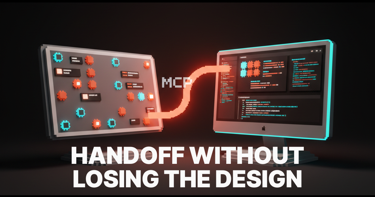
Use Claude Code or Cursor as a translation layer
AI code editors are the fastest translation layer between a designer and a codebase. The right prompts turn a confusing file into a clean component map in under two minutes. The trick is asking the right question, not asking for a code edit.
Three prompts every designer should keep in their notes. First, the component map. Open the file in Cursor or Claude Code and ask, list the props, variants, and visual states this component supports, formatted as a Figma component spec. Second, the design audit. Paste the file and ask, compare this component to the attached Figma frame and list every visual mismatch in spacing, color, or typography. Third, the conditional sweep. Ask, list every conditional render in this file and what design state each one represents.
Prompt 1: "List the props, variants, and visual states this component supports, formatted as a Figma component spec."

Prompt 2: "Compare this component to the attached Figma frame and list every visual mismatch in spacing, color, typography, or layout."

Prompt 3: "List every conditional render in this file and the design state each one represents."
Those three prompts replace ninety percent of the back-and-forth between designers and engineers in a normal handoff. Pair them with AI code editors like Cursor, Claude Code, or Windsurf and the workflow gets faster every week.
Want help leveling up your design team's code literacy and standing up the AI workflow that lets designers ship in real codebases? Hire Brainy. ClaudeBrainy ships Claude Skills as a Skill pack and prompt library that gets the model layer right, and AppBrainy ships full product delivery for teams that want their designers reading PRs, not avoiding them.
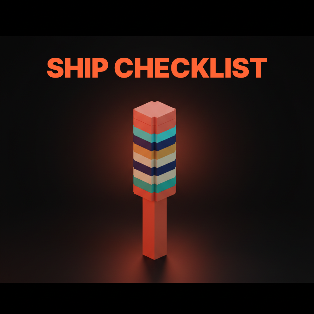
The 12-thing PR checklist for designers
Twelve things any designer can check on a frontend pull request before it merges. No coding required. Run them top to bottom on any component PR and ninety percent of the design issues that survive into production get caught.
- Component name matches the Figma component name.
- Props list matches the Figma variants and properties.
- Variant values in code match the design system token names.
- Size scale in code matches the design system size scale.
- Color classes reference design tokens, not raw hex values.
- Spacing classes match the spacing scale, not arbitrary numbers.
- Typography classes match the type scale.
- Every conditional render maps to a designed state.
- Loading state has a designed Spinner or skeleton.
- Error state has a designed ErrorBanner or message.
- Empty state has a designed empty placeholder.
- Hover, focus, and disabled states are visible in the code.
Twelve checks. No coding. The list lives in your PR review template and gets faster every time you run it.
What to do when the code disagrees with the design
When the code does not match the Figma file, the right move is almost never to argue. It is to ask one specific question. Was the deviation intentional, and if yes, can we update the Figma file to match.
Half the time the deviation is a real engineering reason. The component had to handle an edge case the Figma file ignored, or the design token did not exist yet, or the engineer found a better pattern. The Figma file should update to match. The other half of the time the deviation is a missed detail and the code should update. Asking the question first is what keeps the design handoff loop from turning adversarial.
FAQ
Do designers need to learn to code in 2026?
No. Designers need to learn to read code. Reading and writing are different skills. Reading code well enough to review a PR and collaborate on a frontend feature takes a weekend of reframing. Writing production code takes a year. The reading skill is what the org actually needs.
What is the easiest way for a designer to start reading code?
Open one component file in your team's codebase, ideally a Button or Card. Run the five-glance scan. Use Cursor or Claude Code to ask for a Figma-style component spec of that file. Repeat with three more components. By the fourth file, the patterns repeat and the codebase starts to feel readable.
Should designers edit code in pull requests?
Almost never. Read the code, leave specific PR comments, let the engineer make the edit. The exception is small visual tweaks like changing a Tailwind class on a non-stateful element. Anything touching useState, useEffect, async, or server logic should be a comment, not a commit.
Is React the only thing designers should learn to read?
For most modern product orgs, yes. React with TSX and Tailwind covers the majority of frontend codebases shipping in 2026. If your org runs Vue, Svelte, or SwiftUI, the patterns translate cleanly, components, props, variants, conditional rendering, and styling primitives are universal across modern UI frameworks.
What about HTML and CSS, do designers still need those?
Yes, as a baseline. A designer who can read semantic HTML and recognize the box model, flex, and grid in CSS will read Tailwind faster, since Tailwind is just utility classes mapped to those properties. Try vibe coding a small static page once, then return to reading.
The shift code literacy actually unlocks
A designer who can read code is not closer to becoming a developer. They are closer to shipping the work. That shift is the whole pitch. The work that survives into production matches the design more often, the handoff gets faster, and the conversation with engineering moves from translation to collaboration.
Most design teams still treat the codebase as engineering territory. The teams pulling ahead treat it as a shared surface where the design lives in TSX as much as it lives in Figma. The first treatment ships a design that gets watered down. The second ships the design that was actually drawn.
If your team is investing in design quality and the codebase is still a black box for the designers, the codebase is the bottleneck. Pick one component a week, run the five-glance scan, leave one PR comment, and the muscle builds itself.
If you want help leveling up your design team's code literacy, hire Brainy. ClaudeBrainy ships Skill packs and prompt libraries that get the model layer right. AppBrainy ships full product delivery for teams that want their designers reading PRs, not avoiding them.
Want help leveling up your design team's code literacy and standing up the AI workflow that lets designers ship in real codebases? Brainy ships ClaudeBrainy as a Skill pack and prompt library plus AppBrainy as full product delivery for teams that want their designers reading PRs, not avoiding them.
Get Started