
Packaging Design Identity: जब शेल्फ ही आपका एकमात्र बिलबोर्ड हो
बिना sales pitch के बिकने वाली packaging कैसे डिज़ाइन करें। वे structural, material और visual निर्णय जो लोगों को शेल्फ से आपका product उठाने पर मजबूर करते हैं, न कि उसके बगल वाले को।
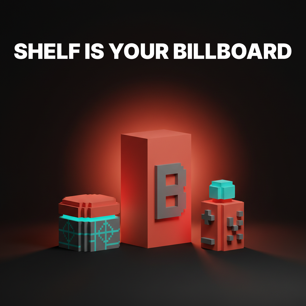
आपकी packaging के पास लगभग तीन सेकंड हैं। यही वह खिड़की है जो एक कस्टमर के शेल्फ scan करने और product उठाने के बीच होती है। उस खिड़की में, आपकी packaging को यह बताना होता है कि product क्या है, किसके लिए है, और यह अपने बगल की हर चीज़ से ज़्यादा ध्यान क्यों deserve करता है।
कोई headline नहीं। कोई sales pitch नहीं। कोई 30-सेकंड की elevator speech नहीं। बस shape, color, material और type एक साथ इतनी तेज़ी से काम करते हैं कि वह निर्णय जीत सकें जो कस्टमर को पता भी नहीं चलता कि वह ले रहा है।
यही packaging design identity है। और यह design की सबसे कठिन disciplines में से एक है क्योंकि constraints बेरहम हैं और गलती की गुंजाइश शून्य है।
Packaging Identity, Label Design नहीं है
Packaging में सबसे आम गलती यह है कि package को सजाने की सतह की तरह treat करना। एक box पर logo चिपकाओ, कुछ product photography जोड़ो, एक अच्छा color चुनो, हो गया।
यह label design है। Packaging identity वह पूरा system है structural, material और visual निर्णयों का जो किसी product को हर format में पहचाने जाने योग्य बनाता है: शेल्फ, e-commerce thumbnail, unboxing video, social media post और कस्टमर की रसोई का काउंटर।
एक असली packaging identity परिभाषित करती है:
- Structural form. Package की physical shape और dimensions।
- Material palette. Kraft paper, matte board, glass, aluminum, compostable film। हर material एक signal भेजता है इससे पहले कि कस्टमर एक शब्द पढ़े।
- Color system. Brand colors किस तरह product variants, SKUs और seasonal editions से map होते हैं।
- Typography hierarchy. कौन सा text किस size पर दिखता है, और तीन फुट की दूरी से पहले क्या पढ़ा जाता है।
- Image strategy. Photography, illustration, pattern या कुछ नहीं। हर choice brand को अलग तरह से position करती है।
- Tactile experience. Embossing, foil, spot UV, soft-touch lamination। हाथ में package कैसा feel होता है।
इनमें से कुछ भी skip करें और आपके पास एक सजाया हुआ container है, packaging identity नहीं।
तीन फुट का नियम
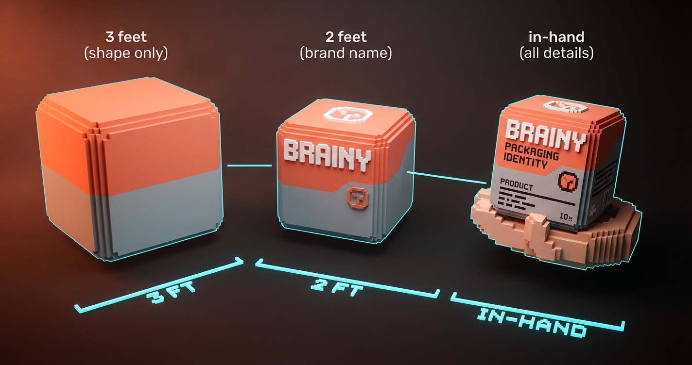
अगर आपकी packaging तीन फुट की दूरी से communicate नहीं करती, तो यह शेल्फ पर fail है। यह metaphorical नहीं है। Grocery store की aisles इस तरह design की जाती हैं कि customers शेल्फ से लगभग तीन फुट दूर खड़े हों। उस दूरी पर, आपका कस्टमर color blocks, shapes और शायद एक-दो शब्द देखता है। और कुछ नहीं।
तीन फुट पर क्या काम करता है:
- High-contrast color. सफेद boxes से भरी dark शेल्फ पर coral accent वाला single black box miss करना impossible है।
- Distinctive silhouette. Method soap bottles इसलिए भी बिकती हैं क्योंकि उनकी shape शेल्फ के हर दूसरे soap से पहचाने जाने योग्य रूप से अलग है। Label पढ़ने की ज़रूरत नहीं।
- एक dominant text element. Brand name या product name। दोनों एक ही scale पर नहीं। एक को dominate करने के लिए चुनें।
- SKU के अनुसार Color blocking. जब line में multiple variants हों, तो हर variant को एक ऐसा color चाहिए जो दूरी से अलग पढ़ा जाए। Oatly यह perfectly करता है। आप store के उस पार से oat milk को barista edition से और chocolate से अलग कर सकते हैं।
तीन फुट पर क्या fail करता है:
- Detailed illustrations जो दूरी से noise बन जाती हैं
- Multiple competing text hierarchies
- Muted, low-contrast palettes जो शेल्फ में घुल जाते हैं
- Clever design जिसे समझने के लिए close inspection की ज़रूरत होती है
Material पहले कहानी सुनाता है
Color से पहले, typography से पहले, किसी भी graphic element से पहले, package का material expectations सेट करता है। कस्टमर kraft paper box उठाता है और artisan, natural, honest की उम्मीद करता है। कस्टमर glossy rigid box उठाता है और premium, luxury, gift-worthy की उम्मीद करता है।
Material के signals:
| Material | Signal | सबसे उपयुक्त |
|---|---|---|
| Kraft paper | Natural, artisan, sustainable | Organic food, handmade goods, eco brands |
| Matte board | Modern, premium, restrained | Beauty, tech accessories, specialty food |
| Glossy board | Mass market, vibrant, confident | Beverages, snacks, consumer electronics |
| Glass | Premium, preserving, ritual | Spirits, skincare, candles |
| Aluminum | Industrial, modern, portable | Beverages, supplements, personal care |
| Soft-touch laminate | Luxury, tactile, intimate | High-end cosmetics, jewelry, spirits |
Packaging में जीतने वाले brands एक ऐसा material चुनते हैं जो उनकी positioning से align हो और उसके प्रति committed रहते हैं। Aesop का amber glass उनकी typography जितना ही उनकी identity का हिस्सा है। Apple का white rigid board with magnetic closure packaging as brand experience है।
Product Lines के लिए Color System
Single-product brands के लिए यह आसान है। अपना brand color चुनो, package पर लगाओ, हो गया। Multi-SKU brands को एक कठिन समस्या का सामना है: हर product को एक ही family का हिस्सा दिखाते हुए तुरंत पहचाने जाने योग्य कैसे बनाएं।
वह system जो काम करता है:
सभी SKUs में एक element fix करें (आमतौर पर brand mark placement, typography layout और structural format)। प्रति SKU एक element vary करें (आमतौर पर color band, background color या accent stripe)। बाकी सब identical रखें।
Oatly layout, illustration style और brand mark position fix करता है। Background color variant के अनुसार बदलता है। आप तुरंत जानते हैं कि यह Oatly है, और तुरंत जानते हैं कि कौन सा variant है। एक system, दो काम।
System को क्या तोड़ता है:
- SKUs के बीच layout structure बदलना
- प्रति variant completely अलग illustration या photography styles उपयोग करना
- Variant color को brand color पर हावी होने देना
- बाकी line को update किए बिना hero SKU redesign करना
शेल्फ Scale पर Typography
Packaging typography, digital typography से अलग नियमों का पालन करती है। Screen पर, आप viewing distance control करते हैं। शेल्फ पर, नहीं।
Hierarchy:
- Brand name. सबसे बड़ा या सबसे distinctive element। कम से कम तीन फुट से readable।
- Product name या variant. Hierarchy में दूसरे। दो फुट से readable।
- Key benefit या descriptor. तीसरे। हाथ में readable।
- Regulatory और detail text. सबसे छोटे। केवल पास से readable।
Packaging type के नियम:
- Sans-serif दूरी पर तेज़ पढ़ी जाती है। इसे three-foot elements के लिए उपयोग करें।
- Serif personality और premium feel जोड़ती है। इसे in-hand elements के लिए उपयोग करें।
- All-caps shelf distance पर छोटे brand names के लिए काम करता है। दो शब्दों से लंबी किसी भी चीज़ के लिए fail करता है।
- Packaging पर Tracking (letter spacing) screen की तुलना में looser होनी चाहिए। Print substrates और viewing angles legibility को कम करते हैं।
- अगर आप इसे arm's length पर नहीं पढ़ सकते, तो शेल्फ shopper के लिए यह exist नहीं करता।
Unboxing Layer
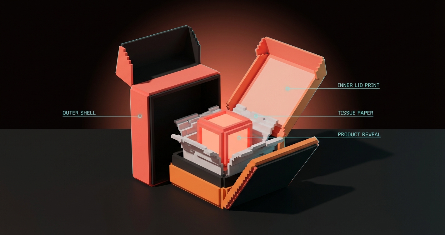
E-commerce ने packaging identity को बदल दिया। शेल्फ अब एकमात्र stage नहीं है। Unboxing experience content है। लाखों लोग खुद को products खोलते हुए film करते हैं, और आपके package का interior अब एक brand touchpoint है जो उन audiences तक पहुंचता है जिनकी आपने कभी plan नहीं की थी।
Unboxing layer को क्या चाहिए:
- एक reveal moment. Tissue paper, printed inner lid, एक pull tab जो product expose करे। कुछ ऐसा जो खोलने और देखने के बीच एक beat बनाए।
- Brand reinforcement. Box का inside, box के outside जैसा feel होना चाहिए। Same color system, same typography, देखभाल का same स्तर।
- एक shareable detail. Printed message, pattern, hidden illustration। कुछ photo लेने योग्य। Glossier का pink bubble wrap pouch उनकी अधिकांश actual packaging से ज़्यादा iconic हो गया।
आप अब केवल कस्टमर के लिए design नहीं कर रहे। आप कस्टमर के camera के लिए design कर रहे हैं।
Sustainability वैकल्पिक नहीं है
Consumers packaging materials पढ़ रहे हैं। "100% recyclable" अब marketing line नहीं है। यह एक purchase filter है। Excessive plastic, non-recyclable coatings या छोटे products के लिए oversized packaging उपयोग करने वाले brands को real backlash का सामना करना पड़ता है।
व्यावहारिक कदम:
- जहां संभव हो mono-material construction उपयोग करें। पूरी तरह paperboard का box recyclable है। जो box paperboard को plastic window, foil laminate और plastic tray के साथ mix करता है, वह नहीं।
- Package को सही आकार दें। हवा ship करना बर्बादी है। Amazon का frustration-free packaging program इसलिए exist करता है क्योंकि customers ने oversized boxes की शिकायत की।
- Sustainability को visible बनाएं। अगर packaging compostable है, तो package पर बताएं। अगर ink soy-based है, तो mention करें। Sustainability जो कस्टमर देख नहीं सकता, purchase decision को प्रभावित नहीं करता।
FAQ
Packaging design की लागत कितनी है?
Single SKU के लिए custom packaging design आमतौर पर structural complexity और identity system के scope के आधार पर $2,000 से $15,000 तक होती है। Structural engineering, prototyping और production management के साथ multi-SKU systems $10,000 से $50,000 या उससे अधिक तक जाती है।
Packaging design और label design में क्या अंतर है?
Label design उन graphics को बनाती है जो existing package format पर apply होते हैं। Packaging design पूरे system को cover करती है: structural form, material selection, graphics, typography और production specifications। Label design, packaging design की एक layer है।
अपनी packaging को शेल्फ पर कैसे अलग करें?
तीन फुट के नियम पर focus करें: high-contrast color, distinctive shape और एक dominant text element। Competitors के साथ तीन फुट दूर से अपनी packaging की photograph लेकर test करें। अगर आप अपने product को तुरंत identify नहीं कर सकते, तो design को और contrast की ज़रूरत है।
सिर्फ Box नहीं, पूरा System Ship करें
एक package एक project है। Packaging identity system एक asset है जो हर SKU, हर seasonal edition, हर market में scale होती है जिसमें आप enter करते हैं। पहले system बनाएं, box बाद में। आपका भविष्य का self, आपकी production team और आपके customers आपको धन्यवाद देंगे।
Ready to build packaging that moves product? Let's design it.
Get Started