Grocery App Design: A Home Screen Redesign, Before and After
A grocery app that looks like a Sunday flyer, and the same home screen fixed: a short header, one promo card, product categories and clean deal tiles. Every change side by side, with the free Figma file.
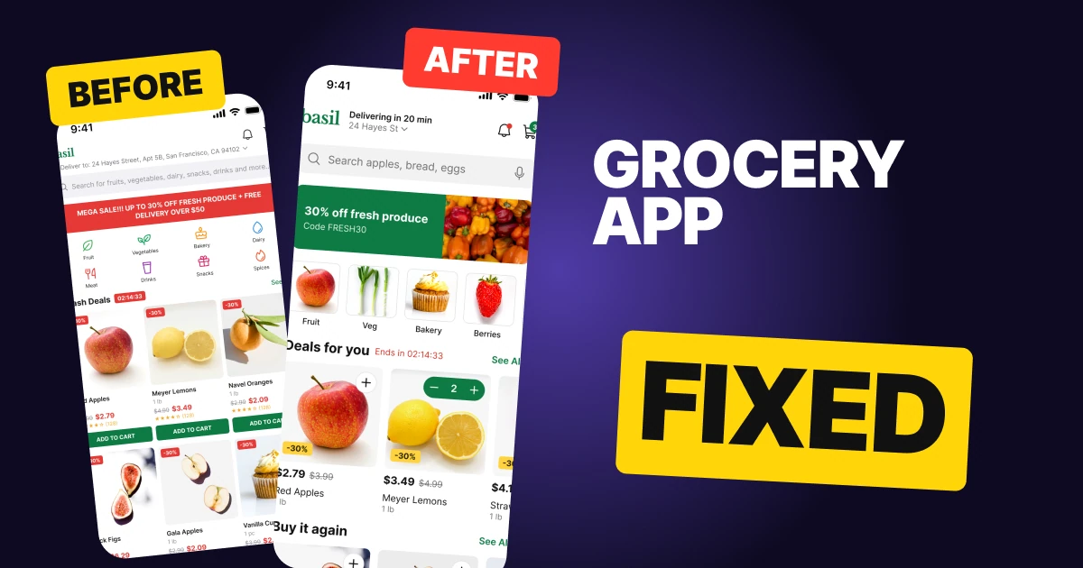
A grocery app has a lot to say on one screen: an address, a promise, a sale, a dozen aisles and a row of deals. The first draft below says all of it at the same volume, so it reads like a Sunday flyer. A full address runs across the top, a red banner shouts over everything, eight small categories compete, and every product card ends in an ADD TO CART button.
The fix keeps every function and gives each block one job. The header leads with the delivery promise, the sale becomes one green card, the aisles become real products, and each deal gets a clean tile with the price first.
The whole screen, before and after
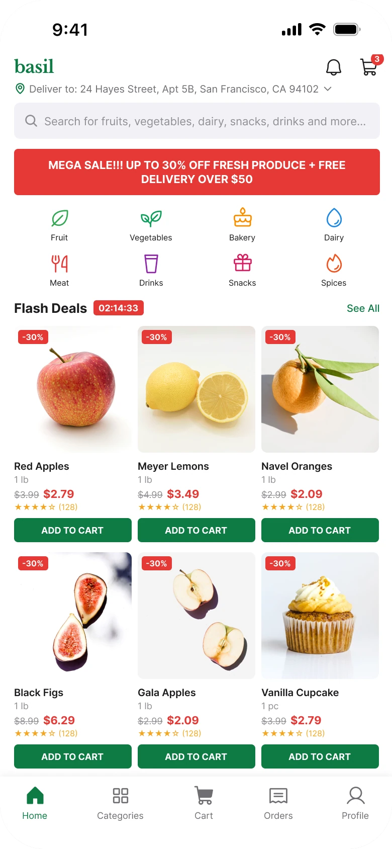
Junior draft
Fixed
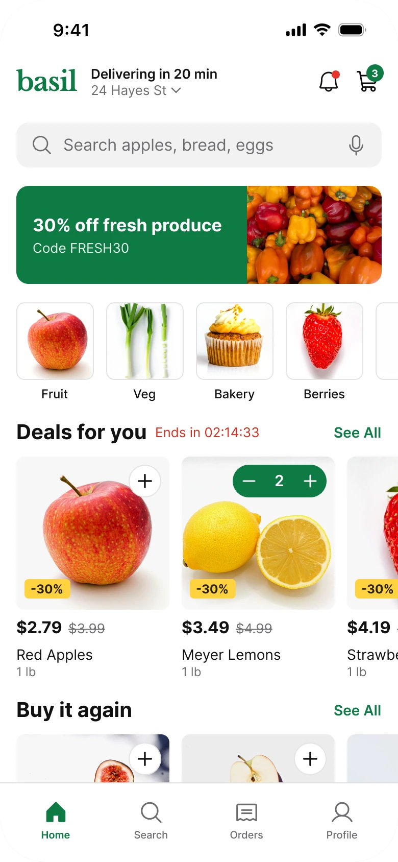
On the left the eye has nowhere to land. The banner is the loudest thing, the red timer is the second loudest, and the product photos, the actual groceries, sit at the bottom in a grid of small cards that all look the same.
On the right the order is clear: where and how fast, what to search, the one offer, what to browse, then what is on sale. Green is the only accent. Red shrinks to two small signals, the dot on the bell and the countdown text, and the photos do the talking.
What changed, measured
| Junior draft | Fixed | |
|---|---|---|
| Side margins | 14 left, 12 right | 16 on both sides |
| Text sizes | 8 to 13 px | 12 to 20 px, three sizes per block |
| Header | Full address, bell, cart | Promise, short address, bell with a dot, cart with a count |
| Search | A smaller bar, no mic | 358 x 44, with a mic |
| Offer | Red banner, 11 px bold caps | 358 x 96 green card, one headline, a 132 px photo |
| Categories | Eight icons in eight colors, 8 px labels | A row of 76 px product photos, four in view and the next one cut off |
| Deal cards | 117 px wide, three per row, a 24 px button each | 150 px tiles, one price line, one plus |
| Tabs | Five, mixed filled and outline icons | Four, one filled for the current tab |
| Red | Banner, timer chip, tags, prices, cart badge | Two small signals only, the bell dot and the countdown text |
Fix 1: lead with the promise, shorten the address
Before
After
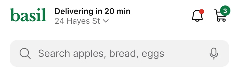
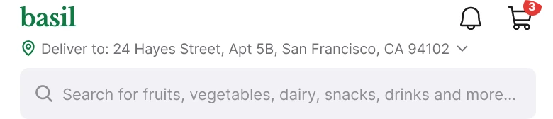
A small green basil wordmark with a bell and a cart with a red badge above a gray line reading Deliver to: 24 Hayes Street, Apt 5B, San Francisco, CA 94102 with a chevron and a search bar below, against a larger basil wordmark beside Delivering in 20 min in bold and 24 Hayes St in gray with a chevron, a bell with a small red dot and a cart with a green count badge, above a taller search bar with a microphone.
The draft header spends its best space on the least useful thing: a full postal address nobody needs to re-read every time they open the app. It also carries a label, "Deliver to:", that the pin icon already says.
The fix puts the reason to stay first. "Delivering in 20 min" is the promise, set in bold, and the address shrinks to the part a person recognizes, "24 Hayes St", with a chevron that opens the rest. The wordmark grows, the bell gets a plain dot instead of a count, and the cart keeps its number in the brand green.
Rule to reuse: show the part of an address people use to check it is right, and put the rest one tap away.
Fix 2: one offer, one card, one code
Before

After
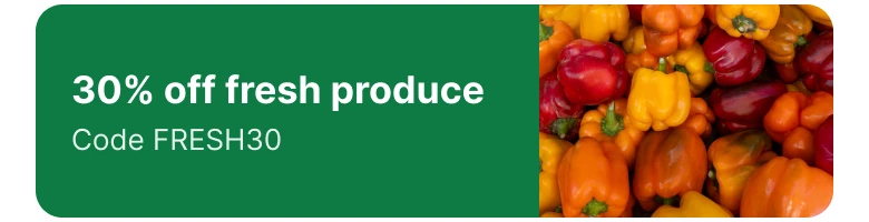
A full-width red banner with white bold capitals on two lines reading MEGA SALE!!! UP TO 30% OFF FRESH PRODUCE + FREE DELIVERY OVER $50, against a solid green card with 30% off fresh produce in white, Code FRESH30 under it, and a photo of red, orange and yellow peppers filling the right side to the edge.
A banner that carries three messages, in capitals with three exclamation marks, is read as an ad and skipped. The draft packs a sale, a discount range and a delivery threshold into one line, and none of it shows food.
The fix says one thing: 30% off fresh produce, with a code. The photo of peppers is flush to the card's right edge, so the offer is the thing it is about. The free delivery threshold moves to the page behind the card, where a shopper who tapped is ready for terms.
Rule to reuse: a promo gets one claim and one picture of what it applies to.
Fix 3: show the aisles as real products
Before
After
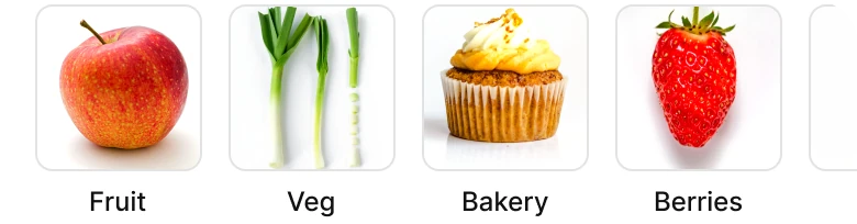
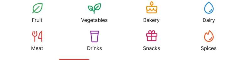
Two rows of four small line icons in different colors, Fruit, Vegetables, Bakery, Dairy, Meat, Drinks, Snacks and Spices, each with an 8 px label, against a single row of square product photos on white, an apple, green onions, a cupcake and a strawberry, with labels under them in a readable size and the next photo cut off at the right edge.
Eight icons in eight colors is a legend, not a menu. At 8 px the labels are also too small to read comfortably on a phone.
The fix uses a photo of the thing. An apple says Fruit faster than a leaf icon does, and a cupcake says Bakery. Four photos fit the width and the next one is cut off by the screen edge, and that cut is the hint that the row swipes. Dairy, Meat, Drinks and Snacks are still there, further along the row.
Rule to reuse: if you have a photo of the category, use it, and let the row run off the edge instead of squeezing everything in.
Fix 4: a clean tile, price first
Before
After
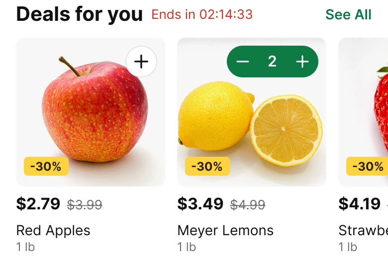
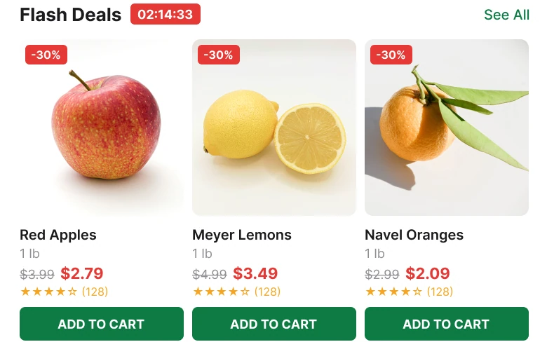
A Flash Deals heading with a red timer chip and See All, then three 117 px cards, each with a red minus 30 percent tag, a product photo, a name, a weight, a gray old price beside a red new price, five stars with a count and a full width green ADD TO CART button, against a Deals for you heading with Ends in 02:14:33 in red and See All in green, then 150 px tiles with a photo, a white plus button at the top right or a green stepper showing 2, a yellow minus 30 percent tag, a bold new price beside a gray old price, and the name and weight under it.
A draft card holds nine things: a tag, a photo, a name, a weight, two prices, stars, a rating count and a button. At 117 px wide each gets a few pixels, and the photo, the reason anyone buys fruit by looking at it, is the smallest part.
The fix keeps five: photo, price, tag, name and weight. The new price comes first and the old one is struck through beside it, so the saving is the first number read.
The ADD TO CART bar becomes a plus on the photo's corner. Once an item is in the cart, the plus turns into a small stepper (minus, 2, plus), so the same spot handles adding and changing the amount. Stars and ratings move to the product page, where someone has decided to look closer.
The prices still hold. $3.99 to $2.79, $4.99 to $3.49 and $5.99 to $4.19 are all 30% off, rounded to the cent.
Rule to reuse: a list tile answers "do I want it and what does it cost". Everything else belongs one tap deeper.
The smaller fixes
- Every function stays reachable. Dairy, Meat, Drinks and Snacks sit further along the category swipe, the full address is behind the chevron, the deal timer and See All stay in the section header, and the search keeps its useful words.
- Even margins. 14 on the left and 12 on the right become 16 on both sides, with 18 between blocks.
- A real type scale. Text runs from 12 to 20 px, against 8 to 13 px in the draft.
- One accent color. Red marked a banner, a timer chip, tags, prices and a badge. The fix uses one green for the promo, the cart count, the stepper and the active tab, and a small yellow for the -30% tag. Red stays only for the bell dot and the countdown text.
- The cart count stays. The cart sits at the top right with its number, and it is correct: two lemons on the stepper and one more item make 3.
- Buy it again. The second row of deals becomes a repeat-purchase row that runs on past the tab bar.
- A calmer tab bar. Four tabs, a hairline above them and one filled icon, instead of five tabs with mixed filled and outline icons.
Audit your own grocery screen
| Question | Why it matters |
|---|---|
| Does the header say how fast, before it says where? | The promise is the reason to open the app |
| Does the offer make one claim with one photo? | Banners with three messages get skipped |
| Are categories shown as products? | People recognize a photo faster than an icon legend |
| Does each tile show five things or fewer? | The rest belongs on the product page |
| Does the price come first, with the saving next to it? | The saving is the point of a deal |
| Is the add button the same spot as the stepper? | One control for adding and changing the amount |
| Is red kept for the few things that really are urgent? | If everything is red, nothing is urgent |
Get the Figma file
The free file has the junior draft, the fixed screen and every part as a component.
Free Figma file
Grocery home screen redesign, before and after
Both screens and every part as a Figma component. Free, view only, duplicate it to your drafts.
FAQ
How should a grocery app home screen be designed?
Lead the header with the delivery promise and a short address, then a search bar, one promo card, a swipeable row of product categories and a row of deal tiles. Give each block one job and use one accent color.
What should a grocery app header show?
The delivery time first ("Delivering in 20 min"), a short version of the address with a chevron to change it, a notification bell and the cart with an item count. The full address belongs behind the chevron.
How big should product tiles be in a grocery app?
Here the deal tiles are 150 px wide, so two fit on a 390 px screen and the edge of a third shows to hint that the row swipes. The draft's 117 px cards left the photo too small to read.
Should a grocery app use a sale banner?
Use a promo card instead of a banner. One claim ("30% off fresh produce"), one code and a photo of the product on a solid brand color is easier to read than a red strip with several messages.
How should an add to cart button work in a grocery app?
A plus on the product photo is enough. After the first tap it can turn into a stepper with minus, the count and plus, so the same spot adds the item and changes the amount.
How do you show grocery categories on a mobile screen?
Use a row of product photos with a readable label under each, and let the row scroll off the edge. It shows more aisles than a grid of icons without shrinking the text.
Sources
- Both screens are our own, designed and measured in Figma. The app, basil, its address and its numbers are made up. The prices are consistent on both screens: 30% off, rounded to the cent.
- Pattern studied: the home screen of Instacart.
- Photos from Pexels: the promo by Kinkini Manjula, the apple by mali maeder, the lemon by khalid, the onions by Larisa P., the cupcake by Aaron Paul, the berries by imsogabriel Stock and the chilli by Murat Tosun. Icons are from Phosphor (MIT).
- First published as a carousel on App Brainy.
Get new papers by email
New Brainy papers in your inbox. Confirm once, unsubscribe anytime.